
David Ricci
Luminous Endowment Lenswork Grant Recipient
Edge Of Chaos


For too many years to count, a project simmered on the back burner of my mind – publishing a book that would present my life’s work in a unified, meaningful and unique way. In 2015 I was very fortunate to receive the Publication Skills Grant offered by Luminous Landscape and LensWork which provided the impetus to make that book, Edge of Chaos, a reality.
In one important sense, this project began decades ago in the early 1980s when my dedication to photography first took hold. Early in my career I photographed manmade structures and worked in a sparse formalist vein based on geometric shapes, trying to perfect “good” composition – move in close, crop tightly, eliminate superfluous objects from the field of view. This body of work composes the first section of the book, “Elements”.


Years later, my work shifted to a new project photographing recreational sites throughout America – theme parks, sports facilities, miniature golf courses and the like. While the geometric underpinnings remained, as the work evolved I progressively included more visual elements in the frame and the compositions became more intricate.


My attention soon turned to the kitschy environments when they were nearly abandoned which seemed to transform these normally lively attractions into eerie, surreal landscapes.


Around this time I became interested in complexity science, the field of study that investigates what occurs when large quantities of individual elements are assembled into increasingly complicated systems. At some high level of organization, bordering on chaos, a new structure emerges – something that is not just complicated, but rather an entirely new entity that is both greater than the sum of its parts and essentially different from the components that produced it. The magical region where this powerful phenomenon unexpectedly appears is the “edge of chaos”. Like free jazz, everything isn’t always in perfect harmony, yet a novel, vibrant music emerges.
I recognized in this discipline a strong connection with the direction my work was headed. The structure of the photographs became increasingly complex as I included more objects and space within the rectangle and made greater use of visual motifs – repeated geometric shapes, colors, and patterns. After several years of mining increasingly complex scenes, the compositions were at the tipping point of information overload. I had arrived at the edge of chaos.


That portfolio is the basis for the second section of Edge of Chaos, “Emergence”. Since that time I have produced several bodies of work photographing in a similar vein – using very intricate formal structures to reveal an underlying elegance embedded in haphazard scenes.
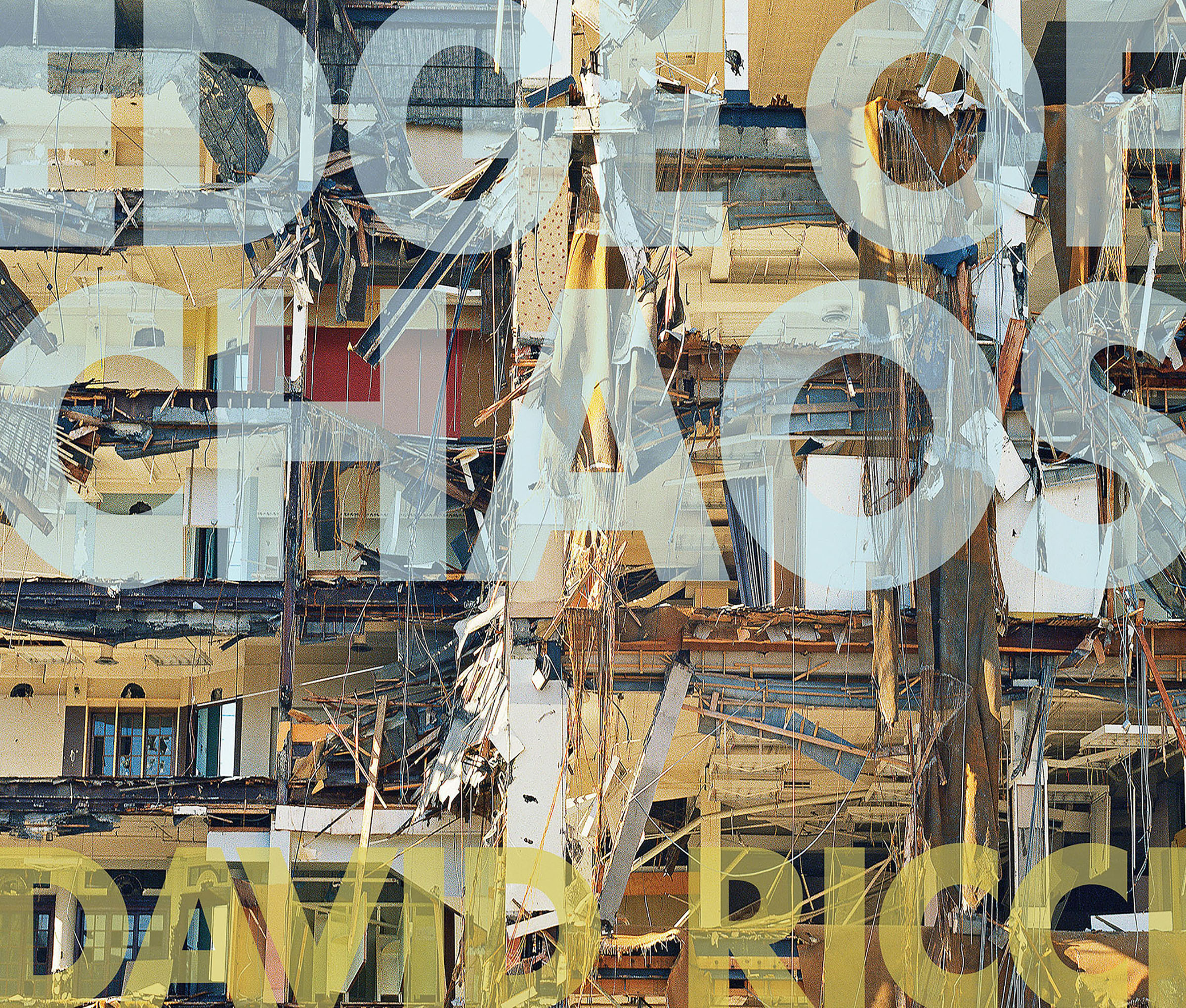
FISSION: a series of projects that examine the startling confluence of loss and grace in dismantled factories, demolished buildings and disaster sites.


FUSION: a photo essay that comments on our throwaway society while revealing an unexpected synchronicity found in heaps of discarded objects;


STRINGS: a portfolio of large-scale prints of brush, branches and seaweed that make a purely formal statement.


WAVES: an ongoing project photographing commercial fishing vessels and riggings that, despite the absence of the crew, evokes their presence and the life of the working waterfront.


So how did I make the transition from a collection of photographs taken over the past 35 years into something entirely new – a photobook? Having never produced a book and knowing precious little about the process, I faced some serious challenges. How and where do I begin? What is the book about? How will it be presented? What are the dimensions, the fonts, the sequence, the layout? I had to do some fast learning, so I started by reading Publish your Photography Book by Darius D. Himes and Mary Virginia Swanson which provided great insight into the publishing world and which I highly recommend to other photobook newbies.
The grant funds were first used to attend a 2-day book publishing workshop in Brooklyn with Magnum photographer David Alan Harvey who is also the driving force behind Burn, an online and print photography publishing concern. Harvey shared his extensive experience with photobook publishing, we reviewed and discussed the work of the attendees, and a few well-established photographers gave presentations on their process in developing and publishing their books.
My main takeaways from the workshop were to continue educating myself about photobook publishing, refine the overall concept for my book, familiarize myself with the design of a wide array of photobooks, and to put together a solid prototype – a book “dummy”.
To that end, I purchased all 3 volumes of The Photobook: A History by Martin Parr and Gerry Badger, a subscription to Adobe InDesign, ink and paper. I immersed myself in the history volumes, studied layouts and design of books in my own and other collections, began to learn InDesign basics and fine-tuned the overarching concept.
One key point stressed at the workshop was that design of a serious photobook should not be developed entirely in a software tool. Prints need to be made and laid out to allow pairings, sequences and groupings to emerge and to get a feel for how the images work together…..or not. This proved to be a crucial piece of advice. I narrowed down the “candidates” and made well over a hundred 8×10” prints on my Epson 8800 – all centered, with white borders and no text – and spread them over several benches in my studio.


Over the next several weeks I played with the sequence, eliminated images and returned repeatedly to add some back in the mix, remove others and rearrange once again. I did this dozens of times, often with input from others whose opinion I valued. Eventually, the book began to take form – the images were in a “final” sequence and organized into six groups that would weave together the overarching concept and form the different sections of the book: Elements, Emergence, Fission, Fusion, Strings and Waves. I printed a cover and had a bare-bones first version of the dummy – no text and no captions, just a printed sequence.


Book dummies range from simple mock-ups of a few pages to fully designed, printed and bound prototypes. What I had was far from a complete representation of the book but I struggled to determine how far along I wanted to bring it. Should I leave it as is to give publishers and potential essay contributors the basic idea? Or bring it to full completion? Something in between? I concluded that if I was going to do this I was going to do it right – develop a fully designed prototype of the book including everything except supporting essays by contributing authors. Since this represents most of my life’s work for the past 35 years I felt it was crucial to have a physical object that would communicate my vision for the book to publishers and writers.


I had settled on the title, solidified the overall concept and had a good, but probably not final, sequence. There was still a long way to go! To move the book to the next level it became apparent that a designer needed to be brought in. Larry Chernicoff, the Creative Director at Windhorse Communications Design who had previously designed a promotional booklet for me and was quite familiar with my work joined me. Due to the visual density of many of the images, we agreed that the book had to be fairly sizable. To print a few copies to shop around to publishers, a print-on-demand (POD) service seemed sensible so I researched PODs to determine which companies printed in dimensions that I thought would work. I decided to go with an 11×13” horizontal format available through Blurb.
Larry developed several possible layouts for the two-page spreads that would make up the bulk of the book, text pages, table of contents, divider pages, and, a project in its own right – the dust jacket.


He would send me InDesign or PDF files and I would review and return with comments and possible edits.
We continued this back-and-forth process multiple times and periodically met in person to review changes and swap ideas. Eventually, I made prints of some of the sequences – full-size, with text – to get a feel for the book dimensions and flow.


We worked on this for nearly a year making numerous changes to sequencing and layouts, editing text, adding captions and printing several full-size spreads to finalize the design of the second dummy.


After a final review and a few more revisions, a file was sent to Blurb to print a single copy. One of the huge upsides to POD is that one copy can be ordered at a reasonable price. One of the downsides is that there is no proofing process – you get what you get. So my single copy acted as the “proof” which Larry and I tweaked one more time, uploaded the new file to Blurb and ordered a few copies. Two weeks later they were in my hands – 134-pages, 11×13 inch hardbound with dust jacket!
The total cost including design fees drove well past the grant amount but while the time, money and effort to bring Edge of Chaos to this point were all well beyond my expectations, so too was the satisfaction and sheer joy of working in a new form and having a hard-bound book in my hands! This would not have been possible without the spark from the Luminous Endowment and the LensWork grant. Certainly the next phases of this process – working with contributing writers, publishing and marketing the book – will be just as challenging, but I figure that just comes with the territory when living and working at the edge of chaos.


