This article is excerpted fromChapter 7ofAndrew Rodney‘s bookColor Management for Photographers. It is provided here as a counterpoint to a previously published article byNigel Williams, titledAn Approach to CMYK. Its publication produced alively debateon this site’s Discussion Forum, which you may also wish to read. (Two cups of double espresso are recommended before reading, followed by two Advil upon completion).
_________________________________________________________________
This chapter could be considered by some to be a continuation of Chapter 6. It is devoted to using ICC color management to produce files optimized for a CMYK printer, specifically a printing press. I decided to break up this subject into two chapters for a number of reasons. First, when discussing CMYK and output to a four-color press it’s not uncommon to see photographers’ eyes glaze over just before their brains explode. Those of us that have been using Photoshop for a long time can even remember the good old days when no provisions for supporting CMYK documents existed. We old timers were brought up to believe that CMYK was best left to prepress experts.
The other reason to devote a chapter to printing on a press is that this topic can be quite involved and for many users, dealing with CMYK isn’t on their radar. No reason to subject these readers to what some have calledthedevil’s color space. When the time comes to begin handling files for eventual output to a printing press, CMYK isn’t a process that can be ignored, although many photographers try. I will discuss some of the advantages to the photographer who decides to tackle this subject. It is somewhat ironic that those people I’ve met who handle CMYK in their daily environments find RGB to be confusing and counterintuitive. Many photographers and RGB virtuosos find CMYK to be equally confusing. One of the best quotes I’ve heard that sums up the differences in the two color models is this: “God created RGB, man created CMYK…what would you rather use?”
_________________________________________________________________
Why Photographers Need to Understand Prepress
When I went through photography school in the early1980s, there were no desktop computers that couldhandle files forelectronic imaging or prepress. I had only one class in photomechanical preproduction (prehistoric prepress) early in my studies. Most of the students ditched the class, spending what we believed was a more important use of our time in the wet darkroom, printing our B&W class assignments. Ignorance was bliss. Little did I know that in the future, I’d never step into a conventional darkroom again and would spend a great deal of effort trying to understand how images were printed on a press. At that time, the only issue photographers had to worry about was getting a well-exposed, well-shot transparency. Hand that transparency to the client, go home, and create an invoice for the job. If the final reproduction wasn’t that good, it wasn’t my problem. Today, the world is a different place, where photographers are capturing and in essence scanning their images in RGB using a digital camera system. Many photographers are shooting film and scanning in RGB on their desktop film scanners. We can no longer ignore the processes that come about further down the reproduction chain.
Does that mean we need to handle CMYK conversions and understand all this prepress nomenclature? We could output all digital files to a transparency using a film recorder, and hand that off to the client. That was the only viable pipeline I had in the early 1990s when I had to end up with a transparency for reproduction. That expensive process degraded image quality and often produced color nightmares. One compelling reason I suggest that photographers embrace the idea of handling their work all the way to press is control and profits. Someone has to control the color processes and be paid to do so. It might as well be you or someone on your staff. I recognize that many photographers simply want to take pictures and not be tied to a computer all day. Who better to control the color intent of your images than you, the creator? Who better to profit from this additional work than you, the photographer? With a bit of education, some new tools, and a few tests under your belt, I think you’ll find, as I did, that producing superb color separations isn’t rocket science by any stretch of the imagination.
Even if you never produce a CMYK conversion, understanding the processes, problems, and lingo may make you a better photographer since ultimately, whatever image you produce that ends up on a press can be improved early in the capture and imaging stage. The other reason I feel most photographers should learn about prepress and printing is that so much of their work is sent to four-color press as the final output. At this time, so few photographers understand the CMYK ink-on-paper process that those who do make themselves more valuable to their clients.
_________________________________________________________________
What Should You Supply?
Many photographers are under the impression that they can have their RGB cake and eat it, too. That is, produce RGB data and hand it off to someone expecting the CMYK issues to disappear. Others in the color management food chain will handle the conversions and print process. Although this is possible, more often than not, the resulting handling of the RGB data is less than ideal. Sometimes the results are heinous! If we go back in time to the days when all a photographer had to do was hand off a properly exposed transparency, others handled the CMYK conversion process. This process was handled by the photographer’s client who took the film to a printer or prepress shop. Technicians would scan the transparency on a very expensive drum scanner that produced an on-the-fly conversion to CMYK for the print process. Years of expertise were required for skilled drum scanner operators to turn the myriad of dials to produce an optimized scan in the right flavor of CMYK. Often multiple corrections and multiple proofs were produced from the scan. In some cases, rescanning was conducted along with more proofing until the client was satisfied with the color; then the CMYK data was sent to the press. This was an expensive process, but no one can deny that for many years, extremely high-quality printing resulted.
This pipeline began to change when desktop imaging became more common and users began to produce RGB scans using desktop equipment. When digital photography took off in a big way, the number of images produced on film and scanned on high-end drum scanners greatly reduced in number. The problem was that RGB data had to be converted to CMYK outside of these high-end, proprietary systems. As more RGB data was finding its way into the print shops, those that needed to deal with the conversions found what they believed were quality issues with the supplied data. Some of this was a lack of understanding of color management on the part of both parties. Since so few photographers were trained to understand the processes involved, and their limitations, much of the film produced for four-colorprinting was difficult to scan. Photographers were trained to make beautiful transparencies to be viewed on a light box. No wonder such expensive high-end, high-dynamic range scanners were necessary. There is still, by and large, a struggle between the two groups: those that produce the RGB data and those who have to handle that data and produce quality four-color output. Today this is far more a cultural issue than a technology issue. As you’d probably expect, I can say with some certainly that implanting good color management, RGB can be converted to CMYK with quality that can match and exceed any process conducted in years gone by. GIGO, as usual, applies to the original RGB data.
When a photographer supplies an RGB file to a printer, the responsibility and ultimate quality of the print job is shared by multiple groups. Some photographers send RGB data to print shops with a reference print in the hopes that the printer will examine and reproduce this appearance. Usually the print is from the RGB data but not cross-rendered. There’s simply no way a printer, with the limited color gamut its four-color presses are capable of, can produce a match to this reference print. Even if they did attempt to match such a print, it’s going to cost someone else money. Printers are smart, they usually don’t “fix” or alter files without generating some fees or at the very least, printing out a number of expensive proofs.
Sending a reference print based on something that can’t be produced is just a waste of ink, paper, and time. Sending a cross-rendered print from a desktop proofer like an ink jet is a far better solution since the appearance of the print has basis in reality. If a cross-rendered print could be produced, it means the person doing this cross rendering must have a CMYK output profile for the process either supplied by the printer, custom, or generic. That being the case, the image could be converted to CMYK ready for output. Sending both an RGB tagged document and a CMYK converted document using a good profile gives the printer everything they could possibly need. What might be useful is some waiver that lets the photographer off the hook if the printer decides to use the RGB file and produces an inferior CMYK conversion (it happens more often than you think). Once again, a cross-rendered proof from the CMYK document can’t hurt, especially if your client has paid for this output. For this scenario to work, the photographer needs a CMYK output profile, thus the reason this chapter exists.
There are some issues in producing really good CMYK profiles. Few are technological issues. Most are either business related, cultural, or simply due to a lack of control on the part of some or all parties involved in this process. With proper communication and tools, the process of making superb separations is not difficult once you understand a few principles that will be discussed. The pluses to the photographer are control over the final intent of their images all the way to press, a competitive advantage over those photographers who fear CMYK, and a nice profit center for the photo studio. This does require an investment in time, which you’re doing at this very moment by learning about the process; equipment; and some selling skills. Once you’ve tested the process a few times and proven to your clients that you can produce quality color separations, you’ll be surprised that you once feared the process.
There are still issues to overcome. You know you want to target a CMYK conversion to a specific print condition and sometimes getting that part of the process defined is next to impossible. You still have to deal with outside people running your files through their equipment. It’s unlikely that you’ll be dropping a million dollars on your own Heidelberg press. You may find roadblocks to finding the right answers to some necessary questions in an attempt to profile and color manage the process. Again, this isn’t a technology problem nor is it a problem that is too complicated for you to solve. I hope that as time goes on and color management is more accepted in the print world, this will get easier.
_________________________________________________________________
The Contract Proof
Even though we may have no idea where a job will be printed or on which press, we do have an ace in the hole—it’s known as acontact proof.Thisis a proof by an outside shop or perhaps the printer running the press. Once the art buyer agrees to accept the color of the proof, the printer contractually agrees to match this color on their press.In other words, a contract proof is made and the print buyer (client) views this under a D50 balanced light box. The client either accepts the colors of the proof or not, in which case another round of corrections and additional contract proofs are generated (usually at their expense). Once the client accepts the contract proof, they sign off on the actual proofs and go home. The files and the contract proof end up at the print shop.
The pressman (he or she is the person running the press) does whatever necessary to get the press running as it should. This sometimes is calledgetting the press up to density. The press is running to some shop-desired specification (or it should be). The pressman runs the job and compares the press sheet to the contact proof. The two need to match closely. When they do, the art buyer gets a call at 2 a.m . and runs down to the print facility to examine the press sheet and the contract proof, once again under the light box. The client signs off on the press sheet, indicating that it and the contract proof match to their satisfaction. Eventually the press prints the entire print job and the client comes back to pay the bill and pick up the job. Ideally, the press run, the contract proof, and signed press sheet still match.
Many users have heard the termMatchprintand assume that this is the sole proofing system I have been calling a contract proof.Just as you can blow your nose in all kind of products other than Kleenex, you can produce contract proofs on all kinds of products other than Matchprint. Kleenex and Matchprint are two specific brand names of products. As for contract proofs, there are many kinds, such asFuji ColorArt,Kodak Approval,DuPont CromalinorChromalin,DuPont Waterproof,AGFA Pressmatch, and of course, the well knownMatchprint(a product now owned by Eastman Kodak).
Besides all these different contract proofing systems, there are a number of different substrates available for many uses on these contract proofing systems. For example, in Fig. 7-1 I have measured the ECI2002 target printed on three Matchprint proofs all from the same device but having three different substrates: Commercial, Publication, and SuperWhite. As you can see, a Matchprint isn’t simply a Matchprint. Notice the differences in the average DeltaE of the two most similar stocks (Commercial versus Publication). Now for a reality check: Fig. 7-2 shows the average DeltaE between the same Matchprint contract proof from two different vendors. Which is correct? Since I measured and built a profile from each contract proof, the correct profile is obvious. What would I do if I didn’t have a custom profile?
Since the contract proof is one item that both the print buyer and print maker agree to match, it is critical that the conversion to CMYK be optimized for this process whenever possible. It is possible to profile the actual press the job will be printed on, but there are issues surrounding this task. The aim is to produce a contract proof that is close to an ideal condition whereby a pressman can match his or her press to this proof. Our job isn’t to take away the necessary skills of the pressman but rather, to provide a file that allows the pressman to produce a very close match from press sheet to contract proof. Therefore, we need to either receive an ICC profile from the print shop producing the contract proof or make one ourselves.
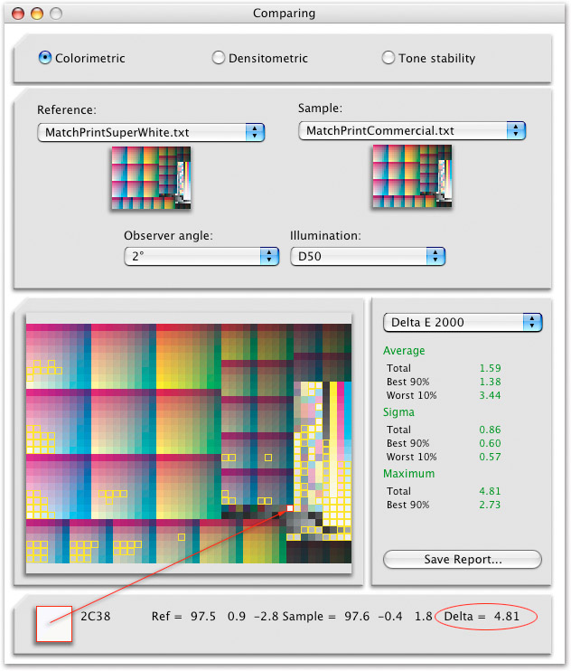
Figure 7-1
The compare option in ProfileMaker Pro’s MeasureTools shows the DeltaE of a Kodak Matchprint made from a Commercial versus SuperWhite substrate from the same Creo contract proofing system.
Note that the MeasureTool has a number of different ways to calculate DeltaE; seen here is the latest method of calculating differences (DeltaE 2000).
The worst patch is outlined in red and I’ve clicked on it to show the DeltaE is 4.81. That one patch just happens to be the white of the stock.
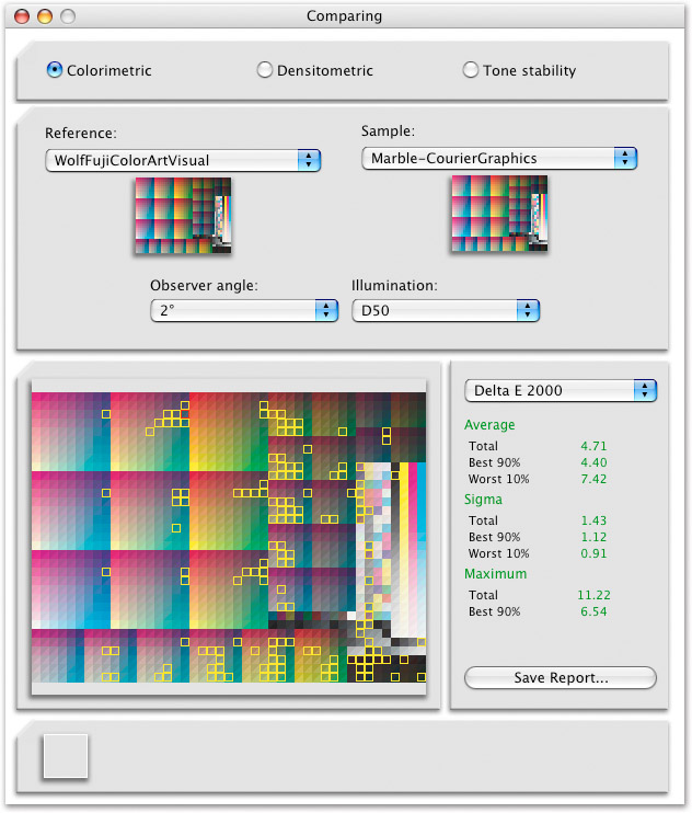
Figure 7-2
The Compare option shows the DeltaE between two contact proofs from two different print shops.
The average DeltaE is acceptably low at 4.71 although the worst 10% of the 1400 odd patches are showing a DeltaE of 7.42.
_________________________________________________________________
SIDEBAR DeltaE Revisited
In Chapter 1 I discussed DeltaE and how this is a useful method of comparing two colors and calculating the differences. As with most aspects of color management, the ways in which DeltaE is calculated is evolving thanks to the ongoing efforts of color scientists (please read some sarcasm into that last sentence). There are at least five different formulas for calculating DeltaE, the differences I can’t even begin to fathom. The latest formula is known as DeltaE 2000 and is seen in the reports shown in the MeasureTool in Figs. 7-1 and 7-2.
To give you an idea how your mileage may vary depending on the math used, I loaded two measured data files from two Matchprints in the Compare option in the MeasureTool. With the DeltaE set to DeltaE 2000, the average reading was 2.14; using another formula called DeltaE 94 the reading became 2.10. Setting the pop-up menu to DeltaE the calculated value jumped to 3.21. Therefore, if a software product is providing some kind of DeltaE value, it might be useful to know how those values are being calculated. The DeltaE 94 formula is said to be more accurate in providing a report when low values between two color samples are calculated compared to the original DeltaE computations. The DeltaE 2000 is the most recent, and my tech editor Karl, tells me it’s considered the most accurate. The bottom line is, don’t be too carried away with small differences in DeltaE, especially when the math used to produce the values is undefined. This isn’t to say that comparing groups of measured patches for evaluating differences isn’t useful, it is. If these differences between the two Matchprints were over six, using any of the DeltaE calculations, I’d begin to worry. With all three reports, the two Matchprint proofs are close (just a bit over three).
_________________________________________________________________
In the old days, CMYK files were separated into four pieces of film, one for each color channel. The film would be used to burn plates for printing on a press. Like the rest of the digital world, filmless systems are becoming more common. Direct to press or direct to plate are newer processes that take CMYK data and produce impressions (pits on a cylinder to hold ink) without film. Some contract proofing systems are designed to proof film-based printing systems; others are designed for a filmless process. The contract proofing system has to be compliant with the type of print process being utilized. It’s necessary that the printing process be defined before a contract proof is made. A film-based proof will serve little purposes if the eventual printing press isComputer To Plate(CTP). Film-based separations have one advantage—that being a print shop can examine the film and provide feedback as to the effectiveness of the separation. With filmless proofs, it is not always evident that the correct CMYK parameters are ideal for the press conditions.
_________________________________________________________________
Profiling the Press
A user can output a target to a printing press and build an ICC profile of the press. There are a number of reasons why this might present a problem. First, getting a press up to density and running any job is expensive. Finding a vendor to agree to run the targets necessary to build a press profile isn’t going to be easy unless the company running the press really wants that profile. Often the targets can be printed on a part of a press run that isn’t being used, such as blank sheet that would be cut away. For this press profiling process to be effective, the targets have to be printed using the paper, inks, and press conditions as subsequent print jobs. Changing ink or paper invalidates the press profile. Some print shops have presses set up for a specific paper (often referred to as ahouse stock) and run the same ink set. This press always runs the same conditions so profiling this condition is quite effective, assuming the press can be kept in a consistent behavior. Some printers have multiple presses and may run a job on press #1 today and a job on press #2 tomorrow. A printer might pull a job off a particular press at the last minute due to scheduling or other issues like a malfunctioning press. What happens now if the job you intended to go onto one press goes to a different press? Are both presses behaving in a similar fashion? If not, the original press profile and CMYK conversions might cause a problem for the pressman.
Some presses, especially the modern computer driver models, are very stable not only from day to day but throughout the entire press run. Some newer presses can compensate for changes over the actual sheet on which it is printing. There are, however, many older presses producing excellent quality but only after a skilled pressman does the work necessary to get that press behaving properly. By the way, that “correct” behavior can be just about any condition the print shop feels is optimized for their needs. That is, some printers go out of their way to make their presses behave in a standardized behavior discussed later, whereas others feel the need to exceed these standards. There are many variables in keeping presses in a consistent behavior. Consistency is a key factor in successfully profiling any device. Therefore, for most users who are simply providing files for output to a print shop, aiming for the contract proof is a more viable option. Press profiling is best left to those people who own and control their presses.
_________________________________________________________________
SWOP and TR001
Do you know the old joke about the three biggest lies in the world? It’s too dirty to reprint here but one of the lies most people don’t know about is the one involvingSWOP(Specifications for Web Offset Publications). TheSWOP committeecame together in 1974 when a group of printers formed this organization to provide some standards for web offset presses. The web in this case shouldn’t be confused with the Internet (World Wide Web), but rather a printing process using large rolls of paper instead of the alternative, which is a sheet-fed press (printing onto cut sheets). The large rolls of paper were known as webs. In 1977, the SWOP committee produced standards for printers to follow and have published updates over the years. To clarify the goal of the SWOP committee, the following quote from their mission statement follows.
SWOP Mission
The mission of SWOP is to continually raise the level of quality of publication printing by setting forth specifications and tolerances.
The SWOP committee is attempting to produce reasonable goals and consistent expectations for print vendors to follow.The SWOP organization publishes very detailed specifications about aim points that when followed, produce SWOP press behavior. The bad news, and that big lie, is that many printers tell their customers they conform and print SWOP when truth be told, they are not anywhere near this condition.Ask a printer what conversions to use for their printing process and they will likely tell you, “we print SWOP.” More often than not, this isn’t the case. Many printers feel they need to modify the press behavior because either they have no incentive to match a specified aim point or they feel that if their press and the press across the street were producing the same color, they would lose the competitive advantage (other than price). This makes aiming your conversions for such a particular print condition quite difficult. Once again, aiming for a contract proof helps this issue a great deal. However, if the press isn’t producing SWOP behavior then the contract proof has to deviate as well.
Other organizations that are attempting to set printing standardsareGRACoL(General Requirements for Application in Commercial Offset Lithography) andCGATS(Committee on Graphic Arts Technical Standards). These groups, at times, have proposed standards for printing based on spectral data measured for presses that these groups have set up to a well-behaved standard they specify. For example, there is a well-defined specification for SWOP known asTR001.The SWOP committee performed a SWOP certified press run that they set up to conform to the published SWOP conditions. On this press they printed a IT8.7/3 press test target, discussed in Chapter 6. They measured the target with a Spectrophotometer and averaged a group of measured data files. The result of this work isSWOP TR001. This process produced a very specific recipe for SWOP based on measured empirical data that thankfully anyone with the hardware and interest can produce and verify. Therefore, TR001 measurement data describes expected SWOP behavior for printing presses, proofing systems, and separations.
The beauty of SWOP TR001 is the lack of ambiguity. For the 928 CMYK values we haveCIELABvalues that define SWOP behavior. That is, if you follow SWOP, and your press, proofer, or separation exhibits this SWOP behavior, then there will be 928 CMYK values that should produce specific CIELAB values. If not, this print condition really is not SWOP. The Adobe-supplied U.S. Web Coated (SWOP) v2 profile conforms to this TR001 specification . If we were going to send CMYK data to a press we knew conformed to SWOP TR001, the canned Adobe profile would produce excellent results.GRACoL has been working on a new standard called DTR004 for Commercial Sheetfed Printing. This is similar to SWOP TR001 standards only for sheet-fed, not web-press, conditions.At the time of this writing, DTR004 is still being drafted but at some point in the foreseeable future, we will have a measurable and empirical method of defining this sheet-fed press condition.
The question now becomes, will printers conform to these standards? If this were possible, we could all produce CMYK conversions of very high quality to multiple presses with no need to build our own custom CMYK profiles. Until that day, the most accurate way to produce conversions based upon the somewhat chaotic methods in which printing is produced is to ask for profiles from print vendors (rarely available), or build our own. For some reason, some printers will admit they have a profile for their process but refuse to supply it to anyone outside their shop, fearing that this profile in some way provides information that could wind up in the hands of theirompetitor. This is ridiculous since the profile provides no such proprietary or useful information for their competitors. This is usually an excuse for not having a profile. When told that a printer is producing SWOP, ask if that means TR001. If you are told that this is the case, the printer likely knows about this standard and is indeed producing this on proof or press. Then a CMYK conversion using the U.S. Web Coated (SWOP) v2 profile is going to work well.
Assuming you need to build a profile for a printing condition, one big issue with handling CMYK conversions is getting the information necessary from the printer or prepress shop about certain print conditions. Communication is key and setting up antagonism between the parties serves no purpose. However, getting some shops to go along with your needs to color mange their process can be tricky. When asking for specifics, show that you understand the various processes by using the correct terminology (that you will learn in this chapter), but provide little details on what you plan to do.
Working with outside vendors that are not color management savvy or ICC hostile can be a difficult tightrope to walk. When supplying targets for output to produce your profiles, try to ensure that the files are output with no manipulation or alterations. You will need to get specific parameters about the press conditions to build the output profile. Finding these answers can be difficult. I’ve talked to press mangers who didn’t understand a simple question like “what total ink limits do you prefer?” The person who can answer these questions is usually the scanner operator. If possible, have a conversation with these knowledgeable technicians. Often you just have to guess, and although this might seem risky, the outcome is usually better than you would expect. A well-built custom profile made with default settings often can produce excellent CMYK conversions
Although there are a myriad of settings for producing CMYK output profiles, we can generate a suite of profiles using different parameters, output a single test image, and get a good idea how well the profiles perform. Having a proof (and film if using a film-based printing mode) will allow the printer to examine the conversion and provide reasonable feedback. They are unaware of how the conversions and proofs were generated and usually will examine the separations without bias.
_________________________________________________________________
CMYK and Black Generation
CMY is a relatively easy color model to understand. It’s when black ink is added to the mix that this color model can be difficult to grasp. Many differing numeric combinations of CMY and K can produce a specific color appearance. This is why CMYK is both complicated yet versatile. By its very nature, CMYK is an output/print space. What makes CMYK tricky is something calledblack generation. This is a general term, which describes how the mix of black with CMY is produced and used in the print process. In addition, there are other parameters that need to be specified when building a CMYK profile such astotal ink limits, something calledUCR/GCR,black start, andminimum/maximum black ink usage. Don’t panic, I’ll explain each.
_________________________________________________________________
Total Ink Limits or TAC
Total Ink Limits, also known as TAC (Total Area Coverage), specifies how much ink is used when printing. If we have four inks and print each at 100% capacity, the total ink would be 400%. On a press, this is an impossible amount of ink to use since doing so would produce output that would be dripping wet with ink. In addition, inks are expensive so printers want to use as little as possible while still producing the quality output necessary. Total ink limits are built into the output profile by specifying how much of each ink to use. Most products allow the total ink to be divided by the individual inks, usually CMY versus K. Coated or less absorbent paper stocks often have higher total ink limits generally ranging from 280% to 340%. Newsprint uses significantly more absorbent paper stock and often uses a TAC value around 200% to 240%. Ideally you would find out what the printer prefers for total ink limits and enter that value into the profile building software. If such a value is not available, an educated guess would be approximately 300% for coated stock and 220% for newsprint. Those values will get you in the ball park. For ink jet printers, dye subprinters, and most toner-based printers that will output CMYK, a 400% total ink limit is an appropriate starting point. The RIPs or drivers that control these printers can play a role in ink limits. In Fig. 7-3 I’ve selected two preset defaults in ProfileMaker Pro for Offset and Newsprint. You can see the total ink limits reflect the basic guidelines shown earlier, and the overall distribution of CMY inks in relationship to K.
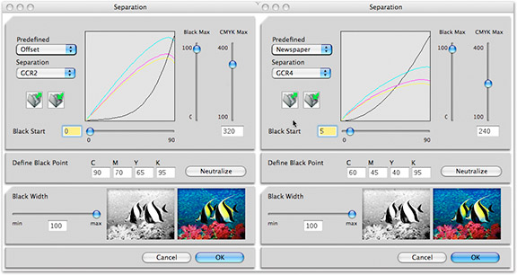
Figure 7-3
Two preset defaults for black generation and total ink for offset and newsprint from the Separation module in ProfileMaker Pro; I can alter the settings if I wish.
_________________________________________________________________
UCR/GCR
There are a number of ways to specify a color by mixing different combinations of CMY with K. For example, you can produce a neutral gray with just CMY inks if the correct combination is produced. Alternatively, some black can be added to the mix. It’s rare that only black ink is used to print anything but a solid black item like text or a drop shadow. This brings us to part of the separation processes known as UCR (Under Color Removal) and GCR (GrayComponent Replacement). The two are used to control the mix of CMY along with K in certain portions of an image. UCR is able to identify where CMY produces neutral values in addition to colors that contain a large mix of neutral values. An example of the latter is a dark brown. GCR then replaces some combination of CMY with the correct amount of black ink. In other words, GCR is the controlled removal of a specific ratio of CMY inks with a replacement of black ink. Far less CMY inks are used since black ink is substituted. Why use expensive CMY inks to produce a neutral gray or color when one lesser expensive ink can produce the same appearance? Using UCR saves the printer money on inks, at least in theory, and it allows less ink to hit the paper and thus dry faster. In addition, it is more likely that a neutral will be produced since even the smallest impurities of the CMY mix can cause a colorcast.
GCR works in a similar fashion except that it affects not only neutrals but many colors in an image. Once again, GCR replaces the right combination of CMY with K to produce the correct color appearance with less inks. The advantages of GCR are images that appear sharper and cleaner with colors less likely to shift on press. In addition, lower total ink percentages and less color inks result in far less registration problems.
Registration describes the lining up of the four colors. When one or more inks misregisters, severe ghosting of images or text result. An advantage to using UCR is that colors are made up of less ink and are easier to edit by the pressman. The pressman has more control and can make delicate color adjustments on press. If asked, most printers will say they prefer UCR. GCR provides more options since it affects not only near-neutrals like UCR but also many colors. In the old days, UCR adjustments were conducted when film was scanned on high-end drum scanners.
Today these kinds of ink replacements are done with the output profile; thus it’s useful to have an idea what settings to apply when building CMYK profiles. For separations to newsprint, use UCR. For separations for offset printing, use GCR.
Different GCR settings can be built into groups of profiles and used based on image content. The amounts of GCR specified usually are labeled light, medium, heavy, maximum, or none, as seen in Photoshop’s CMYK dialog in Fig. 7-4. Based upon what setting is selected, the GCR begins at different percentages within the tonal range of the image. For example, light GCR compared to medium and dark GCR; the curves are more pronounced as the tonal range of the image gets darker as illustrated in Fig. 7-4. Low-key images with lots of shadow detail can benefit from light or perhaps no GCR, whereas a medium-to-light GCR setting is better for mid-key images.
Higher GCR settings can assist with images that contain lots of neutrals such as a photograph of silverware. Neutrals made up with less CMY inks tend to produce better gray balance. Therefore, once you measure a target to build a CMYK output profile, you may wish to create a number of different GCR settings to use based upon image content. Note that the differences in UCR and GCR separations are not visible on screen or even to a proofing system since these options affect the actual inks on the press. You can see the differences in individual color channels. A tutorial in Chapter 9 goes through the steps to produce a number of separations with different UCR/GCR settings, allowing you to get a better idea of how this affects conversions to CMYK. (See Chapter 9, Tutorial #14: “UCR/GCR Settings.”)
Users that need a fine degree of control over the separation should consider building several output profiles from the same measured data using different GCR settings. Otherwise, a light-to-medium GCR setting for high quality offset printing should produce acceptable results. Photoshop and some products also specify a setting called UCA (Under Color Addition). The idea is to add back density to shadow areas as a compensation for GCR. In Fig. 7-5 you can see I added 50% UCA, which caused the CMY inks in the darker tonal areas to increase. This huge addition is used for illustration only. Such a setting would never be used. If you find that GCR produces muddy blacks, adding a small amount of UCA canreducethe problem. UCA is usually an image-specific correction. That is, if a group of images with a great deal of darker shadows are looking flat, a small amount of UCA can help.
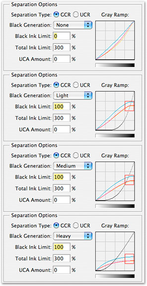 |
Figure 7-4
The various GCR options found in the Photoshop Classic Engine illustrates via curves what happens as GCR is increased from none, to light, all the way to heavy.
Note the relationship between the black curve and the other CMY curves.
The red square is shown to illustrate where GCR begins to affect the curves within the tone scale.
Other products that produce options for GCR will show a similar effect.
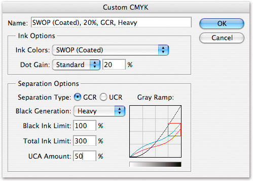
Figure 7-5
The GCA portion of the Photoshop Classic Engine illustrates the effect on the CMY curve when a value is inserted.
I’ve gone overboard with this setting for illustration purposes only.
Five to 10% would probably be the limit used here when necessary.
Notice how the CMY inks have been raised compared to the same curves in the heavy setting in Fig. 7-3 in the darker area of the tone scale.
_________________________________________________________________
Black Start and Black Limit
Some products allow users to decide at what point black ink begins to be used in the separation; this is known asBlack Start. Since this is tied to the Total Ink Limits, as black start increases from zero, CMY inks are also affected. Suppose I set the black start at 10%. Once CMY inks have reached this 10% mark, black ink will begin to be used and mixed with these inks for the rest of the separation. The opposite isBlack Limit, sometimes calledMax Black, which is an option in some products, notably Photoshop. This is an option for ensuring that too much black ink isn’t being used for the separation and used where further ink renditions might be necessary. In Photoshop, altering Black Limit doesn’t update the Total Ink field yet this does affect the total mix of all inks. In most cases, leave both Black Start and Black Limits at their defaults. However, should the need arise to handle how black ink is being used on either end of the tone scale, the controls are available on some products. I would advise against using the Photoshop classic CMYK engine if possible (it’s flaky) and instead use CMYK profiles built with packages that used measured data of the print conditions.
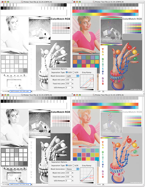 |
The effect of GCR on the black channel and only the CMY channels are seen here (see side bar).
_________________________________________________________________
SIDEBAR – GCR Up Close
]Figure 7-6 shows two separations made with light GCR (top) and heavy GCR (bottom), with the black channel to the left of each separation, and to the right, just the CMY channels. In the center of each separation is the Photoshop GCR portion of the custom CMYK dialog. This shows the curves for GCR settings used. Let’s examine the light GCR first. Notice that the white to black steps in the black channel (outlined in red) shows only the last few steps from pure black appearing on the black channel. Notice that the density background behind the hands with balls is quite light. This is because more CMY ink is being used on these channels (less black) seen in the composite image to the right. Not much CMY is being replaced with K.
Now examine two images separated using heavy GCR. The white to black steps (outlined in red) shows much more density is on this black channel. A heavy GCR setting replaces more CMY with black so the black channel is heavier. The background behind the hands with balls is quite dark due to the heavy GCR, as you would expect. This is the opposite of the composite seen above using light GCR. Once again, in the center is the Photoshop GCR curve used to make this separation. Notice the position of the red outline indicating where heavy GCR has moved the CMY curves compared to the light setting. A red circle shows where the black begins within the tone curve seen under the curve itself. This is the Black Start, affected by the choice of GCR. Also, notice the areas in the tone curve where both light GCR and heavy GCR are most pronounced as the mix of inks starts to shift over to black.
_________________________________________________________________
Other Black Generation Options
Some of the more advanced profile building applications provide additional options to improve the black generation of CMYK profiles. For example, in ProfileMaker Pro, an option known as theBlack Widthslider controls the amount of black ink used in highly saturated portions of an image. This is commonly used for building CMYK profiles for gravure printing. This slider can also be useful to remove the effect of black “peppering,” sometimes seen with ink jet printers using CMYK output profiles. The default is 100% and lowering this slider would produce the effect of using less black ink for highly saturated images. This it is much like the opposite of GCR. That is, black ink is reduced in saturated colors to be replaced with more CMY inks as seen inFig. 7-7.
Another option is theBlack Balancebutton, which uses the measured data to calculate the optimum neutral black point for the output device. Both ProfileMaker Pro and Monaco Profiler have provisions for affecting the neutral values based upon the color of the paper stock. Since the paper is measured and has a specific color, neutrals may be affected. Both products have settings to adjust colors to ensure neutrals are maintained based upon the color of the paper white. For very nonwhite papers like newsprint, this can be a useful option.
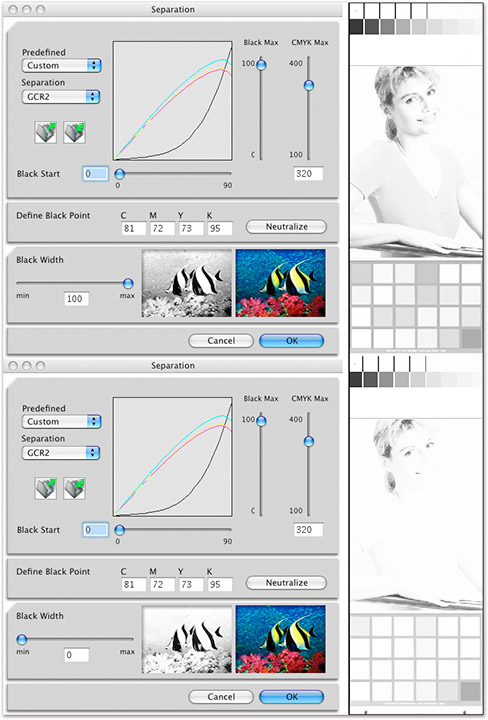
Figure 7-7
The effect of the black Slider in ProfileMaker Pro is seen here on the black channel of two separations.
One separation is made using the slider at 100% and the other is set to 0%.
Notice that saturated colors like the pink outfit on the woman has more black ink used when the slider is set to 100%.
Lowering the slider removes black by adding more CMY inks to the other channels.
The fish image is used to illustrate the effect and matches the behavior of the Printer Test File image.
What to Do When You Can’t Target Your Output
You have a client who might have no idea where the job will be printed. Alternatively, the job might be printed in several shops across the country, not uncommon for large magazine production. This is a significant issue and one that can put a crimp in the best-laid plan for targeting your CMYK conversions. You have to produce a conversion to CMYK, what can you do? Try to get as much information as possible in the attempt to produce the best generic conversion possible. You get an idea if the job is being printed in newsprint, on a glossy stock, a magazine, sheet-fed, or web press. From there, an educated guess can be made. Using the sheet-fed or SWOP profiles from Photoshop are probably as good a guess as any since building a custom profile isn’t in the cards.
You can still consider working with a prepress house that will produce film and proofs (or just proofs) if a client is willing to accept that option. In this scenario, supplying tagged RGB documents in a reasonable RGB working space and a CMYK conversion with a cross-rendered proof is probably your best bet. Convert to CMYK using one of the Photoshop ICC profiles and then proof that onto a desktop printer using the cross-rendering techniques discussed in Chapter 6. This will produce a reference print that someone in the CMYK world can reasonably match. An RGB file in a working space like ColorMatch RGB may be a safer option than a wider gamut working space since we don’t know if the receiver of this RGB file has any idea how to handle tagged RGB. ColorMatch RGB, though having a smaller color gamut than Adobe RGB 1998, is going to preview better for users who may not be using ICC color management or a calibrated display. ColorMatch RGB will stand a better chance of getting converted to CMYK by the less sophisticated color management user.
By providing as much information about the files as possible, the better the job will proceed. If your client demands that you provide CMYK files but can’t provide you with enough information about the print process, you protect yourself. I would also suggest you try to get something in writing stating you will not held responsible for the final color quality nor the number of proofs required to finish the job. This would be true for those providing RGB data as well. A poor RGB-to-CMYK conversion isn’t the fault of the person supplying the tagged RGB data, although if a problem develops at print time, finger pointing is bound to happen.
Operating a press is an expensive process. So is making many contract proofs. Most printers will do their best to produce optimal quality. However, they have lost control over the entire process since desktop imaging began. As such, anyone outside their company who came in contact with the color files is fair game should issues arise. Protect yourself with good paper work, excellent quality files, a cross-rendered proof, and the knowledge of the print process to know if a finger is fairly being pointed in your direction.
Read this story and all the best stories on The Luminous Landscape
The author has made this story available to Luminous Landscape members only. Upgrade to get instant access to this story and other benefits available only to members.
Why choose us?
Luminous-Landscape is a membership site. Our website contains over 5300 articles on almost every topic, camera, lens and printer you can imagine. Our membership model is simple, just $2 a month ($24.00 USD a year). This $24 gains you access to a wealth of information including all our past and future video tutorials on such topics as Lightroom, Capture One, Printing, file management and dozens of interviews and travel videos.
- New Articles every few days
- All original content found nowhere else on the web
- No Pop Up Google Sense ads – Our advertisers are photo related
- Download/stream video to any device
- NEW videos monthly
- Top well-known photographer contributors
- Posts from industry leaders
- Speciality Photography Workshops
- Mobile device scalable
- Exclusive video interviews
- Special vendor offers for members
- Hands On Product reviews
- FREE – User Forum. One of the most read user forums on the internet
- Access to our community Buy and Sell pages; for members only.


