Listening to the Print

January 13, 2009 ·

Michael Reichmann

The story is told that the Pope visited Michelangelo in his studio one day, and on seeing him sculpting his statue of David, the Pope asked, “How do you know what to cut away?” The great artist’s response was, “I simply chip away anything that doesn’t look like David.”

When I look at my raw images on screen, they are indeed “raw”. They may have potential, but they rarely are much like what they will be if I am able to successfully extract their potential, as part of the process of going from latent image to finished print.

Along this route I apply some rules. Well, maybe more personal axioms than rules, and not all of them apply to all images. Nevertheless, here they are, along with some hopefully handy processing tips.

__________________________________________________________________

Images Want to Be a Certain Shape


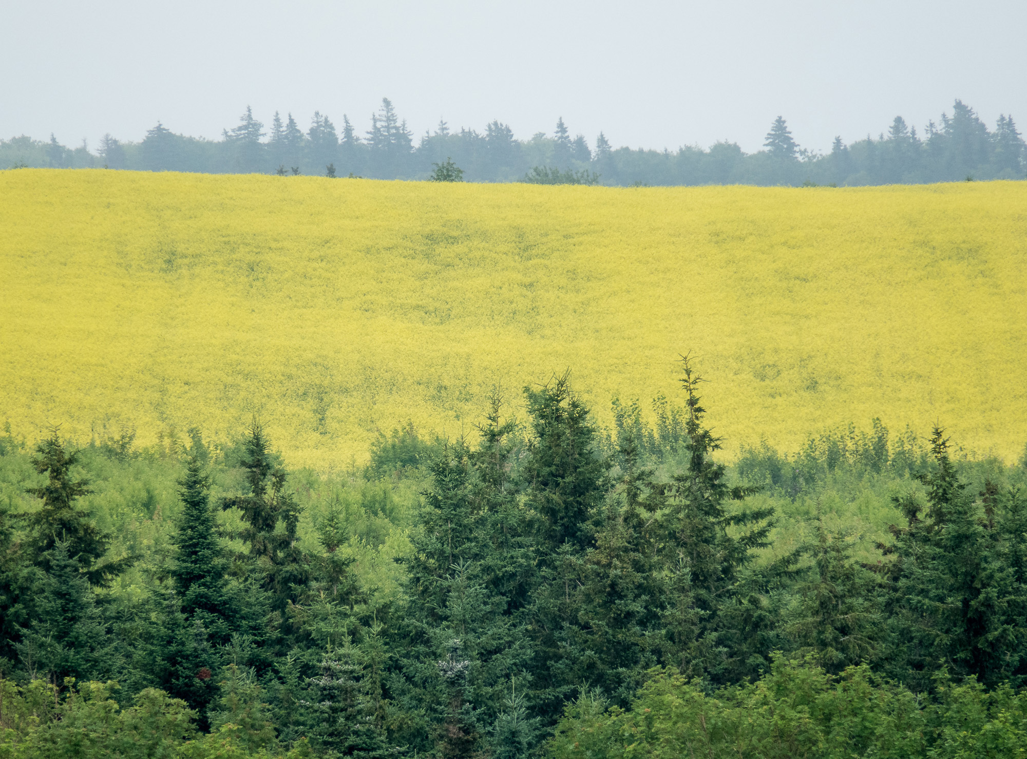
Original raw file in Lightroom, showing initial crop and straightening

Lenses project circular images. All lenses. Always – though people tend to prefer their photographs as squares and rectangles. Different cameras create images with different aspects ratios, ranging from 3:1, to 2:1, to 3:2, to 4:3, to square and everything in-between. Just because a camera maker decides that his camera will create images of a certain aspect ratio, where is it written that your photographs need to conform to that shape?

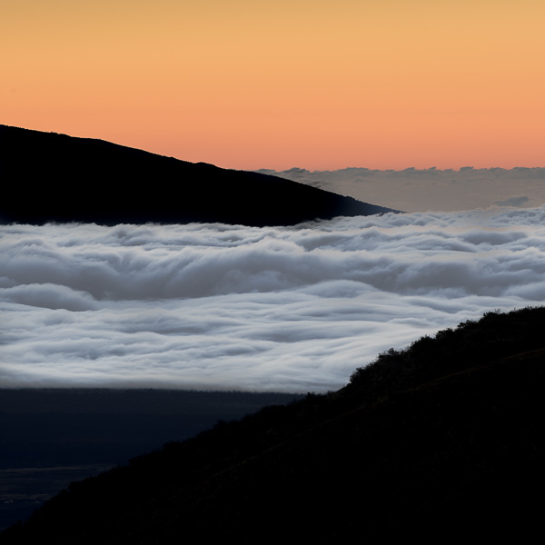
I therefore spend a lot of time deciding what shape it wants to be, both when shooting and when first looking at an image on-screen. Cropping is therefore almost the first thing that I do.

This makes technical sense as well because through the early removal of elements that aren’t going to be in the final image, their influence on other aspects of processing are removed, or at least diminished.

The process of cropping the image to its final aspect ratio may also be influenced by the removal of unwanted elements. We all crop in the field when we choose where to stand, what lens to use, and how to frame the picture. These are all acts of cropping. But physical realities like fences, walls, tree branches and the like can not always be circumvented on location. Therefore the cropping tool becomes just another method for reducing the image down to its essence – what you want it to show. Nothing more, and nothing less.


First interpretation, adjusted for white balance, saturation, etc.

__________________________________________________________________

Images Want to Be a Certain colour (or Not)

Today we all photograph in colour, because our digital cameras are made that way. (Actually, digital cameras are monochrome devices, but that’s another story). But, just because we photographed the scene in colour doesn’t mean that we have to print it that way.

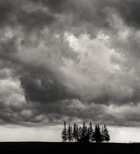
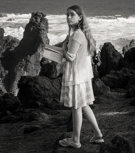
B&W photography has had a huge resurgence in recent years. Many photographers are discovering that the monochrome image has much to recommend it. Sometimes colour is a distraction, or doesn’t add anything to the pictorial or emotional content of the image. Sometimes the graphic simplicity of  a B&W representation is what an image wants.


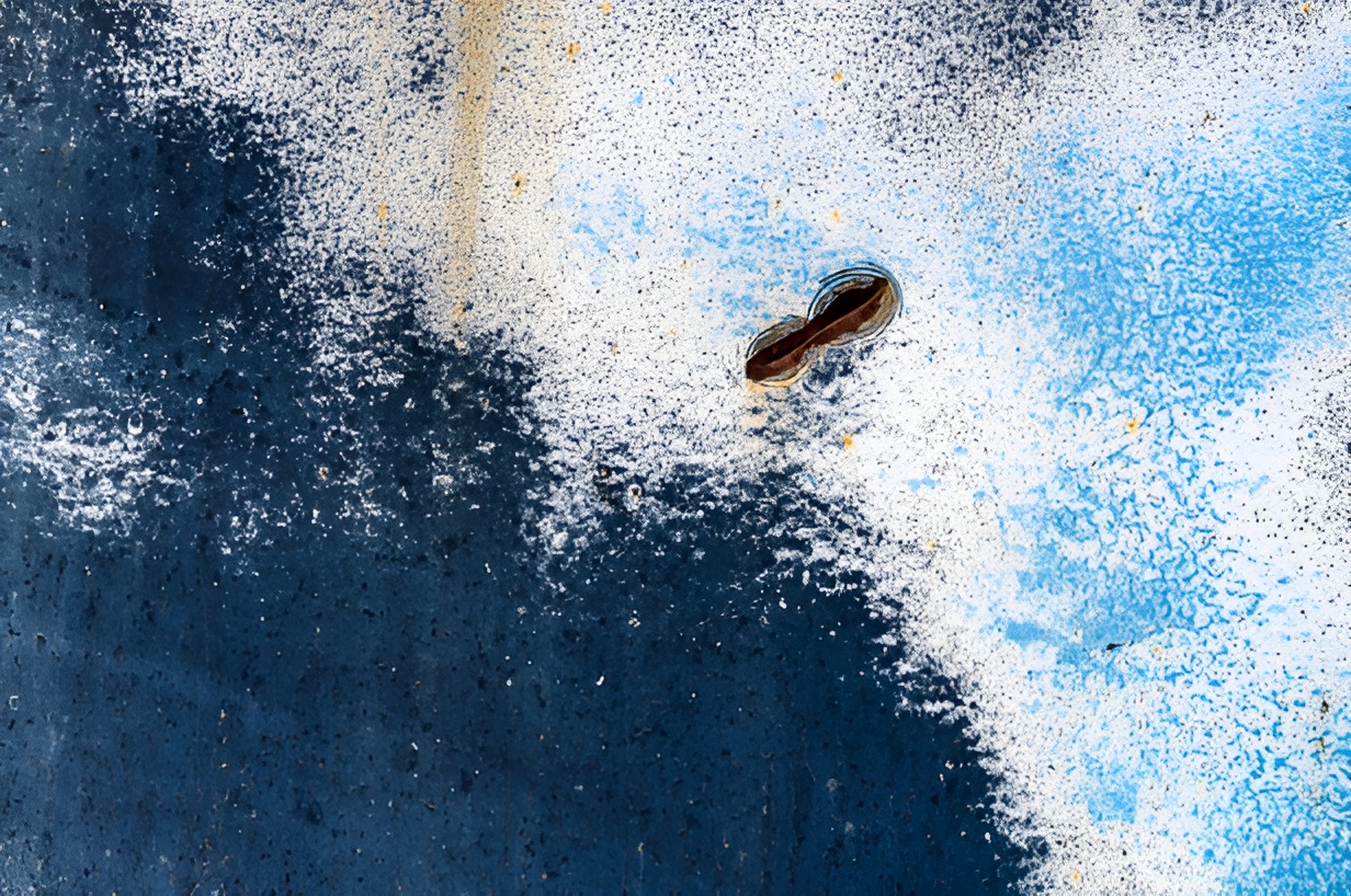
Monochrome conversion using the Auto function in Lightroom’s Grayscale Mixer

If I haven’t already decided while on location that a shot wants to be in B&W, one of the first things that I do when looking at a raw image in screen is to make it B&W, to see if it might be more effective that way. And, one of the best tools for this I find to be Adobe’s newLightroom. A single check box creates an optimized mono conversion, and then a selection of sliders allow for the setting of the desired luminance relationships between the image’s colour elements. This is just like shooting with a large set of colour filters on panchromatic B&W film, except that you get to do it afterward, rather than being forced to make the decision of which filter to use while still on location.

I am also enamored of Lightroom’s split toning capability, which allows for subtle monochrome tinting of the images, from sepia to warm tone, and much in-between.  Another alternative to toning while processing is the ability to tone at the printing stage, which can either be done in various printer drivers or RIPs. It all depends on what the image wants, and that meanslisteningto what the photograph is saying.

__________________________________________________________________

Images Want to Have (Tonal) Relationships


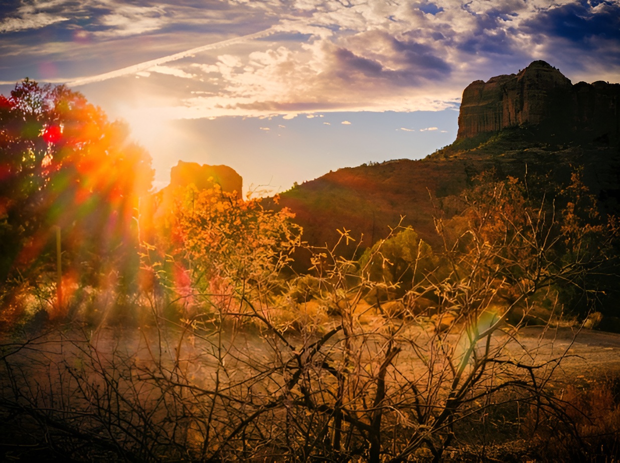
Red tonalities shifted, toned with Lightroom split toning, and cropped again. Another interpretation.

Whether working in colour or B&W. the relationship between colours and tones should not be restricted to those that are there by default. Everyone is comfortable setting gray balance, white point, black point, and gamma, which is just another way of saying, making the image look good – with the highlights not too bright and the shadows not too dark.

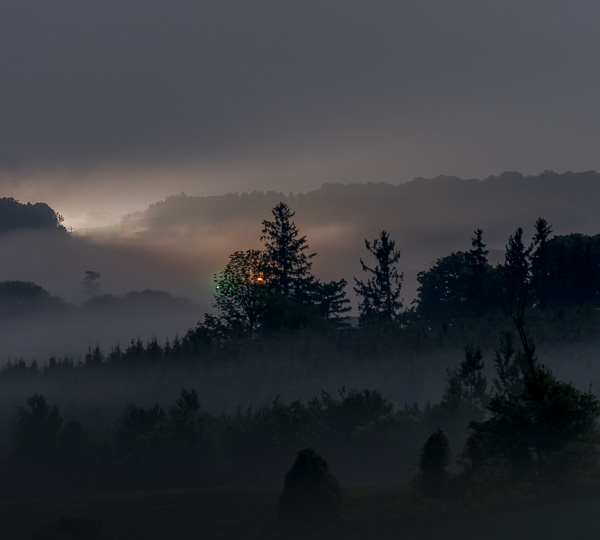
But more than that is possible. Working in colour, individual colours can be saturated, or desaturated. Hues can be shifted. In B&W, the tonal relationship between different parts of the spectrum can be altered to suit our taste, or more particularly the demands of the particular image.

__________________________________________________________________

Images Want to be a Certain Size

Many photographers get into a rut. They buy paper in a certain size, and then that’s the size of prints that they make. There’s also the all too prevalent idea that every photograph needs to be printed 24 X 30” and hung over the sofa.

Visit an art gallery. You’ll see paintings and prints ranging in size for miniatures that can be held in the palm of ones hand, to panels many feet across. Bring the same kind of flexibility to your own printing. Not every image needs, or wants, to be printed so large that it has to be viewed from across the room. Few images are worth framing and hanging on the wall. But many can be enjoyed in a more intimate way through a print that can be held in ones hands and viewed comfortably without bending the elbows. This means an image area of not more than 9X12", or so, on an 11 X17" sheet. Leave lots of white space. No points are given for printing to the edge of the paper. A smaller image on a piece of paper allows the surrounding white area to become a sort of matte, allowing the image to be seen without distractions.

__________________________________________________________________

Keep Listening

I rarely settle for the first-pass print produced from a worthwhile image. I usually put it up in my viewing box and then live with it for a day or two. Sometimes small changes are made; sometimes not. But it’s rare that I hit a bulls eye the first time out.

Often I will return to a file weeks or even months later, and see it in a new way. Part of this may simply be mood. Our esthetic judgments are influenced by many internal as well as external factors. Our abilities as printers likely also will change and develop, or new tools may come along which permit a better, or at least different interpretation of a file.

Indeed I find that the best way to develop new image processing techniques is to practice them on old files. New ones are too exciting. We want to discover what our files have to say. Revisiting old files permit us to discoverwhat elsethey may have to tell us.

Avatar photo

Michael Reichmann is the founder of the Luminous Landscape. Michael passed away in May 2016. Since its inception in 1999 LuLa has become the world's largest site devoted to the art, craft, and technology of photography. Each month more than one million people from every country on the globe visit LuLa.

You May Also Enjoy...

Afternoon in the Park

October 2, 2013 ·

Michael Reichmann

Please use your browser's BACK button to return to the page that brought you here.


Leica M8 Revisited

January 13, 2009 ·

Michael Reichmann

The PurchaseI'm not a range finder guy. In fact for my entire career, other than hold somebody's point and shoot at a party, I've never