


From Academia to “Gut Feel”
Unlike painters, most photographs have little if any training in colour theory. This is a pity, since unless one understands the physiological as well as psychological basis of formal colour theory it’s hard to understand why some photographs work and some don’t, except on a “gut feel” basis.
I find it remarkable, but over the years I have never seen a comprehensive article in any photographic magazine about colour theory. A thorough search of the web has also come up short. Since most landscape, nature and wildlife photographers work in colour it is important we understand the underpinnings of our art.
This is not a simple topic. It intertwines the physics of light, thephysiology of visionand our psychological perceptions. With this essay I hope to assist you in appreciating why we see colour the way we do and what can be done to improve our photography using this knowledge.
I’ve used coloured text wherever the name of a colour is used. After some initial reader feedback I discovered that even though it looks a bit garish it’s a considerable aid to comprehending a somewhat difficult subject.
The Colour Spectrum

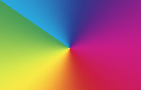
Discussions about colour (British spelling) always begin with a colour wheel (above) and a discussion of the Primary Colours. Depending on the application and environment Primary Colours fall into three families…
RGB( Red / Blue / Green )
CMY( Cyan / Magenta / Yellow )
YRB( Yellow / Red / Blue )
RGB is used by most electronic and transmissive-light technologies such as TV and film, and CMY (actually CMYK including Black) is used with reflected light technologies such as printing inks. The primaries traditionally taught in art school for painters, and for this reason the ones we’ll be discussing here, are YRB ( Yellow / Red / Blue ). There’s no point in arguing over which primary system is best— they each have their place in a specific discipline.
First and Second Order Colours
Any colour of the spectrum can be made by mixing the Yellow , Red , and Blue primaries. This is why they are called First-Order colours. These are pure colours and are not created though mixing any other colours. If you look at the Colour Spectrum at the top of this page you’ll notice that while there are an infinity of additional colours, convention has it that there are in fact 9 additional Second-Order colours, for a total of 12 in the two groups combined. All other colours are considered Third-Order and won’t be discussed here much.
These 12 colours, starting at the top of the colour wheel with Blue and moving clockwise are; Blue-Violet , Violet , Red-Violet , Red , Red-Orange ,Orange, Yellow-Orange , Yellow , Yellow-Green , Green and Blue-Green .
Do you see the pattern here? Work your way clockwise around the Colour Spectrum, starting with Blue and compare the colours in the list below to their positions.
Blue Primary
Blue-Violet 75% / 25% mix of Blue and Red
Violet 50%/50% mix of Blue and Red
Red-Violet 25% / 75% mix of Blue and Red
Red Primary
Red-Orange 75% / 25% mix of Red and Yellow
Orange 50%/50% mix of Red and Yellow
Yellow-Orange 25% / 75% mix of Red and Yellow
Yellow Primary
Yellow-Green 75% / 25% mix of Yellow and Blue
Green 50%/50% mix Yellow and Blue
Blue-Green 25% / 75% mix of Yellow and Blue
Do you see how the Second-Order colours which are half way between the First-Order primaries, Violet, Orange andGreen , are comprised of 50% each of the First-Order primaries on either side of them, and the rest of the colours are 25%/75% or 25%/75% mixtures?
“Very interesting“, you’re probably saying, but what does this have to do with producing better photography? We will start to see how in a moment through looking at each of the First Order colours and the major Second-Order ones using some of my photograph to illustrate the points.
First Order Colours
Yellow — A First-Order Colour
 Aspens #1, Route 168, October 1999
Photographed with a Rollei 6008 Integral and 300mm Schneider APO Tele-Xenar on Provia 100F
While the Yellow of the Aspens in this photograph is a bit toward the Yellow-Orange end of the spectrum it will serve to illustrate this primary colour. (Finding pure yellow in nature is tough, except in flowers).
Yellow is the brightest colour. It screams for our attention and this is why warning signs are frequently painted this colour. Yellow and Yellow-Orange also are the dominant colours of Autumn and as such have a strong appeal to our emotions. Psychologically Yellow is a colour denoting happiness.
Red — A First-Order Colour
 Snow Fence —Toronto, 1994
Taken with a Nikon F4 and 60mm f/2.8 Micro-Nikkor
Red is intense. This is particularly so when placed against a dark background, and is one of the reasons that I chose it as a design element for this web site, (section dividers). Red is a universal warning colour and is therefore hard to ignore. A little Red goes a long way.
Blue — A First-Order Colour
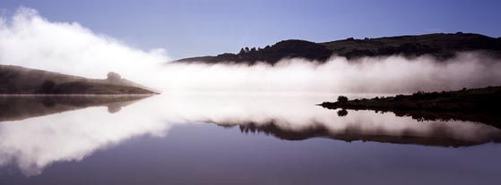 Mirrored Lake —CA, 1996
Taken with a Mamiya 645 and 55mm f/2.8 lens on Provia 100.
The sky is Blue , and water is usually Blue , as it derives its colour by reflecting the sky. Blue is the colour which defines our planet. In fact from space Earth is seen as a Blue planet.
Blue is a retiring colour and conveys a feeling of restfulness and passivity.
Second Order Colours
Orange — A Second-Order Colour
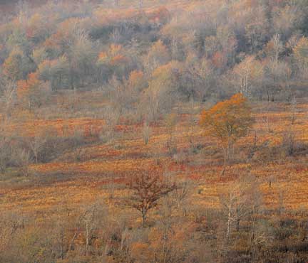 Warm Turnout, October, 2000
Photographed with a Rollei 6008 Integral and 300mm Schneider APO Tele-Xenar on Provia 100F
Orange is a second-order colour formed from the mixing of the Red and Yellow primaries. While the first-order primaries have limited range before one is outside their scope, a secondary such as Orange has a broader range of possible tonalities.
In this photograph, taken along the Blue Ridge Parkway just before sunset on a day in late Autumn, we have everything from the dark Red tree in the foreground to the Yellow one center-right, accentuating the Oranges which add so much warmth to this image.
The bare trees scattered throughout the frame are essentially medium-Gray . Gray is the most neutral of all colours and through the effect of simultaneous-contrast (see below) appears complementary to any other colour in the frame. In this case it tends to subdue the Oranges , which would otherwise appear over-the-top. Nevertheless, the colours are an accurate rendition of late-afternoon light illuminating this scene’s fall foliage and ground-cover.
Green— A Second-Order Colour
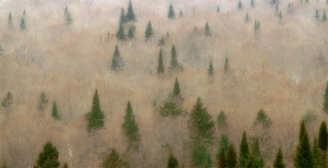
Evergreen Hillside, Quebec, 2000
Photographed with a Canon EOS3 and 100~400mm f/5.6L IS lens on Provia F100 film.
Green is a second-order colour formed from the mixing of Yellow and Blue . As with Orange it is capable of a wide range of tonalities or shades. Of course Green is the predominant colour of vegetation and as such is dominant in many landscape photographs. Interestingly, in searching my portfolio for sample images for this article I found that Green was the hardest colour for me to find. Curious. (I suppose I shoot too much in the desert Southwest).
Violet— A Second-Order Colour
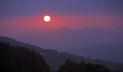 Blue Ridge Sunrise, October, 2000
Photographed with a Rollei 6008 Integral and 300mm Schneider Tele-Xenon lens on Provia 100F
Violet is a Second Order colour formed by the mixing of Blue and Red . It is not a colour which is readily found in nature, though of course the flower of that name is a notable exception. Violet is a colour traditionally associated with nobility and it conveys a feeling of elegance and warmth.
Working with Colour
Now for a look at our perceptions of the relationships between various colours. The following section discuss the concepts of Complementary Colours, Simultaneous Contrast, Complementary Ratios, and Harmonizing Colours.
Complementary Colours & Simultaneous Contrast
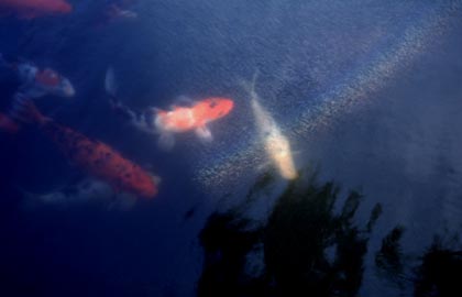 Two Bunch Carp — Desert Hot Springs, CA 1995
Taken with a Nikon F4 and 60mm f/2.8 Micro-Nikkor
Complementary colours are any two colours which lie opposite each other on the colour wheel. Two such opposite colours can be regarded as being in balance when they appear together. In the picture above the Orange carp provide the pleasing complement needed to the Blue water. In fact, when complementary colours appear together they increase their intensity though a process called Simultaneous Contrast.
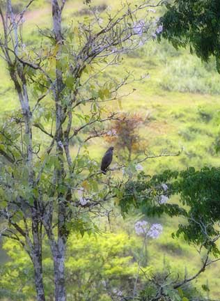
Photographed with a Canon EOS D30 and 100~400mm f/5.6L lens @ 400mm
Red / Green is one of the most common colour contrasts. In this photograph, taken in the Pacific lowlands of Costa Rica, pale pinky/red of the out of focus bush in the center of the frame makes itself and the varying shades of green around it more intense by its presence. Cover it with your thumb to see how the intensity of the greens diminishes.
Note as well that a small amount of a complementary colour (here red ) is needed to enhance its complement.
Complementary Ratios
There’s a test that you can do for yourself in Photoshop or almost any graphics program. Create squares of complementary colours and compare their relative intensities. While Red and Green are roughly equal in their affect on each other Orange and Blue need about a 3:1 ratio for the same balance. With Yellow and Violet it’s about 5:1. (Your mileage may vary).
Harmonizing Colours
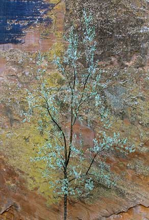 Russian Olive
Photographed with a Canon EOS D30 and 70~200 f/2.8L lens at ISO 100. RAW Mode.
Harmonizing colours are ones which can be found on the colour circle by visualizing the three points of an isosceles triangle that sits in the middle of the circle. This places two of the three colours just one colour zone apart with the third at the long end of the triangle opposite.
People with a good colour sense instinctively choose colours which are harmonious when decorating their home. Photographers, unless they are working in a studio, rarely have the ability to select their palette. But it is helpful to understand when you do encounter a colour combination that is harmonious, such as the one in the photograph above, why this is so.
In this photograph the key colour is the Blue-Green of the Russian Olive leaves. The harmonizing colours are the Orange and Red found in the rock face. The thing to note about Harmonizing Colours is that if mixed together they would produce Gray .
Intensity
The intensity of a light source also affects our colour perception. At low light levels, blue and green objects appear brighter than red ones when compared to their relative brightness in stronger light. This effect is known as the Purkine Shift. When the light become brighter, there is another in hues, called the Bezold-Bruckeeffect. This causes most colours to appear less red or green and more blue or yellow as the intensity of the light source increases.
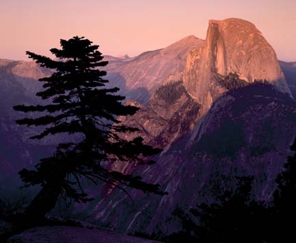 Half Dome and Tree (Rollei), 1999
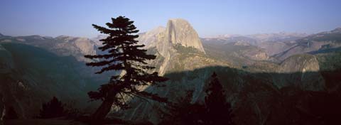 Half Dome and Tree – (XPan), 1999
Conclusion
If you’ve gotten this far, congratulations! Colour theory is a complex subject. It contains objective laws of psycho-optics as well as subjective value judgments. This page is just a quick overview of a large and complex topic. Each of these small sections is at least a chapter in text books on the subject so I’ve only been able to cover selected highlights.
To my knowledge there is no book currently in print with detailed discussion of this subject aimed specifically at photographers. The only one I know of was Harald Mante’s Color Design in Photography published by Focal Press in the U.K. in 1970; originally publication in German as Farb-Design. It has been long out of print but is well worth searching for. The translation is poor (or the original German text may have been badly written), but I owe much of what I’ve learned about colour over the years to this book. (It is also the predominant source reference for this article).
The other book that deserves specific mention is Theory of Colours byGoethe, published in 1810. Yes, that Goethe, of Faustian fame. In addition to being an author and theatrical figure Goethe was an amateur scientist and was fascinated by colour. His book, though scientifically at odds even in its day with the wavelength theory of colour developed by Sir Isaac Newton, is still in print today, almost 200 years later, because of its beauty and philosophical insights. One review described it as having , “excellent observations explained by an untenable theory.”
Colour theory is usually taught to student painters in the first-year of art school. It makes sense for them to learn it because painters createtheir colour environments, while photographers for the most part findthem. Nevertheless, photographers are well served understanding the basics so that they can appreciate why some colour images “work” and others don’t. Tasteafter alldoeshave its roots in objective reality.
One closing thought—to quote from the Encyclopedia Britannica: “Artists and designers have been studying the effects of colours for centuries and have developed a multitude of theories on the uses of colour. The number and variety of these theories demonstrates that no universally accepted rules apply; the perception of colour depends on individual experience.”
Michael Reichmann March, 2001
Light & Colour
If you enjoyed this article you might also wish to read Light-Colour and Human Vision by guest contributor Miles Hecker.

Elevate Your Vision


Read this story and all the best stories on The Luminous Landscape
The author has made this story available to Luminous Landscape members only. Upgrade to get instant access to this story and other benefits available only to members.
Why choose us?
Luminous-Landscape is a membership site. Our website contains over 5300 articles on almost every topic, camera, lens and printer you can imagine. Our membership model is simple, just $2 a month ($24.00 USD a year). This $24 gains you access to a wealth of information including all our past and future video tutorials on such topics as Lightroom, Capture One, Printing, file management and dozens of interviews and travel videos.
- New Articles every few days
- All original content found nowhere else on the web
- No Pop Up Google Sense ads – Our advertisers are photo related
- Download/stream video to any device
- NEW videos monthly
- Top well-known photographer contributors
- Posts from industry leaders
- Speciality Photography Workshops
- Mobile device scalable
- Exclusive video interviews
- Special vendor offers for members
- Hands On Product reviews
- FREE – User Forum. One of the most read user forums on the internet
- Access to our community Buy and Sell pages; for members only.
You may also like