An Analysis by Peter van den Hamer
DxOMark Sensor is a raw benchmark for camera bodies. It is “raw” not just because it looks at Raw file image quality. It is also raw in the sense that it provides data for cooking up hands-on reviews that cover all aspects of a camera.
DxOMark Sensor Scope
DxOMark Sensor is the new name of DxO’s original metric for camera body image quality. The name “sensor” is a bit misleading as the benchmark covers whatever happens to the light or signal from the point it has left the lens up to the point when the raw file is decoded. Other camera properties such as ease-of-use, speed, price, and lens sharpness, are all out of scope.
Note that DxO also provides a second benchmark called DxOMark Score which tests lens/body combinations and which does include lens sharpness.
DxOMark Sensor applies to:
- high-end digital cameras (mainly SLRs and interchangeable lens models),
- when generating Raw output files (JPG introduces too many extra issues),
- including whatever impacts image quality within the camera (except for the lens!), and
- regardless of sensor resolution (more on this later).
The DxOMark Sensor benchmark essentially “only” covers noise under varying lighting conditions and in its various manifestations.
Purpose of the Benchmark
Benchmark data such as DxOMark Sensor give photographers a way to compare camera image quality. This helps people decide whether to upgrade or what to buy – despite that having a low noise camera is nowhere near the top of the list of things that make photos great.
Benchmarks may actually also influence future industry direction. This is analogous to, for example, automotive mileage or safety tests: even when the test definitions are not perfect, vendors will try to optimize their designs to score well on important tests.
Although DxO Labs is a commercial organization, it provides this benchmark data for free because DxO needs to measure the data anyway (e.g. for their Raw converter) and because it uses its DxOMark website to increase brand awareness. The measurements and graphs are incidentally not in the public domain, but can be redistributed under certain conditions.
Purpose of This Article
The data shown here is derived from DxOMark’s website. My graphs don’t replace DxOMark’s graphs and tables: you should use the DxOMark website to compare specific camera models. I simply created new graphs to stress certain overall trends and phenomena – originally for my own needs.
This article thus addresses various interrelated questions:
- What do the DxOMark Sensor results mean?
- How valid are the benchmark scores?
- Why do large sensors outperform smaller ones?
- Why don’t MPixels say much about image quality?
- What can we learn about the cameras and industry from the DxOMark data?
During the journey I will slip in a basic course on Sensor Performance for Dummies. This is good for your nerd rating because it is actually rooted in quantum physics and discrete-event statistics. But this can be explained with a more familiar phenomenon that is remarkably similar: measuring precipitation by putting measuring cups out in the rain. And I even threw in a few Greek λetteρs to remind you that we are on the no man’s land between science, engineering and marketing.
If this gets to be a bit too much for your purposes, just concentrate on the graphs containing benchmark results. Questions like “Please define photon shot noise” will not be asked on the exam.
Four Top-Level Graphs
Figure 1. DxOMark Sensor score plotted against sensor size, cost, year and MPixels.
Click on image to enlarge. The individual graphs are revisited later.
Figure 1a-d shows the DxOMark Sensor score along each vertical axis. The scores are currently between 20 and 90. Scores above 100 are theoretically possible. Don’t get hung up on differences of only a few points: 5 points is roughly the smallest visible difference in actual photos (DxO: “equivalent to 1/3 stop”). The measurements themselves appear to be repeatable to within one or two points[1].
The DxOMark Sensor score is itself based on detailed measurements which we will discuss later. The graphs in Figure 1 show:
-
a. the impact of the sensor’s physical size on the overall score,
-
b. the overall score versus a price indication for the camera body,
-
c. how digital cameras have evolved and improved over the years, and
-
d. how image quality relates to sensor MPixels.
To save you some scrolling (and squinting), each of these four graphs in Figure 1 will be repeated (and enlarged) when it is discussed.
Sensor Size impacts Image Quality
Figure 1a. DxOMark Sensor scores for different sensor sizes.
This is one of the graphs shown in Fig 1.
The horizontal axis in Figure 1a represents relative sensor size. The dimensions of a “full-frame” sensor (24×36 mm) are used as reference. A value of 0.5 thus means that the sensor’s diagonal is half that of a full-frame sensor and that the crop factor is twice that of a full-frame sensor. The axis is “logarithmic”, meaning that every 2× increase in sensor size spans the same horizontal distance[2].
Figure 1a shows (from left to right):
- so-called 1/2.33” sensors in super-zoom bridge cameras,
- so-called 1/1.7″ sensors (5.7×7.6 mm) typically found in high-end compact cameras,
- so-called Four-Thirds sensors with a crop factor of 2.0×,
- APS-C size sensors with a crop factor of either 1.5× or 1.6×,
- specialized APS-H size sensors with a crop factor of 1.3×,
- full-frame cameras (24×36 mm, with a crop factor of 1.0×), and
- medium-format cameras (crop factor of roughly 0.7×).
Some cameras have been labeled with an abbreviated model number. Thus 1D4 is short for Canon EOS 1D Mark IV and α55 is the Sony STL Alpha A55. Remember to use the original DxOMark graphs for looking up specific cameras.
The color scale[3] used in all my graphs represent the size of the sensor: orange means relatively tiny sensors, 4/3 and APS-C are shown in shades of green, cyan is mainly Canon’s 1.3x EOS 1D APS-H series, blue is for full-frame, and magenta and red are the “medium-format” sensors.
Note that mainstream compact cameras with tiny (1/2.5″) sensors and correspondingly lower image quality are hardly covered in DxOMark’s database – partly because they can’t generate the required Raw files. JPeg files would introduce too many extra artifacts at this level of precision. It is also worth noting that the super-zoom models with the smallest sensors (e.g. Olympus’ SP 570 UZ) at first glance resemble SLRs.
Figure 1a already shows quite some interesting information:
- As a general rule, larger sensors outperform smaller ones….
- …but newer models generally outperform older models. In particular, the newest APS-C models (Nikon’s D7000 and Pentax’ K-5 and Sony Alpha 580) outperform the older 1.3× sensors and even most full-frame (1.0×) sensors due to a significantly lower noise floor.
- The performance of the mirrorless Sony NEX-5 is in line with its 1.5× APS-C sensor. Its mirrorless design and its use of an electronic viewfinder have no impact on image quality: a classic SLR swings its mirror out of the way during the actual exposure. So the lack of a mirror doesn’t affect image quality.
- The Sony Alpha 55 , with its notable semi-transparent[4] mirror, performs roughly as you would expect given its APS-C sensor. But because its semi-transparent mirror doesn’t swing out of the way, 30% of the light never reaches the sensor. Note the performance gap between the Alpha 55 on the one hand and the Nikon D7000 or Pentax K-5 or Sony’s own Alpha 580: the higher score (lower noise) of the latter group could be explained[5] by the light diverted by the Alpha 55’s stationary semi-transparent mirror.
- Surprisingly, except for the 1/1.7″ segment, none of the Canon models are currently best-in-class[6] compared to their competition. This is partly because Canon’s two full-frame models (5D Mark II and 1Ds Mark III) are currently 2 and 3 years old. And because both of Canon’s 2010 APS-C models (550D and 60D) are entry-level models which don’t outperform the fancier Canon 7D introduced in 2009 (see Figure 2).
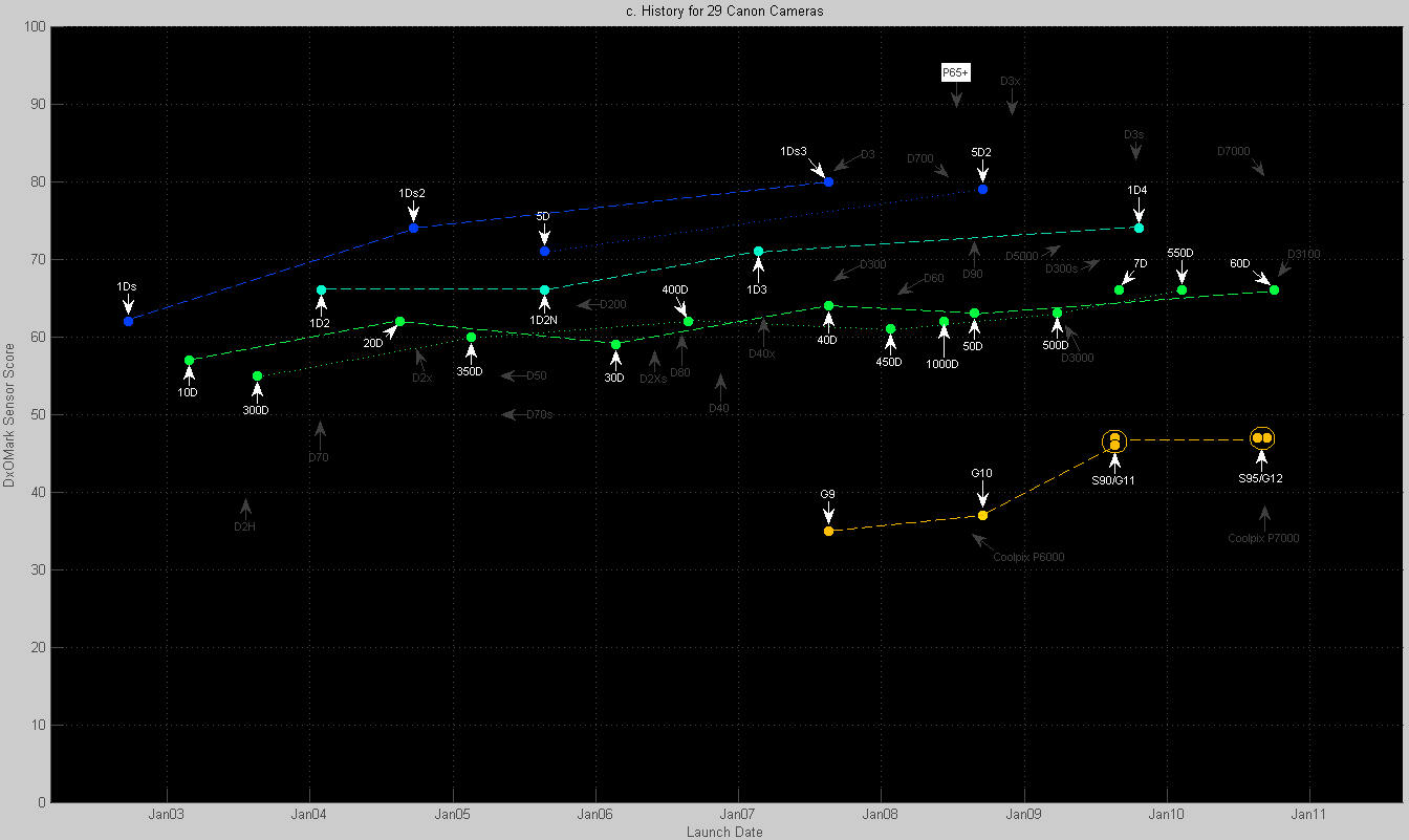
Figure 2. This is a subset of Figure 1c with extra lines to connect Canon
models that form a commercial series. The colors represent sensor size.
Click on image to enlarge.
As we are digressing here anyway, Figure 2 shows that Nikon (gray labels) originally lagged behind Canon (white labels) in terms of the image quality of its D-SLR sensors[7]. But with the introduction of the Nikon D3 in mid 2007, Nikon[8] appears to have overtaken Canon in DSLR image quality – at least for now.
Figure 2 also clearly shows that sensor size has a significant impact on image quality. Even Canon’s two APS-C series (EOS 300D-550D versus EOS 10D-60D) have very similar image quality despite their price difference.
Price and Image Quality
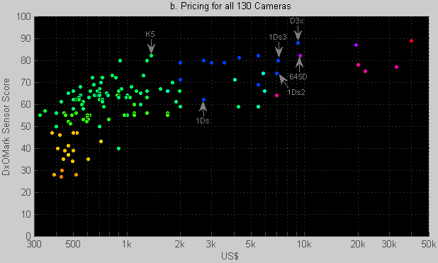
Figure 1b. DxOMark Sensor scores for cameras across the price range.
Some things that can be seen in Figure 1b:
- Note the logarithmic horizontal scale: the DxOMark camera data covers a 1:100 price ratio ($400 – $40k).
- Some models at the bottom of the cloud are older models and are no longer manufactured. Their indicative price is apparently the rough price of used models. The lowest blue (1.0×) model is thus the original Canon 1Ds from 2002.
- The new 9.5 k$ Pentax 645D costs half as much as the other medium-format cameras. It costs about the same as the most expensive full-frame model (Nikon D3x). Although it benefits from its large sensor size, its image quality is similar[9] to the new Pentax K-5 which costs 15% as much.
- Doubling your budget should get you more image quality within the price range up to $2000. Above $2000, you have to be very careful to get any significant increase in image quality – regardless of how much you are willing to spend: you are partly paying for the small series in which these products are manufactured.
Older versus Newer Models
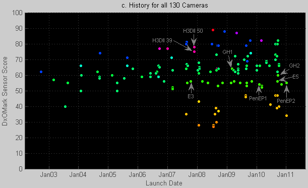
Figure 1c. For a given sensor size (color), the score tends to increase over time.
The historical data in Fig. 1c shows the 130 models in DxOMark’s database at the start of 2011. Various early digital SLR models that mainly have historical significance were not tested by DxO. Other observations:
- Numerous compact cameras are absent. These models (e.g. by Canon, Casio, FujiFilm, Nikon, Olympus, Panasonic, Pentax, Samsung, Sony) typically have 1/2.3″ or 1/2.5″ sensors (crop factor of 6×). This market segment largely caters to those looking for ease-of-use rather than cutting-edge image quality. Consequently most compact models don’t support Raw mode and were not tested.
- With the exception of the Panasonic GH-1, the Four-Thirds category (darker green) has not made much progress so far. The GH-2 even has a marginally lower score than its predecessor. This reflects a slight increase in the GH-2’s (resolution-normalized) noise under both high- and low-lighting conditions.
- The tested Hasselblad models (H3D, 2007) have been gradually overtaken in image quality by full-frame models and even two APS-C models. The newer Hasselblad models (H4D, 2009) have not been tested so far, but should benefit from their increased sensor size. It is incidentally possible to use non-Hasselblad backs on a Hasselblad.
Having Too Many MPixels Often Doesn’t Help
Apart from the fact that DxOMark Sensor only covers image quality, it is important to realize that
The DxOMark Sensor score does not directly reward sensors that have above-average resolutions.
Instead, the score is a measure for achievable print quality for typical use cases where print quality is not limited by sensor resolution. So why didn’t DxO somehow factor sensor resolution into the DxOMark Sensor score?
Firstly, this is because current sensor resolution is generally high enough for producing gallery-quality prints. In fact, software typically silently scales down resolution during printing. And secondly, lens sharpness (rather than sensor resolution) is often the weakest link when it comes to achievable resolution. 60 line pairs per mm is considered an exceptional lens resolution. D-SLR sensors have a typical pixel pitch of 4-8 µm, respectively corresponding to 125-60 line pairs per mm.
Let’s check this by estimating required print resolution. For 250 DPI print resolution, A4 (8.3″×11.7″) or A3 prints require 5 and 10 MPixels respectively when printed with some borders. Because 250 DPI equals 100 pixels per mm², our eyes will have a tough time assessing this sharpness without a loupe. In my own experience with my old 6 MPixel Canon 10D, even slightly cropped images produce great A3 prints without any fancy digital acrobatics[10] – providing that you use high quality lenses.
These numbers are a bit surprising when you consider that sensors only measure one color per “pixel” and thus lack information compared to screen pixels (see Bayer mosaic). But the camera industry is quite good at reconstructing the missing color information using fancy demosaicing algorithms. It also helps that our eyes are not especially good at seeing sudden color changes unless they coincide with sudden brightness changes. So even when viewed at “100%”, camera pixels can look surprisingly sharp.
But wouldn’t we need more pixels for larger prints such as A2 paper? Not necessarily: if you view big prints from a larger distance in order to see the entire image, the required resolution saturates at the (angular) resolving power of our eyes.
You will be hard-pressed to buy a modern SLR camera with less than 12 MPixels (see Figure 3), so those extra MPixels allow you to crop your images (“digital zoom” during post-processing, again assuming your lenses are top-notch) – and to impress (at least male) friends.
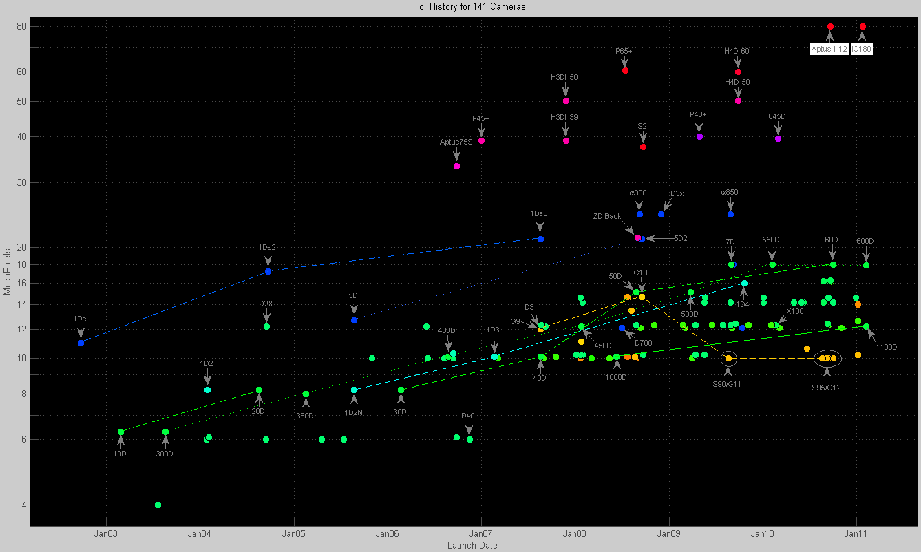
Figure 3. Launch dates versus MPixels. The lines represent the various Canon product lines.
Click on image to enlarge.
Figure 3 shows how MPixel values evolved. The vertical axis thus corresponds to the general public’s belief that MPixels mean image quality. This rather inaccurate view can be tested by comparing Figure 2 (image quality) to Figure 3 (MPixels). For example, take the yellow Canon G-series: between the G10 and G11, the resolution was reduced from 14.7 to 10 MPixels while the image quality actually went up. These new 10 MPixel models (G10, G11 and their respective twins, the S90, S95) were well received by the photographers looking for a small extra pocket camera.
But Having Too Many MPixels Doesn’t Hurt Either
More MPixels imply larger image files and obviously slow down processing and file transfers. But the good news is that extreme MPixel counts do not necessarily harm image quality – despite some tenacious claims to the contrary.
The reason for this is that when you scale down to a lower resolution (often automatically done when you print or view the results), the resulting noise and Dynamic range are equivalent to what you would have gotten if you had started off with a sensor which had the required target resolution.
Let’s look at this more closely – but without scaring you off with actual formulas.

Figure 4. Impact of pixel size on noise level.
Click on image to enlarge.
Figure 4 shows an analogy: measuring the rate of rainfall by collecting rain in measuring cups. We could measure the rainfall with a single large bowl. Or, alternatively, we could use 4, 16 or 64 smaller cups. In all these cases the effective area used for catching drops is kept the same[11].
In the case with 64 cups, I exposed these cups to a simulated rainfall that caused each cup to get on average 5 drops of rain during the exposure. For visual clarity I used really big drops (hailstones) or really small cups. However, for the signal-to-noise ratio the size of the cups doesn’t matter. Due to the statistics ( Poisson distribution with “λ=5”, in the jargon), on average only 17% of the cups will contain exactly 5 drops of rain. Some will have 4 drops (17% chance) or 6 drops (15% chance), but some (4%) may even contain 9 drops or stay empty during the measurement interval (0.7%).
This phenomenon explains a major source of pixel noise (“photon shot noise”[12]) which is unavoidable and especially noticeable with small pixels, in dark shadows and at high ISO settings. The corresponding light level is shown projected as a gray-scale image below the cups: empty cups correspond to black pixels and full cups to white pixels.
Now let’s look at the array with 16 (instead of 64) cups. Each cup is 4× larger and will thus, on average, catch 20 drops instead of 5 drops. But, after scaling, the measurements obviously result in the same estimated rainfall[13]. Due to statistics, we may occasionally (9% chance) encounter 20 drops in cup, but we will likely also encounter 18 (8%), 21 (9%), and 25 (5%) drops. The chances of observing 4 or 36 drops are negligible – but non-zero. So, although larger cups will have slightly more variation in terms of drops than smaller cups, the variations expressed in uncertainty in the amount of rainfall/m2 will actually decrease as the cup size increases[14].
So the point is that when using smaller cups/pixels, proper scaling using all available measurement data allows us to get exactly the same signal and noise levels as when using bigger cups/pixels[15]. In terms of cups, a set of 4 cups will tell you exactly what a single bigger cup would have measured: just pour the content of 4 cups into one big cup.
Per-pixel Sensor Noise
Our cups-and-drops analogy gives a basic model[16] of pixel behavior when there is enough light. Real pixels in say a 12 MPixel APS-C Nikon D300 can hold in the order of 40,000 free electrons[17] knocked loose by those speedy photons. For compact cameras that number is lower because they have smaller photodiodes, for medium-format sensors that number can be higher.
λ=40,000 implies a noise level of 200 (= square-root of 40,000) electrons and thus a signal-to-noise ratio of 200:1 (“46 dB” in engineer-speak). This is under the best possible circumstances: it holds for the noise within an extreme image highlight at the camera’s lowest ISO setting. So instead of λ=5, λ=20, λ=80 and λ=320 as shown in Figure 4, actual sensors have values like λ=40,000. At λ=40,000 the basic principle and the math stays the same, although the noise levels can be imperceptible[18].
However, when parts of the image are exposed four stops lower (-4 EV, 6% gray) than the highlights, you catch 40,000 / (2×2×2×2) drops or λ=2,500. This gives a noise level of 50 drops. So the signal-to-noise ratio is now down to 50:1 (“33 dB”). That’s still pretty good, but you might be able to notice the noise. This is why you sometimes see noise in shadows even at 100 ISO.
If we make matters worse by boosting the ISO from say 100 to 3200 ISO, we are essentially underexposing by a massive 32×. You knew that ISO settings with digital cameras were ‘only’ underexposing, and brightening the results by analog amplification or digital scaling, didn’t you? So exposing our dark 6% gray at 3200 ISO, leaves us with an average signal level of just 78 electrons, with a noise level of at least 9 electrons – resulting in a highly visible signal-to-noise ratio of 9:1.
It is worth noting that, except for the number 40,000 electrons for the “full well capacity”, none of this can be changed by smart engineers or negotiated about by their managers. It’s just math.
But… Per-Pixel Noise Is Not Very Relevant
This gets us back to “smaller pixels give higher noise levels per-pixel”. But per-sensor-pixel noise is the wrong metric for prints (or, for that matter, any other way to view an image in its entirety). Printing implies scaling (let’s assume down) to a fixed resolution. If the resolution scaling is done carefully, it exactly cancels out the extra per-pixel noise which you get by starting off with smaller pixels.
So the following options for reducing image resolution – according to this basic model – give you the same signal levels and the same[19] noise levels:
- Starting off with a sensor which has large pixels (low resolution) with the same total light-sensitive area.
- Using a higher resolution sensor, but combining the analog quantities before going digital. This is like pouring 4 small cups into a bowl before measuring (“analog binning”).
- Using a higher resolution sensor, measuring the output per pixel and then scaling the results down by averaging (“digital binning”[ 20]).
- Using a higher resolution sensor, capturing all the information in a file, and letting a PC do the downscaling.
An example: this means that a 60 MPixel sensor in a Phase One P65+ camera back should[21]give the same print quality and the same DxOMark Sensor score as:
- a hypothetical 15 MPixel sensor with the same medium-format sensor size
- an image that is downscaled within the camera to 15 MPixels
- an image that is downscaled during post-processing to 15 MPixels
By coincidence (as I later heard from a DxO expert) the benchmarking guys had actually tested the second scenario for the P65+ digital back: in its “Sensor+” mode with 15 MPixel Raw output files, it gets the same DxOMark Sensor score as in its 60 MPixel native mode. This helps reassure us of the usability of the model use for scaling noise when the resolution is scaled.
Resolution and DxOMark Sensor Score
As discussed above, the DxOMark Sensor score is “normalized” to compensate for differences in sensor resolution. To summarize: the DxOMark Sensor benchmark doesn’t “punish” high-resolution sensors for having lots of small pixels that are each individually noisier. And similarly, the benchmark doesn’t favor using large pixels despite their lower per-pixel noise. This is not some kind of ideology: it is just estimating the resulting noise level when viewing the entire image.
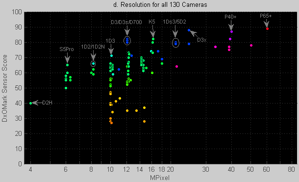
Figure 1d. Although high resolution does not directly increase the DxOMark Sensor score, there is an indirect correlation.
OK. Let’s go back to the data shown in Figure 1d. Despite all the theory which explains why MPixels shouldn’t impact image-level noise, Figure 1d does show a trend that higher-resolution sensors produce higher DxOMark Sensor scores -which essentially means “less noise”.
Question: So why don’t we find 10-16 MPixel sensors with top DxOMark Sensor scores?
Answer: Technically it can be done, but it’s not a commercially interesting product. To make one, you use a large sensor (like the D3x) or even larger, and fill it with say 12 MPixels. But, as we explained above, this hypothetical 12 MPixel D3x-lite should perform just like a real D3x whose output images were downscaled to a lower resolution. So there is no major benefit of designing such a hypothetical D3x-lite compared to a D3x – and you would lose the option of using the high-resolution mode.
Question: If high-resolution is painless, why not provide say 50 MPixel APS-C sensors?
Answer: The pixel pitch would drop down to about 2.5 µm. At that resolution, lenses are generally the bottleneck -so you won’t see much improvement in resolution. And for extremely small pixels, the assumed idealized scaling (with an assumed constant fill factor and constant quantum efficiency) may no longer hold: four 2.5×2.5 µm sensors together would capture less light than one 5×5 µm sensor (wiring gets in the way, mechanical tolerances on filters, “fill factor”, etc). This increase in noise at some point would reduce the DxOMark Sensor score.
Impact of larger sensors on our lenses
It should be clear by now that larger sensors (rather than larger pixels!) can produce less noisy images. This is simply because a larger sensor area can capture more light – and for reasonable resolutions this is pretty independent of the amount of MPixels the sensor’s surface has been divided into.
But to capture more light within the same exposure time, you need a proportionally larger lens. An example:
- Take a 105 mm f/2.8 lens on a full-frame camera as reference.
- And now we compare it to a medium-format camera with twice the sensor surface area of a full-frame sensor.
- If we try to use the 105 mm lens, it may not properly fill the 1.41× larger image circle. And if it did, we would have an increased field of view – which is not a fair comparison. So we use a 150 mm lens with a suitable image circle instead of the 105 mm full-frame lens.
- If the 150 mm lens is also f/2.8, we would get the same exposure times. But f/2.8 at 150 mm requires the effective diameter of the front lens to be 141% larger than a 105 mm f/2.8 lens.
- This means that the diameter of the front lens has increased proportionally with the diagonal of the image sensor. And that the area of the front lens has increased proportionally to the surface area of the sensor[22].
Which sounds sensible: bigger sensors require bigger glass if you want the same shutter speeds. Alternatively, you can use a 150 mm f/4 lens. Either you underexpose your image 2×, and get no noise level improvement over the original full-frame sensor. Or you expose twice as long, using a tripod if needed. But then it would have been fairer to benchmark against a 105 mm f/4 lens as well.
Q: Why couldn’t I overexpose the full-frame camera to catch more light just like the medium-format camera?
A: Just like film, silicon saturates at a particular level of photons per unit area. To avoid that, you have to close the shutter before the highlights have reached that level[23].
In this final part, we examine how the DxOMark Sensor score relates to three more basic metrics.
So What Were We Measuring Again?
The DxOMark Sensor score is itself computed using (measured and then resolution-normalized) figures for:
- Noise levels: what is the highest ISO level that still gives a specific print quality?
- Dynamic Range: ability to simultaneously render highlights and dark shadows under good lighting (low-ISO) conditions
- Color Sensitivity or “color depth”: how much color (“chroma”) noise is there, particularly in the shadows under good lighting (low-ISO) conditions All this data (and more!) is measured and provided by DxOMark on their website.
The 3 metrics are shown in Figures 5, 6 and 7.As DxOMark’s vice-president of marketing, Nicolas Touchard, explained during a telephone interview:
The DxOMark Sensor score is under normal conditions a weighted average of noise, dynamic range and color sensitivity information. But some nonlinearities are deliberately included in the algorithm to avoid clear weakness in one area from being hidden by clear strengths in one of the other areas.
It is worth noting that these three underlying measurements are to some degree interrelated because they are all tied to sensor noise: Dynamic Range is the ratio between the brightest signal and the background noise (at low ISO). Color sensitivity or Color Depth represents whether small color differences are masked by chroma noise. And Low-light ISO tells you what ISO levels give equivalent noise levels on different cameras.
Although this means that some degree of correlation between the three underlying measurements is inevitable, different cameras do come out on top for each sub-benchmark. This confirms that we are not just getting to see the same data presented in three different ways.
DxO at some point tried to link the metrics to different types of photography, but DxO is fortunately starting to deemphasize this as the mapping between measurement and use cases was not very helpful. Here were the mappings:
| Metric | Assumed lighting | Use-case name | Discussion |
|---|---|---|---|
|
Dynamic Range |
Enough-light = low ISO |
“Landscape” |
This metric assumes that you use a tripod if needed. Many non-landscape photos can also have a large contrast: architecture, portraits, night photography, weddings. A higher Dynamic Range also allows you to make larger exposure errors. |
|
Low-light ISO |
Challenging = high ISO |
“Sport” |
This metric assumes you are forced to go to higher ISO. This is relevant for many other types of photography: street, wildlife, news, weddings, night, concerts, and family. Most photographers need to resort to high-ISO settings regularly. And some need it on a daily basis. |
|
Color Depth |
Challenging = high ISO |
“Portrait” |
This metric assumes you have enough light but may be a fair indication of what you would get with little light. Essentially it measures choma noise in the dark parts of a low-ISO image. Portraits may not be especially critical as chroma noise could be filtered out (at the cost of resolution) or you may be able to increase your lighting levels. |
So all-in-all, I indeed wouldn’t take the names Landscape, Sport, and Portrait too seriously. At best they are nicknames, and particularly “Portrait” is the least accurate of the bunch.
We will discuss how the 130 cameras perform on these three metrics below.
Dynamic Range at Low ISO
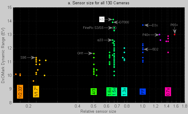
Figure 5. For Dynamic Range, two new APS-C models are currently in the lead.
Here is DxOMark’s definition for their Dynamic Range metric:
Dynamic Range corresponds to the ratio between the highest brightness a camera can capture [..] and the lowest brightness [..] when noise is [as strong as the actual signal].
So far, this is a pretty standard definition. It tells you how many aperture stops of light (EV = bit = factors of two) can be captured in a single exposure. It is analogous to asking how much water a bucket can hold, expressed in units that represent the smallest reliably measurable volume.
Hunting a bit more through the documentation you find that the Dynamic Range value (in “Print” mode) is
normalized to compensate for differences in sensor resolution.
This scaling normalizes to a resolution of 8 MPixel. The choice to use 8 MPixels is irrelevant: it only gives an offset (in EV) in the Dynamic Range scores. And you will find that the Dynamic Range used in the overall benchmarking is the maximum Dynamic Range as
measured for the lowest available ISO setting [typically between 50 and 200 ISO].
Today’s sensor with the highest Dynamic Range score (the Pentax K-5) spans 14 stops at 80 ISO. DxOMark’s Dynamic Range plot for the K-5 shows that its Dynamic Range drops by almost one 1 EV each time the ISO is doubled. The ISO setting for the K-5 thus corresponds closely to an ideal amplifier that amplifies both signal level and noise level equally without adding noise of its own. That is nice.
Various other cameras like Canon’s 5D Mark II shows hardly any Dynamic Range improvements when you decrease the ISO from 800 to 100. This indicates significant background noise[24] in the 5D2 that has been largely avoided in the Pentax K-5 or Nikon D7000.
The data in Figure 5 confirm that larger sensors tend to have a larger Dynamic Range than smaller ones, but there is still a very significant variation within any sensor size. The exceptional Dynamic Range figures for the K-5 and D7000 will likely be exceeded by next generation full-frame and medium-format cameras.
The Dynamic Range scores of the FujiFilm FinePix S3 and S5 models are worth pointing out here because they have exceptional Dynamic Ranges, especially considering that they were introduced back in 2004/2006. This was achieved by combining large and small photodiodes on the same sensor. The small photodiodes capture the highlights, while the larger ones simultaneously capture the rest of the image.
Exercise: If you want to play with the data a bit, you can look up (under DxOMark’s tab “Full SNR”) the gray level at which the signal-to-noise ratio drops to 0 dB for the 80 ISO curve. For the K-5 this is a near-black with only 0.008% reflectivity. The brightest representable shade is 100%. So the ratio is 100/0.008 = 12500:1 which gives log(12500)/log(2) = 13.6 stops.
But we are not done yet: the “Full SNR” values in that particular DxO graph are not resolution-normalized. So we still need to scale from 16.4 MPixels down to 8 MPixels. This is a resolution ratio of roughly 2:1. The noise scales with the square root of this ratio, thus giving an extra 0.4 stop [ sqrt(16.4/8)-1 ] of Dynamic Range when scaled to 8 MPixels. The value listed by DxOMark for their normalized Dynamic Range should thus be roughly 13.6+0.4=14.0. The actual listed value is 14.1. Apart from proving that we still kind of understand how the benchmark works, this exercise shows that a twofold difference in resolution corresponds to 0.4 EV difference in Dynamic Range.
Low-Light ISO Score
Figure 6. The cameras with the 10 highest ISO scores are all full-frame models.
Here is DxOMark’s definition for their low-light ISO score:
Low-Light ISO is then the highest ISO setting for the camera such that the Signal-to-Noise ratio reaches this 30dB value [32:1 ratio at 18% middle grey] while keeping a good Dynamic Range of 9 EVs [512:1 ratio] and a Color Depth of 18 bits [roughly 64×64×64 colors].
This is a rather complex definition with multiple built-in non-linearities: you are essentially supposed to increase[25] the ISO value until you exceed any one of the three rules. Due to this definition, the outcome can be anywhere in the ISO range[26] -not just values normally considered to be high ISO.
Again, Low-Light ISO is normalized to an arbitrary reference resolution of 8 MPixels.
The general idea behind this Low-Light ISO metric is simple: it tests which ISO level still gives acceptable image quality using a semi-arbitrary criterion for what “acceptable” means. As Figure 6 shows, the best camera on this particular benchmark is the Nikon D3s (not to be confused with the D3x). Note that the 10 best ranking models on this benchmark all happen to have full-frame sensors.
The gray scaling line in Figure 6 shows how other sensor sizes would score if they performed just as well as the Nikon D3s – but with an estimated handicap to reflect differences in sensor size. Thus a Four-Thirds sensor has a 4× smaller sensor area than a full-frame sensor, and thus would require 4× more light falling on this 4× smaller area in order to achieve the same signal-to-noise ratio. Indeed, some cameras like the Panasonic FZ28, the Canon S/G-series, the FujiFilm S100fs, the Panasonic GH1 and two new APS-C models perform close to this scaling line.
But the slope of the scaling line also predicts that a typical medium-format sensor should be able to deliver “acceptable” (according to the semi-arbitrary definition) images at 6400 ISO. This is 5-10 times better than the actually measured performance for medium-format sensors. Although commercially it may not be a big deal because these SUVs of the camera world are generally used on tripods or in studios with sufficient lighting, I don’t have a technical explanation yet for this performance.
Similarly, I hadn’t expected that the smallest sensors would quite manage to reach these scaled noise levels. This doesn’t mean these sensors have very low noise. On the contrary: they have to be used at e.g. 200 ISO to get the same print quality as the leading full-frame sensor at 3200 ISO. But given this unavoidable phenomenon, some actually do an admirable job[27].
Exercise: If you want to play with the data a bit, you can look up (under “Full SNR”) the ISO setting at which 18% gray gives a 30 dB (5 EV) signal-to-noise ratio. You should get a value for the K-5 around 600 ISO. To get the more relevant resolution-normalized ISO value, you have to replace the 30 dB criterion by 26.7 dB to compensate for resolution normalization. This should result in a score close to the 1162 ISO in DxOMark’s own results.
Low-ISO Color Sensitivity
Figure 7. Color Sensitivity appears to be best in the largest sensors.
Here is DxOMark’s definition for their Color Depth score:
Color Depth is the maximum achievable color sensitivity, expressed in bits. It indicates the number of different colors that the sensor is able to distinguish given its noise.
The metric thus looks at local color variations caused by noise. It does not cover color accuracy – presumably because that can be corrected in post processing and maybe because it opens an eXtra Large can of worms.
The benchmark values for Color Depth are again normalized with respect to sensor resolution. And, again, the phrase “maximum achievable” means that this is the Color Sensitivity at the lowest (e.g. 100) ISO settings.
As shown in Figure 7, larger sensors clearly have a larger Color Depth score. This is largely explainable by their lower noise at 100 ISO as shown with Figures 4 and 6. But color noise also depends on the choice and performance of the microscopic color filters that allow the photodiodes to measure color information (not shown in Figure 4). If less saturated color filters (“pink instead of red”) were used, the different color channels would respond only marginally differently to different colors. This would lead to higher general sensitivity of the camera, but would introduce more noise when converting to a standard color space.
For more information on the role of the “color response” of color filter arrays, see this white paper where DxO points out the impact of differences in color filter design between the Nikon D5000 and the Canon 500D[28].
A Color Depth value of 24 bit incidentally means that there is a total of 24 bits of information in the three color channels[29].
So How Fair is the DxOMark Sensor Score?
There is no simple objective answer to this important question. Probably every image quality expert would have a somewhat different personal preference for a benchmark like this. But my impression is that the benchmark is pretty useful: I analyzed the model and the data, but didn’t find any serious flaws. Furthermore, results like Figure 2 appear to be pretty consistent with traditional hands-on reviews: models that were stronger [weaker] than state-of-the-art when they were introduced (such as the Canon 40D [50D]) show up as expected in the DxOMark data. And, again, having a pretty solid metric by an independent party is better than endless discussions about what an ideal metric might look like.
The list of critical notes, suggestions and open issues that I ran into so far are all relatively subtle:
Complexity
Undoubtedly complexity is a fact-of-life when you design sensors. And to DxOMark’s credit, they allow you use just a single figure score to compare camera body image quality. But say you have a difference of 5, 10 or 20 points: I found it very difficult to figure out what to look for in a series of real-world test photographs to confirm the difference. In fact, Theuwissen’s[12] parameterized model for sensor noise suggests that one should be able to characterize key sensor behavior in fewer graphs, measurements and numbers.
Undocumented formula
Documentation about the way the final DxOMark Sensor score is computed from Dynamic Range, Color Sensitivity and Low-light ISO scores is not currently available. I don’t know if some manufacturers have access to this information or have figured it out by themselves. But I would prefer to level the playing field by publishing the (probably simple compared to what we already know) formula to compute DxOMark Sensor score from the 3 lower-level metrics (that are documented well enough for most purposes).
Fixed Pattern Noise treatment
FPN is caused by physical or electrical non-uniformities in the sensor and can be largely corrected – although many cameras (like my own 5D2 don’t do this at normal exposure intervals). DxOMark does not attempt to distinguish between FPN noise (that can be subtracted away in say Photoshop) as opposed to irregular (“temporal”) noise. So if a camera would automatically correct for FPN, it scores well on the test[30].
How important is Dynamic Range?
Photographers run out of Dynamic Range once in a while: usually in terms of “burnt” or “clipped” highlights. What DxOMark measures is more subtle: if you make an exposure series, what quality level will the best image have? In photographer-speak, what shadow noise do you get if you do an ideal “expose to the right” exposure. A high Dynamic Range sensor is good, but chances are that you can’t print or even view this without special software. The Landscape/Sport/Portrait terms can easily confuse people who take this literally. I am tempted to interpret the 3 metrics as Dynamic Range (as DxO does), Luminance Noise (instead of Low-Light), and Chroma Noise (instead of Color Sensitivity). Those are quantities you find more often in reviews.
Why measure Color Depth at low ISO?
I doubt people can actually see color noise at low ISO. It’s hard enough to spot regular noise at low ISO, and chroma noise is even harder to see. High-ISO chroma noise seems more relevant. I suspect that the choice to use low-ISO Color Depth is an artifact of originally trying to define a metric that matched studio portrait conditions.
Metric measureable per ISO setting?
It might have been clearer to have a single “perceived image quality” metric that could be measured at different ISO levels. This is particularly relevant because some cameras excel in high ISO conditions (requires a low noise floor) while others excel in low ISO conditions (requires large sensor).
Sensor size visualization
DxOMark’s online graphs allow you to plot scores with MPixels along the horizontal axis. It would be nice to add a setting that shows sensor size instead of MPixels. This would (just like in this article) cluster comparable products together. Representing sensor size in all graphs using color might also be a worthwhile improvement because photographers tend to consider different sensor sizes as different kinds of cameras (unlike MPixel ratings).
January, 2011
Feb 11: updated to 130 cameras
About Peter van den Hamer
Peter van den Hamer is a physicist by training who has been working in the electronics industry in the Netherlands for over 20 years. Apart from his photography (currently on display at a Dutch art gallery) he occasionally writes about technical aspects of photography on his website. A version of this article can also be found there.

Footnotes
[1] The repeatability of the score can be estimated by comparing the scores for virtually identical cameras. Thus, for example, the database contains a pre-production Canon 550D as well as the actual production model. Similarly, the Canon S95 and G12 models are also believed to have the same technology in a different housing.
[2] This is the preferred way to visualize things when the ratio between numbers is more meaningful than the difference between the numbers.
[3] The scale is a continuous color gradient (Matlab-style colormap). If you want to use the same coloring convention formula to represent sensor size, contact me for help.
[4] Sony calls this “translucent”, but this is technically not a very appropriate term. Frosted glass is translucent. Using the right term keeps Ken Rockwell happy 😉
[5] 70% of the light reaches the sensor. That is equivalent to loosing 0.5 stop of light. 15 points was 1 stop according to DxO, so photographing through Sony’s pellicle mirror (or through a 0.5 EV gray filter) should cost about 8 DxOMark Sensor points. Adding 8 points to the Sony Alpha 55’s score (73) brings the camera on par with the Nikon D7000 (80) and Pentax K-5 (82) and Sony Alpha-580 (80) which are believed to use very similar Sony 16 MPixel sensors (likely Sony’s IMX071).
[6] Because Canon is pretty much the only supplier in the 1.6× APS-C and 1.3× APS-H categories, you should compare these against e.g. 1.5× APS-C.
[7] Canon essentially created the mass-market for D-SLRs and had set an aggressive initial pace for innovation and price decreases.
[8] Some people say we are seeing Sony overtake Canon in sensor quality rather than seeing Nikon overtake Canon: Canon makes its own image sensors and Nikon buys some of its SLR sensors from Sony. This view is credible given that Sony’s Alpha A-580 and Pentax’ K-5 (officially known to use Sony sensor) are also both best-in-class in terms of actual sensor performance. So it is quite possible that such companies will start to become serious competition for Canon and Nikon in terms of sensor quality in the coming years.
[9] The Pentax 645D has three times more pixels than the Pentax K-5. But as will be discussed later, this may not be as important for image quality as it may seem.
[10] 5 MPixel for A3 (with a bit of border) corresponds nicely to the 180 DPI lower limit recommended in Luminous Landscape’s in From Camera To Print – Fine Art Printing Tutorial.
[11] As sensor folks say, they have the same “fill factor” or as chip designers say “it’s an optical shrink”. The bowl and cup shapes share here are horizontally scaled versions of each other, thus leading to identical fill factors.
[12] If you have the time and courage to dive deeper, there is a tutorial series at www.harvestimaging.com that quantifies numerous sources of sensor noise. It is by Albert Theuwissen, a leading expert on image quality modeling. I created a kind of synopsis of this 100-page series in another posting.
[13] Expressed in millimeters, or in water volume per unit of area.
[14] Cups that on average catch λ drops during the exposure to rain will on average have a standard deviation of sqrt(λ) drops. To estimate the rainfall ρ we get ρ = λ × drop_volume / measurement_area. The expected value of ρ is independent of cup size. And the variation of ρ decreases when larger cups are used. In Figure 4, ρ would be the depth of the water in the cups if the cups had been cylindrical. So as λ is increased (bigger cups or longer exposure), the Signal-to-Noise ratio improves. But ultimately we care about how hard it rains, rather than caring about droplets per measuring cup. If you measure rainfall with a ruler to see how deep the puddles are, you will get a result that doesn’t depend on cup size, and the noise due to drop statistics will decrease for larger cups.
[15] If you still don’t believe this, go read DxO’s white paper “ Contrary to conventional wisdom, higher resolution actually compensates for noise ” as punishment.
[16] To make the model more complete, you could:
- Measure the amount of water in the cup by weighing each cup. If you don’t subtract the weight of the empty cup, you have a significant “offset”. If you do subtract the weight of empty cups, the correction will not be perfect.
- Assume some random errors when measuring the amount of water per cup. This “temporal” noise has a fixed standard deviation, and has most impact when the cups are nearly empty.
- Assume that the cups are not perfectly shaped (“Fixed Pattern Noise”). Maybe rows or columns of cups came from the same batch and have correlating manufacturing deviations (“row or column Fixed Pattern Noise”).
- Drill a hole near the top of each cup so that excess water from one cup doesn’t overflow into neighboring cups. The holes will have slight variations in their location or size: “saturation or anti-blooming non-uniformity”.
- Place the cups in a tray of water. If the cups are slightly leaky (unglazed flower pots), you will get some water leaking in from the surroundings into the cups (“dark current or dark signal”). Not all cups will leak equally fast (“dark signal non-uniformity”). And at higher temperatures, you will see a bit faster leakage (sorry, it would be too tricky to emulate the exponential temperature dependency without some really fancy materials).
- Break a few cups or their measurement scales (“defective pixels”).
The above covers all the noise sources in the PTC tutorial on www.harvestimaging.com.
[17] For info on the value of λ or “the full well capacity”, see Roger Clarke’s website. See http:// www.clarkvision.com/articles/digital.sensor.performance.summary/#full_well.
[18] You would get the same statistics when you measure rain using 2 liter pans. Two liters correspond to about 40,000 drops.
[19] Note that although this scaling story holds for photon shot noise and dark current shot noise, other noise sources don’t necessarily scale in the same way. In particular, some very high-end CCDs can use a special analog trick (“charge binning”) to sum the pixels, thus reducing the amount of times that a readout is required. This would reduce temporal noise by a further sqrt(N) where N is the number of pixels that are binned. Apart from the fact that only exotic sensors have this capability (Phase One’s Pixel+ technology), DxOMark’s data suggest that this extra improvement doesn’t play a significant role.
[20] Some cameras like the Canon 5D Mark II do this digitally. Canon calls these Raw modes SRaw and they have strange MPixel ratios like 5.2 : 10.0 : 21.0.
[21] The above does not mean that you will get exactly the same resolution-normalized results for any down-scaling scenario. It just says basic scaling laws tell us it should be possible to get close.
[22] Actually a quick search showed that the Phase One’s 150mm f/2.8 lens and Nikon’s 105 mm f/2.8 lens weigh the same and the Phase One has an only slightly larger filter size. But the Nikon is a macro lens and the Phase One isn’t. So maybe these two designs are internally too different or one is especially optimistic about its aperture.
[23] In some cases you can increase the dynamic range by taking N identical noisy exposures and averaging out the noise afterwards. This improves the SNR of temporal noise by sqrt(N) but is generally not a very attractive technique.
[24] According to the theory, this could be either “temporal” (normal) noise or “fixed pattern” (nonuniformity) noise in the sensor. Fixed pattern noise can be corrected via various computational or calibration tricks.
[25] The benchmark doesn’t depend on the actual steps (e.g. 1.0 stop or 1/3 stop) in which a user can adjust the ISO setting. Intermediate values are generated by interpolation.
[26] Strictly speaking, the definition doesn’t allow you to express the Low-Light ISO behavior of a camera with a small enough sensor if the camera fails to meet one or more of the three criteria at its base ISO setting. But one of the tested models (Panasonic DMC FZ28) actually has a Low-Light ISO rating that falls below the (both nominal and actual) ISO range of the camera. So apparently this benchmark accepts extrapolated results.
[27] Arguably the Canon S90 is the best low-light camera in the database – at least when we take its limited size into account. In fact, creating an array of about 20 identical S90 sensors would result in a full-frame sensor which would, at least in theory, slightly outperform the reigning Nikon D3s! And (again assuming one could do the tiling seamlessly and could handle all the resulting data) would result in a 200 MPixel übersensor. Or a larger 400 MPixel medium-format sensor that outperforms all current medium-format sensors. Actually this may put Canon’s 120 MPixel “proof-of-concept” APS-H sensor (August 24th 2010) into perspective: when scaled from to full-frame, it would also have 200 MPixels.
[28] In particular, DxOMark’s analysis is that Color Filter Array colors that have too much overlap in their transmission spectra increase chroma noise. Too little overlap decreases chroma noise at the cost of more luminance noise. This is an example how the details of a benchmark can impact design choices.
[29] It doesn’t mean that each channel is sampled at 8 bit: each channel is typically sampled at 12-16 bit. The actual formulas for Color Depth reflect the amount of noise in each channel and are too complex to explain here (integrals).
[30] This is more or less fair because that this is what the user would like to happen. But the camera may have modes to turn this on (for 1+ second exposures) or the user could bother to take a reference exposure with the lens cap on, and then perform the compensation in software. In such cases, the noise figures from DxOMark are too high. If you really want to manually subtract a “dark frame”: make sure you use the same exposure time and ISO setting and temperature as the real image. Note that you don’t need a tripod for this. But you do want to avoid light leakage – particularly for light coming via the lens.


Elevate Your Vision


Read this story and all the best stories on The Luminous Landscape
The author has made this story available to Luminous Landscape members only. Upgrade to get instant access to this story and other benefits available only to members.
Why choose us?
Luminous-Landscape is a membership site. Our website contains over 5300 articles on almost every topic, camera, lens and printer you can imagine. Our membership model is simple, just $2 a month ($24.00 USD a year). This $24 gains you access to a wealth of information including all our past and future video tutorials on such topics as Lightroom, Capture One, Printing, file management and dozens of interviews and travel videos.
- New Articles every few days
- All original content found nowhere else on the web
- No Pop Up Google Sense ads – Our advertisers are photo related
- Download/stream video to any device
- NEW videos monthly
- Top well-known photographer contributors
- Posts from industry leaders
- Speciality Photography Workshops
- Mobile device scalable
- Exclusive video interviews
- Special vendor offers for members
- Hands On Product reviews
- FREE – User Forum. One of the most read user forums on the internet
- Access to our community Buy and Sell pages; for members only.
You may also like