By Mark Dubovoy
I must admit that I was guilty for a while of becoming a photographic equipment collector. I like nice machines and fine equipment so much that I was often tempted to purchase and I actually did purchase a number of expensive items that were beautifully designed and constructed, but that made no difference in the quality of my photographs. In fact, many of them sat in a closet gathering dust and were hardly ever used or even looked at. What a waste!
Just like youth is a disease that is finally cured by age, I was eventually “cured of the collector disease”. Not that there is anything wrong with collecting if that is your interest. Knock yourself out, I am sure it is lots of fun. The point I am trying to make, however, is that collecting or trading photo gear is not my thing. My thing is trying to produce the best possible prints I can.
At this point, I basically do not buy anything, unless it makes a difference in the quality of my images. If the item does not improve my images, or if I do not use it consistently, out it goes.
DUAL VERSUS SINGLE DISPLAYS
From the very moment that I made the transition from silver based to digital photography I started to use two displays. Why? Because they make my images better.
Some people may disagree, and having a single display may actually be better for them, but for me working with two displays does make a difference. I love having an uncluttered space with nothing but my image on it, plus I also find it much more enjoyable and effective to have all my tool bars in a separate display with lots of real estate so I can have, for instance, all the tools in Photoshop maximized and open.
I have actually performed an experiment where I worked on the same files with a single display and dual displays. Invariably I got better results faster with two displays.
Enough said.
____________________________________________________________________________________
MY STANDARD CONFIGURATION
I started out with a CRT based graphics display as my main display, and an Apple 23 inch LCD display as my second display
As LCD displays improved, and CRT displays started to disappear, I switched to an Apple Cinema 30 inch display as my main display, with the older 23 inch Apple display as my second display. I know quite a number of photographers that use a similar setup.
WHY CHANGE ANYTHING?
I began to worry about my display situation when I purchased my latest printer, an Epson 9900.
The reason for my worry was based on the fact that I read that the color gamut of the Epson 9900 exceeds Adobe RGB in several regions, while the color gamut of the Apple display is smaller than Adobe RGB. In other words, I knew that at least in theory, the printer would be printing things that I could not possibly see on my display-not a good feeling. But, what about it in practice?
Let’s take a look at the following two images, where Adobe RGB is represented by the white wireframe. The first image compares the color gamut of the Apple 30-inch display to Adobe RGB.

The color gamut of the Apple display is quite a bit smaller than Adobe RGB.
The next image shows the Epson 9900 / Ilford Gold Fiber Silk color gamut.
This time, the color gamut of the printer actually exceeds Adobe RGB in relatively large regions of blue, red, orange and yellow.
I will not bother you with other comparison diagrams. It is clear that the gamut of the printer far exceeds that of the display.
My prints showed the issue in spades, particularly when printing images with certain saturated colors, or with high dynamic range. I was seeing things in my prints that looked quite different in the display, or that I could not see at all in the display.
A BIG MISTAKE
Then I made “the big mistake” (notice I jest!).
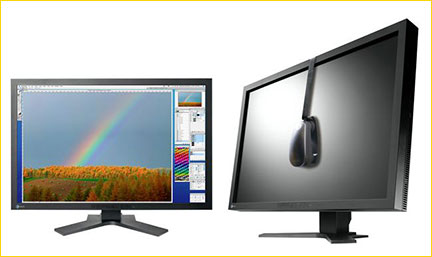
By coincidence, I happened to go to one of my favorite photo dealers to look at some images tha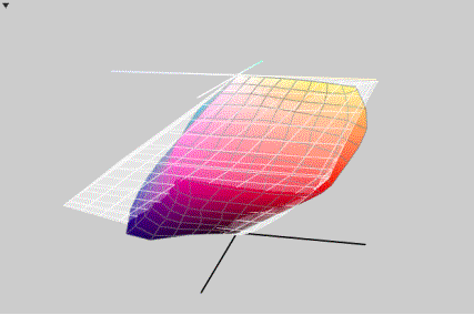 t one of their key salesman had taken during a recent trip. We spend the better part of an hour playing with is images, which he was showing on a 24 inch Eizo display.
I must say that I was quite taken by the display, but I was not ready for the shock when I asked him to show me the same images on an Apple display side-by-side. The difference was huge. The Eizo looked much more pleasing to the eye, much sharper, much smoother, completely uniform in color and intensity from edge to edge and from corner to corner, and the color gamut and dynamic range were clearly far superior. The more shocking thing to me was that after seeing a neutral gray displayed on the Eizo, I realized that we could not get a totally neutral gray on the Apple. We calibrated and profiled the Apple several times, and next to the Eizo the pure gray always had a reddish/purplish or a greenish cast.
THE BIG GULP
Although the Eizo 24 inch displays (there are several models) are quite reasonably priced at around $1,600 “street price”, the top of the line 30 inch display is closer to (gulp) $5 grand street price.
Yikes, if you have ever worked with a 30-inch display, you know how hard it is to go back to anything smaller.
So, I took the big gulp and purchased the 30 inchEizo ColorEdge CG301W.
What can I say? I am simply ecstatic. First of all, look at the gamut versus Adobe RGB:

The display gamut is larger than Adobe RGB and larger than the Epson 9900 with my favorite papers. Hurrah!
But there is much more. Now that I have been using the Eizo side-by-side with the Apple cinema 30-inch display I can tell immediately that the Apple has lots of non-uniformities across the screen (both, color and brightness), it simply cannot display a totally neutral gray and it looks really rough and not nearly as sharp by comparison. The Eizo also displays fine nuances in delicate highlights much better. Finally, the blacks and the deep shadow tones in the Eizo are simply stunning.
PRINTS TOO DARK?
I think that if someone were to do a study of the most consistent complaint in digital photography it is people complaining that their prints are too dark. Every forum, magazine and blog site is full of people constantly complaining about this.
Well, the problem is not that the prints are too dark, the problem is that the displays are too bright!
Let’s face it, photographers represent an infinitesimally tiny portion of the people that purchase computers. The vast majority of computer users want their displays to be brighter and brighter. Display companies brag about the brightness of their displays.
The customer drives the market, so most current displays are designed to operate optimally at very bright settings, usually around 150-160 cd/m2, and most come out of the factory adjusted for very high color temperatures.
Unfortunately, this is way too bright (and way too blue) for photography.
The recommended brightness for photography is 80 cd/m2. The problem is that if you take a standard LCD computer display and begin to lower the brightness below its optimum design point, you also negatively affect the display’s performance. All of a sudden it can no longer display certain colors, and it loses even more uniformity across the screen. It gets all “blotchy” and the gamut and dynamic range get reduced. In many cases, you cannot even adjust the display down to 80 cd/m2.
Many photographers work around this problem by setting their displays to a brightness of roughly 120-130 cd/m2 and developing a “sixth sense” of how their prints are going to look versus what the image looks like on the display.
This is workable, but far from ideal.
The Eizo display I purchased is, you guessed it, optimized for 80 cd/m2. Hurrah again!
There is no sixth sense required. What you see on the display is what you get on the print.
____________________________________________________________________________________
CONCLUSION
Even though I personally chose the 30-inch Eizo, there are other very fine displays on the market that are specifically designed for graphic arts and imaging. If there is any lesson to be learned here, is that using one of these displays can and should definitely improve your work, let alone be much more gentle to your eyes.
I find that the additional information I can now see on the display, as well as the accuracy and uniformity of the display leads me to more accurate and more refined editing, and yes, my images do look better. I am actually going back to older images and taking them to a more refined level of completion. In side-by-side comparisons with some of my older prints, the newer prints look better.
And I cannot emphasize enough what a difference it makes to be able to sit in front of a display for many hours without experiencing the typical eye strain and user fatigue.
Even the non-reflective black bezel and hood make a big difference. While silver and assorted other standard bezels may look cool design-wise, they are actually quite distracting to the eye, and after working with the Eizo I find them quite annoying.
I guess once you have experienced Paris, it is impossible to go back to the woods!
August, 2009
____________________________________________________________________________________
Mark Dubovoy is a Scientist, Venture Capitalist and Photographer. He is a contributor to this site and to other Photographic publications. His photographs can be found in private collections and in the permanent collections of several major museums in the United States, Mexico and Japan. Mark holds M.A. and Ph.D. degrees in Physics from UC Berkeley.

Elevate Your Vision


Read this story and all the best stories on The Luminous Landscape
The author has made this story available to Luminous Landscape members only. Upgrade to get instant access to this story and other benefits available only to members.
Why choose us?
Luminous-Landscape is a membership site. Our website contains over 5300 articles on almost every topic, camera, lens and printer you can imagine. Our membership model is simple, just $2 a month ($24.00 USD a year). This $24 gains you access to a wealth of information including all our past and future video tutorials on such topics as Lightroom, Capture One, Printing, file management and dozens of interviews and travel videos.
- New Articles every few days
- All original content found nowhere else on the web
- No Pop Up Google Sense ads – Our advertisers are photo related
- Download/stream video to any device
- NEW videos monthly
- Top well-known photographer contributors
- Posts from industry leaders
- Speciality Photography Workshops
- Mobile device scalable
- Exclusive video interviews
- Special vendor offers for members
- Hands On Product reviews
- FREE – User Forum. One of the most read user forums on the internet
- Access to our community Buy and Sell pages; for members only.
You may also like