by Gerard Kingma
After the publication ofFancy Graphics Galore – Some observations on Gamutvision and PrintFIX Proon this site in October 2006 – which you may want to read first if you haven’t done so before – I was contacted by two members from the Luminous Landscape community, Greg Endler from the USA and Jan Klabacka, a Czech living in Norway. Independently from each other, they made me the offer to produce additional profiles for the HP Designjet 130 with other third-party profiling packages than PrintFIX Pro. As I had mixed feelings about the results with PrintFIX Pro, I was curious to see how other products would perform, so I gladly accepted their respective offers. I downloaded their various targets, printed these and sent Jan and Greg the resulting prints; they processed the printed targets and sent me their profiles by e-mail. As it turned out, I was in for a bumpy ride, and in for some big surprises.
__________________________________________________
Greg and Jan
So let’s first get to know each other; I asked Greg and Jan to tell me a little bit about themselves, their photography and their interest and expertise in color management, and how they made their profiles. Greg, what can you tell us about that?
I’ve been an amateur photographer for most of my life, and I started printing digitally in about 1998 with my Epson 1520 and pigment inks. Back then there were few choices for inks that would last, and color management was still very young and very expensive. So I corrected things the hard way for many years. In the last 3 years I finally started to spend some money on real color management tools, and did a lot of reading. I also did a lot of printing, and made a lot of mistakes, and tried a lot of new things to correct those mistakes. I now feel I have a good firm grasp on the technology while still diving deeper every day.
My profiles were built using several different applications, but only a single piece of hardware. I used the Xrite DTP20UV spectrophotometer which is the hardware that was packaged with the Xrite Pulse system (the Pulse is now discontinued after Xrite purchased Gretag MacBeth and consolidated some products). I used Xrite’s Colorport utility to generate and measure the profile targets, and then exported the measurement files to Xrite’s Monaco Profiler Platinum 4.8, and to Heidelberg’s Printopen 4.0.5.2. To keep things as fair as possible, I used Xrite’s 729 patch target which is the same size as the target that was used with the PrintFIX Pro system. I used the Heidelberg 840 patch target because they only offer two targets, one with 135 patches, and the other 840 patches. Default settings were used in Profiler, except for selecting the newer ICC version 4 specification. I did supply both ICC version 2 and version 4 profiles in case there was a problem with the newer type of profile. In Printopen I made one profile that was all default, and one profile that had a setting for increasing the contrast in dark tones.
Greg sent me four profiles; of the two that he produced with Xrite, the ICC version 4-version did not cause any compatibility problems, so I used that one. In this article, I will refer to that profile as XR4. I will refer to the Heidelberg Printopen 4-profiles as ‘HBc’ for increased contrast and ‘HBnc’ for the default version.
So Jan Klabacka, how about you?
I am an IT professional with a passion for photography. I developed an interest in color management a few years ago when I purchased my first pigment ink printer, the Epson Stylus Pro R800, and found that the "canned" Epson profiles were not very accurate. First I attempted to build profiles using a scanner as colorimeter. This attempt was not very successful, resulting in profiles that were more or less unusable. Next I attempted to build my own spectrophotometer. It worked, I succeeded in building several profiles – but not very accurate ones either (although far better than the ‘scanner’ profiles). But I learned a lot about colorimetry and related issues. However, I decided that I could not do without "the real thing" and purchased the EyeOne Photo-package from GretagMacbeth. That’s what I used to build the profiles with for this test and comparison.
All three profiles were built based on the same data set. As a basis, the TC9.18 RGB target (918 patches) was used, which is included in the EyeOne Photo package. Based on my experience with the Epson R800, I designed an additional target that contains 459 low-saturation patches; the purpose of that target is to provide additional values to be able to better interpolate tones that are close to neutral. All three targets were scanned using the EyeOne spectrophotometer. This process created the base data set used for all subsequent builds.
The first profile[which I will refer to as JK2]was built from the data set limited to the original TC9.18 RGB target only, using "EyeOne Match 3" software. The software is part of the EyeOne Photo package. The second profile was built from the entire data set (i.e. including the extra 459 patches) using "EyeOne Match 3" software[we’ll call this profile JK3].
After some additional correspondence with Gerard about the quality of the profiles, I decided to give the software that I used during my period of experiments another try, namely ArgyllCMS, which I think is an excellent free open-source CMS software suite created by Graeme Gill. It offers a number of features and options not seen in many professional suites.The resulting third profile was built from the complete data set, using ArgyllCMS software[we’ll call that one JK-ACMS].
__________________________________________________
Printer and paper
It all started with my HP Designjet 130, which I’ve now used successfully for nearly two years. I use HP Premium Plus Photo Satin paper exclusively. In the printer driver, you can choose between two quality settings, "Best" and "Max detail". In my experience, "Max detail" is a bit of a misnomer. When the printer was first delivered, I printed quite a few images in "Best" and "Max detail", looking for… well, more detail in "Max detail". I couldn’t find it, so I printed in "Best" for more than a year – it’s a lot faster anyway. But more or less by chance I found out that "Max detail" actually produces much finer, smoother gradations in areas where there is no detail at all, for instance in a perfectly cloudless blue sky that goes very evenly from a rich saturated blue above your head to lighter, less saturated tones near the horizon. As you’ll see, this comparison is about smooth gradations, if anything, so I used "Max detail" exclusively in all prints, tests and targets.
__________________________________________________
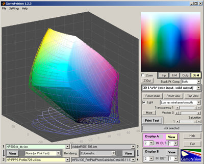
Gamutvision
I studied each profile with Gamutvision, and printed the color plot supplied with Norman Koren’s Gamutvision through every profile, each with rendering intents Saturation, Perceptual and Relative Colorimetric, the latter with and without black point compensation. I compared the test prints, and selected the ones that best matched what I saw on my (calibrated) monitor. For each profile, I chose the most effective rendering intent, and used that combination to print the real-world image discussed below.
Greg’s HBc and HBnc
Greg produced two profiles with Heidelberg Printopen 4, one with default values and one with an option for enhanced contrast in darker regions selected. However, I could not find any significant differences between the two profiles, neither in Gamutvision nor in the printed color plots. In further testing I only used HBc – the profile with enhanced contrast.
Jan’s 2- and 3-target profiles
Because Jan was not entirely satisfied with the profiles he produced for his Epson Stylus Pro R800 with EyeOne Photo, he added additional patches with low saturation values to build an enhanced profile, which I refer to as JK3. Jan claims this version produces better neutral greys in the R800. That may be true, but unfortunately neither I nor Norman Koren could see any significant difference between the profiles with Gamutvision, and I saw no significant difference in the printed test plots. Therefore I decided to use only JK3 in this test.
Jan’s ACMS profile
Fortunately, Jan is not afraid to try out different approaches instead of settling for results out of the box. He decided to build another profile from the same measurement data, but this time with another software package called Argyll CMS. And this time the results are surprising: the profile is not only significantly different – it’s a definite improvement.
HP versus five competitors
So, including the profile I built earlier with PrintFIX Pro (called PFP in this comparison), there are now five third-party profiles to compete with the standard ‘canned’ HP profile: JK3 and JK-ACMS from Jan Klabacka, HBc and XR4 built by Greg Endler, and my PFP profile.
The Gamutvision Shootout: AdobeRGB(1998) to Profile
Many photographers use AdobeRGB(1998) as their default working space to process their images in Adobe Photoshop, which are subsequently rendered (mapped) from this working space to the specific gamut for their individual printer/paper-combination. So what you see here is AdobeRGB(1998) mapped to the six profiles, which represents a commonly used workflow.
The first thing to notice is that all third-party profiles are decidedly larger than the standard HP profile, especially in the darker blues, as exemplified by this screenshot, an unmapped comparison between HP and XR4:
[HP to XR4]
The solid gamut represents the HP profile, the wire frame represents XR4.
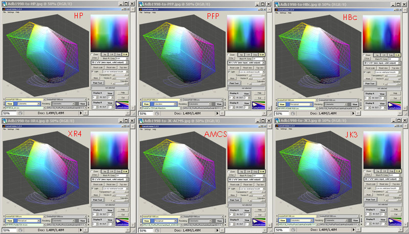
[AdobeRGB(1998) to six profiles]
The PFP profile looks rather uneven and shows ripples, as I discussed in Part I of this article. XR4 and JK-ACMS are fairly smooth and regular; ACMS is significantly smoother than JK3, built from the same data. It’s not easy to see in this small screenshot, but HBc is rather irregular.
Another way of viewing the same mapping of profiles to AdobeRGB(1998) is the L-output plot, which I referred to as the ‘ski slope’ in Part I.
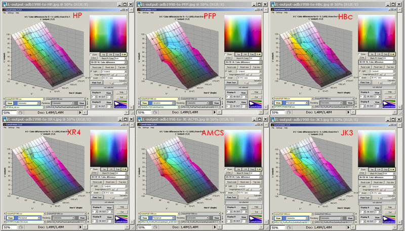
[L-output AdobeRGB(1998) to six profiles]
This shows in the first place that all third-party profiles are similar in the way they differ from the standard HP profile, top left. They all display a dip in the lighter greens and cyans, where the HP profile is smoother. JK-ACMS and PFP are remarkably similar in showing a further dip in the saturated reds. The most obvious conclusion would seem to be that this behavior is particular to my own printer. One would think that in building their standard profile, HP have measured targets printed on a fair number of different HP 130s, and created a kind of ‘greatest common divisor’, an averaged profile from all those data – this would also explain why it is smaller than the other profiles.
I put this suggestion to Mr. Ignacio Ruiz de Conejo of HP Barcelona, the division that develops the Designjets; not only my 130 but also the new Z-series was designed there."Canned profiles are built not only for different printers, but also for different print heads/cartridges,"Mr. Ruiz de Conejo agrees."These are subjected to tolerances. Therefore, canned profiles are built so that any printhead in the market can reach those levels. Some heads deliver bigger drop volumes, but the linearization process calibrates it to a point that is reachable by all heads. If you have installed printheads with a drop volume higher than nominal, a canned profile might be limiting the gamut where a custom profile will indeed deliver better gamut coverage.
A second level of ink limiting can be applied in the profile,"Mr. Ruiz de Conejo explains."The gamut boundary might be limited for the sake of smoothness, for the behavior of the inks at high saturations is more difficult to control (it requires more nodes in the grid of the profile). Therefore, a custom profile, if that is its design goal, can show a bigger gamut than a canned profile whose strategy is to prioritize smoothness, as is the case with the HP canned profile. The smoothness exhibited in the ski slope image is the result of a smoothing process applied to the Perceptual intent (we were favoring smoothness over accuracy)."
As in the first installment of Fancy Graphics, I tend to award points for a smooth ride in the L-output view. But Jan Klabacka came up with an interesting suggestion:In the ditches, output luminance may be changed for better. ‘The larger the ditches’ may not necessarily mean ‘the worse the profile’. Quite the contrary could be true.Hmmm, that’s tasty food for thought. It might be true that larger ditches represent some kind of correction that actually improves the final print. It may also represent different priorities in the way the profile handles out-of-gamut colors – for instance, the HP profile might try to maintain luminosity while sacrificing saturation and/or hue, whereas PFP and ACMS try to maintain saturation and/or hue while sacrificing luminosity, hence the larger ditches.
In that case, we might gain more knowledge from another view in Gamutvision, such as Delta C which shows color differences but omits luminance differences. In the Delta C-comparison below, the HP profile has a large spike in the darker areas – exactly where the real-world print doesn’t perform very well, as we’ll see later on. The best profiles, JK-ACMS and XR4, have much lower spikes in these areas. HBc also performs better in this test than in any other test. JK-ACMS again performs much better than JK3.
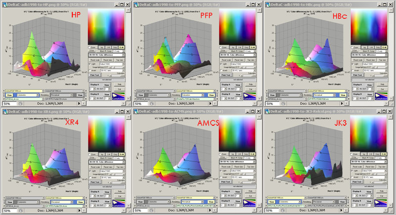
[Delta C AdobeRGB(1998) to six profiles]
__________________________________________________
The Round Trip
In the Round Trip view, each profile is as it were bounced off its own mirror image. Any defects in profiles are exaggerated, while smoother profiles survive more or less unscathed.
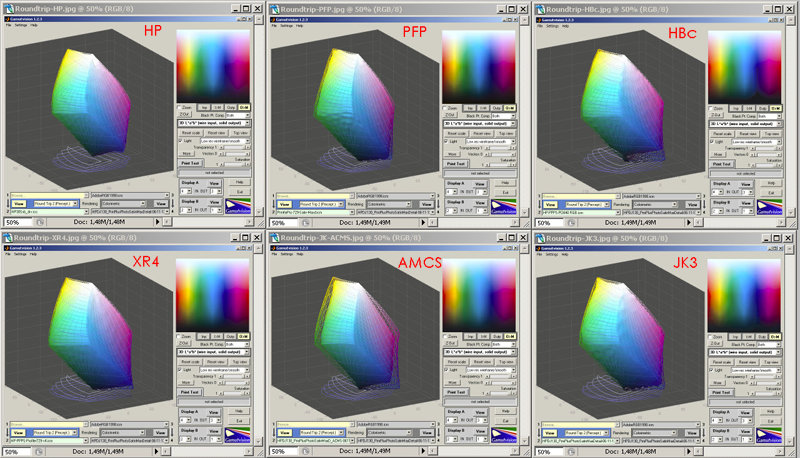
[Round Trip]
HP, XR4 and ACMS survive quite well; PFP is somewhat the worse for wear and ACMS seems to behave much better than JK3. HBc is somewhere in between.
The printed test plots
I lost count how many times I have printed the test file supplied with Gamutvision, Print_test_target.png, over the past few months. My office is cluttered with teetering stacks of this pattern. For each profile, I printed the pattern for four rendering intents: Saturation, Perceptual, Relative Colorimetric with black point compensation and without black point compensation. I selected the most successful rendering for each profile, as to how closely it matched what I saw on my monitor (calibrated to 5000 K) when viewed under a 5000 K light source.
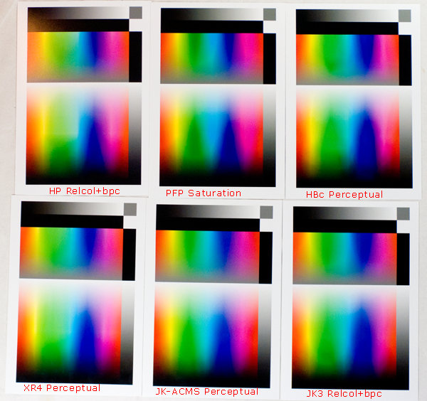
[Six actual test prints]
The differences are significant, but remember these are colors at the edge of the gamut that rarely show up in real-world prints. XR4 resembles the original file as displayed on screen most closely. ACMS also looks fairly accurate, followed by the somewhat less smooth JK3. PFP is rather uneven, but in its basic patterns would seem to be more accurate than HP and HBc. HP is smoother, but rather weak in saturated blues.
__________________________________________________
The proof of the pudding
This is all very well, but by far the most significant test is, how closely does a print of a real-world image resemble what you’ve worked on so hard in Photoshop on your calibrated monitor? That is, after all, the basic source of continuing frustration – you work sometimes for hours to find a perfect balance in colors, luminosity, contrast and saturation, only to find out that your expensive printer seems to have a mind of its own in deciding how to reproduce your efforts in ink on paper. I selected this shot from the ‘Motion’ series on my website, because it has already proved to be fiendishly difficult to print well – it contains many very subtle gradients in dark areas.
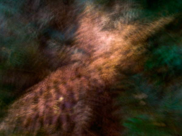
[Autumn Ferns]
These are the six resulting letter-sized prints, in the same order as the test patterns above:
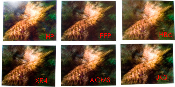
[Six real-world prints]
Obviously, draw no conclusions from what you see here but go by my observations. The upper-left print is the HP print; it shows a glare from a nearby light source.
It’s a great pity I can’t show you the actual prints here because the results are surprising. First, in this particular image, the standard HP ‘canned’ profile produces by far the poorest result. Yes, you read that right – it’s pretty hopeless. There are grey, irregular blotches where there should have been dark tones with some detail. All other profiles fare better, and looking back at the Gamutvision screenshots, I can guess why – this is where the added size, or volume if you will, of the third-party profiles in the darker blues comes in handy, and there is something fishy going on in the way the darker values are rendered. The printer is perfectly capable of producing detail in these shadows, but the HP profile won’t let it.
I can’t show you the actual prints, but I can simulate it for you because this defect also shows up when you do a softproof in Photoshop:
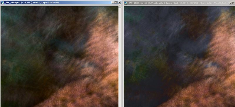
[Original left, HP softproof right]
The HBc profile doesn’t perform well either. The color balance veers off towards green and yellow, the contrast is off; it differs from what I see on screen more than the prints from the other profiles. JK3 performs much better, but the three best prints are JK-ACMS, XR4 and, biggest surprise of all, PFP. These three are actually all very good, very close to what I see on the monitor, and difficult to tell apart. XR4 and ACMS are slightly more faithful in reproducing fine detail and smooth transitions. I will have to give the nod to JK-ACMS. JK3 is good, but ACMS is better.
__________________________________________________
Conclusions
HBc
Well, what does one make of all this? First, let’s have a look at HBc. Heidelberg Printopen has a good reputation. We may have given it an unfair treatment here; first, Greg made the profile with Printopen 4, which is an older version. As Greg says, "I am a little surprised that the Heidelberg didn’t do better, but I guess that’s what you get from 1999 technology. I can say that the Heidelberg CMYK profiles are extremely good with printed images. I used this for more than a year before buying Profiler, and I can only say that I am still very pleased with prints produced from the CMYK profiles that my RIP needs.[…]When using Relative or Absolute they (Heidelberg) expect you to correct any out-of-gamut colors before printing. What this means is that they don’t really do anything to bring those out-of-gamut colors into gamut. Most of the rest of the companies use something similar to Perceptual on only the out-of-gamut colors to make them fit. All of the in-gamut colors are pretty much untouched in Relative rendering, unless you select black point compensation. You might want to try the Heidelberg profiles with Perceptual.[I did, it didn’t help.]And the Heidelberg software was written in (or around) 1999, so the newer version may be very much different. Not that I’m trying to justify its performance, but that’s just the way people used to deal with printing presses, the RGB profiles were fairly new when that version was released so I don’t think it was optimized for RGB devices yet (and may not be even with the current version)."
Be that as it may – I don’t want to treat any product unfairly – this profile is certainly not the preferred option in this workflow, i.e. printing from AdobeRGB(1998) to an inkjet printer.
XR4
Very nearly the winner. This profile looks good in Gamutvision and performs very well in practice. I would not hesitate to print my entire portfolio through this profile. Actually, it answered one of my questions from Fancy Graphics Galore Part I – would a profile built from more patches be smoother? Well, not necessarily – PFP and XR4 were both built from 729 patches, but XR4 is by far the smoothest profile.
Argyll CMS
Then there’s the difference between JK3 and JK-ACMS. Remember, Jan made JK2 and JK3 (which are virtually indistinguishable) with the EyeOne Photo package, also a well-regarded product. He built the ACMS profile from the same data, but this time with Argyll CMS – which is a free, open-source software application. Yes, you read that right as well. And the result outperforms the profile from the standard package by a decent margin. What can one say? Three cheers for software engineers that work very hard on a product and then share their efforts on the Internet at no charge.
PrintFIX Pro
And then there’s the PFP print. It’s not the best print, but it’s actually quite good, and very close to the winner. It’s certainly much better than one would expect from the poor results under the microscope of Gamutvision. It’s very nearly almost as good as profiles from packages that are much, much more expensive. It certainly performs better than the standard HP profile. At least, in this particular print.
Because my initial comment from Fancy Graphics Part I still stands – in the first test I was more pleased with the print from the HP profile. There may be other images in which the HP profile produces more pleasing prints. I really would have to print and compare every image from my archives to be sure.
HP
And finally, the standard HP profile stumbles onto the stage while her bikini straps become undone; she really disappoints in this pageant. Maybe it’s because the profile was produced from averaged values across several printers and print heads. It certainly produces an average print which does not do justice to the capabilities of the HP Designjet 130 – a printer that deserves a better profile.
Of course I was eager to find out what HP’s response would be to this disappointing performance. Mr. Ruiz de Conejo has a few suggestions that point to a similar situation as with the performance of the otherwise well-respected Heidelberg profiles."There are a number of printing paths you can follow with the Designjet printer family. You can let the printer handle the color management through ColorSmart, which is generally the recommended option when printing through non-color savvy applications such as commonly used office suites. You can also choose to print through a RIP. We sell the DJ130 with a RIP and CMYK ICC profiles for supported media. These profiles are very carefully designed; they allow for better control of the inks. You can tweak color output by tweaking these profiles, or generate your own. As a third option, you can print through the Windows pipeline, which is an RGB pipeline. You can print from Photoshop and use RGB profiles; the DJ130 was the first HP Designjet to support this path. Given the big gamut, we thought that many photographers that do not use a RIP might want to use this path, so we included RGB profiles. CMYK profiles for RIP color management were prioritized over RGB profiles, as well as internal colormaps[i.e. ColorSmart – GK]."
That’s another surprise to me – HP has apparently put at lot of effort into delivering optimum performance through a RIP-CMYK workflow, in addition to an RGB workflow. I would have thought the vast majority of photographers would be interested in an RGB-optimized workflow. Does that mean that the intended audience for this particular printer was not the independent fine-arts photographer such as myself, but rather the photographer who wishes to proof his or her images for optimum results in a CMYK prepress workflow?"As you suggest,"Mr. Ruiz de Conejo agrees,"the independent fine-arts photographer was not the main target of the machine, mainly because we thought that although the Vivera dyes of the DJ 130 performed very well under the Wilhelm test[45 years unprotected, and 82 years protected behind glass – GK],pigmented inks were a requirement for the fine-art industry. Therefore, the DJ 130 was only a step towards the Z Series printers, introduced this year, with Vivera pigmented inks."
"We put our efforts in providing a good Perceptual intent,"Mr. Ruiz de Conejo continues."At the time, we thought that Relative Colorimetric might be less important because the general assumption was that Perceptual was better suited to real-world photography. We therefore built the HP-RGB profile for optimum performance with Perceptual intent. The fact is, though, that many photographers prefer to use Relative colorimetric with black point compensation, and ignore the Perceptual table; we’re now fully aware of this preference, and we’ve directed our design efforts to this route as well with the new Z-series printers. But I’m still surprised – did you also print your image with Perceptual intent?"
Yes I did, and unfortunately, in the poor rendition of shadow detail, I see no significant difference between the actual prints printed through the HP profile with Perceptual rendering intent and Relative Colorimetric intent with black point compensation. Again, I can only show you this through screen shots of the soft proof in Photoshop, which – believe me – are similar in behavior to the actual prints:
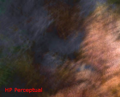

[HP rendering intents – soft proofs]
Gamutvision
If the results from the actual real-world prints are such a surprise after studying the profiles in Gamutvision, then why use Gamutvision? In Gamutvision, the PrintFIX Pro profile looks rather horrible, yet it produces a good, perfectly usable print. So what’s the use? Well, I’m not going to downgrade my previous verdict of ‘Highly Recommended’ because I still think it is a very valuable, inexpensive learning tool that has taught me a lot about color management and about how profiles work. It gives you the chance to visually turn a profile inside out and compare it with other profiles. It will point your nose in the direction where to expect trouble, for instance in relative gamut sizes. I do think it is safe to assume that a smoother, more evenly balanced profile that makes a good match between print and monitor in all tests, will consistently produce better prints than a profile that gives you a bumpy ride in Gamutvision, and Gamutvision will tell you which is which. But it clearly isn’t the whole story. Only the actual print can give you the final answer.
And the winner is…
Please welcome the results from the Prettiest Print and Profile Pageant 2007. Ladies and Gentlemen, may we have your votes please.
| Relcol+bpc | Saturation | Percept | Percept | Percept | Relcol+bpc | 2 | 0 | 1 | 5 | 4 | 3 | 4 | 0 | 1 | 5 | 3 | 2 | 0 | 2 | 4 | 3 | 5 | 1 | 4 | 1 | 0 | 5 | 3 | 2 | 1 | 2 | 0 | 5 | 4 | 3 | 0 | 40 | 20 | 45 | 50 | 30 | 11 | 45 | 26 | 68 | 69 | 41 |
I decided to award considerably more points for good performance in the actual real-world test print than in the theoretical comparisons, because in the end, it’s about the print. That’s what counts. So 5 points for best performance in a theoretical test and in the printed test target, down to 0 for worst performance, but 50 points to be earned for best actual print; going down to 45 and 40 because the best three are so close together, then to 30, 20 and 0. XR4 consistently looks good in Gamutvision, produces a test plot that very closely matches the plot on screen, and produces a very good print. ACMS also produces a very good print and a smooth plot. JK3 and PFP are similar in their performance – both quite good in the actual print. Remember, JK3 was produced with the EyeOne Photo package, which is much more expensive than PrintFIX Pro. HBc may produce better results in a different workflow, but that’s outside the scope of this comparison – it’s not recommended for this workflow. And HP, well, she might want to pursue a different career as well.
A final consideration – I welcome all feedback, thoughts and suggestions, but please don’t tell me that this is not a scientific comparison. I know it isn’t. I’m not wearing a white coat and I’m not sitting in a lab. I’m not a scientist, I’m an end user that tries to find out how well a product that he’s bought performs. Well, now I know. Or at least, now I know more than I did before I started.
by Gerard Kingma
March, 2007
Thanks to Greg Endler and Jan Klabacka for their most valuable contributions, and to Norman Koren for his patience. And many, many thanks indeed to Mr. Ruiz de Conejo of HP Barcelona for his candid and chivalrous feedback. If only every multi-national company in the photographic industry would be so helpful!
Gerard Kingma is a semi-professional landscape photographer based in the north of The Netherlands. Please visit his website athttp://www.kingma.nufor more information on fine-art prints, digital orders, exhibitions and workshops.
__________________________________________________
Relevant links:
Gerard Kingma:http://www.kingma.nu/
Jan Klabacka: search the Luminous Landscape forum members for "Jan Klabacka"
Greg Endler:http://www.dfaprinting.com/
Gamutvision:http://www.gamutvision.com/
HP Designjet:http://www.hp.com/go/designjet
Heidelberg Printopen:http://www.us.heidelberg.com/
Xrite/GretagMacbeth:http://www.gretagmacbeth.com/ and http://www.xrite.com/
PrintFIX Pro:http://www.colorvision.com/
Argyll CMS:http://www.argyllcms.com/

Elevate Your Vision


Read this story and all the best stories on The Luminous Landscape
The author has made this story available to Luminous Landscape members only. Upgrade to get instant access to this story and other benefits available only to members.
Why choose us?
Luminous-Landscape is a membership site. Our website contains over 5300 articles on almost every topic, camera, lens and printer you can imagine. Our membership model is simple, just $2 a month ($24.00 USD a year). This $24 gains you access to a wealth of information including all our past and future video tutorials on such topics as Lightroom, Capture One, Printing, file management and dozens of interviews and travel videos.
- New Articles every few days
- All original content found nowhere else on the web
- No Pop Up Google Sense ads – Our advertisers are photo related
- Download/stream video to any device
- NEW videos monthly
- Top well-known photographer contributors
- Posts from industry leaders
- Speciality Photography Workshops
- Mobile device scalable
- Exclusive video interviews
- Special vendor offers for members
- Hands On Product reviews
- FREE – User Forum. One of the most read user forums on the internet
- Access to our community Buy and Sell pages; for members only.
You may also like