By Alain Briot
Blurs processing in Lightroom
1 – Introduction
In my previous essay,Landscape Blurs Part 1- Notes on Process and Approach, I described what motivates me to create the kind of images that I call “Landscape Blur.” I also talked about how I create these images in the field, including the equipment that I use, the type of light I look for, and the kind of compositions that these images lend themselves to.
In the second essay of this 2-part series, I am now presenting the processing workflow that I follow to convert and optimize these images. This workflow is specific to this type of image since their needs are somewhat different than “non-blurred” images.
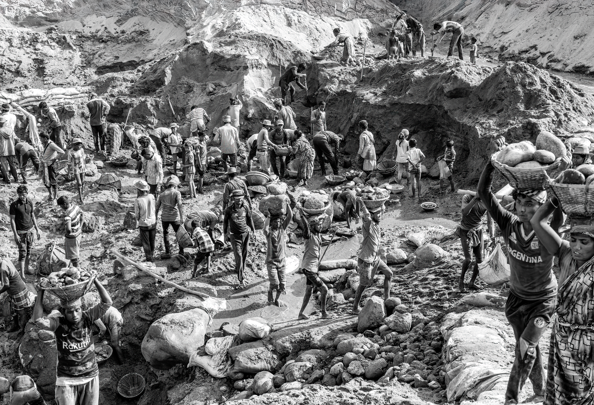
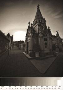
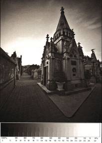
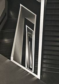
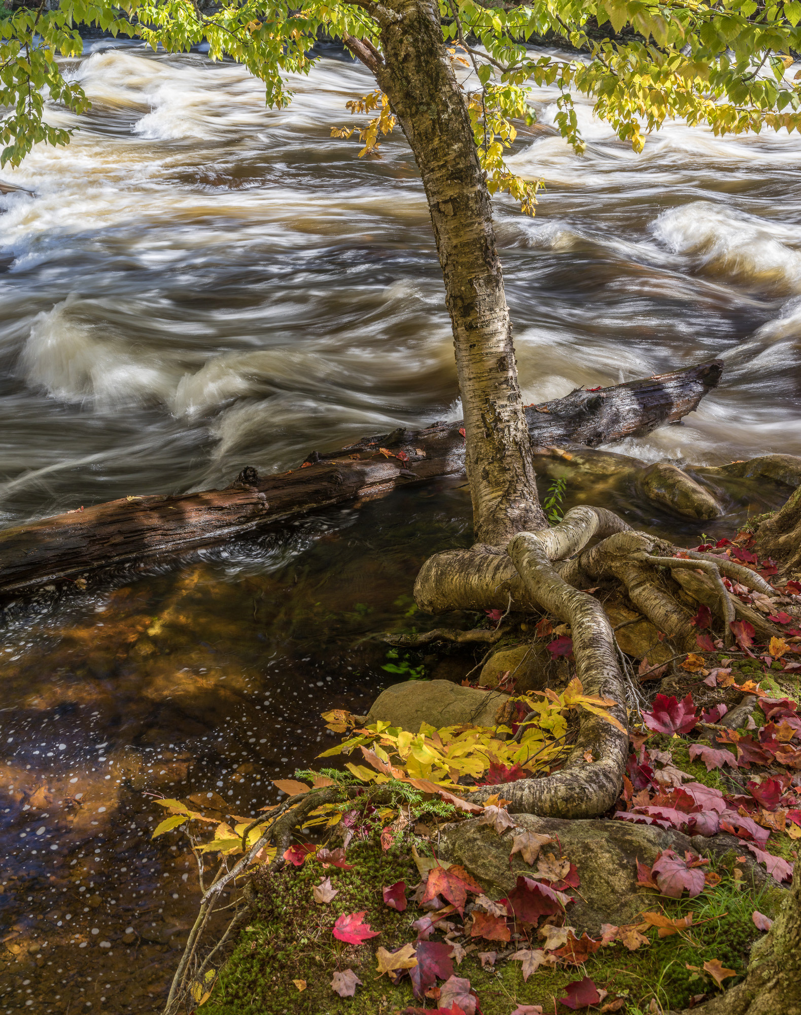
Saguaros Blur 1
– The final version of the image I work on in this essay.
– The processing and optimizing workflow I followed to create this image are described below.
______________________________________________________________
2 – Processing Workflow
Good processing is crucial with blurred images. Because these images retain little details to “clue us” about the nature of the scene, we depend on the color and contrast of the image even more than with images that are not blurred. I found that a number of approaches make things much easier and straightforward in processing images in this series.
First, I learned that setting the black, white and the grey points precisely is crucial to the success, or failure, of these images. As I said these images are very responsive to the quality of light. This continues in raw processing where color balancing the light properly is the continuation of selecting a specific type of light to photograph under.
Very often I find that I get the finest colors if I can find a neutral area in the scene and click on it with the color balancing eyedropper in Lightroom. This area does not have to be middle grey necessarily. It can also be white or black. It can also be a light or dark grey. All that is needed is an area that, once color balanced, is neutral in color. That is, an area that should not have color in it, no matter how light or dark this area might be.
Color balancing on a neutral area usually reveals the true colors in the scene and makes the photograph come to life. When that is found I usually copy the color balance settings for this image then paste them to all the other images captured in the same light. This helps make the process more effective.
I also found that making presets for the setting combination used for specific images is also very helpful. The specific settings used for each image can get very complex, and remembering them is not easy. Saving them under a specific name (I usually use the name of the photograph as the name of the preset) makes reusing them a breeze. It also allows you to build a library of presets that you can later reuse with other images. This gives you a good start to converting images for which you may not be sure which settings to use. It also helps give a feeling of consistency to the work since the same settings are used from one shoot to the next, even if these settings are only a starting point and are modified later on.
Finally, I use Lightroom to convert my images and I complete the optimization process in Photoshop through the use of adjustment layers. I could not complete this process working in Lightroom alone.
______________________________________________________________
3 – Raw Conversion In Lightroom
My first step is converting the image from Raw to Tiff format. I currently use Lightroom for this part of my workflow, but other converters can work just as well. In fact I use different raw converters for the conversion of other types of photographs. My choice of raw converter is based on the needs of each photograph.
Below are screenshots of the adjustment settings I made to the image. For each setting I provide a before and an after screenshot. The image these settings were applied to is the one presented at the beginning of this essay: Saguaros Blur.
Histogram, color balance and exposure adjustments:
As shot (left) and after adjustments (right)
B – The other adjustments I made in Lightroom:
From left to right: tone curve, HSL, Sharpening and noise reduction
C – Lightroom presets
I found that saving the image adjustment settings for specific images as presets in Lightroom to be very useful. The reason for that is simply the complexity of the adjustments I make to each image. It is very difficult to remember exactly what those are when you go from one image to another. It is when you want to use previous settings on a new image that the presets come in handy. Using presets is very simple, all you need to do is click on a specific preset and the settings saved in it will be applied to the image you are working on. I usually name each preset after the photograph they were originally designed for since this helps jog my memory about what each preset does. In case of doubt, or to quickly check what a preset looks like, all you have to do is pass the mouse pointer over the list of presets and the effect of each preset will be applied to the large thumbnail in the preview window. Once you find one you like simply click on it and the preset will be applied to the image you are working on.
Presets dialog box
______________________________________________________________
4 – Image Optimization in Photoshop
A – Selective Color
Using Selective Color instead of curves allows you to darken a color without increasing the contrast of the image. This is achieved by adding black to a specific color (reds for example) instead of lowering the curve for that color. Lowering the curve means modifying not only the density of one color but also the contrast of that color. The two work together because curves do not provide a way to modify color without modifying contrast.
Selective color on the other hand allows you to modify color and contrast separately by affecting the density of a specific color. Increasing the density of blacks will add contrast to the image (contrast is largely defined by the black and white points settings) just like increasing or decreasing the level of whites will either lower or raise the contrast of the image.
Selective color adjustment settings for Green, Red and Yellow.
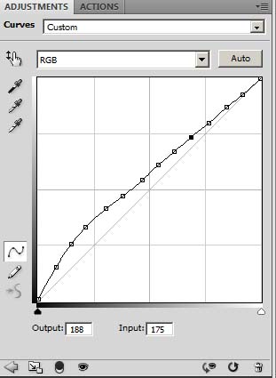
B – Black point adjustment curve
Using a sudden black curve instead of setting the black point regularly (by steepening the entire curve) allows you to set a true black point for the image without increasing the contrast of the entire image.
Often you need a true black point for an image (most images do) but you do not want to either darken the entire image, or increase the contrast and the saturation of the entire image. Increasing contrast substantially results in increasing saturation as well. Often, you may want just one or the other, but if you steepen the entire curve you will get both).
Using a sudden black curve is the solution to excessive contrast and/or saturation maladies. How to create a sudden black curve is explained in the tutorial movie.
Sudden black is the key to creating images that are delicate and yet have a true black point. You no longer have to have chalky images in order to get a true black point:
Sudden Black Curve
C – High pass contrast filter
I found that using a high pass contrast filter on top of the image, after all the adjustment layers are completed, helps a lot in defining the detail level of the image.
Because these images are by nature less detailed, sometimes increasing the level of detail is necessary. This helps bring up the interest level in the image as well as make the image more engaging visually for the viewer.
Of course adding details is not possible. All we can do is increase what is there. We cannot add anything new.
And again increasing what is there through sharpening only takes us so far since there is little detail to start with.
This is where High Pass Contrast processing comes in. This approach basically increases the local contrast between objects, or more appropriately here between the different areas of color and contrast. In effect, to my eyes, it increases the contrast of the lines in the image, the black level of these lines I think.
In the end it makes the image look a little bit less blurry and a little bit more defined. It helps strengthen it visually so that it stands out more as a complete image worthy of a lengthy visual examination. It helps increase the sophistication of the image by adding the impression of detail in an image where, at first glance, it would appear that we would find none.
I also find that increasing the opacity of the High Pass Contrast layer to 35% or 40% instead of the customary 20% is often necessary to get the maximum effect from this filter. A higher opacity can be used here since the effect of the filter is far less than on a normal-detail-level image.
Before High Pass Filter (left) and after High Pass Filter (right)
D – Smudge Tool
I also found that using the Smudge tool in CS4 is very useful in finalizing the image. In a photograph created while moving the camera through multiple tries, it is virtually impossible to control every shape and color in this image. Therefore, small areas are bound to go wrong and have the wrong line, or shape to them.
These areas have to be corrected otherwise they will create a visual deterrent to the enjoyment of the image. In other words, they won’t look good and will create a visual distraction.
The simplest way to get rid of these problems is simply by smoothing them out with the smudge tool. Simply going over these areas with the tool, set at a small to medium diameter, or setting the diameter to the size of the problem area, will allow you to smooth them over quickly and effectively.
The nicest part is that the effect of the smudge tool when used in a dragging motion is to stretch an area. This stretching effect is very similar in look to the effect created by moving the camera up and down, sideways, etc. Therefore, by using the smudge tool to perfect some areas by reworking them, you will be continuing the visual effect created by moving the camera. In the end, the result is a smooth and seamless blend of in-camera and in-Photoshop effects that all go in the same direction and blend together perfectly well.
Before smudge tool (left) and after Smudge tool (right)
E-Shadow- Highlights Adjustments
I find Shadow-Highlights to be a very effective way of controlling contrast. Shadows/ Highlights gives the same results as can be obtained by local masking, but much faster. If used carefully, the results are just as good if not better. However, care must be taken not to push the settings too far because damage to the image can be done quite easily if this adjustment is not used carefully.
Shadows-Highlights settings for Saguaros Blur
F – Vibrance Adjustment
Vibrance is a new adjustment layer available in CS4. Prior to CS4 Vibrance was available in Lightroom, and in Adobe Camera Raw, but not in Photoshop.
Vibrance is a type of saturation increase. In fact, since these two adjustments are somewhat similar, they are offered in the same layer adjustment palette. However, Vibrance is preferable to Saturation, or best used in combination with saturation. The reason being that Vibrance provides more subtle results than saturation.
Basically, Vibrance saturates low saturation colors more than high saturation colors. In other words, it is a “smart” saturation adjustment. Saturation on the opposite saturates all colors evenly, resulting in images that are often oversaturated, either globally or locally. However, the nice thing about the Saturation adjustment layer is that it gives access to individual colors (red, green, blue, yellow, etc.) while Vibrance does not.
Vibrance adjustment applied to Saguaros Blur
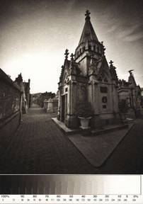
Saguaros Blur 2
Saguaros Blur 3
Two other photographs created during the same shoot as the image discussed in this essay.
______________________________________________________________
5 – Conclusion
Processing blurred photographs is not difficult if you follow the correct workflow. I devised the workflow presented in this essay after multiple tests and trials. The images processed this way print beautifully, and that to me is the final test since my goal is to create fine art prints.
Feel free to experiment with this workflow by changing the settings to make them fit the specific needs of your images and of your inspiration. You can’t hurt anything by trying as long as you back up your work so that you can return to a previous version if the need arises.
Alain Briot
Vistancia, Arizona
May 2009
______________________________________________________________
About Alain Briot
Alain Briot creates fine art photographs, teaches workshops and offers DVD tutorials on composition, printing and on marketing photographs. Alain is also the author of Mastering Landscape Photography. This book is available from Amazon and other bookstores as well as directly from Alain. You can find more information about Alain’s work, writings and tutorials onhis websiteathttp://www.beautiful-landscape.com
Alain just published a new tutorial titled “Alain’s Master Files CD-3”. This tutorial shows the exact process Alain follows in Lightroom and in Photoshop to create his fine art prints. All the settings Alain uses and all the adjustment layers Alain creates are provided to you so you can study them and follow his approach step by step. Two tutorial movies showing Alain work in Lightroom and in Photoshop are included in this tutorial.
A special offer is available to Luminous-Landscape visitors. In addition you also receive a free recording of the three presentations that Alain gave at the2008 Fine Art Summit in Bryce Canyon. These presentations are on image processing, composition and fine art printing. They are not available anywhere else.
The Master Files CD-3 tutorial is available at this link:
http://beautiful-landscape.com/Articles-CD-Master-Files-3-3.html
Elevate Your Vision


Read this story and all the best stories on The Luminous Landscape
The author has made this story available to Luminous Landscape members only. Upgrade to get instant access to this story and other benefits available only to members.
Why choose us?
Luminous-Landscape is a membership site. Our website contains over 5300 articles on almost every topic, camera, lens and printer you can imagine. Our membership model is simple, just $2 a month ($24.00 USD a year). This $24 gains you access to a wealth of information including all our past and future video tutorials on such topics as Lightroom, Capture One, Printing, file management and dozens of interviews and travel videos.
- New Articles every few days
- All original content found nowhere else on the web
- No Pop Up Google Sense ads – Our advertisers are photo related
- Download/stream video to any device
- NEW videos monthly
- Top well-known photographer contributors
- Posts from industry leaders
- Speciality Photography Workshops
- Mobile device scalable
- Exclusive video interviews
- Special vendor offers for members
- Hands On Product reviews
- FREE – User Forum. One of the most read user forums on the internet
- Access to our community Buy and Sell pages; for members only.
You may also like