By George Barr

A lifetime of enjoying wonderful images has taught me a number of important lessons. One conclusion is that really wonderful images often share certain traits and that a study of these characteristics could repay us when we make our own images. I would not want to suggest that there is a formula for creating great images, but if the best images usually do things one way, perhaps we should have a good reason before we go a different direction. Further, while I am uncomfortable with calling these characteristics as rules, understanding how and why rules work can often lead you to also understanding how best to break them.
I have been studying great photography for more than 40 years, reading magazines, buying books, acquiring prints and more recently taking advantage of the web. Over that time I have learned a lot and tried my best to use that knowledge to improve my own images. I suspect that I am like you and that a handful of our images are far better than all the others. Whether we study our own best images or the best from the great photographers of history, the same lessons are there to learn. I have therefore illustrated the article with a series of my own best images which happen to make my points as clearly as possible. Whether you think my images are great is a whole other matter.
While not all wonderful images share all or even any of these characteristics, most have at least some of them, and quite frankly, if your images don’t have any of these characteristics, you aren’t happy with how great they are and if it is your goal to improve your photographs, then perhaps it’s time to start incorporating a few of these ideas into your images.
What characteristics?
Great images often:
– are eye catching.
– are strongly composed.
– have relatively few picture elements.
– have no elements surplus to requirements.
– use lighting and or surface reflections to achieve the best possible tonality.
– contain a limited colour palette which either contrasts or complements each other
– have a message, even if that message is only, “gee, isn’t this beautiful (ugly, old, scary etc.)”
– leave you wondering, while at the same time satisfying you that the image is complete – tricky, huh?
– inform by showing the unusual, the unnoticed or interesting juxtapositions.
– tell a story or trigger memories
– give you reasons to come back to the image again and again
– have some extra magical thing about them
There are several ways in which you can use a list like this. Firstly, you can remember the list as you look at fine images. This will help you recognize the strategies used to make the image strong, and to then learn to use the same strategies in your images. Second, you can take the list into the field with you and having found something interesting, consider the list as you look for compositions. Thirdly, when you have found something to photograph and have framed an image, you can ask yourself if you have done the best possible job in achieving one or more of these characteristics and more specifically, are there changes you could make to improve those characteristics. Lastly, in exploring great images yourself, you can come up with your own list of what attracts you to many of them and use those observations in your image making.
______________________________________________________________
Great images often:
Are Eye Catching
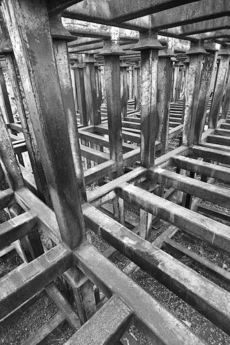
Images need to be noticed to be appreciated. They need to grab your attention within a few seconds or they risk being ignored, the page turned, walked past or just plain rejected. You can’t exactly hang a sign next to an image saying – “If you persist with this image, you will learn to love it, trust me!” Of course, in a collection of images in which the majority do catch the eye, a limited number of more thoughtful quiet or complex images can work because the viewer has already “bought into” the worth of the photographers work and the less lazy of the audience will be willing to take some time to understand and appreciate an image which is more work to view. If you already have a “name” for yourself, you may attract an audience to your thoughtful images simply because they have already “bought in” to your work. It’s even possible to produce thoughtful work with the idea of ignoring the masses and hoping that you will find an appreciative audience even if it is a small or specialized one. Even highly trained musicians usually turn to relatively easy-to-understand pieces of music when they think of the best music ever created. To a great extent, your personality plays a role here in what kind of images you are inclined to make, but if you are unsatisfied with the impact of your images, well, a little bit of eye catching could go a long way.
Ee-catching can come from dramatic colour, from bold graphic design, interesting juxtapositions (large and small, beautiful and ugly, and so on), the use of contrast (black on white or visa versa). it can come from a puzzle the viewer is asked to solve (what is it?, how large?, where from?, etc.).
______________________________________________________________
Are Strongly Composed

It’s my experience that the vast majority of images that many of us consider superb incorporate great use of composition to make their point. This is true even of war photographs in which you would think composition might be surplus to requirements. Truth is, good composition is such a useful tool in presenting your ideas that it’s really a matter of “why wouldn’t you compose it as strongly as possible?”
Composition can point to, frame or set off the main subject element of the image. It can help you find your way through a more complex image.
It is no coincidence that one composes music or that we compose our thoughts. When we write essays in school, they are sometimes referred to as compositions. Edward Weston defined composition as “The Strongest Way Of Seeing”.
______________________________________________________________
Have Relatively Few Picture Elements
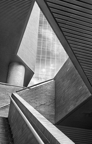
By elements, I mean the various parts of an image. These may be physical objects, but they could just as easily be shapes made by the edges of the image on one side and the beginning of an object on the other. Elements can be many objects which overlap and are of similar tone so they appear as one – for example a skyline of similar tone buildings. Shadows are often very strong image elements. A series of objects can form a space between them and this space can form a powerful compositional element which is stronger than any of the surrounding elements that formed the space.
have found that when I have an image with lots of really good parts, even though I can see my way through the image, often others cannot. The majority of the really great, the famous images are pretty darn simple, or at least the larger number of elements are repetitive or organized into patterns and therefore still simple.
Think of it this way, the fewer words you use to tell a story, the easier it is to get your point across. Telling a joke that goes on for more than 10 minutes risks landing with a dull thud. Could it be that all your images have more to do with “War and Peace” than an editorial cartoon? Remember though, that you are free to disregard any of these image strategies if you have a valid reason – wanting to write War and Peace is a valid reason, so long as you don’t expect to see it on Oprah.
______________________________________________________________
Have No Elements Surplus to Requirements
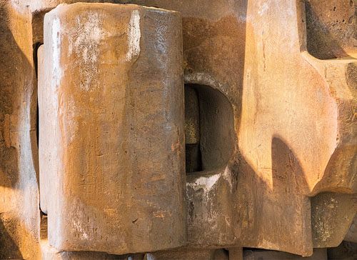
There is nothing to the image beyond what is needed to make the point or set off the subject. Were you to remove even a single picture element, it would be the weaker for it. There’s nothing distracting, no elements that almost match but not quite, never a matter of having to include object B in the image because you really wanted to include C which happens to be beyond B so you end up with both. Sometimes the really great parts of the composition are simply too far apart to make a decent sized print – the thumbnail looks fantastic, the print fails.
______________________________________________________________
Use Lighting And Or Surface Reflections

Glancing lighting in which the angle of the lighting to the surface is quite small reveals undulations and texture to best advantage. When the landscape is horizontal, this requires sunrise or sunset. If it is a vertical surface, it might actually require high noon. Often great images make use of shadows as compositional elements or to outline a subject. Shadows are never taken for granted. In the absence of helpful lighting, it’s often sensible to photograph subjects which have some surface reflections, whether they be be water or ice, skin or fruit. This is particularly true in black and white photography.
______________________________________________________________
Contain A Limited Colour Pallete
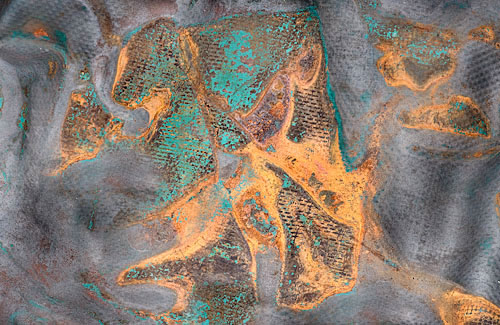
The best images tend not to include a rainbow of colours, often limiting themselves to two or three hues, sufficiently different from each other not to clash, and often with one of them on the opposite side of the colour wheel from the rest. Colour is part of the design process and keeping things simple applies when selecting or editing colours. it is often better to use variation in saturation and brightness rather than small variations in tone. Yellow-green looks disturbing next to olive green. Perhaps you are intending to disturb, which is fine, but were you looking for tranquility, that combination may not work. Strong colours with a background of subtle hues draws attention to the subject, but you might prefer to draw attention with less of a hammer blow through use of lighter tones or complementary yet subtle colours. All depends on what you want – the point being that you should be planning or at least noting these colour characteristics of your potential image, and you have to deal with them in the editing.
______________________________________________________________
Have A Message Or Evoke A Feeling
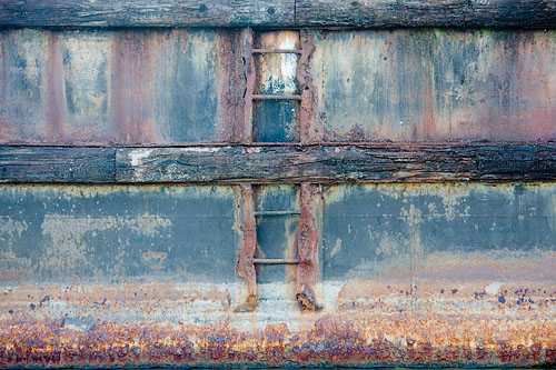
It’s all too easy to produce a well put together image that just doesn’t have anything to say. The really good images are able to convey an emotion or send a simple message.
Perhaps you photograph your grandson. You can produce pleasant pictures. Maybe you can produce pictures which show him at his best or worst or most mischievous or pouting, that make family members go ahah! If you are really skilled, you might produce an image which is so expressive of those emotions and situations that anyone can recognize the kind of moment and have theahahexperience.
A landscape image can be peaceful or dramatic, it can be brooding or exalting. It can induce awe and wonder, a sigh or an exclamation.
______________________________________________________________
Tell A Story
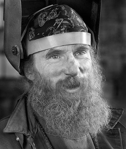
The great images often speak to us. Sometimes the story is laid out for us, other times we merely get the pieces of a story and it is up to us to use those pieces to make up our own essay. It is not necessary that the story we come up with be the same one the photographer intended or understood.
Portrait photography is all about the story. It may not even be a true one. Models and actors are able to create a story to suit and photographers can choose the moment or select lighting which implies a story, making someone appear evil when they are anything but, or outgoing when they are extremely shy. Even the life of the party may be occasionally wistful. Sitters often want to look their best – thinner, younger, more attractive; yet such portraits may not tell much about the sitter. Hands in a portrait can tell a story. How you edit the file or make the print can set a mood and thus imply a story.
______________________________________________________________
Leave You Wondering, While Feeling Complete
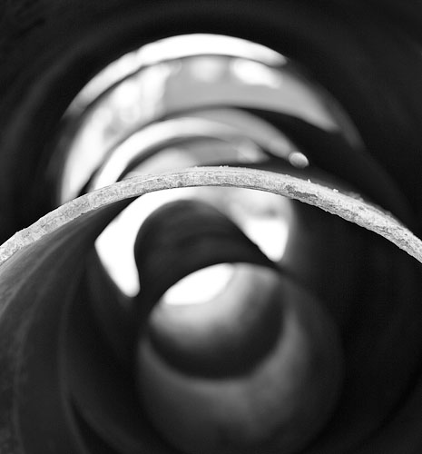
An image which leaves the viewer frustrated that they can’t see an extra inch to the right on the print doesn’t feel complete, but one in which the viewer wonders about where that path leads to, or what’s behind something or how did it/him/her/they get there gives the viewer something to ponder after leaving the image. Think of it this way. If an image is absolutely perfect, but everything can be seen and understood in a single viewing, why should the viewer even need to come back, sort of a ‘”been there, done that, check it off, move on” sort of situation. Oh sure, they might occasionally like to look at it again, but how often, and would they hang it on their wall to see daily for months or years?
______________________________________________________________
Show The Unusual Or The Unnoticed or the Juxtaposed
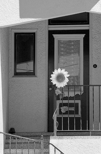
While photographing the exceptional scene results in many wonderful images, often the really great images take a different turn. They surprise us or show the ordinary from an unexpected or unexperienced (to us) viewpoint. Sometimes the individual elements of the image are quite unexceptional other than the fact that the photographer was observant enough to capture them together because they complement or contrast each other or wouldn’t normally be seen together or they just plain interact. The great photographer Elliot Erwitt is known for his juxtapositions. Cartier-Bresson was famous for finding nicely composed scenes, then waiting to capture that extra element (usually a figure) which turned an image from nice to magic. Edward Weston photographed a dead pelican and showed that it could be beautiful. Joe Cornish is known for his glorious landscapes but often it is some minor nominally unimportant feature that occupies the foreground half the image and contrasts with, leads to and works with the “grand landscape” in the background and is therefore vital to the overall image.
______________________________________________________________
Have That Little Extra Something Magic
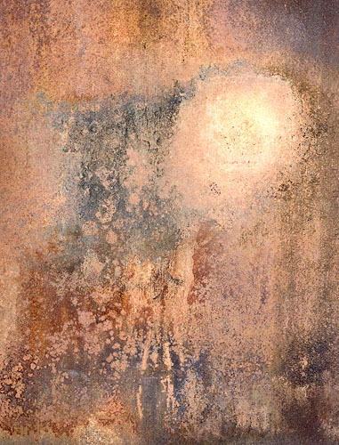
While I would love to have the formula for adding that magic, the truth is that I don’t think any photographer in history could plan it. Every so often, there’s something that elevates an image beyond anything expected or previously produced. It happens to all of us, though on different levels and we don’t fully understand it. Why should Pepper # 30 be so magnificent when many of Weston’s other pepper images were good but not exceptional. After all, it was just a pepper, photographed in an old tin funnel. O.K., the pepper had sensuous curves, but there is something about that image that goes above and beyond the explainable – it just works perfectly. On the other hand, not all of us agree on which images are magic: my daughter doesn’t “get” Pepper # 30, she has a great eye and is quite artistic so that’s not the explanation. Perhaps you too have never understood the attraction of the image, but I’ll bet that if you are at all experienced, you already have your own idea about some different images that you find magic.
The only lead I can possibly give you is that the higher the level of most of your images, the greater is going to be that very occasional exceptional image and so I think our efforts should be aimed at raising the baseline of our images, that our standards for our images be as high as possible so we are ready for the exceptional when it comes along.
______________________________________________________________
Conclusion
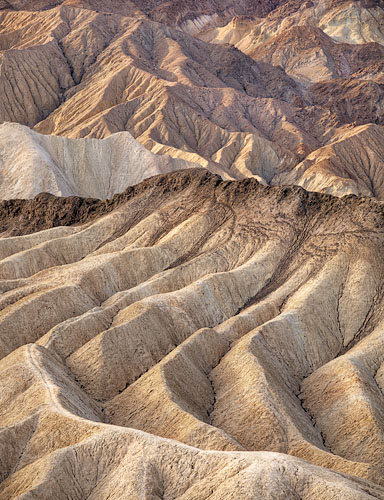
I have presented the argument that our best images often share a number of characteristics, simple design, strong composition, eye catching subject, evocative themes, surfaces of great tonality, story telling and a sprinkle of magic. I have further suggested that if your images have none of these features, it might be that you could take advantage of this information to improve your images. In it’s furthest refinement, you could learn to deliberately flout these “rules” or study fine images to come up with your own ideas on making powerful images of lasting impact.
Remember that before you start considering any of the above, you must find a subject which interests you and a scene within that subject which moves you. Only then can you take these ideas into consideration. More than likely only a few of these ideas will be applicable to any one image, but my hypothesis is that we can make better images when we are at least aware of what tends to work.
I suggest you do your own test to see if my hypothesis is true. While you could simply take my word for it, I strongly encourage you to challenge my argument. Take a dozen of your favourite images by other photographers and then three or four of your own best images and go through the list. If you find as I did that these elements do often show up in the best images, then go through some of your own images which didn’t quite work and see if they lack most if not all of these characteristics.
I would be very interested to hear from readers who take these ideas into the field and apply them – what is your experience with this strategy? How does it change your images? Let the editor or myself know how it works out.
George Barr
February, 2010
Read this story and all the best stories on The Luminous Landscape
The author has made this story available to Luminous Landscape members only. Upgrade to get instant access to this story and other benefits available only to members.
Why choose us?
Luminous-Landscape is a membership site. Our website contains over 5300 articles on almost every topic, camera, lens and printer you can imagine. Our membership model is simple, just $2 a month ($24.00 USD a year). This $24 gains you access to a wealth of information including all our past and future video tutorials on such topics as Lightroom, Capture One, Printing, file management and dozens of interviews and travel videos.
- New Articles every few days
- All original content found nowhere else on the web
- No Pop Up Google Sense ads – Our advertisers are photo related
- Download/stream video to any device
- NEW videos monthly
- Top well-known photographer contributors
- Posts from industry leaders
- Speciality Photography Workshops
- Mobile device scalable
- Exclusive video interviews
- Special vendor offers for members
- Hands On Product reviews
- FREE – User Forum. One of the most read user forums on the internet
- Access to our community Buy and Sell pages; for members only.


