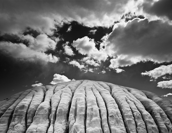
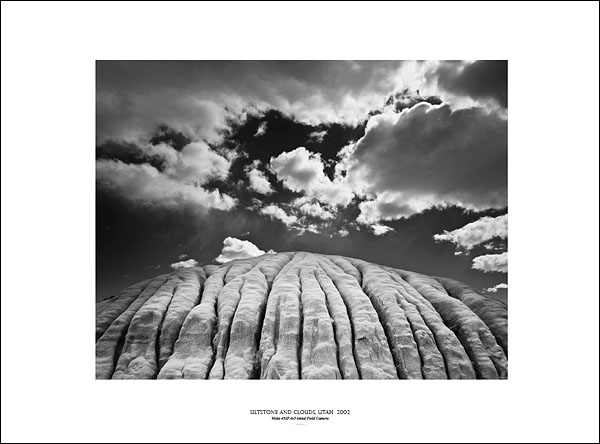
Siltstone and clouds, Utah 2002
Camera: Wista 45SP 4×5 Metal Field Camera
Image Data: 4×5 film scanned on Epson V-750 Pro scanner
Even though I am primarily a color landscape photographer, many of my favorite landscape images are black and white photographs. Of course, everyone thinks of Ansel Adams right away. Other favorite landscape photographers of mine are Edward Weston, Wynn Bullock, Minor White, and Brett Weston. There are also many contemporary photographers worth checking out, such as Paul Caponigro, Michael Kenna, John Sexton, Jerry Uelsmann, Bruce Barnbaum, Chris Rainier and Huntington Witherill. When I stop and think about where my inspirations have come from, I realize that I have found as much or more inspiration in black and white photographs as in color work. Well then, why haven’t I ever pursued making black and white images myself? Good question.
I took basic black and white photography for two semesters back in college. It was the mid-1970s, and I was studying for my degree in Environmental Conservation at the University of Colorado. I was just beginning to get serious about landscape photography. The professor for both courses was not a big fan of either landscape photography or color photography. He was definitely not an Ansel Adams fan, giving me endless grief during my critiques for my “sentimental” and “derivative” attempts to create beautiful nature images. I told him that I’d rather photograph in color, and he informed me that good art could not be made with color photography. I resisted and resented this pressure.
By the end of my second semester, the professor realized he was not going to convert me into the urban or conceptual image-maker that fit his mold. To his credit, he pulled out books by Minor White, Wynn Bullock, Edward Weston and Paul Caponigro in order to show what he deemed great work within the landscape theme. He was right about these photographers, and I was inspired! Not merely descriptive, their best landscape work was (and still is) incisive, innovative and expanded the tradition of landscape photography. Images made from intense exploration and with fearless lack of inhibition, they pushed out the boundaries of traditional landscape imagery, creating meditative and symbolic imagery that speaks to the soul. If you are unfamiliar with their names or photographs, I hope you will look them up in a library or on the Internet. In any case, it is these photographers that inspired the direction of my photography even though I used color instead. Color master photographers like Eliot Porter, Ernst Haas and Philip Hyde also inspired me but not to the same degree. Many years later, my efforts lead to my portfolio and book, Landscapes of the Spirit.
In 1982, I bought my first 4×5 field camera after eight years of using a 35mm camera. I hoped that the larger film and slower pace of the 4×5 would yield both a perceptive and qualitative improvement. I used Polaroid instant film for the first couple of years to test my compositions and exposures before exposing my chromes. My comfort level with the new equipment was greatly helped by Polaroid proofing much as the LCD preview is used today. I could gauge sharpness and image design while I learned to use the view camera adjustments. Of course, living in Yosemite gave me plenty of subjects to practice upon!
Even as I studied B&W a bit in college, I committed my career to working in color. I challenged myself to make color photographs that display the best aspects of B&W composition in terms of graphic design, inject expressive seeing, and use the colors of nature judicially and subtly. However, I never closed the door to B&W in my mind. In the early 1980s, I worked as the staff photographer at The Ansel Adams Gallery in Yosemite. Ansel was alive at that time. Naturally, getting to know him, his images, his environmental activism, and his workshops influenced me. I attended many sessions during his summer courses conducted by the Gallery, where I learned about the Zone System and saw many great darkroom prints. I learned a great deal about fine print quality as I was responsible for showing and exhibiting Ansel’s prints as well as those of his assistants and workshop instructors.
I suppose that I have been looking for the opportunity and time to work in Black and White all these years. When Ansel was shown my early color photographs, he complimented me by saying I “saw” in Black and White!”
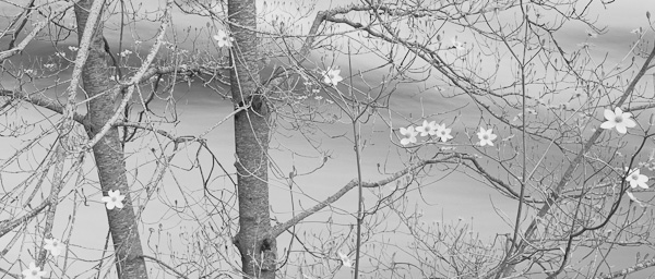
Dogwood tree blooming along the Merced River, Yosemite Valley, Yosemite National Park, California 1990
Camera: Wista 45SP 4×5 Metal Field Camera
Image Data: 4×5 film scanned on Tango drum scanner
Fast forward to 2009, I am now coming back to my earliest form of photographic inspiration, Black and White imagery. Photoshop has opened the door, giving me the chance to play with the possibilities digitally. For my B&W portfolio that I have been developing during recent years, I have worked with both scanned film and digital capture. It is hard to argue against the degree of control using B&W film and the Zone System gives you at the moment of exposure and for realizing a visual idea in the darkroom. However, I never found the time to learn the traditional darkroom approach, and converting color images is relatively easy in Photoshop. I am not normally inclined to take shortcuts or the easy way out. I noticed that some successful fine art photographers, who had been doing B&W traditionally in the darkroom, were working with digital capture and scans, converting color to B&W with Photoshop. After seeing the high quality that was possible, I concluded that the conversion process was more than a cheap digital trick. I started making prints a few years ago. The great advances in digital inkjet printing have made fine art B&W available to everyone with the latest printers. I recently received an order for seven 30×40 prints from a client, and the resulting prints were excellent.
One major aspect of the conversion process is editing. The quality of the exposure and the graphic quality are most important. Just as when exposing B&W film, one must consider how colors translate to grays when choosing the color image. Because B&W images do not depend on colors for impact, black and white compositions are often better designed, and so your ability to compose may well improve by working in B&W! I recommend using software like Lightroom, which has a very useful Grayscale option, for visually “testing” the strength of images to be converted from color to B&W. Some images just don’t translate. Finding the right images to convert takes some trial and error.
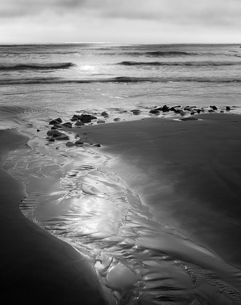
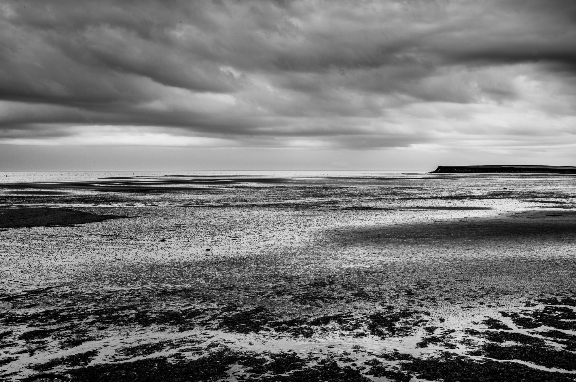
Stream at sunrise, Scarborough State Beach, Rhode Island 1995
Camera: Wista 45SP 4×5 Metal Field Camera
Image Data: 4×5 film scanned on Epson V-750 Pro scanner
The process of sifting through my many high res scans from film, looking for images that sing to me as B&W photographs has been a wonderful experience, and greatly enhanced by our use of Lightroom. Most of the files were already mastered images, meaning the adjustment layers for refining the image are all available in the unflattened digital file. I am also working with many digitally captured photographs for conversion. Since 2004, I have been using high-resolution cameras, and I have plenty of images from which to choose!
My assistant and digital expert,John O’Connor, opened the master files I selected. In Photoshop CS4, we would collaborate on the overall visual direction. John would make a new Layer group above the existing layers for the color image. Next, we select Layer>New Adjustment Layer>Black and White to create the conversion layer. This new tool (since CS3) provides a great deal of control and flexibility. You can use the Default option and adjust the sliders to make your own adjustments. Or try out the dropdown presets like Red Filter, Lighter, Darker, Green Filter, etc. which allow you to explore your options if you are not sure what direction to take.
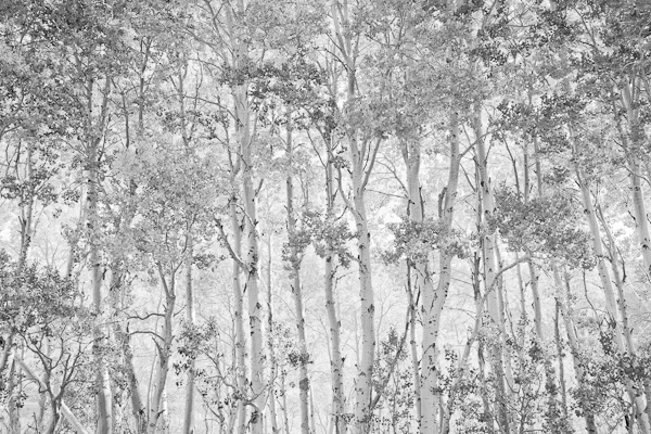
Aspen, June Lake Loop, Inyo National Forest, California 2008
Camera: Canon EOS-1DS MarkIII
When working in Lightroom, we make a Virtual Copy before conversion so we have easy access to both Color and B&W copies. To review the image, simply click on the Grayscale option in the Develop Module, then use the Grayscale Mix adjustments, which is much like the Black & White adjustment layer in Photoshop CS3 and later. In concert with Lightroom’s other tools such as contrast, exposure, Fill Light and Recover, you can quickly decide if you have the right image. If the image needs further work, which is often the case, we send it to Photoshop using Edit a Copy with Lightroom Adjustments instead of Edit Original. For an excellent tutorial on Adobe Lightroom 2, including Black and White conversions, see The Luminous Landscape Guide to Lightroom 2.
Whether using scanned film or digital capture files, the .PSD files for these photos were accessed from my Collections folders in Lightroom, tested with the Grayscale feature, then added to a new B&W collection. In to the future, I can easily add new work to my Meditations in Monochrome portfolio and see my progress.
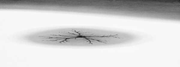
Frozen Lake, Lassen Volcanic National Park, California 2004
Camera: Canon EOS-1DS
I hope that my story gives you some ideas for exploring Black and White conversions in your own photography. For me, the process of making black and white images from color ones has been a great way to fulfill a long overlooked passion for the B&W medium, add a fresh portfolio to my body of work, and energize my creative soul!
______________________________________________________________
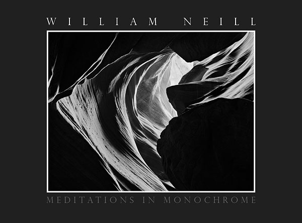
To see my portfolio, see my latest ebook:
Meditations in Monochrome – Digital Edition.
______________________________________________________________
William Neill, a resident of the Yosemite National Park area since 1977, is a landscape photographer concerned with conveying the deep, spiritual beauty he sees and feels in Nature. Neill’s award-winning photography has been widely published in books, magazines, calendars, posters, and his limited edition prints have been collected and exhibited in museums and galleries nationally, including the Museum of Fine Art Boston, Santa Barbara Museum of Art, The Vernon Collection, and The Polaroid Collection. Neill received a BA degree in Environmental Conservation at the University of Colorado. In 1995, Neill received the Sierra Club’s Ansel Adams Award for conservation photography.
June, 2009
Elevate Your Vision


Read this story and all the best stories on The Luminous Landscape
The author has made this story available to Luminous Landscape members only. Upgrade to get instant access to this story and other benefits available only to members.
Why choose us?
Luminous-Landscape is a membership site. Our website contains over 5300 articles on almost every topic, camera, lens and printer you can imagine. Our membership model is simple, just $2 a month ($24.00 USD a year). This $24 gains you access to a wealth of information including all our past and future video tutorials on such topics as Lightroom, Capture One, Printing, file management and dozens of interviews and travel videos.
- New Articles every few days
- All original content found nowhere else on the web
- No Pop Up Google Sense ads – Our advertisers are photo related
- Download/stream video to any device
- NEW videos monthly
- Top well-known photographer contributors
- Posts from industry leaders
- Speciality Photography Workshops
- Mobile device scalable
- Exclusive video interviews
- Special vendor offers for members
- Hands On Product reviews
- FREE – User Forum. One of the most read user forums on the internet
- Access to our community Buy and Sell pages; for members only.
You may also like