From the mid to late 19 th , through to the early 20 th century one of the popular photographic printing processes, even predating silver gelatine, was the platinum print. As the price of platinum soared during WWI and WW2 the process drifted out of practice. Then beginning in the 1970’s creating platinum prints using the traditional methods was re-established by a small number of specialists. Today it remains consigned to the relative obscurity of an “alternative process”. I think 2 factors contribute to keeping platinum printing at its current level of (un)popularity. Compared to inkjet (or even traditional darkroom prints) a platinum print is relatively expensive. A 25ml bottle of platinum solution runs about $200. I estimate that exposing an 8×10 negative and printing on 11×14 paper runs about $12 – $13. Second, there is no silver bullet for learning the process. It’s truly a craft that has to be learned by experience. It took me about 6 months and almost 100 prints to get the technique down to where, 4 times out of 5, I could get a decent print. Having said that, the quality of a well executed print certainly stands out in comparison to the vast number of inkjets on display today. So if you’re looking for a way to distinguish your work, this might be an option. Finally, when viewing the images illustrating this article, I ask the reader to appreciate that a platinum print is even less well served when making the journey to a web image than is a a digital image. These are not digital images toned as platinum; they are scans of “the real deal”.
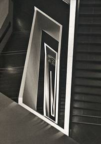
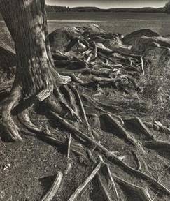
Bonaventure Cemetery, Savannah Georgia
Platinum/Palladium print
______________________________________________________________
Why a Platinum Print?
In his bookPlatinum and Palladium Printing, which I highly recommend, Dick Arentz lists several reasons why platinum prints are of special interest. In addition to being of historic interest these can be summarized:
Archival longevity
Higher dynamic range
Basic aesthetics
I should note that his discussion is in the context of a comparison with silver gelatine. When compared to modern inkjet prints the story is a bit different. With respect to the first point, while platinum prints will last as long as the paper they are printed on, modern developments in inkjet printing have rendered that distinction somewhat less compelling than it would have been even 5 years ago. In the larger scheme of things the difference between 100 years or more for an inkjet (some archival BW inkjet prints are pressing towards several hundred years) and 500 or more for a platinum print doesn’t grab me, but it may some.
Similarly with dynamic range; modern technology and technique can give us all the dynamic range we want (and then some).
So that leaves the final point:aesthetics. While the 2 previous points are more or less objective, this characteristic is entirely subjective, and consequently difficult to describe. But let me try, perhaps comparing to an inkjet print will help. A platinum print seems to me to be more “photographic” and has a sense of depth and richness lacking in all but the rarest inkjet prints. While a platinum print can certainly be “sharp”, the tonality gives it a certain attractive softness. Ultimately, I’m compelled by the visual “feel” of a platinum print.
In addition to the points made by Arentz (only one of which resonates with me), I have to add an increasing interest in the hands on “craft” of making a fine art print. I consider myself a decent, though not necessarily expert inkjet printer, but after 10 years of digital experience, I find that my process, taking place as it does entirely in the digital realm, feels a bit cold and sterile. I find it fascinating to hand craft an analog platinum print, ultimately seeing the latent image on the exposed paper pop out when I pour the developer over the image.
One of the attractions of the platinum/palladium method of printing over a traditional darkroom is that the process isn’t sensitive to low levels of tungsten room light. So if all you’ve ever known is a digital darkroom, this alternative process can at least give you exposure to an analog process, without keeping you in the dark.
While some purists decry the use of the digital rather than traditional silver based film negatives, several clear advantages accrue to the hybrid approach, combining the best of the digital and analog worlds. While the difficulty of the processing logistics increases with the size of the print, the only real limitation to a platinum print is how large a print you can make (the clear film used to print the negative is available in rolls up to 59” wide). A traditional platinum print based on a film negative (even using an inter-negative, and I understand there are some truly nasty chemicals involved in that process) would be a major challenge at 36” x 48”, to say the least. The other advantage of creating digital negatives is the unparalleled control over the editing of the initial image.
I remember attending one presentation to a large format film club by an expert platinum printer using digital negatives. While most in attendance understood the practical necessity of working with a negative in digital, a surprising number still felt that some kind of subtle violation had occurred in compromising a completely analog process. Admittedly the audience had a somewhat unique perspective.
Finally, before moving on to the process I want to point out that I am certainly not an expert in platinum printing, but the experience of learning how to get an acceptable print is fresh in my mind and if you’re interested in trying your hand at this process, in the remainder of this article I’ll point out some of the pitfalls I experienced that might never occur to an expert with 20 years experience to mention. My intent is that the tone here is one of describing my subjective experience, not to outline prescriptive “best practices” (with a few exceptions). This article may give you some useful tips, but it’s certainly no substitute for more detailed information in other readily available publications, including the Arentz book mentioned earlier. As well, I recommend:Digital Negativesby Ron Reeder and Brad Hinkle.
______________________________________________________________
The Process
A short word here about terminology. So far I’ve used the term “platinum print” fairly loosely. In fact most “platinum” prints today are made with a combination of platinum and palladium salts, or even 100% palladium. I started with a combination of 50% platinum and 50% palladium but quickly moved to 1/3 platinum and 2/3 palladium when I realized that the tonality was exactly the same – and palladium is significantly cheaper than platinum. Eventually I switched entirely to palladium. From here on I’ll refer to platinum asptand palladium aspd.
As an interesting aside, the longest pt/pd thread I’ve seen so far on any of the discussion groups that cover “Alt.process” dealt was the ethics of using the term “platinum” to describe the print when most of the metal used was not, in fact, platinum.
In a nutshell, all you have to do is:
1. Print a digital negative on clear film (such as Pictorico)
2. Coat a sheet of paper with a solution that’s a combination of palladium salts, Ferric Oxalate which provides the sensitivity to the UV light and a restraining agent which helps manage the contrast.
3. Place the negative over the paper and using a spring frame expose to ultraviolet light.
4. Develop, rinse, clear, wash and dry.
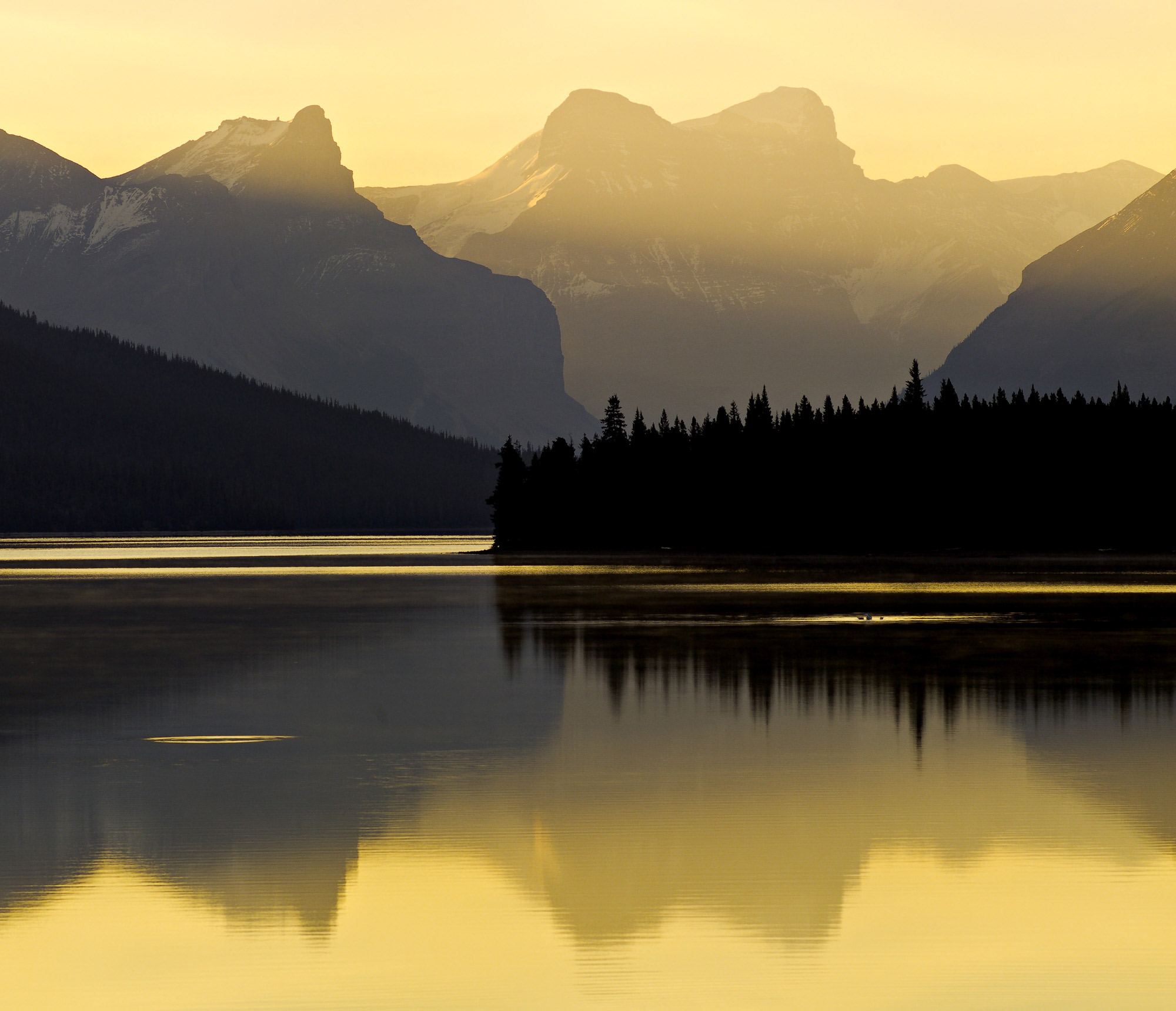
Recoleta Cemetery, Buenos Aires
Platinum/Palladium Print
______________________________________________________________
Making the Digital Negative
This is actually the most difficult part to get right, but once you have a negative that prints properly then, for the most part, you can reuse the same Photoshop adjustments on other images. (Yes, even here, Photoshop is unavoidable).
You MUST start with a RAW image since you really need a high (12, 14 or 16) bit image. For further information on why, seeExpose Righton this site. Using your favourite post-processing techniques you need to end up with an image that’s 1) black and white; 2) inverted (you need a negative image) and 3) rotated horizontally so that in the final positive what is supposed to be on the right will be on the right. The actual order in the layer stack is: original image (flipped horizontally); an adjustment curve; the inverted layer.
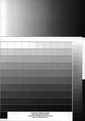
Now comes the fun. Figure 1 is a step wedge that’s been printed as a pt/pd print without any Photoshop adjustment and displays the difficult problem that needs to be solved.
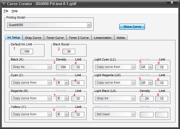
Figure 1: no adjustment curve
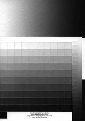
The natural response curve of the chemistry is very contrasty in the mid tones and very flat in the shadows and highlights. If I were to approximate the natural curve in Photoshop it would look something like Figure 2:
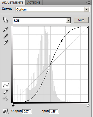
Figure 2 illustration of pt/pd response curve
So the problem is to create a curve that neutralizes this natural response curve so the tonality of the final print is more or less linear, ie: a step wedge looks reasonable.
The process as recommended by Reeder and Hinkle in their book “Digital Negatives: Using Photoshop to Create Digital Negatives for Silver and Alternative Process Printing” basically involves creating a pt/pd (or pd only) print of an unadjusted step wedge, scan the image, or better yet use a densitometer, read each step (or at least 16, which is the maximum number of points you can put on a Photoshop curve), compare them to the value they should have based on the original digital wedge and build the appropriate curve to reverse, or mirror the differences.
Figure 3 is the one of the early curves I tried which is only loosely based on the Reeder and Hinkle method. Really, based on what I already knew about the native response curve, this was no better than a wild guess. One major difficulty with the scan and measure process is that there is actually no contrast apparent in a scan in the first 3 rows or last 2 rows of Figure 1 and so the process seems to have a major challenge where you need the most help – in the shadows and highlights.
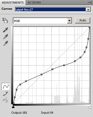
Figure 3: sample trial curve
After a number of iterations, Figure 4 is the curve that gets me decent results in pd, but is still not sufficient for a pt/pd combination. You can see the extreme nature of the adjustments already, and I’m still not there for a pt/pd print.
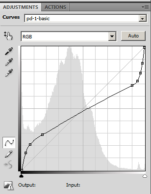
Figure 4: OK for pd, not for pt/pd
The output:input points for the Figure 4 curve are: 36:9 53:17 73:42 175:231 185:241 200:250 and 220:254
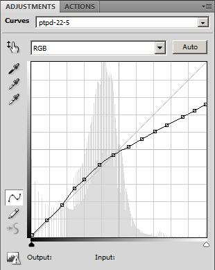
Figure 5: second curve for pt/pd
In building the curve for a pt/pd print, the curve in Figure 4 above proved insufficient and the highlights were still too light, so I developed a second curve, Figure 5, to use in conjunction with the first curve. To emphasize: the curve in Figure 5 is appliedin addition tothe curve in Figure 4 – the cumulative effect is a massive adjustment to the highlights. These extreme adjustments are why you need a high bit depth. These adjustments are to the positive image which gets inverted into a negative so the highlights become the shadows, with significantly less room for tonal adjustments given the exponential nature of how the tonality maps into the bit space.
The reason I used a second curve is that you can see the adjustment to the highlights (and shadows) in Figure 4 is already very extreme, but as mentioned, the highlights were still too light, and so rather than try to tweak that curve further I developed the curve in Figure 5. There’s a limit to what you can draw in Photoshop. The chemistry for prints made with the curves as per Figures 4 and 5 is based on ratios of 2 parts pd, 1 part pt, 2 parts sensitizer and 1 part sensitizer combined with restrainer. (Those reading this article who are familiar with the process might alternatively suggest reducing the amount of restrainer – that’s a fair comment.) The order in the layer stack is important and the new curve sits on top. Since a print from the curve in Figure 4 actually did have some contrast in the highlights I was able to at least start constructing the curve in Figure 5 using the scan and measure technique.
As I mentioned, the curve in Figure 4 turns out to be a reasonable curve for pure pd prints and results in the following step wedge (Figure 6) when printed with a ratio of 12 drops pd metal solution to 12 drops sensitizer to 1 drop restrainer. It’s a bit confusing when describing the chemistry of a pt/pd process compared to pure pd. The reason is that in a pt/pd process, small amounts of restrainer are added by the supplier to a solution of the sensitizer, so the ratio is as noted in the previous paragraph. In a pure pd process a different restrainer is used and it can’t be added to the sensitizer so its added as individual drops separately, hence a ratio like 12-12-1.
I should also emphasize that simply copying this curve into your own process will not typically give good results. For pd printing, you’re certainly welcome to use the curve in Figure 4, but be prepared to do some major tweaking based on you setup and environment.
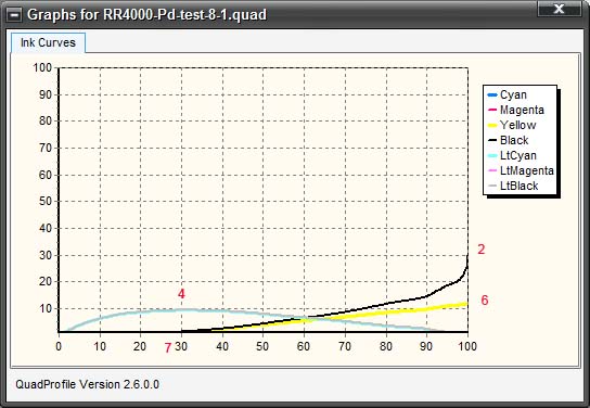
Figure 6; step wedge based on curve in Figure 5
No doubt this looks a bit “rough” and you might think that applying a less extreme curve than Figure 5 could improve the top row of highlights, but the ability to execute that level of precision has, so far, escaped me. The problem is that when using a Photoshop Curve, any change in one region of the curve inevitably impacts the adjoining regions. In any event, the left column seems reasonable and further adjustments so far have been counterproductive when applied to actual images. I guess this is similar to “pixel peeping” in the digital realm. Any strange colour casts in the top couple of rows are artefacts of the scanning process.
A short digression: When I decided to start exploring pt/pd printing I expected to use basically an arbitrary balance of chemistry (50/50 pt/pd and 50/50 sensitized/restrainer) and do all the “fine tuning” with a curve. I told myself that if that didn’t work I wouldn’t spend time trying to simultaneously balance the chemistry and digital curve. (Hence my reluctance to experiment with the restrainer when creating the curves in Figures 4 and 5). By the time I realized that approach was a bit naïve I was too invested and ultimately ended up being reconciled to the need to adjust the chemistry as well as the curve. I first moved from 50/50 to 2/3 1/3 for both metals and sensitizer/restrainer and finally to pure pd and a totally different restrainer.
______________________________________________________________
Two Blind Alleys
There is a free tool (Windows, and Mac) calledChartthrobthat is intended to automate the process of creating an adjustment curve from an exposed and developed metal print of the step wedge). Chartthrob is a Photoshop CS3 or CS4 script and involves the following process:
- Create the step wedge using the Chartthrob script in Photoshop
- Make a digital negative, (no adjustments) and make a metal print (an example of which is Figure 1)
- Scan the print
- Open the scanned image in Photoshop and adjust the white and black points appropriately
- Invoke the Chartthrob script.
Chartthrob then analyzes each step and calculates the appropriate adjustment to linearize the curve, and then builds the curve for you.
Just as I had difficulty with the Hinkle/Reeder method, I could never derive an acceptable curve from this tool, presumably for similar reasons. I did spend a couple of days with a buggy version 1.0 of the tool (my error on downloading), which would never even get as far as generating an adjustment curve, but the current version seems to work fine. I would certainly encourage anyone trying pt/pd printing to download the tool and give it a try, and hopefully your results will be better than mine. You might have decent luck in using Chartthrob to generate a second curve – print the step wedge using a curve that approximates the one in Figure 4 and run a print of that through Chartthrob, then stack the 2 adjustment layers for the final prints.
The second unproductive distraction I encountered was an attempt to create the curve withinQuad Tone Rip(also recommended by Hinkle/Reeder). I use QTR extensively for black and white printing on my Epson 4000 (no advanced B&W….sigh) and I was having difficulty with the tone curve using Photoshop. I spent several unsuccessful weeks trying to use QTR to print the appropriately adjusted negative. The theory, at least as I understand it, is that different coloured inks have different ultraviolet transmission characteristics so by fine tuning the ink mix you can adjust the way the exposing UV light interacts with the negative. (You also have more data points available with which to construct the curve.) I’m guessing, but the benefit is probably that a less extreme curve is required. Note that any color cast to the negative has no impact on the print; the only thing that matters is how the negative transmits or blocks UV light. If you decide to take a look at the Digital Negative book, make sure you check thebook’s website, since following publication, they made a number of refinements to the process.
In any event after dozens of test prints I now have a tone curve that I’m happy with. (But the temptation to continuously tweak is hard to resist).
I suggest you mix prints of a step wedge with real images with which you are familiar. I generally found it easier to tweak the curve based on what was happening in a real image as opposed to the step wedge. In the early days I’d attach a single row step wedge to the image so I’d have both the step wedge as well as the image on the same print to assess. Don’t obsess about getting the step wedge “perfect”. Focus on getting the print to look the way you want.
______________________________________________________________
Final Thoughts on the Negative and Adjustment Curve
Some highlight gradations may be so subtle in the original image they don’t translate well into the print, at least assuming a curve that works well for most images – due primarily to the extreme nature of the adjustment. Highlights are particularly vulnerable largely due to the characteristics of the chemistry, but also because they are rendered as shadows in the negative, and remembering the ETTR math, there are exponentially fewer values available in the bottom stop than in the top stop. The series of images below show the posterization that can occur and how the restrainer can correct the problem. No doubt you could eventually achieve the same result with a curve, but creating that curve would probably cost you more in test prints than simply upping the restrainer by 1 or 2 drops. Another alternative would be to “fix” the offending area of the negative in Photoshop. You can easily see where the problem will occur in looking at Figure 8, the adjusted digital negative.
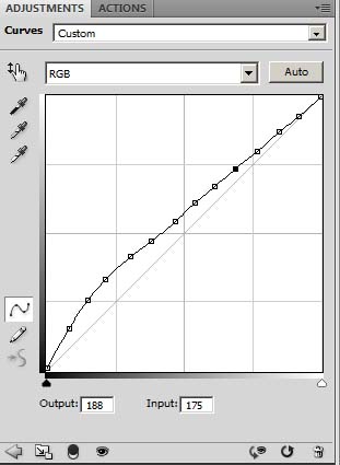
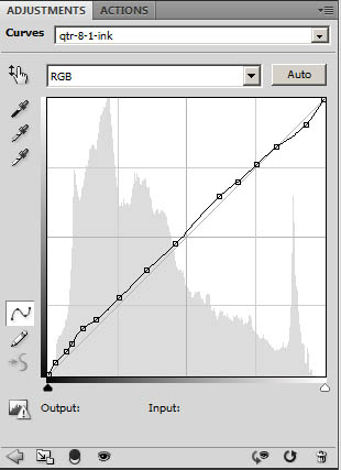
Figure 7: original digital image Figure 8: adjusted negative
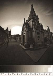
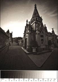
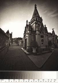
Figure 9: no restrainer Figure 10: 1 drop restrainer Figure 11: 2 drops restrainer
These 3 images were printed small (5”x7”) – the chemistry was 12 drops pd solution, 12 drops sensitizer and 0, 1, 2 drops of restrainer respectively. Unfortunately, these small scanned images don’t completely convey what’s going on in the print. The differences in the highlight end of the wedge are more pronounced in the print, and the sky is of a more even gradation in the print of Figure 11.
______________________________________________________________
Printing the Negative
I’ll probably be taken to task by some for the printing setup I use. I can only say in self defence that this was the setup recommended in the Reeder/Hinkle book and it works for me (although with 20/20 hindsight, the difficulty I had with their scan and QTR techniques should have made me a bit more sceptical).
Here’s a screen grab of the print dialog box in Photoshop CS4.
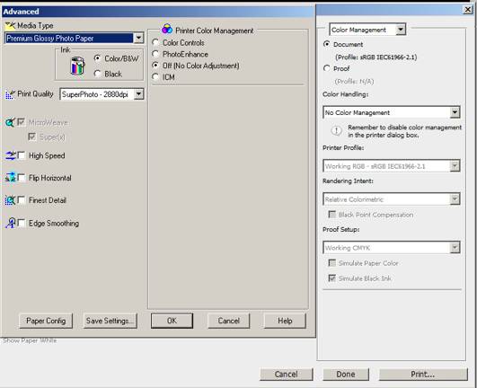
Figure 12
sRGB – GASP
“No Color Management DOUBLE GASP
If you want to try a more traditional set up – eg Adobe RGB and an appropriate glossy profile, be my guest. But, whatever you use, you need to stick to it. I haven’t tried anything other than what you see above and I’m proceeding on the basis that my curve is optimized for this configuration. Given the fact that a printer will typically use all ink colours to make a BW print, the color management settings must be consistent from print to print. My original RAW images are processed in ProPhoto RGB, but converted to sRGB after I convert to BW at the point where I start to make the digital negative. The media I use to print the negative is Premium Pictorico OHP Inkjet Film. There is a front and back to the Pictorico and the printing side is the one with a slight “tooth”. You can feel the difference. In any event the ink simply will not adhere to the wrong side. On the Epson 4000 choose premium glossy photo paper, and you’ll need to select manual feed.
I have two cautions regarding handling the negative. First, the emulsion side is extremely water soluble and even a small drop can ruin a negative. Second, even if you use a tape such as Scotch brand magic tape to keep the paper and negative in registration, make sure you tape to the glossy side since the tape will leave a sticky residue on the emulsion side. If you’re printing an 8.5 x 11 negative on 11×14 paper it’s not an issue, but be careful if the paper size is smaller than the sheet of film the negative is printed on.
______________________________________________________________
The Chemistry
Assuming you have a “happy negative” now it’s time to make the print.
Here’s a brief, but perhaps overly simplified explanation of the chemistry involved:
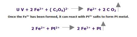
A solution of Potassium Chloroplatinate, Sodium Tetrachloropalladite and Ferric Oxalate is exposed to ultraviolet light which causes the metallic platinum and palladium to precipitate into the paper. The exposed paper is developed in a solution of Ammonium Citrate. This dissolves out the iron salts and reduces the metal salts to pure platinum and palladium in the areas where the exposed iron salts were, ie. an image in platinum metal replaces one in iron.
A restrainer (Potassium Chlorate in the case of pt/pd printing or Sodium Chloroplatinate in the case of a pure pd print) is used to shorten (hence restrain) the scale increasing the contrast, mostly apparent in the highlights. Remember how flat the response curve for the basic chemistry is in the highlights. In the pt/pd method the restrainer is added in small amounts to the sensitizer by the supplier, Bostick & Sullivan, so the amount of restrainer in the final solution is based on the ratio of the 2 sensitizer solutions used. Eg: 2/3 pure ferric oxalate and 1/3 ferric oxalate which contains small amounts of Potassium Chlorate.
So in the end, the final print (particularly the highlights) is based on the interplay between the adjustment curve applied to the negative, and the amount of restrainer used in the coating. A challenge with the pt/pd approach is that Ferric Oxalate plus Potassium Chlorate as a restrainer can, in some circumstances require amounts of restrainer which may result in a grainy appearance to the image.
The process using palladium only (Sodium Tetrachloropalladite) is similar but rather than using Ferric Oxalate plus Potassium Chlorate as the restrainer (which is ineffective for palladium) a weak solution of Sodium Chloroplatinate is used. Sodium Chloroplatinate, in contrast to Potassium Chlorate does not cause grain. This formula is generally referred to as the Na2 method. This somewhat misleading abbreviation was coined by Richard Sullivan of Bostick & Sullivan, one of the principal suppliers of chemistry and printing supplies, who popularized the process.
In summary, the 3 main advantages of the pd chemistry over a combination of pt/pd are: less expensive, less extreme adjustment curve and less grain. Since the tonality is extremely close, there is no downside.
For the chemists among you, here’s the technical reaction (based on pt) as described onalternativephotography.com
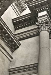
Royal Ontario Museum, Toronto
Palladium Print
______________________________________________________________
Equipment and Consumables
The following is a list of all the paraphernalia you need. Any of the specialized equipment is available fromBostick & Sullivan(B&S). ThePhotographers Formulary is another source I’ve seen recommended.
- The negative film. Pictorico is what I’m using now, but will check out Inkpress Transparency Film shortly as this new product is recently available to me locally in Toronto. I use the Premium OHP Transparency Film, not the “Ultra Premium” Pictorico.
- The basic pd chemistry kit from B&S includes the palladium solution, the Ferric Oxalate sensitizer, the Na2 restrainer, which actually contains platinum and accordingly is expensive (but a little bit goes a long way) and EDTA (Ethylenediamine Tetra-Acetic acid) as a clearing solution. If you buy this kit I recommend also getting some Sodium Sulphite which aids the clearing process. Only the sensitizer has a shelf life – B&S suggests 1 to 2 years, but if you’re not using it regularly it’s probably best to store in the refrigerator, but don’t freeze. The sensitizer is sensitive to UV light, and although the bottle is supposed to be opaque to UV, I keep my working supply in the dark.
- Paper – either Arches Palatine or Bergger Cot 320
- Either a coating rod, which is a glass rod typically available in sizes either 5 or 8 or 11 inches long with a rectangular handle, or a brush. I had one rod custom made at 7” long since 8” is a bit too wide for the digital 10”x 6.666” aspect ratio. The rods as supplied are a bit longer than advertised to allow the solution to be spread on the paper slightly wider than the negative. There’s lots of discussion on the net as to what kind of brush is best but the clear winner is the Jack Richeson water colour 9010 brush, either 1.5” or 2” wide. The larger the print, the more appropriate is a brush over a coating rod.
- Also included in the basic kit is the developer, Ammonium Citrate, which comes in a powder form in a 1 litre bottle. You need to fill the bottle with distilled water. The developer never gets old but does get grungy over time. Filtering through a coffee filter cleans it up a bit. You will deplete the developer over time through evaporation and loss of the residual developer that clings to the paper after developing so you can top it up from another bottle of developer as required. An alternative developer is Potassium Oxalate which apparently gives a bit warmer tone. Although I haven’t experimented in this regard, I’ve read that warming the developer (particularly Potassium Oxalate) can further warm the tonality of the image.
- For cleaning the print I use a combination of Sodium Sulphite and EDTA, mixed 1Tbs each in 1 litre of tap water.
- Developing tray. Given my production style, which is one print at a time, a single tray is fine.
- UV light source. B&S has options ranging from a single 27 watt compact fluorescent UV screw in bulb to multiple UV tube boxes with prices ranging up to $1,000 for an 18”x20” box. A reasonably priced alternative is fromsilkscreeningsupplies.com, which has an aluminum 20×24” box for $400. This is the box I use. If you use the screw in bulb, although B&S says “suitable for prints up to 8×10”, to get enough coverage of the negative to avoid fall off in the corners (ie: having the bulb far enough off the paper) I had to use an exposure time of several hours. This is another reason to stick to 5×7 prints until you decide whether or not you’re a fan of the technique before investing in a larger UV box. When using smaller negatives the bulb can be located much closer to the paper reducing exposure time. (I confess I didn’t experiment with alternative light shades – that might make a difference.)
- Spring clip frame to keep the negative tightly pressed against the negative during exposure. Some production oriented setups use a vacuum press. At the other end of the cost spectrum, some have reported that good results can be had by sandwiching the film/paper between two sheets of glass. I’m guessing that the top pane should be at least 3/16 to ¼” thick to be heavy enough. You’d probably be well advised to have your local glazier smooth the edges a bit. I use the 11×14” frame from B&S.
______________________________________________________________
Making the Print
Rule Number One: as you are evolving your technique, change only one variable at a time for each print you make. Since relative humidity plays a role, this can be difficult.
Rule Number Two: record the details of the process used, including tone curve and relative humidity etc. either in a diary (numbering each print), or on the back of the print. Identify on each negative the tone curve used to make the inkjet print.
Here’s list of most of the variable factors that can go into making consistency from print to print a challenge (the first four seem to have the most impact):
- The tone curve applied to the negative.
- UV exposure time
- Amount of restrainer
- Relative humidity (impacts exposure time)
- Paper used (but the Arches and Bergger are interchangeable)
- Coating technique
- Developer used (and the temperature of the developer)
______________________________________________________________
The Paper
I have tried both Arches Platine and Bergger Cot 320 and both are acceptable. There’s a good discussion in the Arentz book of options. Until you have a curve that works, you should work on small images – 4×5 to 5×7. The paper comes in 11×14 from B&S which I cut in half for smaller test prints. (Full size sheets of the Arches are 22” by 30”).
In the beginning I probably made about a dozen test prints on the wrong side of the paper – which results in uneven and often grainy or blotchy tonality with little consistency. Both the Platine and Bergger are engineered for coating, but only on one side. For Arches Platine, it’s easy to tell one side from the other. Because the paper is cut down from large sheets by B&S every 4 th sheet (at 11×14) will have an “Arches” watermark in the bottom left corner, so if Arches appears backwards you have the wrong side up. As well, one edge is deckled – if you feel the edge you can tell that one side is flat at the edge and the other side, the back, is tapered. Once you get the paper, without mixing it up, find a water mark and make a pencil stroke on the back of each sheet so there’s no confusion later as to which side to coat. It’s not that I couldn’t initially tell one side from the other, it’s just that for some reason of dyslectic brain malfunction I thought the back of the paper was really the front.
The Bergger paper is harder to tell up from down, but the smoother side is up. However the package is labelled so you can tell the up side, The Arches wasn’t packaged in a way that disclosed up or down. Again mark the reverse of each sheet with a pencil.
I have a marginal preference for the Bergger, but usually use Arches because I can source it locally here in Toronto.
Caesar’s Palace, Las Vegas
Platinum/Palladium Print
______________________________________________________________
The Coating
For a pure palladium print you need a 1:1 ratio of the palladium solution (B&S solution 3) and the Ferric Oxalate sensitizer (B&S solution 1) and for every 12 drops of the metal solution (24 drops of the combined metal and sensitizer) add 1 drop of the Na2 solution (at 10%). If getting the highlight part of the curve acceptable proves too difficult, try increasing the amount of Na2 if the highlights are still to dark, or none at all if too light.
For coating an 11×14 sheet for an 8×10 negative (or 10×6.666 for the digital SLR prints) I use 24-24-2 drops of metal, sensitizer and restrainer (restrainer is at 10% concentration). This gives a good coating with about an inch margin beyond the size of the negative. Although the metal solution is expensive, there’s no sense trying to be stingy with the coating. Most of my initial trial work was done on 10×7 sheets (having to trim down an inch since the 11×7 (ie: half an 11x 14 sheet) wouldn’t fit flat in the smaller developing tray. For the small prints I used 12-12-1 drops (multiples of 12 drops seems to be the standard “unit” for this kind of work). Although this is more than enough to cover for a 5×7 negative, I found that working in amounts smaller than 12-12 more trouble than it’s worth. The Na2 came in a 10ml bottle at 20% concentration, but various web discussions suggested that was a bit concentrated, so I added 10ml of distilled water – which meant that I could use one drop (rather than figure out how to get a ½ drop) for the smaller prints.
Mix the chemistry needed for the print size you are making, carefully counting the drops, into a small shot glass. Some sources recommend gently heating the pt (not necessary for pd) to dissolve any crystallized metal. As far as I can tell, this is a holdover from the past where making the pt solution by hand from scratch was imprecise. Today the modern methods employed by B&S seem to make this step unnecessary.
Hint: If you don’t count out-loud, I guarantee that eventually you’ll lose track. 12 drops is about as much as a fully loaded dropper can hold.
Another Hint: for the metal solutions, which don’t age, as I get down to the bottom of the bottle, I switch to a new bottle and after a few prints pour the remains of the old bottle into the new. Since the Ferric Oxalate ages (and I might be over-cautions here) as soon as I have trouble getting the solution into the dropper I pour the remainder into a second shot glass and load the dropper from there. If any remains in the glass, I just load the dropper from that and squeeze back into the bottle. On the other hand, the sensitizer is relatively inexpensive so there’s no real pain in wasting some, but it’s nice to have your inventory of sensitizer equal to the metal solution.
______________________________________________________________
Coating the Paper – Rod
I started off using a rod (aka “puddle pusher”), but eventually switched to a Richeson brush. When ordering your first kit from B&S I suggest you also order the 5” coating rod, since I find that for smaller images the rod is easier to manage than a brush.
Trace out the negative size lightly in pencil on the paper. A 2H lead works better than an HB – I mention this because I’ve compromised several prints by drawing a pencil outline that’s too dark. For a template I removed an 8×10 piece from the centre of an 11×14 piece of cardboard, that way the centre hole always aligns properly when the 11×14 template is placed on paper of the same size. For smaller prints I use a 5” rod (actually 5.5”) so it’s not necessary to mark the paper as long as you make the coat long enough. Tape the 4 corners of the paper to a flat, smooth surface with low stick masking tape. With the rod handle in one hand and the rod lightly resting on the paper just outside the edge of the pencil outline, quickly pour the contents all along the edge of the rod with the lip of the shot glass lightly touching both the paper and rod. Move (or jiggle) the rod, still resting on the paper, up and down a couple of times (towards the top and bottom of the paper) about a quarter inch, to distribute the solution evenly along the edge of the rod. This does take a bit of practice. Gently and slowly draw the rod and solution across the paper to just beyond the pencil mark and then back. I find that 3 complete back and forth passes are sufficient. Watch the bead of solution against the rod and if it “breaks” just push back and forth slightly (left and right) until it’s re-established. With the rod at either end, outside the pencil outline, lift the rod off the paper. Inevitably there will be a smallish puddle of solution still remaining. You can either gently swab off with a q-tip, or, as I prefer, use a dry brush (any smallish high quality oil based brush – eg: Purdy works well) to brush the remaining solution back into the image space.
You can actually keep pushing the rod across the paper until all solution is distributed, but the problem is that after a couple of passes the paper starts to swell and buckle slightly. It’s almost impossible to keep the proper even contact between the rod and paper once it starts to buckle. The larger the coated area, the more pronounced the impact of this swelling.
Don Jail, Toronto
Palladium Print
______________________________________________________________
Coating the Paper – Brush
Start by dipping the Richeson brush in distilled water a couple of times and remove as much water as possible by either shaking the brush (not near the negative!) or blotting with a lint free paper towel. Pour the solution from the shot glass to the centre of the marked paper and simply brush out to the edges to coat. Keep the brush strokes parallel to the edges. Keep brushing until most of the solution has been absorbed, about a minute should suffice. The key here is to make sure the solution is spread as evenly as possible, particularly near the edges and corners. Get it as smooth as possible, but any slight streaking will disappear after drying. It can help by making sure the last brush stroke ends outside the marked area when the brush is lifted from the paper for the last time. You need to be quite careful with the brushing not to get accidental drops or small splashes outside the coated area.
Washing the shot glass, brush, and/or rod in hot running water is sufficient. Shake out the brush and blot dry. Keep covered while stored to reduce the incidence of dust.
Once you’ve mastered the coating process (brush or rod) you can start to get fancy with the edge treatment. The rod leaves a bit of a bland edge but if you take a brush you can brush out the edges to give an interesting effect.
Inevitably you’ll get a piece of dust, brush fibre or hair on the wet paper. You can carefully brush it out of the exposed area or if that’s difficult simply leave until dry then flick out with the point of a knife. Do not try to “dig” out while the paper is still wet.
Note that although the coating solution reacts with metal, for a normal brush the solution never reaches the metal ferrule. There are some purists who insist a wooden goat hair Japanese hake brush is what’s needed – more theoretical than practical in my estimation (and yes, I have tried that kind of brush).
______________________________________________________________
Drying the Solution: Caution – Poison Alert
So now it’s time to mention the nasty nature of the chemicals, particularly the platinum or palladium salts. These metallic salts are poison, and as noble metals (not technically “heavy” metal, or so I’ve been told) can build up in the body if absorbed over time. I mentioned at the beginning that this article is largely subjective. This warning is not.
As long as you don’t touch the solution the danger is minimal, since, while in solution the metal can’t become an airborne particulate. The greatest risk occurs during the drying process. The literature generally recommends letting the print sit for about 5 minutes then drying with a hair dryer. It’s this process of blow drying that can cause the particulate metal dust to become airborne and subsequently inhaled. I don’t print in any kind of production volume and I started this relatively late in life, but for the professionals, it is an issue – mitigated by wearing the appropriate mask/filter. What I do is simply wait for the print to dry in a drawer, 30 minutes seems to work well – avoiding the blow drying entirely. Another benefit to drying in a drawer for a consistent amount of time is that, as noted earlier, humidity is a factor and it’s difficult to manage that variable if a hand dryer is used.
After the paper is dry, check the paper, negative and frame for dust. Place the negative, INK SIDE DOWN on the coated paper and tack one edge with a small piece of scotch tape. This helps make sure the print and paper stay in the same registration when you place the print in the frame.
______________________________________________________________
Exposing the Print
You need a UV source to actually expose the print. If you want, you could try the sun on a direct bright sunny day, but in Canada that’s not an all season solution. Earlier I mentioned either a single bulb, or a UV box. Assuming you’re initially doing this economically, my experience with the 27 watt bulb was that having the source 10 inches from the surface of the frame a 3 hour exposure was required, and even then the exposure in the corners of an 8×10 was only marginally acceptable. I’d definitely recommend putting the bulb closer to the paper and using a 5×7 print size. With my UV box, exposures are in the 8-15 minute range, depending on humidity, about 13 minutes at 50% RH seems about right.
To determine how long to expose, take a clear strip of Pictorico, a piece of coated paper and tack the film to the paper with tape such that the film is only partially covering the coating (ie about ½ is under the film and ½ is exposed directly to the UV light). Expose the entire sheet for 15 minutes, cover ¼ and expose the rest for another 15 minutes, cover the right half and expose the third quarter for half an hour. Cover all but the last quarter and expose for 1 hour. Basically you are doubling the exposure time (equivalent to 1 stop) for each quarter. In the example below, the 2 hour exposure still showed a bit too much contrast between the paper directly exposed and the paper exposed through the clear film, so I added another hour (somewhat less than a full stop). The times are based on the use of a single bulb about 10 inches from the paper.
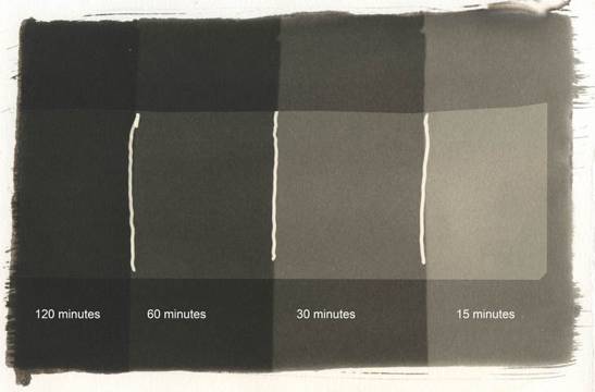
Figure 13: exposure test strip
The exposure time appears to be somewhat related to relative humidity (both ambient and the humidity of the coated paper after drying). When I was using the single bulb I found I could reduce the exposure time from about 3 hours to just over 2 hours by aggressively humidifying the paper by moving the paper, both sides, over a pot of boiling water for about a minute and then letting it rest for five minutes before coating. (Don’t let any steam condense on the paper!)
Hint: for larger prints (where the film the negative is printed on is smaller than the paper) my exposures show a very slight difference where the negative ends on the paper. If, in fact, there is no discernable difference I know there’s a risk that I’m exposing the print for too long, and should think about dialling back the time. For smaller prints (but still printed in 8.5 x 1l Pictorico) since the paper is smaller than the film, I trim off a diagonal corner so I can have a sense of whether or not the print is over exposed – ie: darker than it should be. Once you have a good sense of the impact of humidity you can ratchet up the exposure times slightly so as to get the blacks as black as possible, but if the print looks too dark over the entire tonal range, dial back the exposure time.
______________________________________________________________
Developing Out
Remove the negative and store in a safe place (where it can’t be splashed during any of the subsequent processes). Place the paper, coated side up in a clean dry tray and rapidly pour the Ammonium Citrate developer over the entire print. There’s no need to pour the entire 1 litre, even for 11×14 paper, just enough to fully cover the print, which is about ¾ of the bottle. Tilt the tray back and forth rolling the developer over the image for about 2 minutes. Pour the developer back in the bottle using a funnel.
______________________________________________________________
First Wash
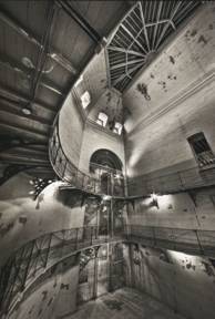
At this point the print (at least using Platine or Bergger paper) is relatively robust. To make the clearing agents last longer, it helps to wash the print under running water until the water runs clear. Using the same tray is fine.
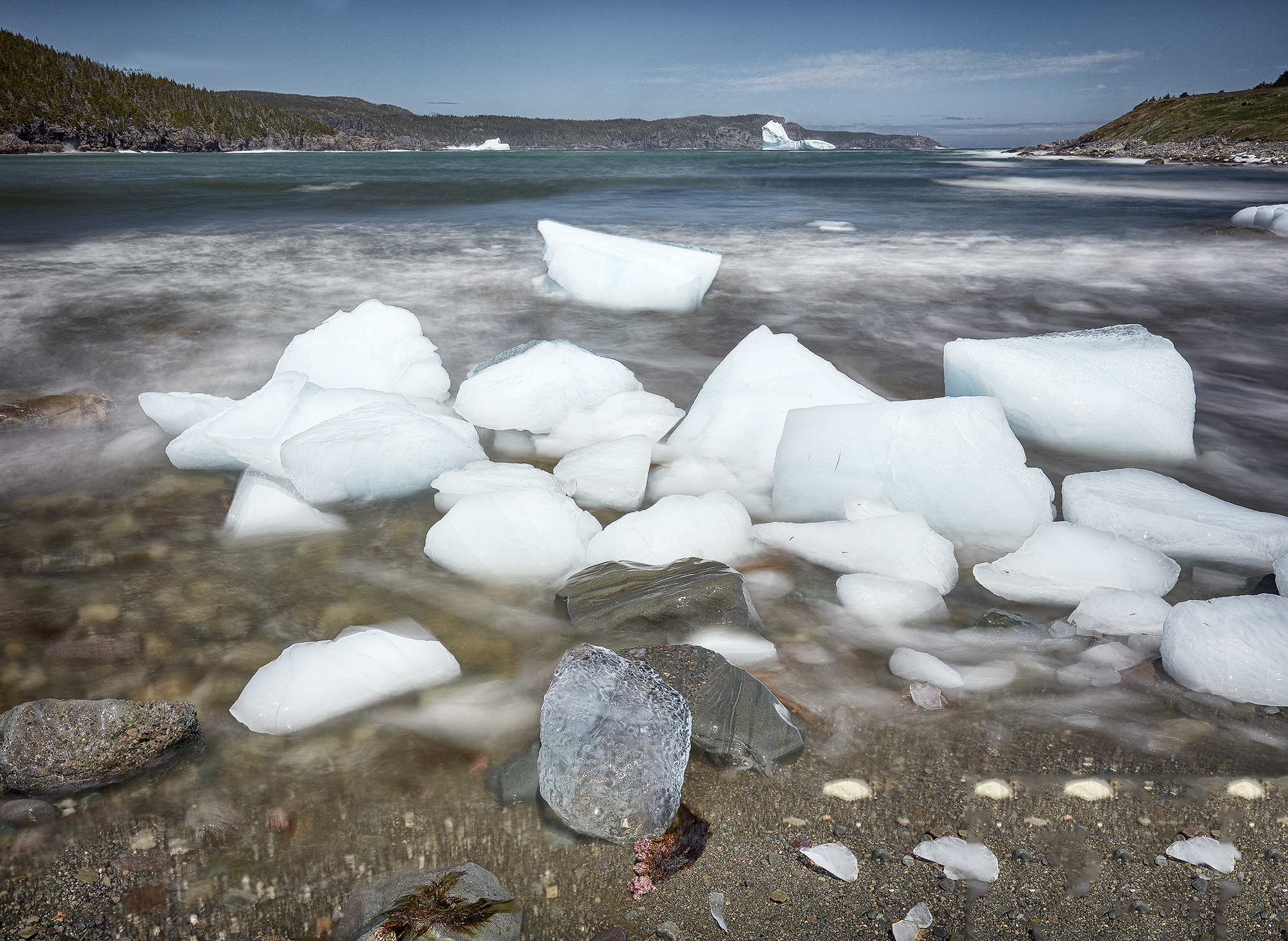
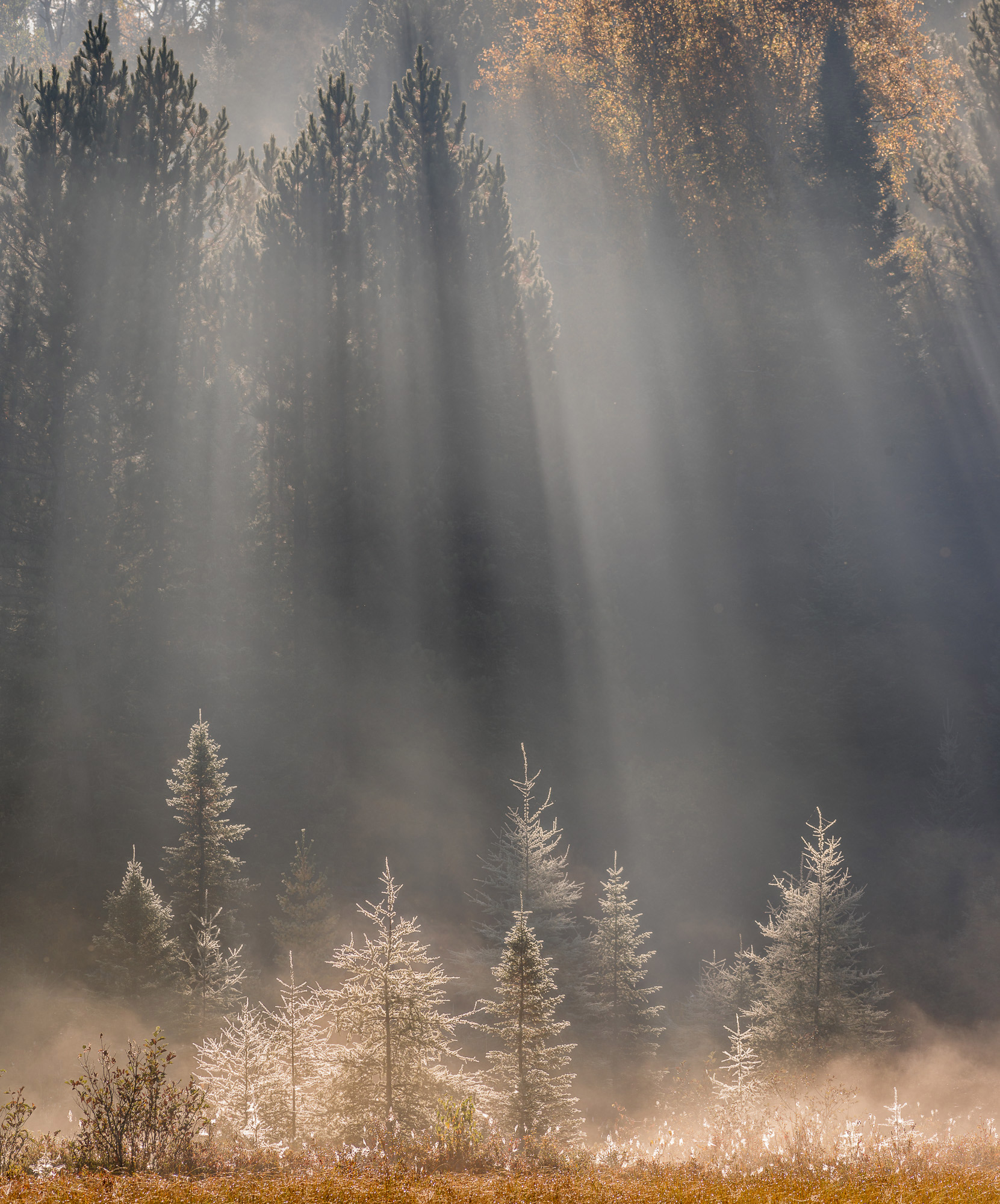
Algonquin Provincial Park, Ontario
Platinum/Palladium Print
______________________________________________________________
Clearing and Final Rinse
At this point the “white” areas of the image will likely have a noticeable yellow cast which is removed by the clearing process. I have two containers of clearing agent (1Tbs EDTA and 1Tbs Sodium Sulphite per litre), and keep the containers identified separately. Two litres in each container works well for 8×10 prints on 11×14 paper developed in a 16×20” tray. Start with the first container and slowly pour over the paper, print side up. I suspect that this initial pour deals with 80% of the residual developer solution. Turn the image face down and leave for about 5 minutes (longer doesn’t hurt). Drain off the clearing agent into the container and pour the second container over the image (again image side up), turn the paper face down and let sit for another 5 minutes. Drain back into the second container. The literature suggests agitating the tray during the clearing process, but I haven’t found that necessary. Nor have I found a third cleaning cycle to add value. I did find that using EDTA alone made the print difficult to clear. Adding an equal amount of Sodium Sulphite nicely solved the problem.
The reason for 2 containers is that over time the first container will become contaminated with the residual developer solution and will start to lose its effectiveness. As soon as the second container starts to become tinted, discard the contents of the first container, which will be noticeably rust coloured by this time, replace with the solution from the clearer, second container, and make a new 2 litre batch for the now empty second container. You should always have clear solution for the second bath.
The final step is to rinse for a few minutes. Initially the paper will feel slightly slippery from the clearing agent. I rinse relatively aggressively with lukewarm water for about a minute then let sit for 5 minutes face up in the water, re-rinse the back and let sit for another 5 minutes, face down. A final rinse on both sides and drain and that’s about it.
Let the print dry lying flat, face up, on absorbent paper or towel. Don’t hang from a clip since the wet paper is heavy enough to stretch a bit as it dries.
That’s all there is to it!!
______________________________________________________________
About Tim Gray
Tim was raised in Calgary Alberta but has called Toronto Ontario home for the past 20+ years. He acquired his first digital camera in 1999, when 2 mpx was considered “high resolution”. His immediate objective was photographing the millennial fireworks from his condo window. That Nikon Coolpix 950 camera, an Epson 1270 printer and the fireworks were enough to trigger a passion for photography that grows every year. Preferring the simple landscape, his photography has taken him from the cityscapes of downtown Toronto to as far afield as Antarctica. Lacking experience in the analog darkroom Tim felt a desire to connect with some of the deep historical roots of photography and acquired a taste for the time honored technique of hand printing with platinum and palladium. Tim’s work (but alas, not the noble metal prints) can be viewed, and he can be reached via his website:www.timgrayphotography.com.
June, 2009

Elevate Your Vision


Read this story and all the best stories on The Luminous Landscape
The author has made this story available to Luminous Landscape members only. Upgrade to get instant access to this story and other benefits available only to members.
Why choose us?
Luminous-Landscape is a membership site. Our website contains over 5300 articles on almost every topic, camera, lens and printer you can imagine. Our membership model is simple, just $2 a month ($24.00 USD a year). This $24 gains you access to a wealth of information including all our past and future video tutorials on such topics as Lightroom, Capture One, Printing, file management and dozens of interviews and travel videos.
- New Articles every few days
- All original content found nowhere else on the web
- No Pop Up Google Sense ads – Our advertisers are photo related
- Download/stream video to any device
- NEW videos monthly
- Top well-known photographer contributors
- Posts from industry leaders
- Speciality Photography Workshops
- Mobile device scalable
- Exclusive video interviews
- Special vendor offers for members
- Hands On Product reviews
- FREE – User Forum. One of the most read user forums on the internet
- Access to our community Buy and Sell pages; for members only.
You may also like