
The outcome of all your efforts is ink on paper,
therefore you better use the best ink and the best paper.
Ansel Adams, paraphrased and adapted to digital printing.
1 – Introduction
I decided to follow my series about Printing in Lightroom with an essay about my favorite printing papers. It is a logical continuation. After writing about printing I wanted to talk about the reasons why I like specific papers and how I use these papers for different purposes.
This essay being about printing papers it would be most appropriate to start it with the printing reflections I featured in my previous essay. It would and most likely I should have. Unfortunately when it comes to reflections and inspiration would and should are wishful wishes because inspiration strikes unexpectedly and leaves without warning. So rather than ponder what could have been and try to re-invite muses that have already visited and departed I decided to start this essay by writing a conclusion to the introduction of my previous two essays in which I talked about papers, printers and printing. This is what I do below (if you did not read my two previous essays you can do so now by clicking here and here). So what is the point of all of this? The point maybe is that there is no point. Or maybe the point is that engaging in a reflection such as the one you are reading now is the point. That it is important to stop for a minute and to look back. To reflect on a process –printing fine art photographs — that seems, so far, to have pushed full steam ahead without ever taking the time to find out where it comes from and where it is headed.
The point maybe is to seek tradition in a process in which there is none yet. The arts — painting, drawing, sculpture, theater, architecture, music, and cinema — all have traditions. Even photography, film photography that is, has traditions. Digital photography however does not seem to have any, or at least not yet or none that I can see. Hopefully one day it will and perhaps, just perhaps, reflections such as these, apparently meaningless and pointless, are one way to establish them. For what are traditions but something we do without knowing why, something we do because it is what we do. The act of referring to things because we have been referring to them apparently forever. Specific words we use or techniques we favor for example. Not as individuals but as a group, as a community. Specific activities, people, times and places. Points of references. Things we do each year, year after year, because it is what we do. Traditions are established over long periods of time, for no particular reason other than that they happen to be there because they are there. Traditions care little about technology and technological improvements. They are more about poetics than about technique.
It is no wonder then that in a medium dominated by technique traditions have a hard time finding their way in. But traditions are important. They are the roots of a practice, of a medium, of a community of artists, of an art movement, of a cultural phenomenon. In pondering what may be the traditions of digital printing, or of digital photography as a whole, I am left wanting. Are there any? Maybe but I do not see them. Maybe it is because I am too close to the medium and cannot distance myself enough to see these traditions. Or maybe it is, quite simply, because there is none, hopefully none yet, not none because there will be none but because we have not had time to establish them yet.

2 – About Printing Papers
I like to think of printing paper as being paper that is more than paper. Printing paper, good printing paper that is, has style. It is attractive. It is beautiful to look at as it is, without an image on it yet. Personally I like slightly off white papers. Just a few points off pure white, a few points less blue and more yellow. Say 247, 247, 258 for example in RGB numbers.
In short good printing paper has class. It makes me want to print on it, to lay a beautiful image on a beautiful paper. It creates desire in me and hopefully, if I do my job right, if the print pleases the client, it will create desire in my collectors as well. The desire to collect, to invest, to buy because art is desire, passion and the inevitability of purchasing, not because one wants to but because one needs to. Needs to have it. Can’t afford to pass on it and miss losing the opportunity to acquire a specific print and add it to their collection.
A good paper has tooth and character. It is visually pleasing. Above all it has aesthetic and artistic qualities. Of course it also has to have technical qualities. The right coating, the proper sheen or gloss, the correct luster or mat finish. It has to have a good D-max because the darkest black is defined by it. It must have a beautiful white tone, not too white or too yellowish. Finding the right combination of artistic and technical aspects is what keeps me searching for the elusive ‘perfect’ paper, the one that will make my prints look just the way I want. A paper that is impressive yet subdued. Attractive but not flashy. Technically perfect but artistically inspiring. Able to convey my message in the best possible way. Voltarian in a word, yet able to deal with the elusive artistic possibilities that art offers to artists, collectors and admirers alike.
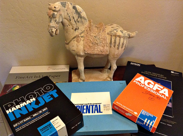
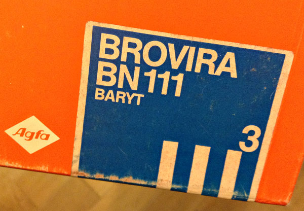
Agfa Brovira was such a paper. Printing on Brovira meant making a statement, visualizing a print like no other because it was going to be made on Brovira. Brovira printing was its own medium in a way, just like creating a Dye Transfer or a Cibachrome print. An image printed on Brovira was more than a black and white print. It wasn’t just printing in black and white because Brovira wasn’t white. It was just the right shade of off-white yellow, a thing of beauty, with a texture to die for. Brovira was passion infused into a sheet of paper. But what paper! Of course if you never printed in a darkroom, or if chemical photography is something that sounds museum-like to you, something historically significant but timely irrelevant today, then you probably will not know what it means to print on Brovira beyond the words I just put down. If so take my word for it, or not, but most importantly find your own Brovira, of it’s look alike rather, or any paper that makes you jump for joy, that excites you, that makes you feel passionate at the prospect of printing on it when you open the box, or better before you open the box, just by looking at the package and visualizing what lays inside, waiting for you to create your next, or your first, masterpiece.
Today Hahnemuhle Baryta or Epson Legacy Baryta are such a papers. I print on them, often, and when I do I think of Brovira. It is the smell of the paper for one does that to me. Baryta has a specific odor, one that reminds me of Brovira and one that inspires me.
3 – My favorite printing papers
Paper is not all about look, texture and D-Max. Selecting the right paper for a specific project also means looking at how the print will be presented. When I work on a project I select the paper based on the nature of the project, how often the prints will be handled and whether the prints will be presented lose, matted or framed under glass.
It all starts with a sheet of paper. It has to be the right one and choosing it takes time. Below is my personal paper selection organized by project type. It details how I go about selecting the paper to use for a specific image or project.
4 – Folios
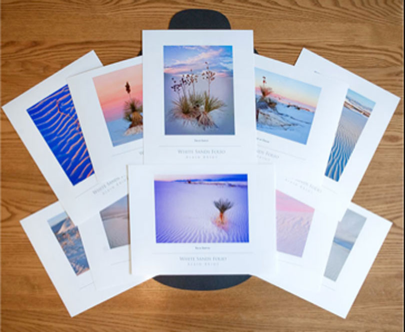
A folio is basically a mini-portfolio. My folios are letter size (8.5×11). The prints are presented lose, non-matted and placed into an enclosure that looks very much like a sturdy envelope. Folios are meant to be looked at by taking the prints out of the envelope and looking at them one at a time. This means a lot of shuffling and moving prints around. To protect the image it is important to use a paper that does not scuff or get scratched easily. A natural fiber paper does not work well because the coating is fragile and tends to flake off if handled frequently. Glossy paper does not work well either because it is get scratched easily and marked by fingerprints.
Taking all this into consideration, my paper of choice for folios is Harman Crystal Jet Luster. I have a stock of it because I believe it is no longer available. However, most luster paper will work as long as it is not too thick. I usually feature 12 prints per folio together with an artist statement, a list of images and a colophon. This means the enclosure has to hold 15 sheets of paper. Because there is only about ¼ vertical clearance in the folio enclosures I use, I won’t be able to fit all 15 papers in it if the paper is too thick.


5 – Portfolios
Portfolios require a different paper than folios. Although the prints in a portfolio are expected to be handled frequently, they are matted. In effect the mat acts as a spacer between prints, protecting them from being scratched and scuffed by rubbing on each other. The mat also protects them from hand contact with the viewer’s hand because the mat, rather than the print, is what will be handled.
My favorite paper for Portfolios is Hahnemuhle Photo Rag Ultra Smooth. I like its texture and look. Most of all this paper has a superb print quality, giving me both saturated yet subtle colors together with the tactile, artistic, and handmade look of a natural fiber paper. All these factors are important for a portfolio because the print quality is essential and because the cost of a portfolio calls for using a premium paper.
I prefer the Ultra Smooth surface to the regular surface because it gives me greater detail with no loss of textural quality.


My Navajoland Portfolio is printed on Hahnemuhle Photo Rag Ultra Smooth paper.
6 – Matted prints
Matted prints are not part of a folio or a portfolio. Being presented individually, matted prints do not have to be all printed on the same paper. This gives me greater freedom in regards to paper choice and lets me select papers based on the requirements of individual images instead of the requirements of an entire project. For this reason I use a variety of different papers for matted prints.
One of the papers I use for matted prints is Hahnemuhle Baryta. I like this paper because it has the look and feel of a chemical paper such as Agfa Baryta. Baryta papers have a barium sulfate coating which gives them an unmistakable odor. I like it because I associate it with fine art printing, both chemical and digital.


I also use the Epson Legacy paper series for matted prints. There are four different papers in this collection:
Epson Legacy Baryta, Epson Legacy Platine, Epson Legacy Fiber and Epson Legacy Etching.
Epson Legacy Baryta and Platine have a luster surface while Epson Legacy Fiber and Etching have a matte, natural paper surface. Each of these four papers has unique surface textures.
Epson Legacy Baryta is comparable to Hahnemuhle Baryta, although each has it’s own specific printing qualities. Epson Legacy Platine is somewhat comparable to Baryta but without the Barium odor and the texture of Baryta. I like both but I choose Baryta more often than Platine. The other two Epson Legacy papers are great when I want to give a handmade, artisanal look to the print. The natural paper surface of Epson Legacy Fiber and Etching gives me the look of a fine art paper for images where I want delicate tones and a matte finish.


7 – Prints framed under glass
When framed under glass the delicate texture of a Baryta or a natural fiber paper disappears. While still there, it is virtually invisible to the eye. Under glass, everything looks glossy. This means that paper texture becomes of secondary importance. What is primary is print longevity and because a framed print leaves little room for paper to ‘breathe’ and expand or contract, having a paper that does not curl when exposed to humid or dry conditions is of primary importance. Therefore, rather than use a natural fiber paper I turn to a polyester base paper for framed prints. The paper surface may not be as exciting as natural paper or a Baryta surface but curling is prevented.
My paper of choice for prints framed under glass is Epson Premium Luster. It is an excellent paper in regards to both print quality and curling. The polyester base guarantees a permanent size that will not be affected by being displayed in humid or dry conditions. When I sell a print I never know where it might end up. While I usually know the location of the original buyer, people move and prints are resold so a print can end up being displayed in widely different conditions, some unexpected. For this reason a polyester based paper such as Epson Premium Luster is an insurance against unknown display environments.
Epson Premium Luster is an excellent all-around paper, not only because of its size and stability but also because it handles a wide variety of images very well, from color to black and white, from saturated to pastel and from soft to high contrast. In fact, I would do very well if I used only Epson Premium Luster. However I would lose the artistic qualities of Baryta and natural fiber papers, qualities that are visible in loose prints.

8 – Spare ink cartridges
Although it is not directly related to paper choice, I need to mention the importance of keeping a set of spare ink cartridges on hand. Of course I should have done this in the previous essay since it focused on printers but I did not because perfection is, well, hard to reach if it is possible at all. Personally I don’ t think it is but opinions on this vary, and which side they veer to is usually proportional to a person’s delusion level.
In any case I usually store my spare ink cartridges with my printing papers so that I can keep an eye on them when I get paper in and out of their boxes. I do so for each of my printers. The reason why this is important is so I do not need to stop printing when ink runs out. If a cartridge shows up as empty and you replace it immediately, not only do you not have to interrupt your printing session, you also do not lose the print currently in the printer. As long as the ink is still wet the next passes of the print head will blend with the previous ones and the fact you had to replace an ink cartridge will be invisible. No one will know. However, if you leave an unfinished print in the printer while you order ink and wait for it to be delivered (or drive to the store if you can find the ink you need locally), the ink will dry and when printing resumes the dry ink will not blend with the new ink. Not to mention that this will tie up your computer with an unfinished job in the queue for anywhere from a couple hours to days or weeks. Not fun. And if you turn off your machine the job is lost. Who wants that?


9 – Conclusion
With hundreds, if not more, beautiful papers to choose from finding the ones you really like and that work best for your needs can take time. It is a process and going through it means testing a variety of papers and seeing how they work for you. Most importantly, this process requires that you make decisions. Testing is fun but it cannot go on forever. At some point decisions have to be made regarding which papers you want keep and which ones you want to put aside. Creating masterful prints is not just a matter of finding the ‘perfect’ paper. It is also, and mainly, about knowing how your work looks like when printed on a specific paper. I have used the same papers for years and while I test new papers occasionally, I keep going back to specific papers not only because I love the way my images look on them but essentially because I know what to expect when I print on them. I can look at the image on screen and know how it will translate into a print on that paper.
10 – Skill enhancement exercises
Here are two skill enhancement exercises for this essay:
1 – Find your favorite printing paper
Test a variety of papers until you find one, or several that you really like. This process may take some time between procurement, testing and selecting. Give it time. When you make your final decision try to have only two or three different papers that you want to use to print serious work.
2 – Work with these papers for a year
Having found which papers you like best, work with them for a year. It takes time to learn how a paper reacts to ink and how it behaves under various printing situations. A paper may work great for images that are light and bright but not so well for images that are dark and require heavier ink load. Other factors may affect print quality as well. Only time can tell what those are and how you like the outcome. For this reason working with a specific paper for a certain length of time is indispensible. Experience is an important aspect of fine art printing.
11 – What’s next?
This series is a suivre. The next episode will focus on the Epson SC-P600 printer.
12 – About Alain and Natalie Briot
I create fine art photographs. Before that I studied painting and drawings at the Academie des Beaux Arts in Paris. I have published four books and over 500 essays in many different publications, both analog and digital.
Besides creating fine art photographs I enjoy landscaping, attending cooking classes, driving sports cars and restoring bicycles. Bianchi, De Rosa and ParkPre are among my favorites together with anything Campagnolo. I like Italian bicycles, bicycle components and cars. It has a lot to do with the passion that the artists and engineers place in the design of their creations. I also like wearing handmade leather driving gloves and worn-out converse shoes.

If you enjoy my essays you will enjoy attending one of the workshops Natalie and I teach together. There is a lot more to photography than reading about it. Nothing replaces being in the field, admiring the light, composing images, creating art, experiencing incredible locations at the best time with the best light. Great landscapes, great companionship, like-minded participants and learning how to improve your work by finding out what works and what you need to improve upon, all combined to create unique events that will change how you approach fine art photography and will show you how to take the next step with your work.
Our workshops focus on both the artistic and the technical aspects of photography. Our goal is to help you create photographs that you will be proud of and that are unique to you. The locations we photograph include Navajoland, Antelope Canyon, Monument Valley, Zion, the Grand Canyon and many others. Our workshops’ listing is available at this link: http://beautiful-landscape.com/Workshop-home.html

You can find more information about our workshops, photographs, writings and tutorials by subscribing to my Free Newsletter on my website at http://www.beautiful-landscape.com.
Alain Briot, Arizona
January, 2018

Lorem ipsum dolor sit amet, consectetur adipiscing elit, sed do eiusmod tempor incididunt ut labore et dolore magna aliqua. Ut enim ad minim veniam, quis nostrud exercitation ullamco laboris nisi ut aliquip ex ea commodo consequat. Duis aute irure dolor in reprehenderit in voluptate velit esse cillum dolore eu fugiat nulla pariatur. Excepteur sint occaecat cupidatat non proident, sunt in culpa qui officia deserunt mollit anim id est laborum.
You May Also Enjoy...
Celebrating Alternative Photography: Cyanotype Prints with Ashok Viswanathan
FacebookTweet By: Ashok Viswanathan – FFIP, EFIAP.PPSA Cyanotype is one of the earliest printing processes, dating from 1842 by Sir John Herschel, shortlyafter the discovery
Celebrating Alternative Photography: Mastering the Van Dyke Process with Ashok Viswanathan
FacebookTweet Long-time Lula member, Ashok Viswanthan, kindly offered to share his approach and methods for alternative photography processes. I hope you enjoy his detailed “how-to”
