The holy grail of digital printing is to be able to get the image that you print to appear as close as possible to what your screen displays. The first ingredient in this quest is to ensure that your screen is properly profiled. This was once a mysterious and expensive prospect, but now most experienced photographers understand that they need to buy a colorimeter for a hundred dollars or so, and profile their screen on a regular basis.
Of course the second step is to print using accurate profiles. These may be available from your printer or paper maker. Preferably you should have custom profiles made foryourprinter,yourpaper andyourinks. Unless you frequently switch papers this isn’t terribly expensive to have done. There are quite a few services online that will do this for you. The best profiles though are likely ones that you make yourself, but this requires spending at least $1,000 and involves the purchase of a spectrophotometer and accompanying software. For anyone using different printers and testing new papers as they come out, this ultimately ends up not being that big an expense.
Regardless of where the profiles come from though, using them is a must for any serious printing.
But, even with a proper profile for your particular screen, as well as printer / paper / ink combinations, many photographers are often disappointed with the results. What appears on screen simply doesn’t match what is seen on the print, especially with regard to colour intensity and saturation.
There is a solution, and it’s known as soft proofing.
_____________________________________________________________________
Soft Proofing
Soft proofing is simply a mechanism that allows you to view on your computer monitor what your print will look like when it is on paper. A specific paper. That paper and ink combination has been defined by the profile that you or someone else has made for your printer / paper and ink combination. When a printer profile is made the colour of the paper is one of the factors that is figured into the profile, because the spectrophotometer is reading the combination of the ink, and the paper that lies beneath it.
So, if you were able to view your imagethroughthe printer profile, you would be able to see how that particular combination of ink and paper would reproduce it, taking into account the gamut as well as other characteristics of the inks used.
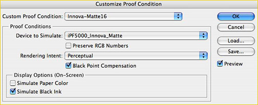
Fig #1
Figure #1above shows what is displayed when you selectView / Proof Setup / Customin Photoshop. If you now select the pull-down available next toDevice to Simulateyou will see a long list of profiles that are found on your computer, including the printer profile that you are interested in printing with, and therefore soft proofing.
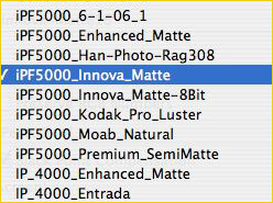
Fig #2 & #3
Figure #2shows a partial list of the profiles that are found on my computer, including in this case the paper profile that I would like to soft proof through. By selecting it along with a preferredRendering Intent(either Perceptual or Relative, and you’ll need to experiment to see which is preferable for any given image), you are now able to turn on soft proofing by pressingCTRL / CMD Y. This key stoke allows you to toggle back and forth between the image that you’ve been editing and the way that the image will look when it’s printed out.
_____________________________________________________________________
Image Editing
Well,that’s nice, you may say. But by doing this the image looks really crummy. Sort of washed out. That’s because paper simply can not reproduce the dynamic range that a monitor can. The range is about 100:1 to 150:1 for a print, and as much as 300:1 or even 500:1 for a screen. Also, the gamut of the screen and the paper / ink combination are different.
So – what can be done about it?
There are a couple of approaches. One is to turn onGamut WarningwithSHIFT / CTRL/CMD Y. If any of the colours are going to be out of the printer’s gamut, they will be indicated, and you’re then able to use various tools within Photoshop to bring the colours back into gamut, such as through the use of the Saturation control.
But the problem with this is that you really don’t know how the out of gamut colours are going to reproduce, and this often leads to needlessly desaturated prints.
A much better approach is as follows.
– duplicate your on-screen image.Image / Duplicate
– then useWindow / Arrange / Match zoom and Location
– turn off soft proofing on the new copy.CTRL / CMD Y
– switch to the soft proofed version
– use any of the image editing tools available (Levels, Curves, Hue & Saturation), preferably on anAdjustment Layer, to try and visually bring the soft proofed image close to the appearance of the one you have just created on screen. You may not be able to do it exactly, but likely it will be a much better image than what would result if you printed without soft proofing and those adjustments.
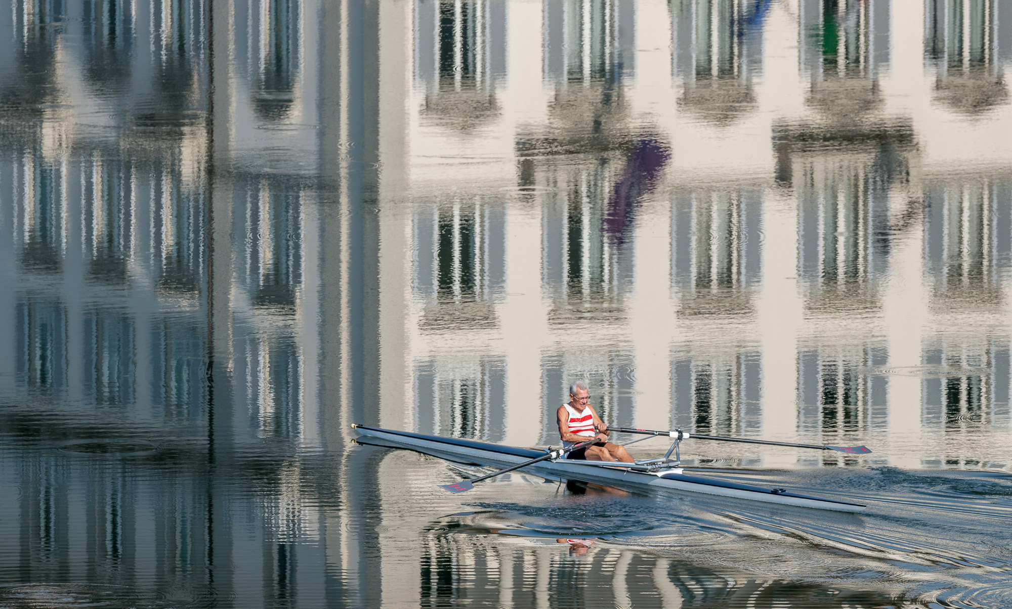
Figure 4.
Left side shows Soft Proofing On.

Because of the conversion to sRGB for web display,Figure 4above doesn’t show as much difference as it does on my screen. But if you look at the foreground shadow area on the left-side image (displayed with soft proofing on), there is a quite noticeable difference.
Most imaging experts agree thatSimulate Black Inkshould always be left on. With this set you are quite able to judge the colour gamut of the print on-screen through the soft proof. If you turn onSimulate Paper Coloryou will now be able to judge dynamic range as well. But, the image on-screen will look washed out compared to the original image. The reason for this is that the whites will no longer be as bright as the monitor can display. The trick is to remove all user interface elements from the screen so that your eye sees nothing whiter than the whites on screen that are in the image.
You’ll need to be aware of this behavior, and so my recommendation is to start off withSimulate Paper Colorturned off, until you become familiar and comfortable with how what you’re seeing will translate onto paper.
June, 2006


Elevate Your Vision


Read this story and all the best stories on The Luminous Landscape
The author has made this story available to Luminous Landscape members only. Upgrade to get instant access to this story and other benefits available only to members.
Why choose us?
Luminous-Landscape is a membership site. Our website contains over 5300 articles on almost every topic, camera, lens and printer you can imagine. Our membership model is simple, just $2 a month ($24.00 USD a year). This $24 gains you access to a wealth of information including all our past and future video tutorials on such topics as Lightroom, Capture One, Printing, file management and dozens of interviews and travel videos.
- New Articles every few days
- All original content found nowhere else on the web
- No Pop Up Google Sense ads – Our advertisers are photo related
- Download/stream video to any device
- NEW videos monthly
- Top well-known photographer contributors
- Posts from industry leaders
- Speciality Photography Workshops
- Mobile device scalable
- Exclusive video interviews
- Special vendor offers for members
- Hands On Product reviews
- FREE – User Forum. One of the most read user forums on the internet
- Access to our community Buy and Sell pages; for members only.
You may also like