By Charles S. Johnson, Jr.
PART II:
Understanding What Makes a Good Image and Learning How to Use That Knowledge
New cameras don’t just capture photons; they compute pictures, Brian Hayes
Finally I found in the appearance of the real world the same abstraction as in pictures, René Magritte
______________________________________________________________
Why do images attract or repel?
Now we come to the crux of the matter. Why do we respond as we do to art? It is easy and fun to speculate. Consider the following suggested “attractants”:
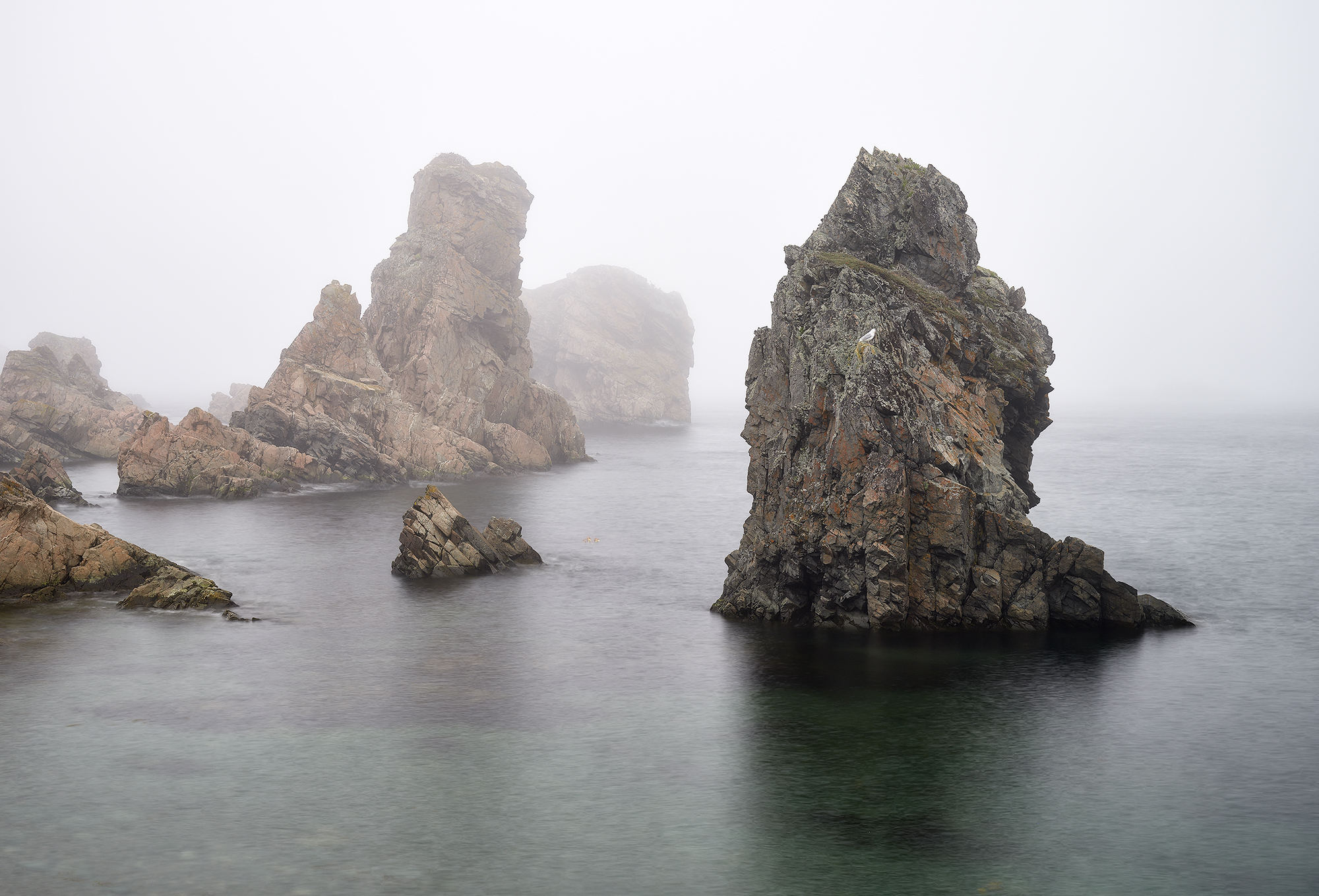
Representations and reminders of stimulating experiences: Representational art certainly reminds us of people and events. Food, games, combat, and attractive people are all featured in popular art. This brings to mind good documentary photography that has impact and evokes feelings. At a deeper level all art represents nature, and some universally satisfying features of images reveal our evolutionary past. Natural landscapes are preferred, especially ancestral landscapes like the African savanna. Furthermore, images of natural objects such as mountains, clouds, and trees often reveal patterns that repeat at increasing magnification. For example shorelines may have a similar appearance, at least statistically, when viewed from 1000 ft, 5000 ft, and so on. The complexity of these images can be characterized by a similar “fractal” dimension, and it turns out that observers prefer images that have the fractal dimension of nature even for things like skylines of cities.
Sexual stimulation, overt or subconscious: At the simplest level images may remind the viewer of sex objects or sexual activities that are stimulating. The suggestions may be more subtle as, for example, hidden faces or subliminal images in artworks. It has been suggested that Stone Age cave paintings contain abstract representations of vulva. At a different level art may serve as the plumage of the artist to impress potential mates, ostrich. Similarly, the ability to appreciate art or even afford art can confer status.
Curosity/inquisitive tendency: Animals tend to explore neighboring areas even when food is plentiful in the vicinity. This can have survival value when environmental conditions change, and curiosity appears to be an essential feature of our genetic makeup. This may explain the stimulating effect of art since art involves novelty as well as repetition. In our search for novelty we travel to new places, we visit museums, and sometimes we even attempt to create art. This line of thought fits well with the idea that all forms of fictional experience including art, drama, and imagination play an important roll in organizing the brain – a major adaptive task throughout life. 1
This list is intuitive and may capture important attributes of art, but it is in the category of suggestions or maybe “trial balloons” rather than proofs. Experience shows that the brain is not only capable of creating art and judging art, but that it is inclined to commit its resources in those directions. In recent decades functional imaging of the brain by neuroscientists has revealed details of the operation of the visual system and has pinpointed areas of the brain that are involved in various tasks. This is very encouraging to those who are attempting to discover the biological basis of art creation and appreciation. However, we are very far from being able to understand anything about our emotional response to art from physical studies of the mind in action.
At this stage we must be satisfied with a descriptive approach based on cataloging the way the mind perceives and reacts to art. This is an experimental study, and through the millennia artists have unknowingly served as neurologists in determining which constructions and compositions stimulate the mind. Our museums are filled with works of art that have stood the test of time, and every day new works of art including all varieties of photographs are competing for approval. The take home message is that we already have a vast collection of works of visual art that have been found to stimulate the mind, and this reveals to us the way the mind functions. We can use the successful features of works of art in new creations, and we are free to experiment with new art forms to determine their compatibility with the structure of the human mind. Humans have very similar visual capabilities, but our schemata are all different. This accounts for subjectivity in the evaluation of art; but, in spite of that, there is wide consensus on what represents good art.
What we can learn from successful images: Just as the conscious mind thrives on the consistency and stability of our world view in spite of the plethora of sensations and the jumpy nature of eye movements, it responds favorably to simplicity in framed images. That does not mean that details should be missing, but rather that there is a center of attention and a minimum of distractions. The eye should be directed into the most important areas by visual clues and should not be confused by areas of equal importance. Similarly, framed images are favored that are balanced and are not boring. This has to do with composition, that is to say the location of features that have been selected for inclusion by the artist and their effect on the overall impact of the work.
Beyond the simple admonitions to keep it simple and avoid distractions, we can list features that have found favor with most observers. These guidelines to composition can save time and, to some extent, substitute for experience for beginning photographers. With digital photography, where each captured image costs practically nothing, it is all too easy to shoot away without planning and later to realize that the compositions lack something important. I believe that lists of guidelines can increase awareness about composition and motivate planning by photographers. They may also forewarn about likely reactions of critics.
With the usual caveat that guidelines are not rules and that there are exceptions to all of them, I list a selection of guidelines that are frequently encountered.
1. Establish a major object or area of interest. It should be easy to answer the question, “What is the subject of this photograph?” The object of interest can be isolated by means of placement, background, and depth-of-field. In some cases natural lines and contours can be used to direct the eye to the subject. Natural frames within the image can also be helpful.
2. Avoid distractions. Some of the major distractions are competing points of interest such as bright areas especially at the edges, large fuzzy areas in the foreground, busy backgrounds, and lines that run directly to a corner.
3. In general avoid placing objects directly at the center of the frame unless symmetry demands it. Center placement, especially of small objects, makes balance difficult and tends to be boring. As a corollary, avoid placing the horizon exactly in the center of a picture. The subtle difference in composition of Figs. 1 (a) and (b) is sufficient for most observers to find (b) more pleasing.
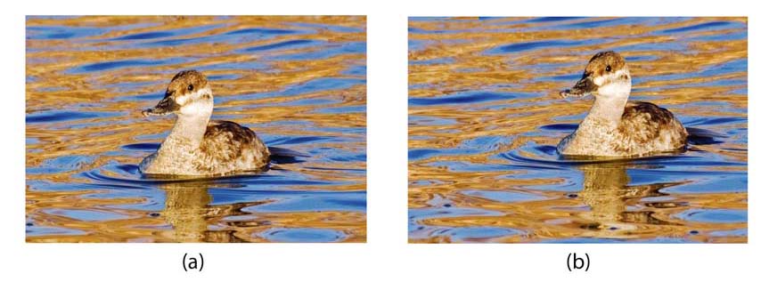
Figure 1: Placement of objects on and off center.
4. Consider using the rule of thirds. Divide the image into thirds in both the horizontal and vertical directions by means of imaginary lines to make nine blocks. The crossing points of these lines, namely one-third of the way in from both the vertical and horizontal edges, make favorable “hot spots” for the placement of objects or points of interest in the image. Placement at a crossing point works for the geyser in Fig. 2; however, the symmetry and size of the orchid in Fig. 3 leaves little choice about placement.
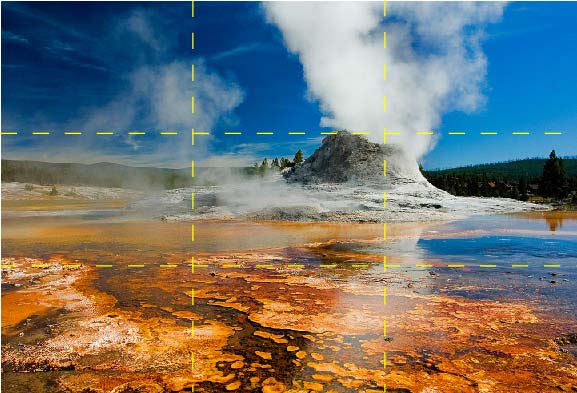
Figure 2: Castle Geyser and the rule of thirds.
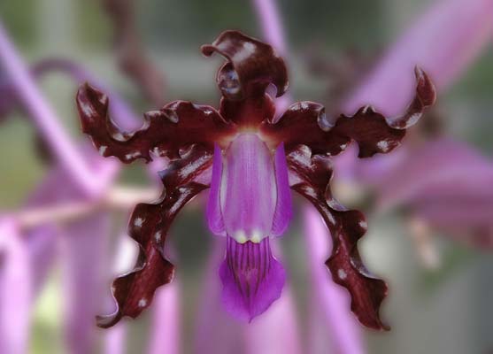
Figure 3: Orchid symmetry controls the composition.
5. Give moving objects extra space in front for their anticipated movement. This is obviously desirable in most cases. In the event that the moving object has a “tail” such as the wake for a boat or the jet trail of an airplane, it may be better to assume that the tail is part of the object.
6. Avoid awkward clipping of objects or features at the edge of images. For example, windows in walls should usually be totally in or out of the frame. Tight cropping to show a face or perhaps a waist length portrait may be fine, but avoid clipping small parts. For example, try not to clip a hand or an ankle and foot.
This list simply attempts to put into words some of the features that contribute to our like or dislike of certain images. Sometimes placement is so obvious to most people that a rule is superfluous. Consider, for example classic portraits created over many decades of faces that show two eyes. The faces are seldom straight on, and the dominant eye tends to be in the exact center of the canvas with remarkable consistency. The location of noses and mouths is much more variable. This observation is interesting but not particularly helpful.
With all this discussion of composition, one should not lose sight of the importance of subject matter. A valid criticism of any work of art is that there is no inherent interest in the subject. This immediately gets us into the most subjective part of art criticism. One photographer may find art in the placement of a cigarette butt on a sidewalk or the location of a weed growing from a crack in concrete while another photographer is bored stiff by the same subjects. The choice of the subject is quite personal. I personally am attracted to images that help me see the world in a new way. That might mean detail and colors in insects and birds, frozen action in sports, or composition and color in landscapes. The reader can insert their choices here as well.
______________________________________________________________
According to the aphorism, “knowledge is power,” and knowledge of the characteristics of the human visual system should impart some advantage to photographers and other artists. I suggest two strategies for the use of this knowledge. The first and more serious one has been used by successful painters perhaps without their understanding. Thus artists have given conventional images extra impact through the use of unrecognized illusions. For example there is impact resulting from the use of equiluminant objects and backgrounds. 2 A commonly cited example is Monet’s “Impression Sunrise” that is shown in Fig. 4. When properly reproduced, the solar disk and its background have the same luminance, and for many observers the sun attracts attention because our visual system has a hard time fixing its position.
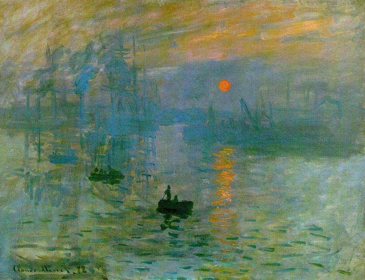
Figure 4: Monet’sImpression Sunrise
There are also illusions of motion resulting strictly from the geometry of an image, and in particular from closely spaced lines of high contrast. High contrast layers adjacent to equiluminant layers can impart the impression of motion. Here again Monet comes to mind for his genius at making water appear to flow in his paintings. I have put together an illustration of this effect in Fig. 5 where I hope the reader will experience a sense of flow in the solid areas.

Figure 5: Impression of flow, a visual illusion.
Still in the category of conventional images I would mention hidden images within pictures that take advantage of the human propensity to recognize faces from a minimal set of clues. 3,4 A famous example is Salvador Dalí’sThe Slave Market with Disappearing Bust of Voltaire(1940). Numerous examples can be found online, but as far as I know they have been limited to paintings. However, with the capabilities of readily available photo processing software, the introduction of hidden images is within easy reach.
The second category of images, suggested by the operation of the human visual system, are images that have been designed to have shock value by defying the built-in assumptions of our bottom-up awareness system (inductive inference engine). 5 By that I mean images that at least at first glance appear to represent impossible or extremely unlikely situations. Images that provide contradictory clues for determining depth are easy examples. In Fig. 6 three identical images of an egret are located in a beach picture to give conflicting clues about size. The basic rule is that the perceived size of an object projected on the retina is proportional to the perceived distance to that object.
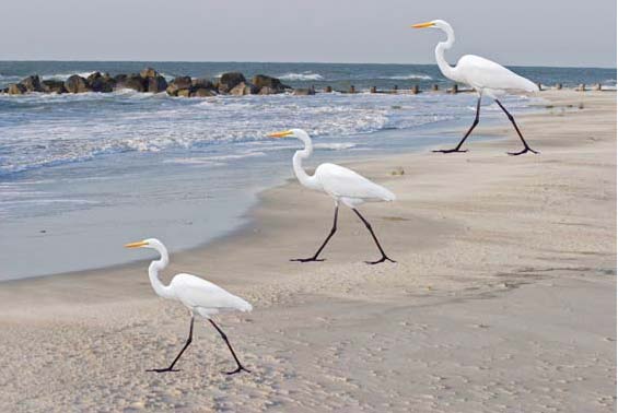
Figure 6: Identical images of an egret in three locations.
Visual dissonance is a state of psychological tension that results from seeing something that is different from what one expects to see. Functional imaging studies show that this state leads to the activation of more areas of the brain that would be required for the processing of expected scenes. This increased stimulation may lead to attraction or repulsion, but at least it is different. Surreal art such as that created by René Magritte and Man Ray provides numerous examples. 6 In Fig. 7 I show a composite photograph motivated by the work of Magritte.

Figure 7: Moon Space, a hole in reality.
Here the illusion of the Moon over the Sandia Peak is disturbed by a look at the dark space. Another example of dissonance results from impossible reflections in mirrors. A fanciful mirror photo of the impossible is shown in Fig. 8.
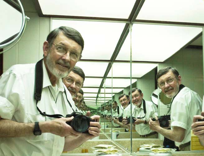
Figure 8: Me me me …
______________________________________________________________
Conclusions
This brings me to the end of my excursion into art in photography. The take-home message is that the world as we perceive it is a creation of our brains based on limited information. It depends not only on the capabilities and limitations of the human brain, but also its history of visual stimulation. Art exists because (1) the human mind enjoys stimulation by visual images and (2) the response of our visual system is sufficiently universal that we can share the pleasures of visual aesthetic stimulation with others. Artists through the millennia and neurologists more recently have discovered empirically what types of images appeal to the human mind, and the experiments continue to our great benefit. What I have learned from this study is something about how the human mind copes with the limitations of our visual system, and more importantly that there is a vast world of wonderful art to be enjoyed. And last, but not least, there is still a world of wonderful art yet to be created by us photographers and other artists.
______________________________________________________________
Notes
1. Gazzaniga, M. S.,Human, (HarperCollins Pub., New York, 2008).
2. Livingstone, M.Vision and Art(H. N. Abrams, Inc., New York, 2002).
3. Solso, R. L,Cognition and the Visual Arts(MIT Press, Cambridge, MA, 1994).
4. Solso, R. L,The Psychology of Art and the Foundation of the Conscious Brain(MIT Press, Cambrdge, MA, 2003).
5. Palmer, S. E.,Vision Science(MIT Press, Cambridge, MA, 1999).
6. Meuris, J.,René Magritte (TASCHEN America, Los Angeles, CA, 2004)
______________________________________________________________
Excerpted fromScience for the Curious Photographer.
©2009 Charles Sidney Johnson, Jr.
Charles S. Johnson, Jr. taught physical chemistry at the University of Illinois at Urbana, Yale University, and The University of North Carolina at Chapel Hill where he held the title of Smith Professor of Chemistry. He has publised approximately 150 papers on magnetic resonance and laser light scattering as well as books on laser light scattering and quantum mechanics.
His interest in photography goes back to the 1950’s; however, for many years his career in science left little time for serious photography. Now he is making use of his scientific background to research and write about the physical and psychological bases of photography. His recent book,Science for the Curious Photographer, includes discussions of light and optics, sensors, and the human visual system. In addition, it provides an introduction to human perception of color, appreciation of art, and cognitive limitations. The table of contents and additional excerpts from this book can be found at photophys.com. Arrangements for hardcopy publication have not yet been completed
June – 2009

Elevate Your Vision


Read this story and all the best stories on The Luminous Landscape
The author has made this story available to Luminous Landscape members only. Upgrade to get instant access to this story and other benefits available only to members.
Why choose us?
Luminous-Landscape is a membership site. Our website contains over 5300 articles on almost every topic, camera, lens and printer you can imagine. Our membership model is simple, just $2 a month ($24.00 USD a year). This $24 gains you access to a wealth of information including all our past and future video tutorials on such topics as Lightroom, Capture One, Printing, file management and dozens of interviews and travel videos.
- New Articles every few days
- All original content found nowhere else on the web
- No Pop Up Google Sense ads – Our advertisers are photo related
- Download/stream video to any device
- NEW videos monthly
- Top well-known photographer contributors
- Posts from industry leaders
- Speciality Photography Workshops
- Mobile device scalable
- Exclusive video interviews
- Special vendor offers for members
- Hands On Product reviews
- FREE – User Forum. One of the most read user forums on the internet
- Access to our community Buy and Sell pages; for members only.
You may also like