by
Alain Briot
1 – Introduction: The nine color harmonies
In order to create a specific color palette for a photograph, colors need to be organized. This is done by using one of several color arrangements. These different color arrangements are called Color Harmonies. They are called harmonies because the goal of these arrangements is to create harmonious color palettes.
There are nine different color harmonies. In this series of essays we are going to study examples of all nine harmonies. In doing so I will go over what each harmony consists of and provide examples of each harmony.
2 – The three variables of color
Color is influenced by three variables: hue, saturation and luminosity. To create a specific color harmony, all three variables of color need to be modified. This is done in the software, either in the raw converter or, for a higher level of control, using layers in Photoshop.
Here is s short description of the three variables of color:
A – Hue
Hue refers to the name of a color. For example blue, red, yellow, etc.
B – Saturation
Saturation, which is also called chroma it is the intensity of a color. High saturation colors are bright and colorful while low saturation colors are less colorful and appear dull.
C – Luminosity
Luminosity, which is also referred to as value, is the lightness or the darkness of a color. Any color can be made lighter or darker. In painting this is achieved by adding black or white to a color. In photography it is achieved by increasing or lowering the exposure of the image either in the camera or in the software. In a photograph areas that receive a lot of exposure are more luminous than areas which received little exposure.
3 – Monochromatic color harmony
The first color harmony we are going to study is the Monochromatic color harmony.
In a Monochromatic color harmony we use any single color plus tints, shades and tones of the same color. For example orange with black, white and grey added.
A tint is a color to which white was added, a shade is a color to which black was added, and a tone is a color to which grey was added.
In a monochromatic color harmony the hue stays the same in the entire image. Only the saturation and the luminosity of the color changes.
Very delicate effects can be created with this harmony because the use of a single color lends itself to subtlety and refinement in art.

Monochromatice color harmony shown on a color wheel
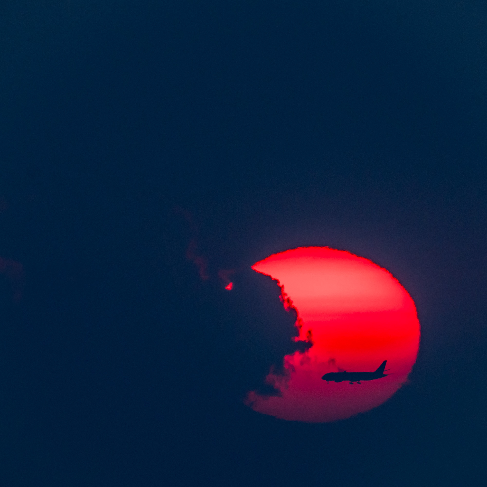
4 – Example: Bryce Canyon Sunrise Fog
This photograph was taken at sunrise in Bryce Canyon National Park. There was a heavy layer of fog over the canyon. The sun was rising behind the fog, giving the fog an orange glow. The whole scene exhibited a natural monochromatic color harmony, the color being composed of variations of orange tones, some lighter, some darker, some more saturated and some less saturated.
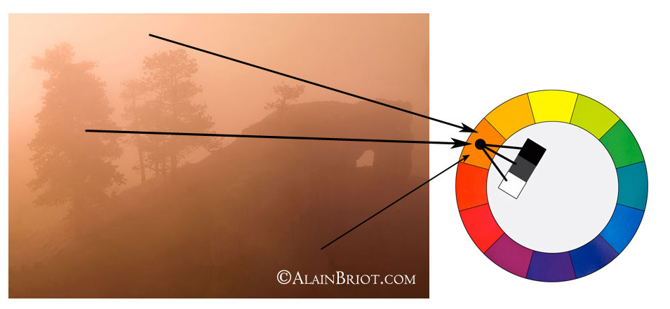
Bryce Canyon in Fog Color Harmony
5 – Remarks on this color harmony
– This color harmony is found frequently in nature on overcast, pre-dawn, or post-dusk lighting conditions
– Only 1 color is present but in luminosity and saturation levels
– This is a very effective and artistic harmony
– In this harmony, as with many aspects of art, less is more
– This harmony is minimalist by definition
6 – Continuing your studies
Color harmonies are one of the most important aspects of a personal style. If you are working on developing your personal style, take a look at my just-released Personal Style Master Class Workshop on DVDat this link. A free 20 pages ebook table of content is available together with a limited time special offer. The Personal Style Master Class is designed to help you develop a personal style.
About Alain Briot
Alain Briot creates fine art photographs, teaches workshops and offers DVD tutorials on composition, image conversion, optimization, printing and marketing. Alain is the author ofMastering Landscape Photography.Mastering Photographic Composition, Creativity and Personal StyleandMarketing Fine Art Photography. All 3 books are available in eBook format on Alain’s website at this link:http://beautiful-landscape.com/Ebooks-Books-1-2-3.html
You can find more information about Alain’s work, writings and tutorials as well as subscribe to Alain’s Free Monthly Newsletter onhis websiteathttp://www.beautiful-landscape.comTo subscribe simply go tohttp://www.beautiful-landscape.comand click on the Subscribe link at the top of the page. You will receive information on downloading the table of contents, plus over 40 free essays by Alain, immediately after subscribing.
Alain welcomes your comments on this essay as well as on his other essays available. You can reach Alain directly byemailing himat[email protected].
Alain Briot
Vistancia, Arizona
September, 2012

Elevate Your Vision


Read this story and all the best stories on The Luminous Landscape
The author has made this story available to Luminous Landscape members only. Upgrade to get instant access to this story and other benefits available only to members.
Why choose us?
Luminous-Landscape is a membership site. Our website contains over 5300 articles on almost every topic, camera, lens and printer you can imagine. Our membership model is simple, just $2 a month ($24.00 USD a year). This $24 gains you access to a wealth of information including all our past and future video tutorials on such topics as Lightroom, Capture One, Printing, file management and dozens of interviews and travel videos.
- New Articles every few days
- All original content found nowhere else on the web
- No Pop Up Google Sense ads – Our advertisers are photo related
- Download/stream video to any device
- NEW videos monthly
- Top well-known photographer contributors
- Posts from industry leaders
- Speciality Photography Workshops
- Mobile device scalable
- Exclusive video interviews
- Special vendor offers for members
- Hands On Product reviews
- FREE – User Forum. One of the most read user forums on the internet
- Access to our community Buy and Sell pages; for members only.
You may also like