SMP’s Third Anniversary: A Digital Black and White Update
The Imaging Factory ConvertToBW Pro v.3 and MIS Ultratone EZN "Carbon on Cotton" Printing
Here we go again!
The hands of the clock have spun and spun, the pages of the calendar have flown off one after the last, and here we are at the third anniversary of this column. As best I can figure, it has somewhere between 20,000 and 80,000 unique viewers each month, a small but respectable audience. It appears on three of the largest and best photography websites in the English language, and is translated into Polish, Portuguese, Hungarian, and Greek, appearing on excellent photo websites in those languages. It’s now monthly, rather than weekly. Despite this, I’m still way behind on many of my 40 other projects. I really, truly need to prioritize, I know. If all goes well and I manage to avoid any setbacks, by the time one more month goes by I will have a) finished the book, b) delivered the next issue of the newsletter, and c) have actually written the column I promised you last month, "The First Annual 37th Frame Lens Awards."
Instead, I want to talk about two things today: first, basic, practical instructions for using a truly wonderful black and white tool, The Imaging Factory’s wonderful ConvertToBW Pro v.3. Second, I wanted to bring you up to date on my experiences with the MIS EZ "carbon on cotton" archival inkjet printing option, which I’m provisionally quite enthused about, as you’ll see.
I’m also pleased to announce that, beginning with either this issue or the next, I’ll be writing a column in every issue of the American magazineCamera Arts. The magazine’s new owner, Tim Anderson, has asked me to write about culture and art, and at greater length than I do elsewhere. This is an invigorating opportunity for me, since in the past I’ve written disproportionately about gear. In my first column, I write about something I almost never discuss – how I personally practice photography, and why. It’s adapted from an older essay that has never seen the light of day, but which I think is one of the three or four best things I’ve ever written about photography. It’s close to my heart, at any rate. I do hope you’ll check it out.
ConvertToBW Pro v.3
I’m always wary of writing reviews of things I don’t really know backwards and forwards and inside and out. When I used to write camera reviews (for print, I mean), my personal rule with myself was that I’d use the camera daily for three months before writing about it. Why tell the reader what he or she can figure out standing at the camera store counter?
It’s much more difficult to write about software, because there are so many permutations, variations, and differences in skill levels and judgment. When writing about darkroom skills, comments about a print developer, let’s say, are more or less universal. Everybody reading may use different print developers, but they’re all similar enough and they all do more or less the same thing, so what a magazine writer says about them can be applied by most anyone. With software, sometimes all you need is to be writing about a different version than the reader has, or for a different platform, and everything you write may be completely useless.
So, okay: The Imaging Factory’s totally great black-and-white converter is a) for Mac OS X only, and b) a plug-in for full Photoshop, and c) pricey. So if you don’t have full photoshop on a Mac and/or can’t or don’t want to spend a hundred bucks just for a B&W converter, we’ve just parted ways. What followsmightbe interesting to you anyway, but in case you don’t think it will be, skip ahead to the next section, which is pertinent whether you have a Mac or a PC and regardless of what imaging processing program you use.
There are all sorts of ways to convert a color digital image to B&W. Some cameras have it as a capture option; you can click on "grayscale" in most image-processing programs; and there are various different ways you can do it in Photoshop, such as using Channel Mixer. Then there are a number of freeware, shareware, and commercial applications, several but by no means all of which I’ve tried. This column’s home base is The Luminous Landscape, and thanks to a recent recommendation from Michael Reichmann, the site’s proprietor, calledThree Must-Have Photoshop Plug-ins, I got turned on to what I think is a really great one: ConvertToBW Pro v.3.
The critical thing I’ve noticed with all conversion programs is that there is so much flexibility that the problem is nothowto get something done, butwhatyou want to do. Looking at B&W images all over the internet, I’ve seen a wild variance in peoples’ judgment. Some people really know what a B&W picture should look like; others appear to have absolutely no idea; and there’s a wide spectrum in between.
So rather than simply list all the plug-in’s features giving equal emphasis to all, I thought I’d map out how to proceedconceptually, to help you best arrive at the version that’s best for each picture.
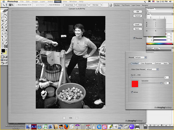
The three-window plug-in interface, with Photoshop open behind it.
I advise setting the levels on the picture while it’s still in color, especially if it’s a JPEG. After opening the plug-in, the first thing you want to do is make the picture as big as you can. Size the main window to your monitor and increase the image size using the plus and minus buttons underneath the image. Next, in the secondary box, click on the "Prefilter" tab. Make the function active by checking the "Active" box on the lower left. Set the saturation fairly high, around 90%.
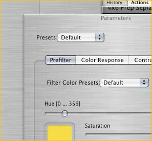
A detail of the prefilter slider, set for a high-saturation yellow filter.
Now, what you want to do is to slide the "Hue" slider back and forth, quickly at first and then slowly. This is the equivalent of using colored filters on your lens. A box underneath the slider shows the color of the "filter." Gradually, start to decide what positions look best to you.Take your time– this is where you want to let things sink in. Pay special attention to the skin tones if there are people in the picture. Notice the separation between important elements in the picture, and any place where lack of tonal separation causes visual confusion. If you find a couple of positions you like best, shuttle back and forth between them. When you decide on the position you like, look away from the computer for a minute or two and then look back to see if it’s really what you like. It’s easy to get lost in all the variations when staring at the picture.
When you’ve arrived at your "best choice," experiment a bit with the "Saturation" slider. This just makes the "color filter" on your "lens" stronger or weaker. In the old days, Leitz used to make five different strengths of yellow filter, for example (I think, anyway – color filters is one thing Jim Lager doesn’t cover in Volume III ofLeica: An Illustrated History: Accessories). Now you have even more choices, and in every color. Color me happy.
Next, make Prefilter inactive by unchecking the Active box, and go to the "Color Response" tab. Make this box Active. Color Response provides you with presets for five films: Kodak Tri-X and T-Max, Ilford FP-4 and Delta, and Agfa APX. To begin with, leave the individual color sliders alone and just switch back and forth between the five film presets until you decide which one you like best (ironically, although I use Tri-X in real life, I find I most often prefer the Ilford Delta preset). Important: notice where the sliders are! Each time you use Color Response, you should note where the color sliders are. This will help you a lot when your skills advance and you use the color sliders more often.
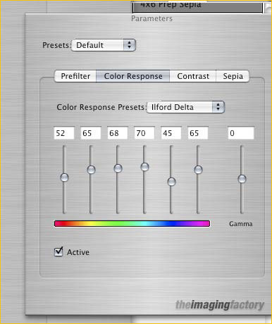
Detail showing the Color Response tab. The preset for "Ilford Delta" sets the individual sliders to mimic that film’s color response.
Now, leaving the Color Response box active, go back to Prefilter. What you will find is that by clicking and unclicking the Active checkbox, you can toggle back and forth between the Prefilter hue value you first chose, and the preset film Color Response you like best. This can tell you a lot about what you like about the conversion values.
At this point you can of course just choose one or the other. If you like the film preset best but still like some of the qualities of your Prefilter choice, try making Prefilter inactive, going back to Color Response, and adjusting the slider that most closely conforms to the color in the Prefilter color box. For beginners, though, I’d recommend staying away from the color sliders generally, unless you have a lot of patience for experimentation.
By now you’ve gotten a pretty good handle on conversion values, so it’s time to discover ConvertToBW Pro’s truly special capabilities, in the "Contrast" tab. Amazingly, ConvertToBW Pro allows you tovirtuallyadjust first the "Negative Exposure," (the equivalent to how you would have exposed your film when you took the picture), then the "Exposure" (this would be equivalent to the exposure given under the enlarger), and the Multicontrast filter grade! (The analog, of course, of the the enlarger filter). Using these tools, you can proceed just as you would in the darkroom, except that you can now control the "thinness" or "thickness" of the neg (within judicious limits, naturally), and you can make enlarger exposure and multi-contrast changes in seconds. And you can change contrast and exposure to suit each other, just as you’d do in the darkroom.
This is, to put it mildly, a wonderful feature. Just as with "Unsharp Masking," in Photoshop, this takes a darkroom task that was time-intensive and makes it almost instantaneous.
Flaws? Just one, although it’s also true of Photoshop and every other digital image-management program I’ve ever seen: it’s that the contrast function is tied to a middle value. With variable contrast silver paper, of course, the highlights are set mainly by exposure, and the shadows are set with contrast filters, meaning that contrast control is tied to one end of the scale – highlights – rather than free-floating somewhere in the middle of the scale. A much more sensible and controllable system. You can of course compensate for this with ConvertToBW Pro’s controls, but it’s not as easy or as intuitive as it would be if contrast were tied to one of the extremes of the scale, which would allow you to get to where you want to go much more efficiently. But this is a relatively small niggle.
In any event, I’d like to very enthusiastically second Michael R.’s strong recommendation of The Imaging Factory’s product. It’s not that much better atfunctionallygetting the job accomplished, but it greatly enhances your ability to judgewhatyou want to do, to get the best possible result out of all of the virtually limitless, and thus frequently confusing, options.
"Carbon on Cotton"
I wrote a couple of months agohereabout the new "EZ" black & white printing option, developed by MIS Inks and Paul Roark. You might want to re-read that bit first, but just to refresh your memory, the system uses one of the common and inexpensive Epson C82 / C84 / C86 4-color printers as a base, replacing the color inks with carbon inks, and is made to work without profiles – it will print in any application that supports printing. You just get the picture looking good on your monitor and hit print. EZ!
Well, I’ve had some more experience with the system now, and I must say it’s capable of making superb prints…if you are. It works nicely on the inexpensive Epson Enhanced Matte paper; my own best results have been on Lyson Photo Velvet Fine Art paper (a.k.a. Smooth Fine Art Paper "Portfolio" in metric sizes), but I haven’t tried all the options. Paul Roark likes Hahnemuhle PhotoRag, PermaJet Portrait Classic, PermaJet Alpha, and Premier Fine Art Hot Press.
Besides the "EZ" part there are two really formidable advantages to this system. The first is extreme economy. Although it sets up as a four-ink process, it’s really a two-ink process, because the gray inks in the C, M, and Y positions are all the same. Since you can purchase a CFS (continuous flow system) with empty tanks for $100, and two pints of the two inks for another $100, you can provide yourself with a nearly inexhaustible supply of ink in a very low-maintenance setup for a mere $200, which wouldn’t even buy three sets of color ink carts for, say, a Canon 9000 or an Epson 2200. Ordinary ink carts supply volumes of ink measured in milliliters; your $100 buys aquartof ink for the MIS EZ system. Add this to the fact that the Epson C86 printer can be bought for $60-$100 depending on how good a deal you find, and Epson’s very good and very inexpensive Enhanced Matte paper, and you’ve really got a very inexpensive system.
The other extraordinary property of the system is extreme stability and permanence. All of the MIS EZ inksets are pure carbon pigment. Unlike even Epson’s excellent color UltraChrome inkset, no dyes are used at all. What this means is that if you use a truly archival 100% rag paper, you’ll be making prints every day that will still be viewable 500 years from now. (I know whereof I speak, having studied many 500+-year-old books printed with carbon ink on rag paper.) As Paul points out, the inks will easily outlast the 100-year-plus-or-minus life span of Epson Enhanced Matte. Although it’s tough to say for sure, when I consider that photo paper has to go through an acid bath and has a gelatin supercoat that certain bugs love to nibble, and also that metalized silver sometimes has a tendency to "plate out" over long periods of time, it’s probable that MIS EZ prints on the best papers are more permanent even than archivally-processed fiber-base B&W prints. And that’s really saying something.
Image quality
I’ve only used the Eboni black ink with matte papers, so I can’t say anything about glossy papers and the Photo Black ink. However, image quality with the former is surprisingly high. The nice thing about the system’s image quality is that it’s not hard to get a very decent B&W print without a great deal of effort or hassle. If you want a truly great print, however, many of the same issues pertain here as pertain with more involved systems: monitor calibration, careful file management, and experimentation with papers and settings.
It seems to me so far that the weakness of the system lies in its shadow separation abilities. That may well be a function of using JPEGs; as you may know, camera gamma compresses shadow values relative to human visual gamma, so the shadow data has to be "stretched out," and hence gets very "thin," you might say, which is one of the problems that people who shoot RAW to try to ameliorate. I also think it’s probably a property of the two-ink system itself, though. Most traditional large-format printers aren’t able to distinguish Zone I from Zone II, at least if their negatives conform to Ansel Adams’s recommended densities for those Zones. This system has trouble separating the equivalent of Zone II and Zone III, and darkens Zone IV a bit. Highlights also need to be watched carefully, but what darkroom craftsman isn’t used to doing that? I’ve always had microwave ovens in my darkrooms to evaluate drydown.
It’s also very possible that I just haven’t learned to optimize shadow detail yet. At the risk of providing illustrations that might well be totally useless, take a look at the following two:

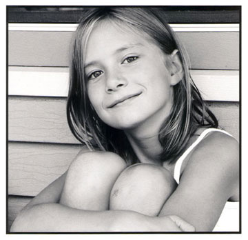
The left one is a low-res version of the original file, made with a 5-MP Sony F-707 last summer and converted using ConvertToBW Pro. The right one is a scan of a print made with MIS Eboni/EZN inks on the Lyson paper. Although you won’t be able to tell much about the quality of the latter, if the illustrations are showing what I want them to show, compare the dark rail at the top of the picture, behind the top of the girl’s head; you’ll notice it goes a bit darker in the print, whereas in the file it’s a lighter value that shouldn’t change all that much. Then compare the shadowed area in the girl’s neck. You should see that it’s gained some density and a little harshness in the print – partly a function of increased contrast, but partly the capability of the system. At least, I think it is!
Although you really won’t be able to get an idea of it from this little web picture of a scan, the print itself is really quite gorgeous. It has a richness and a vividness equal to what I’d hope for from a fine fiber-base print; the black on the coated Lyson paper is really quite good; and the tonal smoothness and detail is at least up to the standard of good 35mm. It’s only a 6×6" print from a 5-MP JPEG, but it’s something I’d have no trouble at all hanging on the wall of a gallery or museum.
As I make more and more prints with the system, some from files pulled down off the web so I can see how it does with other cameras, I’m incrementally learning how to make better prints more consistently. Almost all of the prints I’ve made so far are perfectly good as proof-prints, and the best of the prints made on the Lyson paper are ones I’d be proud of in any medium.
So where do you go from here? The next step up would be the MIS Ultratone UT7 inset in an Epson 2200. I haven’t tried that system yet. For now, I don’t feel I really need to. To sum up: I don’t quite feel I canyetgive the MIS EZ system an unqualified thumbs-up as a true printmaker’s tool, although I’m not discouraged yet (an endorsement by itself). Where Idogive it an unqualified thumbs-up is for what it’s made for and what it’s advertised to be: easy to use. It sure is that. Add in the potential cost-efficiency and the potential print life expectancy, and you’ve got a solid winner.
So that’s SMP for April. Here’s to Year No. 3!
— Mike Johnston
Subscribe to Mike Johnston’s photography newsletter athttp://www.37thframe.com/subscribe.htm.
More grumpy stuff, mostly on politics:http://quotidianmeander.blogspot.com.
See Mike Johnston’s website atwww.37thframe.com.
Also, check out his monthly column in the BritishBlack & White Photographymagazine!
(Usually available at Barnes & Noble bookstores.)
Want to read more? Go to the SMP Archives
Elevate Your Vision


Read this story and all the best stories on The Luminous Landscape
The author has made this story available to Luminous Landscape members only. Upgrade to get instant access to this story and other benefits available only to members.
Why choose us?
Luminous-Landscape is a membership site. Our website contains over 5300 articles on almost every topic, camera, lens and printer you can imagine. Our membership model is simple, just $2 a month ($24.00 USD a year). This $24 gains you access to a wealth of information including all our past and future video tutorials on such topics as Lightroom, Capture One, Printing, file management and dozens of interviews and travel videos.
- New Articles every few days
- All original content found nowhere else on the web
- No Pop Up Google Sense ads – Our advertisers are photo related
- Download/stream video to any device
- NEW videos monthly
- Top well-known photographer contributors
- Posts from industry leaders
- Speciality Photography Workshops
- Mobile device scalable
- Exclusive video interviews
- Special vendor offers for members
- Hands On Product reviews
- FREE – User Forum. One of the most read user forums on the internet
- Access to our community Buy and Sell pages; for members only.
You may also like