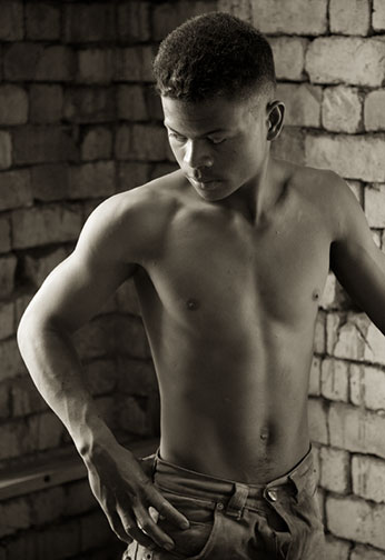
Kiln Worker – Madagascar, October 2007
Canon 1Ds MKIII with 24-105mm f/4L IS lens at ISO 1600
The newest buzz word in inkjet printing paper is Baryta. While it may be new to the 21st Century digital printing world it actually has its roots in high quality B&W printing papers from our past.
Baryta is barium-sulphate, a clay-like material that is applied to a fiber paper substrate. On traditional papers with light sensitive emulsions it acts to whiten the paper, produces a high degree of reflectivity, and as well provides a ground for the emulsion. Some of the finest photographic papers that we used to use, such as Multigrade IV FB and Ilfobrom Galerie FB, were Baryta based.
Now, on a new breed of papers designed for inkjet printing with pigment-based inks (all current professional printers and inks from Epson, HP and Canon) Baryta is being used not to hold a chemical emulsion but to provide a smooth reflective coating.
Three new inkjet papers have come to market in the last quarter of 2007; Hahnemuhle Fine Art Baryta 325, Harman Gloss FB AI, and Ilford Galerie Gold Fibre Silk. During November and December ’07 I have been printing with all three papers and this report is based on my impressions and experience with these papers for producing exhibition and portfolio grade colour and B&W prints.
_______________________________________________________________________
Matte vs. Glossy
Anyone with a photographic background that includes working in the chemical darkroom knows that we are now in many ways in theGolden Ageof printing. We have a range of paper choices beyond the dreams of a previous generation of photographers. The two major groupings are matte papers and so-called photo papers.
Matte papers are based on either alpha-cellulose (wood fibers) or cotton rag fiber. Their appeal lies in their “look” and “feel“. These papers are akin to the papers used for various non-photographic fine art processes. As such they have a texture – a look and tactile experience that is simply lacking in photo papers, which are constructed on a plastic base.
These plastic (resin coated) papers have the advantage of much higher reflectivity and thus they allow for the use of Photo Black ink, rather than the Matte Black ink that fiber papers have till now required. This produces blacker blacks and more saturated colours.
The bottom line is that for the past 10 years we have had the choice of matte papers with their appealing tactile feel but subdued look, with reduced colour gamut and lower dMax, and plastic photo papers with their higher Dmax and more saturated palette but less appealing tactility.
This is the problem that the paper industry has been trying to address for the past couple of years – to produce a paper optimized for the latest generation of pigment inks, which offers a suitable heft yet smooth surface, along with a high degree of reflectivity, high Dmax, and wide colour gamut.
The three papers reviewed here are the latest salvo, and their new form of ammunition is Baryta.
_______________________________________________________________________
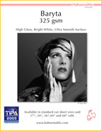
This is the newest kid on the block, having just gone into production in November, 2007. Hahnemuhle is the world’s oldest ongoing paper maker and one of the leading lights of the digital era. Its matte papers have been adopted by many fine art photographers (me included) as their standard for exhibition and portfolio prints.
Now with Fine Art Baryta 325 Hahnemuhle has produced one of their most attractive papers yet.
_______________________________________________________________________
Harman Gloss FB AI,
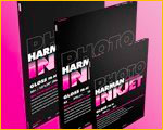
This paper was reviewed on these pages in September ’07 by Richard Lohmann. (There is now also a matte version which I have not yet had an opportunity to review). Though it is a much glossier paper than either the Hahnemuhle or Ilford papers also reported on here, it is included because it has been on the market for some months and has garnered a strong following, especially among B&W printers.
I have printed several 40 foot rolls myself, and in fact my upcoming (January, 2008) Madagascar show at The Luminous Landscape Gallery in Toronto will have largely been printed on this paper.
_______________________________________________________________________
Ilford Galerie Gold Fibre Silk
I have known about the coming of this paper for more than a year, as I was asked by Ilford to provide some feedback on early samples, and even earlier in the design process.
You would think that I am therefore somewhat biased in this paper’s favour. Yes, I am. But not because of any history (or other reason, as my efforts were pro bono). Rather, as you will see it turns out to be my favourite for a variety of reasons.
_______________________________________________________________________
Price
Price is a factor for most of us. If a paper is too expensive we may not use it as freely as we might otherwise. Here then are sample prices for all three papers as of mid-December, 2007. Prices shown are from Shades of Paper for the Hahnemuhle paper, Red River for Harman, and B&H Photo for the Ilford. I have selected the largest available packaging of 13X19″ as my sample point and listed them below in descending order of cost.
Harman 50 sheets of 13X19″ = $202.75.
$4.06 / sheet
Hahnemuhle 50 sheets of 13X19″ = $190.40.
$3.80 / sheet
Ilford 50 sheets of 13X19″ = $112.95.
$2.26 / sheet
Obviously, the least expensive paper is the Ilford – just over half the price of the Harman. The Hahnemuhle is in between, but closer to the Harman’s price than Ilford’s.
Once you have bought a sample pack of each and come to your own conclusions (which I recommend that you do) then you can decide the extent to which price will be a factor, and which, if any, of these three papers you decide to adopt.
_______________________________________________________________________
The Comparison
Printing paper selection is a highly subjective process. It’s all about esthetics andtaste. What you like might be completely differen from what appeals to me. Also, just as with discussing wines, for example, using words rather than actual tasting, similarly one can only describe the way a paper looks and feels. To really take the measure of a paper one has to actually print with it oneself.
Over a period of several days in mid-December, 2007 Mark Segal (a photographer, and sometime contributor to this site) and I made profiles and test prints as well as example prints on each of these papers. We examined them separately and together and compared our evaluations under different lighting conditions. Here are our observations of how these papers compare in each of the most important categories.
Each of these papers was profiled with an Eye One Spectrophotometer. Prints were primarily made with an Epson 3800, though prints were also output on an Epson 7800 and HP Z3100. All three printers performed very well with each of the papers and no significant differences were noted between printer outputs.
Price
Price has already been discussed above, but here is the executive summary. The Ilford paper is the least expensive of the three by a considerable margin. Hahnemuhle is in the middle, and Harman is the most expensive.
For exhibition and portfolio purposes, especially when a print is going to be sold, the cost of the paper is only a minor concern. But on an everyday basis a spread as large as we have here between the Ilford and the other papers is not inconsiderable.
Weight and “Feel”
All three papers are quite heavy at just over 300gms. They all feel good in the hand and add substance to a print when it is being shown. I didn’t notice any greater or lesser tendency to curl among them.
The Harman paper has the glossiest surface and therefore seemed more like a resin coated photo paper than a fibre paper. The front surface of both the Hahnemuhle and Ilford paper feels quite similar, though the rear of the Hahnemuhle is a bit rougher and therefore more “fibrous” than the Ilford paper, which is a bit smoother.
Gloss and Colour
This is where there is considerable difference between the papers.
The Hahnemuhle is the whitest of the three papers, while the Harman has a slightly blue tint. The Ilford paper is quite warm in tonality when compared to either of the others, though with colour prints when viewed alone this “warmth” is hardly noticeable.
Where it is noticeable is when B&W prints are made. Then the warmth of the Ilford paper becomes a consideration, and this will become very much a matter taste on your part.
I find the Hahnemuhle the brightest and most neutral of the three, but I really like the way that the Ilford paper looks when printing B&W. For monochrome work I would easily choose this as my favourite, but this is because I’m partial to warm tone prints.
Ilford reports that they essentially use no OBEs (Optical Brightening Agents), something that many printers may find to be important in terms of long-term image consistency. At this time I am unable to confirm the status of either the Harman or Hahnemuhle papers when it comes to the use of OBAs , though it’s hard to imagine that the Hahnemuhle and Harman don’t have any, since they are so white.
In a related area, both Hahnemuhle and Ilford claim that their papers are acid free. This is a positive note with regard to longevity, but there is no hard data on this from Harman or independent parties at this time.
Gloss Differential
The Harman paper had essentially no gloss differential. Some is definitely noticeable on the Ilford paper, though not so much as to be a problem when viewing the print at any angle that allows one to see the image without glare. There was almost none noticeable on the Hahnemuhle paper at any angle.
Sheen and Texture
Because the Harman paper is glossy there is very little surface texture. The Ilford and Hahnemuhle both have a subtle surface stipple, though that on the Hahnemuhle paper is a bit more obvious than Ilford’s.
Surprisingly this difference changes depending on the character of the light. Under a fluorescent viewing box and under gallery tungsten lighting one can see quite different textures on the paper (more “egg-shell” under the former, more stipple under the latter), but in both cases the Ilford paper has the visually smoother surface.
Note though that this difference is subtle, and one has to hold the prints at a critical angle to even see it.
Bronzing
There was no noticeable bronzing with any of these papers.
dMax
dMax measurements were made showing an average value of 2.13 on both the Ilford and the Hahnemuhle, and 2.17 on the Harman paper. This is too small a difference to be noticed except under the most careful visual scrutiny.
Abrasion Characteristics
This is tough to quantify. I tried my best to scratch and scuff each of the papers, but without much success. They seem as robust as anything to date and better in this regard than any matte paper I’ve regularly used. The Harman paper when used in rolls though seems to shed a bit more than the other two.
_______________________________________________________________________
Paper White
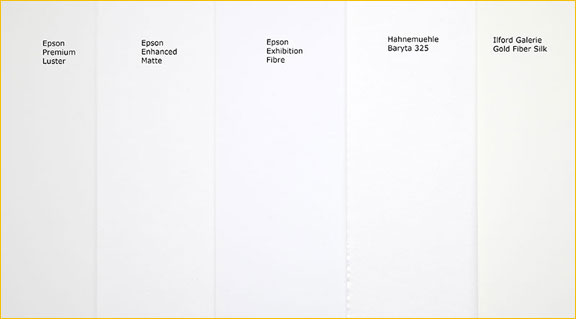
Photograph Courtesy Mark Segal
The frame above shows the colour of the surface of the Hahnemuhle and Ilford papers along with Epson Exhibition Fibre, as well asEpson Enhanced MatteandEpson Premium Lusteras control points. Keep in mind that the differences are subtle and only really visible when the papers are compared with each other. The eye quickly becomes used to whatever white one has, and it’s always the case that the eye is also drawn to the brightest white, making any other white in the field of vision diminish by comparison. That’s why, for example, you want all extraneous on-screen whites to be removed when doing soft proofing.
_______________________________________________________________________
Gamut Compared
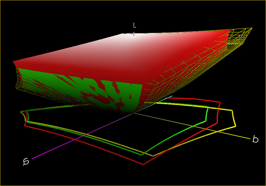
Sometimes a picture speaks louder than words. In the above gamut plot we see Ilford Gold (wire frame) compared with a typical matte paper ( solid). We clearly see the extent to which blacks as well as dark saturated colours are sacrificed with matte papers and matte black ink.
The projected 2-D plots also shows the gamut limitations in the blue end of the spectrum, though the matte paper is a close match in the warm tones and some yellow/greens.
Plots of all three Baryta papers reviewed here are close enough that their plots as well as the visual gamut appearance are pretty much a quibble.
_______________________________________________________________________
What Else?
Finally, what about Epson’s latest paper, Exhibition Fiber? It is not included in this comparison for two reasons. Firstly, I did not have large sizes or enough quantity of this paper to do adequate testing by the time that this review was ready in late December. Secondly, and more to the point of this test, Exhibition Fiber is not a Baryta-based paper. This isn’t a value judgment, but simply a difference that puts the three papers that are reviewed here into a category of their own.
Just for point of reference, Epson Exhibition Fiber costs about $5.95 a sheet in 13X19″ size, making it more than 2.5X more costly than the least expensive of the papers tested here, Ilford Gold Fibre Silk.
It’s interesting to note that the dMax of Exhibition Fibre measured at 2.25, and even a casual comparison shows it to be a deeper and richer black than any of the other papers tested here. Quite astonishing actually – possible the richest black I’ve ever seen on any paper, traditional or inkjet. I look forward to receiving sample sheets sufficient for further testing, and I will have a review ofEpson Exhibition Fiberhere in due course.
_______________________________________________________________________
Fibre / Fiber
You’ve probably noticed that different manufactures spell the word fiber different. The reason is simple – UK vs. US spelling. Living in Canada I tend to be a bit confused and therefore use both. Be aware of this though when doing web searches on papers. Both spellings are in use.
_______________________________________________________________________
A Word About Baryta
Baryta as applied to inkjet media is starting to become a bit of a buzzword. Put Baryta in the product name or promotional material and generate sales. But, does the paper actually contain Baryta? There may be only one way for the layman to tell without an X-ray diffraction device – the sniff test. Traditional Baryta papers have always had a very slight odor. Not very noticeable, and not very strong, but usually there when a new package is opened or if one sniffs a sheet of paper carefully.
To my nose (not ISO calibrated, I assure you) only two of these papers have that distinctive Baryta smell – Ilford Gold and the Harman. Does this mean that the Hahnemuhle does not really contain Baryta? No, possibly not. But curiously, though it has the word Baryta in its name it doesn’t pass the smell test.
_______________________________________________________________________
Conclusion
Here is my conclusion, and Mark Segal reports that he’s pretty much in agreement with it. Since experience has shown that Mark has a very clear head (he’s a world-class economist by profession) and a very good eye for technical and quality details, I feel pretty confident of our conclusions. But, as I say, they are subjective, and you may not agree.
The winner for me is Ilford. It also wins an award for the least appealing name –Gold Fibre Silksounds sexy, but since it’s neithergoldnorsilky, the reason for this name simply fails me. Marketing nonsense. But,a rose by any other name, etc, etc…..
The reasons why I have chosen Ilford are several fold. Price is one. This is a very modestly priced paper given its very high quality, and recognizing that it is highly competitive with papers costing nearly twice as much, it’s hard to deny its price advantage.
Tonality is another. I happen to like warm toned paper, and in fact I actively dislike cool bluish papers. To my taste Ilford’s Gold Fibre Silk may be one of the most beautiful papers I’ve ever used for monochrome printing and its warmth enhances most colour images as well.
The surface look is also very much to my liking. The stipple is extremely subtle, adding a bit of sparkle yet not being at all intrusive. I have found that by comparison the Hahnemuhle Baryta has a somewhat more obvious paper surface texture, though it too is quite subtle. Some observers though report prefering the Hahnemuhle surface texture.
This combination of factors makes Ilford’s Gold Fibre Silk a winner for me, but your mileage may vary.
_______________________________________________________________________
Parting Thoughts
It should be noted that as technologies evolve, new products enter the market expanding choice and influencing taste. Some lament the passing of traditional photographic papers and want to see them exactly reproduced in the form of inkjet printing papers, while others are content to accept these new media as a new paradigm.
Until quite recently the industry simply didn’t provide a very attractive palette of non-matte offerings that weren’t at the same time very high gloss, but it did provide some truly artistic matte papers which much of the North American and European photographic community, me included, found to our liking. As I mentioned above, what they lacked in DMax and gamut, they offered in “character”, and if properly printed – quality images.
Though I have been printing on matte fine art papers such asHahnemuhle Photo Ragfor the past few years, I think that my days with matte papers and matte black ink are now over.
Frankly, it’s about time!
December, 2007

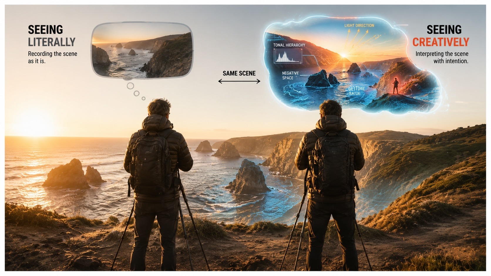
Elevate Your Vision


Read this story and all the best stories on The Luminous Landscape
The author has made this story available to Luminous Landscape members only. Upgrade to get instant access to this story and other benefits available only to members.
Why choose us?
Luminous-Landscape is a membership site. Our website contains over 5300 articles on almost every topic, camera, lens and printer you can imagine. Our membership model is simple, just $2 a month ($24.00 USD a year). This $24 gains you access to a wealth of information including all our past and future video tutorials on such topics as Lightroom, Capture One, Printing, file management and dozens of interviews and travel videos.
- New Articles every few days
- All original content found nowhere else on the web
- No Pop Up Google Sense ads – Our advertisers are photo related
- Download/stream video to any device
- NEW videos monthly
- Top well-known photographer contributors
- Posts from industry leaders
- Speciality Photography Workshops
- Mobile device scalable
- Exclusive video interviews
- Special vendor offers for members
- Hands On Product reviews
- FREE – User Forum. One of the most read user forums on the internet
- Access to our community Buy and Sell pages; for members only.
You may also like