by
Alain Briot
1
– Cool Colors Dominance harmony
In a Cool Colors Dominance harmony we use colors that have a cool quality. These include blues, violets and greens
This color harmony is useful to express feelings of cold or remoteness. It is also useful to represent scenes where you want the elements to recede away from the viewer and appear distant.
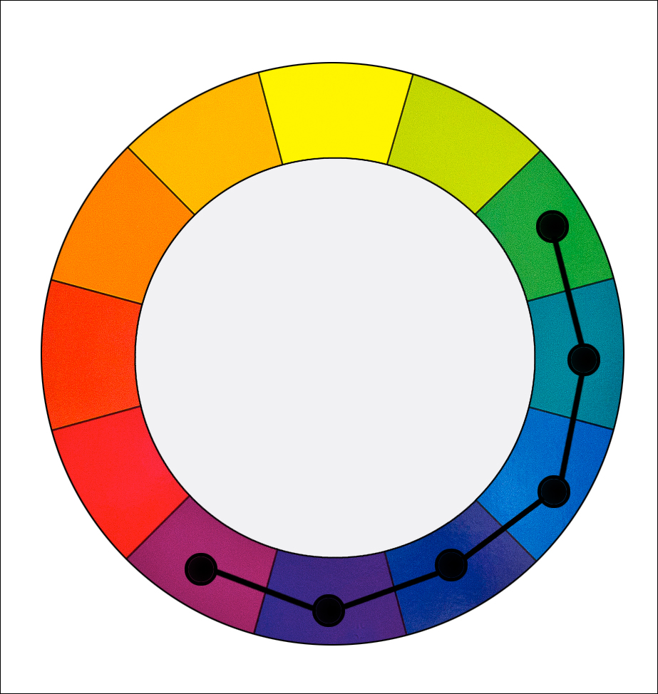
A cool color dominance harmony that uses
purples, blues and blue-greens
2 – Example
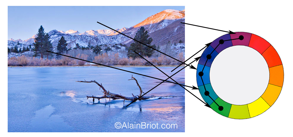
Example 1 – Lake Sabrina Sunrise, Eastern Sierra Nevada
3 – Notes
Creating a Cool Color Dominance Harmony does not mean there are no warm colors in the image. It only means that cool colors dominate.
– This harmony features a wide range of colors.
– It is therefore different from a Monochromatic Harmony
– Half of the colors on the color wheel are used
4 – Warm Colors Dominance
harmony
In a Warm Colors Dominance harmony we use colors that have a warm quality. These include reds, oranges and yellows. This color harmony is useful to express feelings of warmth and comfort. It is also useful to represent scenes in which you want the elements to move towards the viewer and appear to be close by.
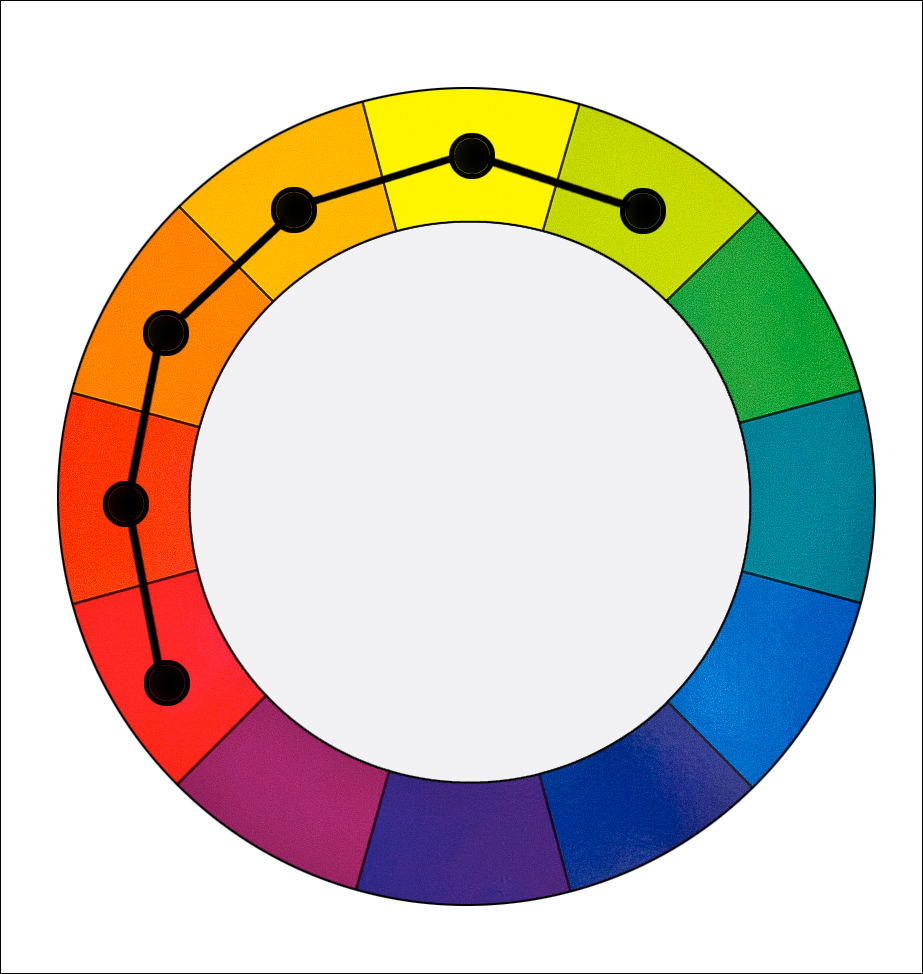
A warm color dominance harmony that uses
Reds, Oranges, Yellows and Yellow-Greens
5 – Example
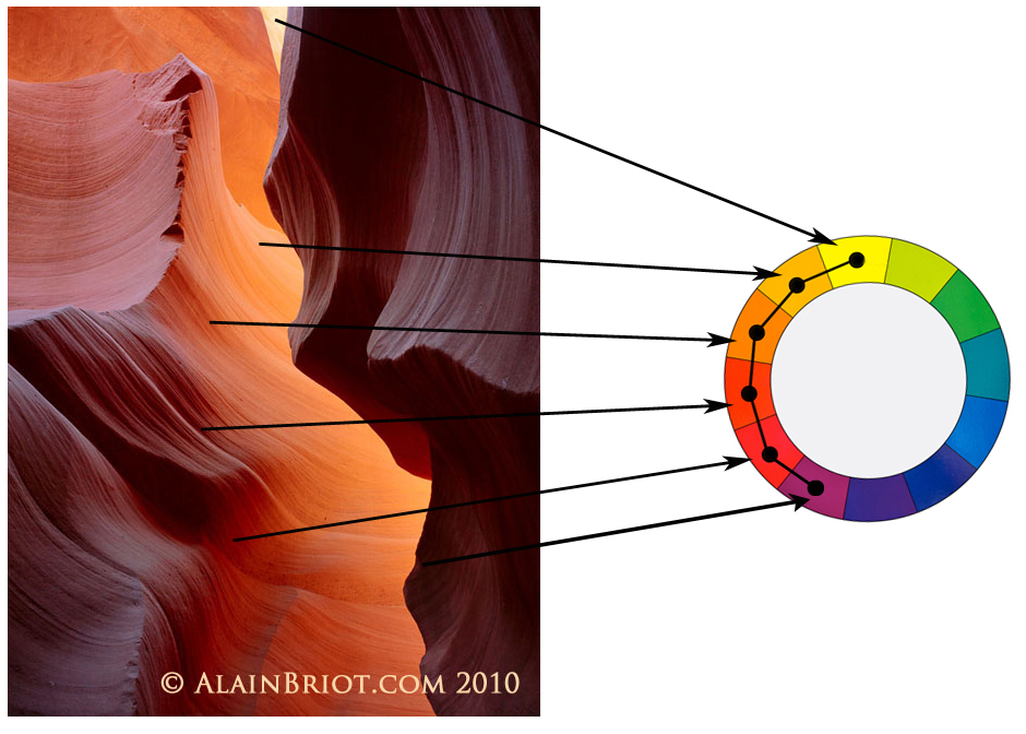
Example 2 – Antelope Canyon
6 – Notes
Creating a Warm Color Dominance Harmony does not mean there are no cool colors in the image. It only means that warm colors dominate.
– This harmony features a wide range of colors.
– It is therefore different from a Monochromatic Harmony
– Half of the colors on the color wheel are used
7 – Exercises
A – Create a photograph featuring a Cool Color Dominance Harmony.
B – Create a photograph featuring a Warm Color Dominance Harmony
8 – Split Complementary color harmony (also called Compound Harmony)
In a Split Complementary color harmony we use two colors plus the color that is opposite to them on the color wheel. For example blue and purple with yellow.
This harmony has a strong visual contrast, similar to the complimentary color harmony (see my previous essay), but with less tension because three colors are used instead of two.
This is an easy harmony to use and therefore it is appropriate for study and practice.
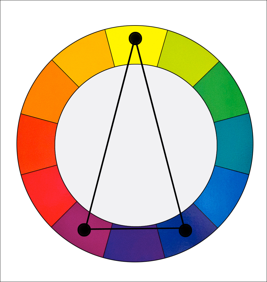
A split complementary color harmony using yellow, purple and blue
9 – Examples
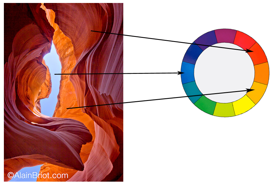
Example 1: Antelope Canyon and Sky
An example of a blue-red Split Complementary Color Harmony.
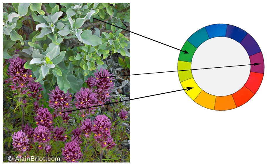
Example 2: Wildflowers close up
A second example of a purple-green Split Complementary Color Harmony
10 – Notes
– Comparable to Tetradic harmony except colors are not evenly spread.
– Actually between Tetradic and Analogous.
– Comparable to analogous harmony except there are 2 opposite colors spaced 1 color apart
– Very visually pleasing and artistic harmony.
– Common in nature
4 – Exercise
Create a photograph that features a split complementary color harmony.
11 – Tetradic color harmony (rectangle)
In a Tetradic color harmony we use a combination of four colors that consist of two sets of complementary colors. For example: purple and blue green plus yellow green and red.
These colors form a rectangle on the color wheel. The colors on the short side of the rectangle are spaced one color apart.
This is a rich color harmony that offers many opportunities for variations. To be most effective it is best to let one of the 4 colors dominate. It is also important to pay attention to the relationship between the warm and the cool colors used in this harmony.
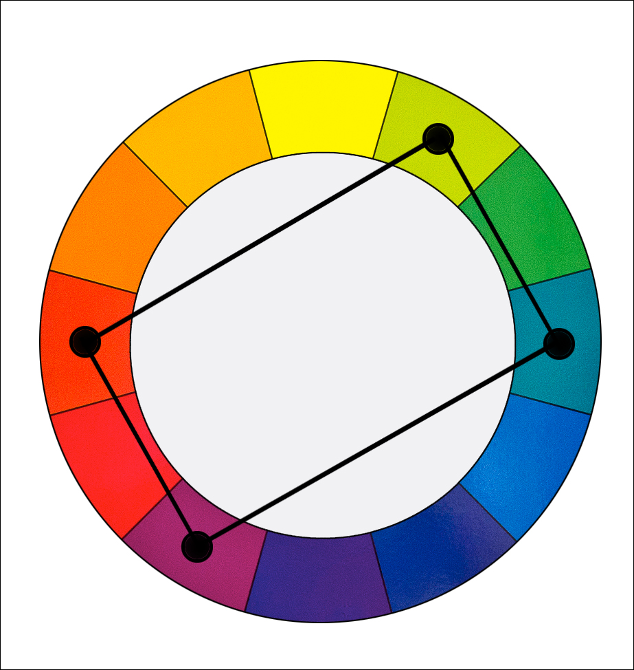
A tetradic color harmony that uses red, purple, yellow-green and blue-green
12 – Example
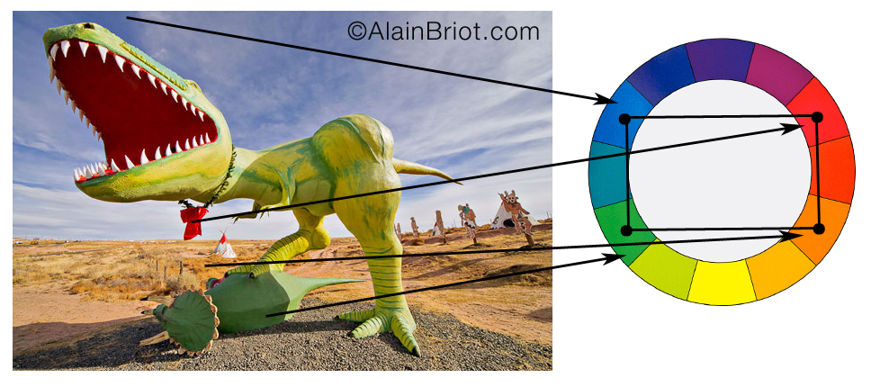
Example 3: Route 66 Dinosaurs
An example of a Tetradic Color Harmony
13 – Notes
– Very colorful harmony
– Tends to be ‘in your face’
– Works well with ‘flashy’ subjects
– Easily gets ‘crude’ if overused
– Works when you want to call attention in a dramatic manner
– Similar to square harmony except that colors are one apart on the short side
14 – Exercise
Create a photograph that features a Tetradic Color Harmony.
15 – Square color harmony
In a Square color harmony we use a combination of four colors equally spaced around the color wheel. For example: orange, yellow-green, blue and violet.
These colors form a square on the color wheel, with each color being spaced two colors apart from the the other colors.
This harmony is comparable to the Tetradic harmony but with the four colors spaced evenly around the color wheel. This harmony works best if one color dominates. Just like the Tetradic harmony, you need to keep track of the relationship between the cool and the warm colors.

A square color harmony that uses orange, purple, yellow-green and blue
16- Example
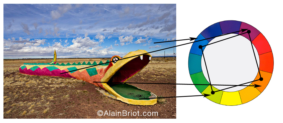
Example 4: Snake
An example of a Square Color Harmony
17 – Notes
– Very colorful harmony
– Tends to be ‘in your face’
– Works well with ‘flashy’ subjects
– Can easily give a ‘crude’ effect if overused
– Secret is to use small amounts of three colors and a larger amount of 1 color.
• For example here lots of blue is used and only small amount of green, violet and red are used.
• This prevents the effect from being overly flashy.
– Works when you want to call attention in a dramatic manner
– Similar to Tetradic harmony except that colors are two apart on the short side
18 – Exercise
Create a photograph that features a Square Color Harmony.
19 – Continuing your studies
Color harmonies are one of the most important aspects of a personal style. If you are working on developing your style take a look at my just-released Personal Style Master Class Workshop on DVD. A FREE 21 pages ebook table of content is available. All you need to do is email me at[email protected] with the words ‘Master Class’ in the subject line and you will receive the link to the free eBook immediately.
You can also read Alain’s previous essays by visitingAlain’s Briot’s View Index Page. The index page features over 70 different essays by Alain.
20 – About my next series of essays
This is the final essay in the Color Harmonies Series. My next series of essays will focus on Vision, one — if not the — most important aspect of creating photographs that are unique to you. The first essay of this new series will be published on this site in January 2013. Stay tuned!
21 – About Alain Briot
Alain Briot creates fine art photographs, teaches workshops and offers DVD tutorials on composition, image conversion, optimization, printing and marketing. Alain is the author ofMastering Landscape Photography.Mastering Photographic Composition, Creativity and Personal StyleandMarketing Fine Art Photography. All 3 books are available in eBook format on Alain’s website at this link:http://beautiful-landscape.com/Ebooks-Books-1-2-3.html
You can find more information about Alain’s work, writings and tutorials as well as subscribe to Alain’s Free Monthly Newsletter onhis websiteathttp://www.beautiful-landscape.comTo subscribe simply go tohttp://www.beautiful-landscape.comand click on the Subscribe link at the top of the page. You will receive information on downloading the table of contents, plus over 40 free essays by Alain, immediately after subscribing.
Alain welcomes your comments on this essay as well as on his other essays available. You can reach Alain directly byemailing himat[email protected].
Alain Briot
Vistancia, Arizona
December 2012


Elevate Your Vision


Read this story and all the best stories on The Luminous Landscape
The author has made this story available to Luminous Landscape members only. Upgrade to get instant access to this story and other benefits available only to members.
Why choose us?
Luminous-Landscape is a membership site. Our website contains over 5300 articles on almost every topic, camera, lens and printer you can imagine. Our membership model is simple, just $2 a month ($24.00 USD a year). This $24 gains you access to a wealth of information including all our past and future video tutorials on such topics as Lightroom, Capture One, Printing, file management and dozens of interviews and travel videos.
- New Articles every few days
- All original content found nowhere else on the web
- No Pop Up Google Sense ads – Our advertisers are photo related
- Download/stream video to any device
- NEW videos monthly
- Top well-known photographer contributors
- Posts from industry leaders
- Speciality Photography Workshops
- Mobile device scalable
- Exclusive video interviews
- Special vendor offers for members
- Hands On Product reviews
- FREE – User Forum. One of the most read user forums on the internet
- Access to our community Buy and Sell pages; for members only.
You may also like