A Tutorial by Miles Hecker
NB: Please note that whenever possible Curves as well as any other form of image adjustment should be done as an Adjustment Layer, as described in my tutorial titledInstant Photoshop. — Michael
Like theLevelscommand, theCurvescommand allows you to adjust the tonal range of an image. However the range and quality of adjustment is much greater. Levels is similar to using a hatchet, Curves is more scalpel-like in its precision.
The Levels command limits adjustments to just three variables, highlights, shadows and midtones. With the Curves command, you can adjust any point along a 0 – 100% scale while keeping up to 15 other values constant. This precision and accuracy can be intimidating to a new user but it need not be.
Before using the Curves command, go toImage | Mode |and selectLab Color. Adjustment of tonality levels can be done in other color modes, but artifacts and color shifts can result, especially if your monitor is not well calibrated. When you are done editing the tonality you can return to your previous image mode.
While editing your image, open the curves dialog box. Image | Adjust | Curves
You should see a dialog box as below in Figure 1. The channel should be set toLightness.
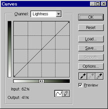 Fig. 1
The horizontal axis of the graph represents the original brightness values of the pixels (Input levels); the vertical axis represents the new brightness levels (Output levels).
In the default diagonal line, no pixels have been mapped to new values, so all pixels have the same Input and Output values.
For Lab Color or CMYK images the curve displays percentage values from 0 to 100, with the whitest highlight (0) on the lower left. The darkest shadow (100) is on the upper right.
For RGB images, Curves displays brightness values from 0 to 255, with the shadows on the left.
While it is possible to use many adjustment points, usually only three are needed! The software automatically controlling most scanners tries to make the world a mix of midtones as shown below. No tone too black, no tone too white, all tones just right.
 Fig. 2
This was okay for Goldilocks’ porridge but most of us like some snap in our images!
Start by moving the crosshair cursor to point A and clicking to establish an anchor/drag point. This point will be used to adjust the quarter-tones or highlights. Then move to point B, click and establish a mid-tone anchor/drag point. Finally move to point C and establish a three-quarter-tone or shadow anchor/drag point. See Figure 3.
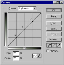 Fig. 3
Make sure you have the preview box checked at this point so you can see the changes as you make them!
Adjusting the contrast can now be done via three simple steps.
(1) Pull the highlights down to the desired level.
Grab point A, the highlight drag point by moving the cursor over it and clicking. Pull it down while watching the highlights in your image. Clouds if available are good visual reference points. Stop pulling when things are to your liking. Most midtones and all the shadows should remain unchanged. Be careful not to burn out the highlights by going too far. See figure 4.
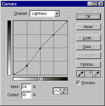
 Fig. 4
(2)
Grab point C, the shadow drag point by moving the cursor over it and clicking. Push it up while watching the shadows in your image. Stop pushing when things have darkened to your liking. See Figure 5. You can move the drag point slightly left or right for more subtle tone changes.
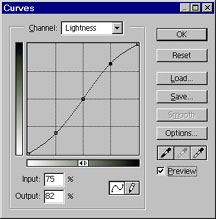
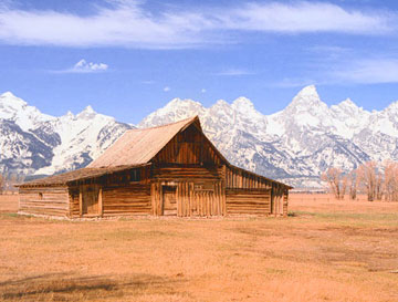 Fig. 5
(3)
Grab point B, the midtone point and tweek the midtones up or down so the overall image tonality looks good. Sometimes this might night not be needed, but the first two steps will usually move things out of visual wack enough that some midtone adjustment is necessary. See Figure 6.
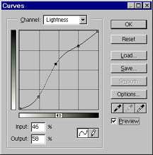
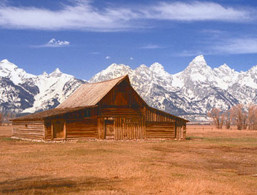 Fig. 6
The new tonality curve you’ve just created to enhance your image is called the S-curve.
If an image is overly contrasty rather than flat the process would be reversed and the S would appear inverted.
Simply pulling down on all three adjustment points would tend to lighten the overall image and is similar to increasing brightness with the Levels command, but much more precise.
Likewise pushing up on all three adjustment points would tend to darken the overall image and is similar to decreasing brightness with the Levels command.
With plenty of practice, you will become better and better at placing the image tonality where you want it. Multi-contrast paper, RIP.
Miles J. Heckeris currently Chair of The Division of Technology & Trades atCasper Collegelocated in Casper, Wyoming. Mr. Hecker has taught digital electronics and electronic imaging at Casper College for 25 years. His hobbies include photography, climbing, caving and running.
Mr. Hecker is currently in the process of co-foundingWyoPhoto, a web site which will be dedicated to Wyoming and Rocky Mt. landscape and nature photography.
Mr. Hecker graduated from The Cooper Union for the Advancement of Science and Art in 1971 with a Bachelor’s degree in Electrical Engineering. He also holds a M.Ed. in Science Education from the University of Wyoming.
More of Mile’s work may be seen atWyoPHOTO.com
All text and photographs on this page are Copyright‚© 2000 by Miles Hecker
Elevate Your Vision


Read this story and all the best stories on The Luminous Landscape
The author has made this story available to Luminous Landscape members only. Upgrade to get instant access to this story and other benefits available only to members.
Why choose us?
Luminous-Landscape is a membership site. Our website contains over 5300 articles on almost every topic, camera, lens and printer you can imagine. Our membership model is simple, just $2 a month ($24.00 USD a year). This $24 gains you access to a wealth of information including all our past and future video tutorials on such topics as Lightroom, Capture One, Printing, file management and dozens of interviews and travel videos.
- New Articles every few days
- All original content found nowhere else on the web
- No Pop Up Google Sense ads – Our advertisers are photo related
- Download/stream video to any device
- NEW videos monthly
- Top well-known photographer contributors
- Posts from industry leaders
- Speciality Photography Workshops
- Mobile device scalable
- Exclusive video interviews
- Special vendor offers for members
- Hands On Product reviews
- FREE – User Forum. One of the most read user forums on the internet
- Access to our community Buy and Sell pages; for members only.
You may also like