


![]()
Overview
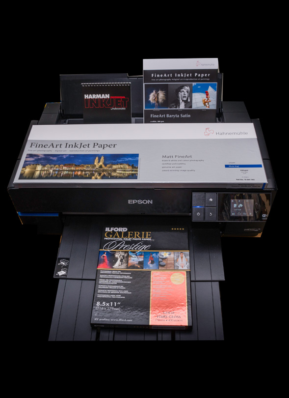
This article reviews eight papers of interest, in the context of our theme “Back to the Print”. The papers for this review were selected based on interest in the market, interest in forum discussions, being recent products deserving attention and diversity of printing choices. They are listed in Figure 1 of the article. Six are gloss/luster type papers (“PK” papers) and two are matte (MK papers). The papers come from Hahnemuhle (Fine Art Baryta Satin, Photo Pearl, Photo Rag), Ilford (Gold Fibre Gloss, Smooth Pearl, Cotton Artist Textured) and Harman (Photo Baryta and Photo Baryta Warmtone). Within the PK category two are of the luster type, two are “pearl” (a beadier kind of luster), while the Harman papers resemble unferrotyped gloss. Within the MK group, Photo Rag is smooth neutral and Cotton Artist Textured is textured with a slightly warm paper white.
The article begins with quantitative descriptions of the papers’ characteristics and ends with an aesthetic appreciation and comments on handling properties. All the printing and testing is done in an Epson P800, for both manufacturers’ profiles and custom profiles that I made with an i1Pro2 and i1Profiler.
The purposes of the quantitative work are to measure gamut volumes, accuracy of colour rendition between image file colour values and those printed, maximum Black, and neutrality of the grayscale, as well as to examine other aspects of overall print quality in terms of colour saturation, smoothness of tonal gradations, shadow detail and the like.
All of these papers are well-known reputable brands, so what you buy is largely a matter of price and preference.
While the custom profiles are on the whole more accurate and of slightly higher gamut volume than the manufacturer’s profiles (not unexpected), all the profiles are of high enough quality to be usable for general photographic purposes, whether custom or not.
For the PK papers, gamut volumes (the range of reproducible colours) fall within a range of 746,000 to 825,000 units (as measured in ColorThink Pro). This is not a very broad range and the difference of print appearance attributable to this range is extremely hard to see, if at all. The MK papers have a much more limited range of 482,000 to 500,000, as well as considerably lighter maximum Black. This means that the MK papers cannot reproduce the colour saturation or depth of shadow detail characteristic of the PK papers. This is normal. The maximum Black for the PK offerings is on the whole very Black indeed. Whether the Luminance values of these Blacks are 1, 2, 3, or even 4 doesn’t matter much in terms of our visual perception.
Neutrality of the paper coating does vary visibly from slightly cool to slightly warm, so what one buys in this regard is a matter of taste. Figure 10 documents these differences, in the a* and b* columns of the “Paper White” section of the table. Positive numbers indicate warmer inclination, negative numbers cooler inclination. A* is an axis from Green to Magenta and b* is an axis from Blue to Yellow. If both were zero the colour would be gray. You will see that on the whole deviations from zero are not large. Figure 6 shows you the visual effect of deviating three points from zero positive or negative. The blue and yellow column of Figure 10 indicates that for all of these papers rendition of grayscale neutrality is very good.
I also look at the question of OBA content (Optical Brightening Agents). Figures 13 and 14 show which of the papers include them and which don’t. OBAs have been present in photographic papers from decades well before the digital era. They can fade over time, so many people now sensitized to this issue prefer to buy papers that have none. Hahnemuhle has represented to me in the past that a moderate OBA content in the paper base can do very little to impair long-term archival quality of the prints. Those who really wish to avoid OBAs regardless can focus on the papers in Figure 13 with no evidence of OBA content – Ilford Gold Fibre Gloss, Ilford Cotton Artist Textured and Hahnemuhle Fine Art Baryta Satin. The evidence of OBA in Hahnemuhle Photo Rag is present, but to a more limited extent than seen for the other papers exhibiting what may be OBA content.
Of the eight papers, only the two Harman offerings caused issues with paper handling in the P800 because of their curl. None of the other papers curled in this manner and they fed into the printer satisfactorily. The Ilford Cotton Artist Textured did require a bit of coaxing up the back of the Front Fine Art feed, but I mention how to manage that issue.
The main choice one needs to make for printing is whether to use a PK or an MK paper. This depends very much on how the paper suits the character of the photo, or whether the photo can or should be edited to suit the capability and character of the paper. I provide a brief demonstration of this, showing how the same photo can be repurposed depending on the paper. Which version one prefers is a matter of personal judgment. Between papers of similar character and characteristics, price would probably be the next most appropriate decision factor.
Of the eight papers tested in this review, the four I considered particularly appealing are the Ilford Gold Fibre Gloss, the Hahnemuhle Fine Art Baryta Satin, the Ilford Cotton Artist Textured and the Hahnemuhle Photo Rag. All of them are rich in character, print well within their capabilities and handle well.
Mark D Segal
Toronto, June 2016
Eight Papers
……..and there are papers and papers – many papers. So why review these eight? This review provides both additional perspective on paper offerings building upon previous paper reviews published on LuLa and a stepping-stone into a more ambitious project to come focusing on papers within the context of LuLa’s well-received “Back to the Print” theme. I selected these eight papers in consultation with a very experienced professional paper specialist here in Toronto. The choices are a combination reflecting one or more criteria of (a) interest in the market, (b) interest observed in discussion forums, (c) new-ish product deserving more attention and (d) diversity in choices for printing. Figure 1 shows the papers reviewed here.
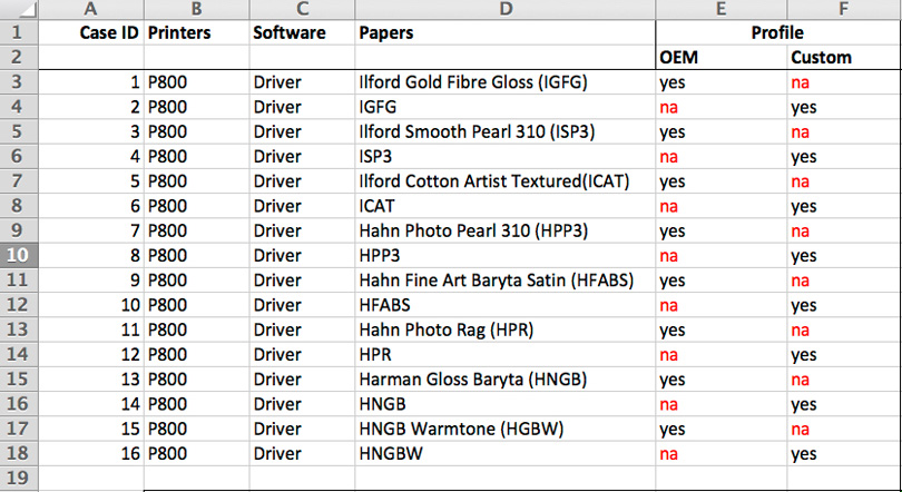
Six of the eight are gloss/luster type papers using PK ink, two are matte using MK ink (ICAT and HPR). Within the six PK papers, finishes differ quite obviously. For all eight, of course one may use manufacturer profiles (OEM) or custom profiles. I created custom profiles for all eight based on printing in an Epson P800, from Photoshop or Lightroom, using the Epson printer driver and the Epson Media Types the manufacturers recommend. The purpose of this is to see whether it makes much difference using the OEM or custom profiles for each of the papers, those differences being statistical gamut, statistical accuracy of printed outcomes relative to file reference values for the colours tested, and most important of all, relative appearance of the prints. As I’ve noted in previous reviews, differences of numbers don’t always translate into corresponding differences of perception. Given how we see (or don’t), an e.g. 10 percentage point statistical difference between one outcome and another doesn’t necessarily mean that we somehow perceive one result as 10% different from the other. This is discussed further below.
What’s in a name – I sometimes wonder how much committee time these companies spend hammering out the imaginative names they give these papers in order to describe them, differentiate them and give them market appeal. The names can end up rather long, and being a lazy guy who doesn’t like repetitive typing (yup – I do this all by myself), I developed abbreviations for identifying these papers, shown above in brackets beside the paper names. So as you read through you may be referring back to Figure 1 for what “HNGBW” or some other is, or you may just get better than me at memorizing them once and for all. Apologies in advance for any inconvenience (it has been remarked in travel surveys that Canadians are too polite and can be excessively apologetic – those who live here can decide for themselves…).
As I did in the review of the Epson Legacy papers, I’ll first show and discuss the analyses of the papers, and then talk about the aesthetic aspects. The procedures used here are essentially the same as those used in that article, so I won’t repeat all the details, except to summarize the key components of the analysis.
1. Analyze the OEM profiles in ColorThink Pro for gamut volume, white point, black point and values of primaries at the gamut borders.
2. Create custom profiles for the eight papers (using a 1600 patch X-Rite target with an i1Pro 2 and i1Profiler) and repeat step 1 for these.
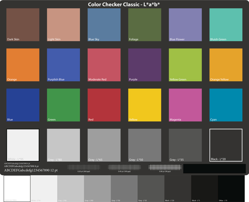
3. Print the GMCC synthetic target and the extended grayscale (both having known file reference values) in Absolute Colorimetric (Figure 2).
4. Measure the patches (same kit as for profiling), compare them with file reference values and derive the dE(76) outcomes, which show the differences between the file reference colour values and the colour values reproduced on paper. This is useful to see, at least statistically, how accurately the whole system (paper, ink, profile, printer driver, printer) is reproducing colour, and of particular interest, what is maximum reproducible Black and how well grayscale neutrality is preserved. Please read the Annex on dE(76).
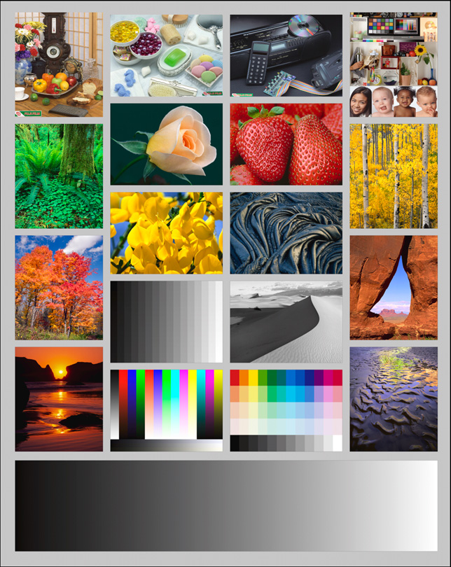
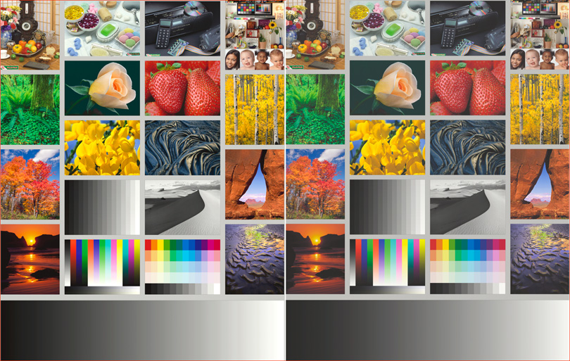
5. Make prints of real world photos and see what they look like on each paper. For this I use the Atkinson printer test page (Figure 3) because its photos and ramps are truly well chosen for rapid assessment of all the important qualities of a print – those of us who have been using this image for years can spot issues and differences between papers “real fast”.
Just before continuing on to the results, I should tell you that I’ve had feedback on this approach, ranging from “too technical – this is about aesthetics, not numbers” to “just what we need to know – great objective approach, so hard to find these days”. So that means I’m doing something right, especially as I try to cover both. The bottom line is that appreciation of paper is subjective enough to confound convincing communication over the internet (my medicine may be your poison), yet there are objective properties that can be measured and help you choose what to print with once you understand what the numbers say and don’t say. So the numbers are the numbers, but whether you agree with my evaluation of what they mean is your call.
OK, moving on, Figure 4 shows the results (Gamut volumes, maximum Whites and Blacks) from reading the 16 profiles in ColorThink Pro.
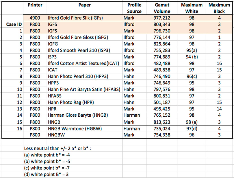
The orange rows contain benchmark numbers for Ilford Gold Fibre Silk that I use for much of my own work in both my Epson 4900 and Epson P800 printers. This review, however, focuses on the one printer (P800) and the sixteen cases in the rows underneath (life can become overly complicated with too many options – this is quite enough in one bite – but we can have more bites in future reviews).
The first salient point is that nothing in this chart beats the gamut volume of the Epson 4900; but I’ve shown in the Canon Pro-1000 review that the visibility of this added volume is limited to a narrow band of colour in real world photos. So ignoring that and focusing on the 16 cases for the P800, what do we see?
1. On the whole, the gamut volumes of my custom profiles are either larger or very close to those of the OEM profiles. The differences aren’t large enough to detect in most prints, so on this criterion you can be satisfied with OEM profiles. But if bigger means better for you, high quality custom profiling is a viable option. I’ll say more about this below, comparing printed outcomes.
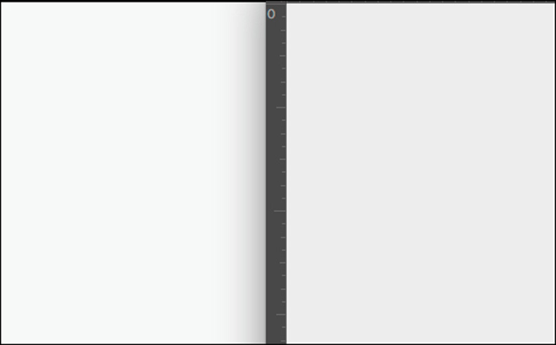
2. The brightness (L*) range of maximum white seems narrow across the papers (L*94 to 98). However, a difference between L*94 and 98 is noticeable (Figure 5).
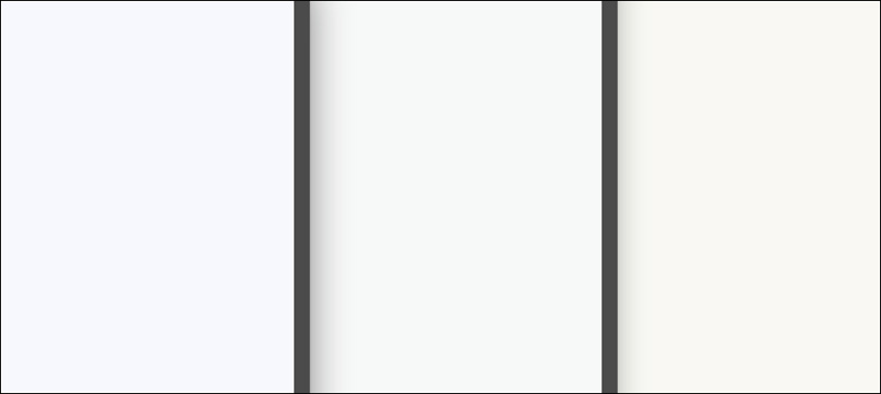
3. There are five cases of maximum White for which the b* (blue to yellow axis) departure from neutral (b*0) exceeds 3 either cool or warm. Figure 6 shows the visual difference for L*98 between b*-3 (a bit cool), b*0 (neutral) and b*+3 (a bit warm). It’s not huge numerically, but noticeable, and quite enough to make a perceptible difference between a “cooler” and a “warmer” paper. If the cooler paper were viewed under warmer light or vice-versa, these differences could be offsetting to some extent.
4. Profiled maximum Black from the P800 is a tad more capable than the older Epson 4900 in this respect. When we see maximum Black getting down to a value of L*1 (IGFG, OEM profile), this is indeed impressive. For all the PK papers, the range of maximum Black is from L*1 to 4. Figure 7 shows the visual differences these numbers represent.

If there’s a visible difference I won’t be losing sleep over it, but blacker is better. As well, moving higher than 4 the difference becomes more noticeable, and especially that between PK and MK papers. Figure 8 shows the visual difference between L*3 and L*14; the latter is the blackest Black achieved for the four profiles of the two matte papers.

The difference this makes to prints is that matte papers will lose the shadow detail that resides South of L*14, or whatever the paper’s minimum is, because that paper/ink combination simply can’t reproduce tones below its minimum. I hasten to add that not every photo needs these tones in order for the print to look fine on matte paper, but that is an artistic matter, varies from photo to photo and by viewers’ taste.
The foregoing dealt with inputs to the printing process; the remainder discusses outcomes.
Much detailed data per colour (of the GMCC 24 and the 9 Extended Neutrals) per LAB channel per profile underlies the summary data in Figure 9, which provides an overview of printed accuracy for each profile/paper combination measured from the printed output and calculated case by case.
For all cases, given the presence of OBAs in some papers but not others, I used the profiling and measurement combinations that provided the most accurate renditions taking the OBA factor into account, as relevant. I1Profiler and the i1Pro 2 make this possible. Cases 1~2, 5~6, and 9~10 do not show indicators of OBA in i1Profiler’s patch analysis, cases 3~4, 7~8, 11~12, 13~14 and 15~16 do. I say and show more about OBAs further on. I have no analytical view on what the presence of OBAs in these latter papers imply for their archival properties, as I cannot measure for OBA fading. I would recommend Henry Wilhelm and Mark McCormick-Goodhart (Aardenburg Imaging and Archives) on that matter.
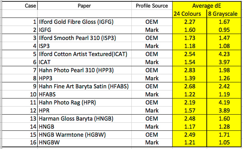
Lower numbers indicate smaller differences between file values and printed values, hence perhaps better. In all cases, on average, the custom profiles are more accurate than the OEM profiles. This is to be expected, because my profiles are bespoke to the printer I’m using. The relatively higher inaccuracies for the extended grayscale (“8 Grayscale”) of the two matte papers happens because these patches include values (L*05 and L*0) that matte papers cannot replicate, whereas they can replicate the blackest patch of the GMCC (L*20). Where differences of accuracy are in the range of dE 1 ~ 2, especially using the dE(76) metric, there is likely to be little to no perceptible difference between using the OEM or the custom profile.
Now, the numbers in Figure 9 are averages. That means there are individual patch values lower and higher than their average. For example, taking ICAT, HFABS and HPP3, the OEM profiles produce dE values well above 3 for 8 to 10 of the 24 patches. Comparing the real prints of the 24 colour target from the OEM and custom profiles, the visual impact of the accuracy differences between the two is actually very subtle even for the patches showing dE values greater than 3. Hence, you can use OEM or custom profiles with these papers and struggle hard to perceive meaningful differences between them; it’s just that custom profiles, for some colours, will be a little better at accurately reproducing the file values.
Turning to grayscale performance in respect of both maximum White/Black values and grayscale neutrality, the data appears in Figure 10.
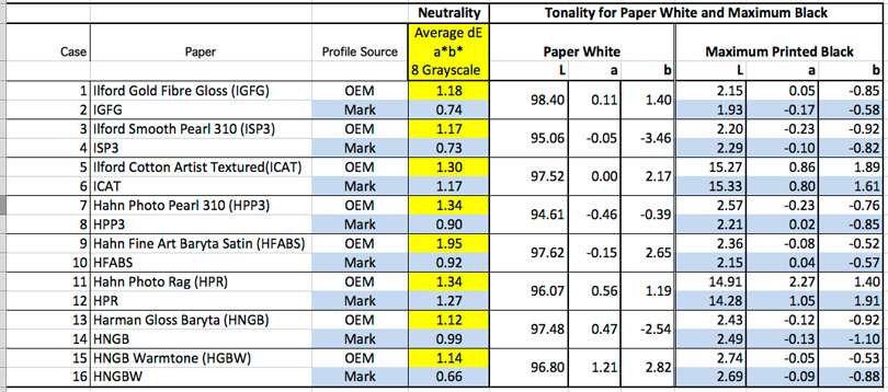
The column shaded in Yellow/Blue is the average dE for only the colour (chroma) channels (a*, b*) of the 8 grayscale patches from L*95 to 0 in order to isolate and measure for statistical chroma neutrality (unlike in Figure 9 where L* is included in the dE calculation for the overall outcome).
The paper white reading is independent of profiles because the values are read from non-inked paper. Looking at Paper White, the b* values are particularly useful for making choices between cooler or warmer tone paper. b* values with a minus sign are of a cooler tendency, and those with positive b* a warmer tendency; b* 0 is neutral gray. For example, a photo that would look better on a cooler tone paper could be printed on ISP3, while a photo wanting a warmer context would call for something like HFABS of HGBW.
Maximum Printed Black is not very sensitive to differences of profiling. As noted above for the profiles themselves, the major difference is between gloss/luster and matte papers. Setting aside the matte papers, the Luminance values of all the PK papers fall within a quite narrow range for all the profiles and most of the departures from neutral gray are below or around 1 dE(76), which is very good – and this is using the standard Epson driver with ICC profiles, not in ABW mode. It truly is remarkable that for the PK papers I am systematically getting maximum Black in the range of 2.1 to 2.7.
Just to put some historical perspective on this, I reverted to prints I made in the darkroom days of the 1960s and early 1970s on a range of Agfa and Ilford papers probably developed in Dektol, and measured for maximum Black. The best result was 7.5 on one photo. The others ranged between 8.3 and 9.7. If these results are typical, our current inkjet technology has bested the darkroom in this respect quite considerably, but funny enough – those old prints still look pretty darn good (at least to me – but then again, I could be biased)!
Turning to paper handling and aesthetics, within their gamut capabilities all of these papers are capable of producing fine prints in all important aspects of print quality. They are differentiated mainly by surface texture, substrate, tint, OBA content and handling characteristics.
Starting with surface texture, the most important visual difference between the papers is that of gloss/luster vs. matte. In Lightroom I softproofed IGFG (PK) and ICAT (MK) and made the screen grabs in Figure 11 to show the differences. The visual comparison is very similar replacing ICAT with HPR.
You can see immediately the different perceptual impact of saturation and dynamic range between these papers. This is not a judgment about either paper, but simply a demonstration of differences. The matte papers can be superb for certain kinds of photos – in particular (but not necessarily limited to) Black & White where, for some images, a lot of detail in the deep shadows could be more of a distraction than an artistic merit – for example where emphasis of shape and form matters more than detail.
Within the matte group, HPR is a brighter and smoother form of matte than ICAT. ICAT is thicker, considerably more textured and slightly warmer than HPR. Both have cotton substrate. Their image rendition characteristics under similar profiling conditions are very similar. Which of the two kinds of matte one would select for printing should depend on which better suits the subject matter. Subjects that would be enhanced by a somewhat grittier and warmer appearance may be better served by ICAT, while subject matter for which the grit would be a distraction should better be printed on a paper like HPR.
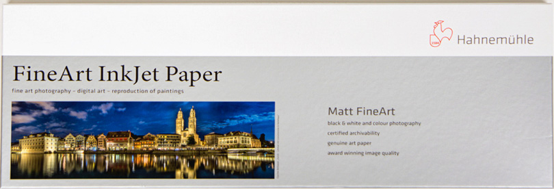
HPR is Hahnemuhle’s star player for three “valued-added” products: (i) “Pano paper” (paper for printing small panoramas using long narrow sheets (8.27 * 23.39 inches) rather than rolls (Figure 12), (ii) the Photo Book Album and (iii) the tin box of photos. I shall explain these uses in a follow-up article.
Within the Gloss/Luster group, they break-down into three types, distinguished by finish and substrate. IGFG and HFABS have more of a conventional luster finish, with cotton substrate for IGFG and Alpha-cellulose for HFABS, while ISP3 and HPP3 are designated “Pearl” having by comparison a finer beady-looking surface texture and alpha-cellulose substrate. The character/quality of image rendition between these four papers and the HNGB discussed just below is so similar that they are really awash. What you use between all of them depends on your taste for finish and substrate – and perhaps price.
HNGB/HNGBW are the glossiest, smoothest papers of the lot reviewed here, but they are not high gloss papers – rather a smooth finish between eggshell and gloss, (somewhat like unferrotyped gloss paper from the darkroom days) with alpha-cellulose substrate. It is perhaps the gloss and smoothness that leads some to feel they produce sharper prints than the luster papers as there is no texture to interfere with appreciation of detail. However, to my eyeballs, even under a 7x aspherical loupe, they don’t produce sharper prints – and with my glasses I have 20/20 vision.
“Warmtone” doesn’t excite me as a paper feature because if I want warm-tone black and white I can dial that in using the Split Tone panel in Lightroom. This doesn’t affect the unprinted borders, but it will tone the photograph any way one pleases. However, if one wants a paper with a warm tone look all over, which can be particularly evocative of the old days in Black and White, this is one such offering.
Turning to the subject of OBAs, I think there is general agreement in archival/preservation circles that the less OBAs in a photographic paper the better, and none at all is the best of all. BUT, turning back to that exercise on historical perspective I mentioned above, some of those very popular papers of the chemical darkroom days contained quite a bit of OBA and the prints still look fine – but they’ve been kept in dark storage for 45 years or so. Were they on display the outcomes may have been different.
There are four fairly accessible ways of determining OBA content: (i) believe what the manufacturer says or doesn’t say (rule of thumb: if they specifically report in the specs “No Optical Brighteners” believe it, otherwise believe they use optical brighteners; (ii) use a UVLED flashlight to see whether the paper fluoresces; (iii) use Ernst Dinkla’s Spectrumviz; (iv) do spot measurements with an i1Pro2 and i1Profiler to graph the difference between M1 and M2 measurement conditions (M2 ignores OBA content, while M1 measures it; if there is none, the M1 and M2 curves converge; otherwise they diverge in the 420~470nm range) indicating possible OBA presence. I don’t have the said flashlight so I use a combination of (i) and (iv). The information happens to converge for each paper between these two approaches, but for the ones possibly harbouring OBAs, to a differing extent as shown in Figures 13 and 14.
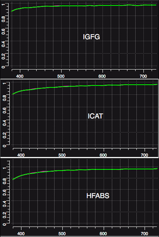
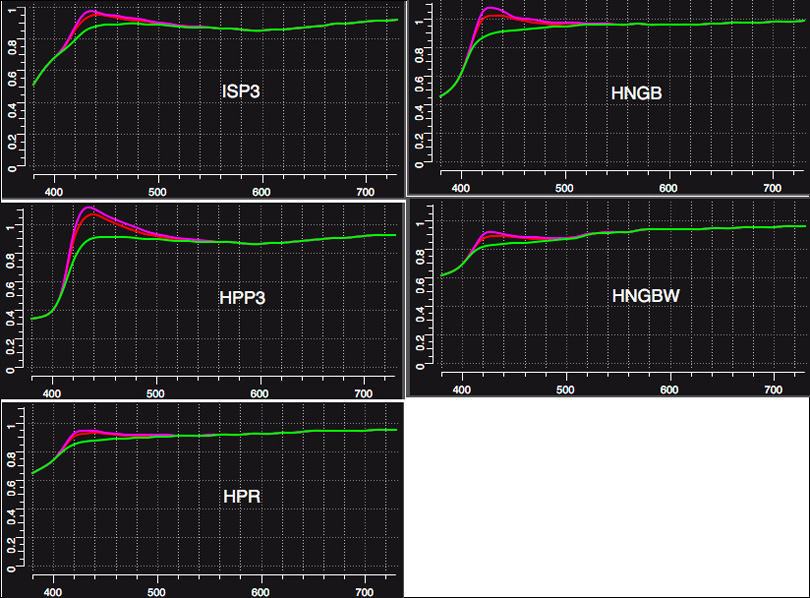
The purple curve is M1 (for papers with OBAs present and to be measured). The Green curve is M2, for which any OBAs are not measured. If only the Green curve shows, one can take this to mean that the paper has no OBA content. If the Purple curve spikes above the Green curve in the 420~470nm range, this indicates possible OBA content as OBAs fluoresce in this range. All the readings are taken from paper white – i.e. un-inked paper. Notice the measured range of difference between HPP3 and HPR in Figure 14. Whether to be concerned about the OBA content partly depends on whether the OBA is in the substrate or the coating (the former will fade much less quickly if at all according to one major manufacturer with whom I discussed this), how the prints will be stored and whether you the viewer would be upset by OBA-influenced paper white turning to non-OBA white over time.
A few comments are in order on paper handling. It varies by product.
Starting with the Harman papers, handling in my Epson P800 was unsatisfactory. Because of the paper curl the front fine art feed had trouble loading it. It did load from the sheet feeder, but even with platen gap set to Wide and thickness to 4, the curl sometimes caused a bit of ink to smudge from the printhead onto one or more corners of the sheets. When the sheets dry, they do not dry completely flat, but rather mildly wavy. That settles out within a couple of days, but the paper retains a mild curl. I am informed this paper has a considerable following nonetheless. Yes, it supports the making of fine prints as do the others, but I’m not enthralled by the flatness of texture, or the handling in the printer or the remaining curl. As they say in Internet lingo – YMMV, as it is reputed to be a very popular paper.
Hahn Photo Pearl and Ilford Smooth Pearl: The Ilford is slightly heavier than the Hahn, but you could get away with loading both from the sheet feeder rather than the Front Fine Art feed. Handling these papers presents no special issues.
Ilford Gold Fibre Gloss and Hahn Fine Art Baryta Satin: Both of these are thicker than are the Pearl papers and should be fed through the Front Fine Art feed if printing in a P800. Because the IGFG has a cotton “rag” substrate, it feels somewhat fuzzier to handle than is the HFABS. For those who find that this kind of fuzzy feeling contributes to the artistic experience, the IGFG will satisfy. Otherwise, as the print quality on both of them is for all intents and purposes identical and neither have OBAs, price may be the deciding factor in which to select – at least it would be for me.
Ilford Cotton Artist Textured and Hahn Photo Rag: While both are matte papers, their handling characteristics differ. ICAT is a considerably heavier and stiffer product, so it really is necessary to feed it through the FFA feed in a P800. Because of its resistance, it is a bit less yielding when it needs to bend upward onto the extendable back paper support of the printer, so I found it useful to nudge this back-support outward as far as I could without breaking it (one thumb on each side and gentle outward pressure) to be completely sure of the paper not jamming as it reaches the back support – you want it to be sliding upward. Perhaps this issue is unique to the P800 feed.
#2 Load the paper from the rear paper support and extension (instead of through the front manual feed tray)
#3 Line up the paper to the right and on the line of the front manual feed tray.
#4 Select load on the LCD panel and follow the instructions on the LCD panel.
HPR is not as stiff and presented no particular loading difficulty. One thing that struck me about both of these papers is how far the rendition on a high quality matte surface has improved over the years. (I made the same observation in respect of the two matte offerings in the Epson Legacy line.)
Summing up, in case I’m asked about my favorites in this lot, the usual answer is “it depends mainly on the photo”. But generically, I found the Ilford Gold Fibre Gloss, Hahn Fine Art Baryta Satin, Hahn Photo Rag and Ilford Cotton Artist Textured to be my four preferred of the eight. The look, handling, feel and robustness of these papers all give them particular appeal.
I should close with a brief demo of how different kinds of paper can be used to help craft different photographic character from the same image. I made this photograph (Figure 15) in Cappadocia, Turkey back in 2009.
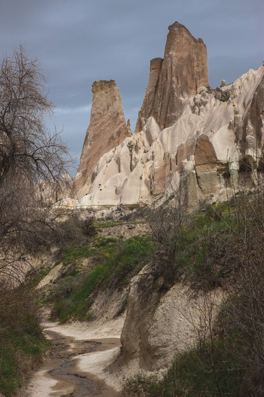
I started with a conventional raw file and decided to interpret this scene in a quiet, somewhat muted mood (as it felt to me on that partially overcast day) using a Lightroom preset called “Direct Positive”. I also considered this photo a good candidate for conversion to Black and White because of its contrasts, lines, forms and sky. I gave the B&W two renditions in Lightroom: a PK rendition with some mild warm-toning, and an MK rendition emphasizing contrast and shapes more than shadow detail (Figures 16 and 17).
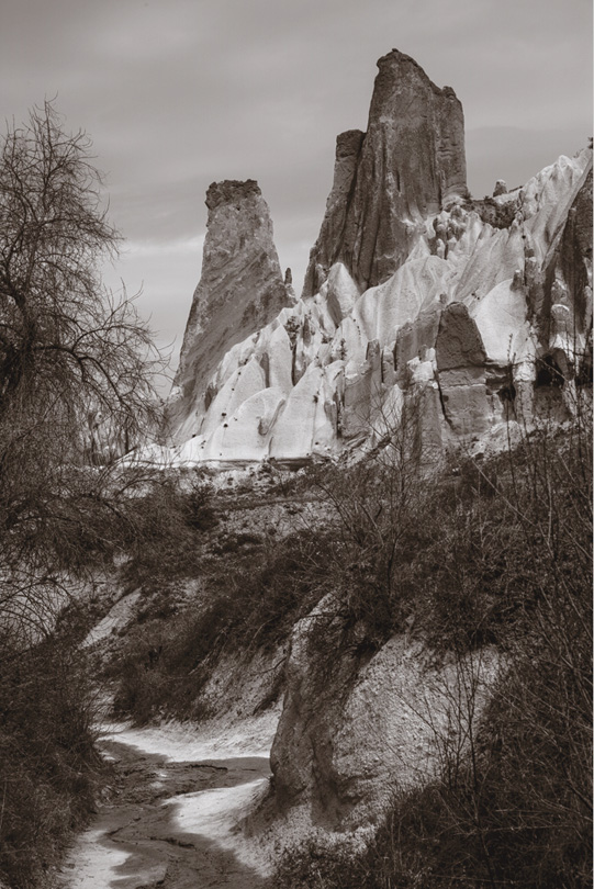
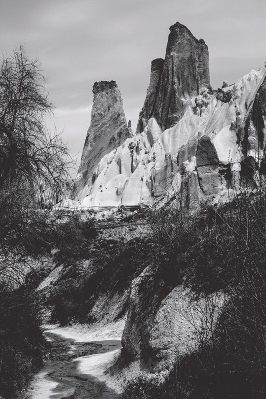
In Figure 16 your eyes will linger longer in the foreground shadow detail as you follow up the creek and the slopes to the rock forms above. The balance of lighting between the center of interest and the foreground is gentle enough not to jar your vision too forcefully into the brighter center of interest. In Figure 17, the same photo but on HPR matte paper, I added contrast and brightness, preventing the image from looking “matte muddy”, while strengthening it. As a result shadow detail is smothered beyond the sole effect of matte paper, resulting in nearly Black foreground masses, while the center of interest atop the slopes is brighter. Your eyes will be more immediately drawn to the contrasting rock shapes sitting atop these slopes bordering the creek. So, we have two different photographic characterizations of the same scene resulting from the mating of different Develop settings to suit the different papers and photographic intent. I think each works in its own way, but as I keep saying, definitely a matter of taste.
Mark D Segal
June 2016
Annex
A Note on the Use of dE(76)
“dE(76)” is the CIE’s earliest attempt to measure how the human visual system perceives colour difference, published in 1976. The L*a*b* colour space and colour measurement scales of L*, a* and b* are the bases for making these measurements. The “d” or “delta” part of the expression is an abbreviation for “change” or “difference” between two colour values. The “E” is an abbreviation for the German word “Empfindung”, meaning “sensation”. So “change in sensation”. The formula, taken from Wikipedia “Color Difference” looks like this:
It’s the square root of the sum of the squared differences between the L*, a* and b* values for two colours. In our application of the concept, the two different colours are the file reference values of the target image versus the values measured for “the same colours” off of the print. All the squaring and square rooting is necessary to get rid of the inconvenience of positive differences offsetting negative differences, in order that absolute differences are calculated. Note the remark about “JND” having a value of 2.3. This is true for some colours but not others; however it makes two important points: (i) worrying about dE values below the vicinity of this level is not useful, hence my interpretative cautions about evaluating profile accuracy and grayscale neutrality in the foregoing text, and (ii) dE(76) is not really that accurate a metric for portraying different “Empfindung” across all colours. There are reasons for this I won’t get into here (plenty of involved literature about it on the Internet).
Hence the CIE developed far more complex mathematical expressions to correct the defects of dE(76). dE(2000) is the currently recommended best practice formulation of the concept – but it takes one quite far afield from our limited objective of simply measuring the extent to which a printing system (machine, ink, paper, profile) can accurately reproduce the colour described by its L*a*b* value in the image file; dE(76) is fine for this purpose, because for each measured colour, it takes the absolute difference between the file reference value and the value measured off of its print.
Once we know the differences, and we print some outputs with known reference values, we can then make judgments about the extent to which a dE value reflects our perception of how the colour differences look; so for example, if we print patch X with profile “y” and it’s dE is say 3 points more accurate than the print of the same patch using profile “z”, do we see the difference of colour comparing patch X between the two prints. This arithmetic does not attempt to encompass those judgments – it only calculates simple differences. But from experience comparing dE’s and prints, it does generally tell us not to get obsessed about low dE(76) values (less than 2 and in some cases less than 3 or 4, depending on the colour) showing up in the majority of the measurements I performed above. Larger dE values would indicate the usefulness of better profiles or equipment/media.
Elevate Your Vision


Read this story and all the best stories on The Luminous Landscape
The author has made this story available to Luminous Landscape members only. Upgrade to get instant access to this story and other benefits available only to members.
Why choose us?
Luminous-Landscape is a membership site. Our website contains over 5300 articles on almost every topic, camera, lens and printer you can imagine. Our membership model is simple, just $2 a month ($24.00 USD a year). This $24 gains you access to a wealth of information including all our past and future video tutorials on such topics as Lightroom, Capture One, Printing, file management and dozens of interviews and travel videos.
- New Articles every few days
- All original content found nowhere else on the web
- No Pop Up Google Sense ads – Our advertisers are photo related
- Download/stream video to any device
- NEW videos monthly
- Top well-known photographer contributors
- Posts from industry leaders
- Speciality Photography Workshops
- Mobile device scalable
- Exclusive video interviews
- Special vendor offers for members
- Hands On Product reviews
- FREE – User Forum. One of the most read user forums on the internet
- Access to our community Buy and Sell pages; for members only.
You may also like