


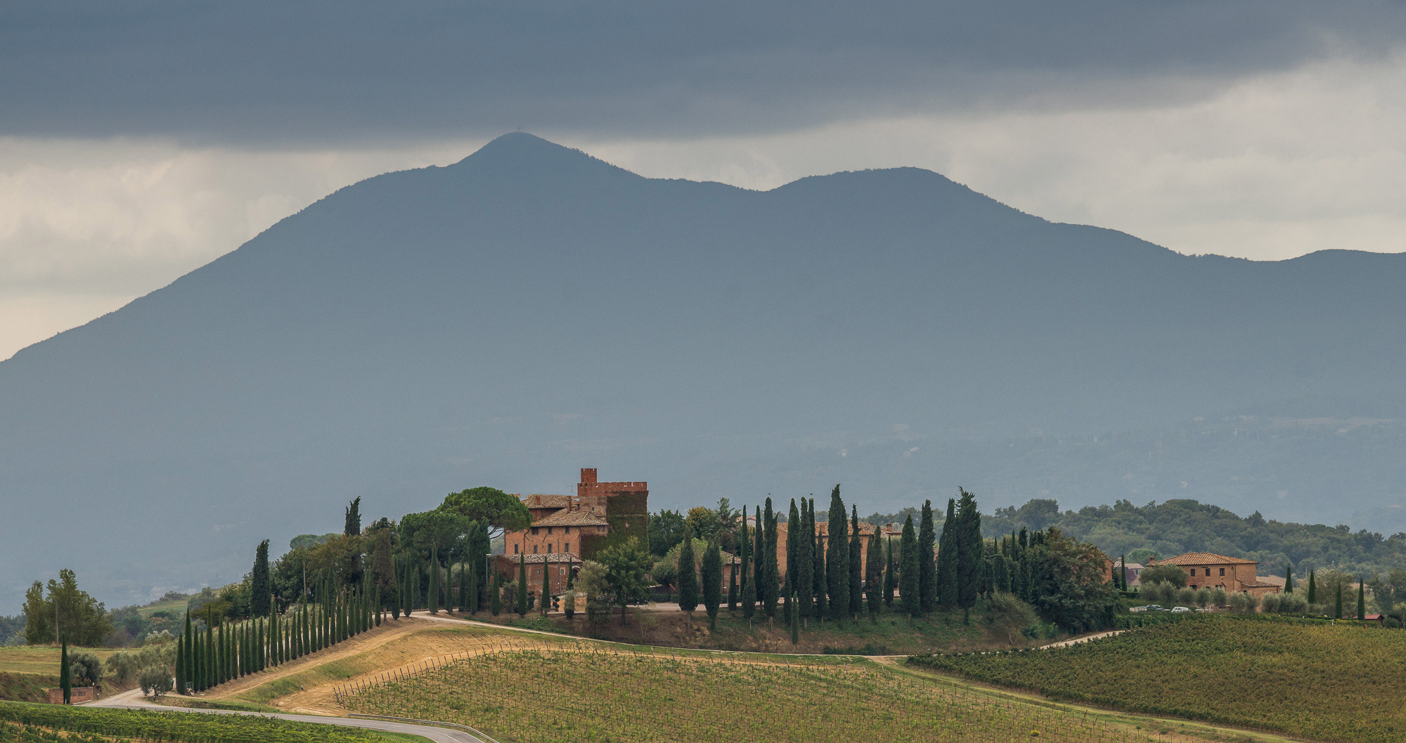
by Frank Sauer

Wild Roses
Sony A65, Minolta 100mm @ f3.2
There are painters who paint in a painstakingly detailed, photorealistic way. While I admire their technique and skill, I am not sure whether I fully appreciate the point of it. In our contemporary world, why not just take a photo if we want photorealistic details?
In contrast, I find myself drawn to photos that have painterly qualities. When photography started in the 19th century, people had either of two main reactions. They admired and embraced it as a true imprint of nature, freezing a moment in time and preserving it (and I love historical photographs for exactly that reason). Others had a more deprecating reaction. What dishonorable detailedness in a photo – instead of a scene’s true spirit as conveyed in a painting!
Now I don’t want to pursue the idea of true spirit, whether it can be captured in a painting or a photograph (or whether it exists at all). But I am interested in an image that is for my taste aesthetically pleasing, an image that evokes feelings. And if you look at an oil painting by Auguste Renoir or a watercolor by Emil Nolde, you see that it does not need photorealistic detail to create feeling and capture the essence of a scene. On the contrary.
Let us say we want to take a picture of an azalea bush. What appears as a gorgeous abundance of flowers from afar may show petals with spotty blemishes, wilted blossoms, and torn leaves upon closer inspection. The imperfections in the detail diminish the splendor and take away from the idea of the bush. If I simply defocus my lens, however, I just get a photo that appears out-of-focus. No distracting details, all right. But probably no magic either.
So what makes an “unsharp” painting with broad and washed-out brush strokes work? What’s the secret? I assume that texture is of importance here, but I cannot put my hand on it exactly. So rather than answering the question, I simply want to share some observations and photos on this topic.
While out-of-focus blur over a whole image does not work for me, I find that motion blur has a completely different quality. The pictures that William Neill took in his Impressions of Light series have no sharp detail in them. The details are replaced by a flow reminiscent of brush strokes. For me, these pictures are magnificent. And there are plenty of examples where a photographer has panned the camera along with a moving object and has achieved very compelling effects. Look for example at Art Wolfe’s Rhythm of Nature book.
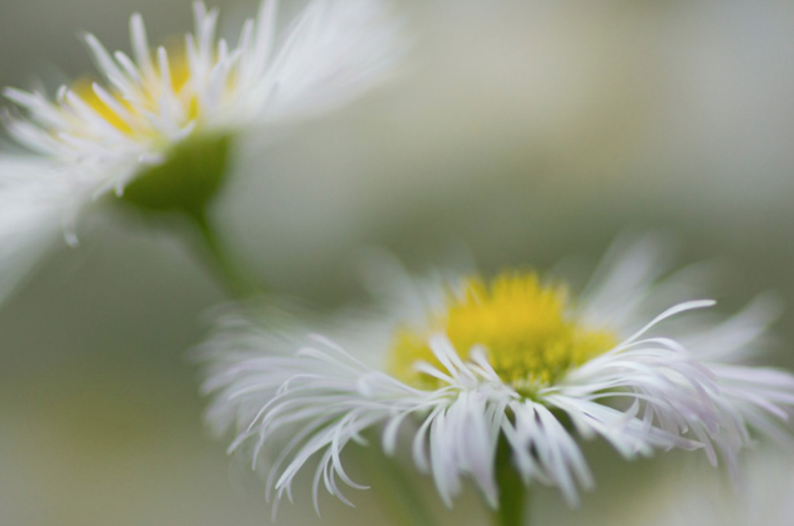
Here is the first photo I would like to share with you. It is a close-up of two small flowers. They are a variety of daisies, with small heads, bright yellow centers and delicate white petals. Only a few of the petals are in focus, and even though there is no motion blur, the image exhibits a flow like quality. In the foreground, the slender petals curve like wings, and the petals of the daisy in the background appear as impressionistic brush strokes.
This is, of course, my personal way of seeing it, and my own description of why I like this image. You need to look and feel and judge for yourself.

Two Daisies
Sony A65, Minolta 100mm @ f3.2
A large grass bush is the object of the second image. It had rained, and the grass blades still have some raindrops clinging onto them. It is evening, and the daylight is fading.
How much sharp detail does a photo need in order to work? If you can develop a liking to this current image, the answer is: pretty little. Only the bottom grass blade is completely in focus. Another grass blade – running diagonally – appears sharp just over a third of its length. The rest of the image is very much out of focus.
And yet, the blurred sections do not simply provide the background to the one sharp grass blade. The whole grass bush is very much the object of the photo. As much as the bottom grass blade with its prominent rain drop contributes to the picture, it is not the center of attention. The attention is distributed. And follow the partially sharp grass blade along the diagonal – does not its bright out-of-focus section in the center draw more attention than its darker in-focus section?
Of course, the sharp objects in this photo carry somewhat diminished weight because of their peripheral locations. But then, the center of the diagonal grass blade stands out not only because of its location but even more because of its bright green intensity. And because it is in a sweet spot regarding the amount of out-of-focus blur – not too blurred, not too detailed. A sharper focus would not make it anymore grass like. The essence of grass blade is already here. This is where photography meets painting.

Evening Grass Bush
Sony R1, 14-72mm f/2.8-4.8 @ 65mm, f4.8
The next image shows two blossoms of a flowering dogwood tree. In this picture there is now a clear separation between foreground and background. The blossom on the right side is in front and in focus, the rest of the frame provides a blurred background. If you wonder how the structure of the background comes about: a bed of grayish wood mulch runs along the diagonal, and is framed by a branch of the dogwood tree on the top, and by green lawn on the left and groundcover with yellow flowers on the right side. The sunlight is filtered through the leaves and creates light speckles on the ground. In combination with the lumpy structure of the mulch and flowers we get the sun-filled patchy nature of the background.
The texture reminds me somewhat of impressionist paintings.

Dogwood Flowers
Sony R1, 14-72mm f/2.8-4.8 @ 71mm, f4.8
The fourth picture is again very different from the previous ones. Here is no sense of movement, no dominance of blur. The maple leaves cover the whole frame and they are (in principle) all in focus. And yet, also this photo has a painterly quality. This comes from the leaves’ texture and colors. And from the bright background with its pastel color variations that show through the curtain of leaves. Printed on a textured fine art paper, this photo evokes very much the feel of a watercolor painting.

Fall Maple
Sony A65, Minolta 100mm @ F3.5
I showed you four photos that – in different ways – convey a painterly feel to me. The goal is not to imitate painting, no. But rather to better understand how to move photos away from a strict clinical recording of a moment in time to a more expressive capture of nature. To go from documentation to poetry.
Remember that we started from the observation that a painting can convey a feeling through a few brushstrokes, a feeling that may well go away if we would fill in all the minute detail from a real scene. Out-of-focus blur is, of course, one major tool to reduce details in photography. The four example photos have in common that they are all taken with wide apertures. The out-of focus blur is an important element in all of them. It manifests itself in different textures – from motion-like flow to long diffuse strokes to sunny patchiness to pastel color variations.
When we reduce the details, we put something else in place. And of course, it is this other something that needs to have the “looks” and work. Sooo … is this in the end just about the b-word: bokeh? The Internet is full of discussions on bokeh, and which lenses render out of focus objects in a particular smooth and pleasing way. Is the current article just a stealth discussion on bokeh? Does the quest for an appealing painterly look in a photo just boil down to using the right lens?
Let me show you crops of three more pictures to illustrate my personal opinion. These three examples exhibit very different textures. The first looks like a Waldorf water color painting, the next one reminds me of a Georgia O’Keefe image, and the last – well, the last looks simply like a photo that is out of focus.


Now all three photos have been taken with the same camera and the same lens, and more or less also with the same aperture (f3.2/f4.0/f3.2). Yet, they display very different textures. So by all means, give me a good lens, give me one that renders with a nice bokeh. But: this is not the end of it – it is only the start. Now comes the hard part (in terms of achieving good results) or the fun part (in terms of exploring the world with camera and lens). Each object will be different, it takes experience, a lot of patience and always (at least from my perspective) a bit of luck.
Let me share the complete frames of the three photos so you can appreciate the context.


Lavender – Peony – Mums
Sony A65, Minolta 100mm @ f/3.2 – 4.0 – 3.2
The bottom photo is a close-up of a mums flower. While the blurred background has a somewhat boring texture, the whole photo redeems itself to some extent with the sharpness of the yellow petal compensating for the overly softness of the background. And the blue-yellow complementary color scheme provides an interesting touch, too.
The middle image shows a close-up of a Peony flower. Here and there across the image, some edges fall into focus. Most parts of the petals, however, are blurred because of the very narrow depth of focus. This combination of a few sharp lines embedded in a blurred structure leads to a particular glow effect. For my taste, though, the photo is too abstract and cold. It is not a favorite of mine.
The photo of the lavender bud, however, would easily have been a personal favorite. I love the texture of the green stems and leaves in the background. Unfortunately, the foreground object is so simple and trivial that it makes the whole image uninspiring. Which is a pity. Often enough I get excited about a particular out-of-focus texture, and then fail to find an object that is interesting enough to take center stage and complete the picture. But then – this is photography. We have to deal with what we have in front of us.
So sometimes I wish I knew how to paint – and be freer in capturing and interpreting reality. But if you are like me, you won’t paint but rather take more pictures. If you want to work with out-of-focus blur, go out and look, and have your mind and your aperture wide open. Try out photos. Many may not work. But some will. And then it feels deeply satisfying and rewarding, and keeps you going. And keep in mind: ultimately, the success of a photo is very much a matter of personal taste.
P.S.: One of my personal favorites is “Wild Roses”, the photo at the top of this page. As with the other photos in this article, there is no effect filter applied here. Apart from some slight tonal adjustments and a tiny amount of cropping, the picture shows essentially what came straight out of the camera. From time to time, it still amazes me what the camera can render.
About Frank Sauer
Frank Sauer has been taking photos nearly all of his life. He feels that the practice of creativity is an essential ingredient of happiness.
You can see some more of his pictures at HERE.
Published XXXXXXXXXXXX
Elevate Your Vision


You may also like