



Legion paper invited me to test their new version of Silver Metallic paper, distinguished from the previous offering with the suffix “Pro”. This new version has several technical improvements over the previous one. I was pleased to accept their invitation and give this new version a complete look-over.
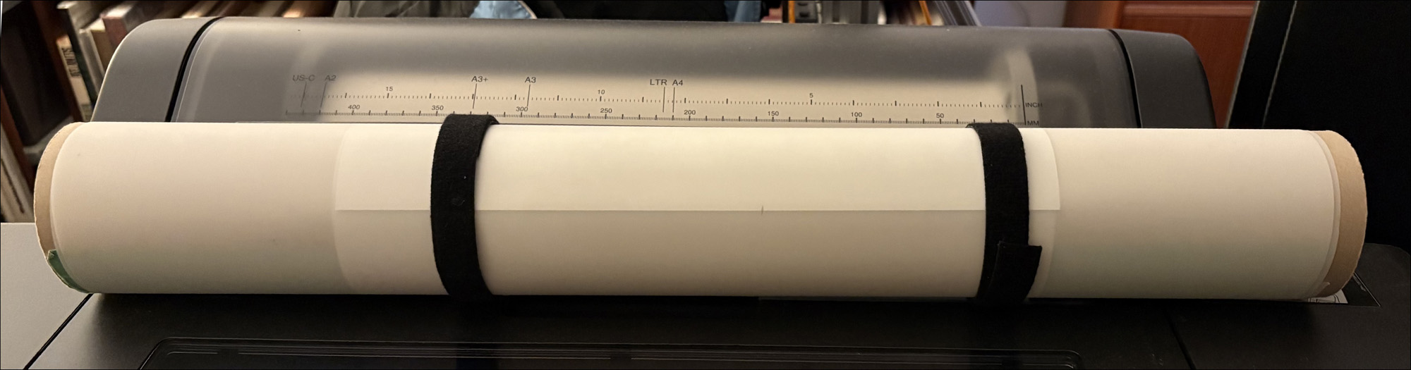
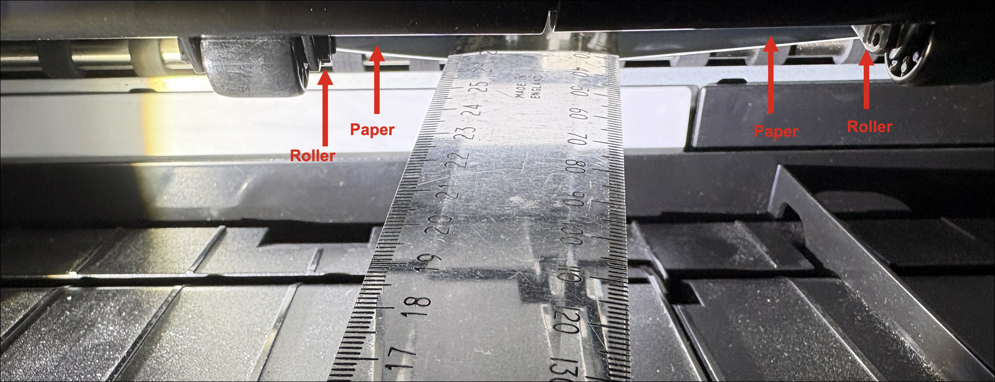
Legion paper advises me the paper substrate is alpha cellulose, and the reflective layer is polyester metallic film (PET – polyethylene terephthalate). This is a very robust, “springy” paper. You can’t rip it apart with your hands – cutting it needs scissors. The paper has a convex curl which can cause it to catch on the back-end of the final egress rollers in an Epson SC-P5370 printer. I don’t know whether this can happen with any other printer. It happened to me, and I solved it with two measures: (1) counter-rolling the paper before loading it, and (2) holding the paper down a bit with a plastic ruler just before it moves toward the back-end of those rollers (Figures 1 and 2). Both are harmless, easy to do and solve the problem. Legion Paper is aware of the issue and working on a fix.
The improvements versus the previous version: according to Legion Paper, the L* value has increased, so the paper is slightly brighter, and the silver base is closer to neutral vs a blue tint in the original. With the changes in silver, home users can now profile the paper with an i1Pro spectro and no work-arounds (this is good, as, for instance, my i1Pro was unable to read profiling patch values from the original version). As well, according to Moab, they are using a different coating, providing a larger gamut. Moab created its current profiles with i1Profiler and generated them from M1 data (which accounts for UV; I do the same).
Up-front, this testing isn’t aimed at printer/paper profile accuracy, because this paper isn’t intended to reproduce tones and colours accurately (vis à vis the reference values of the colours in the image file). It is intended for producing metallic silver effects. It works well for some kinds of photos and not so well for others. There are reasons and we’ll get into that. Nonetheless, I’ve run the accuracy test with the objective of identifying how INaccurate various colour patches are and in what way, as that gives me insight for what to expect when trying to select and print good candidate photos. An important aspect of this approach is to also understand the paper’s gamut characteristics, as in this case gamut is an important determinant of photo choice and editing approach. Every photograph requires custom editing to suit the special character of this paper. We’ll get into that as well.
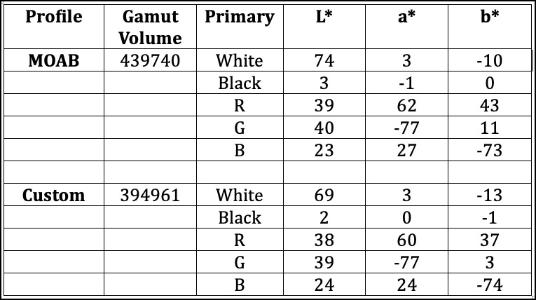
Let’s begin with the profile characteristics as analyzed in Color Think:
You may ask why should I bother making a custom profile when both the company and I are using similar profiling technology. Well, there’s a simple answer: we are using different units of the same printer model operating in different atmospheric conditions using the same inks but likely with different ages and batches. While the printer manufacturers strive (and achieve) a high degree of uniformity from one unit to the next of printers and inks, it’s not perfect, hence there could be some value to a custom profile reflecting the specific conditions of one’s own printer and inks. But I must confess, these days (unlike in the much earlier days of inkjet printing) in general the manufacturers who make them are adept at profiling and providing very usable product. Another reason for custom profiling is simply to confirm the case-specific validity of the statement I just made. It’s like the “second opinion ” – backed by data.
Table 1 above tells a lot about what to expect for colour gamut, White Point and Black Point, especially if we were to compare this data versus more “normal” inkjet papers.
Figure 3 indicates that the paper has no OBA content, viz. the absence of a Violet/Magenta curve spike at the left end of the colour spectrum scale (<400 nm) in the reflectance graph, and the close similarity of the L*a*b* readings for the M0, M1, and M2 measurement conditions (X-Rite publishes a paper on Measurement Conditions (https://www.xrite.com/learning-color-education/whitepapers/m-factor); for our purpose the key difference between them is whether or not they include Ultraviolet (UV) measurement.
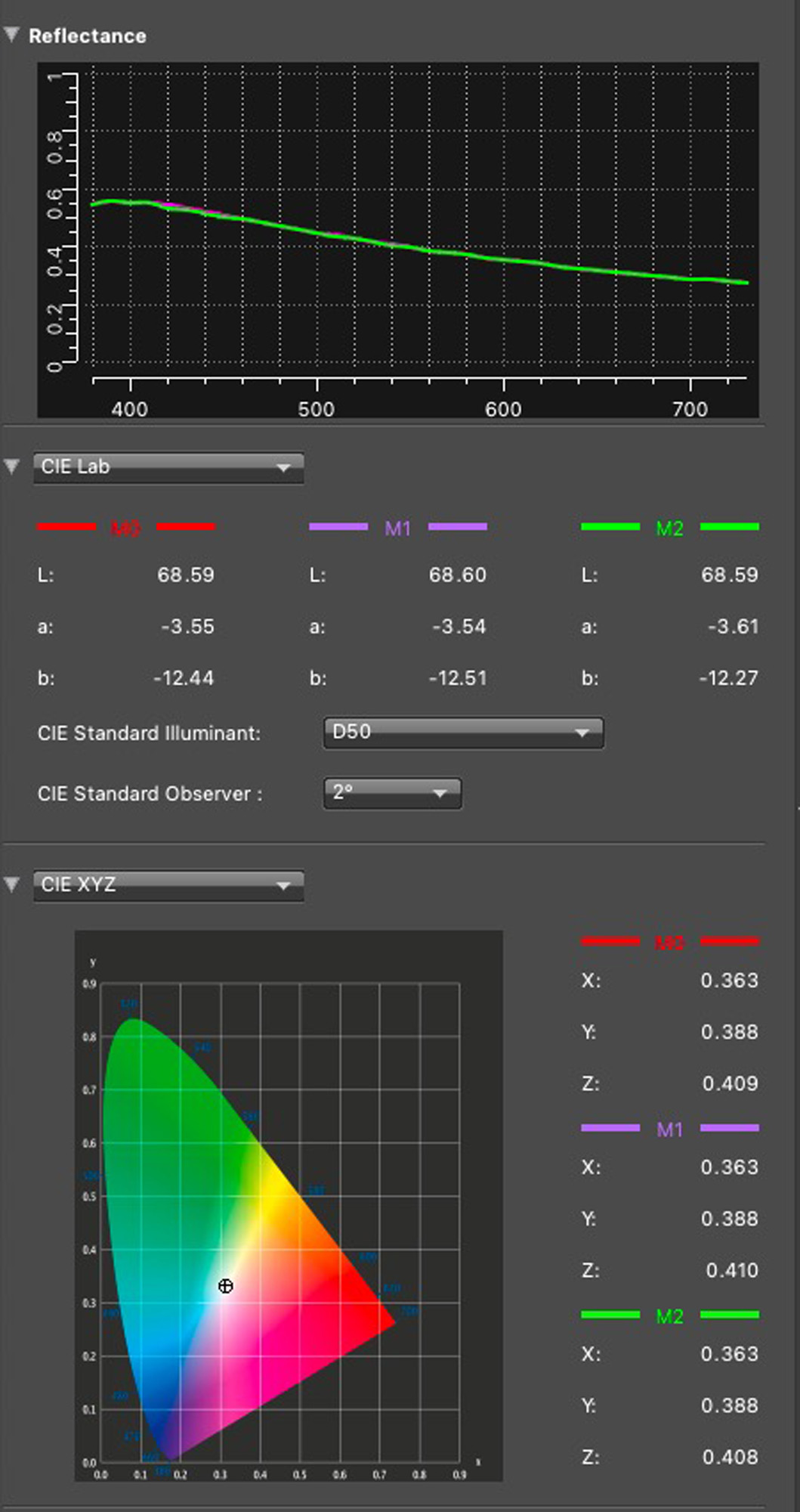
Also notice how non-white the White Point is in the reading of paper white in i1Profiler (Figure 4). This of course explains the Low L* (lightness) the non-neutral values of a* and b*, especially b* reading -12.27 indicating a bluish temperature, less so in the a* axis reading -3.6, indicating a slightly greenish cast, together imparting a slight Cyan shading of the paper, which when combined with its high-gloss PET coating imparts the silver-metallic appearance. Also note how the maximum reflectance (upper panel, Y axis) is about 0.6 which correlates with the L* maximum lightness of 68.6. A normal baryta semi-gloss paper would have Paper White at about L*98, with a* and b* both close to 0.
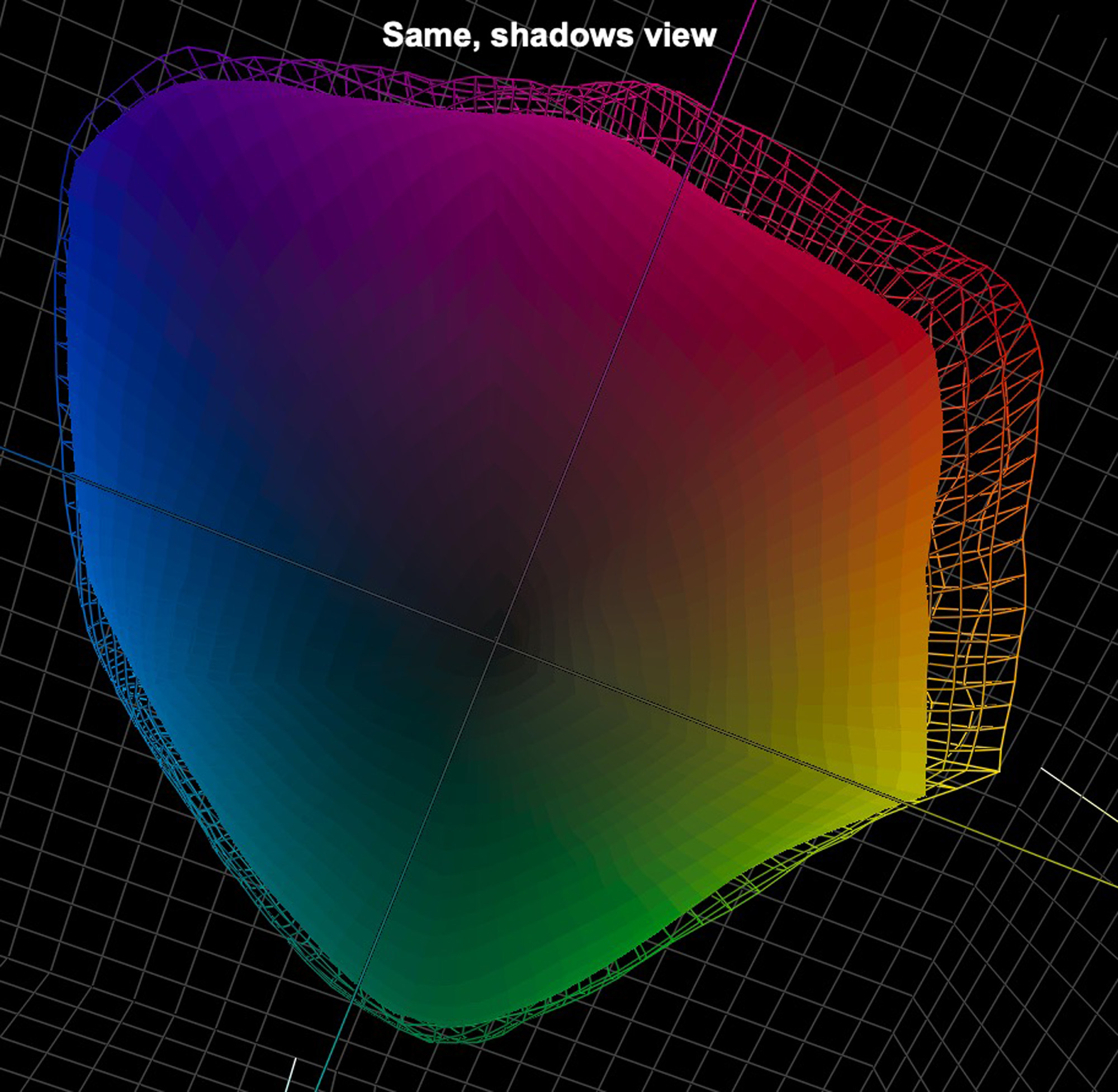
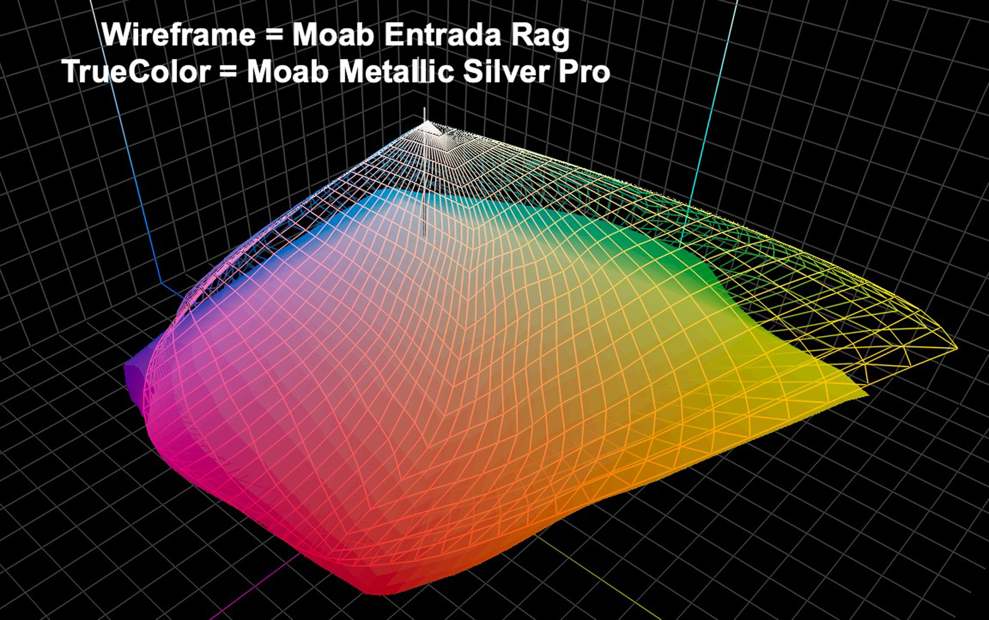
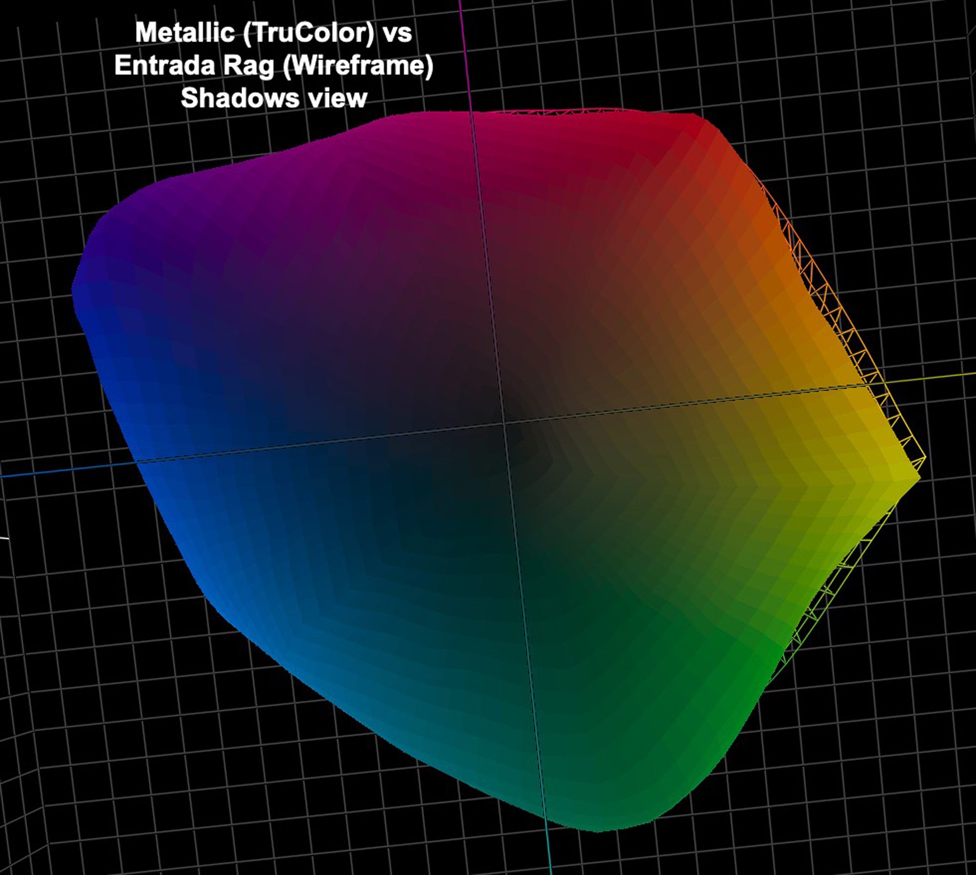
These observations explain much about the gamut volume: for both profiles it’s quite low, mine some 10% lower than MOAB’s for reasons we don’t know. I’m not sure this difference matters much. (In other respects, our profiles yield similar numbers under analysis). The key point is that relative to a normal quality Baryta Photo paper, such as Moab Juniper Baryta Rag, Metallic Pro has quite a low gamut; in fact, even a bit lower than their Entrada Rag, which is smooth matte, and the main cause of the relatively low gamut volume is the reduced L* value. Let’s look at several diagrams for a visual impression of what’s going on.
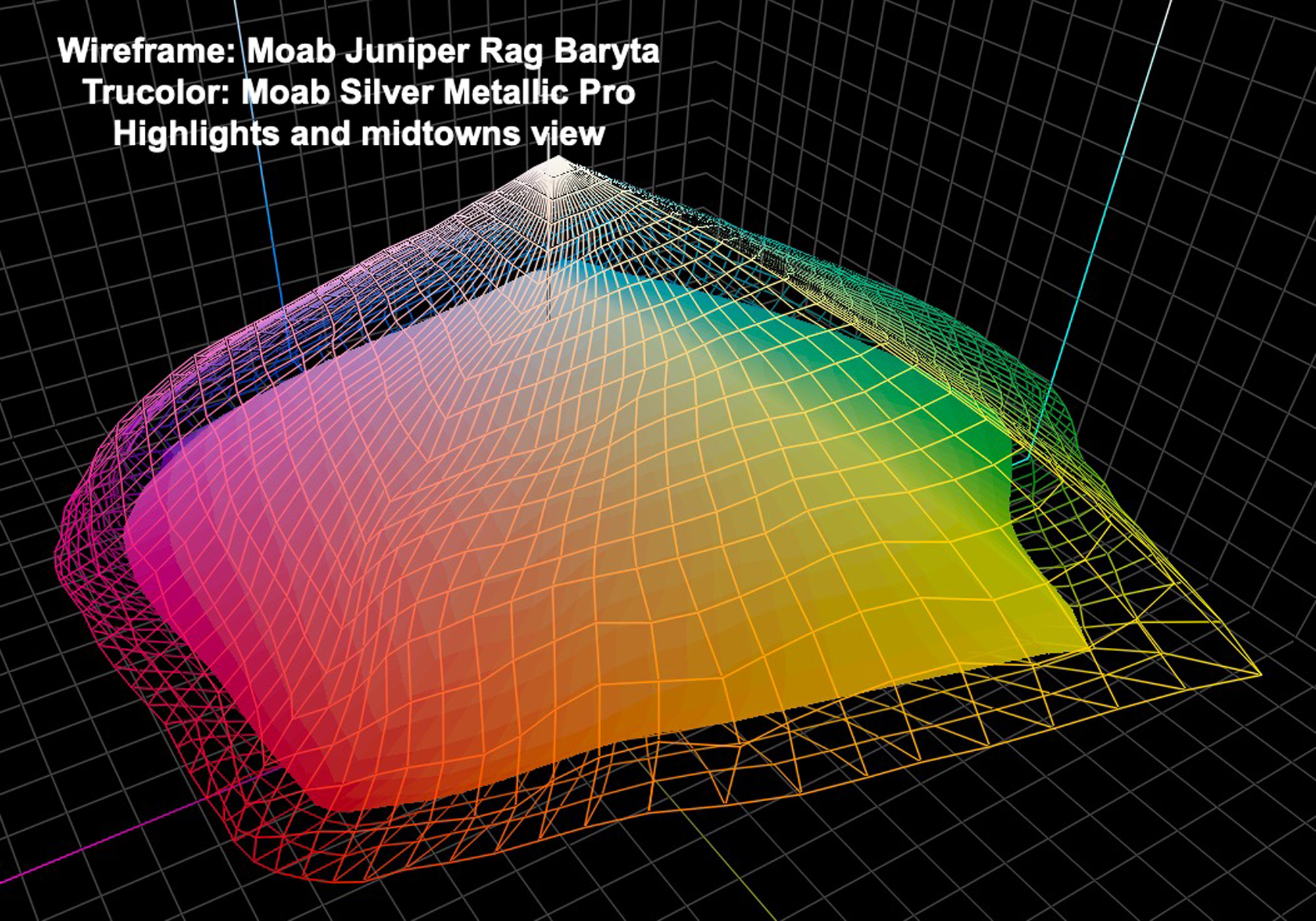
Notice the extent to which Juniper Rag Baryta (wireframe) exceeds the gamut of every upper and mid tone compared with Metallic Silver Pro (Trucolor) (Figure 5). The opposite is the case for the dark tones (Figure 6). (Note: in these diagrams the version that “pokes out” or covers the other is the one with larger gamut in those areas where this happens; so, where the wireframe prevails, Juniper Baryta has the wider gamut; where the TruColor covers the wireframe, the Metallic Silver Pro has the wider gamut.)
Let’s now see the same comparison this time Metallic Silver versus Moab Entrada Rag, a smooth matte (Figures 7 and 8). The pattern is similar but the extent of difference lesser because Entrada Rag, being a matte paper, has lower gamut volume than Juniper Rag Baryta, mainly because its reflectance is lower and therefore maximum Black weaker.
Lest one think the relatively lower gamut volume of Metallic Silver makes it unusable, let me dispel that idea quickly. The paper is eminently usable provided one prints the kind of photos on it that it accommodates nicely with tone and colour editing.
I can offer a priori technical guidance for selecting such photos, derived partly from the INaccuracy test and partly from general principles observed working with the paper. Let’s start with INaccuracy. Figure 9 shows the approximate appearance of my 48-patch test if it were printed on a standard semi-gloss paper such as Juniper Baryta Rag, while Figure 10 is the result of a scan (as close as I could get it) of the same patch test printed on Metallic Silver.
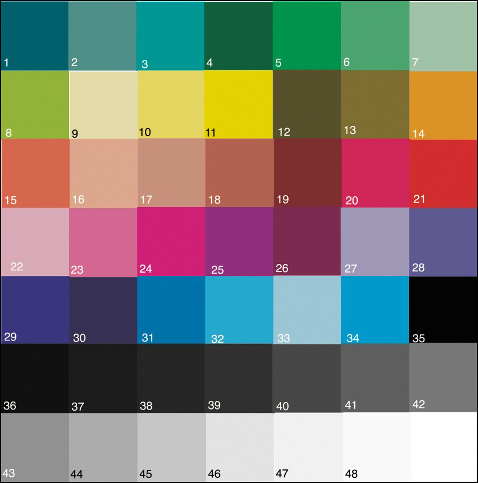
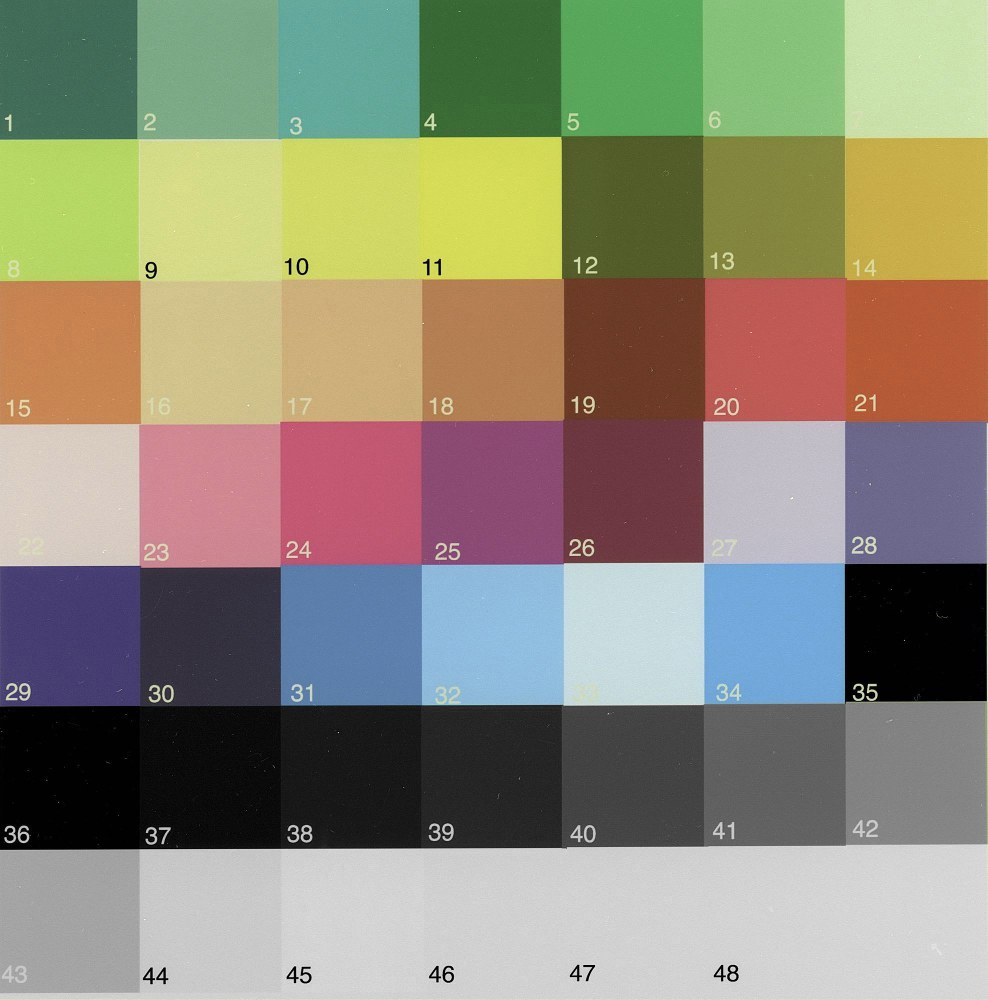
Figure 10 isn’t a totally faithful reproduction of what this print looks like because this paper is hard to scan accurately. It gives you the general idea that none of the colours look quite the same, but there is some resemblance! This fact is reinforced with the data in Figure 11. Here is the key to understanding this informative table.
Column A: the patch number.
Column B: the approximate patch colour in the test chart.
Columns C,D,E: the test file reference values for L*, a* and b* (**definitions just below).
Columns F,G,H: the read values of the target print patches for the custom profile.
Columns I,J,K: same, but for the Moab profile.
Columns L to Q: the absolute differences between read values and reference values for both Moab and Custom profiles. Interpretation:
For the L* columns, where the back fill is blue (yellow) the direction of change is that the read values are darker (lighter) than reference values by the amount indicated.
For the a* columns, , where the back fill is blue (yellow) the direction of change is that the read values are more greenish (more reddish) than reference values by the amount indicated. For the b* columns, where the back fill is blue (yellow) the direction of change is that the read values are more bluish (more yellowish) than reference values by the amount indicated. Larger numbers in these columns of course mean bigger differences.
(**For the benefit of those not familiar with the L*a*b* colour model: L*: Luminance, scale 1 to 100 from Black to White; a*: Green to Magenta/Red, scale -128 to +127; b*: Blue to Yellow, scale -128 to +127; when both a* and b* are 0, the colour is gray.)
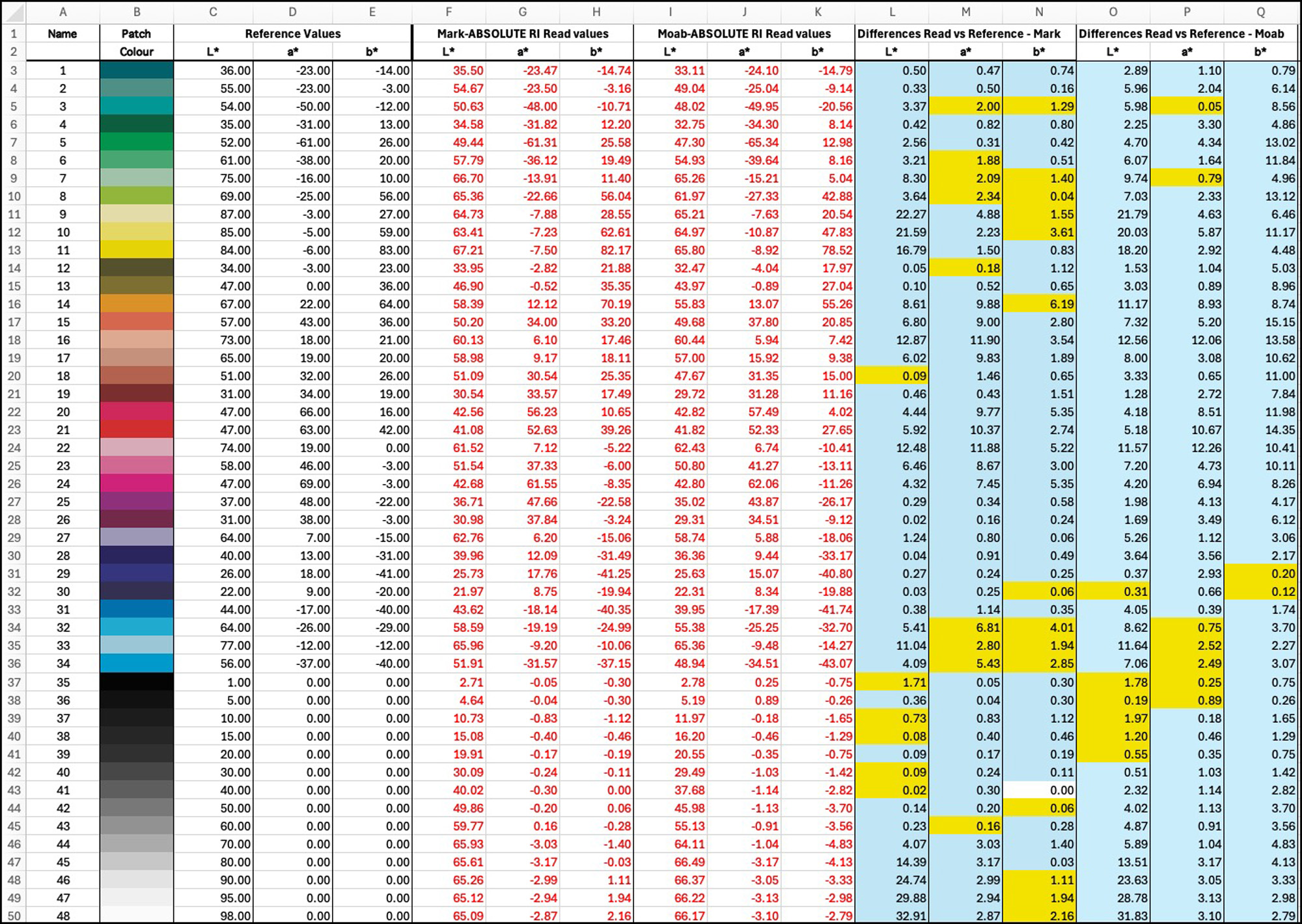
So, of what predictive value is all this numerical voodoo when it comes to selecting photos for printing on this paper? Let’s take yellow as an example that screams out: patch 11 in row 13. Regardless of which profile, it will print a whopping 17~18 L* values lower than its file value, and it will have a slight but still noticeable Cyan cast (a* and b* both in negative territory versus the file values). Hence, we know before we start that any photo with a lot of yellow in it will need lots of adjustment if we want to try better approximating the original appearance but with a metallic flair. Forewarned is forearmed. We can do this look-up using the above table for any of the 48 patches of particular interest.
Also notice the L* data at the light end of the grayscale clearly shows that reproduction is stuck in the range of L*66~68 as we move from patch 44 upward. So that tells us to avoid printing photos that have large very bright areas exceeding L*65 or so, because they’ll struggle with tonal differentiation on this paper. The remainder of the grayscale from patch 35 (Black) to 43 (a mid-tone gray) inclusive shows quite neutral reproduction (a* and b* being close to zero) for both the Moab and Custom profiles. There is enough ink being laid down to largely overcome the Cyanish colour cast of the paper itself.
Another interesting general point coming out of the data is that most colours reproduce darker and cooler than their reference values (we see a lot more blue than yellow backfill in those columns L to Q). This means that selecting and adjusting photos for this paper, we may tend to prefer images that are somewhat on the darker/cooler side where more of this paper’s gamut is. But mid-tones with lots of contrast work too.
The main point is that similarly to working with a matte paper, because of limited gamut compared with a Baryta semi-gloss, one way or another we are managing image gamut compression to optimize the appearance of what the printer/paper can reproduce.
That now takes us to general guidelines for selecting “metallic-worthy” photographs. General guidelines don’t replace the need to appreciate each selection under soft-proof on one’s colour-managed display, but they help shorten the selection process by reducing the number of rejects.
So, the guidelines:
Photographs with one or more of these qualities:
- Strong contrast without very bright highlights;
- Strong colours;
- Bold compositional lines;
- Metallic and glass or glassy subject matter;
- Subdued highlights;
- Well-differentiated dark tones;
- Textures and other detail that get sharply defined on a high-gloss medium;
- Lower key photos as much of this paper’s gamut is concentrated in the darker tones.
From my experience working with metallic papers, the more the photos have these characteristics the better they show.
My procedure is, working in Lightroom Classic, to select a candidate photo for printing on Metallic Silver, make a virtual copy of it and experiment with the most appropriate tone and colour adjustments relative to its previous status in order to make it stand-out from its subdued silver media.
Having selected a dozen candidates from my archives to test for this article, respecting as many of these criteria as I could manage, I found that often the following adjustments were needed, done under softproof, the extent of each being quite variable (pointless going to Photoshop and creating actions for this; it’s photo by photo, easiest in Lightroom):
- Limited Exposure increase;
- Contrast increase;
- Highlights reduction;
- Vibrance increase;
- Selective colour saturation and lightness up or down as appropriate;
- Clarity increase;
- Lightening darks and darkening Black to increase shadow detail separation;
- Generous use of masking for local area adjustments.
I’ll proceed to demo this process with one photo, and then post others that I tested. I made this photo (Figure 12) at the Völklingen Hütte on the outskirts of Saarbrücken, Germany. These kind of machinery and structural steel constructs do well on metallic paper. But the photo has an important yellow component, so we’ll see how well that does.
Here’s a screen grab of what that photo looks like under various relevant viewing conditions:
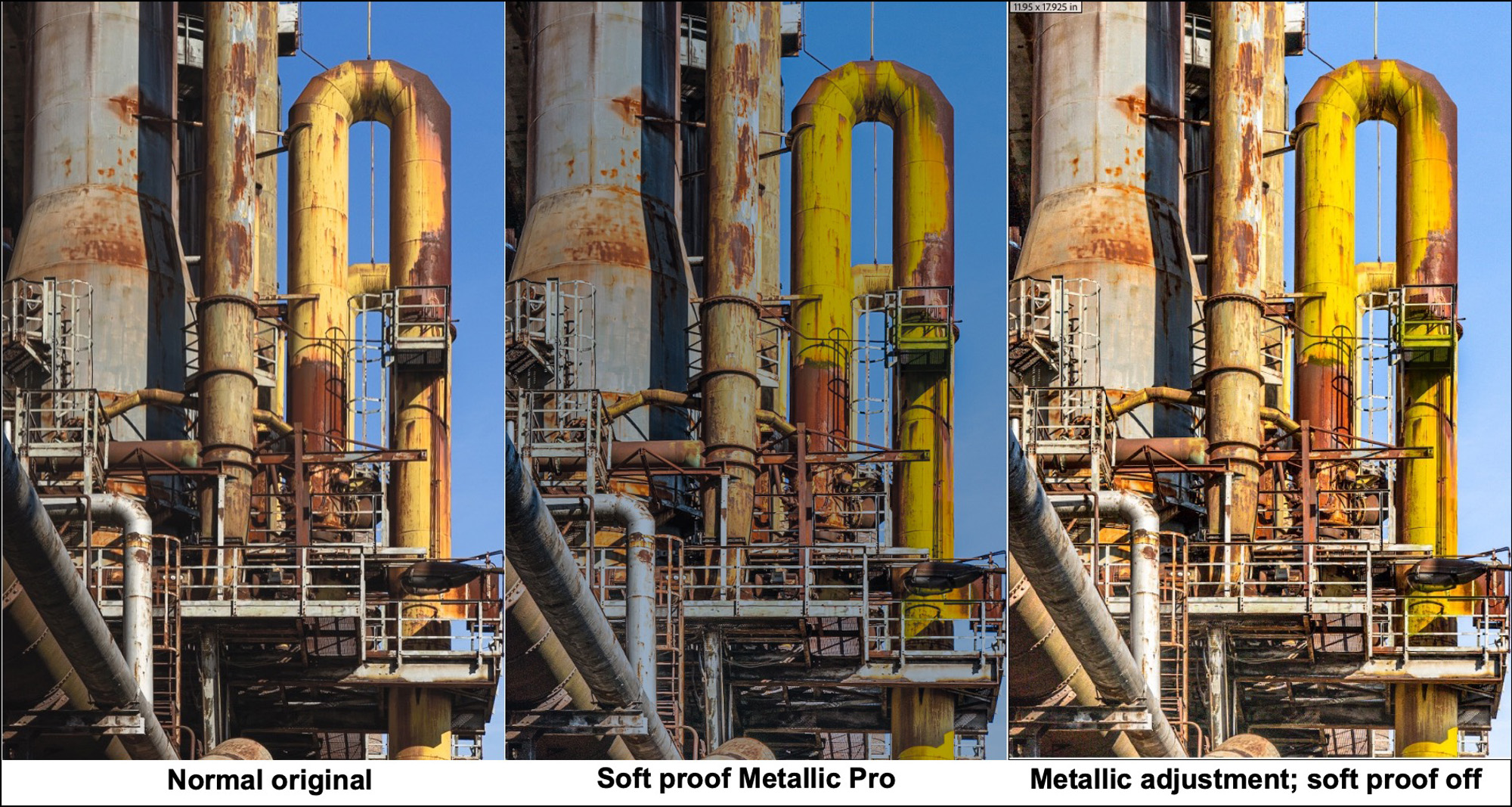
The left panel of Figure 12 shows what the photo looks like printed on a normal baryta semi-gloss. The center panel shows what it looks like on a soft-proofed, colour-managed display when the Metallic Pro profile is selected as the printing condition, but before any custom edits to adjust from the settings used for the baryta semi-gloss profile to any needed for the Metallic Pro profile. It’s clearly too flat and dark to print this way, hence a bunch of adjustments were in order. The adjustments consisted of increasing brightness, contrast, vibrance, clarity and a custom increase (using a mask) of the yellow column’s hue, brightness and saturation. The panel on the right shows what those adjustments look like if the profile were reverted to the baryta semi-gloss paper without re-adjusting settings used for metallic. The idea is that we can compare the left and right-side panels to see how much brightness, contrast and vibrance were increased for the needs of the metallic paper.
Figure 13 is a photograph of the print on Metallic Pro paper including the custom adjustments made for it.
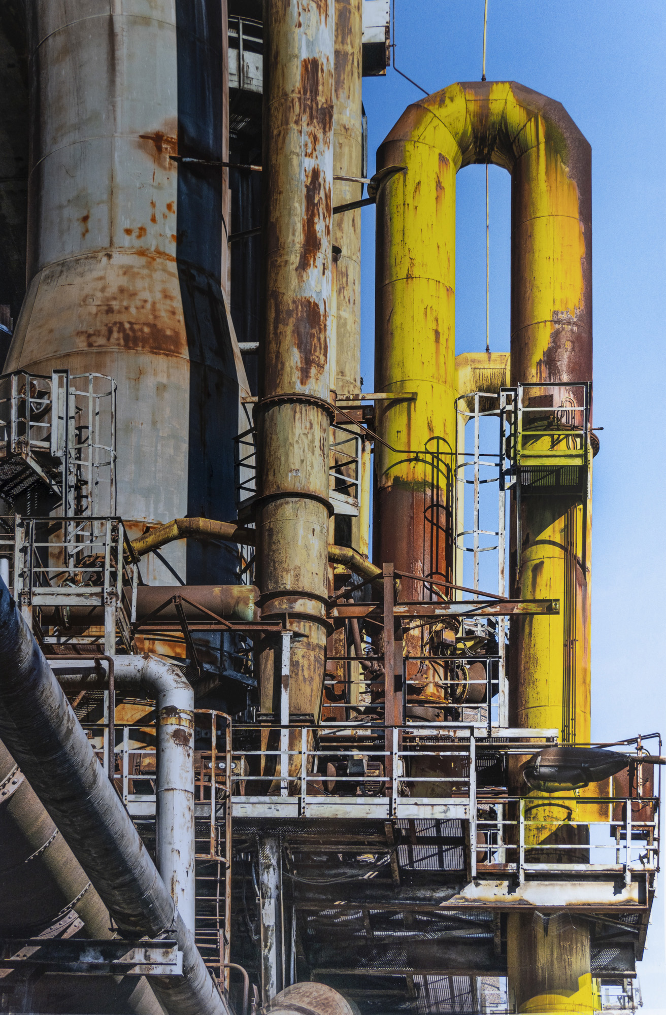
It’s not possible to faithfully reproduce on non-metallic media the metallic-looking properties of these prints (as seen when holding the actual sheet); hence what you see here is an impression of how tone and colour can be adjusted to suit the needs of this specialty paper, even though the unadjusted soft-proof (Figure 12 middle) looks to be quite an unpromising starting point.
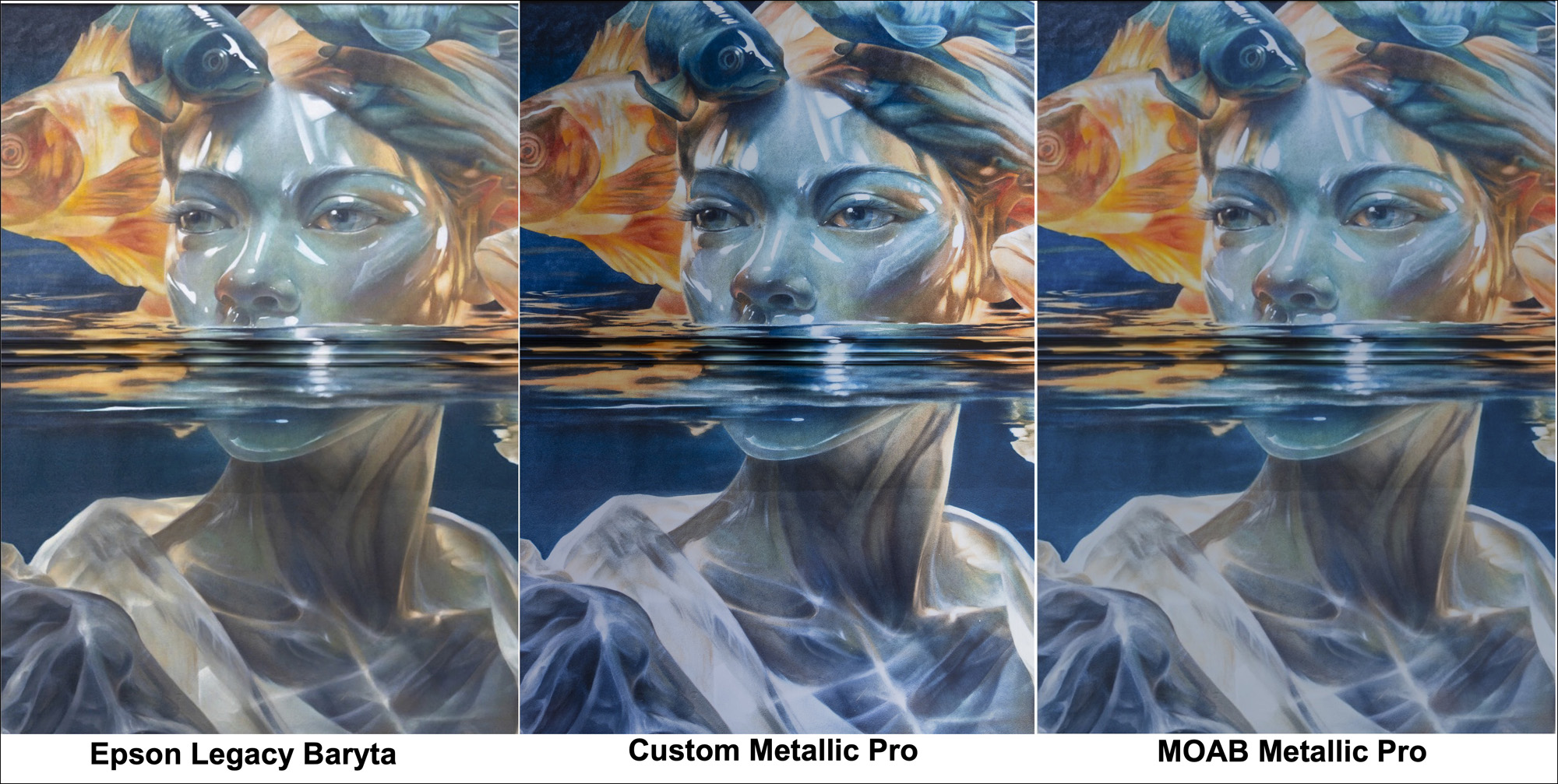
I’ll turn now to a more challenging case which highlights several interesting points about using this paper (Figures 14 – screen grabs of soft-proofed versions, and 15 – photo of the metallic print). I made this photograph of a segment of a new wall-painting by “Bacon”, internationally reputed Toronto mural painter.
The left panel shows what the painting and the photo look like softproofed for Epson Legacy Baryta, a quality semi-gloss baryta paper. The center panel shows the softproof of the same photo after image adjustments for my custom Moab Metallic Pro profile.
The right panel shows the same, but simply changing from my profile to the Moab profile for the same paper. Figure 15 is a photograph of the print made with the custom profile.
While the differences between the Moab profile and mine aren’t dramatic, there are several noticeable differences, consistent with the data. The Moab profile produces a slightly lighter outcome with slightly less apparent contrast. This coheres with the fact that their “white” point is 5 L* values above mine, and their gamut volume is 10% greater, most likely due to the higher White Point. Neither profile could help much with the translucent bright tones of the lady’s dress collar, probably because they sit close to or above the rather low “White” Point of this paper, implying substantial compression of the tonal range in that area of the photo; as well the delicate yellowish tone tends to be extinguished by the paper shade. Both metallic renditions are lower-key than the one on Legacy Baryta, and upon trying to brighten them, the image falls flat. To get the maximum metallic effect it’s best to leave the tonal range darker. This is the kind of thing that can be assessed only by experimenting with settings under soft-proof case-by-case.
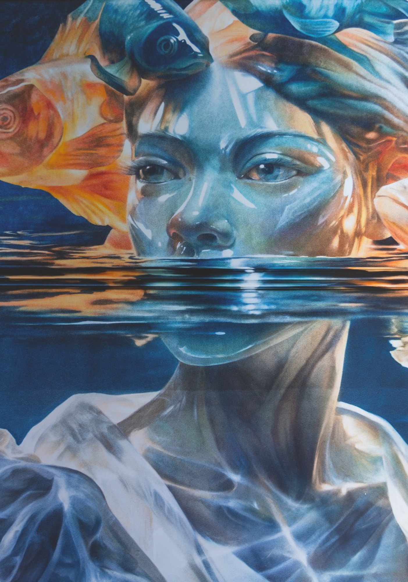
As an aside, the main reason why I selected this photo is to see how well the metallic paper picks-up the glassy-looking effect Bacon painted on this wall – it’s a specialty of his. When one looks at the actual print, the paper does this effect justice because of its glossy metallic character. This is an example of what I mean by selecting appropriate photos, matching the character of the photos to the character of the paper.
Another very different genre of photo that also has “glassy” effects I thought well-suited to metallic treatment is this 2014 photograph I made on the “Beach” in Iceland (Figure 16 – softproof view of the photo printed on Epson Legacy Baryta).
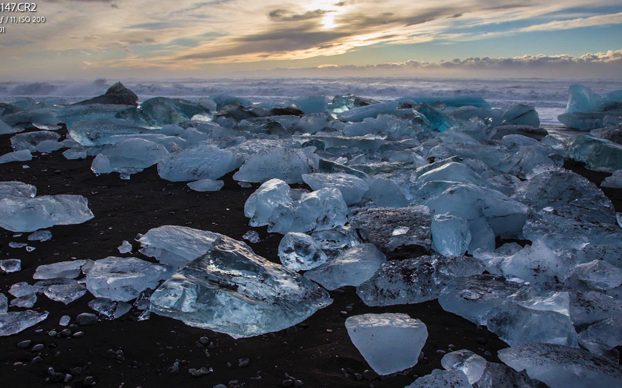
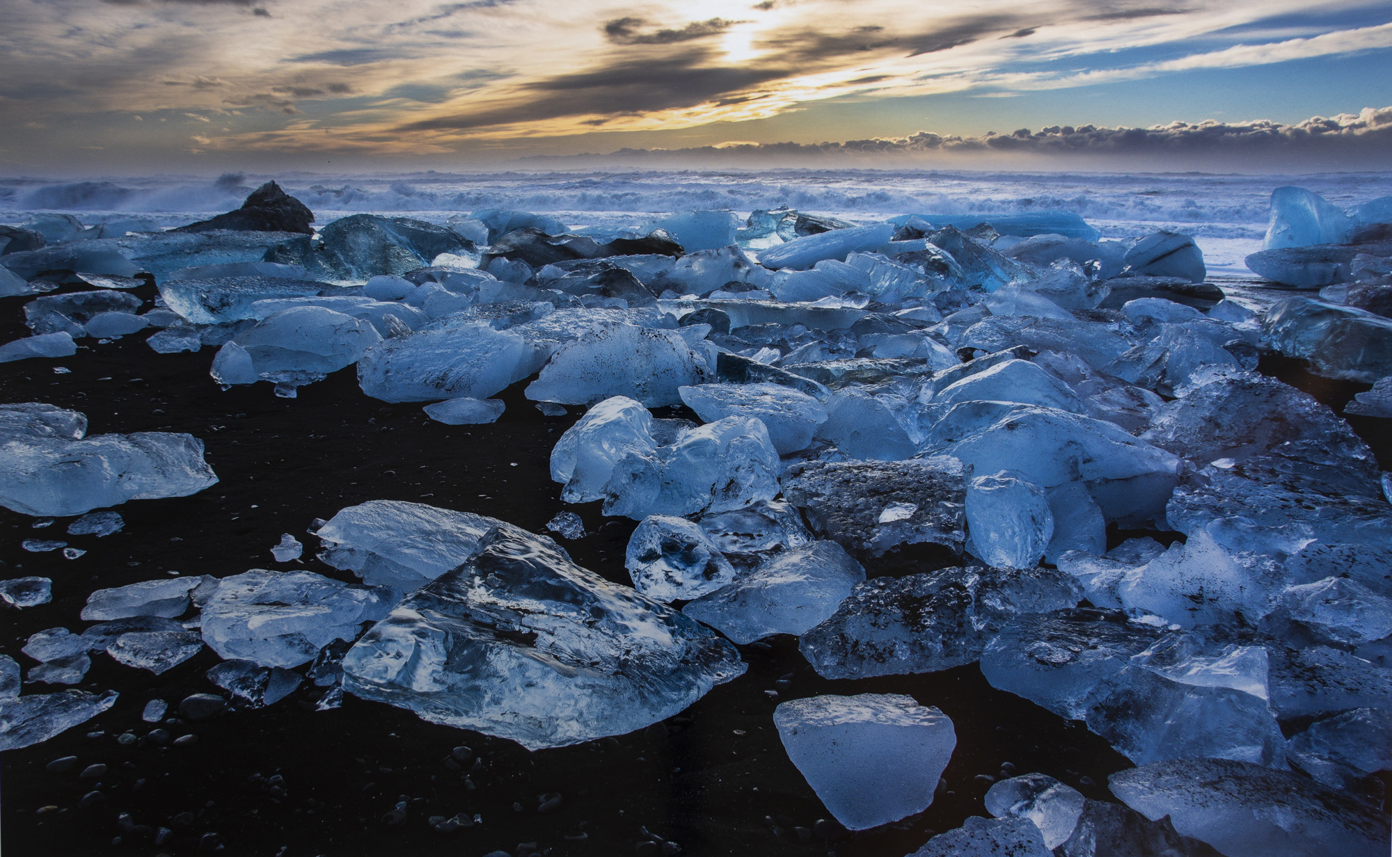
The challenges with this photograph were to reproduce the yellow/orange character of the sky, preserve the translucent effect of the ice, and maintain the deep shade detail in the black lava of the beach. The photograph was made in early morning. You can see why these would be challenges looking at the softproof with the metallic profile before adjustments (Figure 18).
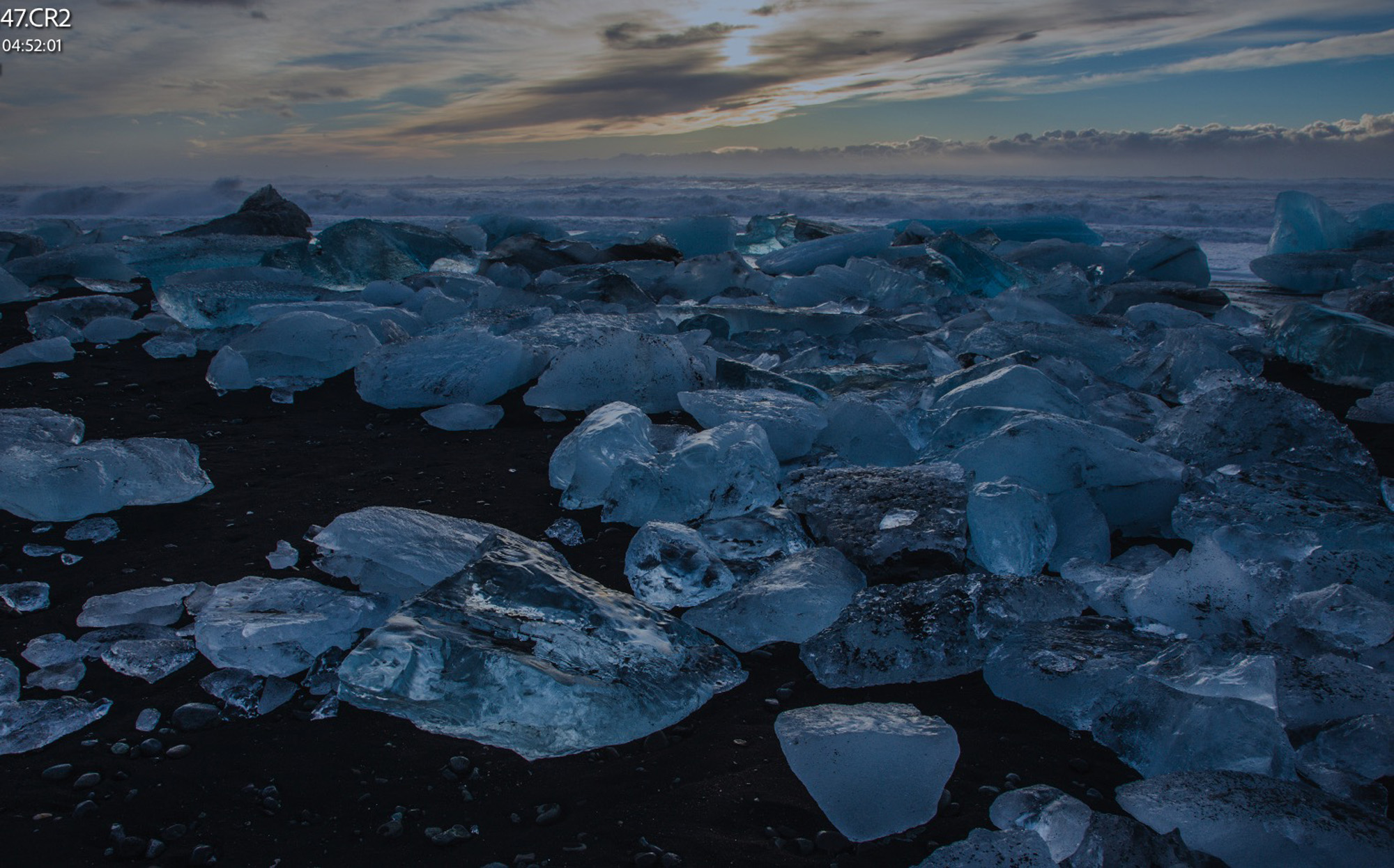
An alternative rendition would have been to lighten the dark tones a bit more to reveal more detail in the lava. This would have had the effect of Figure 19.
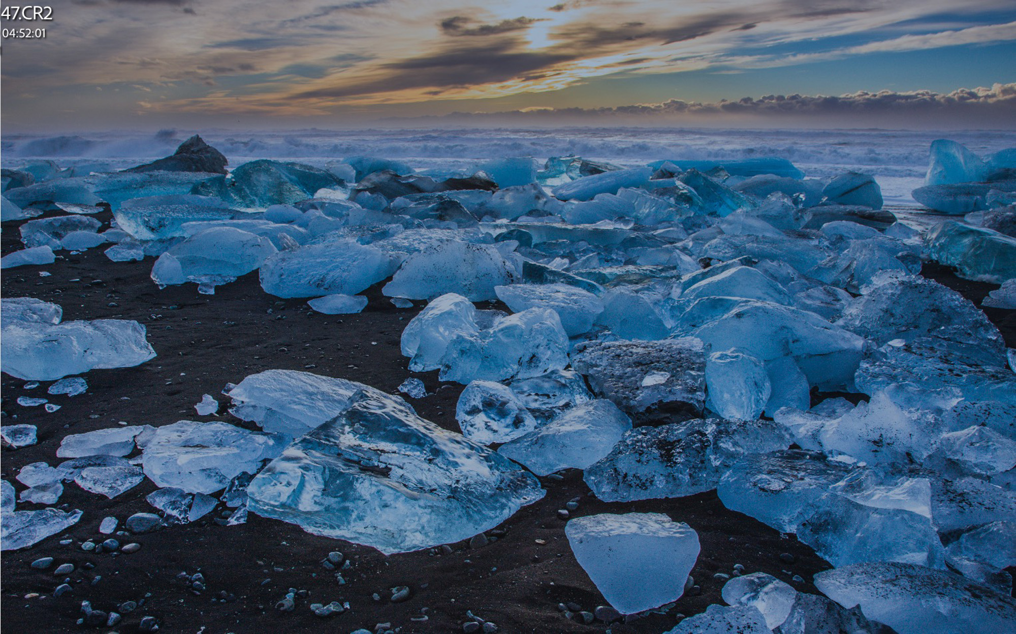
Seen on paper, I preferred the rendition in print of Figure 17 – it’s a bit bolder, higher in contrast, which suits metallic paper nicely. At the same time, I observed that this photo tolerates more adjustment than the one of Figure 15. I believe that is because it’s a lower key image and the metallic paper’s profile shows more gamut in the dark tones than in the light.
Notwithstanding the dark tone “bias” of the paper gamut, it is nonetheless possible to extract good highlight detail from photos whose highlights don’t transgress the paper’s rather low “White” Point (Figure 20) because the nature of the subject matter is such that the highlights look brighter than they were in the original photo.
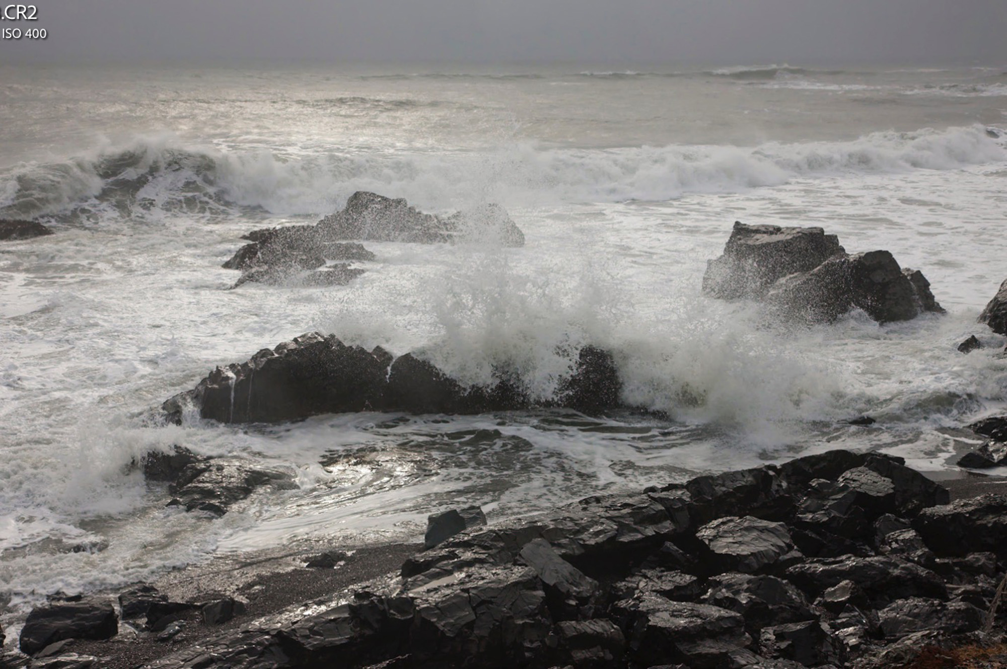
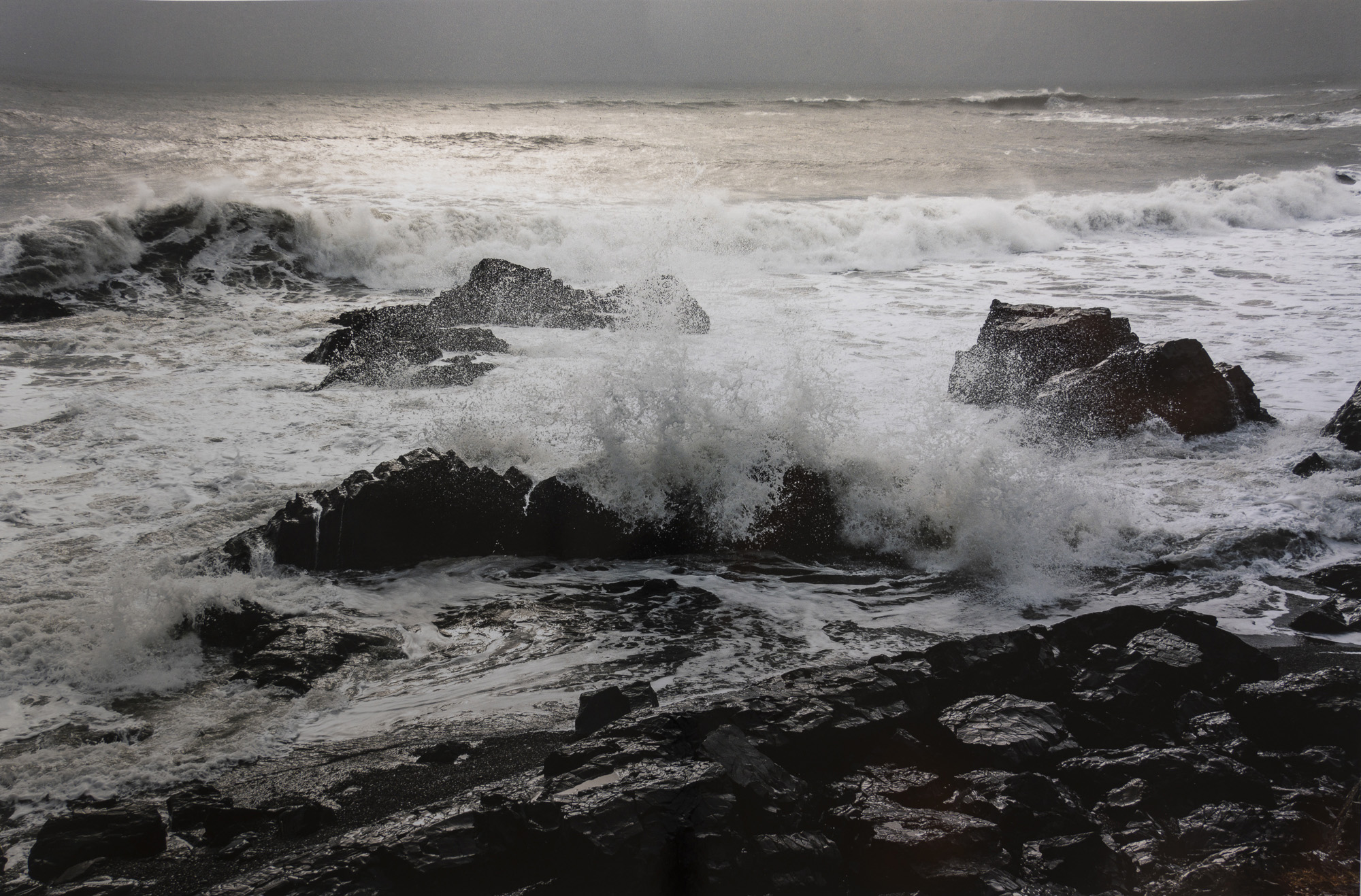
This is a case where careful adjustment of the highlights preserved the detail, as essential to the character of this photo. Adjusting them any brighter wipes-out important highlight detail, again because of the limited gamut in the light tones. As well, it was necessary to lighten the dark tones so that the sheen on the back rocks in the foreground would reproduce well on this paper.
Metallic paper plays particularly well with rusty tones and one of the richest places available for photographing rusty industrial relics is the Völklingen Hütte outside of Saarbrücken, Germany. I made so many photographs in that huge site that the main challenge was which to select for metallic treatment. The one in Figure 22 is well-suited because it combines the rust with reddish ~purple and Cyan hues that my patch test showed could do well on this paper.
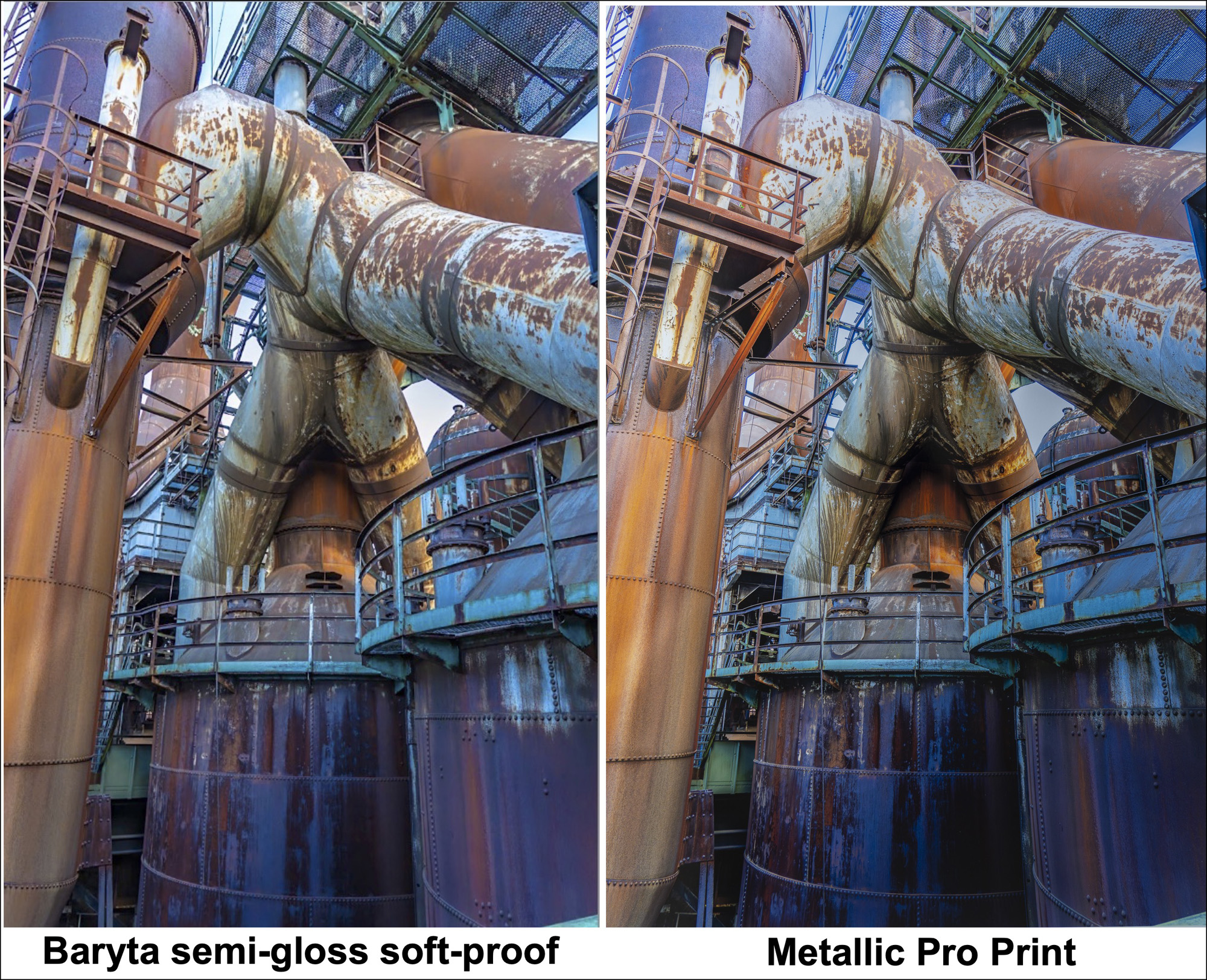
The adjustments from baryta semi-gloss to metallic were not radical. I had to lift the dark tones at the bottom and boost the highlights on the pipes to brighten them just enough to avoid clipping detail. Those highlights remain a bit dimmer than in the semi-gloss version, again because of this paper’s lower White Point.
Metallic paper works particularly well with strong architectural lines, glass, metal and reflections. A wonderful site for making such photographs, though I didn’t have metallic in mind at the time, is the Hauptbahnhof, Berlin (main railway station). So, I plumbed my archives from a trip there several years ago and pulled-up a few that I thought would do particularly well in metallic, and I wasn’t disappointed. The main challenge adjustments were to lift highlights without erasing highlight detail, and to make sure the mid-tones in the metallic version are not too subdued – i.e. emphasize contrast using the originals as guidance, while preventing the prints from being overly dark (Figures 23, 24 and 25).
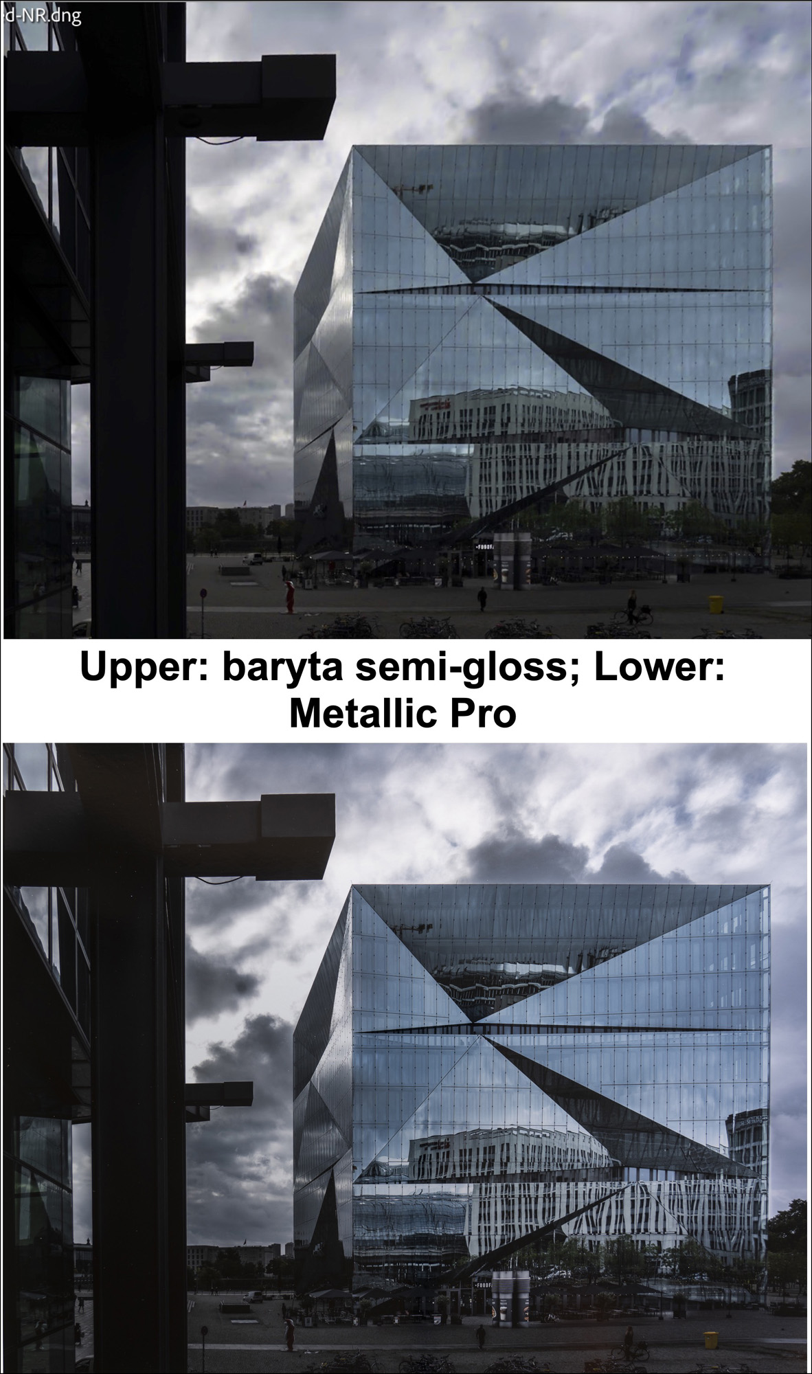
Figures 23 and 24 illustrate how strong lines, glass, reflections and architectural subject matter do well on metallic paper.
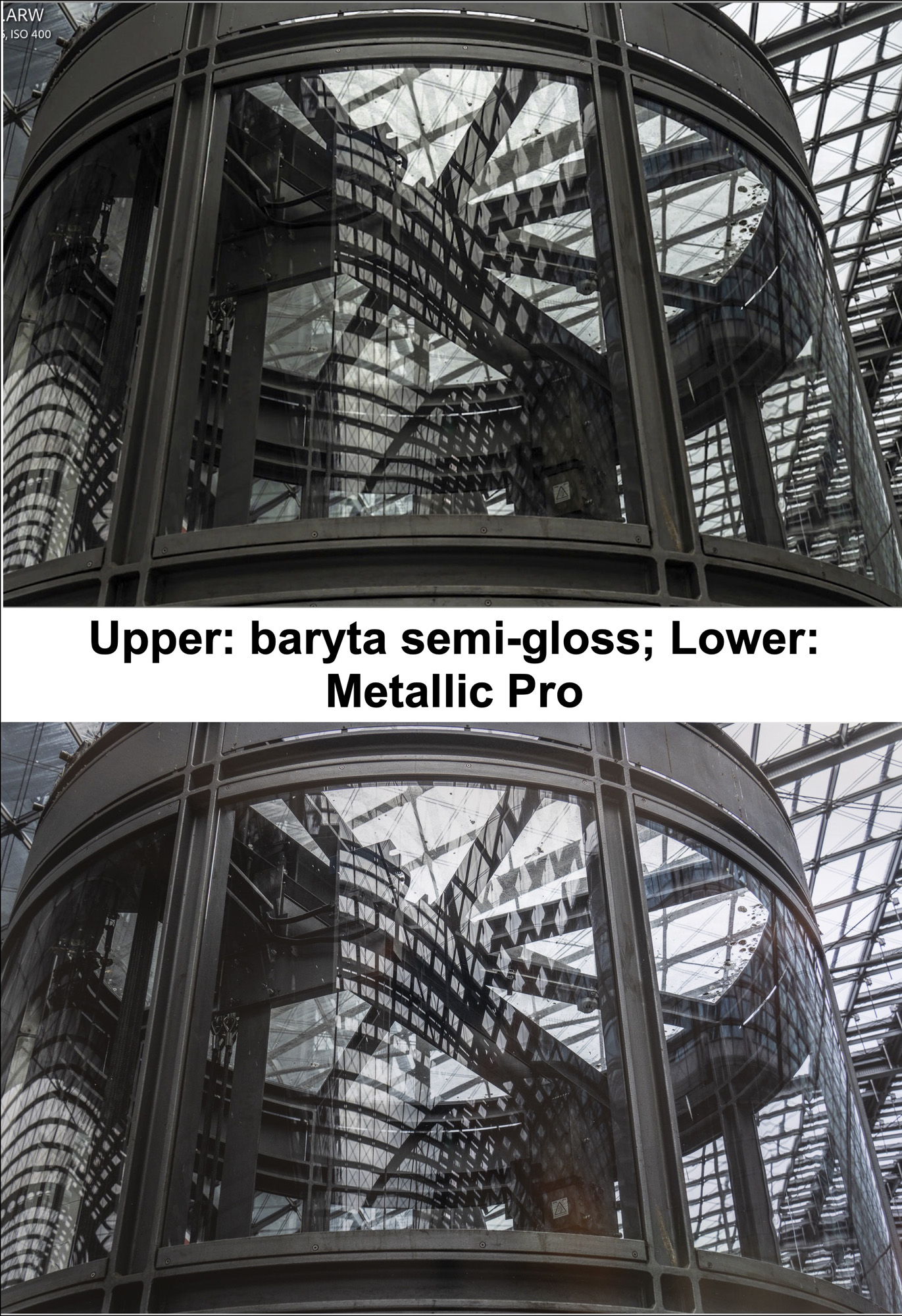
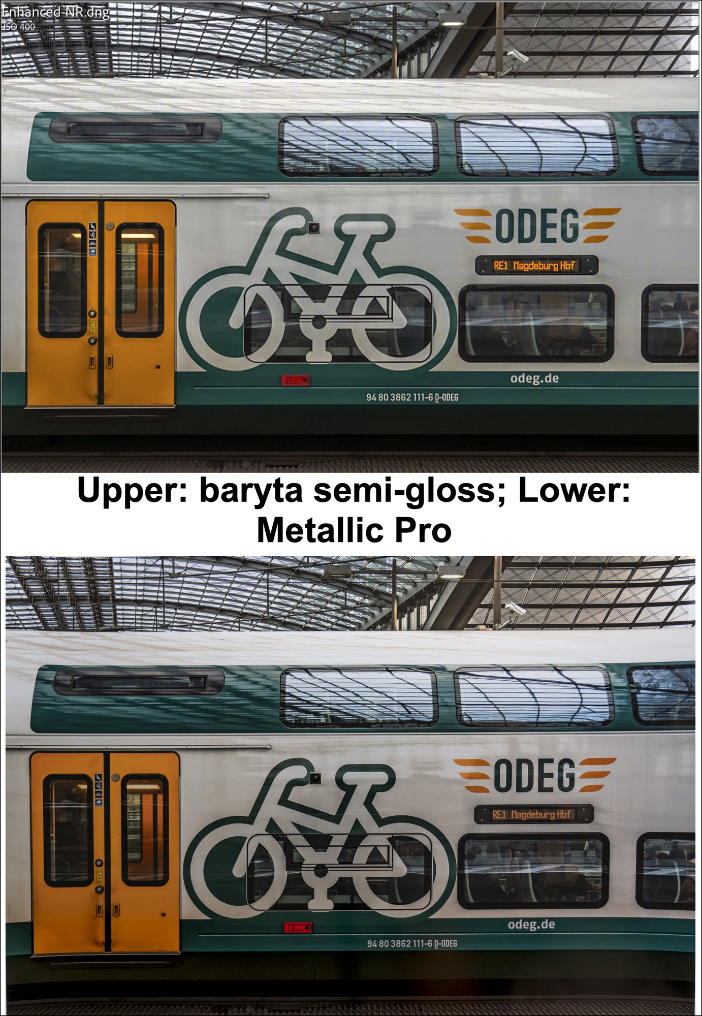
The main adjustment challenge in Figure 25 was to replicate the shade of the yellow doors, because as I had mentioned above, yellow is the colour showing the biggest disconnect from reference values in the patch test. I did this adjustment with a mask in Lightroom, using Tone, Saturation, Temperature and Tint controls in the masking tool panel.
Next, I implemented tests with colour – extreme colour – to see how well this paper could handle it considering its profiles exhibit relatively small gamut. Photos from the 2023 Festival of Light in Berlin served this purpose admirably. All these photos were made at night using low ISO and a tripod, with a Sony a7rIV. The panorama of the Humboldt Law Faculty was particularly challenging to capture because of the sheer size of the building and the large number of spectators milling about the plaza in front of it – those contributed to the atmosphere of the site. The colours projected on buildings and other structures were dazzling and said to be well-suited for providing dramatic effects on metallic paper, so I decided I had to try this (Figures 26~28).
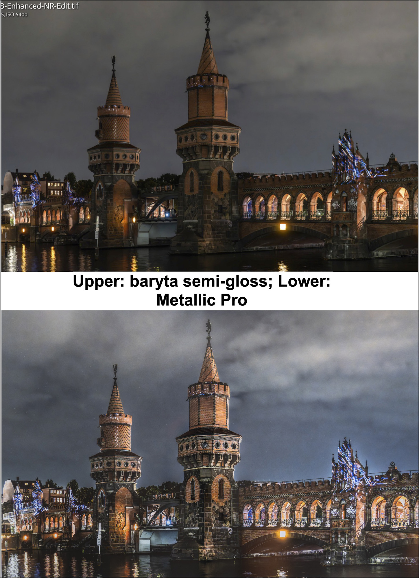
I made the overall effect brighter in the metallic version than in the original baryta semi-gloss because this gave it more “pop”, but I needed to use a mask to rescue the highlight detail under the arches. The rendition of fine detail in the metallic print is remarkable. Having seen it work so well with their orange lighting, I decided to try another, this time with their blue lighting (Figure 27) – in case you’re interested, the lighting and the projected designs evolve continuously during each cycle of the show.
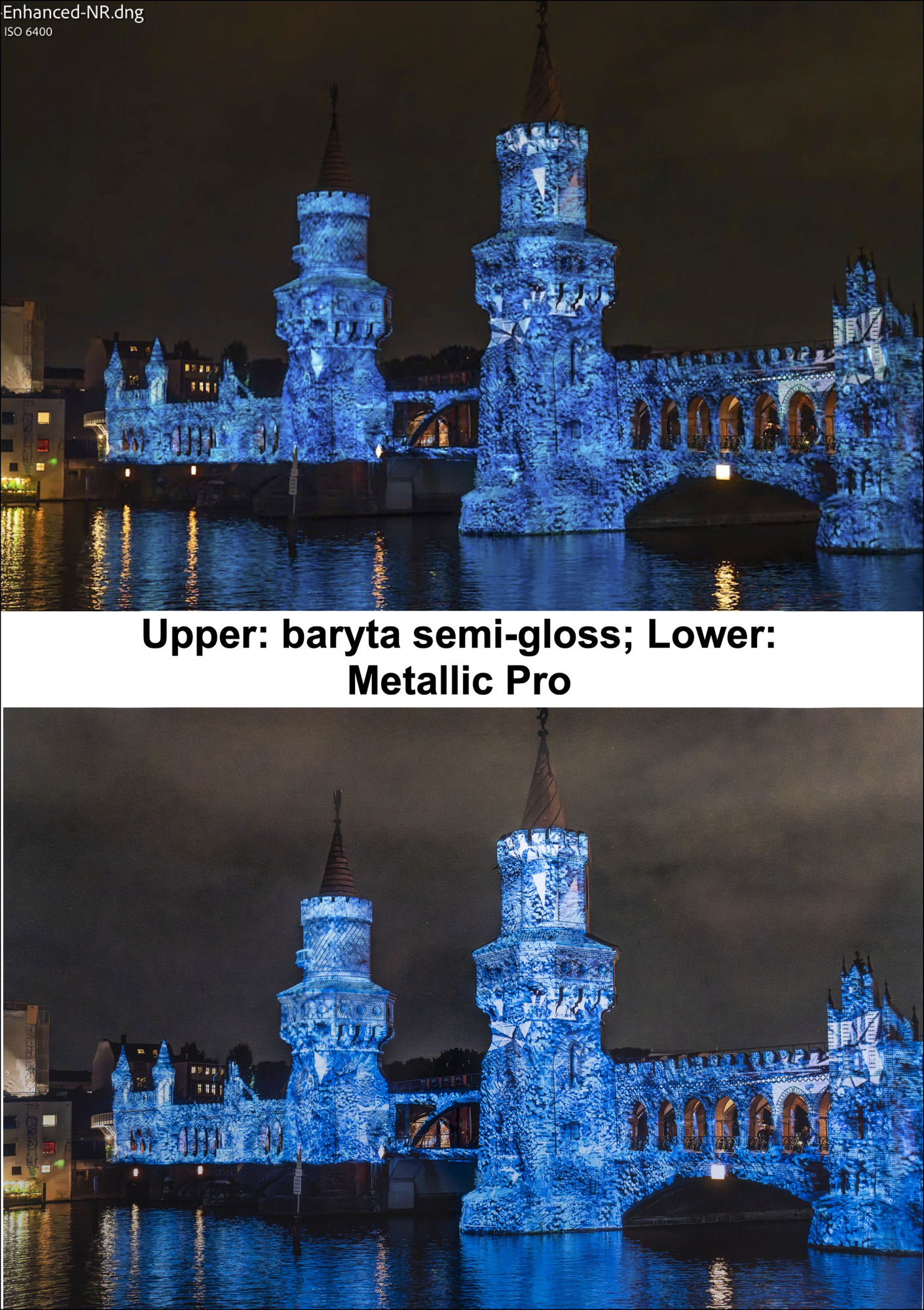
As above, I chose to add a bit of brightness to the metallic rendition purely for the effect, and it works well. Again, rendition of detail in the metallic print is superb.
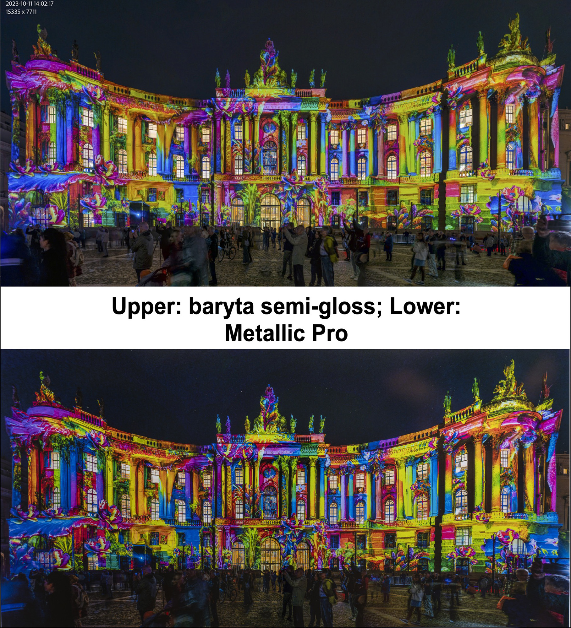
The colours projected onto the Humboldt law building were so intense and the tonal range so large, that taming it was a challenge even for Epson Legacy Baryta II paper, let alone the much more restricted gamut of Moab Metallic Silver Pro. To make the original print I needed to mask and reduce highlights and exposure for every window and door to prevent these extreme highlights from looking blown-out. I also had to mask the foreground of on-lookers to brighten them up a bit so they became part of the picture. For the Metallic Silver Pro version, the range of tone adjustability is limited because of the much smaller paper/printer gamut, nonetheless it was possible to approximately replicate the vibrancy of the baryta semi-gloss version in the Metallic Silver Pro version. The actual print shows the onlookers slightly brighter than in this photographic reproduction of the print. That said, the main focus of this image is the brilliant, saturated colour which the metallic silver paper handled well with appropriate tone and colour adjustments.
Finally, I wanted to test the metallic rendition of a Grayscale architectural photo having strong contrast and bold lines. I reached into the archive from the 2023 Berlin trip again and came up with the one in Figure 29, which I photographed of a new-looking building on Kurfürstendamm near the Kaiser Wilhelm Memorial Church in Berlin and converted it to Black and White.
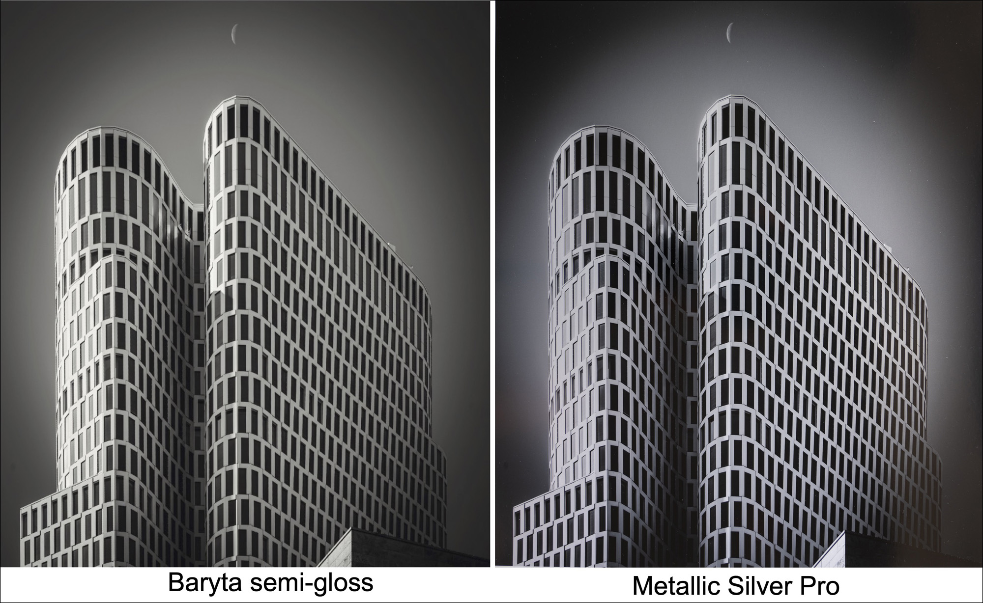
This result is very much what I expected. While the metallic version has its own silver-like character, the paper cannot replicate the white building shell to the extent shown in the baryta soft-gloss version, simply because its white point is so much grayer. Hence it looks silvery rather than white, which is the whole point of this paper. The issue here isn’t whether one can exactly reproduce a very bright white tone to look that way on a silver styled paper, but whether the silvery metallic-looking rendition on the Silver Metallic Pro media looks good, and I think it does.
Summing up, this is very good media. With appropriate image preparation it can handle both colour and grayscale nicely and has a just-right silvery-metallic look and feel.
Mark D Segal
Toronto, September 2026
Join the discussion in the forum.

Elevate Your Vision


Read this story and all the best stories on The Luminous Landscape
The author has made this story available to Luminous Landscape members only. Upgrade to get instant access to this story and other benefits available only to members.
Why choose us?
Luminous-Landscape is a membership site. Our website contains over 5300 articles on almost every topic, camera, lens and printer you can imagine. Our membership model is simple, just $2 a month ($24.00 USD a year). This $24 gains you access to a wealth of information including all our past and future video tutorials on such topics as Lightroom, Capture One, Printing, file management and dozens of interviews and travel videos.
- New Articles every few days
- All original content found nowhere else on the web
- No Pop Up Google Sense ads – Our advertisers are photo related
- Download/stream video to any device
- NEW videos monthly
- Top well-known photographer contributors
- Posts from industry leaders
- Speciality Photography Workshops
- Mobile device scalable
- Exclusive video interviews
- Special vendor offers for members
- Hands On Product reviews
- FREE – User Forum. One of the most read user forums on the internet
- Access to our community Buy and Sell pages; for members only.
You may also like