Why do some images work and others don’t? What are the ingredients for a successful photograph? Why is it so difficult to put into words something that we usually have an intuitivefeelfor? And if we recognize thatfeel, why is it so difficult for us to produce powerful and compelling images?
I believe that before one can effectivelytakephotographs one must be able to know how tolookat them — in other words, have something of an understanding of the visuallanguageof photography.
Here are some reflections on the subject (pun intended), using the photograph below by way of example.
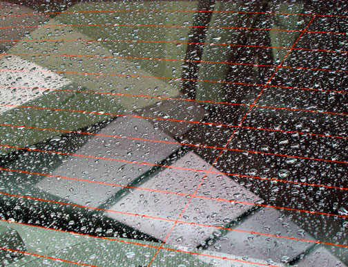
Reflection. Toronto, April, 2003
Canon S50 at ISO 100
Making It
This image was taken at a time when photography was the last thing on my mind. I was walking in the rain on my way to a dentist appointment. Not exactly an atmosphere or head space conducive to creativity. But I was literally stopped in my tracks by these reflections in a parked car’s rear window. The geometric patterns were compelling and I immediately saw it as a photograph.
Fortunately I had a digicam in my pocket, the new 5MPCanon S50. It just took a moment to frame the shot and then continue on my way. But all through the rest of the afternoon the image stuck in my head, and whenever I had a chance I’d sneak the S50 out of my pocket and review the image on the LCD (What is that strange man doing Mommy?)
When I returned to my office and processed the image I was thrilled with the serendipity of it all. But as I was looking at a large print I started to ask myself — what is it about this image that is appealing, and what can be learned from it?
The Sum of The Parts
Let’s look closely atReflectionabove. You may wish to click on the image orhereto see a larger version. Trying my best to see this as a critic rather than as the photographer that made it, here’s what I see.
There appear to be some five layers to the content. The first thing that the viewer needs to do is to gain orientation. If one knows that this is a series of reflections in a car’s rear window, that’s a start. But if not it might take a few moments to orient oneself. When this is done the layers that become apparent are the glass covered in raindrops; the reflections of windows above that somehow appear to be beneath the glass, and the surfaces of the interior of the car. In addition, and on closer examination, there are reflections in the raindrops as well. Finally there are the red heater wires in the glass.
So much for what is seen. Now how does it make the viewerfeel? My first reaction is that of disorientation. But this is quickly followed by some extended viewing, with my eye constantly roaming around the frame. It is only then that I start to appreciate the symmetry. There is no classical center of interest though. My eye flows across from left to right following the red lines, but then is captured by the sweep of the large reflections at the bottom of the frame. The strong vertical red wire leads my eye upward and then I find myself looking at andintothe raindrops in the darkest upper left hand corner.
So, what is it that keeps the eye roaming and draws the viewer back into this image? Why is it something more than a mundane picture of raindrops on a car’s windscreen?
Motion and Categories
I have to go back to the observation thatthe eye takes pleasure in motion, and the brain takes pleasure in puzzles. This image is more of a puzzle than most. People also like to categorize. Think about how when we see something new, and ask what it is, we are usually satisfied to simply have that object named. Just having a label is often enough. Here though we try and puzzle out the "meaning" of what we’re seeing. What is it? What am I looking at? What’s real and what’s a reflection?
The motion aspect is created by having effectively no center of interest, yet at the same time several strong flowing graphic shapes that command attention by their sweep and curves. The eye almost can’t stop moving from one to the other.
But is it Art?
Of course all of this begs the question — is it art? But, who really cares!? The important thing is, does it command your attention? Does it give pleasure and create any other strong emotion? If it does, then it is. If not, it fails. Maybe. Maybe not.
If you’re interested in reading more about this subject a book titledThe Nature of Photographs, byStephen Shoreis worth your attention.
Postscript
This is essentially astraightphotograph. No tricks. Just what was in front of the lens. I did use theHue / Saturationslider in Photoshop to make the red lines of the heater wires in the glass slightly redder than they were in reality. Why? Because I wanted them be be a more effective part of the composition, also making the contrast with the predominantly monochromatic aspects of the image that much more evident.
If you’d like to comment on this image and essay; pro, con or otherwise, you can do sohereon this site’sDiscussion Forum.
I have also placedthree additional photographsonline that you can use to practice your photographic "reading" skills.


Elevate Your Vision


Read this story and all the best stories on The Luminous Landscape
The author has made this story available to Luminous Landscape members only. Upgrade to get instant access to this story and other benefits available only to members.
Why choose us?
Luminous-Landscape is a membership site. Our website contains over 5300 articles on almost every topic, camera, lens and printer you can imagine. Our membership model is simple, just $2 a month ($24.00 USD a year). This $24 gains you access to a wealth of information including all our past and future video tutorials on such topics as Lightroom, Capture One, Printing, file management and dozens of interviews and travel videos.
- New Articles every few days
- All original content found nowhere else on the web
- No Pop Up Google Sense ads – Our advertisers are photo related
- Download/stream video to any device
- NEW videos monthly
- Top well-known photographer contributors
- Posts from industry leaders
- Speciality Photography Workshops
- Mobile device scalable
- Exclusive video interviews
- Special vendor offers for members
- Hands On Product reviews
- FREE – User Forum. One of the most read user forums on the internet
- Access to our community Buy and Sell pages; for members only.
You may also like