A Weekly Column By
Mike Johnston
Hartmann Single Black: A Procedure For Printing Scanned 35mm Black-and-White Negatives
‚ Part 1‚
Nicholas Hartmann, who earned a PhD in archaeology and for the last twenty years has worked as a technical and scientific translator, has been a photographer for most of his life. He’s the son of the late Erich Hartmann, a longtime member and past president of Magnum Photos. By inclination and heritage, Nick‚ who grew up thinking it was normal for people like Inge Morath and Elliott Erwitt to come to the house for dinner‚ practices a fairly severe form of what might be called "the Magnum style": 35mm black-and-white photography, typically with a rangefinder camera and a 50mm lens.
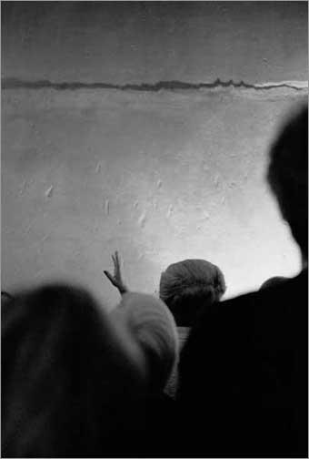 Rome (Domus Aurea), 1999, photograph‚© 2002 Nicholas Hartmann
When digital started to heat up, Nick had little interest in digital capture. He’s good with his camera and at making negatives, and in any event he has a sizeable archive of work steadily amassed during the first half of his life. However, having never been a great fan of darkroom drudgery, he saw an opportunity in so-called "hybrid" methods‚ the digital printing of conventional 35mm negatives.
With methodical thoroughness, he went about searching for a procedure that was not just technically feasible but also aesthetically "right." The technique he’s come up with uses only a single black ink, something that medium and large-format hybrid printers think is inherently inferior. But Hartmann’s digital prints fit the aesthetic of his pictures beautifully. They look great at a fairly large size, they’re very true to the 35mm originals, and their tonal properties, which look for all the world like repro photogravure, are wonderful. Although there may be nothing revolutionary in Hartmann’s method, there may be other veteran photographers who can benefit from his experiences. I interviewed Nick by e-mail, not in real time but in "real sequence," not sending any question until the previous question had been answered.
MJ:First, please give us a brief sense of your history with the conventional darkroom. What led you to think that digital printing might be a good fit for you?
NH:The darkroom has always been magical: from a very early age I "helped" my father while he was printing, and the orange-tinted darkness and the smell of hypo became part of a kind of sacrament. In my teens and twenties I had learned enough to do some truly useful printing work for Dad; later, as part of a research fellowship in graduate school, I had almost exclusive access to a darkroom, which I shamelessly abused for experiments in materials and processing that had nothing to do with my photographic duties in the field and the lab. I made lots of mistakes, investigated and then abandoned lots of techniques, and generated stacks of prints that exemplified some technical nicety but were perfectly awful as pictures. After a gap of about ten years during which I shot only color slides, my wife and I bought a house and I put a tiny darkroom in our basement. That marked the beginning of the "modern" era of photography for me: I went back to shooting only black and white because now I had a way to print negatives, and started to use the medium more effectively as a means of expression and communication.
But I was always insecure about printing. Although I have no uncertainties about my procedures for exposing and developing film, I never became what I consider an expert printer. All the subtleties of materials and processes that I never explored just made me feel inadequate, since all I ever wanted was to see my image on paper in a way that looked right. So with my first inkjet printer I started experimenting with printouts of scanned negatives and slides: the results were mediocre because I had no clear idea about appropriate resolutions for either scanning or printing, and in any case back then (the mid-1990s) the equipment at both ends of the process was fairly primitive. A couple of years ago, when scanner and printer resolutions were getting high enough that I believed most of the information could be extracted from an ISO 400 35mm negative, I started thinking seriously about digital printing. Although I looked forward to the opportunity to work sitting down in a comfortable room with no chemical fumes, mostly I wanted to achieve more precise control over the picture’s appearance without resorting to exotic and time-consuming wet-chemical techniques.
MJ:Speaking of ‘the picture’s appearance,’ perhaps we should get the most important point out of the way right up front: you print using only black ink. Why don’t you just print in Quad-Tone like everybody else? Did you try Quad-Tone at all?
NH:I sure did. In April 2001 I shelled out several hundred bucks for Jon Cone’s Piezography system, complete with software, detailed instructions, and a set of ink cartridges. The first results were dreadful: what should have been smooth tonal transitions came out blotchy and posterized, and nothing looked really sharp. With extensive assistance from the helpful participants in thehttp://groups.yahoo.com/group/DigitalBlackandWhiteThePrinte-mail list, I spent several months fiddling with every conceivable variable. The prints still looked dreadful. Since I found the Piezography system unsatisfactory in other ways as well‚ the driver created microscopic but perceptible white stripes on the prints, and the inks came out greenish-brown and repeatedly clogged my print heads‚ I then tried a quadtone ink set devised by Paul Roark (http://www.PaulRoark.com) that includes one colored ink to allow some variation in image tone. Still blotchy. In the meantime, I began surreptitiously experimenting with using only black ink, and soon got results that were crisp, tonally smooth, and convincingly photographic. When I eventually sent sample output to several of my quadtone list correspondents, they admitted that although a "mono-ink" print had no business looking that good, mine did.
MJ:What do you think the problem was? Did it have to do with the fact that you’re working with 35mm negs? You’ve got to admit that some people make the Piezography system work wonderfully‚ I’ve seen some very good Piezography prints.
NH:Many suggestions were made, most often regarding too much or too little resolution or sharpening or grain. My specific combination of film, scanner, manipulation practice, and output device may also have caused the symptoms I saw. The best explanation I have come up with, however, is that there was nothing at all wrong with the procedures themselves, and I simply don’t like the way my pictures look with quadtone output.
MJ:You’ve said that some of your quadtone list correspondents admitted that your single black prints looked really good. Because readers of this conversation can’t see the original prints themselves, I should probably mention my reaction to them to give them an idea of how they look good. To qualify myself, I’ve been a darkroom expert for years, have worked for extended periods as a custom printer, and as a critic have looked at a huge variety of original prints from throughout the history of photography. Okay, so having said that, I must say that although I find your Single Black prints very beautiful, they’re perhaps not beautiful in the way that quadtone prints are. We all know that 35mm ‘slice of life’ photographs have a different aesthetic than, say, large-format black-and-white landscapes‚ for me, a large part of beauty of your prints resides in their appropriateness to the 35mm aesthetic. A little rougher, tonally a little coarser than large-format prints. Was this part of what got you excited about the potential of black-ink prints?
NH:I don’t want my prints to be beautiful in the same way as a quadtone print; and after all, an enlarger print from a 35mm negative will also look "a little rougher, tonally a little coarser" than a large-format print, won’t it?
MJ:For sure.
NH:Even if it were possible, I have never wanted to get a large-format "look" from a 35mm negative using any technique. The native, authentic 35mm "look" is what I find viscerally satisfying. What I like most about it is the way the picture’s grain works: in out-of-focus areas with smooth tonality, the grain can act as a pictorial and visual element in its own right; but in finely resolved areas the grain magically switches roles and becomes the carrier of all the detail the lens and film saw, so the visual information penetrates down into the negative’s physical structure. With the black-only printing procedure I can get that dual nature to express itself better than I ever could in the darkroom, and in that way I believe I am being entirely faithful to the 35mm aesthetic.
MJ:So let’s get down to specifics. What’s so different about your printing procedure?
NH:The only thing that differentiates my method from color printing or any of the quadtone methods is that I print using only one (black) ink. The only control action necessary is that in the Photoshop "Print" dialog, I select "Black" rather than "Color." The printer is set up for the highest possible resolution (1440 dpi with the printer I use), and the black ink is a third-party product rather than what Epson sells in its cartridges. The result is that the images on my prints are made up of tiny dots of black ink deposited onto a matte coating on white paper, a direct analogue of the conventional photographic process in which the image consists of tiny particles of reduced silver dispersed in a gelatin emulsion on white paper.
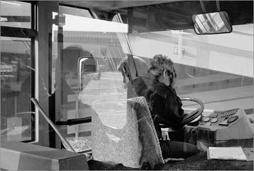 Rome (Fiumicino), 1999, photograph‚© 2002 Nicholas Hartmann
MJ:Okay, but that’s not exactly all. You’ve also spent a lot of time finding what works best‚ trying different scanners, printers, and papers, for instance.
NH:True, although I did most of that research with the expectation that I was going to be doing quadtone printing. My method is not that radically different from quadtone, however, so I’ll give you a rundown of the equipment and materials I ended up with, and why:
Epson inkjet printers are the standard for high-end photographic output, so I simply needed to decide which one. Although "Photo"-series Epson printers (with black plus five colors) were advertised as being superior for pictures, I knew that quadtone required only black + three; I also wanted to avoid the more recent printers with their "chipped" cartridges (which make cartridge refilling, and the use of third-party cartridges, much more difficult). I settled on an 1160‚ much praised by Piezography buffs and other quadtone practitioners‚ which had just gone out of production and was difficult to obtain. It accepts paper up to 13 inches wide, and is a robust, business-class machine that nevertheless will print at up to 1440 dpi. It accepts hand-refilled non-Epson cartridges, weird ink (see below), and bulky paper without a murmur.
I started out thinking I needed a 4000-dpi scanner. Since I was constrained by the fact that my Macintosh computer can connect only via USB or FireWire, but not SCSI, I first bought a Nikon unit. It proved unusable: either that model or that particular sample was incapable of focusing sharply at both the center and the edges of a 35mm negative. I then tried (and now still use) a Minolta Dimage Scan Dual; despite dire warnings that its resolution of 2820 dpi would be insufficient, I have compared my scans to silver prints under a magnifier, and have found that the scanner does in fact capture the same detail-within-grain effect that I like so much. It also has a flexible and unobtrusive user interface, works fairly fast, and cost less than $500.
Finding the right paper and ink combination required a bit more experimentation, but at least it was cheaper. During my initial ventures into quadtone I bought from MIS Associates (http://www.inksupply.com/index.cfm?source=html/quadtone.html)a set of inks called Variable Mix, designed for Paul Roark’s adjustable-tone quad ink process. That process itself turned out to not to work for me, as I said, but the black ink is what I now use for my black-only work. It’s pigment-based, meaning its archival properties should be comparable to those of gelatine silver prints. Although dye-based inks are said to give deeper blacks, I have never objected to the Dmax I get. As far as paper goes, at first I tried to duplicate the air-dried "F-surface" look, and tested half a dozen glossy and semi-gloss inkjet papers before realizing that the surface didn’t look right with B&W inkjet output. Based on recommendations from others, I then tried out lots of matt-surfaced papers‚ including some very pricey and hard-to-find ones with big-time reputations‚ and very quickly determined that plain old Epson Archival Matte gave me the best combination of absorption, durability, and tonal range. This is a bit like conducting a comprehensive taste test of vintage Bordeaux and finding that you prefer the stuff in the half-gallon jug.
All of this is, of course, valid and "right" only for my negatives and my pictures and ultimately my eye and heart. It is my way of getting from the instant of exposure to a piece of paper that pleases me. If it serves as a starting point for others who share some of my preferences and prejudices, so much the better; but I did not work out this unconventional procedure with the idea of establishing it as some new orthodoxy. The digital revolution in imaging is exciting precisely because it makes so many unexpected things possible: why just follow in other people’s footsteps when there is more than enough uncharted territory out there for everyone to explore?
Part IIof this article contains more specifics, thoughts about the aesthetics of printing methods, and the advantages of a digital workflow with traditional 35mm black-and-white film photography.
© Mike Johnston 2002
Mike Johnstonwrites and publishes an independent quarterly ink-on-paper magazine calledThe 37th Framefor people who are really "into" photography. His book,The Empirical Photographer, is scheduled to be published in 2003.
You can read more about Mike and findadditional articlesthat he has written for this site, as well as aSunday Morning Index.
Elevate Your Vision


Read this story and all the best stories on The Luminous Landscape
The author has made this story available to Luminous Landscape members only. Upgrade to get instant access to this story and other benefits available only to members.
Why choose us?
Luminous-Landscape is a membership site. Our website contains over 5300 articles on almost every topic, camera, lens and printer you can imagine. Our membership model is simple, just $2 a month ($24.00 USD a year). This $24 gains you access to a wealth of information including all our past and future video tutorials on such topics as Lightroom, Capture One, Printing, file management and dozens of interviews and travel videos.
- New Articles every few days
- All original content found nowhere else on the web
- No Pop Up Google Sense ads – Our advertisers are photo related
- Download/stream video to any device
- NEW videos monthly
- Top well-known photographer contributors
- Posts from industry leaders
- Speciality Photography Workshops
- Mobile device scalable
- Exclusive video interviews
- Special vendor offers for members
- Hands On Product reviews
- FREE – User Forum. One of the most read user forums on the internet
- Access to our community Buy and Sell pages; for members only.
You may also like