The Power of Curves
In Photoshop, my primary tonal adjustment tool has been the Curves Adjustment layer. I would wildly guess that 85% of the adjustment layers in my Photoshop files are curves. With them I can add or subtract contrast, lighten or darken, change color balance, even do what I call “tonal selections” (see myarticle here). Lightroom also has a global free-form curve, the Point Curve that is very powerful. But, curves do have their limits. I liken global curve adjustments to a slinky toy—when you expand the tones in one area, another area gets compressed. Open up the shadows, and the highlights get compressed. For these global adjustments, I often say “there is no free lunch”. Well—Lightroom 4 is footing the bill for a catered banquet, as the new Process 2012 raises the bar on image adjustments! The new Shadows and Highlights sliders can do things curves can only dream about. Things that can really improve images. For example, the image below….
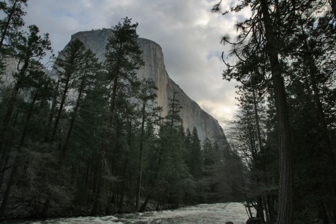
Working with Shadows
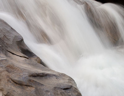
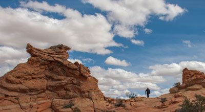
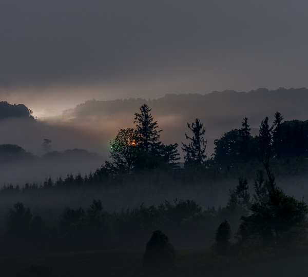
This was a snapshot made by my friend Karl Kroeber (see his real work at www.karlkroeber.com), and is a jpeg file. It was actually an excellent exposure, because the highlights are not blown out. But then there’s that big problem with the remaining ¾ of the image…
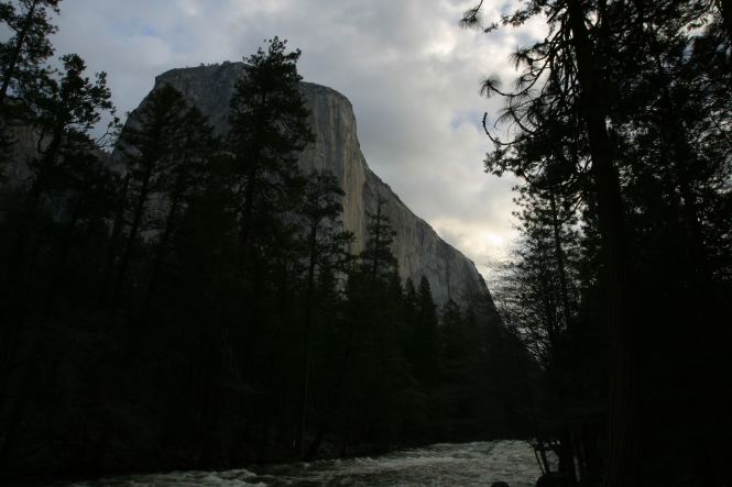
Some very dark shadows
The dark trees above arealmostcompletely black. The RGB values in the Photoshop info palette are all below 10. If they were any darker—there would literally be nothing there. Since digital capture records tones differently than film, there’s more detail to be rescued, but how does one strongly brighten the dark tones without completely messing up the lighter tones?
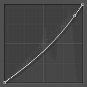
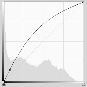 Here’s what a curve could do.
Step one—this will lighten the shadows nicely, but all the other tones go along for the ride, making the sky too light, and compressing the detail in the bright clouds.
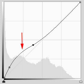
Step two—bring down the brightening in the clouds—except there’s now a dreaded FLAT spot in the curve, compressing and squishing together any tones on that part of the curve. This is not pretty. I call this tonal “constipation”. Curves can lighten shadows in a minor way without causing problems. But with major lightening of only the dark tones—no way. The problem is the transition between the brightened tones and the non-brightened ones. That’s where the crunch comes, and tones can get very compressed. Like I said, no free lunch here…
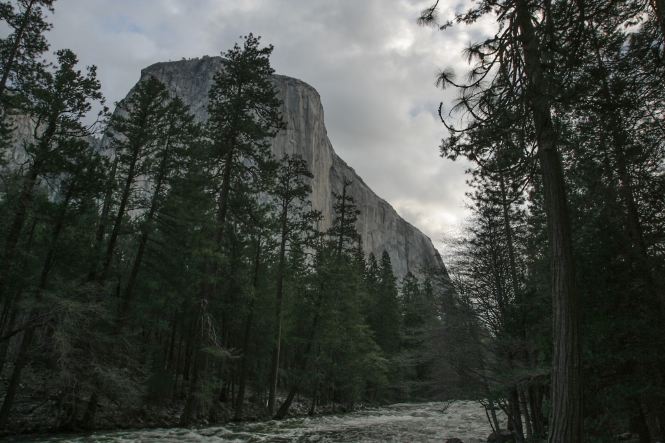
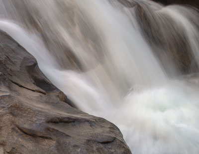
Now Photoshop does offer what could be called a predecessor to the new Lightroom Shadows and Highlights sliders, but it works in a very different way, and not quite as well. It’s the under-appreciated Shadows/Highlights adjustment. This is not an adjustment layer, but instead has to work on real pixels. I usually make a copy of the background layer and run this adjustment there. It can wonderfully open up shadows, and/or also restore detail to washed-out highlights. It does this by making a sophisticated selection behind the scenes. This selection can by adjusted by using the “radius” slider, which helps control the feathering and resulting halos. It does a very good job here—except for the halos. They are visible where the cliff first appears behind the trees, causing the the cliff to look too light there.
Shadows Lightened using Photoshop’s Shadows/Highlights Adjustment
But, importing this jpeg into Lightroom 4 (or opening it into Adobe Camera Raw 7), provides a great result using the Shadows slider, with minimal halo problems (below). Astounding! And this is a crappy little 8-bit jpeg….
Shadows Lightened Using Lightroom 4’s Shadows slider
This tonal legerdemain must be very hard, because it took Adobe many years to get it working this well. Let’s go back in time to Lightroom 2 (process version 2003) and examine a small section of one of my southwest images (below left). There’s a juniper tree that needs a fair bit of lightening, just the job for the predecessor of the Shadows slider—the Fill Light slider. But there’s something about these colors that causes great confusion, because setting the Fill Light halfway to +50 created terrible posterization (below right). This posterization was not normally a problem (and this is the worst case I’ve found), but it did happen to a lesser extent with many images if you looked closely. The Fill Light slider at higher settings also tended to wash out brighter tones.
![]()
No Shadow Adjustments
+50 Fill Light in Lightroom 2 (PV2003)
LR3 (PV2010) greatly improved the way Fill Light worked (below left), with less posterization. (I’ve over-brightened the tones here to show that posterization can still happen). In LR4 (PV2012, below right), we finally have excellent brightening, with no posterization! And the effect is essentially limited to darker tones.
![]()
+90 Fill Light in LIghtroom 3 (PV2010)
+100 Shadows in Lightroom 4 (PV2012)
I know of no other raw developer that offers such lightening of dark tones without significantly impacting the lighter tones. I recently asked Eric Chan of Adobe, one of the people behind the new Highlights, Shadows and Clarity sliders, how they achieved these remarkable results. Eric said they had been exploring various algorithms that used edges to modify various tones, but they were incredibly slow. Initially, these algorithms took about one minute of computation for every megapixel in a file! Twenty megapixel file = twenty minutes. After months of work, they had sped this up to around 8 seconds for a typical file, but that was still too slow. After more months of work, they got it working in almost real time. I find this new slider incredibly useful.
Working with Highlights
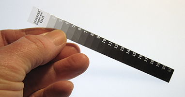
Let’s now talk about dealing with highlights, and the new Highlights slider. For this, I find it useful to use a stepwedge to evaluate tonal adjustments. Lightroom can open a stepwedge in a tiff or jpeg format, but I wanted an actual RAW stepwedge, to see what really happens with RAW files. So I needed a physical stepwedge that I could photograph—it turns out I already had one that I used in my darkroom days, made bywww.stouffer.net. Below is that stepwedge, and the resulting image.

What’s really valuable about this file is the histogram, as seen in Lightroom:
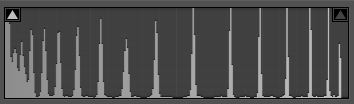
Each spike represents a discrete tone on the stepwedge. Seeing how these spikes respond to various tonal adjustments can be very instructive. We’ll see this in action a little later.
Highlight Headroom
In my workshops, I preach about the dangers of overexposure, using a one-stop overexposed version of this stepwedge (different from the one above). In LR3, this stepwedge looks as seen below left, with the red indicating clipped highlights. When I converted to LR4 without changing anything else, it looks as you see below right. Now, what’s going on here is the new automatic highlight recovery, which gives us several more unclipped steps. This is built-in, and happens automatically.

![]()
 Developed in LR 3 (PV2010) default settings
Developed in LR 4 (PV2012) default settings
In LR3, this overexposed stepwedge could not be saved, even by lowering the exposure to -4.0 and adding +100 recovery. It still had blown highlights in the rightmost step. But in LR4, by moving the Highlights slider to -38, I recovered even that last step.
Below left is an overexposed cloud rendered as best I could in LR3. Adding lots of recovery and reducing the exposure resulted in a blocky-looking, unnatural cloud. But, with LR4’s automatic highlight recovery it looked much better at default settings, to which I then reduced exposure -15, and moved the Highlights slider all the way to the left (-100), for a passable result. I would say LR4 gives slightly more highlight headroom, and can do a better job rescuing overexposed images.
![]()
 LR3 (Process Version 2010)
LR4 (Process Version 2012)
Highlight Detail
The Highlights slider, moved to the left, increases the highlight recovery as seen above. It works especially well when just one or two of the channels are clipped, as with saturated colors. But the Highlights slider also increases separation and detail in washed-out highlights. And it does amuchbetter job at this than the old Recovery slider. This effect is similar to what the shadow slider does, but in the opposite direction. This is also very hard to do with a curve, because of the resulting flat spot.
Below is a well-exposed image showing how the new Highlights slider can bring out detail and nicely separate highlights without affecting other tones. Previously, this was very hard to do, but the Highlights slider now makes it much easier. This is a huge advance, as I feel highlights areveryimportant in an image.
![]()
 Highlights Slider at 0
Highlights Slider at -100
Adjusting the Sliders
LR3’s default settings had the Brightness slider at +50, Contrast at +25, Blacks at +5, with a “medium contrast” Tone Curve. These were basic settings that made most images look better. In LR4, we get the same results, except all the sliders are set at zero. (The exceptions being the auto-calculated black point, and the automatic highlight recovery). There has been discussion about whether this is optimal and a good starting point. For most images, I think this works fine.
With LR4 (PC2012), we get some new sliders, and new ways to work with them. The first six sliders in the Basic panel (from Exposure through Blacks) each control a separate part of the tonal scale. If you hover with the mouse in the LR4 histogram, you’ll see the different sliders highlighted as you move around the histogram. If you start on the left of the histogram and move slowly to the right, the following sliders will be highlighted in this order:
Blacks → Shadows → Exposure → Highlights → Whites
Therefore, the midtones are controlled by the Exposure slider! It actually kinda worked this way in LR3, too.
How best to start adjusting an image? Since all six sliders in the Basic panel (from Exposure through Blacks) are now to some extent image-adaptive, the engineers at Adobe recommend adjusting these sliders in order, from the top down. They are designed to work this way, and this should usually give the best results.
The overall tonality—the balance of shadows, midtones and highlights—should first be set with the Exposure slider. Then add desired contrast with the Contrast slider. Then use the Highlights and Shadows to optimize those respective tonal areas. Final tweaking of the image endpoints can be done with the Whites and Blacks sliders. For any extra help, the Tone Curve can be used.
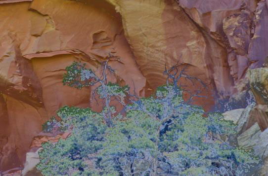
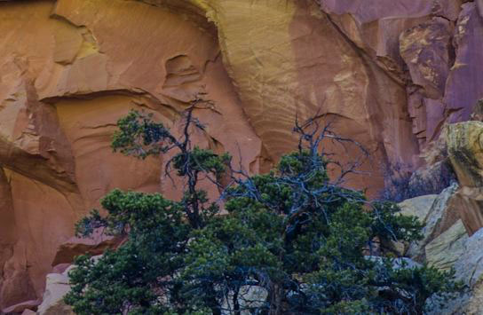
The Clarity slider has also undergone big changes that make it much stronger, and—even less likely to produce halos than before. I usually add +15 now as a starting point, as it nicely increases local contrast in a way that a single curve could never do. On flatter images (like a closeup of a sandstone wall), I would add even more.
Let’s see what the Clarity slider does to my raw stepwedge. Here’s a section below of just three steps—the top row has no Clarity, the bottom row has +100 Clarity.
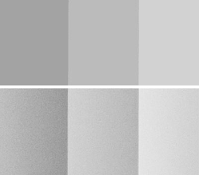
Wherever a lighter and darker tone meet, Clarity makes the darker one darker, and the lighter one lighter. It’s similar to using the Unsharp Mask filter in Photoshop for sharpening, but with a much bigger radius. Adding the maximum of +100 clarity on the bottom row causes the middle step to become a tiny gradient! It is darker on the right where it meets a lighter tone, and lighter on the left, where it meets a darker tone. In Lightroom 3, too much clarity would create obvious halos, but that has been greatly improved in Lightroom 4. Clarity can really improve certain images. In the example above, adding maximum clarity also significantly increased noise.
Below are some histograms from the entire stepwedge. The top histogram is it at default, with no Clarity. Increasing the Clarity slider basically gives more local contrast wherever a lighter and darker tone meet. That’s why the spikes below broaden out. It exaggerates the tonal differences where the tones meet.
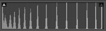 PV2010
Clarity zero
The steps on the stepwedge are seen as spikes.
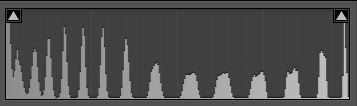
PV2010
Clarity +90
With PV2010 at +90 Clarity, the spikes have broadened out. With PV2010, really high Clarity values often created noticeable halos, and thus could not be used.
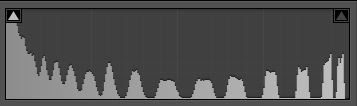
PV2012
Clarity +32
The Clarity slider in PV2012 is MUCH stronger. At a paltry +32, it’s close to matching what we previously got at +90. With the reduced haloing, we’re able to use higher values now.
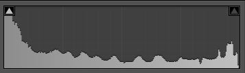
PV2012
Clarity +75
With Clarity at +75, the tonal differences between each step have been exaggerated such that the spikes have disappeared. This is not necessarily bad—it just shows the power of the improved slider.
With reduced halos, we can now add even more Clarity. At a certain point, though, too much Clarity can give a grungy HDR-type look (HDR in this case meaning “Highly Doctored Result”). Like with the Vibrance and/or Saturation sliders, just how much is enough? In America, isn’t more is always better? I would vote the Vibrance/Saturation and Clarity sliders as the “sliders most likely to be abused”. I advise caution with these sliders, and to start with less rather than more. Then, after careful consideration, and a cooling-off period, add more if needed. (If your Clarity or Vibrance sliders are routinely at +60 or more, an intervention may be needed…).
Brightening Highlights
“Expose to the Right” (ETTR) is a way of maximizing the levels of gradation and reducing noise in digital exposures which makes great sense, both theoretically and in practice. (Seehere, andhere). In a perfect ETTR world, we would only be darkening our digital captures. But for me, I worry about overexposing, and losing some of my image into the void of clipping. The god of clipping has NO mercy—if a highlight is clipped, there’s no way to get any detail back. So most of the time I err on the side of too little exposure. As soon as I see blinkies on my camera, I get very worried, even though I know they start blinking about one stop too soon. So, I often have to resort to brightening my digital captures. When I started using a digital camera, the acronym ETTR was not even coined, so many of those early exposures need lots of brightening. With those failings in mind, let’s discuss how best to do this.
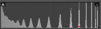
With LR4, there are three ways to brighten an image. There’s the Exposure slider, the new Whites slider, and the Point Curve. What’s the difference? My normally exposed raw stepwedge actually needs a little bit of lightening, so let’s work with it to find out. I aim for the brightest step on the stepwedge to read around 98.
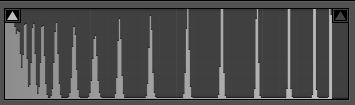
Default
The default histogram, with no adjustments
Exposure +80
Everything has moved to the right, but notice that there is some highlight compression—the rightmost spikes are closer together, especially the brightest two.
Whites +29
Brightening with the Whites slider gives essentially no highlight compression.
 The Point Curve top endpoint was moved to the left. Since this file is only slightly underexposed, this gives basically the same result the Whites slider did, showing no apparent compression in the highlights.
Now with an image without any important highlight detail, it probably doesn’t matter if the highlights are compressed by brightening. Use the Exposure slider. If the image has some nice fluffy clouds, then you probably don’t want highlight compression. Use the Whites slider, or Point Curve. It all depends on the image. And how much it was underexpsoed…
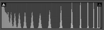
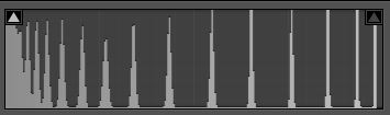
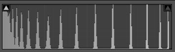
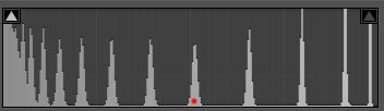
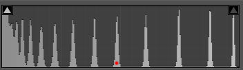
Let’s see what happens with images underexposed by a stop or more. Below is the alternate stepwedge that was underexposed by a full stop. I have brightened it up three different ways so the top step again reads 98. After brightening with the Exposure slider, much greater compression of the highlights is now evident. The Whites slider yields very nicely separated highlights, while moving the top of the Point Curve left gives even more separation to the highlights. With each histogram, I have placed a red dot on the fifth step from the right, showing how those tones are affected. Since the Exposure slider compresses the highlights, that fifth step gets to be quite a bit brighter. The Whites slider doesn’t compress as much, and therefore that fifth step appears darker. The Point Curve fifth step is only slightly darker than the Whites slider result. So, if your image is mainly darker tones, then the Exposure slider may be the best approach.
 Exposure
+ 2.00
All of the highlights are showing compression—the spikes are closer together.
Whites
+65
Highlights are now quite separated.
Point Curve
Moved Left
Even greater separation. For maximum separation of highlights, use the Point Curve.
Let’s see how this works with an actual image. The image below was underexposed by a about a stop, maybe a little more, and has important highlight detail. Brightening with the Exposure slider really washes out this detail. The Point Curve does a much better job at enhancing highlight detail. To make it fair, I had the Highlights slider set to -100 on both.
Developing this image in such different ways results in all the tones changing. The rocks appear lighter with the Exposure slider adjustment—since it compresses highlights, the midtones and shadows get to be brighter. With the Tone Curve adjustment, it gives lots of separation to the highlights, forcing all the other tones darker. However, since I always bring my images into Photoshop after raw developing, I can use various methods and selections to get the rocks to look how I want them. Since this image is 60% bright water, it’s important to raw develop with as much highlight detail as possible! After bringing this image into Photoshop, I would probably try to get even more highlight separation.
![]()
Exposure + 1.50, Highlights -100
Point Curve moved to Left, Highlights -100
For images with important highlight detail that are underexposed, I’d recommend brightening with the Whites slider or Point Curve to reduce compression of detail in the highlights. For underexposed imageswithoutimportant highlight detail, I still might try that first, or a combination of Exposure and Whites slider/Point Curve. For maximum separation in the highlights, the Point Curve works slightly better than the Whites slider, especially with one or more stop underexposure.
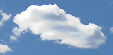
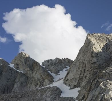
For a final example, here’s an image that was exposed just about right, needing no brightening. This was another snapshot by Karl Kroeber, with some nice fluffy clouds.
 No Adjustments. The clouds are OK, but could use some more detail and separation.They are flat and pasty looking. In a big print, this would be very disappointing, since the clouds are about half the image.
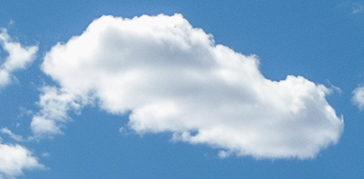
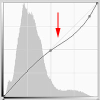
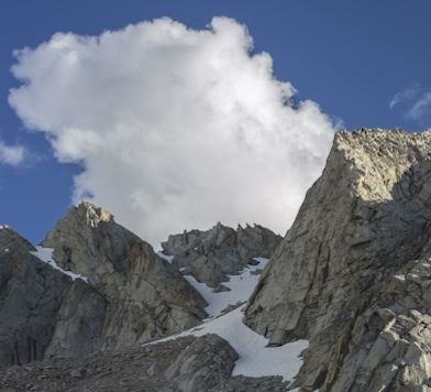
The Highlights slider is set to -100, which helps with the separation of tones in the clouds. Since this image is basically all about the clouds, I want even more modeling and dimensionality in the clouds.
 |
For even more highlight separation (in addition to the -100 Highlights slider), I added a point to the linear Point Curve, and moved it slightly to the right, making the curve steeper in the highlight area. This adds more contrast, especially in the bright tones. I use this type of curve fairly often with my images. This does cause the darker tones to be darker, but the Shadows slider can often be used to compensate. |
Ifeven morehighlight detail is needed, you can get creative. I first lowered the Exposure slider to -50, making the whole image darker. But then brightened it back up by moving the top endpoint of the Point Curve to the left, and added the extra point to make the curve steeper in the highlights. The default develop settings Adobe uses when all the sliders are set to zero impose an “S” curve on the tones, which compresses highlights to some degree. By darkening the image, and then brightening back up with a method that does not compress highlights, greater separation is achieved. Obviously, darker tones will now be a little darker, but they can be massaged up in Photoshop. One could also bring the previous image into Photoshop, and get the extra highlight separation there, but I think this method would work better.
 |
Exposure set to -50, darkening the image. Point Curve top endpoint moved left to brighten it back up, plus the extra point for steepening the curve, results in even more highlight separation. Compare this to the first in this series, and see how much more three-dimensional the whole image looks. Like I said, highlights are very important in an image. |
So, let me repeat and summarize:
If your image does not need any brightening, but you want more highlight detail:
First try moving the Highlights slider to the left.
If you want even more, also try adding a point near the top of the Point Curveto steepen the curve in the highlights.
If you need even more, then darken the image by moving the Exposure slider to the left, then brighten back up by moving the top of a linear Point Curve to the left. Then add the extra point near the top to steepen the curve in the highlights.
For images that are underexposed:
If there is important highlight detail, I’d definitely brighten with the Whites slider or Point Curve to reduce compression of detail in the highlights.
For images without important highlight detail, I still might try the above first—or a combination of Exposure and Whites slider/Point Curve.
For maximum separation in the highlights, the Point Curve works slightly better than the Whites slider, especially with one or more stops underexposure.
May, 2012
About Charles Cramer
Charles Cramer was selected by the National Park Service to be an artist-in-residence in Yosemite in 1987 and again in 2009. Cramer teaches digital printing for the Ansel Adams Gallery Workshops, the John Sexton Workshops, and his own program in California (all the details here). He also sells prints through many fine galleries, and in 2010 had a solo exhibition at the Center for Photographic Art in Carmel, California. You can see more of his work atwww.charlescramer.com
Elevate Your Vision


Read this story and all the best stories on The Luminous Landscape
The author has made this story available to Luminous Landscape members only. Upgrade to get instant access to this story and other benefits available only to members.
Why choose us?
Luminous-Landscape is a membership site. Our website contains over 5300 articles on almost every topic, camera, lens and printer you can imagine. Our membership model is simple, just $2 a month ($24.00 USD a year). This $24 gains you access to a wealth of information including all our past and future video tutorials on such topics as Lightroom, Capture One, Printing, file management and dozens of interviews and travel videos.
- New Articles every few days
- All original content found nowhere else on the web
- No Pop Up Google Sense ads – Our advertisers are photo related
- Download/stream video to any device
- NEW videos monthly
- Top well-known photographer contributors
- Posts from industry leaders
- Speciality Photography Workshops
- Mobile device scalable
- Exclusive video interviews
- Special vendor offers for members
- Hands On Product reviews
- FREE – User Forum. One of the most read user forums on the internet
- Access to our community Buy and Sell pages; for members only.
You may also like