


By Mike Johnston
Many photographers and even some experienced and knowledgeable ones, seem permanently confused about contrast, especially when the word is used to describe lenses. In photography, like the word “speed” (which can refer to the maximum aperture of a lens, the size of the gap in a constant-rate shutter, or the sensitivity of an emulsion), the word “contrast” actually refers to several different things. “Contrast” in photo paper, for instance, or in a finished image, refers to overall (sometimes called “global“) contrast, meaning how the materials distribute tonal gradation from black to white or lightest to darkest.
When we talk about lens contrast, we are not talking about that quality. What weþre talking about is the ability of the lens to differentiate between smaller and smaller details of more and more nearly similar tonal value. This is also referred to as “microcontrast.” The better contrast a lens has (and this has nothing to do with the light/dark range or distribution of tones in the final print or slide) means its ability to take two small areas of slightly different luminance and distinguish the boundary of one from the other.
You can have a lens of very low contrast that can be made to transmit the same overall range of light to dark or white to black as one with high contrast. It will just show much less micro detail in the scene, and look relatively muddy and lifeless. Some pictorialist-era pictures actually have a full range of tones from white to black but show (by design) exceptionally low degrees of what we would call lens contrast. Low lens contrast is also created when you put a “softening” filter on a lens you can still print the picture with an overall contrast from pure white to maximum black, but the microcontrast will be severely curtailed.
Savants talk about resolution and contrast being the same thing. Ultimately, they do go hand-in-hand, because you can’t distinguish contrast without resolution and you can’t distinguish resolution without contrast. But this is for very fine detail, in the range of 30-40 lp/mm or even greater frequencies (“frequency” in this sense refers to the spacing of the equal black and white lines used to determine lp/mm and MTF), which the eye generally canþt see in prints and slides (although Ctein thinks we “sense” it in terms of a subjective sense of richness in gradation).
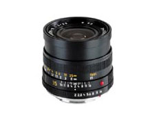
Leica 35mm f/2 Summicron R
At coarser levels (or “for larger structures,” as optical jargon might put it), say 5 lp/mm, you can have more of one than the other, and, indeed, lens designers make choices in these areas. I have one lens, the Leica 35mm F/2 Summicron-R, which has very high large-structure contrast, but not terribly good resolution. That is, if you shoot with a very fine-grained film and look at the detail under a microscope or in well-made enlargements, you may see finer actual detail in pictures made with other lenses yet the Leica lens has a very high (and very pleasing!) sense of subjective “sharpness“.
To see a great visual demonstration of this, check out Canon’s excellent primer on optics at the back of their bookLenswork(a must-read for any photographer interested in, but not trained in, optics). They show the same picture (of a cat) with a.) poor contrast and poor resolution, b.) good contrast but poor resolution, c.) good resolution but poor contrast, and d.) both good resolution and good contrast. This will “key” your eye in to what is meant by lens contrast better than any verbal description can. As you can see from those illustrations, it has nothing to do with overall contrast of the sort we mean when we talk about paper grades.
Color Creates Contrast
The issue is further confused by color, since color sometimes functions similarly to contrast. Imagine two areas in an image of similar value, but one red, and one green. Take a picture of this with black-and-white film, and you have one undifferentiated gray. Take a picture of it in color, and the green area easily stands apart from the red area and vice-versa. Although it has nothing to do with optical or sensitometric contrast, color contrast helps with definition and hence with a sense of general image clarity. What this means is that different lenses perform differently or perhaps I should say “to different tastes” in black-and-white and color. I conjecture that Leica designers used to pay most attention to relatively low-cycle contrast, meaning in the 5-20 lp/mm range, and then let resolution fall where it may. This is the smartest approach (in my opinion) for black-and-white film. Lenses which have been optimized this way look best for black-and-white. But now that so many people are shooting in color, giving a little more weighting to resolution at higher frequencies (as, say, Canon and Mamiya seem to do pretty consistently) and expecting color to “help with contrast” is a smart approach, too.
What is an MTF Chart?
Basically, how lenses are evaluated is by looking at how well they transmit evenly spaced lines of black and white; ten, 20, or 30 “line pairs per millimeter” (lp/mm) means exactly what it says. As these lines get more and more closely spaced, the “noise” between them blurs the edges and makes the black lines look dark gray and the white lines look light gray to the lens (and also to your eye, especially as you get farther away). As the lines get closer and closer together, pretty soon the lens canþt distinguish them tonally, and the lens “sees” one undifferentiated gray. This ability on the part of the lens, charted graphically, is what MTF, or Modulation Transfer Function, is all about.
MTF graphs typically chart a lens’s performance at various “image heights“. This just means the distance from the optical axis, which would correspond to the center of the negative. The exact center would have a height of zero, and so forth out to the corners. Thus, the left-hand side of most MTF graphs corresponds to the center of the image, and as the graph line moves to the right, it corresponds to areas of the negative further from the center. So the MTF chart describes a radius of the image circle cast by the lens. Any other radius from the optical center is presumed to mirror the one that’s charted (which assumes the lens elements are perfectly centered, but manufacturing defects and quality control is another article).
You will note that most MTF charts have two graph lines per frequency, one solid and one dotted. This just measures object lines (“object” in opticspeak corresponds to what weþd call the “subject“, what the lens is pointed at and focused on) that are either parallel to the radius of the image circle (called “sagittal“) and those that are perpendicular to the radii (“tangential“). Most lenses are unable to do equally well with both simultaneously.
Technically speaking, MTF measures both contrast and resolution more or less simultaneously. In a photographer’s reading of an MTF chart, however, generally the position of the topmost lines (typically 10 lp/mm, sometimes 5) will have the highest correlation to visible lens contrast. The lowest set of lines (30 or 40 lp/mm) will correspond best to actual resolving power. Personally, I pretty much ignore the lowest set or sets of lines when reading an MTF chart.
You should note here that different manufacturers provide different MTF frequency measurements. One company may provide 5 lp/mm graph lines, which makes their lenses look good. These lines are often very close to the top boundary of the chart. Other manufacturers may provide lines for 10 lp/mm as the coarsest structures they measure. The two should not be compared directly. In fact, MTF charts from two different sources shouldn’t be compared directly, either. There are enough experimental and procedural variations to make direct comparisons meaningless.
To get a really good idea of a lens’s performance using MTF, you’d need a “family” of charts. For starters, every lens will perform differently at different apertures and at different distances. Just charting an F/16 lens for three different object distances – say, infinity, close focus, and perhaps 20 x F, where F = focal length, would mean you’d need 21 different charts. Really, you should have charts for at least six (and ideally, thirty!) randomly-chosen production samples, too, to account for sample variation. There are a dozen or so other conditions you should measure at every aperture and taking distance. You can see how the volume of data would quickly get out of hand for enthusiasts. But do bear in mind that when manufacturers give you one chart, it only measures performance at one aperture and one distance. That doesnþt really tell you much, except comparatively, and it may not tell you want you need to know.
Often, usefully (sort of), they’ll provide two charts; one for the lens stopped down, and one for full aperture. The more closely these two charts resemble each other, the better and more consistent the performance of the lens is likely to be across the range of apertures. (I say “sort of” usefully because open-aperture charts for an F/1.4 lens and an F/2 lens wouldn’t tell you how the same lenses compare when they’re both at F/2, which might be practical information to know.)
Incidentally, as an aside for those of you who may have seen the articles on “bokeh” (bo-ke, the Japanese word meaning “blur“) in the March/April 1997 issue ofPHOTO Techniques, off-axis aberrations are typically the cause of “bad” or confused-looking blur. The relative superimposition of the sagittal and tangential lines of an MTF chart are one predictor of “good” or smooth bokeh. (This article is available as a PDF filehere.)
So what does an “ideal” or very good MTF chart look like? A good pair (one wide open, one stopped down) would show the solid and dotted lines for each frequency on the stopped-down chart more or less superimposed (predicting good bokeh), moving straight across the chart (predicting good center-to-corner consistency), with the top set of lines (coarse image structures) as near as possible to the top of the chart (predicting good lens contrast). Then, the wide-open chart should look as much like the stopped-down chart as possible (predicting consistent performance throughout the aperture range). In my experience, the lenses that most closely approximate this description are highly corrected short telephotos of moderate aperture. Designers often have somewhat more money to work with when designing macro lenses, so macros such as the 100mms from Leica, Zeiss, and Canon, and the Zuiko 90mm F/2 from Olympus, probably can be said to have the best MTF charts I have seen. (I am not being prejudiced against Nikon; it just so happens I have never seen any MTF charts for Nikkor lenses.)
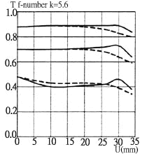
Carl Zeiss Apo-Makro-Planar 120mm f/4
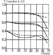

Illustrations © Carl Zeiss
This is an example of what an excellent set of MTF measurements looks like. Note that “U” on these graphs is image height.
A Third Definition
So far I’ve mentioned overall contrast and lens contrast. The final type of contrast we have to deal with is something still different from either of the two definitions above, and this is “local contrast“, or tonal differentiation within certain specified tonal ranges. A film/paper combination whose characteristic curves interrelate in a certain way can yield high highlight contrast (i.e., not much tonal discrimination in the highlights, but a greater sense of “snap” in the gradation you do see) and low shadow contrast, or good shadow contrast and low highlight contrast. In lenses, local contrast issues are accounted for mainly by flare and veiling glare, and are affected mainly by lens coatings. A lens can have exactly the same level of overall contrast (i.e., it will transmit the same overall range from light to dark), but it might have much worse shadow contrast, for instance, in certain real-world situations. Meaning, there will not be as much separation between slightly different shades of gray in very dark areas of the picture. (Transmission of color is also very much affected by the efficiency of the coatings and the relative contribution of flare.)
The big question mark where local contrast is concerned is that almost all actual picture-taking situations allow flare and veiling glare (the latter an overall dulling or haze of the image similar to “flashing” an enlargement with a low dose of non-image-forming light, or fog) to contribute in varying amounts and varying ways. Despite lots of scientific research, there still seems to be not much way to quantify it exactly, or predict its contribution exactly with any given system (“system” meaning camera-lens/film/enlarger-lens/paper) in real-world situations. Flare is always present to at least some degree, but it is seldom present in exactly the same way in two different systems encountering two different situations.
Before lens coatings were invented, lens flare was a major determinant of image quality. The best lenses were generally the ones that allowed performance to remain high with the fewest elements, because there were fewer air-to-glass surfaces to create flare. This explains the lifespan of the exceptionally long-lived Tessar-type, despite its speed limitations. Lens coatings are of critical importance to modern lenses; virtually all zoom lenses and many highly-corrected multi-element lenses would be useless for general photography without them. Often, coating is what makes the most difference between an average lens and a very good one.
Have you ever noticed how many early 35mm photographers tried to avoid bright sunlight? You might be forgiven for thinking that the decade of the 1940s was entirely overcast (and not just by the world political situation). With experience as their teacher, many photographers in the ’30s and ’40s learned various clever ways of avoiding or minimizing high-flare situations. The amateur admonition to “never point the camera in the direction the sunlight is coming from” dates from this era. Such was life with “miniature” cameras before the days of multicoating.
The Importance of Lens Contrast
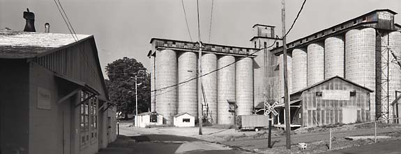
© Carl Weese – Used with permission
Dixie Milling, Easley, South Carolina. Overall contrast is the range of lightest to darkest tones in the picture. Resolution refers to the lens’s ability to distinguish fine detail. Lens contrast refers to the lens’s ability to discriminate tonally between small adjacent areas in the print, lending a sense of texture and surface. Local contrast is the lens’s ability to distinguish different tones within a narrow range, for instance, in the shadow areas at the left. Platinum/palladium print by Carl Weese.
In my opinion, lens contrast of fairly large image structures is a primary determinant of subjective optical quality in a camera lens. The old Leica 7-element 50mm Summicron was optimized for high contrast at 5 lp/mm, for instance, and under favorable picture-taking circumstances (i.e., avoiding too much flare and too wide an aperture), these lenses can still yield glorious-looking pictures today.
Also, it’s very interesting to note that high apparent lens contrast can be simulated digitally, and this may eventually prove to be an Achilles heel for silver-halide photography where viewer appeal of prints is concerned. “Sharpening” only improves visual micro contrast, of course, not actual resolution of detail. But resolution of very fine structures seldom helps pictorial photographs much, and, in my opinion, is an overrated property where lens quality is concerned.
Mike Johnston
For an additional perspective on the related issue of Sharpness you may want to next read Michael Reichmann‘s tutorial on that subject and you can learn more about color contrast in his Colour Theory tutorial.
Photogeeks each have their own peculiar afflictions or areas of obsession, and Mike Johnston’s happens to be lenses. He is faithless, however, transferring his loyalties from one lens to another in a most disconcertingly philandering manner. He is currently enamored of a particular fast Pentax lens. But wait till the weather changes; his loyalties and enthusiasm will have shifted.
Johnston has a B.F.A. in Photography from the Corcoran College of Art and Designin Washington, D.C. He was East Coast Editor of Camera & Darkroom magazine from 1988 to 1994 and Editor-in-Chief of PHOTO Techniques magazine from 1994-2000, where his editorial column “The 37th Frame” was a popular feature. His critical and technical writings have appeared in various publications in the United States and England, and on the www. His articles and reviews began appearing on The Luminous Landscape in June 2001, with many more to come.
This piece is part of an on-going series of articles, reviews and essays written for this site by Mike Johnston.
Mike Johnston
2011
Elevate Your Vision


Read this story and all the best stories on The Luminous Landscape
The author has made this story available to Luminous Landscape members only. Upgrade to get instant access to this story and other benefits available only to members.
Why choose us?
Luminous-Landscape is a membership site. Our website contains over 5300 articles on almost every topic, camera, lens and printer you can imagine. Our membership model is simple, just $2 a month ($24.00 USD a year). This $24 gains you access to a wealth of information including all our past and future video tutorials on such topics as Lightroom, Capture One, Printing, file management and dozens of interviews and travel videos.
- New Articles every few days
- All original content found nowhere else on the web
- No Pop Up Google Sense ads – Our advertisers are photo related
- Download/stream video to any device
- NEW videos monthly
- Top well-known photographer contributors
- Posts from industry leaders
- Speciality Photography Workshops
- Mobile device scalable
- Exclusive video interviews
- Special vendor offers for members
- Hands On Product reviews
- FREE – User Forum. One of the most read user forums on the internet
- Access to our community Buy and Sell pages; for members only.
You may also like