Fotospeed (https://fotospeed.com/about/) started over forty years ago supplying the photographic community with darkroom chemistry and has grown into supplying a wide range of photographic products, not least of which is its extensive inkjet paper range for which it has become particularly well known, especially in the UK where the company is located. It recently introduced its inkjet papers to the US and Canadian markets. Fotospeed has its papers manufactured to its specifications by the foremost substrate manufacturers and coating mills in Europe.
When I learned of their entrée to the North American market, I contacted them about their possible interest in my testing and reviewing a sampling of their offerings for PhotoPXL. They were immediately interested. I suggested they nominate which papers I should review – I suggested a maximum of eight, but we ended-up with nine (out of the 34 they provide) which they think could be of most interest to our market, and those are the subject of the current review. There is something for just about every taste in these offerings: with or without OBAs, whiter or natural, luster or matte, smooth or more textured matte, lighter or heavier, etc. So given the quantity and variety, this is kind of an industrial scale review, which I think adds to its technical interest because of the comparisons it affords.
I proceed very much as I have done in my previous paper reviews, first looking at what we can learn objectively from measurements and data, then evaluating the reproduction qualities of well-known printer test images (Bill Atkinson, Scott Martin, and BVDM’s Roman-16).
For brevity of presentation, I’m providing all the measured data in three PDF files which are downloadable as a single zip archive here, (They will appear in your browser’s default Downloads folder). I’ll refer to them in the text as needed. First a bit about the papers.
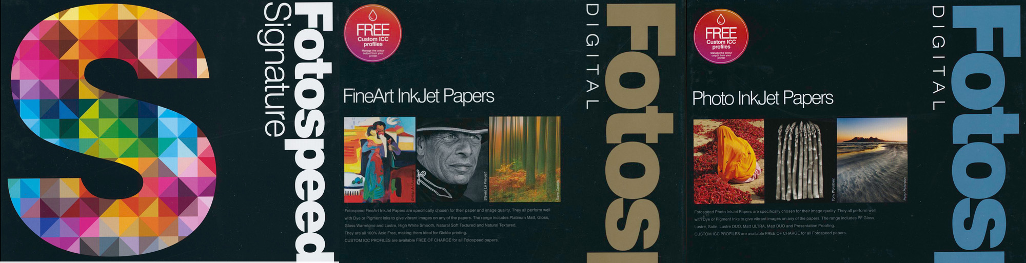
Fotospeed has three main series of inkjet papers (apart from the double-sided, metallic and canvas speciality products not reviewed here): “Signature”, “Fine Art” (Gold Fotospeed) and “Quality Photo” (Blue Fotospeed), (Figure 1).
The main distinction is that the Signature papers were designed to meet the stylistic requirements of certain photographers collaborating with the company. The quality of these papers is not necessarily better than the higher-end ones in the Fine Art Series. The Quality Photo series tends to be more economically priced than the other two. This review includes three Signature, four Fine Art and two Quality Photo papers. Seven of the nine papers are matte using MK ink, while two are Gloss using PK ink.
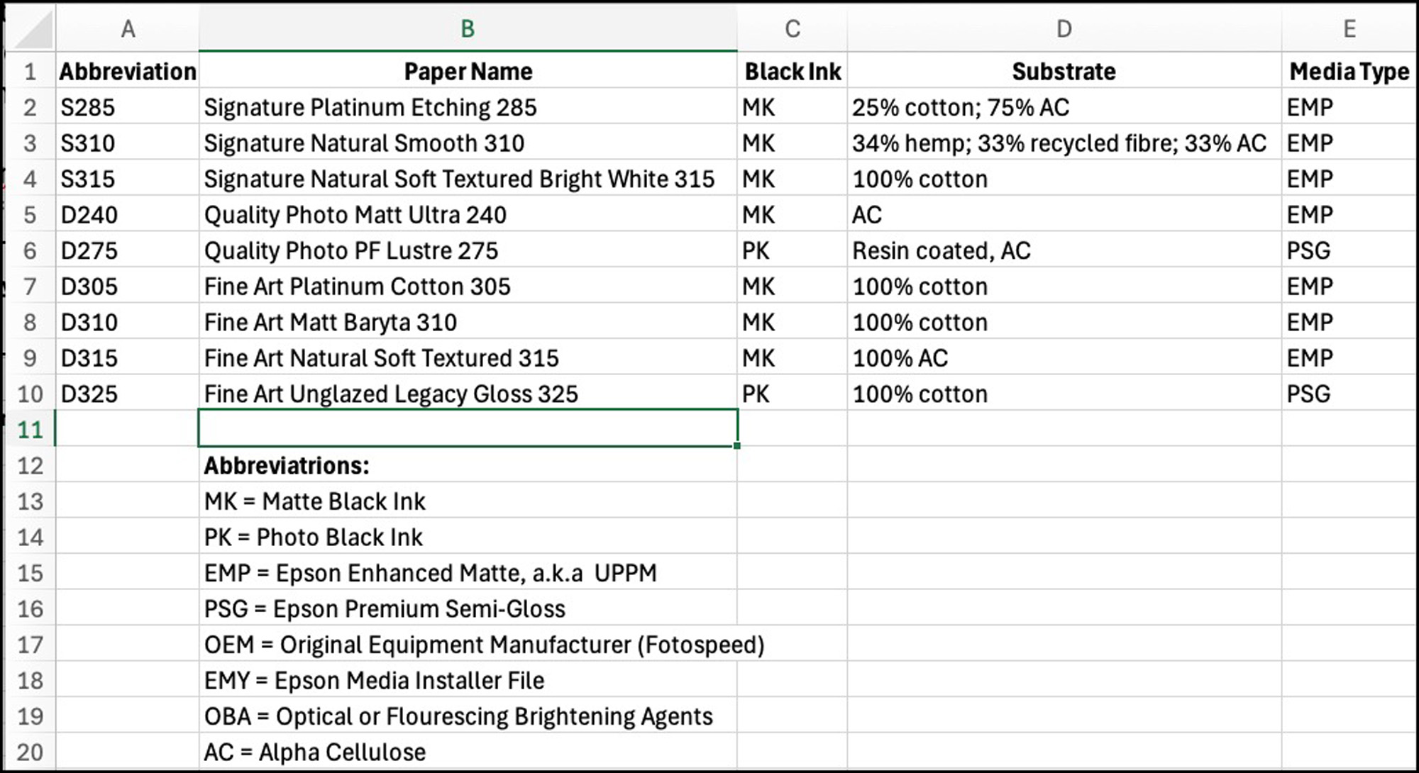
The Fotospeed Basic Info PDF file lists the paper names, my abbreviations for them, their generic profile names (downloadable from the Fotospeed website), the kind of substrate, their Media Types (for printing with Epson printers), preferred Black, and whether they contain OBAs. For brevity I shall use the abbreviated names in this write-up (Figure 2).
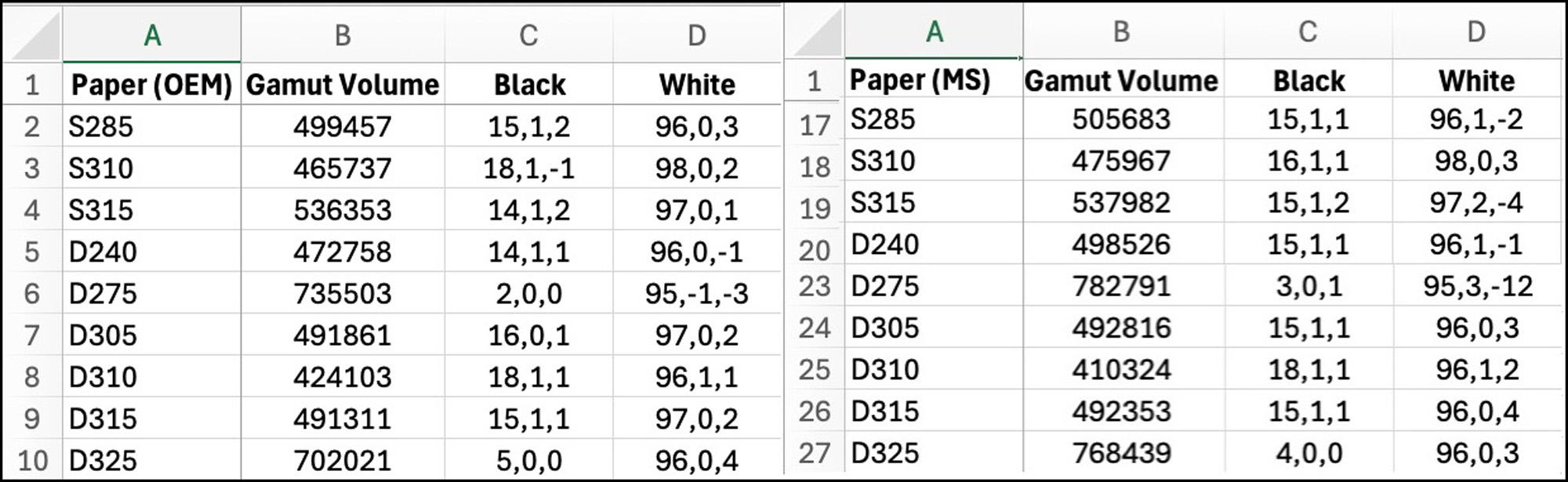
The Fotospeed Papers Profiles Data PDF file shows the gamut data for the printer profiles of all nine papers obtained from ColorThink 4, the new release of the well-known Chromix colour analysis application. As I tested all these papers in the relatively new Epson SC-P5370 (Europe SC-P5300) printer, the gamut volumes reported on that page (Figure 3) relate to this printer and the papers’ profiles; all of them fall within the expected ranges for the paper types. (Note: the gamut volumes reported from ColorThink 4 are not exactly comparable with those from ColorThink Pro3, as Chromix has modified the calculation method between the two versions.)
The Fotospeed Papers Analysis PDF file provides the printing accuracy data obtained from testing both OEM and my custom profiles for the nine papers.
All the results are very much as expected from well-made inkjet papers. All the custom profiles I made have dE(2000) average values in the range of 0.46 to 0.64, and in the range of about 1.0 to 2.3 for the OEM profiles. These are fine outcomes, meaning that papers are amenable to very good profiling. (Readers may find it useful to review my article on this website < https://luminous-landscape.com/augmented-inkjet-printer-paper-and-profile-evaluation-190617/> to refresh memory of my paper testing procedure.)
The difference between the OEM and the Custom results is that Fotospeed uses their printer for making their generic profiles, but they get tested with a patch set printed in my printer, whereas for my custom profiles I use my printer for both profile creation and testing, hence greater consistency. As well, I use a MYIRO-1 spectrophotometer with its MYIROTools software for both profile creation and testing, which I have found to be marginally the most accurate hand-held device available for these purposes.
Speaking of profiles, it could be important for readers to know that Fotospeed offers a FREE custom profile making service for purchasers of their papers, regardless of from where they purchase them. One downloads their profiling target from their website, prints it as they instruct, fills the form they provide and mails the print and the form to Fotospeed who very rapidly create a profile and send it back by email. The user then installs it in the System level profiles folder as instructed, which is easy to do. Fotospeed provides full instructions in both written and video formats on their website and YouTube channel explaining how to prepare and submit the profiling target and then how to install the resulting profiles.
I asked them to make two (for the D240 and S310 papers) for me to test the service, and I found that it works very well. It took only three days for the target to reach them from Canada, and within a day they emailed me my two profiles. I tested these profiles and found them to be very good, as reported in the data (<FS Custom for Mark>). The advantage of using this service is that the profile is customized to the user’s printer, hence more accurate than an OEM generic profile made from their printer but used in mine.
Also reported in the <Analysis> file, is the data on the papers’ Black and White points as read from the prints of the test patches. For the matte papers, Black points fall within the range of L*15~L*18, and for the luster papers L*3~L*4. The White Points of all the papers fall within the range of about L*94.5~L*96.8. All this data is consistent with other high quality inkjet papers.
Detailed Comment on the Individual Papers
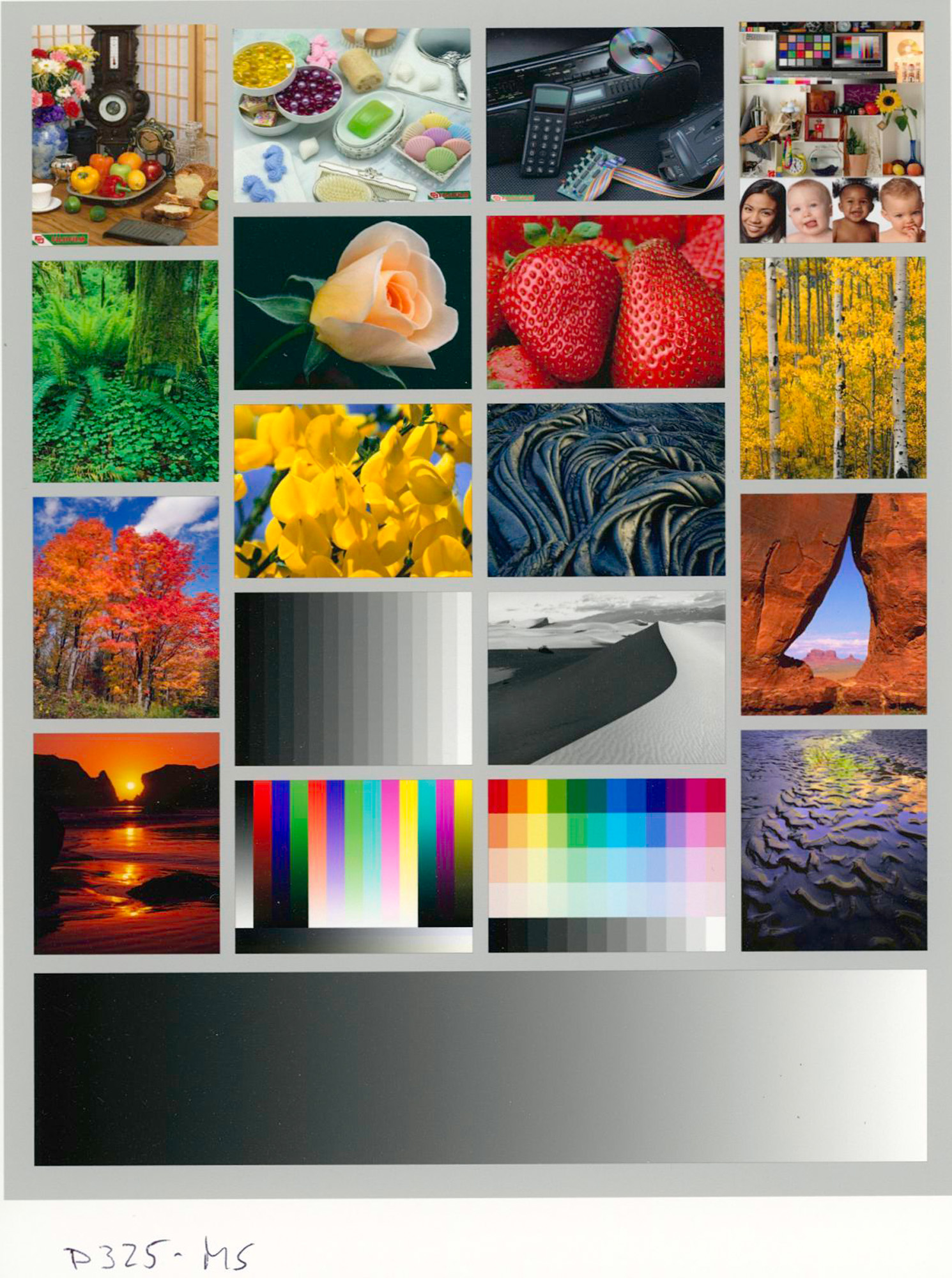
D325 (Digital Unglazed Legacy Gloss 325 gsm)
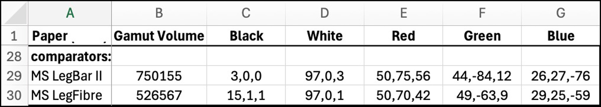
I’ll begin with this one, because it is the “Fine Art” quality wide gamut PK-ink paper in the set. It’s profile data (Figure 3 rows 10 and 27) compares with, say, Epson Legacy Baryta II for the same printer and measurement conditions (Figure 4, row 29). It does not contain OBAs.
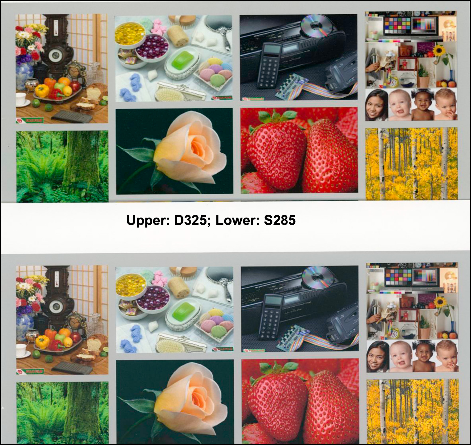
The paper has an unobtrusive luster finish which is visible to differing extent, depending on the angle at which one views the paper surface. When held at an angle that minimizes glare, the surface texture is almost invisible, and the image colours and detail are rich and well pronounced. Figures 5, 6, 7 and 8 are faithful scans of the printer test images made on this paper.
This is a robust, heavy paper with good flexibility; it can withstand handling and feeds through the SC-P5370 top manual paper feed without any issues. Based on the results of the printer test images and the test data, this is clearly a quality professional product.
To recall key qualities of the printer test images: The Atkinson image is good for assessing colour, saturation and tone across a range of subject matter, colours and tones. The Onsight image is particularly useful for assessing reproduction of fine image detail and the rendering of dark tones and colours. The Roman 16 images used here are particularly good for assessing the rendition of shadow and highlight detail through fine tonal gradations.
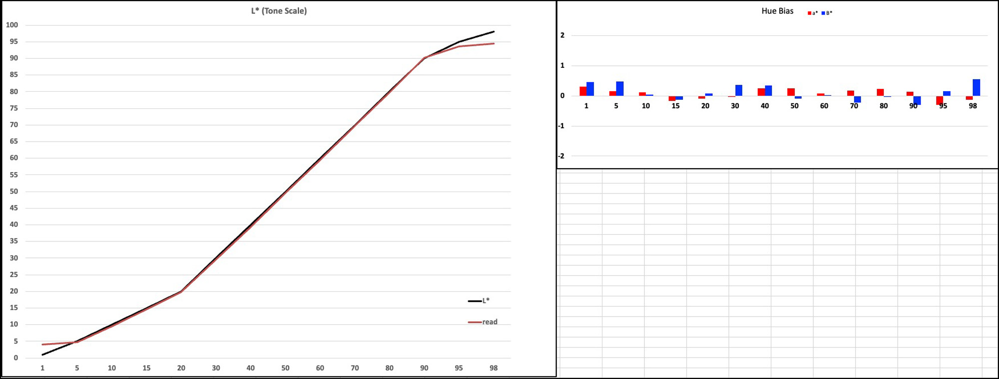
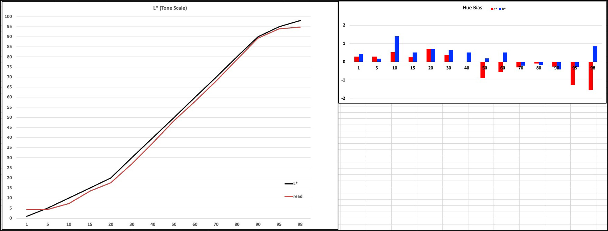
In Figure 9, I show from the measured data analysis the excellent fidelity of tone reproduction (left side) and hue neutrality (right side) for the B&W section of my 48-patch test image. For tonality, the more closely the Black and Red lines converge the more accurate the tonal rendition across the range, and for hue, the closer the bars are to zero the more neutral the grayscale rendition, anything absolute1.0, give or take a bit, being visually “neutral”. The Fotospeed profile will also produce fine-looking prints despite being statistically a bit less accurate than the custom profile (Figure 10). (When I talk “accuracy” here, I mean fidelity to the tone and colour values in the test image files.)
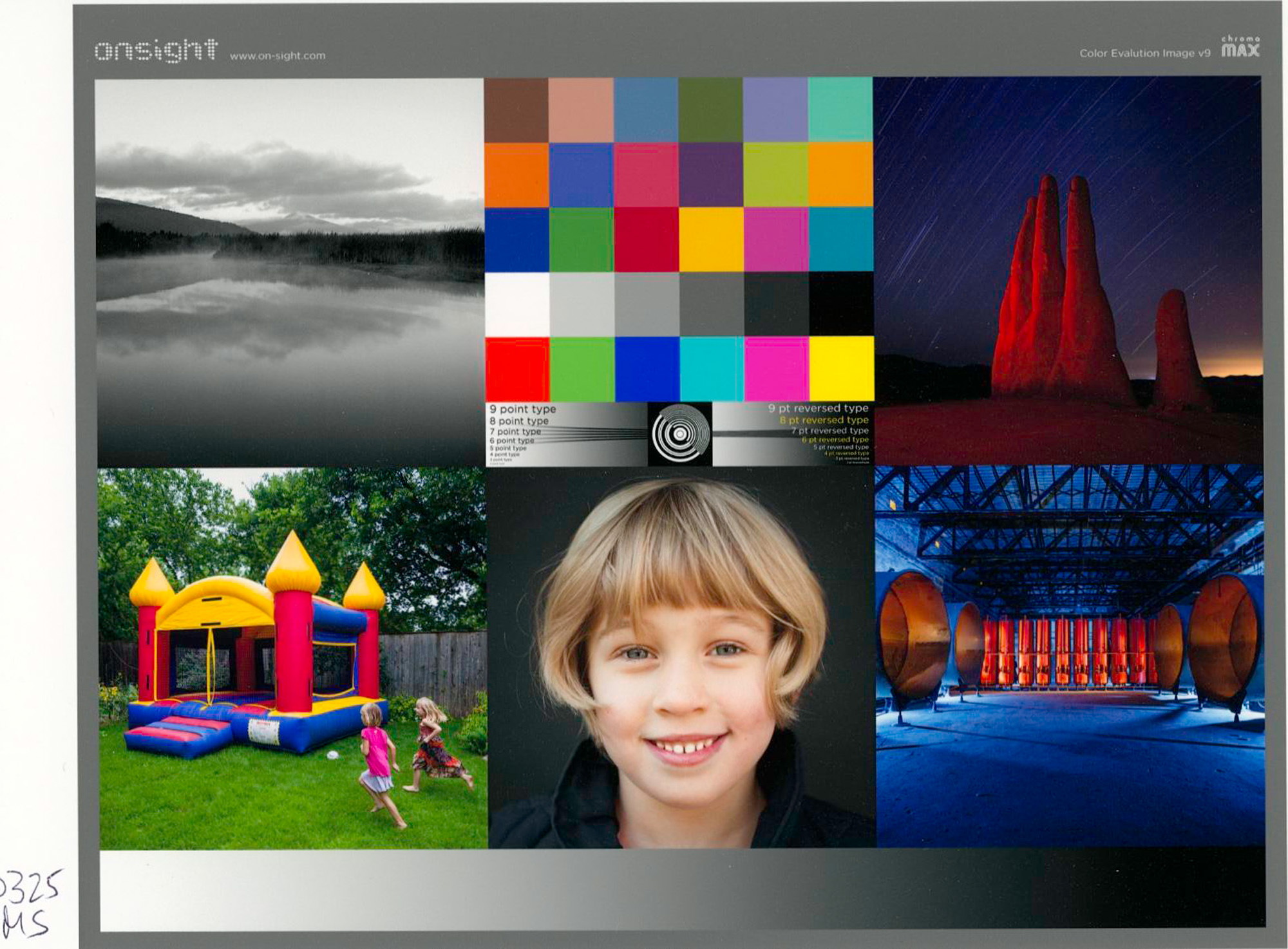

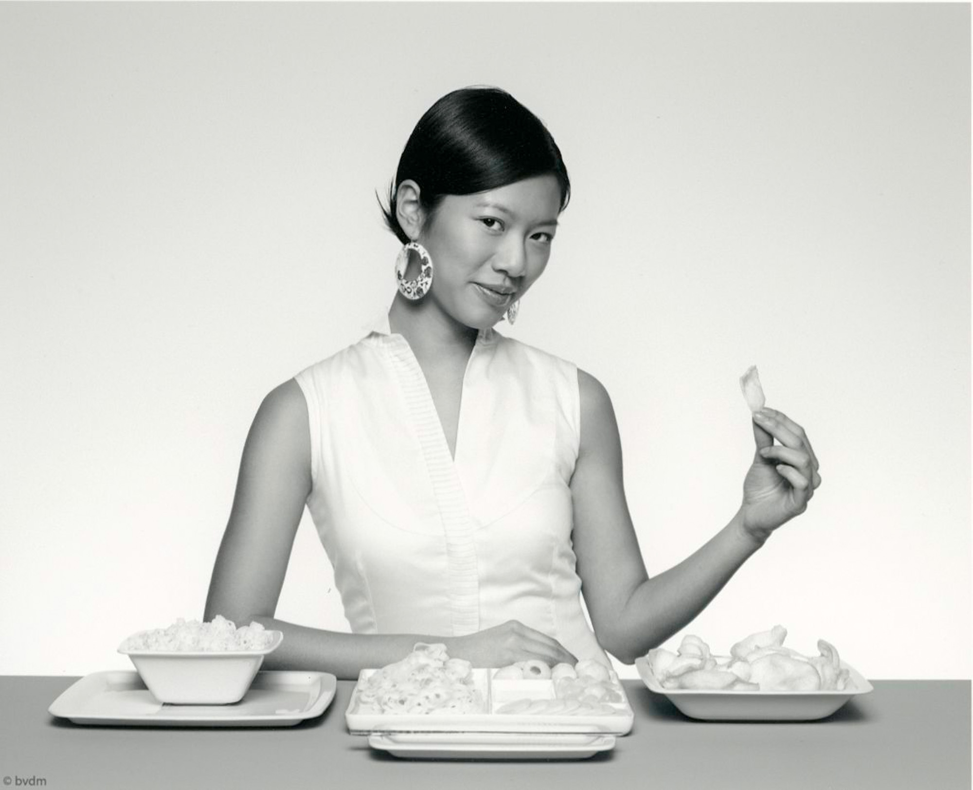
Examination of the printer test images shows that colours are well reproduced, shadow and highlight detail are well preserved, and tonal separation in the deep grays and darkest colours is excellent, all as one would expect from the foregoing data.
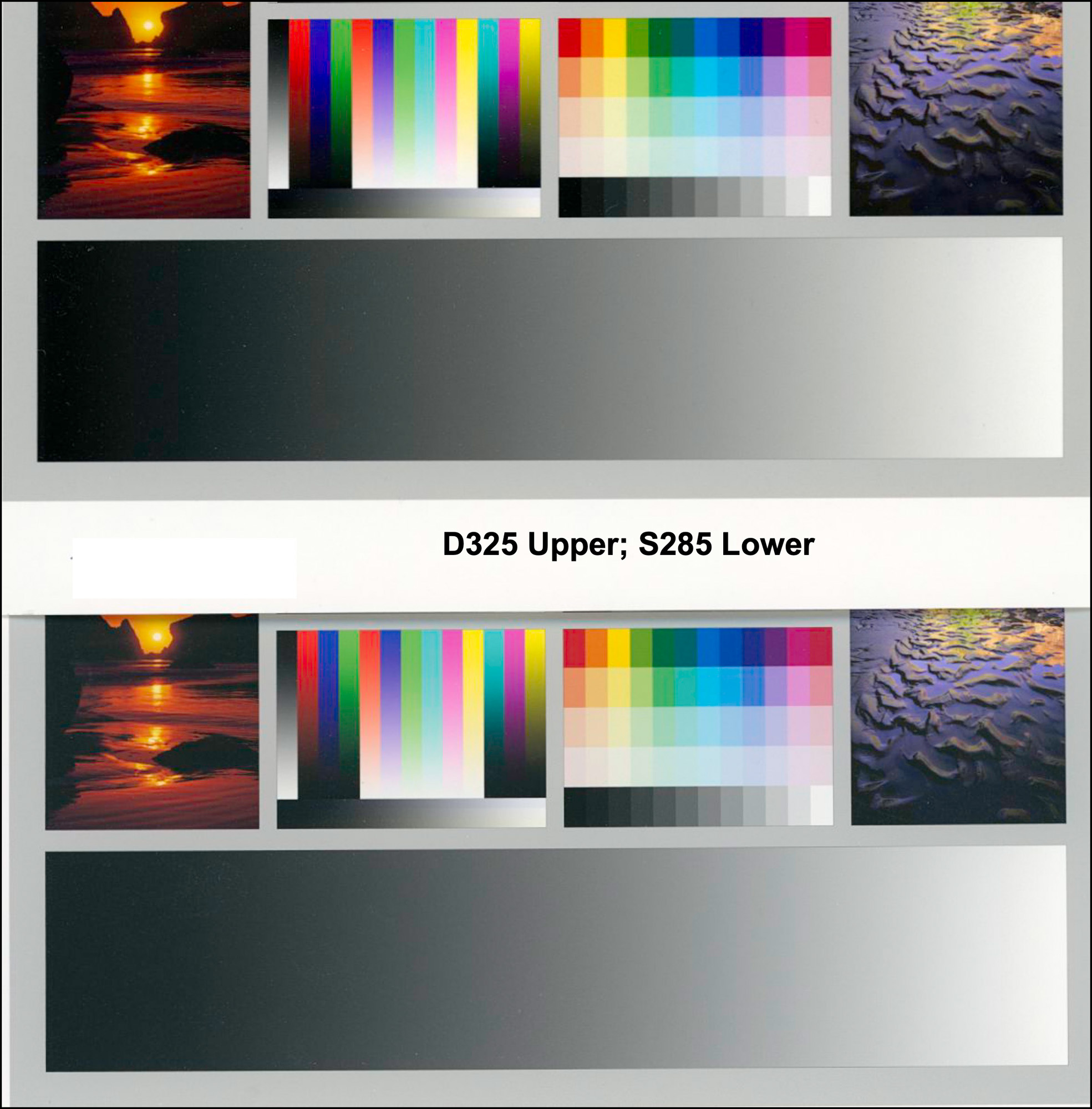
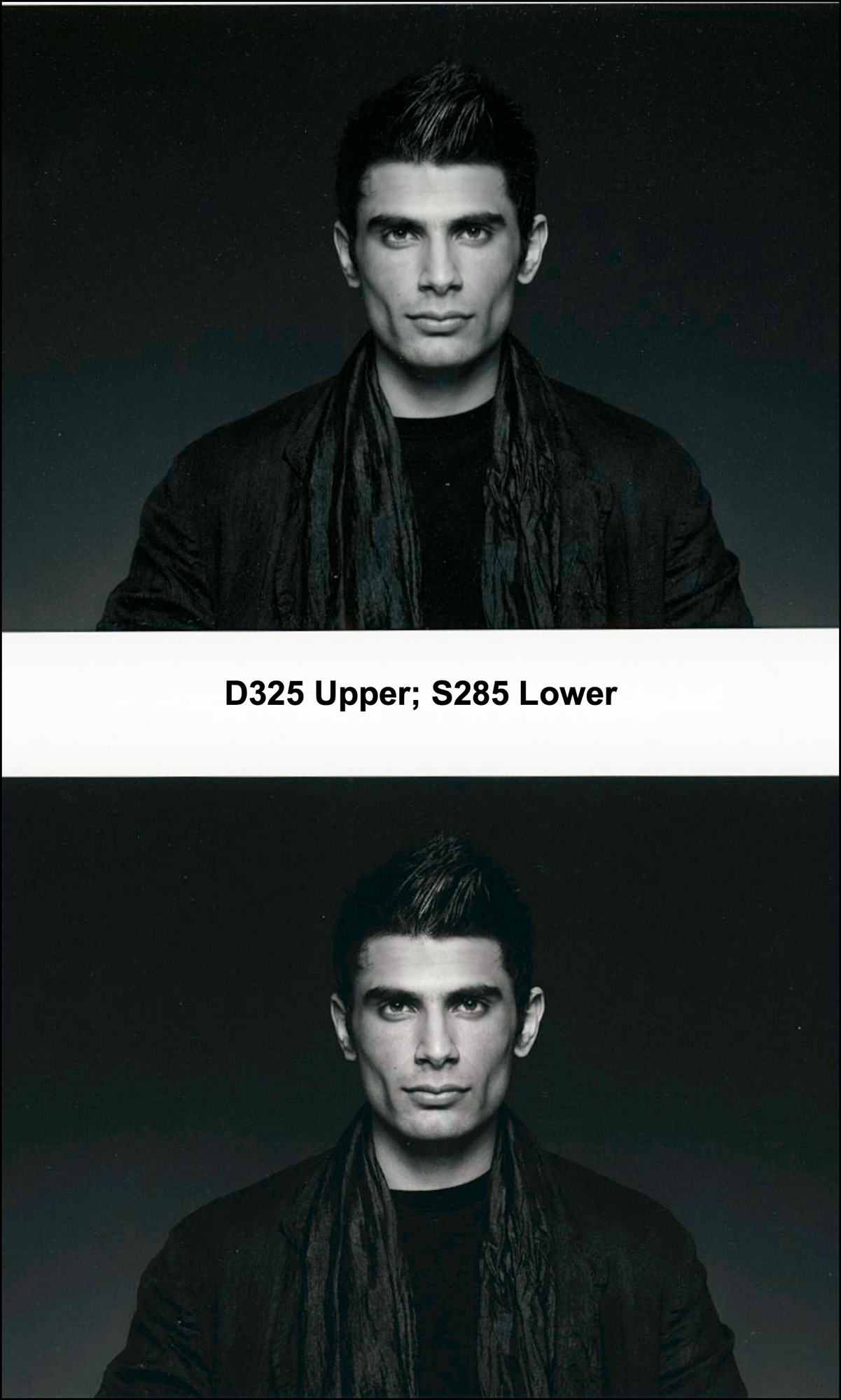
S285 (Signature Platinum Etching 285)
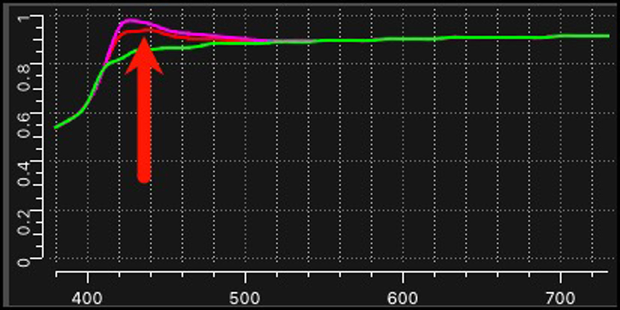
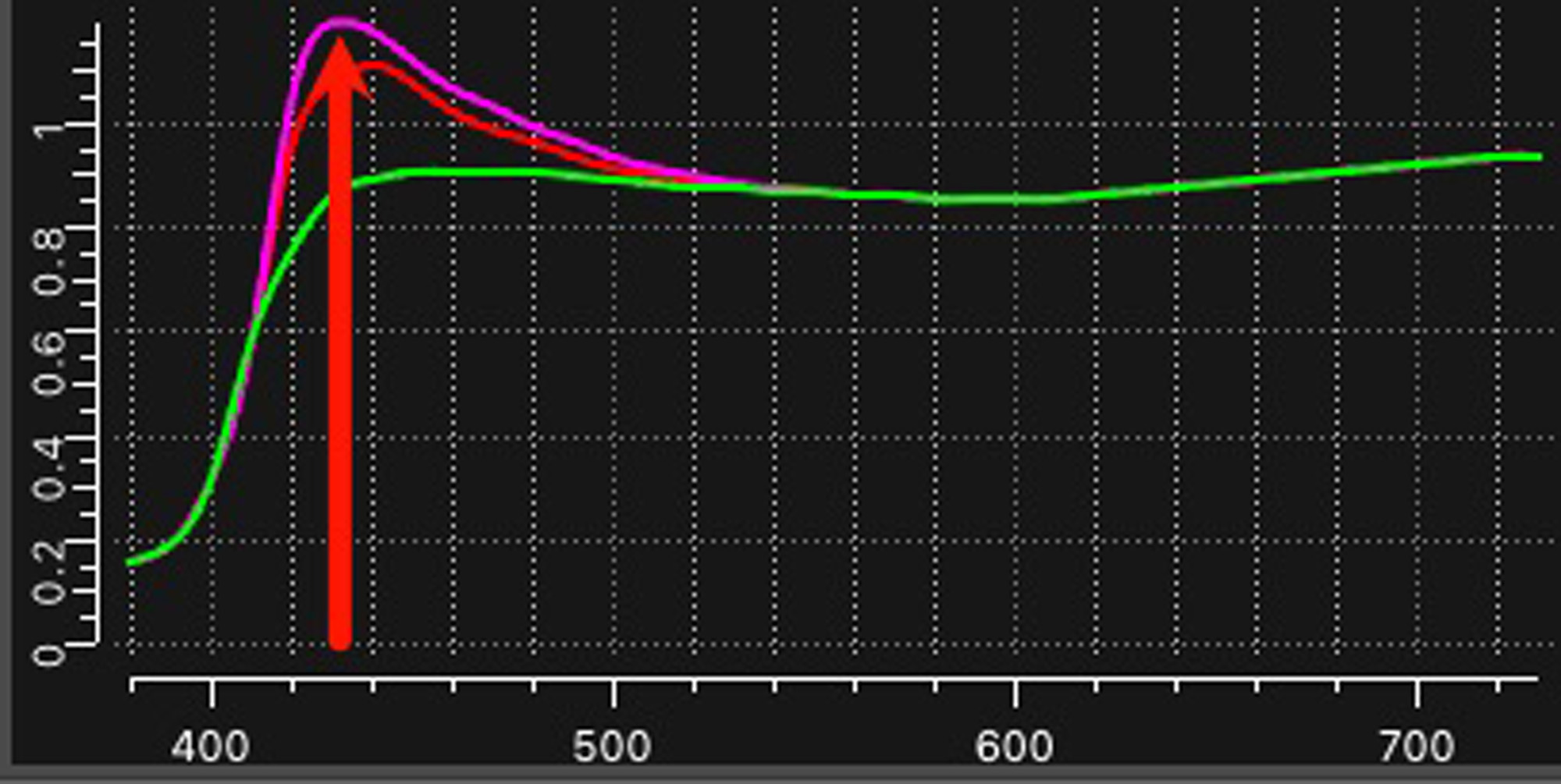
This is a mildly textured matte paper with OBA content, as evident from the uptick of the magenta-coloured M1 reflectance curve in the 410~500nm section of the spectral scale (*)(Figure 11). So, if you insist on using papers with no OBA content, this would not be your first choice of paper. That said, its reproduction of colour and dark tones is really very good for a matte paper. Often comparing a matte print with the same print on a paper like the one reviewed above, the matte version looks dull. That is much less the case here than usual, as observed in Figures 12 to 15. [*The Red and Magenta curves in the Reflectance graph portray M0 and M1 measurement conditions which include measurement of UV reflectance shifting due to OBAs, whereas the Green curve for M2 measurement condition excludes UV (a.k.a “UV-cut”). Hence the differences between M0_M1 and M2 are largely an implicit indication of OBA presence where that spike occurs. ]
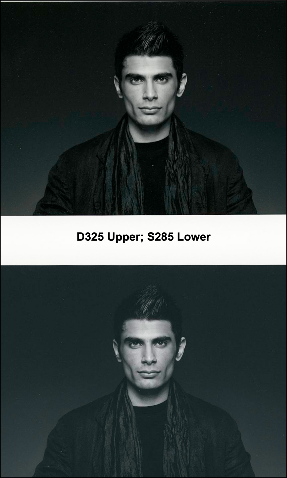
In Figures 12 to 15, the Photo Black print on luster paper is the upper sample, and the Matte Black print on matte paper the lower sample.
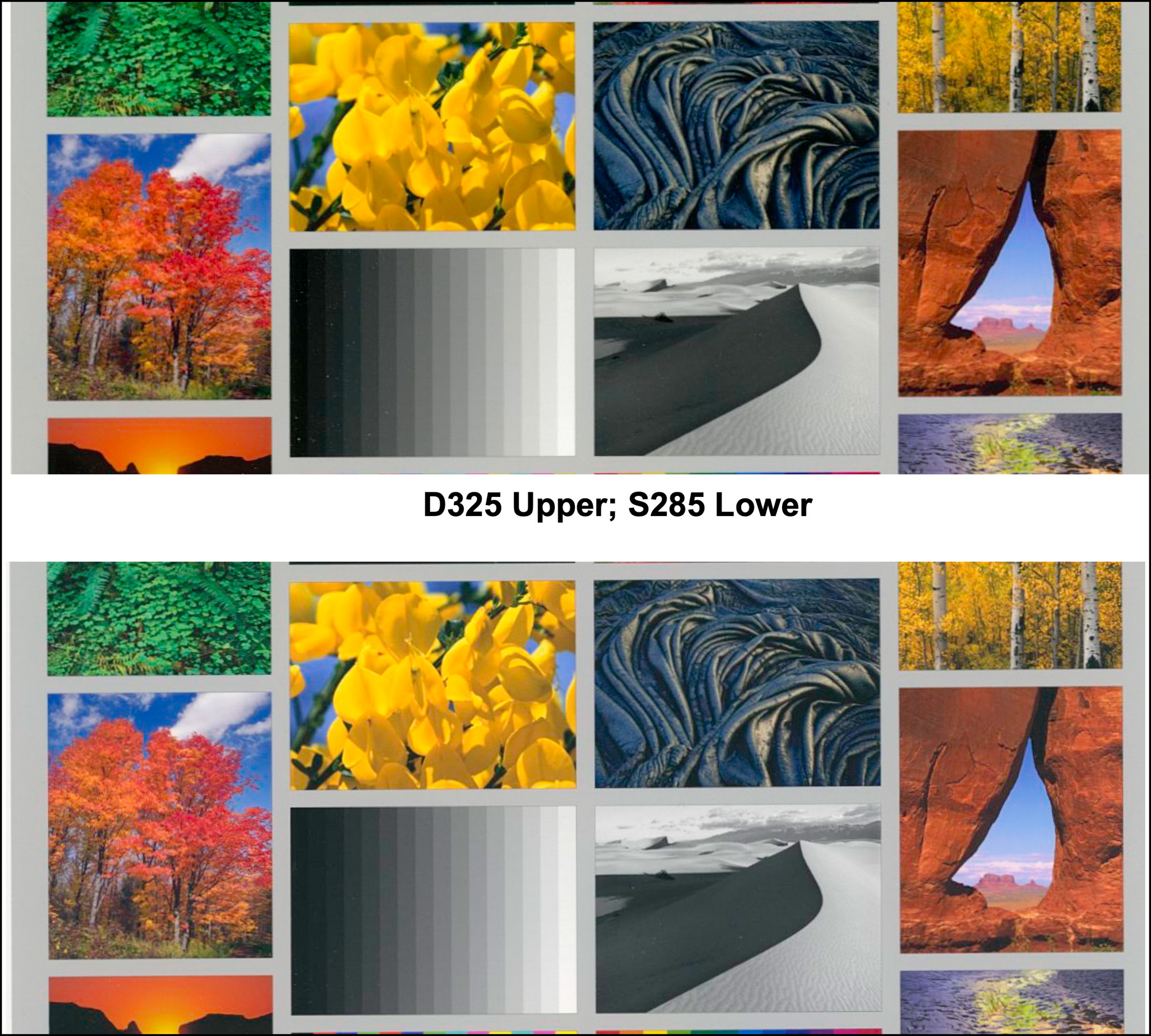
In all these samples, while the rendition on matte is not quite as saturated and brilliant as that on luster, they come remarkably close for a matte paper. Even the grayscale image matte rendition has rather clear tonal separation in the very dark tones, albeit it the overall image has less Black density than observed from the luster paper. Worth considering, however, that by adding a bit of contrast to the matte photo, its appearance can be brought quite close to its luster comparator (Figure 16) without clipping much useful shadow detail.
Useful to understand in these comparisons, the test chart patches are printed with Absolute Colorimetric Rendering Intent (ABSCOL) , while the printer test photos are printed with Relative Colorimetric Rendering Intent + Black Point Compensation (RELCOL+BPC) – this or Perceptual Rendering Intent, being the normal/usual ways one would print photographs.
ABSCOL is used when we want to test how accurately a printing system renders the image colours (as defined in the image file) without the image editing software interfering by remapping the tone values in the image file; hence, for example, if Maximum Black for the printer/paper combination is L*15, ABSCOL will print image file values L*0 ~L*15 as uniform L*15. However, RELCOL+BPC causes the image editing software to remap tone values starting from Maximum Black and to scale the printed deep grays up from there in relation to the successively higher grayscale values in the image file. This provides for tonal separation on paper within the lowest 15 or so tone values of the image file, without being compressed into one indistinguishable value at Maximum Black.
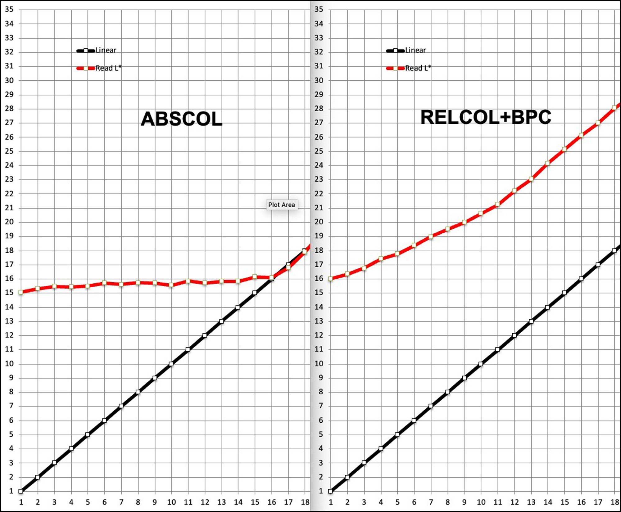
One can see how this works graphically (Figure 17) based on prints of my L*1 ~ L*35 patch grayscale, one printed in ABSCOL, the other in RELCOL+BPC. Notice on the ABSCOL side how the red curve (read values from the test print) is a quite uniform horizontal line from L*1 to L*16, showing that without BPC and Relative Rendering Intent, the first 16 luminance levels of the image file are squished into the narrow range of L*15, with no tonal separation. However, on the RELCOL+BPC side, the red curve indicates tones above are always lighter than (and therefore separated from) tones below from approximately the paper Black point (~L*16) upward, this separation revealing deep quartertone detail throughout the lower quartertone range, albeit at lighter printed gray values than in the image file.
One would see much less difference between ABSCOL and RELCOL with a luster paper, as the paper Black Point is well below that of matte paper (usually in the range of L*2 to L*4), meaning that BPC doesn’t have much to adjust from the Maximum Black of the image file to the Maximum Black printable value (viz. lower left corner of Figure 9).
In summary, this printer/paper combination handles the grayscale very well – in fact a bit of contrast adjustment results in deep shade appearance that belies the fact this is a matte paper. Other matte offerings from Fotospeed come close in these comparisons as well. For both its colour and B&W rendering, this is a paper I wouldn’t hesitate to use for matte prints.
In the following comments on the other seven papers in this review, for sake of brevity I shall comment on them in terms of differences between papers.
S310 (Signature Natural Smooth 310 gsm)
This is a new paper in the Fotospeed line-up. Main differences between it and S285 above are that it contains no OBAs, has a smooth surface (no texture), and a different substrate, being 34% hemp, 33% recycled fibre and 33% Alpha-cellulose. Its paper White is a trifle warmer than that of S285 . This is confirmed in the Analysis data which for the White Point b* value shows S285 being slightly negative and S310 slightly positive, the difference between them being small (recall b* <0 is “cool” and b*>0 is “warm”). It’s also a slightly stiffer and heavier paper than S285. For brilliance of the warm tones (yellows, oranges, reds) I would give a very slight edge to S285, but S310 is close all-round.
S315 (Signature Natural Soft Textured Bright White 315) (see why I prefer the abbreviations!)
This is a paper with 100% cotton substrate. It’s surface texture falls between S285 and S310, so if you want neither the more pronounced texture of S285 nor the absence of texture in S310, this may be the one for you. But – it does contain OBAs (Figure 18).
It’s a slightly stiffer paper than S285 – more like S310 in that regard. Its paper White is quite close to neutral with a* and b* values of only -0.06 and -0.74 respectively. Quality of tone and colour reproduction is also fine.
D240 (Digital Matte Ultra 240)
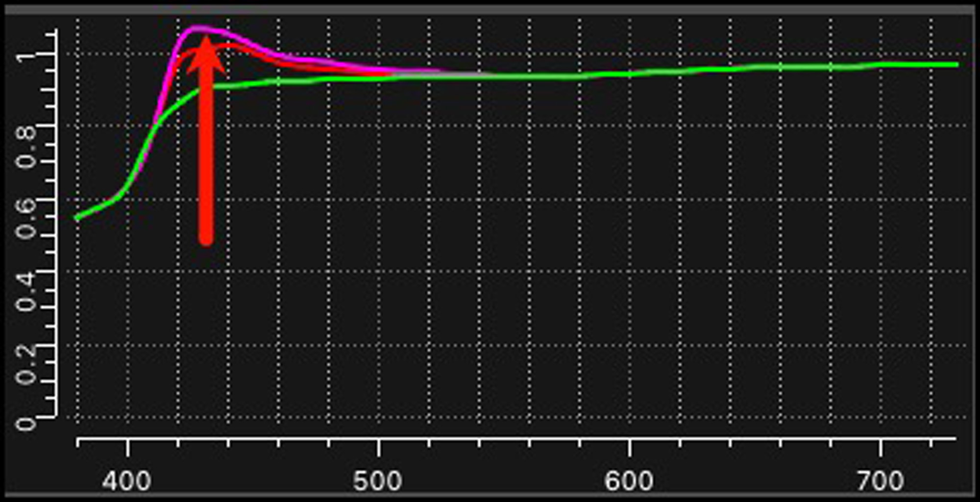
Physically, this paper kind of resembles Epson Enhanced Matte. It’s thinner and weighs less than those discussed above, and contains a fairly substantial amount of OBAs, as inferred from the size of the Magenta curve reflectance spike shown in Figure 19.
Over time, the OBAs are expected to fade revealing the true colour temperature of the paper, which in this case may not be too bad insofar as the substrate is almost as white as the coated surface, which itself is bright white leaning very slight cool. Its dark tone appearance is good, tonal separation above its Black Point being very good. Colour saturation is pleasing for a matte paper.
D275 (Digital PF Lustre 275)
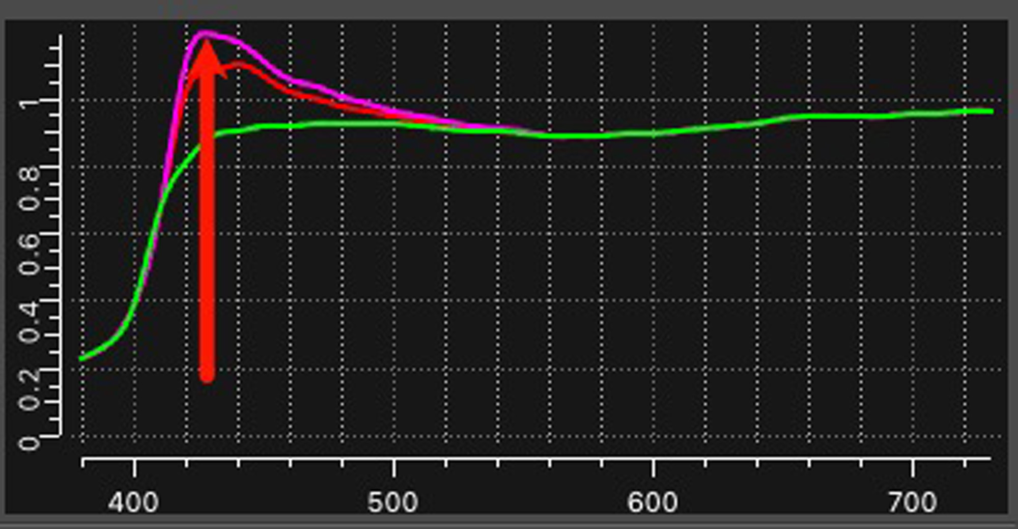
This paper uses Photo Black ink and has a Black Point of about 3.3, which is in the typical range for luster papers. It’s White and Black points are quite neutral. Colour saturation is rich. This paper is also rich in OBA content (Figure 20).
This paper is similar in weight, thickness, feel and appearance to Epson Premium Luster Photo Paper, except that it looks whiter. This may be because my samples of the latter are about 20 years old and , although in dark storage, may have experienced OBA fading by now.
I should add, perhaps, for both this paper and the others above containing OBAs, I have prints on both Epson Enhanced Matte and Epson Premium Luster dating back over 20 years. Although bound in books (just about equivalent to dark storage), I have no doubt OBA fading has occurred, but these prints still look fine. If the OBAs have faded, they’ve done so evenly, so no blotchy appearance. Nonetheless and quite properly, they are not considered “archival”. However, for many peoples’ purposes they would still be acceptable print media – but just be aware that their paper white will be less stable than that of papers without these chemicals. So, are OBAs that big of a deal? Well, like so much else, “it depends”. If you are going for “archival”, yes it is, and there is a legitimate question about what sense it makes to add OBAs to photographic papers altogether – just to make them a bit brighter for some years? Why is that important? But if you’re not too concerned about the “archival” designation and just want nice looking prints on real bright paper, go for it – OBAs and all. The remaining three papers in this review do NOT contain OBAs. They are all nice matte papers.
D305 (Digital Platinum Cotton 305)
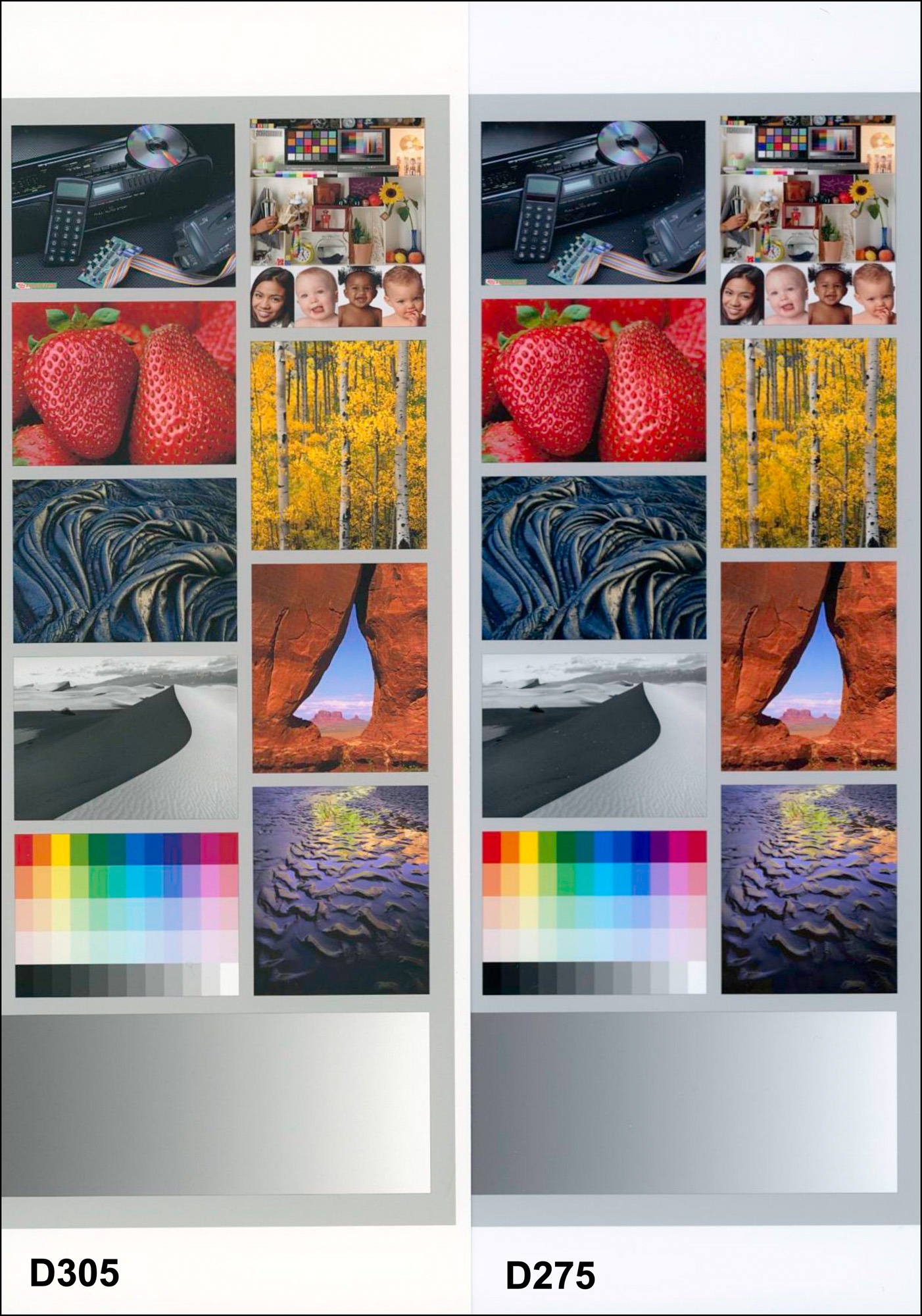
Figure 21 shows three main differences between a matte paper without OBAs versus a luster paper with them; notice: (1) the difference of paper white (warm vs cool), (2) the somewhat brighter Black of the matte, and (3) given the quality of these matte papers, the rather subtle difference of colour saturation appearance between the luster and the matte. The luster paper still has an edge for reproduction of a very wide colour gamut and deep-looking Blacks, but not by all that much. I was favourably impressed with the quality of dark tone appearance due to the good tonal separation of the Blacks in the BVDM printer test image (Figure 22).

Apart from its fine colour and grayscale reproduction characteristics, D305 is a robust paper in terms of weight and thickness, and its 100% cotton substrate gives it an artistic feel. The paper surface has a slight texture, giving just a bit more “tooth” compared with a smooth matte.
There is quite a striking difference of appearance for light-tone B&W photos between a paper such as D305 and D275 Luster (Figure 23).
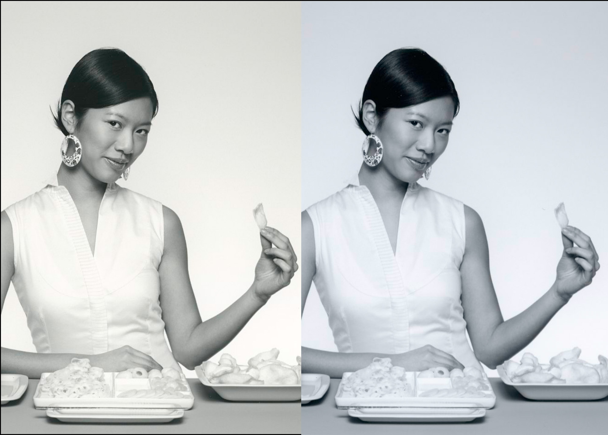
This kind of difference is obviously real, but only hits you this way when you look at them side by side as in Figure 23. When you look at them individually, yes, you sense that D305 is warmer and D275 cooler, but they both come across as “white” because of human visual adaptation. Both have very good highlight retention properties, as you can see, for example, in the pattern on the dress collar.
D310 (Digital Matte Baryta)
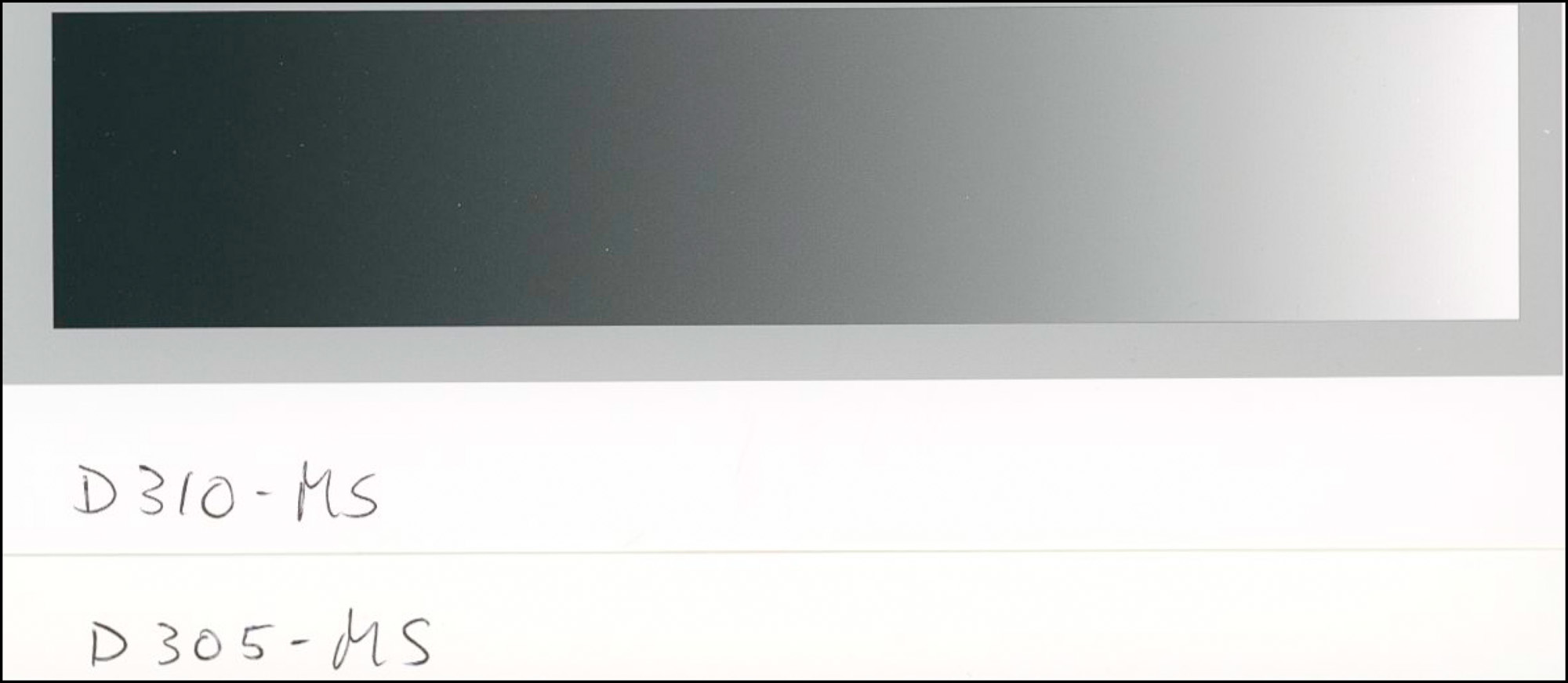
As said in the paper name, this offering includes Baryta. This is a moderate brightener that is not a fluorescing brightening agent. As such, D310 is a tad more neutral white than D305. Looking at paper whites directly compared between D305 and D310, you may be able to see what I mean (Figure 24). The grayscale ramp in Figure 24 is for paper D310.
Interestingly, I found the overall brightness of colour from this paper to be just a bit subdued compared with either D305 or D315 below; however, the difference is subtle, easily adjustable to taste; essentially, reproduction on this paper is quite like that of the other matte offerings in this article. D310 also has a 100% cotton substrate. The “tooth” of the surface is similar between D305 and D310 – just a bit of texture relative to “smooth”.
D315 – Digital Natural Soft Textured 315
This is an unusual and pleasing paper. It’s relatively thick and heavy, but feeds through the top feed of the P5370 just fine and withstands handling. The unusual aspect is the construction. It has an alpha-cellulose substrate but it feels like cotton – not at all like cardboard or plastic. Its matte surface has a bit more tooth than the two above; looked at under a magnifier, one can see that it has two styles of indentation juxtaposed, which give it a bit of a more textured feeling. Grayscale and colour reproduction are very good, comparing well with S285 even though S285 has moderate OBA content whereas D315 does not.
To conclude, this article, having tested and examined all nine of these papers rather carefully, I give Fotospeed full marks for putting a very good range of inkjet papers on the market. Just as important, I commend their customer service – from my interaction with them it is prompt and attentive. Their provision of free custom profiles to customers sets them apart from the rest of the pack, and really a good idea for those who need or want that extra level of customization; but that said, as you can infer from the downloadable data sheets I prepared, their Generic profiles also perform well.
At time of writing, for North America, Fotospeed Papers are available from MidWest Photo in the USA and CyberSport in Canada.
Mark D Segal
Toronto, April 2025.

Elevate Your Vision


Read this story and all the best stories on The Luminous Landscape
The author has made this story available to Luminous Landscape members only. Upgrade to get instant access to this story and other benefits available only to members.
Why choose us?
Luminous-Landscape is a membership site. Our website contains over 5300 articles on almost every topic, camera, lens and printer you can imagine. Our membership model is simple, just $2 a month ($24.00 USD a year). This $24 gains you access to a wealth of information including all our past and future video tutorials on such topics as Lightroom, Capture One, Printing, file management and dozens of interviews and travel videos.
- New Articles every few days
- All original content found nowhere else on the web
- No Pop Up Google Sense ads – Our advertisers are photo related
- Download/stream video to any device
- NEW videos monthly
- Top well-known photographer contributors
- Posts from industry leaders
- Speciality Photography Workshops
- Mobile device scalable
- Exclusive video interviews
- Special vendor offers for members
- Hands On Product reviews
- FREE – User Forum. One of the most read user forums on the internet
- Access to our community Buy and Sell pages; for members only.
You may also like