Introduction
We know that different media and printers have different capabilities for reproducing the full gamut of the photos we make. Knowing more exactly what different media and machines allow for a particular image can be instructive when selecting how to reproduce or re-adjust specific photos.
Now that ColorThink is issued in version 4, I thought it would be useful to re-test the application for this usage, which it was also capable of doing in version 3.
Analysis
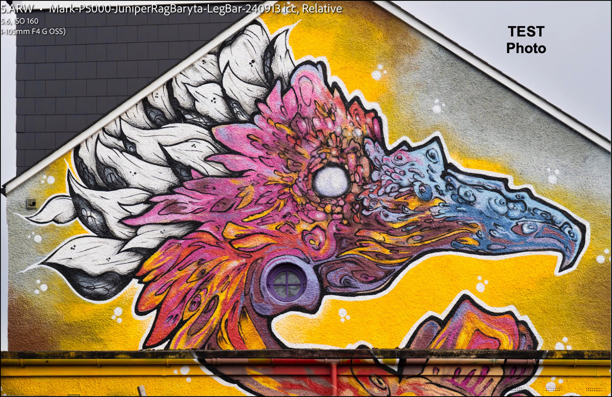
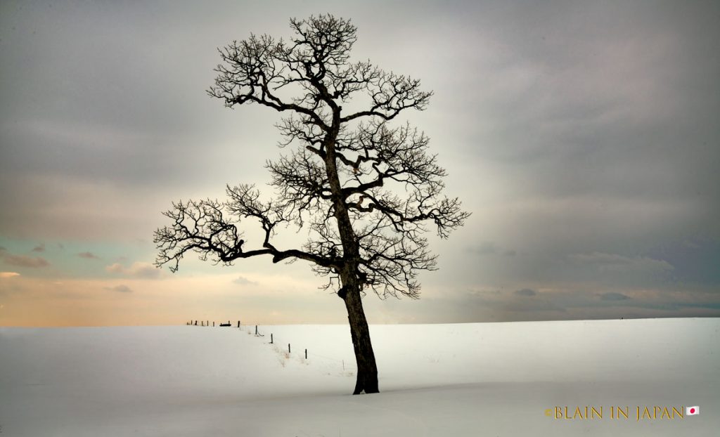
Figure 1 shows the test photo for this exercise. I made this photo last November in Penge, an ex-burb Southeast of London, England, which has become quite a hub for the mural arts. I selected this one because of its very rich warm tones, often the favorites of mural artists because of their graphic impact. The aim is to see how much and which areas of this rich color palette can be reproduced on a range of equipment and media.
The general method of doing so is to convert the photo into all of its colors as small dots on a three-dimensional graph (in this case, a L*a*b* graph) and then to map on top of this array a graph of the ICC profile for the printer/paper combination being tested. Any dots that stick out from under this graph of the ICC profile are out of its gamut and will not reproduce accurately with that printer/paper combination (see below on Rendering Intent – RI.)
For purposes of this work, I exported the worked-up raw file from Lightroom Classic as a JPEG at high quality. The work-up consisted of the various tone and colour editing one normally does with raw files, and which I do under soft-proof for one printing condition in the first instance – usually a wide-gamut baryta paper printing with PK ink.
Figure 2 shows the plot from ColorThink 4 of the photo’s colors:
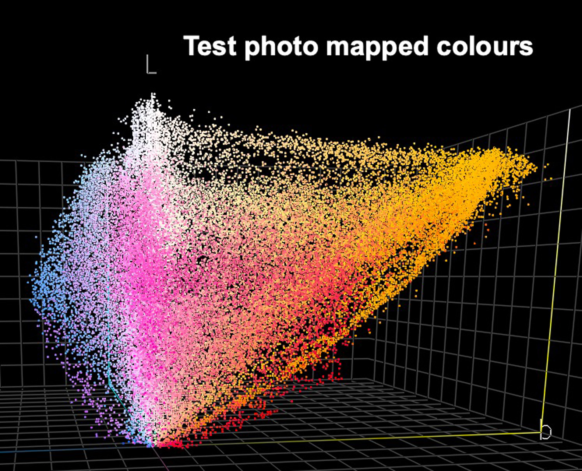
Notice of course the preponderance of the warm colours.
We know that the native working space for Lightroom Classic is a version of ProPhoto RGB; but that space is so large that few photos I’ve ever worked with can fill it, and most printing conditions we normally work with can at best moderately exceed the gamut of Adobe RGB (98). So I thought for comparison it may be an idea to see how this photo’s gamut plot fits ARGB(98) (Figure 3):
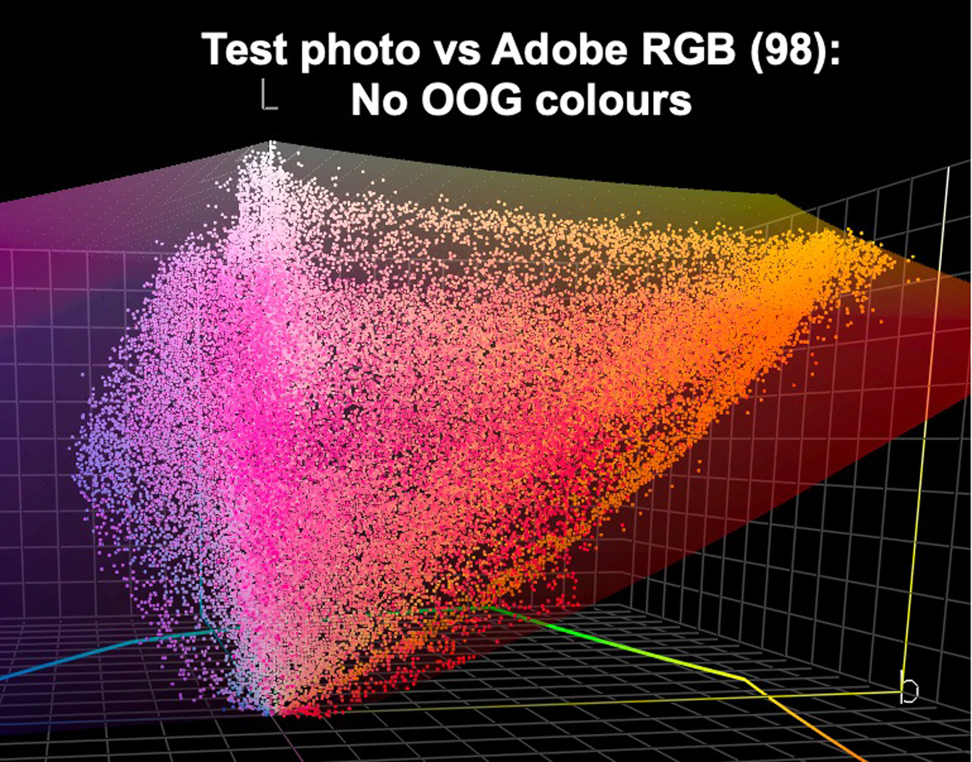
In Figure 3 the veiled multi-colour gamut map of the working space is overlaid on the image dots of Figure 2. You can see here that just about all of this photo fits within ARGB(98).
Now, we turn to the print gamuts as reproduced in ColorThink 4 from their ICC profiles.
This exercise covers two printers and two papers, with one demonstration of an offset press profile for those with an interest in publishing books with photographs reproduced in web-coated offset.
The two printers are the Epson SC-P5000 and the newer SC-P5370 (5300 overseas). The two papers are Epson Legacy Baryta II and Epson Legacy Fibre, the former a PK luster paper and the latter an MK matte paper. In this way, we will see whether the printer or the media are most responsible for the observed differences.
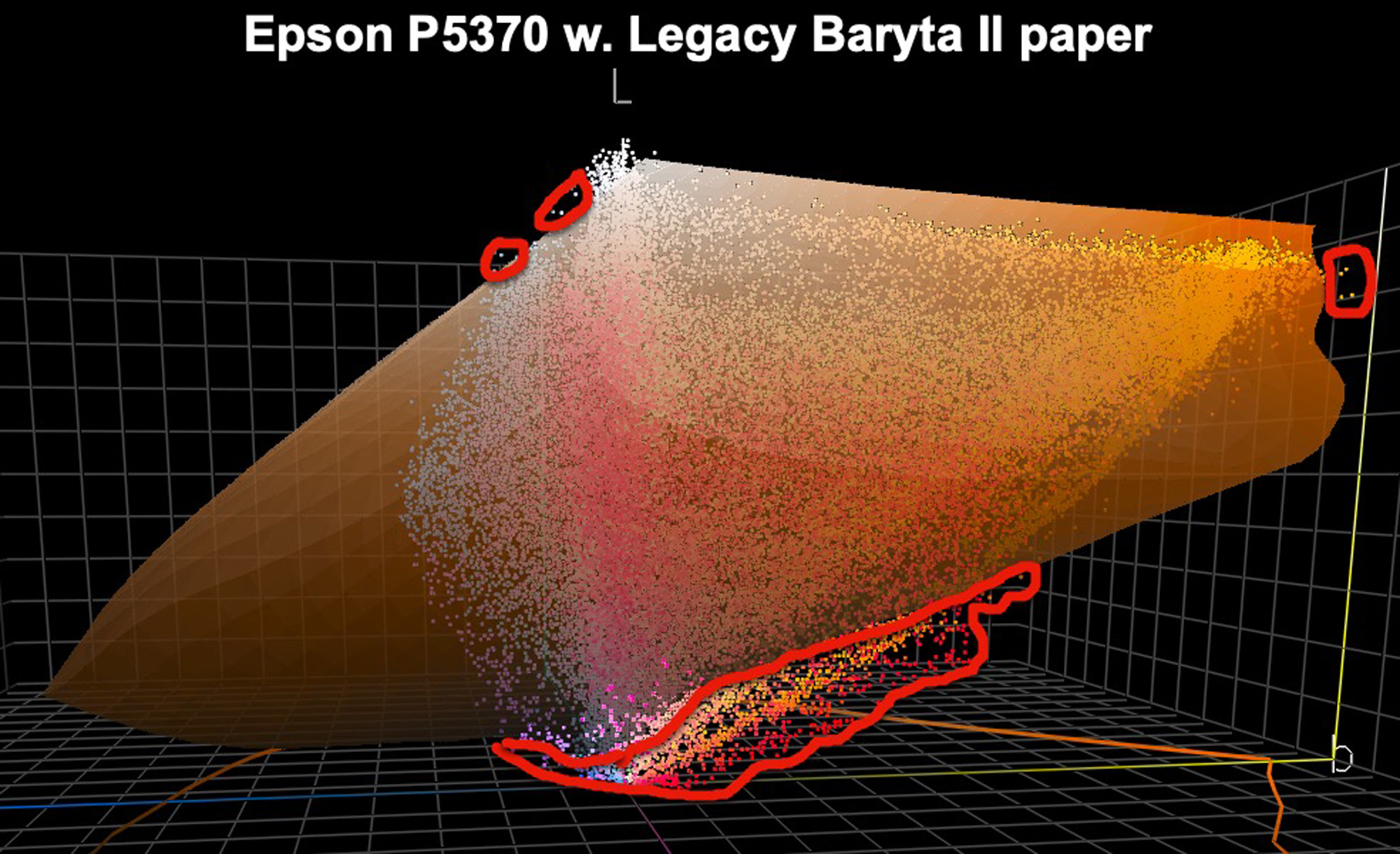
One of my favorite print combinations is Epson Legacy Fibre, printed in the SC-P5370. Despite its being a matte paper, it produces stunning, rich-looking output. But here’s what the “data” shows (Figure 4).

The white wireframe is the gamut plot of the printer/paper profile. The image dots encircled in red are all the colors that, unless remapped, do not fit within this gamut. It means that when printed, they will be “fitted” into the print according to whether one has selected Relative or Perceptual RI. In these cases, I always recommend soft-proofing both RI and selecting the one producing the results one likes better. (In this example, most of the out of gamut colours are in the darker part of the tone scale. The tone scale, L*, is the Lightness axis, graphically vertical from White to Black).
Now let us see for the same printer what happens were we to print this photo on Epson Legacy Baryta II (another of my favorite combinations) (Figure 5).
In this illustration, the gamut delivered by the ICC printer/paper profile is mapped as a veiled orange plot overlaying the photo colors. Compared with Figure 4, you will see immediately the much wider in-gamut inclusion of the photo’s color gamut. This of course is because the Baryta II paper has a much darker reproducible Black point than any matte paper.
Switching over to the SC-P5000 printer, let us recall this now 8-year-old printer model uses Orange and Green inks which the SC-P5370 does not (but it has Violet which the SC-P5000 Standard Edition lacks). The SC-P5000 remains one of the widest gamut capable printers on the market – but does it matter? Let’s see.
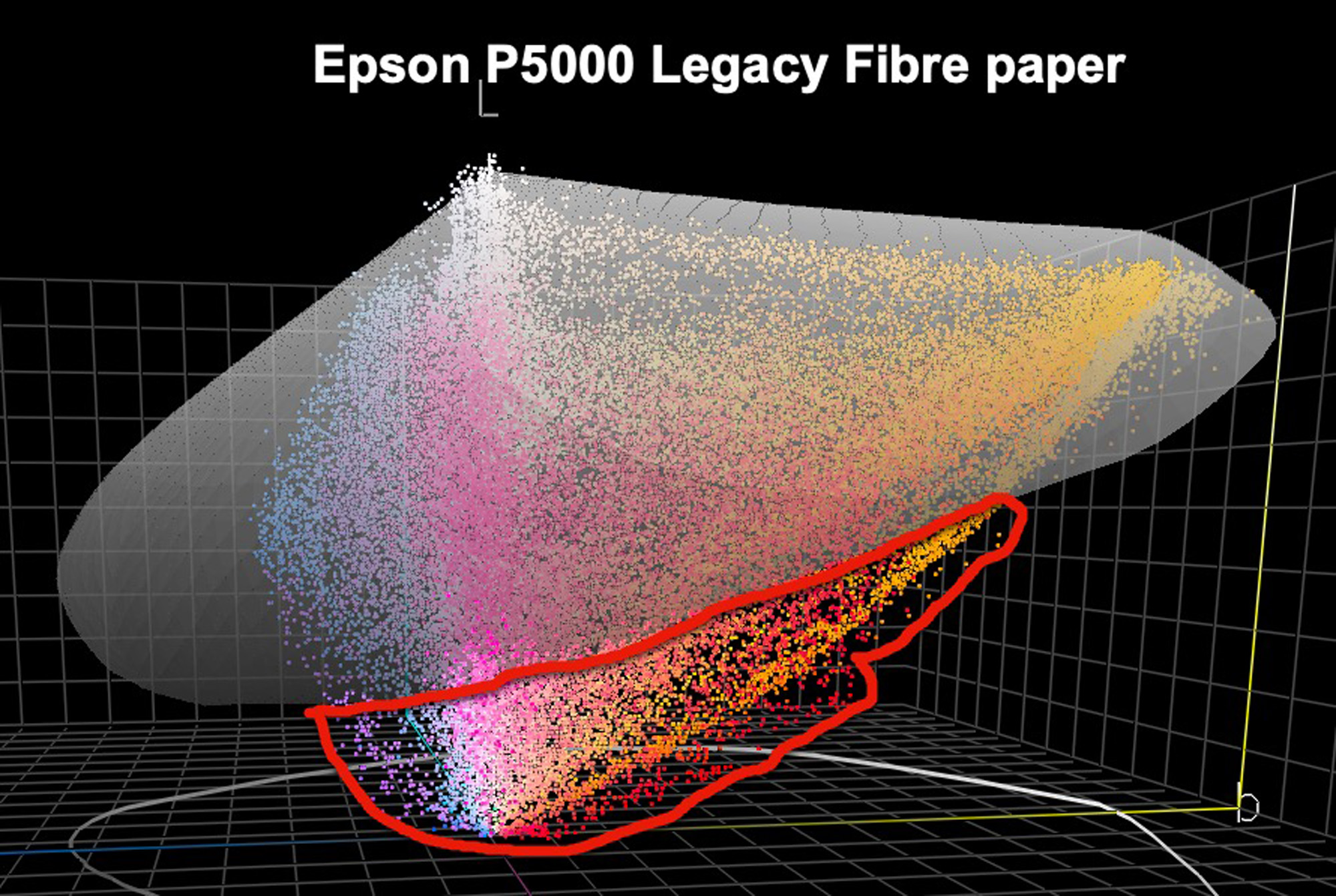
Figure 6 overlays the Epson SC-P5000/Legacy Fibre profile on the image colors. The veiled gray gamut overlay is the printer/paper ICC profile gamut map. If you compare the appearance of Figure 6 with that of Figure 4 (different printers, same paper), you will notice that there is precious little difference of coverage between the two printers.
Now let us look at the Epson SC-P5000 printer using Epson Legacy Baryta II paper (Figure 7).
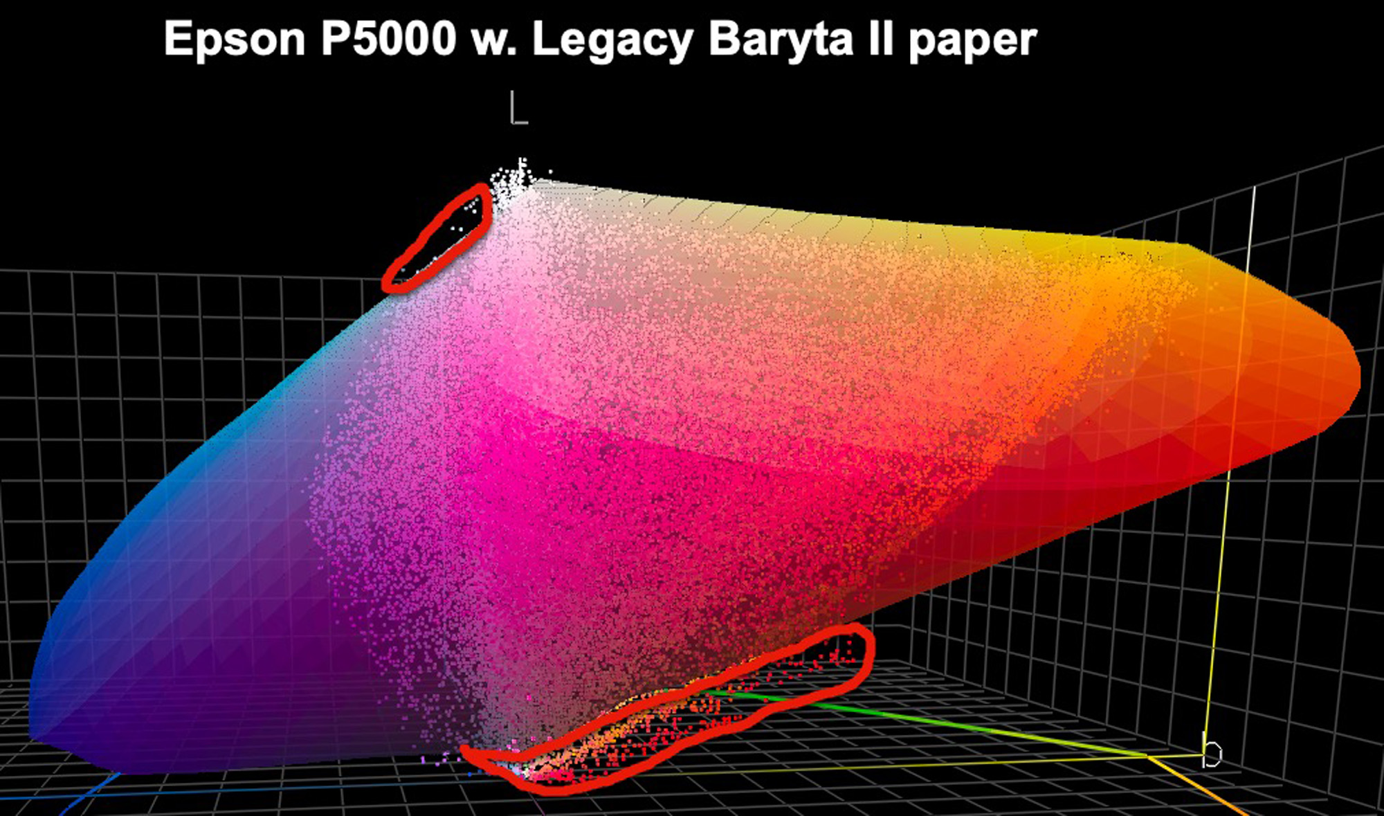
Comparing Figure 7 with Figure 5, we observe a very similar range of omitted colors, meaning that despite its wider gamut in principle, at least for this rather wide gamut image (in the warm colors), the P5000 and P5370 perform similarly with the same paper. So, the bottom line result emerging from a comparison of Figures 4 to 7 is that for these selected options, the paper is far more determinative of included image gamut than the printer. (When speaking of “included image gamut” in this context, I mean all those colors that are within the profile’s gamut without being forced from the outside in.)
Finally, moving away from inkjet printing to the world of offset press, we can test the image colours against the profile, say, for a commonly used SWOP profile (e.g. US Web Coated SWOP 5), (Figure 8).
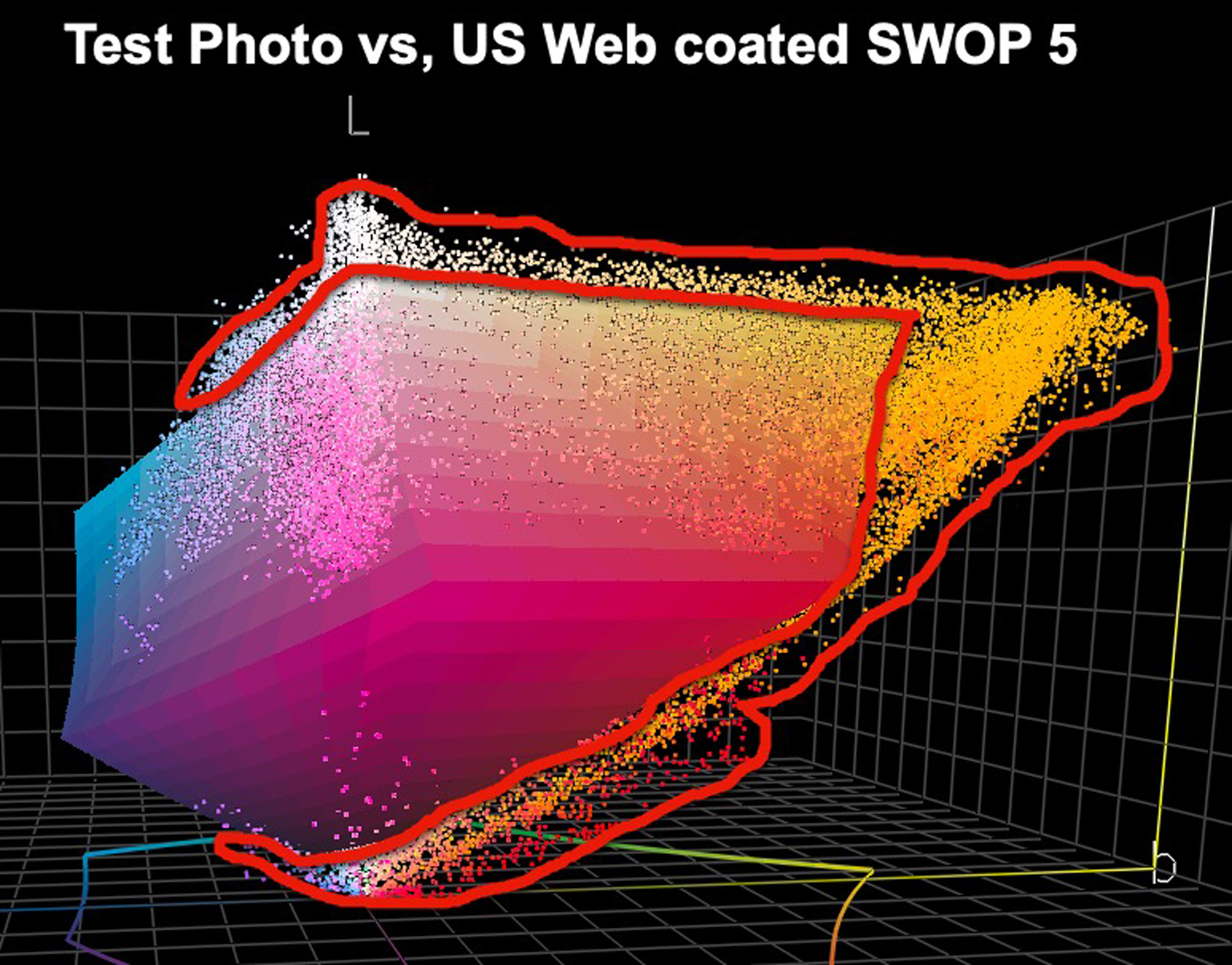
Here, one sees the general superiority for a photo like this of the highest quality inkjet printing versus a normal offset rendition. Big differences of technology and paper are at play, so the challenge at the pre-press stage is to make the best of the colors that are within gamut, and depending on economics, persuade the printer to use an expanded CMYK gamut (e.g. CMYK + OGV) which expands the normal offset gamut by some 15~20%, but there are not that many printers in North America, at least, who are keen or able to use it.
To conclude, and reverting to the beginning of this article – why bother going to the expense and trouble of seeing all of this in our photographs? Essentially, its intent is to help us see more accurately which colors or areas of color in our photographs will be out of the gamut in their final output. Of course, we do have the choice of RI to determine how those colors will be forced into the gamut, but maybe before it comes to that, we would like to manage some of those colors in a more custom manner, always with the objective to custom control how the photo will look in its output condition. So, for example, some colors could be OOG due to saturation clipping; in that case, we may wish to desaturate them enough to bring them into the gamut. Or they may be just a bit too dark, such that by moving them up the Lightness scale they come into gamut. Doing this under soft-proof, of course, gives us a real-time visual insight into the impacts of the moves we make on those colors that we know from this technique may deserve this kind of attention.
Mark D Segal
January 2025


Elevate Your Vision


Read this story and all the best stories on The Luminous Landscape
The author has made this story available to Luminous Landscape members only. Upgrade to get instant access to this story and other benefits available only to members.
Why choose us?
Luminous-Landscape is a membership site. Our website contains over 5300 articles on almost every topic, camera, lens and printer you can imagine. Our membership model is simple, just $2 a month ($24.00 USD a year). This $24 gains you access to a wealth of information including all our past and future video tutorials on such topics as Lightroom, Capture One, Printing, file management and dozens of interviews and travel videos.
- New Articles every few days
- All original content found nowhere else on the web
- No Pop Up Google Sense ads – Our advertisers are photo related
- Download/stream video to any device
- NEW videos monthly
- Top well-known photographer contributors
- Posts from industry leaders
- Speciality Photography Workshops
- Mobile device scalable
- Exclusive video interviews
- Special vendor offers for members
- Hands On Product reviews
- FREE – User Forum. One of the most read user forums on the internet
- Access to our community Buy and Sell pages; for members only.
You may also like