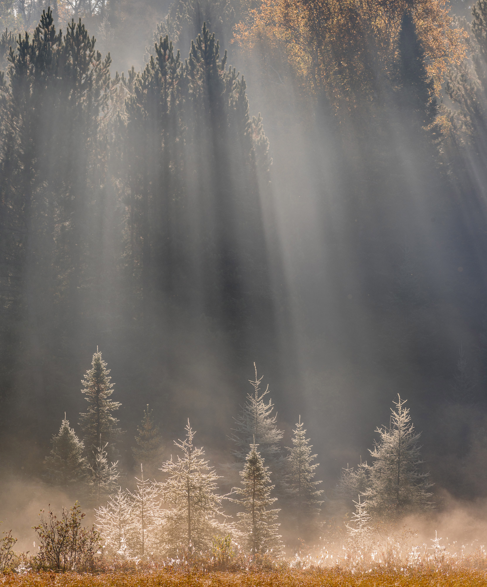
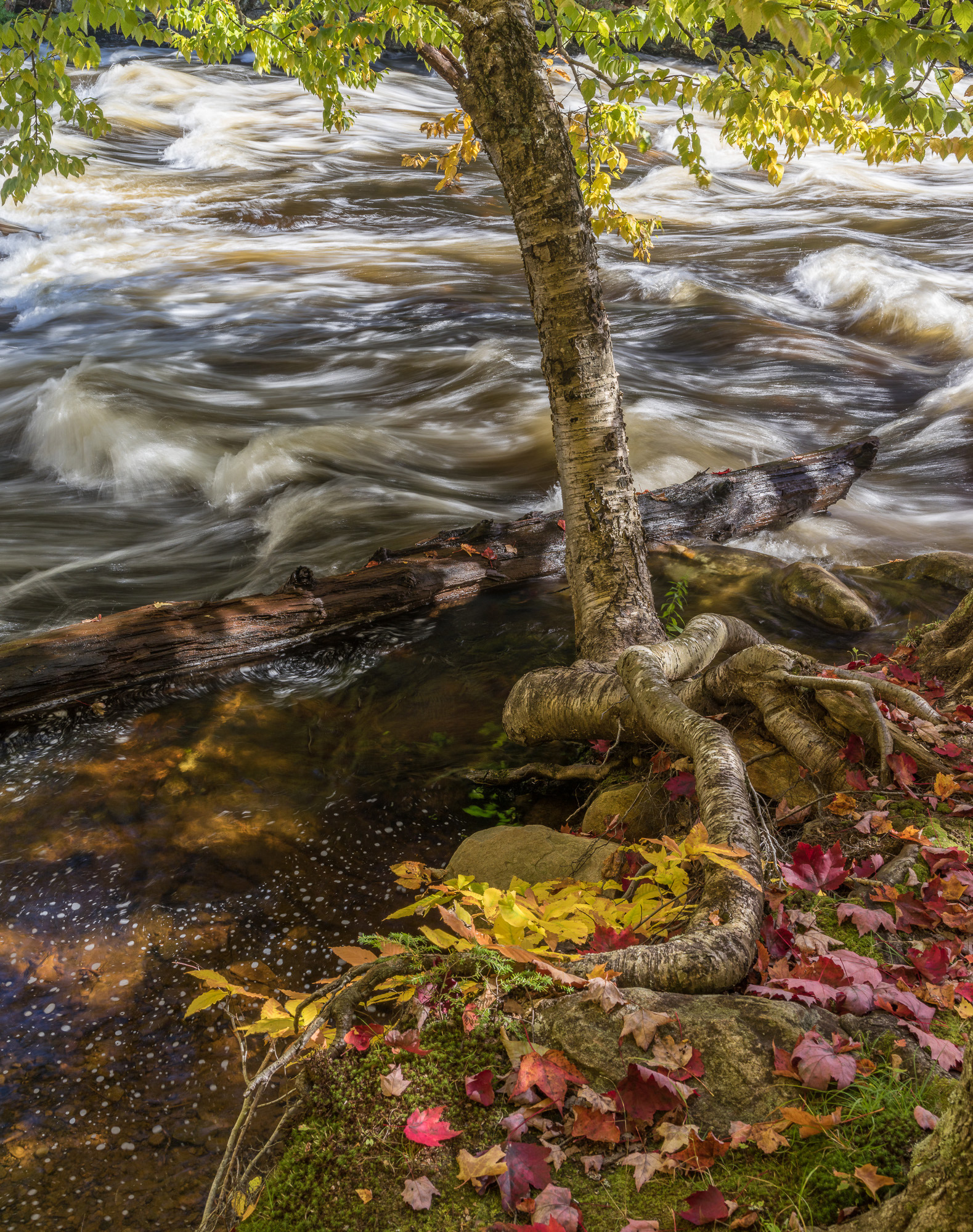
In this second part of the printing and paper series, we’ll take a look at nine papers that are competing for a share of your printing work. Five are from Canson Infinity, beautiful papers suitable for a wide range of images. Of the Canson Infinity papers, three are fiber-based “baryta-type” papers in the glossy range that use Photo Black ink. Baryta Photographique II and Baryta Prestige are true baryta papers, while Platine uses slightly different coatings for a similar effect. The remaining two Canson Infinity papers are watercolor-type papers that use Matte Black ink, adding some texture to the surface of your print. A wide range of images will look good on the Canson Infinity papers, although some images match one type of paper better than the other – and certain images will take advantage of the special characteristics of a particular paper.
The other four papers covered here are exotics from Moab. They occupy opposite edges of the paper spectrum, with the Canson Infinity papers in between. None of the Moab papers here are a match for every image, or even for most images – but they can make certain images shine. Moab also makes a line of more standard papers that are easier to use for a wider range of images than these exotics – but these four unique and intriguing papers show what is possible, and how an unusual paper choice can complement a particular image.
For most photographers looking to move up from a resin-coated glossy paper from Canon or Epson, the first truly fine paper to learn would be a baryta type like any of the three Canson Infinity Photo Black papers reviewed here. Once you are getting truly beautiful prints on that paper, the first logical addition is a beautiful watercolor paper like PrintMaKing Rag or Aquarelle. If your images are softer or more impressionistic in feel, you might want to start with a watercolor paper using Matte Black ink instead, then add a baryta type second. The four exotic Moab papers are additions that don’t fit every image, and that you won’t use every day.
None of these papers are inexpensive – expect to pay between $30 and $40 for a box of 25 8.5×11” sheets, and between $150 and $250 for a 24”x50 foot roll of any of them. They are about the same price per square foot as a high-quality fiber-based black and white enlarging paper. They are at least twice the cost of a resin-coated photo paper from a printer manufacturer, but they offer true fine-art printing. It’s worth learning to make a decent print on manufacturer paper, then moving up to a fine paper (or several) once you are confident in your printing craft.
After you are comfortable with both a good Photo Black paper (or two) and a good Matte Black paper (or several), and you know which of your images look best on each, it’s a good time to explore an exotic paper. You will know whether your images tend towards Slickrock or Moenkopi (only a few photographers will regularly use both) by the time you are skilled enough at the printer to make the best use of either one.
There are a few genres of photography where it might be worthwhile to start with something like Slickrock Metallic. If you are an automotive or aviation photographer whose images feature a lot of chrome, or if you love 50s diners or the Vegas Strip, it might be worth either starting your serious printing journey with a metallic paper or adding one relatively early, perhaps right after an adventure with Baryta Photographique II and before exploring Matte Black papers.
Conversely, if you photograph flowers in muted, impressionistic tones, you might look at adding a Japanese Washi paper like one of the Moenkopi series right after Aquarelle or PrintMaKing Rag, saving any ventures into the world of Photo Black papers for later.
Canson Infinity Platine:
Platine is a good place to start, because it will make just about any image look good. It is a very high-quality 100% cotton rag semigloss paper with an excellent tonal range. Probably the best way to put it is that it looks as much like the classic Oriental Seagull enlarging paper as it is possible for an inkjet paper to look. If you’ve ever wondered what a color image would look like on the paper Ansel Adams used for the last 20 years of his career, you might put some Platine in your printer and find out. Of course, it works beautifully for black and white as well.
If you’re going to learn one high-quality paper, Platine would be one of the two top choices (depending on what you tend to print). Its semigloss or medium gloss surface means that gloss differential or bronzing effects are less prominent than they are on glossier papers. Bronzing or gloss differential occurs when the ink is not quite as glossy as the paper, and the darkest areas become less shiny than areas of the image that have received less ink. It’s less of a problem than it was, both because modern inks are less prone to it in general, and because many printers use a clear “gloss optimizer” or “chroma optimizer” ink on areas which otherwise receive little or no ink, equalizing the gloss. It can still occur in certain images, manifesting as very shiny highlights surrounded by semigloss midtones and shadows, especially if you’re using an older printer. Platine is not prone to gloss differential on modern printers, and is relatively resistant to it on older hardware.
Like most of the classic fiber-based darkroom papers, it has a very slight surface texture. Canson Infinity refers to it as a smooth paper with a satin finish, while they refer to Baryta Photographique II as extra smooth, also with a satin finish. The slightly textured surface makes Platine feel a little less contrasty with the same file than Baryta Photographique II. It is the nicest of the three Canson Infinity Photo Black papers to handle, because of the pure cotton rag base. It is also the only one of the three with no optical brightening agents at all, although both Baryta Photographique II and Baryta Prestige have very low levels.
Canson Infinity Baryta Photographique II:
This brand-new paper is the sharpest, glossiest and most contrasty fiber-base paper I’ve seen. If you’re looking for a paper that resembles the glossiest of the great old Kodak fiber- based enlarging papers, this is it. It has no surface texture to speak of, living up to the manufacturer’s description of extra-smooth. I love it for images that require the extremes of detail and tonal range. If Platine starts out as a Grade II enlarging paper (affected, of course, by the contrastiness of the file you print on it), Baryta Photographique II is a Grade III.
Anything glossier or contrastier will lose that beautiful fiber-base effect (there are certainly glossier papers – anything metallic or fully plastic, and some full-gloss resin-coated papers). It is a dramatic paper that does best with dramatic images – I have been using it with desert images to wonderful effect. That said, it’s still a fiber-base baryta paper, capable of the subtlety of tone of these beautiful papers. It is noticeably thinner in the hand than Platine, and slightly brighter white, with a very low (but non-zero) level of optical brighteners. I wouldn’t be concerned about these OBA levels, but if you despise them and prefer not to use any paper with any brighteners at all, Platine is a better choice.
Canson Infinity has added a wonderful option with Baryta Photographique II. If your work tends towards the more dramatic and contrasty, it may be a good first fiber-based paper, especially because it will be closer in rendering to the resin-coated paper you’ve been using than any other fiber paper. If you tend towards softer subjects, but still prefer a Photo Black paper, I’d start with its stablemate Platine, but keep some Baryta Photographique II around for that image that requires its extra punch. Much as darkroom printers kept a couple of grades of paper around, or a set of variable-contrast filters, pairing Platine and Baryta Photographique II allows that subtle adjustment in effect.
Personally, both Platine and Baryta Photographique II are among my favorite papers – I will keep rolls of both in stock, and choose between them based on the image. Forest images will tend to go on Platine, deserts on Baryta Photographique II. Many other types of images will require careful contemplation of the individual images – mountain images, for example, are diverse enough that I prefer some on each paper. These two papers are similar enough that it is up to the artist to make the choice between them for each image – this isn’t a case where the average print buyer will specify between the two papers, as they might between a matte and a glossy paper, or between paper and canvas. Fine-art inkjet printing has advanced to the point where we have multiple excellent papers from the same manufacturer that give us this type of fine-grained control!
Canson Infinity Baryta Prestige:
I had a much smaller sample of this paper than either Baryta Photographique II or Platine, and I didn’t have the chance to make the diversity of prints on it that I made on the other two papers. To me, it is the least appealing of the three in hand, being a rather stiff paper due to its heavy weight and pure alpha-cellulose composition. It could have feed problems in printers with especially tight paper paths, although it fed through my Canon Pro- 2000 with no problem.
If the other two Canson Infinity fiber-gloss options didn’t exist, I would happily print on nothing but Prestige. With three beautiful options, I am less sure of where it fits into the range. It doesn’t have the wonderful texture of Platine, nor the extra measure of hand-feel that paper offers with its pure cotton rag base. It contains low levels of OBAs, which Platine does not. It doesn’t have the gloss and contrast of Baryta Photographique II, being closer to the usual soft gloss of this type of paper.
Maybe I’m missing something due to my lesser experience with Prestige, but I haven’t found what it can do that its stablemates can’t. That doesn’t mean that it isn’t also a wonderful paper, just that my Photo Black printing needs are met by two Canson Infinity papers and I’m looking for the right place for a third.
Canson Infinity Aquarelle:
Printing on a matte paper is quite different from a gloss finish, and it requires a different sort of images. Glossy papers emphasize the highlights and shadows, while really good matte papers sing in the midtones. The crispness of a glossy paper emphasizes line, while the texture of Aquarelle (in particular) emphasizes form. For the right sort of image, Aquarelle is a living paper. While something like Baryta Photographique II loves the kinds of subjects Ansel Adams favored, Aquarelle prefers Claude Monet’s favorite subjects. The reference to Monet is about colors, tones and general type of subjects, not blurring of detail. Aquarelle actually captures a great deal of detail, although it doesn’t hit you over the head with it. The first impression of an image might be somewhat Impressionistic as the color, form and texture are the first things to stand out – but come closer, the detail is there as well.
If you’re coming from a glossy paper, even the best matte paper (and Aquarelle is my favorite that I have printed on) requires a recalibration of what to expect in the shadows. There simply aren’t the infinite reserves of shadow detail that the best glossy papers have – you want to prepare the file with the most important shadows burned in toward the midtones, because the transitions down around Zone I and II just aren’t as visible as they are on glossy paper (and maximum black isn’t as dark). Aquarelle’s home is between about Zones III and VII, where its midtone life lends a special feel to the image. The highlights will hold in, but they don’t sparkle the way they do on a glossy paper. This is not a criticism, but a difference between the matte and glossy printing experiences – it is just as true to say “the midtones on even the best glossy paper just don’t have the organic life that they do on a really beautiful matte paper”.
For your midtone-centric, form-centric images, there is no paper I know of as rewarding as Canson Infinity Aquarelle. I also don’t know of any paper that is quite as beautiful in the hand – I actually use it for high-end greeting cards for that reason. When you pick up a print on Aquarelle, you are greeted by a slightly warm and very inviting pure cotton rag paper, devoid of any OBA content. It is an inkjet version of a great mould-made watercolor paper, and that tradition is apparent as you hold it in your hand. If you are signing a print on Aquarelle, you are tempted to sign with a fountain pen. The Canson papermaking tradition dates back to the Jacques Montgolfier paper mill in Beaujolais, France – founded 1557. As you handle a print on Aquarelle, this artistic tradition is deeply apparent.
For most of the past 20 years, I have printed primarily on glossy papers – Aquarelle convinced me of the error of my ways. I have moved all of my greeting card printing to Canson Infinity Aquarelle due to its hand feel, and it is my go-to paper for a certain type of midtone- centric images. If you’ve always printed glossy, try Aquarelle on some images where there is emotion in the midtones – it’s a special paper.
Canson Infinity PrintMaKing Rag:
The choice between Aquarelle and PrintMaKing Rag (besides a choice between a conventionally capitalized paper and one NaMeD by a bored aPpLe iToy designer) is really about texture. Aquarelle has a strong texture, while PrintMaKing Rag’s is much more subdued. They’re both pure cotton rag papers of about the same weight and thickness with very similar inkjet coatings. Canson Infinity calls Aquarelle warm white and PrintMaKing Rag pure white, although their measured whiteness values are quite similar.
For my work, when I want the behavior of a matte paper, I find that the texture of Aquarelle generally interacts positively with the images. The texture draws attention to form over line, which is the strength of matte papers – glossy papers are at their best with straight lines and higher contrast, while matte papers can emphasize organic forms and midtone gradation. I also like the slight warmth of Aquarelle on the images that are a natural choice for matte papers. PrintMaKing Rag is at its best with images that want a matte paper, but warm, textured Aquarelle is a bit much.
Even more than glossy paper, character-laden matte paper is a personal choice. While Aquarelle fits more of my images better than PrintMaKing Rag, and will probably be my always- stocked matte paper, this is entirely dependent on your work and your tastes. Both are very high-performing papers with similar technical characteristics in how they accept an image. The choice between them comes down to which texture interacts better with your images and your eye.
Canson Infinity makes a smoother, whiter matte paper than PrintMaKing Rag – Rag Photographique. Velin Museum Rag is another product I haven’t seen – it looks like it might fall in between PrintMaKing Rag and Aquarelle in texture. Finally, Edition Etching Rag rounds out Canson Infinity’s selection. Fortunately, they make a sample pack, called the FineArt Discovery Pack, that includes two sheets of each of the matte papers, plus two sheets of Platine and (inexplicably) two of PhotoSatin resin-coated paper. While I would love to see Baryta Photographique II replace the RC paper, it is otherwise a wonderful introduction, especially to the matte papers.
These five Canson Infinity papers are all excellent choices for most fine-art printing. If I was told I had one paper to print on for the rest of my career, I’d probably pick Platine for its flexibility, but any of the five would be fine. We are lucky enough to live in a time when all of these papers are available. Fine-art inkjet printing has reached where black and while silver gelatin printing was from the 1960s or so onward – technically excellent materials offering a broad range of artistic choices.
The next four papers in this roundup, from Moab, are far from everyday papers, at least for the type of photography I do. They are specialty papers, but they are also special papers. With the right image, one of the four can lend it that final piece it needs. They fall in two different, and opposite categories. The two Moab Moenkopi papers are Japanese Washi, thin, almost translucent matte papers with gorgeous midtones and almost no shadows at all. The
Slickrock papers are at the opposite end of the spectrum – resin-coated metallic papers that emphasize contras, shine and the ends of the tonal range.
Moab Moenkopi Unryu:
Unryu translates from Japanese to English as “Cloud Dragon Paper” – a beautiful, ethereal name for a beautiful, ethereal paper. Moenkopi Unryu has a weight of 55 grams per square meter (gsm) – by contrast, all five of the Canson Infinity papers in this review are over 300 gsm. Unryu is approximately 1/6 the weight of a classic Western fine-art paper. It is strongly translucent, while most Western fine-art papers are almost entirely opaque. It is made from mulberry and hemp fibers, not cotton and wood. There are long mulberry fibers (very) visibly swirled into the paper, which need to become part of the final artwork.
Unryu has no shadows – this is not a “slightly weaker shadows” paper like a good Matte Black paper compared to a good Photo Black paper – it is a paper that fades to a muddy deep somewhere not all that far below the midtones. It also doesn’t get all that bright in the saturated colors. If it has no shadows and limited saturation, why bother with it at all – why not stick to a Western paper with a full tonal range?
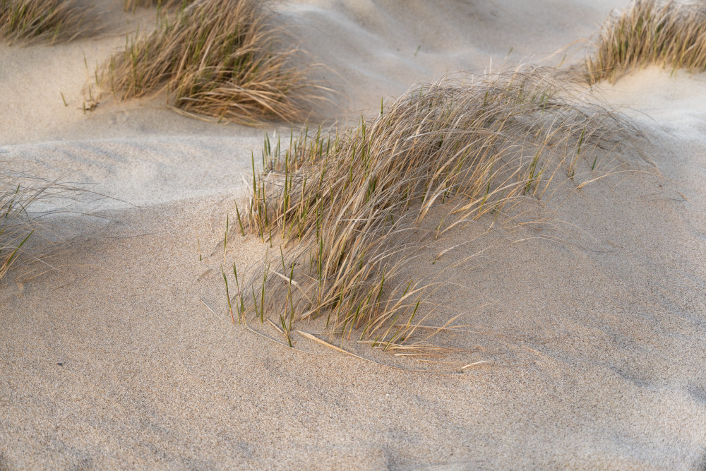
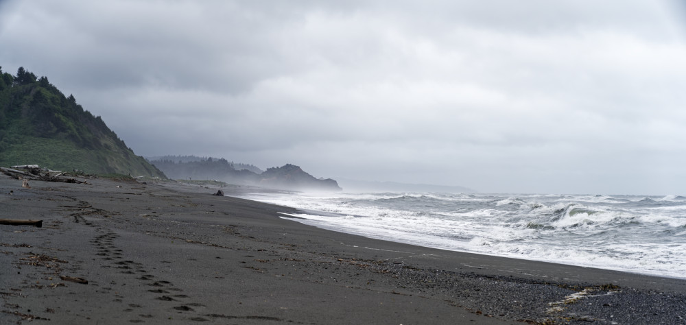
You could, but if you did, you’d be missing a special, ethereal experience in the softer midtones and highlights. I know of no paper that brings clouds to life like Unryu. Unryu’s rendering of midtones in sand and rock is unequalled. Tans, browns, grays, pastels – these are the colors of Unryu, and with care, it will reward the artist deeply in these colors. Think about scenes on the shore. Think about deserts if there isn’t a saturated sky. Think about flowers in lighter and pastel shades. Think about foggy days – Unryu does fog like no other paper. I’m not a portraitist, so I didn’t try Unryu on portraits, but I suspect there is some lighting in which it would do very well, if the texture wasn’t too distracting – but the texture would play an important role.
As you can tell from the above, Unryu is a paper that requires special image selection. It also requires special file preparation – turn up the contrast a bit (or one of the more modern vibrance or dehaze type controls) if you don’t want to lose any contrast. Of course, you might want to lose some contrast – remember that these are supposed to be ethereal images – we’re in the home of the Cloud Dragon, after all.
Another special characteristic of Unryu is that it can be backlit. It is so thin that it can be suspended in front of a lamp, a window or a lightbox for a beautiful, glowing effect. At this point, the only experimentation I’ve done is to hold some prints up to a window, but I fully intend to experiment with presentations that take advantage of this effect. It loves to hang loosely, rather than being mounted to a medium that takes away some of its effect. Think about scrolls, wall hangings, or even something hanging from a ceiling.
Other photographers have mentioned that it can be folded into a unique greeting card. If it is writable on the back side (I haven’t yet tried), how about some very special stationery, made by printing an abstract image lightly (desaturated) on the inkjet-printable side, then writing on the back. The production cost of Unryu stationery would be just above $2.00 per letter-sized sheet, so it’s obviously not for ordinary letters – but how about for holiday letters, wedding invitations, etc. It’s actually slightly lighter than standard office paper, and it folds beautifully…
Moab Moenkopi Kozo:
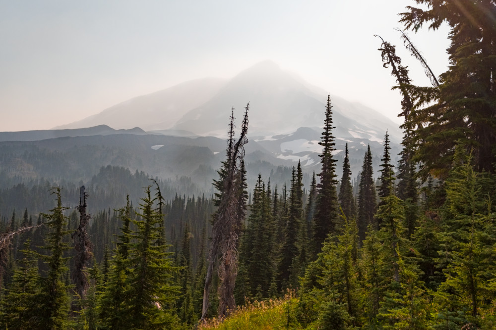
I love Mount Adams in this image on Kozo – the foreground takes some care to avoid going muddy. It also prints quite beautifully (but differently) on Platine.
Average Unryu and PrintMaKing Rag, and you get Moab Moenkopi Kozo… It is a light, soft paper, much lighter and softer than any Western watercolor paper (which is what high- quality matte inkjet paper is based on). Unlike Unryu, it is not really translucent. If you put a powerful light behind it, it will shine through – but the image won’t truly be backlit.
It has much more shadow definition than Unryu, although less than virtually any other paper. The long, swirling fibers are absent – it looks like a relatively standard soft-textured paper. Kozo is about twice the weight of Unryu and somewhat heavier than standard office paper, although it is only about 1/3 the weight of a heavy watercolor paper. It is about the weight of high-end resume or thesis paper, but it has a completely different feel – much softer and more flexible. It still has some of Unryu’s ethereal grace in midtones and neutral colors, while being enough closer to a standard Western paper that it is a good bit easier to print on.
I like it best for abstract scenes with relatively little tonality – think beach still-lifes and the like. Any image that will print on Unryu will print well on Kozo as well. You won’t get the same ethereal quality, but the paper will not become anywhere near as much of the finished artwork, either. You also have probably an additional stop or so into at least deep midtones, if not true shadows, in which the paper responds as expected without blocking up – it’s still significantly less than a good Western matte paper, and quite a bit less than a glossy paper, but it’s not right below the midtones where Unryu can block up. Similarly, it handles saturated colors somewhere in between Unryu and a Western matte paper.
Kozo can be a good introduction to printing on Washi, because it offers some of the beauty with fewer pitfalls than Unryu. It is a lovely, soft, impressionistic paper (unlike something like Aquarelle, it really is softer than many other papers, rather than just not emphasizing detail) that doesn’t impose as much of its own character on the image as Unryu does. It’s a specialty paper, but it’s an easier paper to print on than Unryu.
Of Kozo and Unryu, my personal preference is for Unryu. When I have an image that will work on Washi, it is likely to work on either paper – I don’t have very many images that need Kozo’s additional versatility, but that don’t need to take the next step of crispness and saturation to Aquarelle. If I have an image that works on either paper, I want the full measure of ethereal beauty that only Unryu can provide.
Another photographer who works more impressionistically than I do may well find that they don’t need a Western watercolor paper. Kozo might cover the range of tones they typically use – and its softness might complement their work. I could very easily see Kozo finding use in portraits, where Unryu could be tricky due to the swirling fibers. Portraits of kids, or any portrait subject done in a soft-focus style, might work especially well. Unryu will never be your only paper unless your work is very unusual (probably a craft that starts with a photograph), while Kozo could be if you work in a certain style.
Moab Slickrock Metallic Pearl:
Remember Ilfochrome? Even farther back, it was Cibachrome… Slickrock Metallic Pearl is probably the closest you can come to that look in a digital print. It’s glossy (maybe too glossy?), contrasty (maybe too contrasty?) and dramatic. Colors are bold and brash, and it’s all too easy to lose detail in the highlights. Just like Ilfochrome, it’s not for every image, but when it works, it works beautifully.
The great advantage Slickrock Metallic Pearl has over Ilfochrome is that it isn’t the only tool in our toolbox. There was a time in the early 1990s, before the final generation of RA-4 papers appeared, when Ilfochrome was THE most archival, most accurate color process short of dye transfer. When an image wasn’t suited to Ilfochrome’s brashness, photographers used several types of masks and other techniques to tone down its contrast. Now, we can just pull out another paper for that image, and save the Slickrock for the images where its character is an asset.
Many of us have a certain subset of our images where we long for the contrast, definition and color rendition of Ilfochrome. I know I continue to capture a number of “Ilfochrome specials” each year – images whose ideal printed rendition would have come through the Ilfochrome process. I now have a tool to get these images on paper in an inkjet process with very similar rendition. The beautiful thing is that there is a toolbox of papers running from Unryu to Aquarelle, Platine, Baryta Photographique II and finally reaching Slickrock Metallic Pearl, each of which renders images differently.
Of the papers I use, Slickrock Metallic Pearl is the only one that is NOT a traditional fiber-based material. It is a resin-coated paper, and it contains significant levels of optical brighteners (as this kind of paper would almost have to). Of course, Ilfochrome was ALSO a resin-coated material (some versions were conventional resin-coated papers while others were actually full plastic bases with no “paper” content at all), and it also contained brighteners, although probably of a different chemistry than inkjet paper. Ilfochrome paper was more or less black prior to development, and relied on dye destruction, while all inkjet papers are more or less white and rely on pigment (or dye) addition.
If you need a paper with unusual “pop”, Slickrock Metallic Pearl is a great choice. I’ll always have a roll around for those relatively few images that need it. The existence of increasingly bright and glossy baryta papers like Baryta Photographique II has reduced the number of images that need something even punchier, compared to what it was a few years ago. Still, they’re out there, and Slickrock Metallic Pearl puts the tool for those images in our hands.
Moab Slickrock Metallic Silver:
If Slickrock Metallic Pearl is a specialty paper, Slickrock Metallic Silver carries that specialization to an extreme. The unprinted paper is actually a glossy silver-gray color with a metallic sheen. It is the only inkjet paper I am aware of that is not some shade of white. Images printed on Metallic Silver carry some of the look of a metal print, without the expense and difficulty of feeding metal sheets through a printer or using dye sublimation materials to transfer the image to a metal substrate.
The highlights in particular carry a strong metallic look, since that is where the ink obscures the paper surface the least. For most of my images, Slickrock Metallic Silver isn’t the right fit – but I don’t tend to do metal printing, either. Landscape photographers who do a lot of HDR work may appreciate the unique look of a metal print, and Slickrock Metallic Silver is the way to get there without the fuss and expense of printing on metal. Abstract images are another possible fit for this unusual paper – the best several images I got on it were decidedly abstract.
Outside of the landscape genre, many of Moab’s demonstration images for Metallic Silver are what I would classify as “Americana” – classic cars, motorcycles, diners and similar subjects. It works very well in those applications, and it’s certainly worth a try for images in that genre. Certain types of architectural photography might also work very well on Metallic Silver.
Compared to a true metal print, Slickrock Metallic Silver is a bargain. A 24”x 50 foot roll costs approximately $150, for a cost of $1.50 per square foot. 5 20×24” sheets of Booksmart’s inkjet-printable aluminum (approximately 17 sq ft in total) sell for $225, just over $13 per square foot. A single 24×36” metal print from a print shop costs $250 or more, over $40 per square foot. Unless you have prints made at ~$40/square foot, the setup cost to produce metal prints is substantial. The Booksmart sheets require overcoating or preferably lamination, and a laminator is expensive. Spray coating is a possibility, but spray cans are expensive, environmentally questionable and not the easiest to use. They only work on certain printers with a straight-through paper path (most Epsons and a small selection of other makes).Dye- sublimation, the process that professional metal-printing shops use, has a $4000 or so setup cost for a dedicated printer and a heat press.
Slickrock Metallic Silver is an inexpensive way to try the look of metal printing. The entry cost can be as low as $30 for a box of 25 8.5×11” sheets, and it’s a relatively easy paper to use (although a very difficult one to get to look really good). It is a standard resin-coated paper that will feed through any photo printer – for all of its unusual nature, it may be the easiest paper to feed in this roundup. If you have any interest in metal printing, $30 to try the look is a bargain, and 25 sheets is enough to give you a sense of what might work.
Dan Wells
April 2020


Elevate Your Vision


Read this story and all the best stories on The Luminous Landscape
The author has made this story available to Luminous Landscape members only. Upgrade to get instant access to this story and other benefits available only to members.
Why choose us?
Luminous-Landscape is a membership site. Our website contains over 5300 articles on almost every topic, camera, lens and printer you can imagine. Our membership model is simple, just $2 a month ($24.00 USD a year). This $24 gains you access to a wealth of information including all our past and future video tutorials on such topics as Lightroom, Capture One, Printing, file management and dozens of interviews and travel videos.
- New Articles every few days
- All original content found nowhere else on the web
- No Pop Up Google Sense ads – Our advertisers are photo related
- Download/stream video to any device
- NEW videos monthly
- Top well-known photographer contributors
- Posts from industry leaders
- Speciality Photography Workshops
- Mobile device scalable
- Exclusive video interviews
- Special vendor offers for members
- Hands On Product reviews
- FREE – User Forum. One of the most read user forums on the internet
- Access to our community Buy and Sell pages; for members only.
You may also like