


Introduction
When taking the time and effort needed in a digital workflow to make prints that translate our photographic vision onto paper (for example – the contrast and vibrancy of tone and colour), we first express that vision on a properly calibrated and profiled computer display, ideally under soft proof, editing the photos until we’ve achieved our intended vision. That editing process changes the color numbers (tone and colour values) being sent to the monitor and the printer. We want the printer to lay down the appropriate colours.
An ideal printing process will translate the photo’s intended colour numbers into a print, wherein the measured colors on the print exactly match the colour numbers sent to the printer. Unfortunately, that ideal printing process does not exist (for many reasons), but it is a worthy goal and we can come close. The more accurate the conversion processes from colour numbers to ink laydown, the more confidence we can have that the image we create on display will reproduce as the prints we expect. So printing accuracy is a core component of a reliable printing workflow.
“Accuracy” in the context of this discussion about testing/proofing specifically means how accurately a printing workflow can print a set of color patches stored as L*a*b* values in a reference file. In the perfect case, using only colors that are within the printer/paper gamut, the L*a*b* values measured from the print would perfectly match the L*a*b* values stored in the reference file.
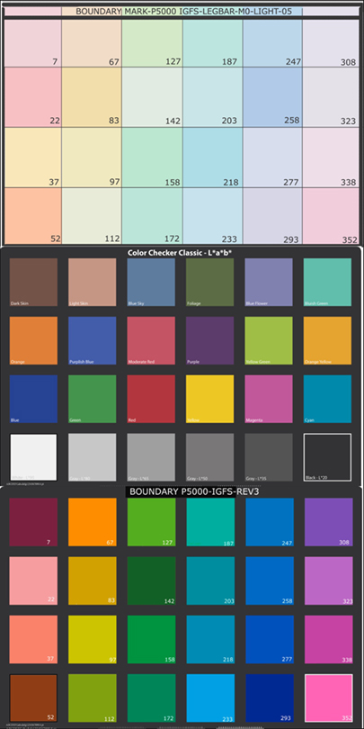
Up to now, my printer and paper testing process for accuracy of colour and grayscale rendition uses custom-built 21 and 30 neutral patch sets for measuring grayscale as well as a digital version of the Gretag-Macbeth ColorChecker (GMCC), which latter has 18 hues in colour and another 6 in B&W making a total of 24 patches. The GMCC is a very long-standing, well-known product used in numerous proofing exercises. It provides a useful sample for indicating how accurately various imaging operations perform at least within the gamut of its 24 patches. One of its advantages is that its colour values fit most inkjet matte paper gamuts and other papers of similar reflectance (Figure 1; the gamut volume of the selected paper in the SC-P5000 is c.585,000 – quite wide for a matte paper).
However, just in case printers don’t perform as accurately reproducing more highly saturated colours, or much lighter pastel colours than found in the GMCC, I thought it worth considering whether I should move beyond the GMCC for a more comprehensive accuracy test covering (i) the more saturated colours that gloss and luster papers using Photo Black ink in today’s inkjet printers (Figure 2) are capable of printing and (ii) the challenge of accurately reproducing delicate pastel colours.
Hence, I’ve been working on a logical and systematic approach for defining and using evaluation targets that can be customized to meet three conditions:
(1) All the patches are within the gamut of the paper/printer being assessed, in order to avoid capturing inaccuracy between the file values of patches and their printed values simply due to out of gamut (OOG) colours being compressed into gamut; (to further explain the importance of this condition: colours in an image file can (and often do) have L*a*b* values that exceed the gamut of the printer/paper combination. Rendering Intents move those values into gamut so the printer can print them, in different ways depending on the Intent. But then the printed colour value will necessarily be different from the original colour value in the image file because the Rendering Intent altered them to fit the paper/printer gamut. These differences will make a comparison of file values versus printed values look inaccurate. This is true by definition and should not be allowed to confuse an exercise of determining how accurately a printing workflow lays down colours that are within its gamut capability.)
(2) All the patches come close enough to the gamut boundary that they challenge the printer/paper to accurately reproduce colour just within its gamut, whether high saturation or light pastel, and
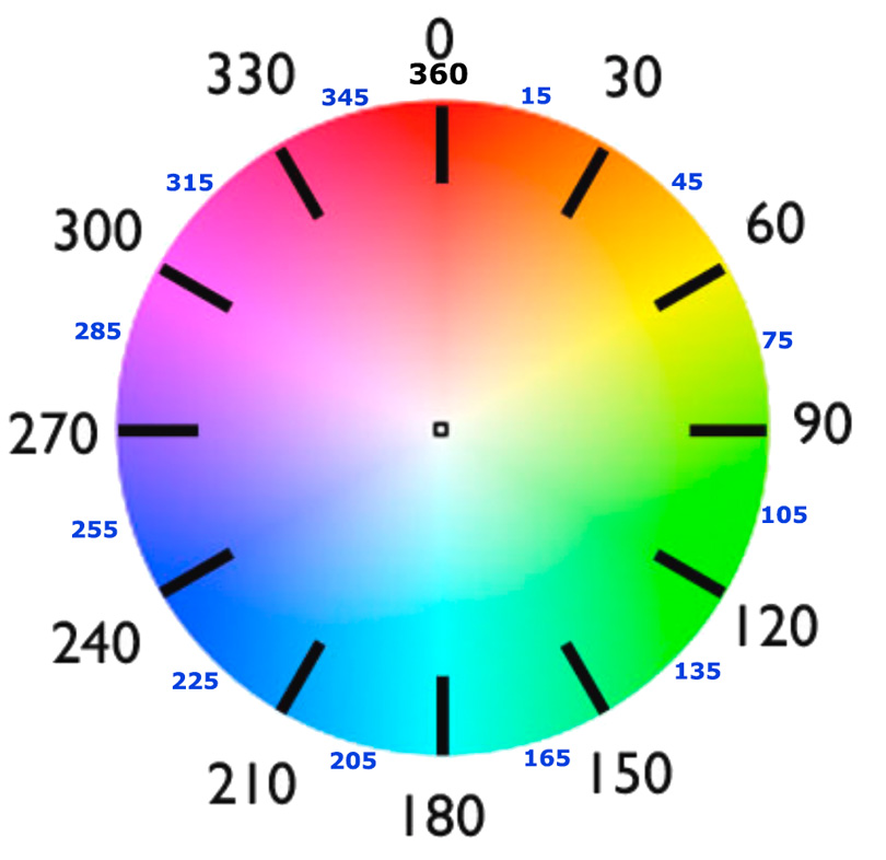
(3) The patch set is a balanced representative sample of colours from around the Hue Wheel (Figure 3).
There is an abundant effort and literature on monitoring the accuracy and consistency of CMYK printing presses. The three conditions above make this kind of inkjet printing evaluation approach different from current CMYK press process control in important respects. Firstly, after conducting a review of the literature sufficient for present purposes, it became apparent that there are CMYK press concerns that CMYK targets are designed to evaluate and aren’t relevant to inkjet printers. Secondly, while the most currently used CMYK targets have fixed patch values applied to any press, my extended targets do not – they are customized to the gamut of the printer/paper being tested. Thirdly, while CMYK control targets may include OOG colours, mine do not for the reason stated in Condition (1) above. Finally, I wanted to be sure that I have a balanced representation of printable colours from around the hue wheel.
When doing these tests, a core element of the printing chain inherently being evaluated is the performance of the printer/paper profile, because it plays a critical role in the accuracy of the printing process. As well, the gamut volume and gamut shape of the printer/paper combination are represented through this profile. Gamut volume and shape differ for each printer/paper combination (sometimes not by much, sometimes by quite a bit), so for implementing conditions (1) and (2) it’s useful to be able to customize the patch values of the evaluation target for each different combination being tested. This customization requires (i) an ability to see the relationship between the target’s colour patches and the profile gamut volume, (ii) a means of adjusting the values of individual patches to assure they meet conditions (1) and (2) above, and (iii) the accurate transfer of these values into a printable target.
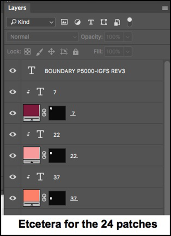
To implement these requirements, I use several applications in coordination: (i) Chromix ColorThink Pro (CTP) to visualize conditions (1), (2) and (3), (ii) Microsoft Excel for doing colour calculations and making CGATS formatted *txt files for CTP and (iii) Adobe Photoshop to specify the target image as 24 patches with their known colour values and print it in Absolute Rendering Intent. One can also use Patch Tool to create a printable image of the patch set and save its reference file data, but then one will not have the patches on separate layers, which come in handy if amendments of colour values are needed. The whole procedure for constructing the target and the associated workflow for amending it took a while to develop, but now that it’s established and tested, using it is rather straightforward. In the remainder of this article I discuss the process of developing the target, using it and some results.
Before proceeding, I must recognize the immense value of CTP for doing this kind of work and the most helpful advice I received from CTP staff on various aspects of the application’s capabilities that proved most useful for this purpose. I also acknowledge the great resource the community has at its fingertips with Bruce Lindbloom’s colour mathematics website. Of course, I remain fully responsible for what I did with these resources.
Development of the Extended Accuracy Evaluation Targets
The enhanced testing procedures described in this article apply to gloss/luster papers using PK inks. For now I am not applying these procedures to matte papers because I find that the standard GMCC colour set adequately corresponds to the gamuts of these papers.
Before proceeding into the details of the extended procedures, a word to the wise about colour numbers and printing accuracy: much of what we do to characterize colour numbers depends on data from measurements. The measurements themselves are not totally accurate, so neither will be the results. Spectrophotometers may return slightly different measurement values with repeated sampling of exactly the same printed color patch, or when sampling different printed patches of the same colour. Also be aware that in Photoshop, the Color Picker L*a*b* values can only be set to integer values – thereby losing the use of decimal places for fine specification of colours. A good workaround is to make sure that the reference values for the target’s patches in the reference file and those in the Photoshop image of the target are exactly the same, which is easy to do. Lastly, for assessing what is in gamut versus out of gamut (OOG), I rely on ColorThink Pro (CTP) because values that are clearly in- gamut – visually and by the numbers in CTP- can be shown as OOG in Photoshop’s Color Picker. So for all these reasons I never expect zero errors in the accuracy measurements. If they occur, it’s an accident. But none of this should cause large enough errors to worry about when making prints.
The two new targets I developed are stand-alone evaluation tools that provide results for their colours. Target “A” is for testing the printing accuracy of highly saturated dense colours near the gamut boundary, and Target “B” is for testing the printing accuracy of light pastel shades near the profile’s gamut boundary at just-about the uppermost luminance values. Each target has 24 patches. I chose to not combine these targets with each other or with the GMCC target I’ve been using to date, because I want the ability to compare performance independently for each set of 24 that by design have different overall colour characteristics. This allows me to determine, for example, whether highly saturated (Target A) colours pose more of a challenge to printing accuracy than less saturated ones (e.g. the GMCC target), or whether light pastel colours (Target B) are more difficult to print accurately than the others.
Taken together, the three targets – A, B and the GMCC – provide for 72 patches (24 each), which when complemented by the 100 patch neutral target set I developed dedicated to B&W accuracy evaluation, gives me a total of 172 patches for the whole test suite. By the way, this patch count exceeds that of the two main CMYK control wedges – Idealliance (84 patches) and Fogra (72 patches), but that by itself is unimportant. My searching and inquiries turned up no principles or research focused on the sample size or sample stratification of patches that would most accurately predict how correctly all colours would print. This is a sampling issue – to know what sample size and what stratification of the sample is needed for obtaining a reliable prediction of results for the whole population of colour data. Nonetheless, the industry appears to be satisfied that a double-digit number of well-chosen patches can adequately represent how accurately printing processes will lay down hundreds of thousands of colours.
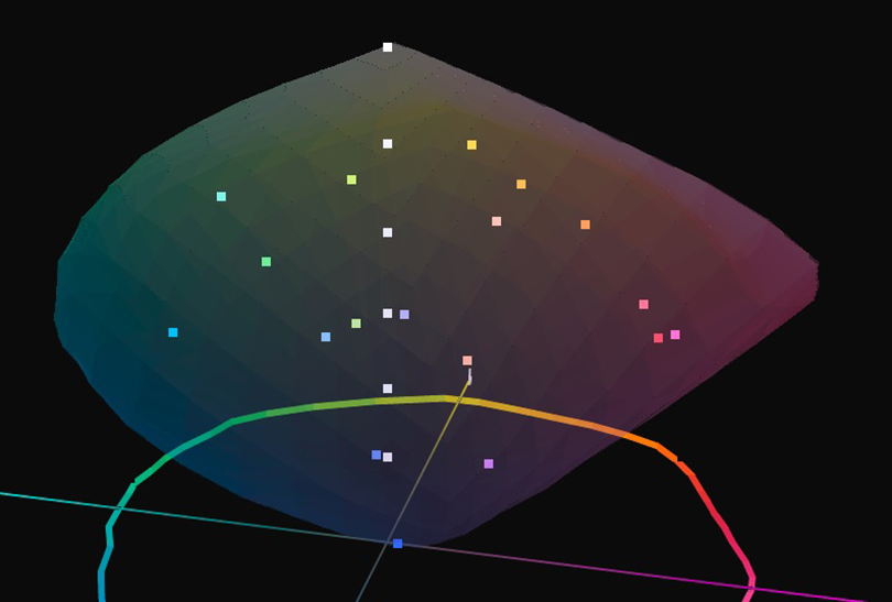
To meet condition (3) in particular, it is useful to begin the target creation process using the LCH colour measurement model, wherein “L” is for Luminance, “C” is for Chroma (i.e. saturation) and “H” is for Hue (Figure 4).
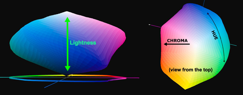
What’s nice about the LCH model is that it allows us to individually manage rather easily the three core variables that define a colour: it’s brightness (L), its saturation (C) and its hue (H). After working initially with LCH, the process defined below moves into L*a*b* for more granular analysis and management of colours.
Looking at the colour wheel (Figure 3 above), hues are measured as degrees on the 360-degree circumference of the wheel. With each of the three colour targets standardized to contain 24 patches (the number in the GMCC), I can have 24 colour samples, each one representing a different “club” of 15 degrees around the wheel (360 degrees/24 samples = 15 degrees per sample). Steps (1) to (5) are for selecting an initial representative set of colours from this wheel to be converted into a printable test target.
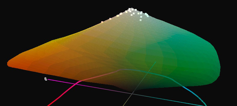
Step 1: Map and list in CTP all the colour points (Figure 5) that CTP uses to calculate the gamut volume and shape of the printer/paper profile (hereafter simply “profile”). CTP makes a list of over 4600 points for my custom SC-P5000 IGFS profile. Important: these points sit on the gamut boundaries of the profile.
Step 2: From CTP, save the list in Excel, LCH, CGATS format.
Step 3: In Excel, sort the list by increasing order of Hue, which in my SC-P5000/IGFS profile produced a list of about 4600 colours from 0 to 360 degrees.
Step 4: In Excel, go through the list and mark the boundaries creating 24 “clubs” each containing 15 degrees Hue.
Step 5: In Excel, find the median colour of each hue club, using the MEDIAN function on each club, and for making Target A, in the vicinity of each median identify and highlight a colour that has a value in mid-range L and high C; (this will produce dense, vibrant colours, but just in gamut because all the values on the list are on the profile gamut boundary (Figure 5 above). When finished, this will yield 24 barely in-gamut samples representing the colour wheel.
Steps (6) – (14) are for getting the selected colours into lists that can be used for managing positioning within gamut and preparing a printable 24 patch target.
Step 6: In Excel, aggregate these 24 samples highlighted in Step 5 into a separate list. At this point one has an LCH list of 24 colours consisting of 72 LCH data points (1L, 1C, 1H per colour).
Step 7: Translate the 72 LCH values into 72 corresponding L*a*b* values using conversion formulae from Bruce Lindbloom’s website, such that we now have side by side linked lists containing each of the 24 LCH colours linked with its corresponding L*a*b* version.
Step 8: In the LCH panel, set-up the 24 L values and 24 C values with formulae enabling them to be factored up or down by an assumed fraction.
Step 9: Set-up the 72 L*a*b* values with formulae so that each channel of each colour can be individually factored up or down by an assumed fraction.
There are two reasons for steps 8 and 9: (i) the first worksheet being set-up can be used as a template for other profiles that may have less gamut or a different gamut shape than the one being constructed now, so the eventual patch values may need to be amended, and (ii) while all the points being selected for the current profile are on the boundary, it may be safer (avoiding any risk of compression) to have the patch values just within the gamut boundary rather than on it.
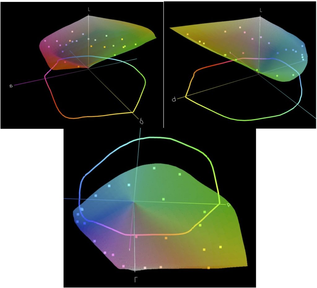
Figure 6 illustrates the kind of configuration of colours relative to the profile gamut one would end-up with to meet the three Conditions. It’s rather difficult to illustrate this succinctly because (i) there are a number of gamut boundaries for the same profile and they are not all easily perceptible with the reduced opacity needed for the points portraying the 24 colours to show through, and (ii) depending on the positioning of the plot, the relationship of the points to the boundaries looks different, but perhaps you get the idea nonetheless. All the points are near one boundary or another, and they do not over-spill any.
(I do all the above Excel steps on the same worksheet and save the workbook as the “Core worksheet” for this profile.)
Step 10: Save the list of 72 L*a*b* values as a new XLSX document and save that as a text file (*.txt) in CGATS format so that CTP can read it and graph the values. (CGATS is the Committee for Graphic Arts Technologies Standards. It developed a standard text file format for exchanging colour management data that one uses to ensure that the data shows the proper colours in the right format when using compliant applications).
Step 11: Import this *.txt file into CTP, graph it as points against the 3D (reduced opacity) rendering of the printer profile and check whether all the points are within the profile gamut. This is a bit of an art, as it requires rotating the diagram so you bring these points as close to their respective gamut boundaries of the profile as possible, looking for over-spills (Figure 6).
Step 12: To be certain that there will be no compression in Photoshop when printing the target, in the Core Worksheet I factored down the Chroma of all the patches by about 5% so they are close to but safely within the gamut boundaries, then repeated Steps 10 and 11 to double check.
Step 13: Place these amended L*a*b* values into the Reference Values section of the Excel template (another copy of the same one I had previously made for the GMCC target) used for doing the dE measurements.
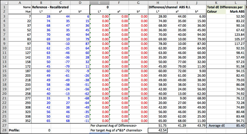
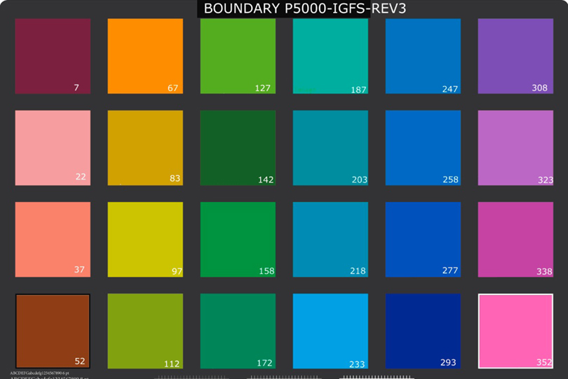
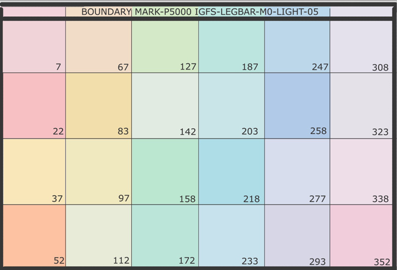
Step 14: Construct the patch set target image in Photoshop using the reference values in the left panel of Figure 7 (which can vary by target as determined in the foregoing steps). Name the patches according to their median hue values, e.g. patch “7” means 7 degrees in the 0-15 hue club.
Step 15: Print Target “A”, let it dry, then measure it, export (to hard-drive) the measurements as a CGATS *.txt file. Import this file into the Excel dE measurement template (Columns E, F, G red font) making sure the correct reference numbers are in the Reference value section (Step 13) and see the dE results (Col. L).
While this looks like a time-consuming, ponderous procedure, that’s because the first time it kind of is! But once the tools and procedure are created it becomes much smoother sailing to make other targets using the same set of Excel materials.
For making Target B, steps (1) to (5) and (7) to (9) need not be repeated. A duplicate of the Core Worksheet from Target A can be resaved as another file, and step (6) followed by steps (10) to (15) are repeated amending the core worksheet values, this time selecting values having high L and low C in the vicinity of the Medians for each club. These values are on the gamut boundary in the upper luminance reaches of the profile gamut shape (Figure 10).
Step 16: Make Target B either in Patchtool or Photoshop (Figure 13). Then repeat Step 15 for this target.
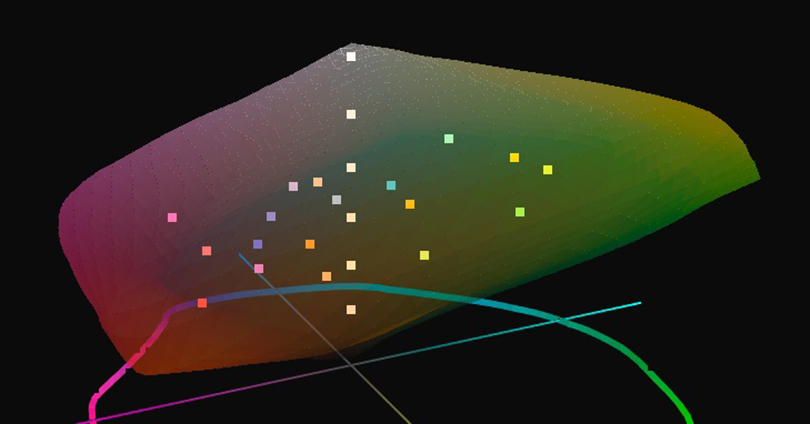
To recap the evaluation targets, the three of them in increasing order of overall colour density are shown in Figure 12, and the dispersion of the three targets’ values in the SP-5000/IGFS printer space in Figure 13.
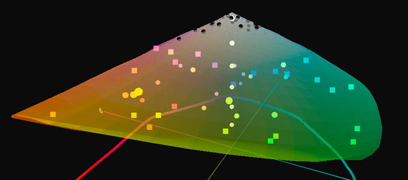
Black spheres: Target B; Circles: GMCC Target; Squares: Target A
Before reporting on the testing of this framework with several papers, I conclude this methodology discussion by introducing the other 100 patches devoted to grayscale tonality. This new detailed 100 neutrals test(an expansion from the previous 30 Neutrals test concentrating on shadow tones, as described in my article: Expanded Neutrals Testing), focuses on the accuracy of total, detailed grayscale reproduction for both adherence to the reference Luminance scale and Chroma neutrality (Figure 14).
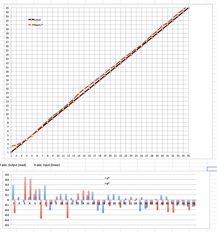
(from L*1 to L*35)
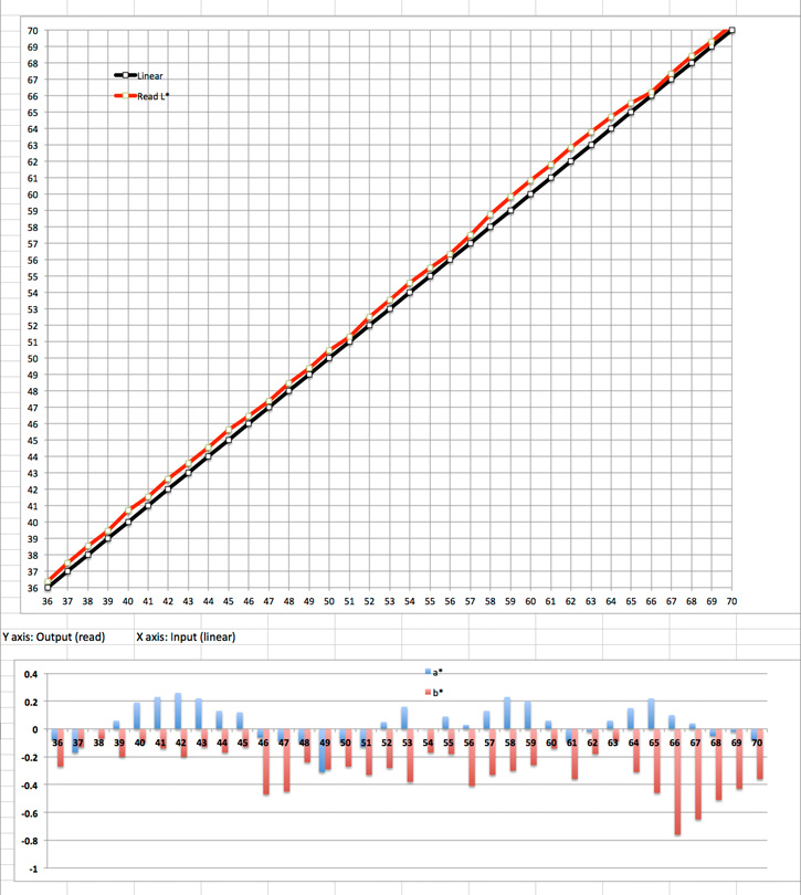
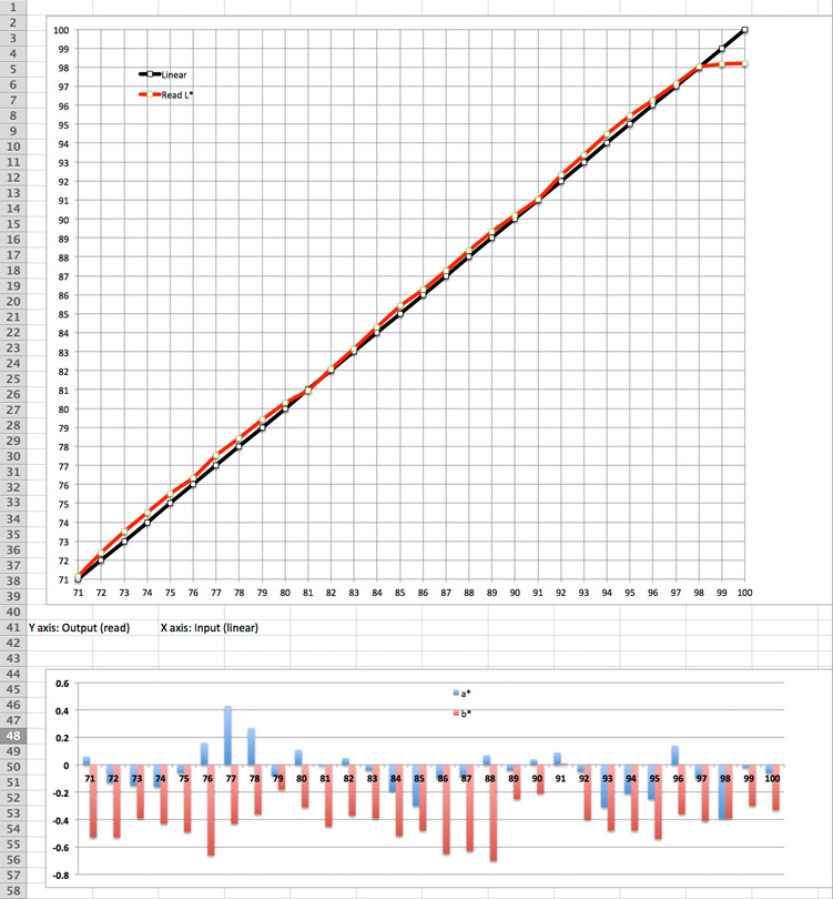
The three graphs in Figures 14D, 14M and 14L divide the Luminance scale into three large zones, being Dark, Medium and Light grays respectively. They are evaluated separately to gain a bespoke impression of grayscale quality for each of the three zones. If the printing workflow were completely linear in respect of Luminance, the values of the printed patches (red line) would fall exactly onto the black line in the graph, which depicts the file reference values for L*. The appearance of a red line (the read values from the target print) means there is some departure from the linear L* reference values. For the grayscale rendition to be considered smooth and reasonably accurate, the red line should be close to the black line. If it zigzags around the black line or shows quite wiggly progression, or for any one step departs by more than say 2 Luminance points from the black line reference values, we’d have evidence of non-linearity that could be noticed as discontinuities of tonal gradation – i.e. either lack of smoothness in tonal progression, or compression of tones that should be distinguishable.
In the samples of Figure 14, the lower left corner of the red line in Figure 14D indicates the Maximum Black that this printer/paper can render. The upper right corner of the red line in Figure 14L indicates the Maximum White the printer/paper reaches. No inkjet printer/paper combination so far yields L*0 or even L*1 Black, or L*100 White, so some departure of the red curve at these extremes is unavoidable.
For my SC-P5000 printer/IGFS custom profile, Maximum Black is L*2.13 and White point L*98.22 – hence, impressive tonal range. For White, it’s very hard to see any difference between L*98 and L*100. Most people looking at Black would have difficulty seeing any difference between L*0, 1, 2 or even 3.
The bar chart under the linear graph shows for each patch on the chart how far its colour departs from 0 in either the a* (magenta to green) or b* (yellow to blue) channels. If the grayscale were completely neutral, all a* and b* values would be 0 and there would be no bars. I’ve never seen this happen; indeed we are happy to see several 0 values (no bars) and all the rest being close to 0. Very few people are expected to be capable of perceiving as non-gray any a* or b* values up to at least +1.0 (trifle warm) or -1.0 (trifle cool). Therefore, as long as the bars in these bar charts do not climb higher or descend lower than +/- 1.0, we can consider the grayscale to be perceptually neutral.
The results from the Figure 14 graphs are summarized in Figure 14S.
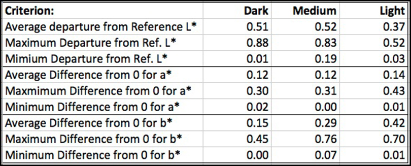
We have here a clear indication of a high performing printer/paper/profile combination with good grayscale neutrality and quite linear tone ramp. In fact against the backdrop of complaints one hears about printer drivers not being particularly good at B&W linearity or neutrality, I think these results should put those complaints to rest, at least for this printer/paper/profile combination. I’m challenging the providers of alternative printing software to help me do better: if your application supports: (i) OSX 10.11, (ii) the Epson SC-P5000 printer/HD inkset and (iii) Absolute Rendering Intent, send it to me with a license key; I’ll test this suite of grayscale evaluation targets and report the results on this website. If you have a better mousetrap than the Epson driver for this printer/paper combination, that’s good; if you don’t, well, you don’t.
Results (Multi-Colours) from Measuring the Printed Targets
Reverting to the colour patch tests, I tested Target A using four luster/gloss papers I had on hand, all Ilford Galerie Prestige products:
- Gold Fibre Silk (IGFS)
- Gold Fibre Gloss (IGFG)
- Smooth Gloss (IGSG)
- Smooth Pearl (IGSP)
I tested Target B with IGFS.
For each paper I had created a profile for the Epson SC-P5000 printer in i1Profiler using two of Ethan Hansen’s “good” number sets (1877 or 2371 patches) from the list he published last year in the LuLa Forum. I made the prints of the profiling target with the Adobe Color Print Utility (ACPU), which for this printer assures that color management is neutered, as it must be to make profiling targets.
I then printed the patch sets (GMCC and Target A) on all four papers, plus Target B on IGFS, using these custom profiles and Absolute Colorimetric Rendering Intent. After overnight dry-down, I measured them with my i1Pro 2/i1Profiler and saved the measurements to the Excel templates I had created for the dE(76) measurements (such as Figure 7). Recall, these dE numbers indicate the absolute difference between the file reference values of the patches (the correct colour numbers) relative to the read colour values of the printed results, with no adjustments for the non-uniformity of human visual perception (better captured with dE(2000) metrics). Mine are limited to addressing the extent to which the printer is laying down the same colour values for the patches that are in the image reference file.
Starting with IGFS, Recall, the conventional GMCC target has 18 multi-colour patches and 6 grayscale ones. Figure 15 shows the distribution of dE results in descending order, and Figure 16 a summary of the key results from printing and measuring the three targets. For the GMCC target I show the results for the 18 multi-colour and 6 grayscale patches separately in Figure 16.
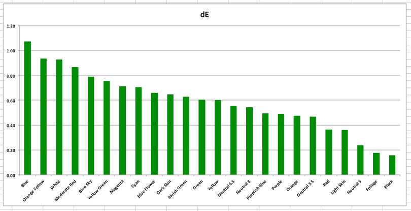
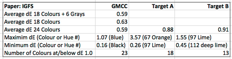
The overall GMCC result shows Average dE 0.59 for the 24 patches and 0.63 for the 18 multi-colours ones. 23 patches have dE below 1.0. The Black in that target is actually L*20 which is a deep gray, coming in with the lowest dE at 0.16. All told, this is a highly satisfactory outcome, indicating very good profile quality and printer performance.
For Target A, to remind being 24 multi-colours, the average dE is 0.88, the summary results appearing in Figure 16 above. The detailed dE results by hue are in Figure 17.
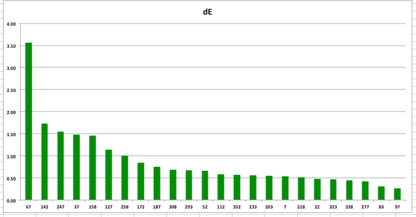
The colour with the largest error is #67 (an intense orange) coming in at dE 3. 57. Just about the whole error is composed of b* (Yellow) being over-saturated relative to the image file colour value (b*94 reference value versus b*97.56 printed value). For the remainder of the target 5 hues have dE results between 1.7 and 1.0, while 18 are below 1.0. These results indicate that average dE for Target A has increased by about 0.25 relative to the multi-colours of the GMCC target, which is not significant. Apart from the hue 67 (intense orange) result, accuracy is on the whole good for heavily saturated colours.
Target B light pastel colours are quite subtle, such that differences between them may look as if they could fool the printer badly, but that didn’t happen (Figure 16 above and 18 below).
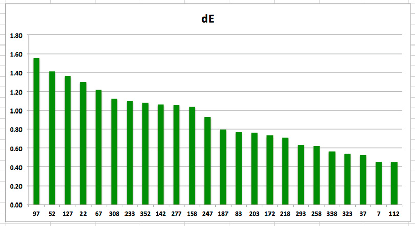
The average dE of the 24 patches is 0.91, the one with the largest dE being Hue 97 (lime) with dE of 1.55 – not too much above the limit of perceptual difference from its correct value. 12 values are below dE 1.0, the remaining 11 being between dE 1.4 and 1.0. This is also a good set of results in respect of printing accuracy.
The main conclusions from this first round of testing on IGFS are that (1) accuracy performance is on the whole good for all three patch sets; (2) Targets A and B do pose a slightly greater accuracy challenge compared with the standard GMCC colour set, but not inordinately so; and (3) perhaps the original GMCC 24 patch set is sufficient for a general impression of printing accuracy; though obviously it doesn’t provide very detailed guidance, again raising the question about how much detail one really needs – the answer would vary from one use of photography to another and from one user to another.
The next paper I tested for the GMCC and Target A colour samples is IGFG, very similar to IGFS, two main differences being that the substrate is cotton rag rather than alpha-cellulose and it has no OBA. Like IGFS, it is also a very wide gamut paper in the Epson SC-P5000 printer (gamut volume over 998,000 – the largest I’ve measured for any paper).
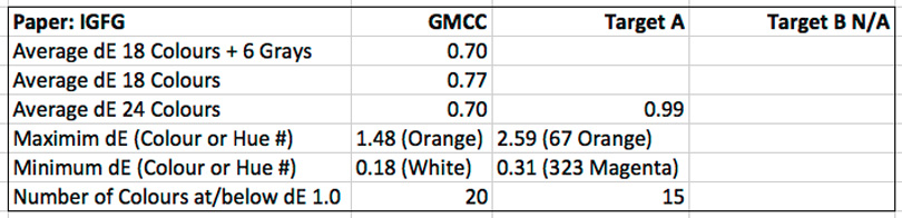
The custom profile performs very well, the average dE for the GMCC test target being only 0.7 (Figure 19); the average dE for the 18 multi-colours is 0.77. The maximum dE result is 1.48 for Orange (Figure 20). The minimum dE result is White, which in this chart is actually very light Gray at L*95. 20 of the 24 patches have dE less than 1.0.
The Target A patch values that worked for IGFS are fine for this paper as well because their gamut volumes and shapes are close. Printed on this paper, the Average dE is 0.99 (Figure 19). Two patches are outliers – hue 67 (dE 2.59) and hue 142 (dE 2.28), being intense orange and intense dark green respectively. The character of the dE errors is most importantly over-saturation of the b* axis (yellow) in both cases. Fifteen patches are below dE 1.0, the remaining seven ranging from about dE 1.1 to just over dE 1.5. (Figure 21).
Hence for this paper as for IGFS, the more highly saturated Target A on average produced slightly larger dE errors than did the standard GMCC chart, and the two outliers are a bit of a mystery, but apart from that, this printer/paper/profile combination works well in respect of accurately printing highly saturated colours.
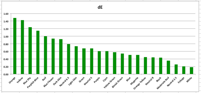
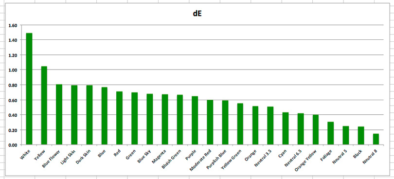
Turning to IGSG, this is a smooth high gloss paper with a somewhat lower gamut volume (c.922000 versus c.978000 for IGFS) and slightly different gamut shape than IGFS, enough that I needed to customize the Target A patch values just a bit to ensure their compliance with conditions (1) and (2). The custom profile is very successful for the GMCC target (Figure 22).
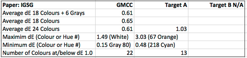
The average dE is 0.61, or 0.65 for the 18 multi-colours alone. The maximum dE is 1.49 for White (95% Gray) and the minimum 0.15 for Gray L*80. 22 of the 24 patches have dE below 1.0. The dE for all 24 patches shows in Figure 23.
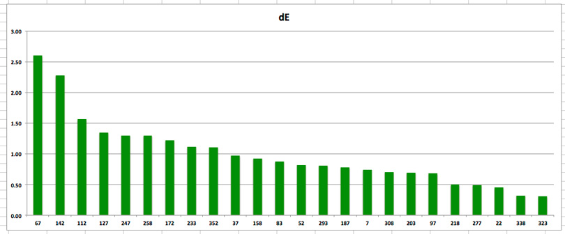
Target A dE results are fairly good, but not as good as for the GMCC colours. The average dE is a respectable 1.03; however, there is one troublesome outlier – hue 67 (intense Orange again) at dE 3.03; as for IGFG the main reason for the size of this dE is over-saturated Yellow. Patch hue 218 (intense Cyan) is the best performing one of the set at dE 0.48. 13 of the 24 patches are below dE 1.0. (Figure 24).
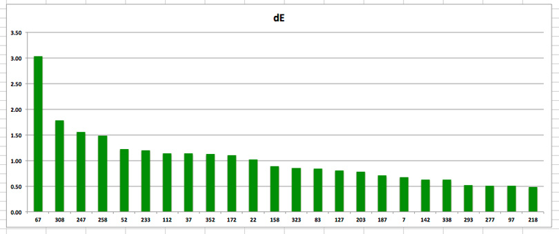
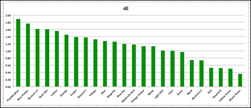
The final paper tested in this research is IGSP. It performed differently than the others comparing the GMCC versus the Target A results. This paper has similar gamut volume to IGSG and allowed me to use the same Target A patch values as I did for IGSG. For the GMCC target, the average dE is 1.15 for the 24 patches and 1.19 for the 18 colour patches (Figure 25). (This overall result is quite similar to that achieved for this paper when I tested it in the Epson SC-P800 for a previous papers review article, though the detailed numbers for the patches differ.)
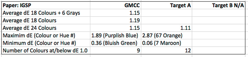
The maximum dE is 1.89 (Purplish Blue, mainly due to lower printed L* versus the file value) and the minimum 0.36 (Bluish Green). 9 colours are below dE 1.0.
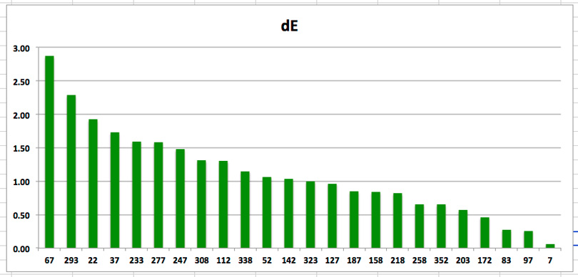
Unlike for the other papers tested here, the Target A results (Figure 26) were on average slightly better than the GMCC results. Its average dE is 1.11, the highest dE being 2.87 (hue 67 intense Orange, again due to over-saturated Yellow), and the lowest 0.06 (hue 7, Maroon). 12 colours are below dE 1.0.
Summing-Up:
The extended accuracy testing procedures described in this article provide a practical way to obtain a more comprehensive sampling of colour reproduction accuracy than available from use of the GMCC target alone. That said, the results confirm that the GMCC test is quite reliable on a stand-alone basis. The extended testing provides more insight into printing accuracy of colours near the limits of profile gamut. With one exception, average dE was slightly higher for the extended tests (Target A, Target B) versus the GMCC test, but all remained within acceptable ranges, the one possible exception being the systematic over-saturation of intense orange (hue 67). Apart from showing the obvious – over-saturation of the b* channel (Yellow), these tests cannot provide further insight into why such outcomes happen. In this particular case, it could come from how the profiles are characterizing the printer, or from how this printer driver is rendering the data into printed colours. There may be other possibilities.
Results of such testing need to be interpreted in terms of their real-world significance. For example, based on previous samples I’ve prepared for seeing differences from reference values per colour within a range of +/-4 dE values for each of the L*, a* and b* channels, I find that mild over-saturation in the orange/yellow segment of the hue wheel is unlikely to be bothersome in the context of a complex colour photograph.
It is hard to know exactly why differences of results occur between these four rather similar papers given the same printer, the same profiling procedure with the same equipment, and for the GMCC, the same target for all. By elimination, this would seem to leave fine differences of the coating and texture of the papers being the causal factor of the distinctions.
Finally, the extension of the grayscale into detailed (one L* step increments) for almost the whole tonal range (L*1 to L*100) provides granular and comprehensive information on grayscale smoothness and neutrality. In the particular case tested here, it shows that the standard ICC Application Managed workflow used with the Epson driver, Ilford Gold Fibre Silk and the Epson SC-P5000 printer leaves very little on the table to be improved upon.
Mark D Segal
2018 May


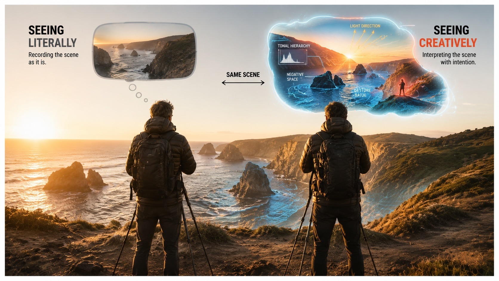
Elevate Your Vision


Read this story and all the best stories on The Luminous Landscape
The author has made this story available to Luminous Landscape members only. Upgrade to get instant access to this story and other benefits available only to members.
Why choose us?
Luminous-Landscape is a membership site. Our website contains over 5300 articles on almost every topic, camera, lens and printer you can imagine. Our membership model is simple, just $2 a month ($24.00 USD a year). This $24 gains you access to a wealth of information including all our past and future video tutorials on such topics as Lightroom, Capture One, Printing, file management and dozens of interviews and travel videos.
- New Articles every few days
- All original content found nowhere else on the web
- No Pop Up Google Sense ads – Our advertisers are photo related
- Download/stream video to any device
- NEW videos monthly
- Top well-known photographer contributors
- Posts from industry leaders
- Speciality Photography Workshops
- Mobile device scalable
- Exclusive video interviews
- Special vendor offers for members
- Hands On Product reviews
- FREE – User Forum. One of the most read user forums on the internet
- Access to our community Buy and Sell pages; for members only.
You may also like