In latter 2024 and earlier this year three new Canson Infinity papers became available: Somerset Enhanced Satin, Enhanced Velvet and Enhanced Watercolor, made in St. Cuthberts Mill, UK. Legion Paper, the North American distributor, provided me with a package of each to test and review. Legion Paper also makes the profiles for these papers. Quite apart from being good quality papers and a pleasure to work with, a rather unusual feature of these offerings is that for two of them: Satin and Velvet, Legion Paper opted to provide profiles made with the M3 Measurement Condition.
This adds spice to preparing a paper review, because M3 as the default profile option is unusual. Most profiles are generated for M0, M1 or M2 Measurement Conditions. So, this development occasions a new dive into the relative merits of M3 relative to say M1, now a recommended default. What does an M3 profile do for a print that is otherwise unattainable? The profiles sure look different when examined in ColorThink 4, and they have different statistical properties, but what are the observable results of printing with them, and are they any better than using say an M1 profile? I researched these questions years ago when there was a “raging debate” in the community about the value of M3 profiling, but that was a long time ago, so I figured this is a timely opportunity to re-examine the question in the context of this review.
Firstly we’ll review what a Measurement Condition is, then observe what an M3 profile looks like in ColorThink 4, then see how it compares with standard M0/M1/M2 profiles, which latter perform similarly for papers having no optical brighteners (OBAs), as is the case for these three papers. Of course I’ll also discuss the qualities of the papers.
“Measurement Conditions”: They define how spectrophotometers measure a patch-set of colours when making paper/printer profiles. There are four such conditions in ISO Standard 15655:2009; here are abbreviated definitions and use conditions.
| Condition | Description | Key features |
| M0 | Measurement condition with an undefined UV(*) component. | M0 is ideally CIE Illuminant A (**) but is not precisely defined and the relative amount of UV is unspecified. |
| M1 | The modern standard that uses a calibrated D50 illuminant with a defined amount of UV. | M1 requires a match to the CIE Illuminant D50 (***) over the full range from 300nm, and it includes a defined UV component. |
| M2 | Measures color without any UV component. | M2 is useful for eliminating the effect of OBAs from measurements. |
| M3 | Uses a polarized light source to minimize surface reflections. | It is intended to remove gloss that can change during print drying. It may also open shadow detail and improve highlight gradation. |
(*) UV = Ultra-violet light
(**) CIE Illuminant A = a standard illuminant representing the light from a tungsten-filament lamp, temperature of about 2856K.
(***) D50: a theoretical light source that approximates “warm daylight” and follows the CIE standard.
For papers with no OBAs, M0, M1 and M2 Measurements return similar readings.
Konica-Minolta, manufacturer of high-end colour management instruments, recommends M1 as the default for making paper/printer profiles.
When you open an M3 profile in ColorThink, its properties look very attractive to photographers (Figure 1).
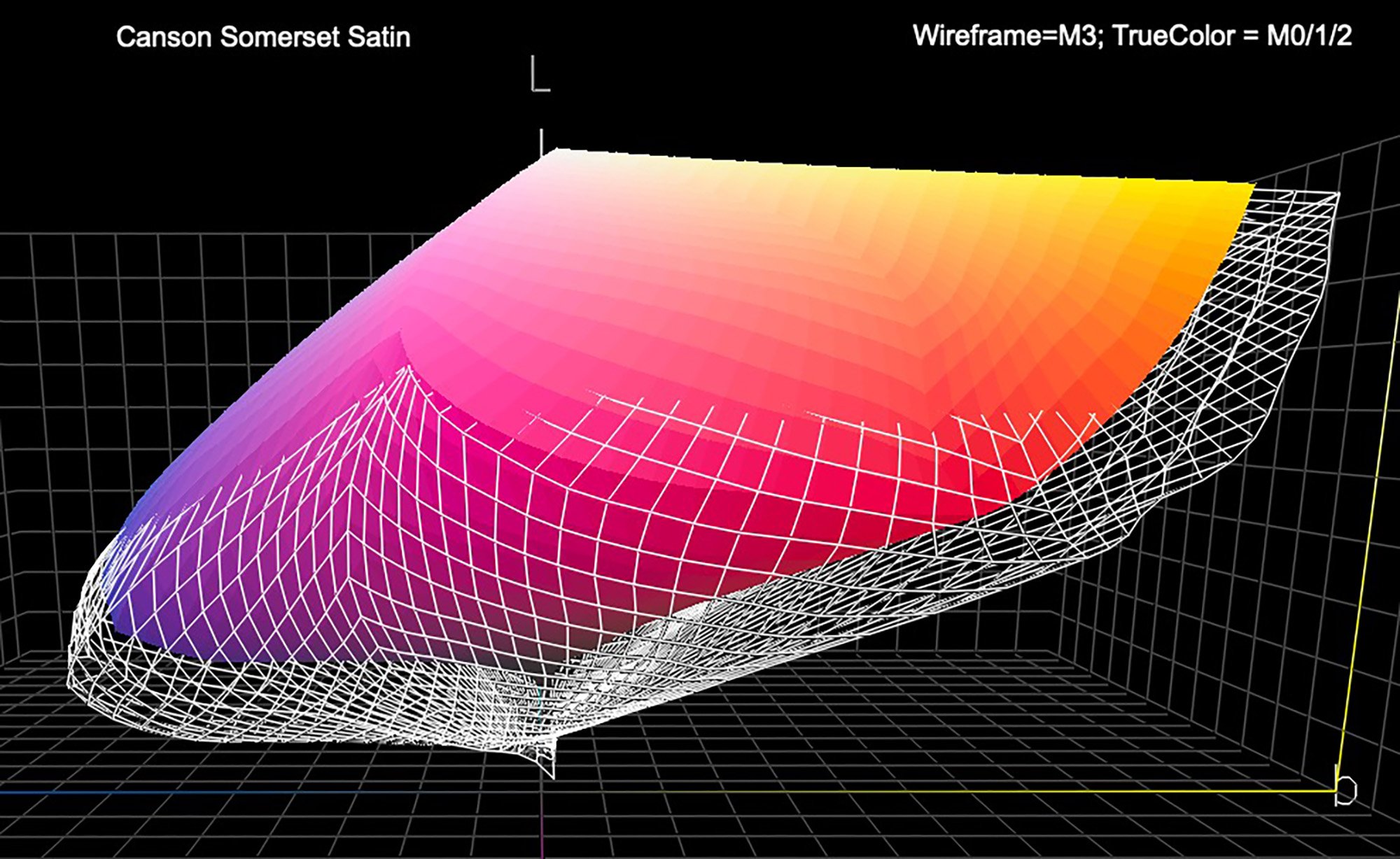
Notice how much more gamut volume the M3 profile displays in the mid to deep tones of the gamut plot (the underside). This is confirmed in the ColorThink 4 data of Figure 2:
The gamut volume of about 726,000 and a maximum Black of L*2 is normally unheard of for a matte paper, which all three in this review are. Normally, for matte papers with their lower reflectance compared with gloss/luster papers, one expects gamut volumes and maximum Black values of the kind shown in the right side of Figure 2, which are typical of M0/M1/M2 profiles – i.e. substantially less gamut volume and much weaker Maximum Black. Photographers would be in printing heaven if in matte papers they could see gloss-like gamut volumes and Maximum Black values as shown for these M3 profile statistics, but alas, this is not to be. Stay tuned.
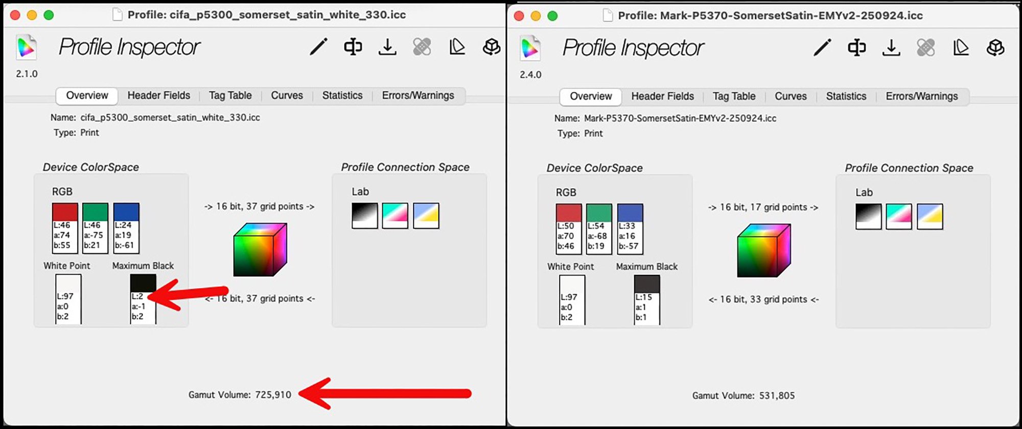
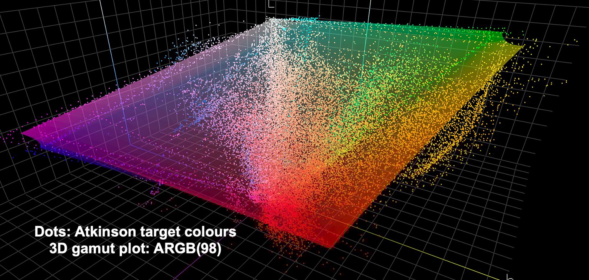
In the reality of printed results, one could hardly perceive much difference of colour gamut between prints made with the M3 versus M1 profiles. I can illustrate this objectively with scans of two prints of the Atkinson Printer Evaluation Target; the Atkinson target (see Figure 14) is a set of photos altogether adding-up to a wide colour gamut (Figure 3a – numerous colours even exceed the boundaries of the ARGB(98) colour space). I made one print with the M3 (CIFA) profile, the other with the M1 (Mark) profile and loaded both into ColorThink 4 (Figure 3). Each dot in Figure 3 is of a unique colour from the scanned prints (using a custom-profiled Epson V850 scanner) as analyzed in ColorThink 4. The White set is the target colours that result from printing using the M1 profile, the colour set likewise for the M3 profile. We can see from these plots that there is not much difference in the overall spread of these dot sets, only that the M1 set is displaced slightly higher on the Luminance dimension relative to the M3 set. This means that, at least for this set of images, the M3 profile isn’t contributing many printed colours beyond the range obtained from the M1 profile.
Now, please follow closely here because it’s a bit intricate: To test the accuracy of a printing workflow including its profile, the conditions used for printing and measuring the test patches should be the same as those used for creating the profiles. So, if we made an M3 profile we should test it with an M3 Measurement Condition. But many of us, me included, do not possess the spectrophotometer model needed to make M3 measurements. Therefore, we read the results of the printed tests under M0/M1/M2 Measurement Conditions, which yield some very different data than suggested by the M3 profile statistics of Figure 2. For example, as you’ll be seeing, from reading the printed results of the test targets, printed with the M3 profile, we get a Maximum Black of L*15 rather than L*2. But that’s OK, because regardless of how the profile was made, measuring a printed patch-set with an M1 device tells us what to expect a print to look like under D50 viewing conditions even though it was printed using an M3 profile. In some respects, the results may have somewhat different appearance from those using “normal” M0/M1/M2 profiles because the profiles are not the same. I’ll provide the visual evidence of these differences below. Spoiler alert: they are not large, but they are noticeable.
Now let’s talk a bit about the papers. Firstly, I should mention – I did all my work with these papers using the Epson SC-P5370 printer, because it is the newest high-end 17-inch professional inkjet printer on the market, which I had thoroughly tested when it came out in 2024.
The common characteristics of these papers are that the substrate is made at St. Cuthberts Mill, UK, the coating is made by Canson, they have no OBAs, the substrates are mould-made 100% cotton, they are all white and the Satin and Velvet come in different weights, the Watercolor in one weight. You can examine the physical details here: https://www.stcuthbertsmill.com/st-cuthberts-mill-paper/somerset-enhanced/ and here: https://www.canson-infinity.com/en/products/somerset-enhanced-watercolour-rag. The samples sent to me were the low weight ones. The advantages of the low weight are that the sheets feed into the printer easily with reliable uptake, and they would be ideal for binding into books because they are flexible. The downside is that they need to be handled with some extra care to avoid damage.
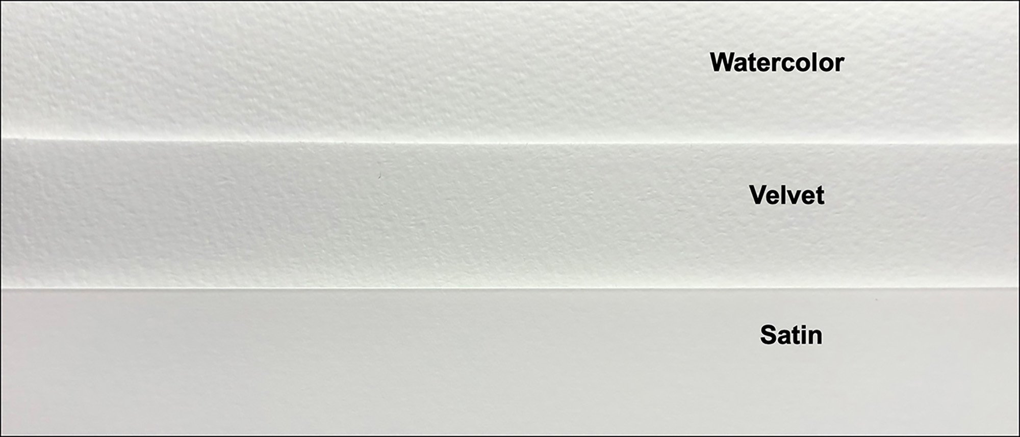
Figure 3 captures the textures of the three papers. Capturing texture doesn’t work well in bright white, so the tones here are intentionally darker than the product white to more easily see the texture.
The papers profile well and the test photos printed very nicely, as we’ll see. I’ll discuss each paper in turn, looking at the profiling data and the resulting images together.
Somerset Enhanced Satin:
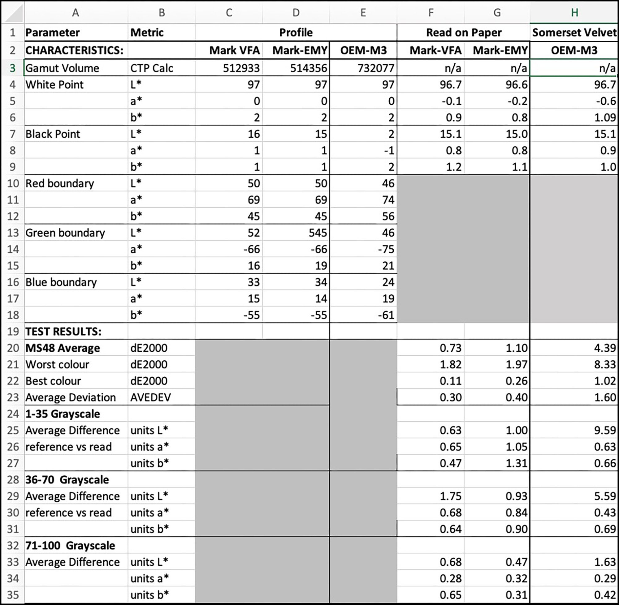
This is a smooth white matte paper, and one of the two for which Legion Paper provided an M3 profile. I also made a custom M1 profile. Figure 5 shows the results of testing both profiles.
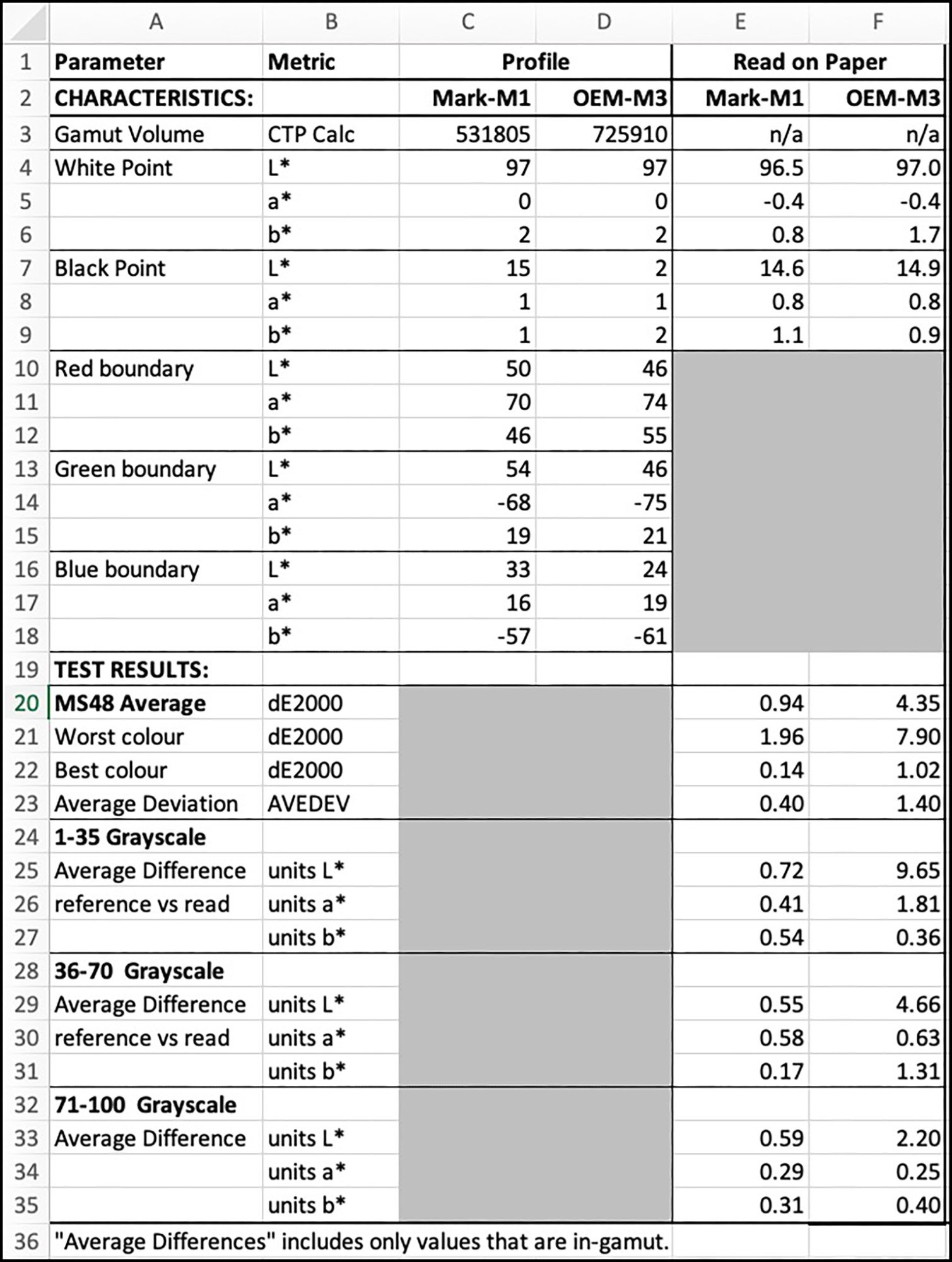
Notice the large difference of ColorThink 4’s evaluated gamut volume (row 3) between the M1 and M3 profiles. From my experience, this is typical for such M3 versus M1 readings with matte papers. As we’ve seen in Figure 3 it doesn’t mean anything in respect of the spread of colours revealed in prints made from the two profiles, at least based on the large colour gamut represented in the Atkinson evaluation target.
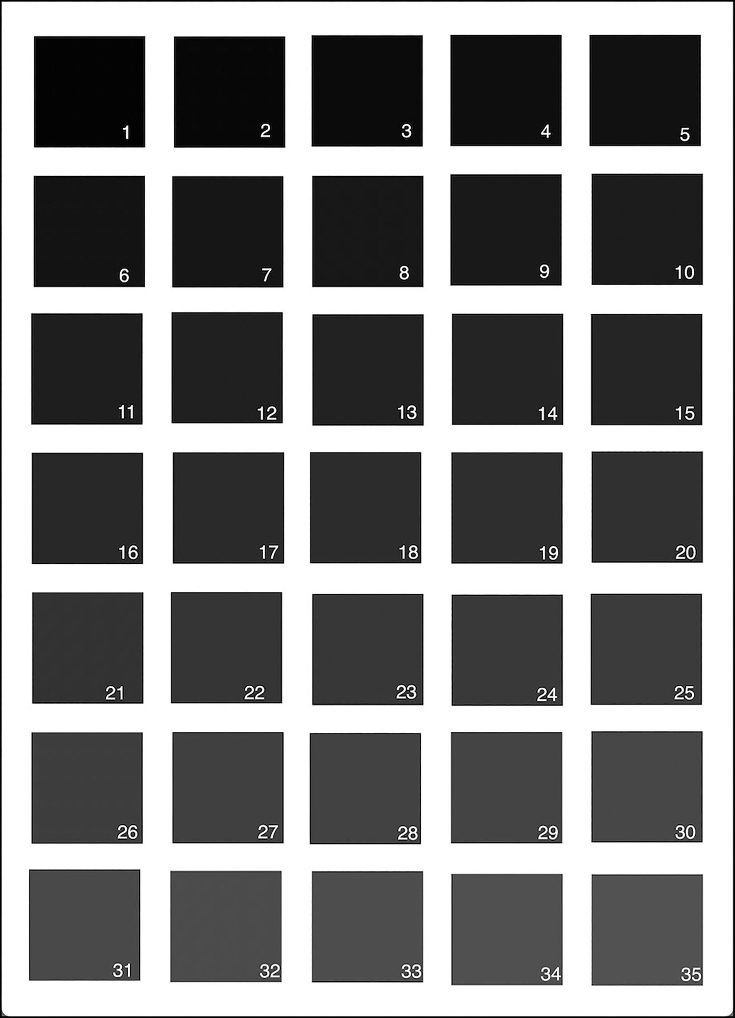
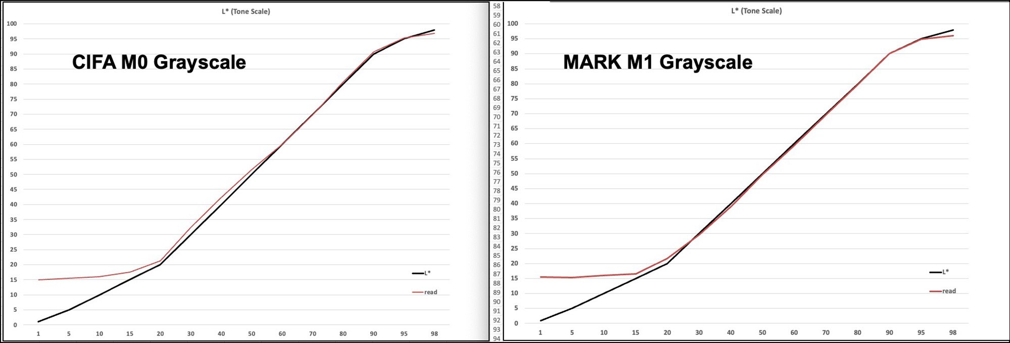
The next major difference to observe is in row 7, the difference of the Black Point between the two profiles: L*15 for the M1 and L*2 for the M3, suggesting that one should see a much deeper Black using the M3 profile. To remind, with matte paper Maximum Black is usually in the range of L*14~18. The question is whether, when printing with an M3 profile, we see richer Blacks in the prints than we would with the usual M1 profile. I examine that question in two ways, one from a set of dark tone target patches (Figure 6, Lightness range L*1 to L*35) printed with each profile, and another from the BVDM (*) Roman-16 image especially designed to evaluate the quality of dark tone reproduction in printing processes. To see how the printer renders the file values without Photoshop remapping values I print this target using both the M1 and M3 profiles and Absolute Colorimetric Rendering Intent (ABSCOL). Then I graph the results by measuring the printed patches with a Myiro-1 spectrophotometer. The resulting graphs (Figures 7 and 8) give us a picture of the values of the unadulterated printed tones (red line) relative to their file values (black line).
(*) Bundes Verband Drück und Medien (Federal Association for Print and Media, Germany)
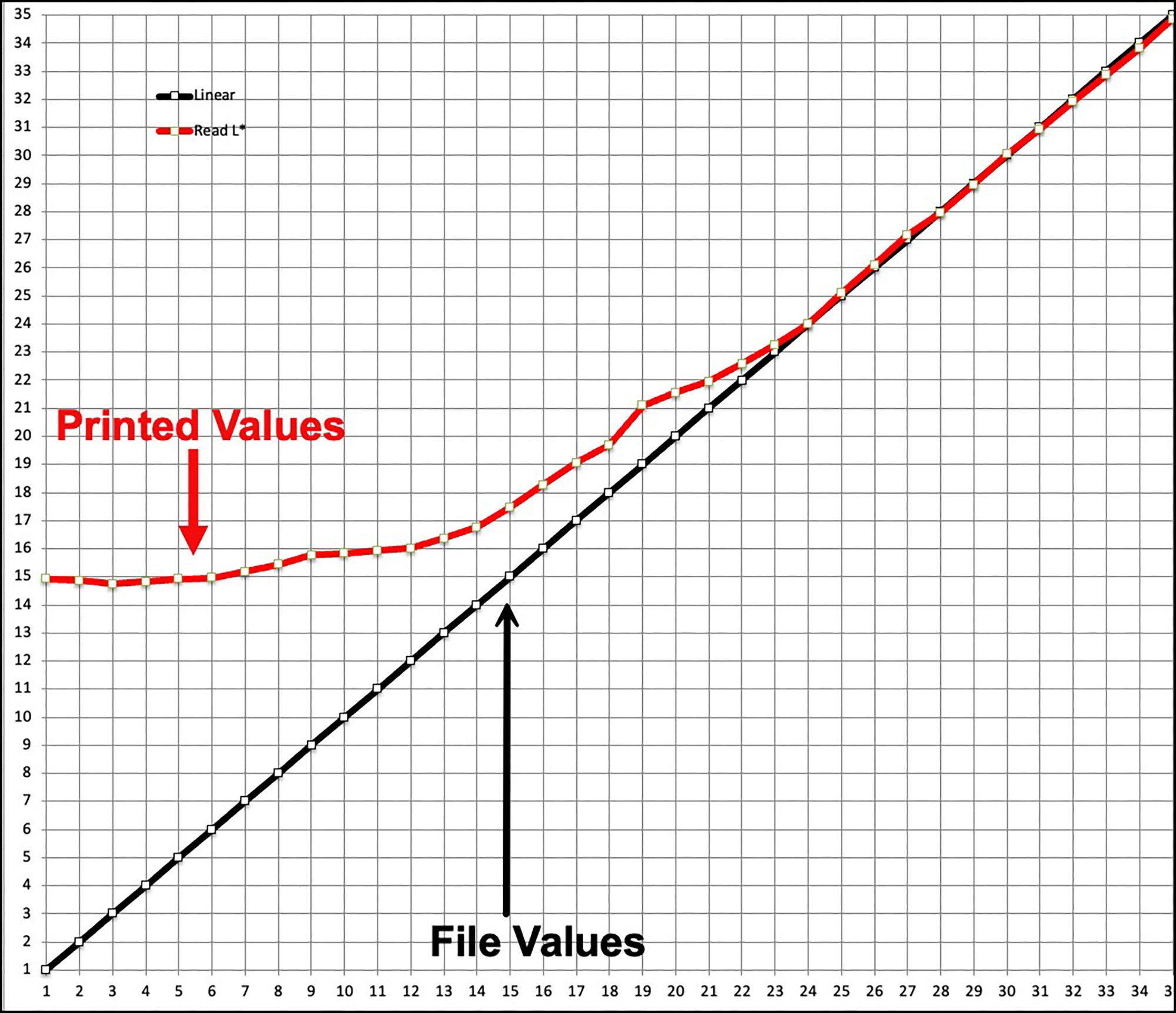
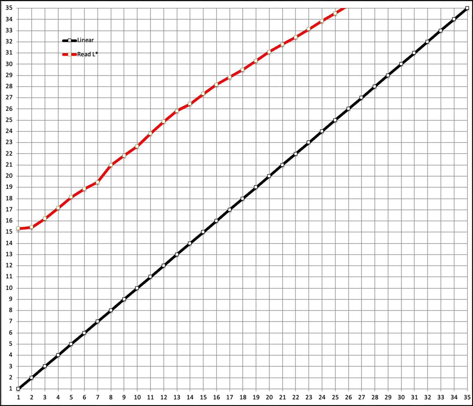
The Black line is an exact trace of tone graduation in the target file patches (Figure 6) from Levels L*1 to L*35. The Red line shows what the printer/paper/profile combination delivers with each profile. The closer the red and black lines converge the more accurately the printed result reproduces the file value. The only difference between the M1 and M3 renditions is the profile. In Figure 7 the M1 result shows that this paper/printer delivers a maximum Black of about L*15, therefore the printed tonal gradation only starts to increase beyond this level from L*15, and accurately so from about L* 23. In Figure 8 we see that with the M3 profile the printed Maximum Black also reaches only as dark as Level 15 (as in Figure 7), BUT unlike for the M1 profile, with the M3 profile all the tones in the test file from L*2 upward are remapped accordingly, creating a smooth tonal graduation roughly proportionate to the increase of L* from one level to the next as exists in the target file (notice how the red and black lines are roughly parallel), but higher (brighter). This is close to what happens when using an M1 profile and printing with Relative Colorimetric Intent (RELCOL) plus Black Point Compensation (BPC) (Figure 9), which is how we would normally print (ABSCOL is meant mainly for colour management testing).
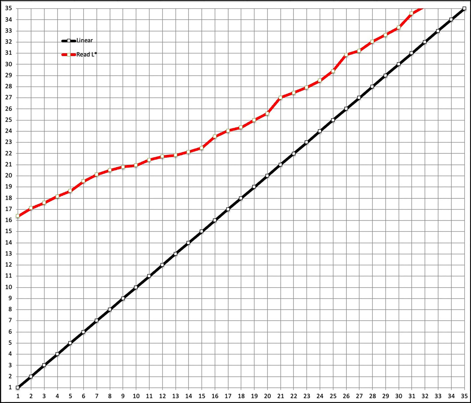
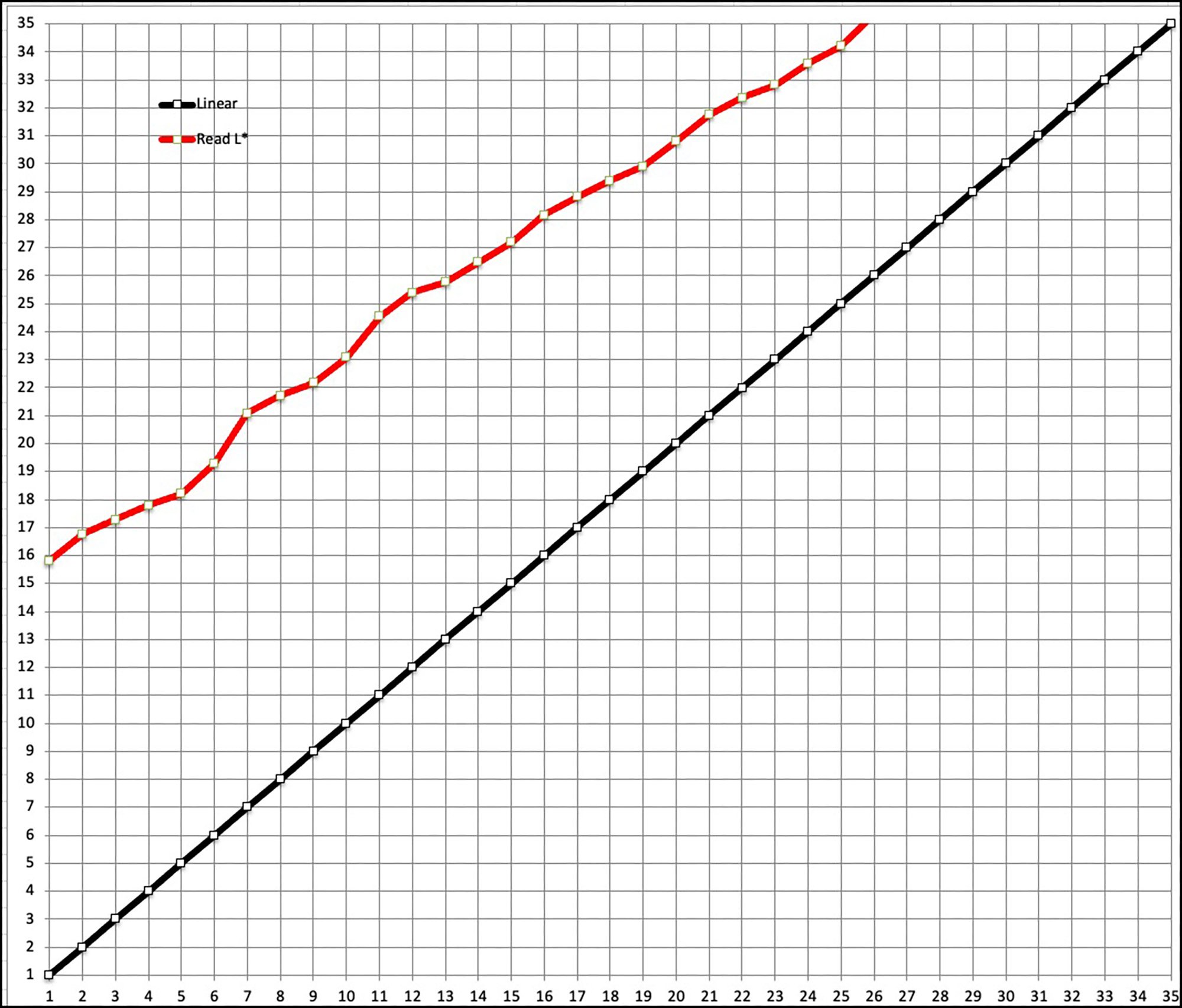
Normally, we would also use RELCOL+BPC when printing with the M3 profile, which is portrayed graphically in Figure 10. Here, the printed result remains brighter right up the scale than does the M1 result of Figure 9. In Figure 9 (M1) the red line (printed result) converges more closely to the file values as one progresses up the Lightness scale than happens in Figure 10 (M3).

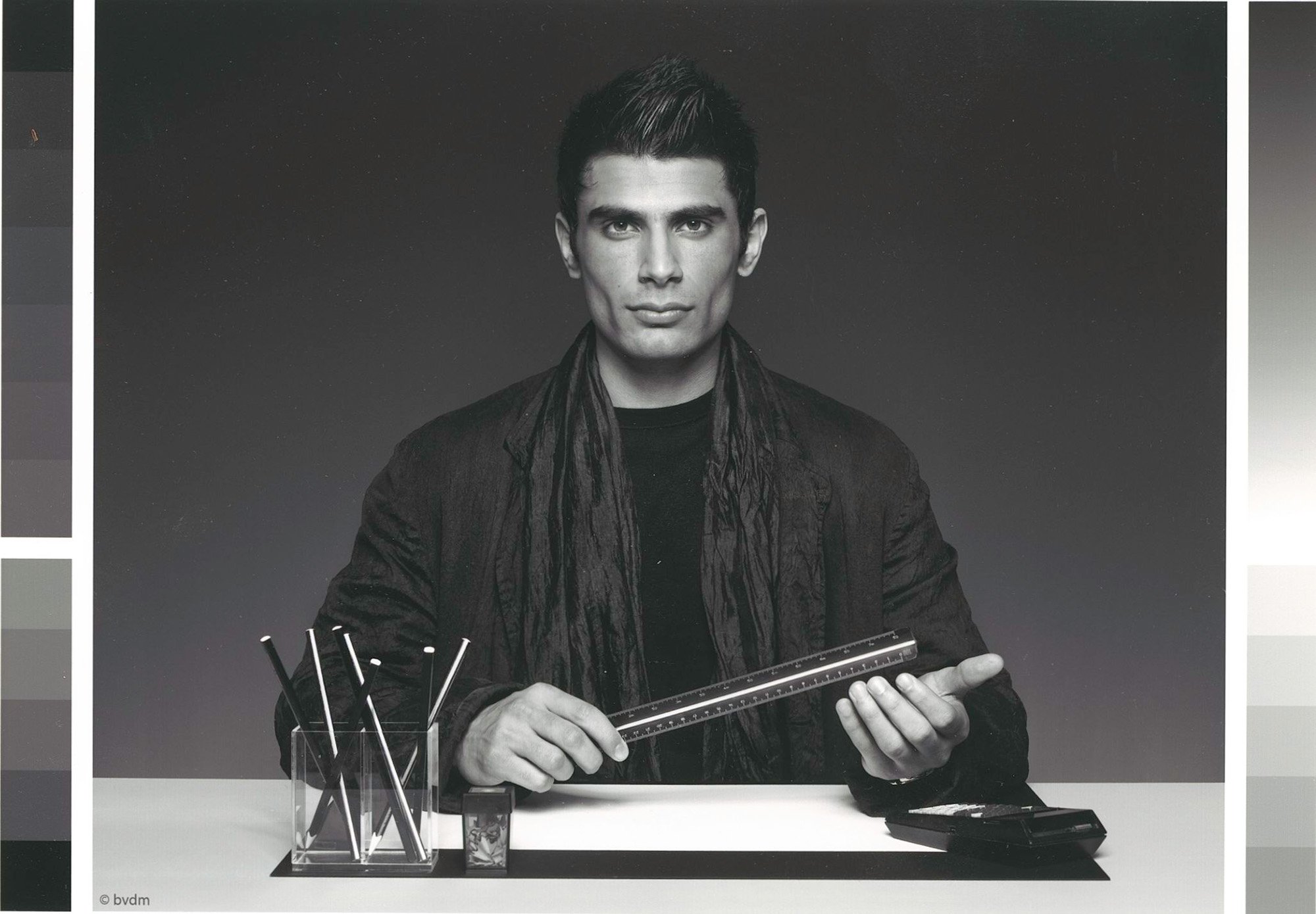
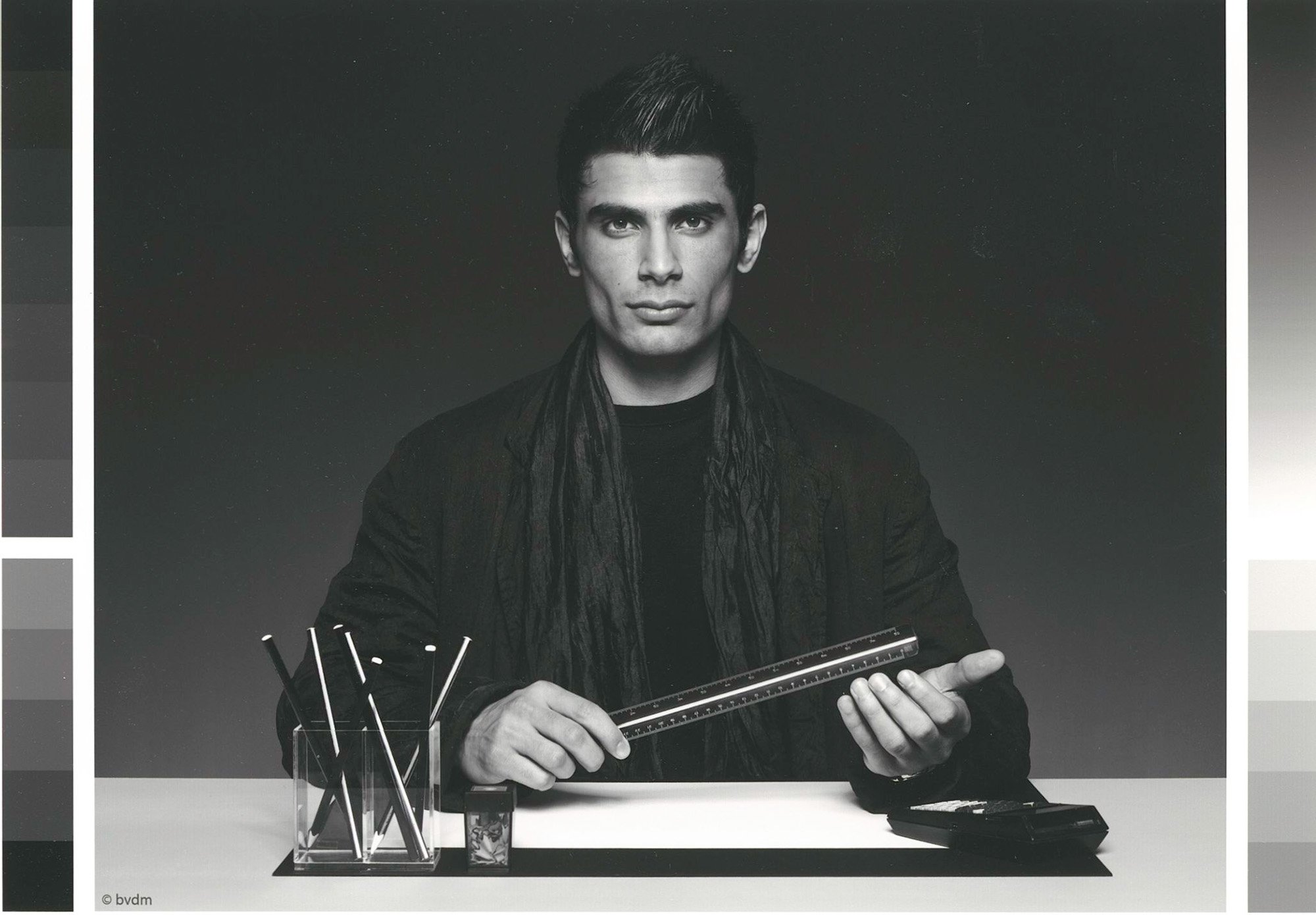
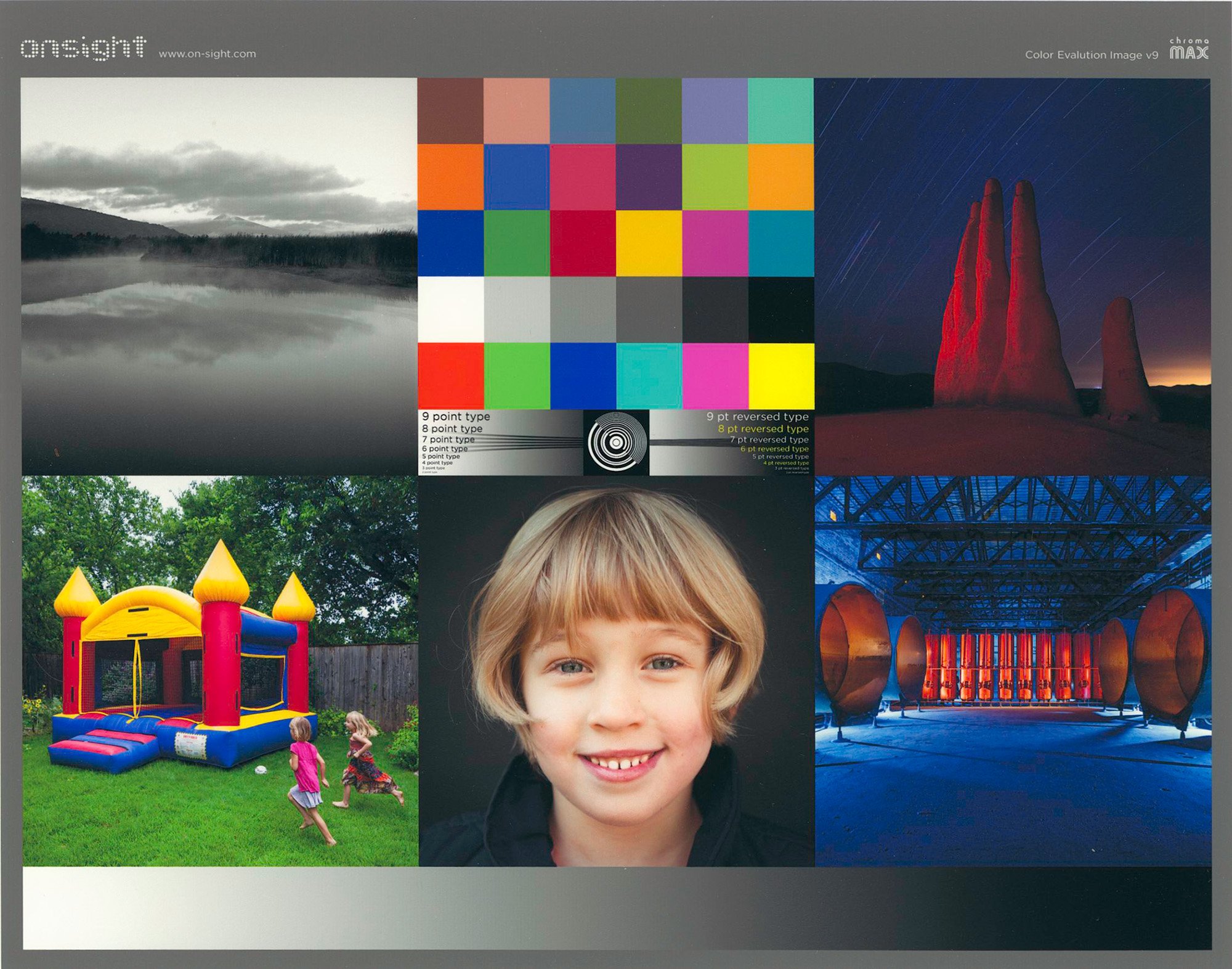
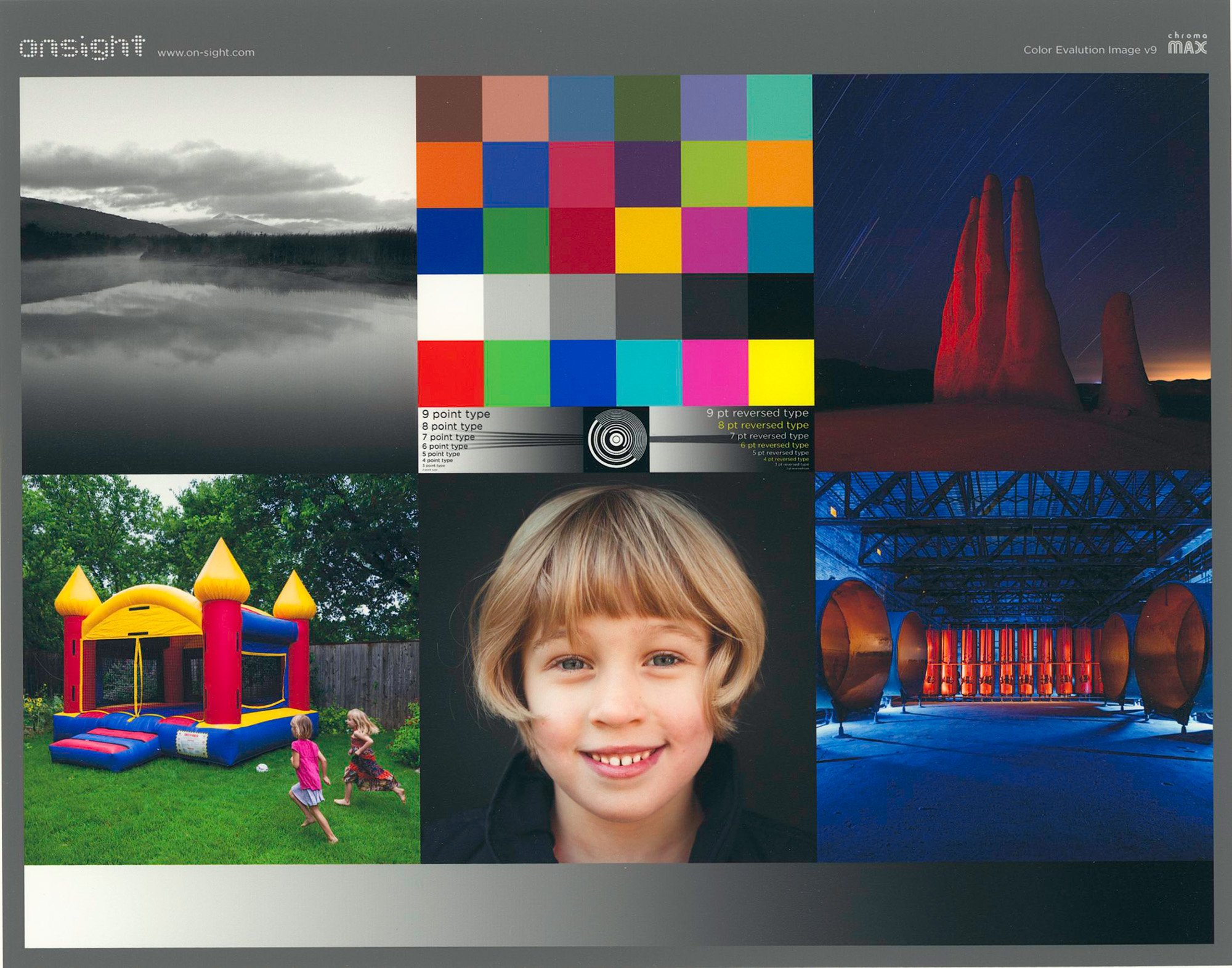
Now let’s look at what difference this makes in a printed photograph, specifically the Roman-16 dark tone grayscale evaluation photo. These differences are a bit subtle, so I’m not certain how obvious they will look transmitted over the Internet with low-resolution imagery, but let’s try and see (Figures 11, 12 and 13). In Figure 12 the detail in the man’s clothing comes out in more relief from the M3 rendition than from the M1 rendition in Figure 13, which is what one would expect comparing the red curves of Figures 9 and 10. Comparing photo versions 11, 12 and 13, to my taste, the M3 version is both more pleasing and closer in appearance to the reference version which I scanned from the BVDM catalog. All told, I find the Black and White reproductions on Canson Infinity Enhanced Satin to be rich and satisfying; their M3 profile does them justice.
Finally, with respect to hue bias in Black and White printing, the data for the a* and b* channels in the lower portion of Figure 5 indicates that neutrality is generally well preserved, a bit better for the M1 profile than the M3; (the closer those values are to 0, the more neutral, anything less than 1.0 not supposing to cause the appearance of non-neutrality). To the eye, hue bias in the greys is non-apparent.
Turning to the colour test images, whether using the M3 or M1 profiles, they print well and look good, regardless that with the M1 profile one attains a more accurate result relative to the file values of my 48-patch test for both colours and grayscale. The main difference between them is that the M3 results in a slightly brighter impression compared with the M1 (Figures 14, 15, 16 and 17). I could have a slight preference for the colour results from the M1 because they are a bit more saturated, and the grayscale results from the M3 because they are a bit brighter in the deep shade areas, but we’re dealing in small differences.
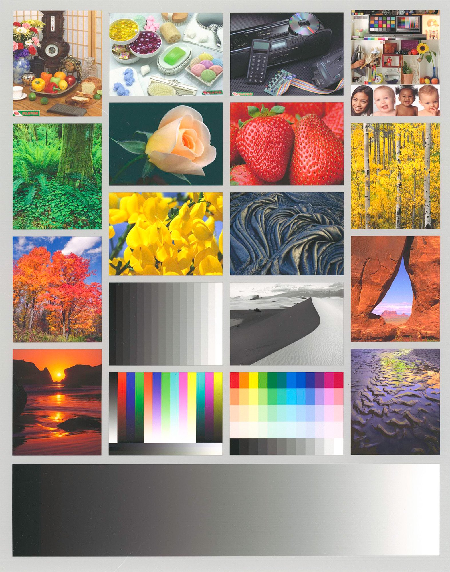
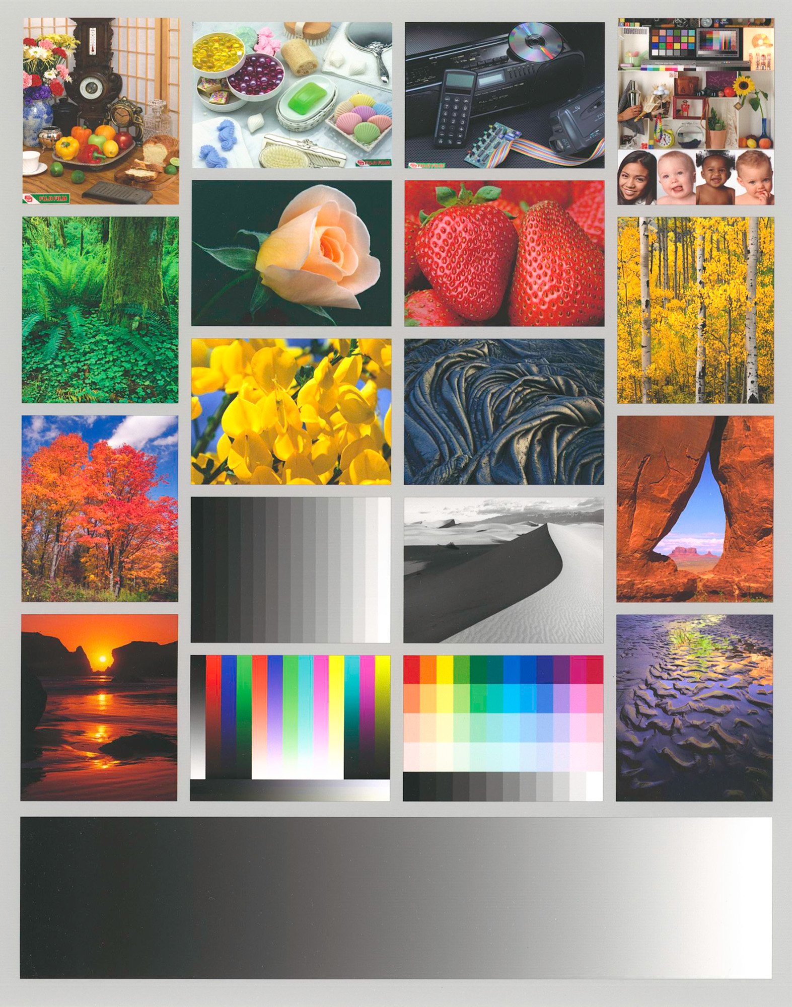

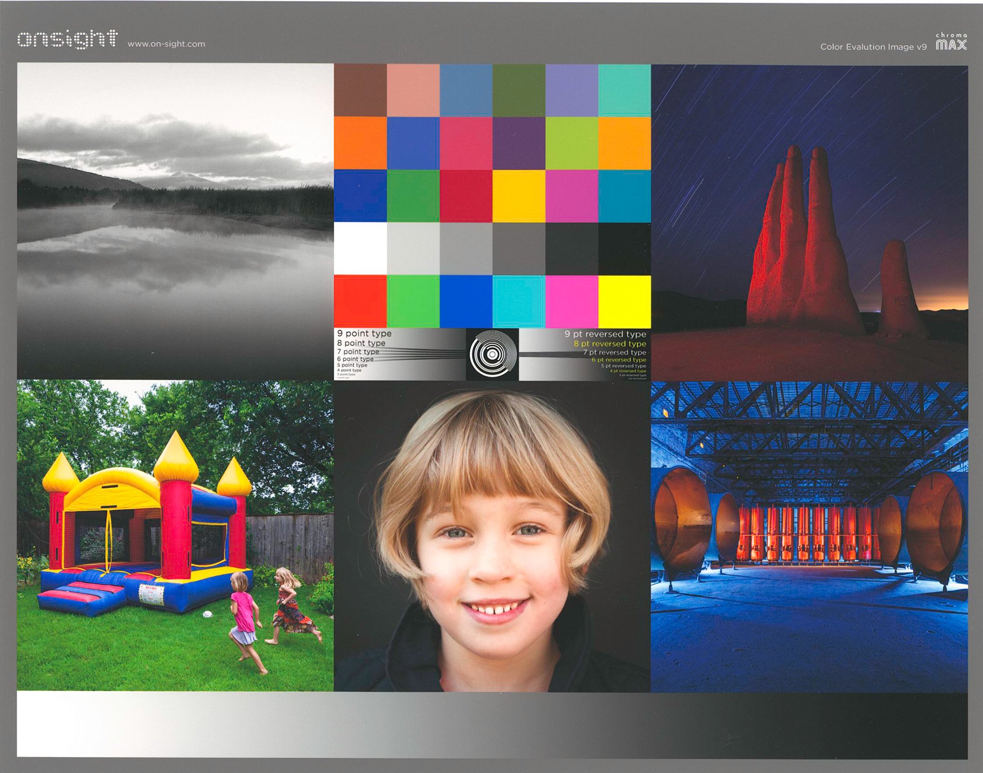
The good reproduction of fine detail in the boy’s hair, in the industrial scene (lower right) and in the type faces (center) indicate the resolution capabilities of both the Epson SC-P5370 printer and this paper. Whether with the M1 or M3 profiles, colour is credible, the latter delivering a result that has slightly more transparency in the deep shade areas.
Somerset Enhanced Velvet
Figure 18 shows the data summary from tests performed with this paper.
A profiling variant I tested for this paper is the choice of Media Type. Legion Paper prepared an EMYv2 Media Type which one may install in the more recent Epson professional printers using the Epson Media Installer, a piece of software I reviewed in my Epson SC-P5370 review and more recently in the SC-P7370 review. To remind, these files store the mechanical properties of the paper which the printer uses to determine ink-laydown and other printer operating conditions. Alternatively, Canson recommends Epson Velvet Fine Art (VFA) as the Media Type. I thought it may be interesting to see which approach (EMY vs. VFA) delivers more accurate results, and that is why there are columns in Figure 18 for both EMY-based and VFA-based custom (M1) profiles. The “OEM” is the Legion Paper M3-based profile.
Looking at the key results of Figure 18, once again row 3 shows the characteristic difference of statistical gamut volume between the M3 and M1 profiles, and in row 7 the statistical Black point of L*15 for the M1 profile and L*2 for the M3 profile – very similar to the results reviewed above for the Satin paper. Turning to the test results in rows 20 to 23, interestingly, using the VFA Media Type produced slightly more accurate outcomes than the EMYv2, but both these results are fine and at these low levels of difference one doesn’t notice a difference of print quality regardless of which is used.
Looking at rows 24 to 35 for the detailed grayscale, the picture is a bit more mixed in respect of whether using the VFA or EMY Media Type delivers more accurate output, but all of it is either below or close enough to the limit at which any of these differences would likely be noticed in a real photographic print.
The difference of accuracy results between the M1 and M3 profiles are, as usual, substantial for this kind of comparison. To remind, we aren’t looking for accuracy using an M3 profile, it’s for effect.
The comparative test prints with this paper look the same as they do for Satin so I won’t bother posting them. The Velvet is a slightly heavier paper than the Satin and has more tooth, but the prints look similar.
Somerset Enhanced Watercolour
This is the most textured and heaviest of the three papers, so I thought it could be interesting to see how well-preserved fine resolution can be with a quite textured matte paper in the Epson SC-P5370 printer. I did this by making a close-up scan of one part of the Onsight target which is particularly useful for evaluating resolution (Figure 19).
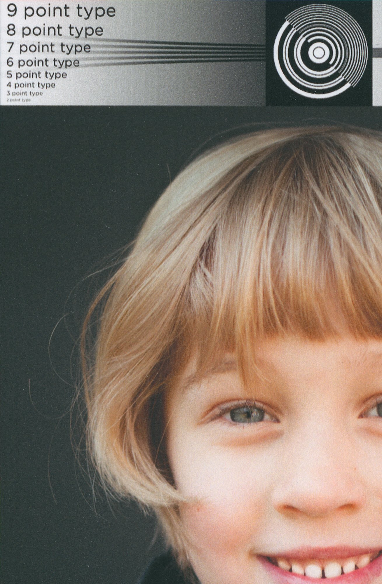
Three-point type and individual strands of hair are clearly distinct, good, especially considering this is a 48-bit high resolution scan from an Epson V850 flatbed scanner – a good piece of equipment but every stage of a transformation can be counted on to degrade sharpness just a little.
Now, unlike for the two previous papers, Legion Paper did not make an M3 profile. They provide an M0 profile. This is more directly comparable to the M1 custom profile I made, especially as the paper has no OBA content and we are both using the same EMYv2 and VFA paper as the Media Type. More important than the difference of Measurement Condition between them is the fact that they made their profile on their SC-P5370 printer, and I tested that profile on my SC-P5370 printer. Therefore, the consistency loop is broken in respect of machines used between the making and the testing of their profile, which is not the case for my profile made and tested with the same printer. There is not necessarily anything “wrong” with either their printer or mine, it’s just that certain subtle printing conditions may differ enough to make their generic profile perform less accurately in my printer than my custom does. That is indeed what we see in the Summary Data of Figure 20.
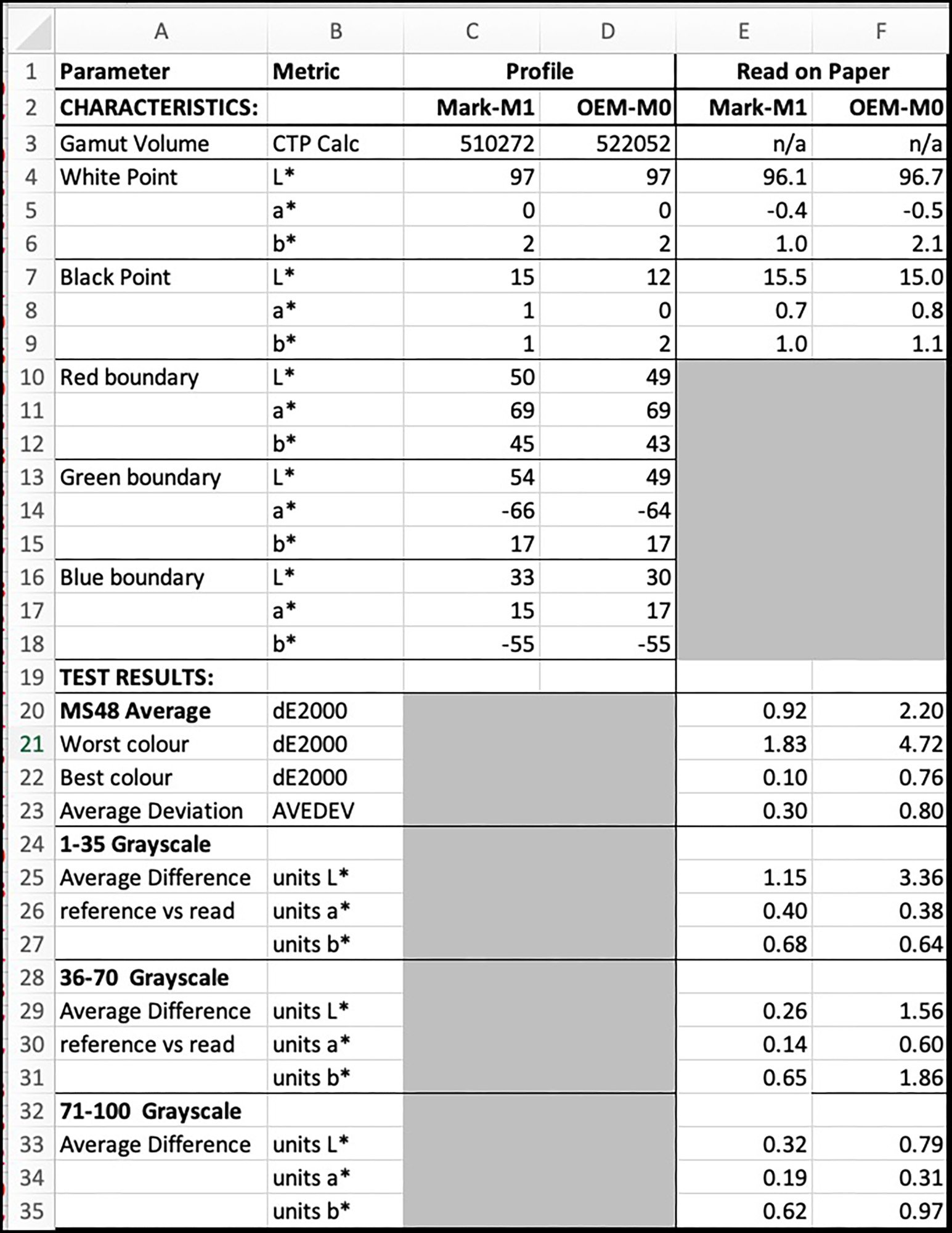
The gamut volume is not significantly different between the two profiles. While the M0 profile has a several level deeper Black point as read in ColorThink 4, when the Black point is tested for both profiles in prints, the measured difference of the Black point turns out to be insignificant – L*15.0 vs. L*15.5. The colour boundaries of the two profiles show only small differences as well. While the average dE from the 48-patch test is 0.92 for the custom M1 profile but 2.2 for the Legion M0 profile, one should not make too much of this difference, because the test prints from each profile look very similar (Figures 21 and 22).
If upon close examination of these prints you observe that the OEM version is just slightly brighter, that’s because it is, and the evidence of why this is expected turns up in the reading of the grayscale results graphs for the two profiles (Figure 23).
You should notice that from about L*16 upward until L*60, the grayscale rendition of the CIFA profile is ever so slightly brighter than the test file reference values and that of the Custom profile (the space between the red and black lines on the graph). This indicates that from deep shade into the mid-tones, the result from using the OEM M0 profile, at least in my printer, produces an ever so slightly lighter rendition. As I mentioned, these differences are small, and without these kinds of close comparisons of images and data, they would go unnoticed. Seen independently, both prints would be considered highly acceptable.
In conclusion, I enjoyed working with these papers. The surface textures are pleasing, they produce a nice gamut for matte papers, and the black and white renditions are particularly pleasing for their near neutrality and rich Blacks.
Mark D Segal
Toronto, October 2025
Have thoughts or insights on these papers and profiles? Join the conversation in our forum here.


Elevate Your Vision


Read this story and all the best stories on The Luminous Landscape
The author has made this story available to Luminous Landscape members only. Upgrade to get instant access to this story and other benefits available only to members.
Why choose us?
Luminous-Landscape is a membership site. Our website contains over 5300 articles on almost every topic, camera, lens and printer you can imagine. Our membership model is simple, just $2 a month ($24.00 USD a year). This $24 gains you access to a wealth of information including all our past and future video tutorials on such topics as Lightroom, Capture One, Printing, file management and dozens of interviews and travel videos.
- New Articles every few days
- All original content found nowhere else on the web
- No Pop Up Google Sense ads – Our advertisers are photo related
- Download/stream video to any device
- NEW videos monthly
- Top well-known photographer contributors
- Posts from industry leaders
- Speciality Photography Workshops
- Mobile device scalable
- Exclusive video interviews
- Special vendor offers for members
- Hands On Product reviews
- FREE – User Forum. One of the most read user forums on the internet
- Access to our community Buy and Sell pages; for members only.
You may also like