April, 2005
In order to properly evaluate equipment, you need the right tools for the job. When it comes to screen profiling, printer profiling, soft proofing, and similar colour management endeavours, there are a number of useful test files available. Some are free, some are available for download, and some come with various books and programs. But there are two mathematically-derived test charts you can make yourself that are both useful and consistent from user to user. All that’s needed to create them is a copy ofPhotoshop.
In the weeks and months ahead, I will be writing a new series of articles on the topics of colour management, profiling, inkjet printing, soft proofing and the like. To learn from these articles and to apply that knowledge to your own work, you will require access to certain test charts.
Here then are the instructions for creating those charts. If you are printing and profiling currently with a colour managed workflow, you may find these to be of immediate value. Otherwise, just create them and file them away for the time that you need them. I’ll have more to say about how to use these files for various aspects of colour management work in the days ahead.
As always, the only difference between PC and Mac commands in Photoshop is the use of the CTRL vs the CMD key.
_____________________________________________________________
Granger Chart
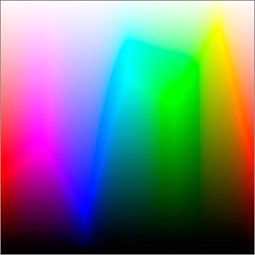
Create a new file. CTRL / CMD – N. I make mine 10 inches by 10 inches at 300 ppi in 16 bit RGB mode. Make sure that the Background colour is White.
Select the gradient tool (G) and then, from the Gradient Picker, the gradient called Spectrum. You may have to add ‘Spectrum’ from the drop-down menu within the Gradient Picker. Set the Mode to Normal and
Opacity to 100%.
Draw a gradient from left to right across your document while holding down the Shift key. (This keeps the line and the gradient straight).
Create a new layer CTRL / CMD SHIFT – N with the default settings of Normal, 100% Opacity & 100%.
Select the gradient tool (G) again, this time choose the ‘Black, White’ gradient from within the Gradient Picker. Draw a gradient from the bottom to the top your document while holding down the
Shift key.
Finally, double click on the ‘Layer 1’ thumbnail of your Layers palette to call up the ‘Layer Style’ dialog box. Change the Blending Mode to ‘Luminosity’.
Flatten the two Layers of your document, and save the file in a place where you won’t misplace it. I call itGranger Chart.
A word of caution. Because this file is mathematically derived, it contains colours which no display device, from screens to printers, can completely display properly. That’s what makes it such a powerful evaluation tool.
Thus the web graphic shown here will likely look somewhat different to yours in its edge shading due to the restrictions of web graphics and your display.
_____________________________________________________________
Gamut Chart
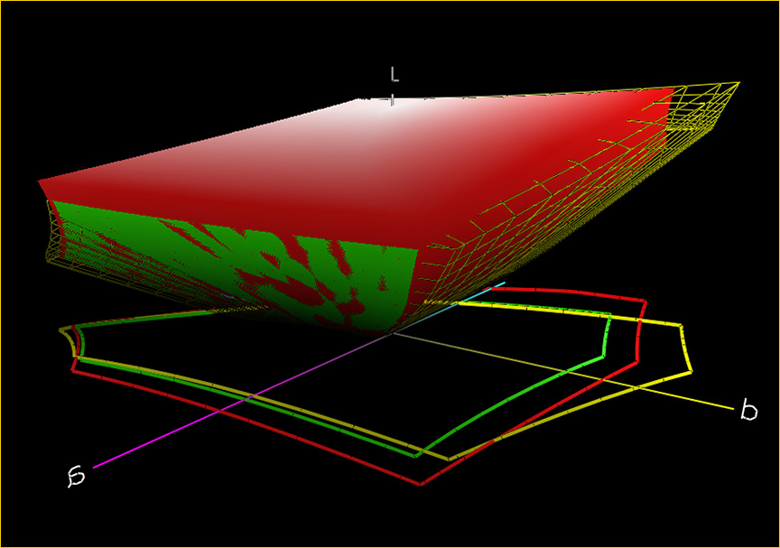
This chart is very useful for judging a device’s ability to display subtle hues and tonalities.
Create a new file. CTRL / CMD – N. I make mine 10 inches by 10 inches at 300 ppi in 16 bit mode. Make sure that the Background colour is White.
Convert the file to LAB mode; Image / Mode / Lab Color.
Select the Channels palette. Select the ‘a’ channel.
Select the gradient tool (G) and then the ‘Black, White’ gradient. Set mode to ‘Normal’ and ‘Opacity’ to 100%. Draw a gradient from left to right across your document while holding down the Shift
key. (This keeps the line and the gradient straight).
Select the ‘b’ channel.
Using the current gradient settings draw a gradient from the bottom to the top of your document while holding down the Shift key.
Click on the Lab channel.
Convert the file back to RGB mode; Image / Mode / RGB Color.
Save the file in a place where you won’t misplace it. I call itGamut Chart.
A word of caution. Because this file is mathematically derived, it contains colours which no display device, from screens to printers, can completely display properly. That’s what makes it such a powerful tool. Thus the web graphic shown here will likely look somewhat different to yours due to the restrictions of web graphics and your display.
Elevate Your Vision


Read this story and all the best stories on The Luminous Landscape
The author has made this story available to Luminous Landscape members only. Upgrade to get instant access to this story and other benefits available only to members.
Why choose us?
Luminous-Landscape is a membership site. Our website contains over 5300 articles on almost every topic, camera, lens and printer you can imagine. Our membership model is simple, just $2 a month ($24.00 USD a year). This $24 gains you access to a wealth of information including all our past and future video tutorials on such topics as Lightroom, Capture One, Printing, file management and dozens of interviews and travel videos.
- New Articles every few days
- All original content found nowhere else on the web
- No Pop Up Google Sense ads – Our advertisers are photo related
- Download/stream video to any device
- NEW videos monthly
- Top well-known photographer contributors
- Posts from industry leaders
- Speciality Photography Workshops
- Mobile device scalable
- Exclusive video interviews
- Special vendor offers for members
- Hands On Product reviews
- FREE – User Forum. One of the most read user forums on the internet
- Access to our community Buy and Sell pages; for members only.
You may also like