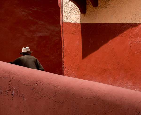
What Is Compositional Balance?

Balance is a compositional tool which often works in tandem with the centre of interest.
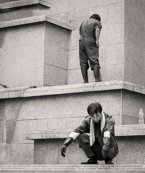
When we talk about balance, we often think of two objects the same size. For instance, two people the same size and shape, sitting on either side of the frame, would be considered balanced. Balanced and probably a bit boring!
A ton of metal will balance a ton of feathers, but in terms of size and area, the ton of feathers will be much larger.
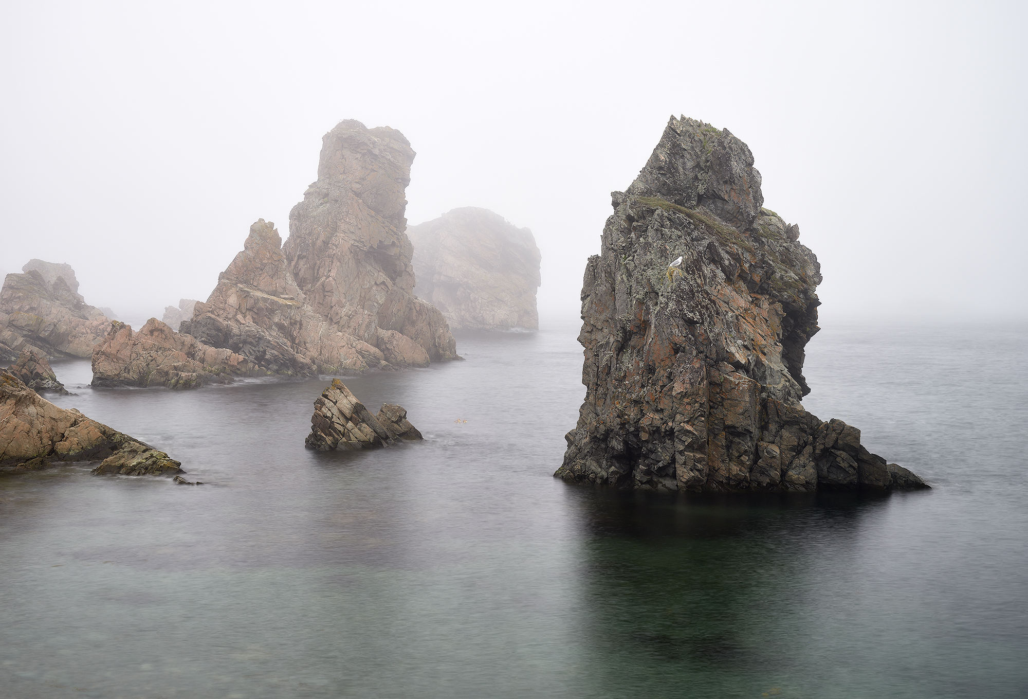
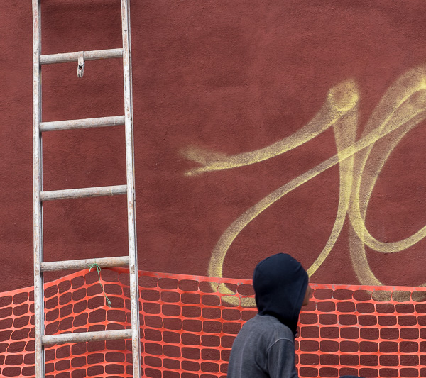
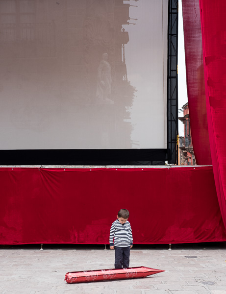
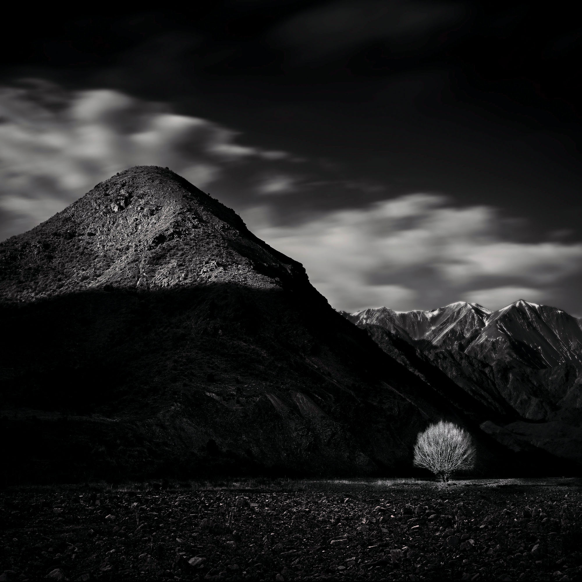
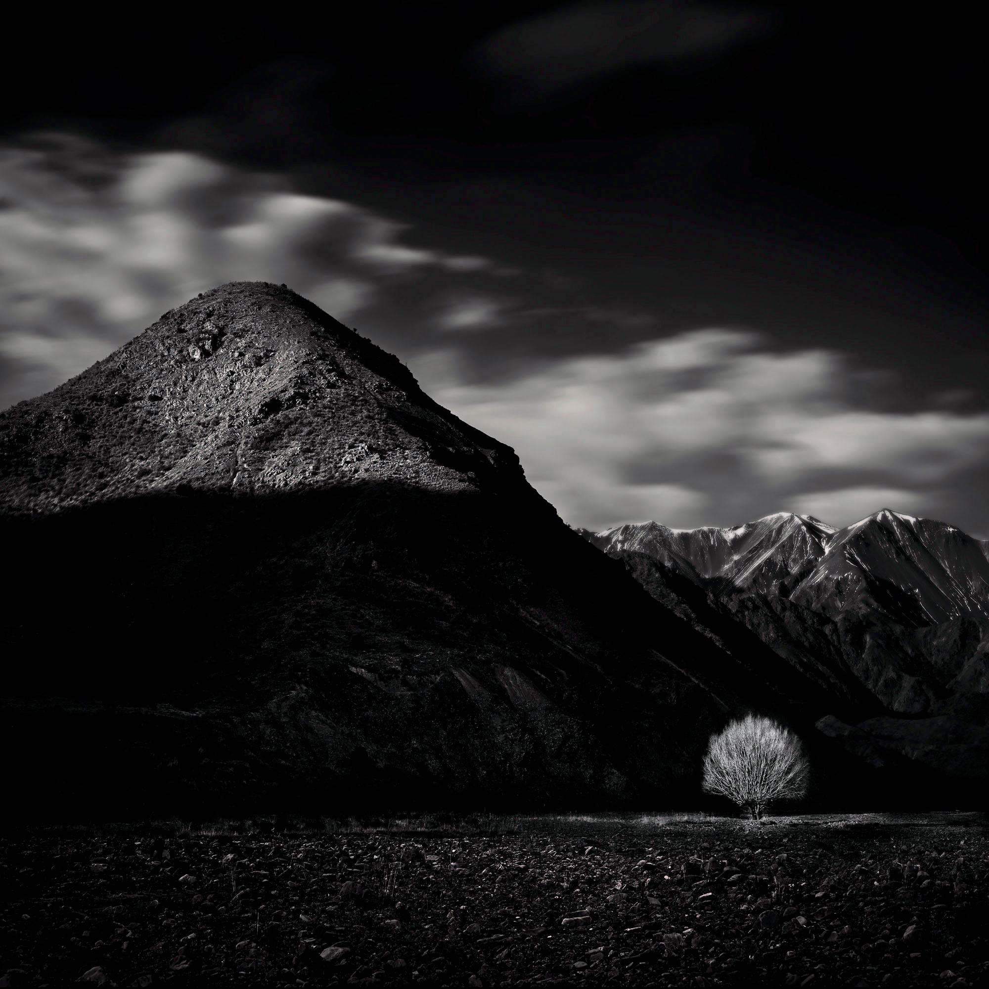
In the same way, a small compositional element within a frame can balance a much larger element elsewhere. A small tree can balance a large mountain, a single red leaf in a tree can balance one hundred surrounding green leaves.
Compositional balance can also be implied. A lone building in a large open expanse or perhaps on a hill covered with trees, can appear balanced – the small structure balances the huge space surrounding it. It is considered balanced because the importance of the building is so much greater than the empty space or the surrounding forest.
The next question is not so easy to answer: how much space or how much bigger can one compositional element be than another and still end up with a balanced composition? And where do you position these elements within the frame?
There are no hard and fast rules and it depends on the subject matter, lighting and a host of other issues.
To achieve balance may require you to crop your image, to change the amount of space or the position of elements within the frame.
When shooting with your camera, consider taking some wider views of your subject which will allow you to crop them later on. Most cameras have sufficient pixels to allow you to crop and still produce a high quality image.
Post-production also becomes an important part of creating balance in the image. In the photograph of the tree and mountain above, large areas of the photograph (the sky, mountain and foreground rocks) have been significantly darkened. This allows the small, sunlit tree to stand out more strongly. A small light area can ‘balance’ much larger areas of dark or dim shadows.
However, without the post-production, this balance wouldn’t be so apparent. The tree’s surroundings would have competed with the light tree. The balance between the mountain and the tree would not be at all obvious, if perceived at all. So, in addition to compositional balance, we can talk about tonal balance. And colour balance too, of course.
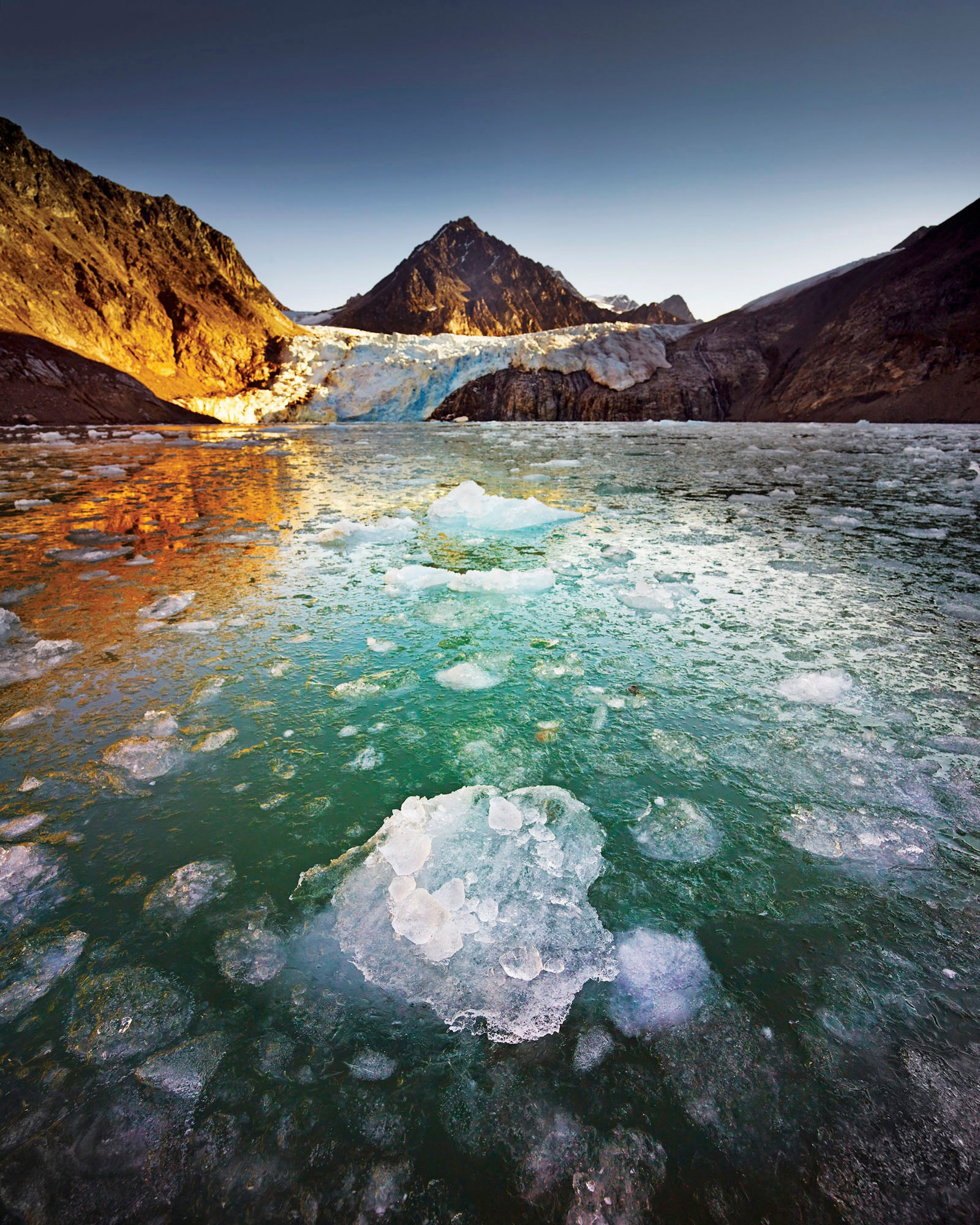
In the examples on the next page, you can see that compositional balance usually involves sides – left and right, top and bottom. Either the space is balanced on either side, or the compositional elements are positioned on opposite sides or corners.
Don’t forget if you are a silver or gold member you can click on an image and see it larger.
Balance is a tricky concept to explain, but with a basic understanding, you can start to look at photographs in a new light. Certainly one of the main reasons particular photos work so well is that they are compositionally balanced.
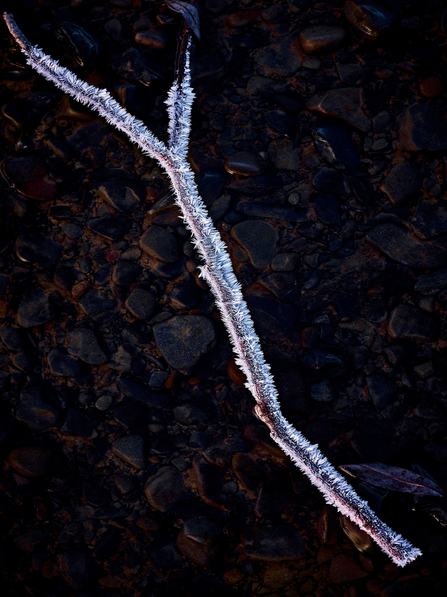

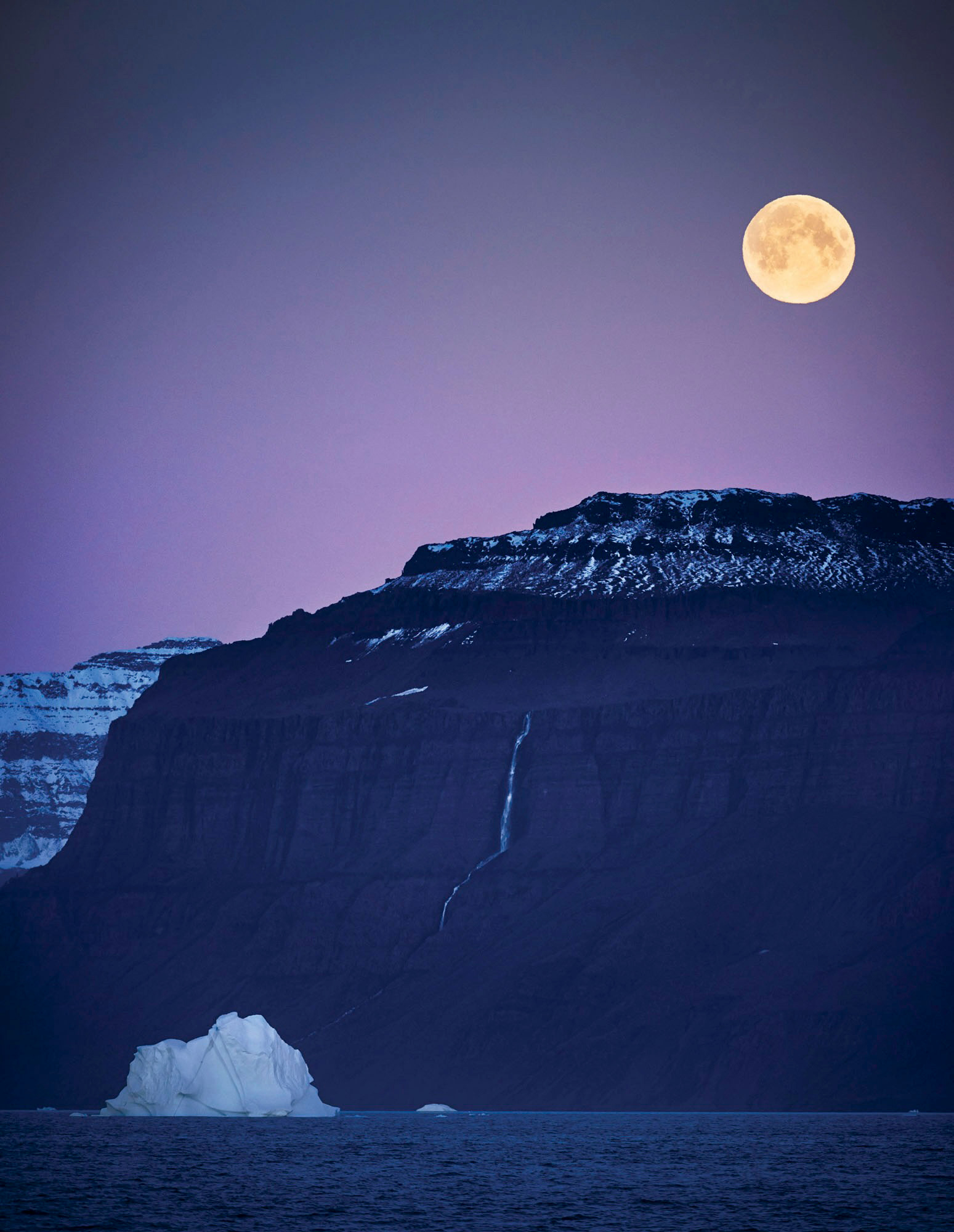



Repetition, Patterns & Textures


Sometimes several centres of interest can produce an interesting image and if the centres of interest are all the same or similar, so much the better.
This is called repetition.
Repetition as a compositional tool seems to work for most viewers, probably because people like to see lucky coincidences.
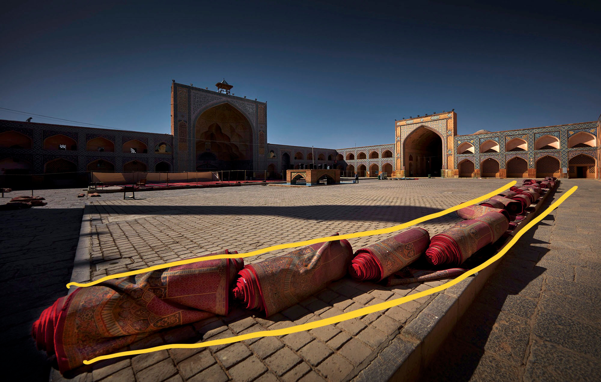
To see one object in a photograph can be great, to see two, three or four in a row, all exactly the same as the first one, is a bonus.
Exactly why people like seeing multiples is something the psychologists can debate; but for photographers, repetition certainly works.
Some of the best repetitions are created when your framing is tight, meaning the objects being repeated are quite large within the frame.
If the repeating objects are too small within the frame, there often isn’t sufficient impact or importance. A telephoto lens is often the best choice so you can ‘get in close’ and concentrate on the repetition, excluding competing elements within the scene.
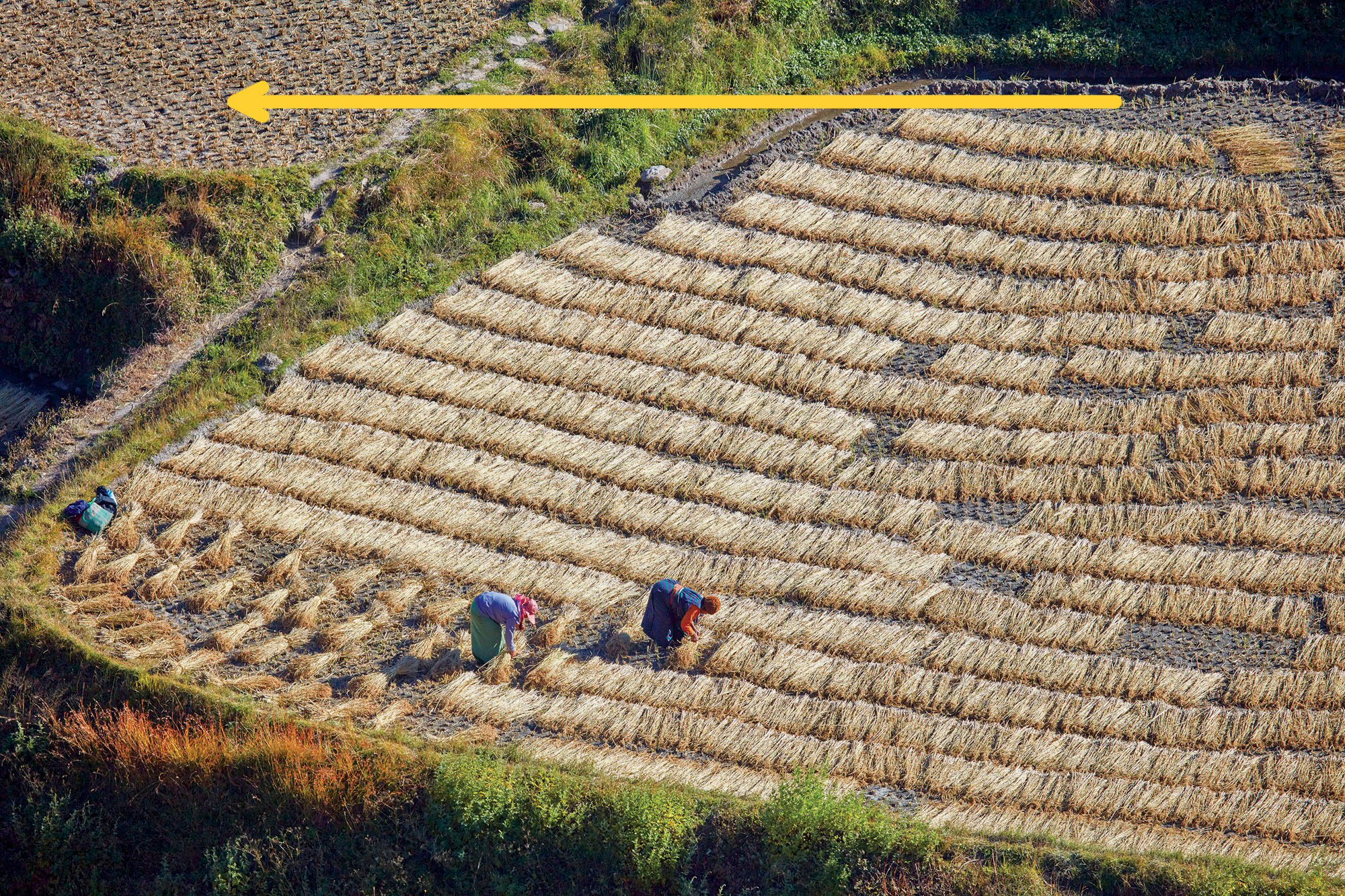
Pattern is similar to repetition, but on a larger scale. Patterns can be found in fields in a landscape, tree trunks in a forest, or ripples on water. Some patterns can be found in textures, such as bark on a tree or sand on a beach.
Patterns can work without a centre of interest, as long as the pattern extends from one edge of the frame to the other.
Patterns lose their impact if there are other compositional elements intruding into the frame. However, having something that contrasts with the pattern can be a good thing.
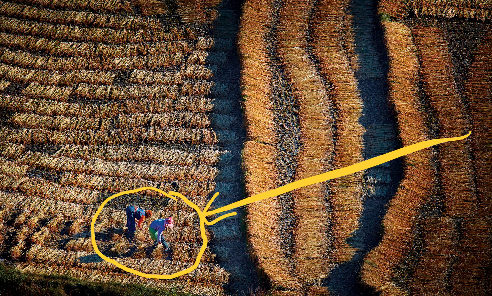
For example, a pattern of fields can lose its impact if the fields are replaced by trees or a different type of landscape. In comparison, a photo with fields that extend from corner to corner, but are broken up by a farmer in a truck can be quite powerful.
However, pattern photos are usually best presented with other images taken of the same location to give them some meaning or context.
Both patterns and repetitions can work really well if there are some noticeable differences in one or more of the subjects.
A row of people can look great, but if the second one from the end is wearing different clothes or has a hat on, it creates more interest.



Peter Eastway
May 2022
Read this story and all the best stories on The Luminous Landscape
The author has made this story available to Luminous Landscape members only. Upgrade to get instant access to this story and other benefits available only to members.
Why choose us?
Luminous-Landscape is a membership site. Our website contains over 5300 articles on almost every topic, camera, lens and printer you can imagine. Our membership model is simple, just $2 a month ($24.00 USD a year). This $24 gains you access to a wealth of information including all our past and future video tutorials on such topics as Lightroom, Capture One, Printing, file management and dozens of interviews and travel videos.
- New Articles every few days
- All original content found nowhere else on the web
- No Pop Up Google Sense ads – Our advertisers are photo related
- Download/stream video to any device
- NEW videos monthly
- Top well-known photographer contributors
- Posts from industry leaders
- Speciality Photography Workshops
- Mobile device scalable
- Exclusive video interviews
- Special vendor offers for members
- Hands On Product reviews
- FREE – User Forum. One of the most read user forums on the internet
- Access to our community Buy and Sell pages; for members only.


