The portraits hit my feed like a splash of cold water.
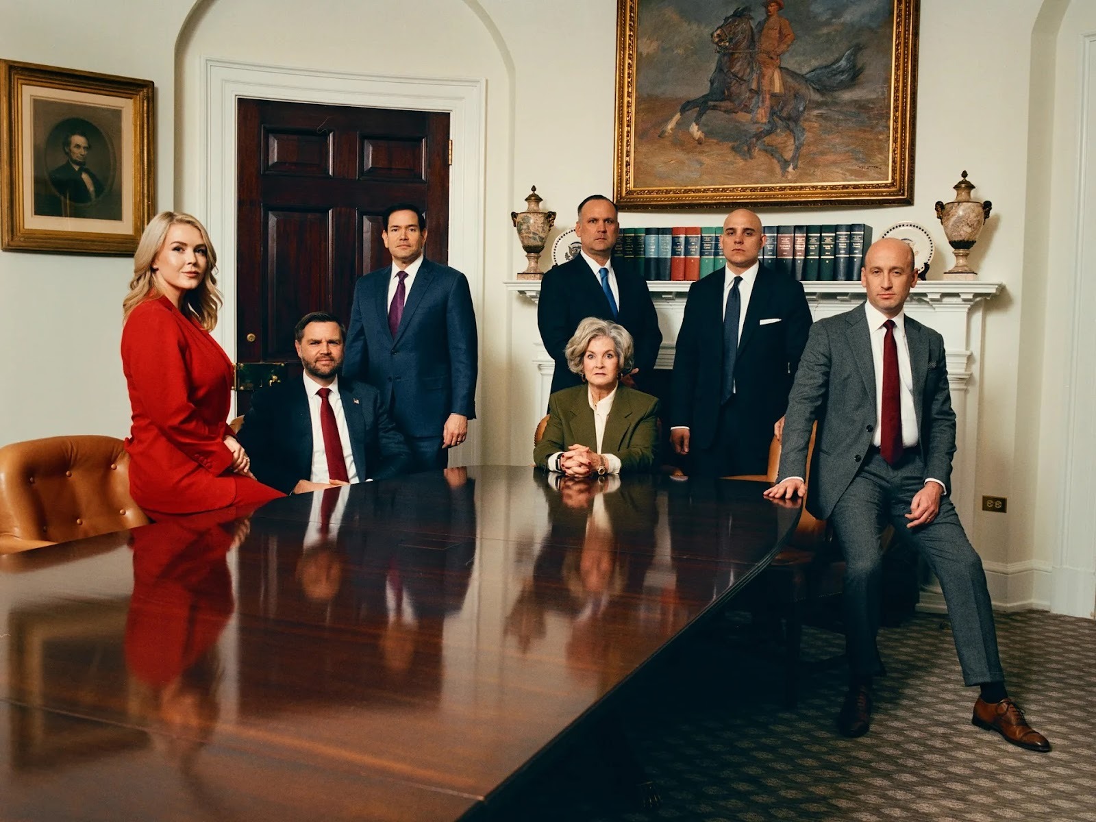
I was scrolling through TikTok – as one does – when I stumbled into a firestorm. People were losing their minds over a series of photographs from Vanity Fair. The subjects? White House Chief of Staff Susie Wiles, Press Secretary Karoline Leavitt, Vice President JD Vance, Secretary of State Marco Rubio, and several other Trump administration officials. The reaction? Visceral. Words like “diabolical,” “crazy,” and “jump scare” kept appearing in the comments. Someone joked that Vanity Fair should have included a warning.
What had the photographer done to these people?
As photographers, we know the answer – it was what wasn’t done. A portrait reveals a story of the person.
And the story behind these images sent me down a rabbit hole that I think we as photographers should explore. So let me share what I found, because there’s something important here about craft, intent, and the choices we make every time we press the shutter.
The Photographs
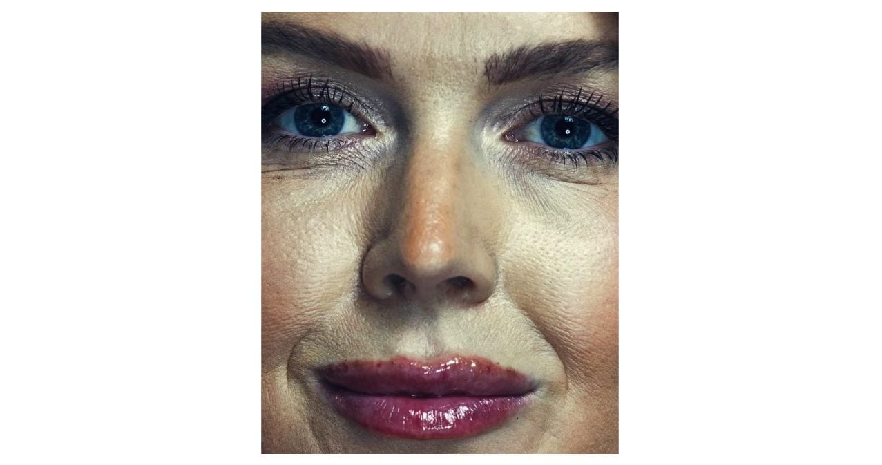
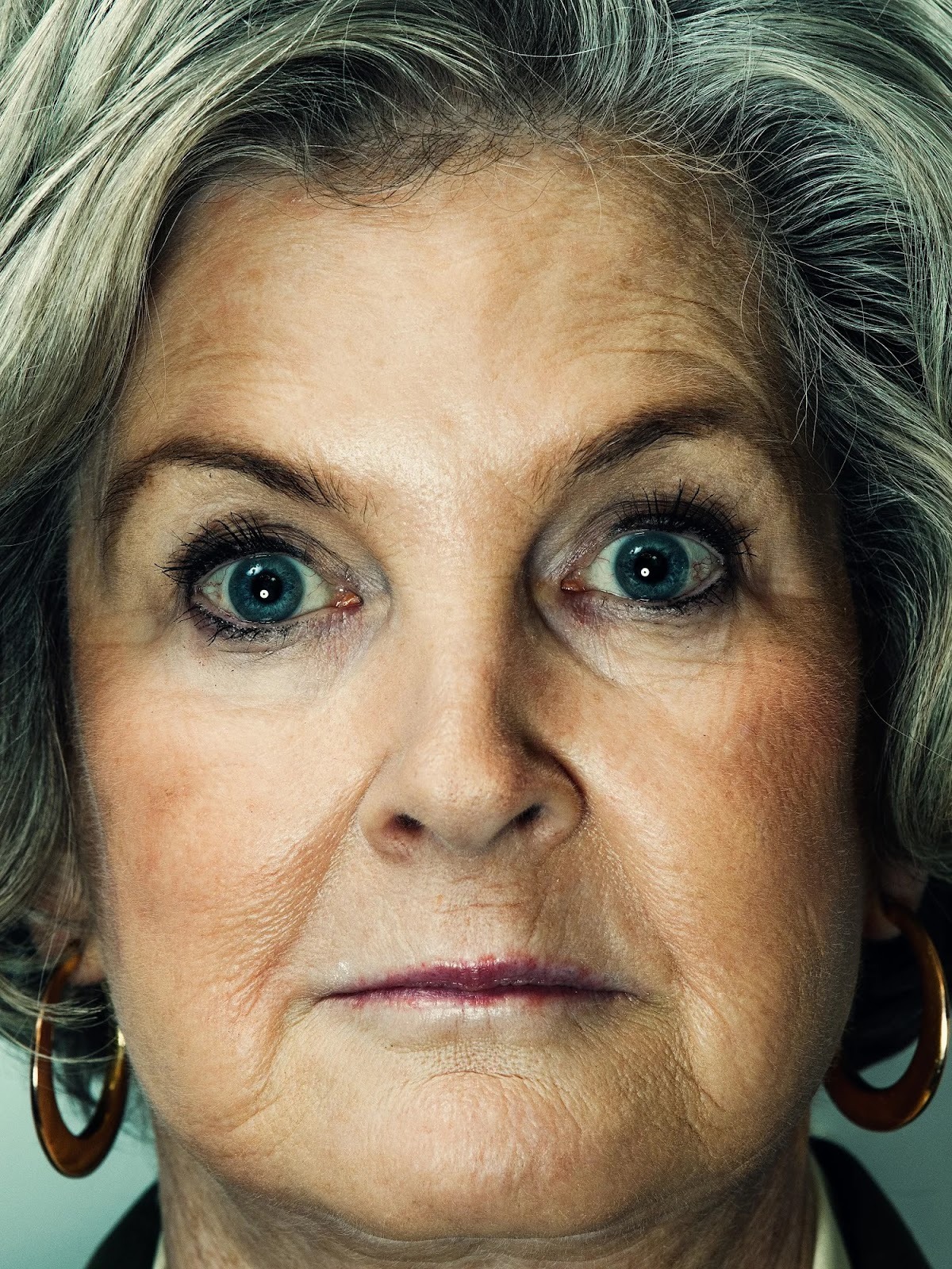
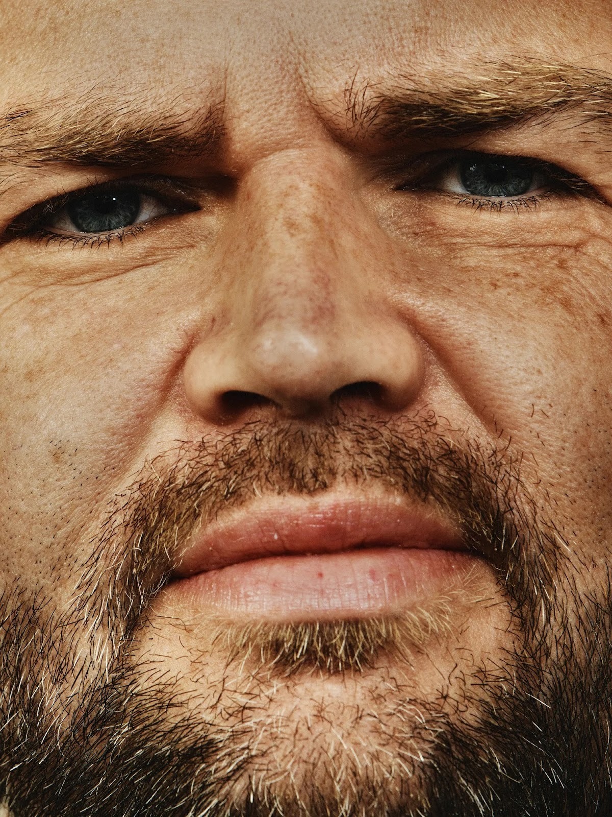
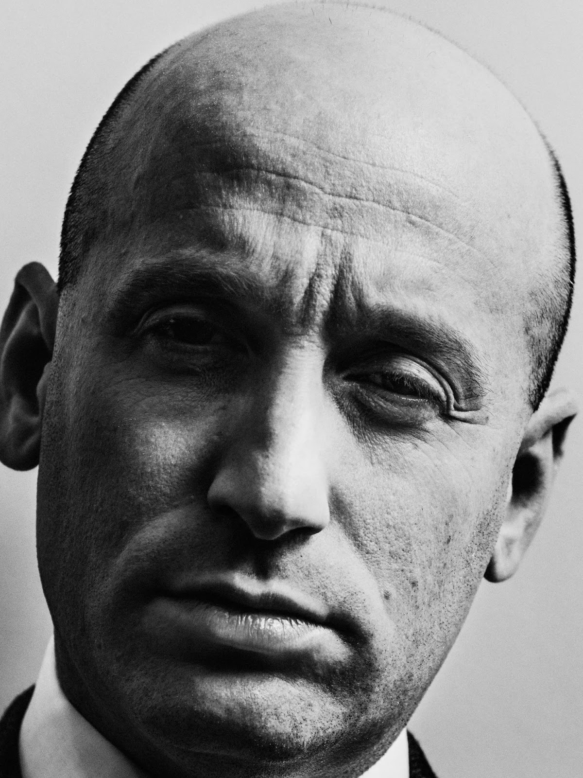
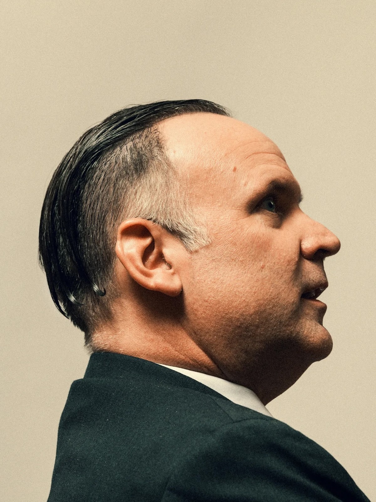
On December 16, 2025, Vanity Fair published an exclusive two-part feature on Susie Wiles. Alongside Chris Whipple’s candid interviews, the magazine ran a portfolio of extreme close-up portraits. And I mean E.C.U. (extreme close up).
Every freckle, every wrinkle, every pore, every stray hair, and yes – every makeup smudge – rendered in extreme detail.
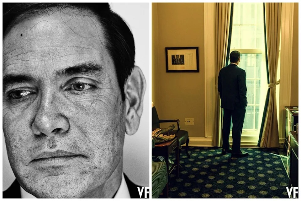
One Instagram commenter put it perfectly: “Did VF use the camera from the dermatologist that shows sun damage?” In Karoline Leavitt’s portrait, viewers could see what appeared to be cosmetic injection marks on her lips. Rubio’s heavily textured skin became the subject of memes. Vance’s portrait was called a “jump scare.”
The backlash was immediate. Marco Rubio publicly accused Vanity Fair of maliciously doctoring the photos to make Trump’s team “look bad.” The magazine denied any deceptive editing.
But here’s what fascinated me as a photographer: the images weren’t really doctored. They were simply photographed with intention – an intention that ran counter to everything we’ve come to expect from political portraiture.
The Man Behind the Lens
The photographer responsible for the visuals is Christopher Anderson, and understanding his background makes these portraits more interesting.
Anderson isn’t some provocateur looking for controversy. He’s an award-winning photographer with lots of credentials. Born in 1970 in Canada and raised in west Texas, he first gained international recognition in 1999 when he won the prestigious Robert Capa Gold Medal for his reportage on Haitian migrants crossing the sea in a rickety boat – a journey during which the boat actually sank. That harrowing experience shaped his entire approach to photography.
He spent years as a member of Magnum Photos from 2005 to 2023, covering conflict zones in Afghanistan, Iraq, Lebanon, Israel/Palestine, and Venezuela. From those experiences, he developed a reputation for photographs with what critics call an “emotionally charged connection” to his subjects – whether ordinary people or world leaders. He later served as Photographer-in-Residence at New York Magazine, helping craft its striking visual style.
His portfolio includes countless public figures – celebrities, artists, heads of state – and shot for outlets like The New York Times Magazine, Esquire, and WSJ. His 2018 series “Approximate Joy” used extreme close-ups of strangers in China to reveal unguarded expressions, deliberately countering what he called the “self-perfected images” we typically see in media.
This is a photographer who has spent decades thinking about truth, power, and the human face.
The Intent: Penetrating the Theater
When asked about these specific Vanity Fair portraits, Anderson’s explanation reveals everything about his artistic vision.
“Very close-up portraiture has been a fixture in a lot of my work over the years,” he told The Independent. “I’ve done a lot of close-ups in the same style with people of all political stripes.”
His stated goal? “I try to cut through the image that politics want to project and get at something that is more truthful.”
Let’s think about that for a moment. In an era of Instagram filters, Facetune, and carefully managed PR images, Anderson is doing the opposite of what’s expected. He’s using his camera not to flatter, but to reveal. Not to smooth, but to sharpen. Not to distance, but to move uncomfortably close.
He describes his approach as an attempt to “penetrate the theater of politics” – to get past the stage-managed image that powerful people project. Rather than the usual flattering light and touch-ups that politicians often receive, Anderson opts for a raw, high-fidelity look that he feels captures a more authentic truth.
During the shoot itself, there was clearly an awareness of what was happening. Vice President JD Vance reportedly joked with Anderson, “I’ll give you $100 for every person you make look really s–tty compared to me. And $1,000 if it’s Marco.” The subjects knew these portraits would be revealing. They participated anyway.
Perhaps the most telling exchange came with Stephen Miller, who subtly appealed to Anderson’s mercy after his session. “You know you have a lot of power in the discretion you use to be kind to someone in your photographs,” Miller said.
Anderson’s reply? “You know, you do too.”
The Technical Breakdown: How He Did It
Now we get to the part that matters most to us as photographers. How did Anderson achieve this look? While Vanity Fair hasn’t published a complete gear list, we can piece together the technical approach from interviews, the images themselves, and accounts from people who’ve worked with him.
Camera and Capture
Anderson used a high-resolution medium-format camera for the White House shoot. Medium format sensors capture far higher resolution and color detail than standard full-frame DSLRs, producing images where you can zoom into every pore without losing clarity. The massive file sizes give enormous latitude in post-processing while maintaining that razor-sharp detail. Hasselblad? Fuji?
But gear alone doesn’t create this look. The key technical choice was shooting distance.
These aren’t telephoto crops. Anderson physically moved close to his subjects – uncomfortably close. The “you could drive a Buick into Marco Rubio’s pores” reaction comes from genuine proximity, not aggressive cropping. From his previous political work in projects like “Stump” and “Approximate Joy,” we know he tends to work in the short-tele to normal range – roughly 50-85mm full-frame equivalent. This creates a slightly dimensional, “in-your-space” feeling rather than the flattened compression of a 200mm headshot.
The result emphasizes textural detail: pores, fine lines, tiny flyaway hairs. Everything that most portrait photographers work to minimize, Anderson amplifies.
Lighting: Hard, Direct, and Unforgiving
Vanity Fair described the setup as “specific lighting” – and that’s an understatement.
According to people who have worked with Anderson, he’s a “huge fan of direct, bare bulbs that illuminate the smallest details” and doesn’t shy away from overexposing. This is the opposite of beauty lighting. Where most portrait photographers reach for large softboxes and fill cards to wrap the face in flattering, diffused light, Anderson uses hard, relatively frontal light from a small, undiffused source – likely bare strobe or a small reflector.
This lighting choice is deliberate and devastating. Hard light catches every micro-texture in skin. It highlights makeup transition edges and fine lines. It throws minimal fill into shadows, preserving contrast that reveals rather than conceals.
The result? That slightly clinical, “dermatologist camera” vibe that viewers noticed. The light doesn’t sugar coat – it documents.
Exposure and Sharpness
The coverage consistently stressed that these photos show “every freckle, line, strand of hair and makeup smudge.” That level of detail requires specific technical choices.
Anderson likely used a high-resolving power lens – a modern prime or top-end zoom with excellent microcontrast and high acutance. The aperture was probably in the f/4-f/8 range rather than wide open, keeping most of the face in crisp focus rather than using shallow depth of field to soften details. Shutter speed and ISO were tuned for clean, low-noise files – these are editorial-level portraits, not grain-driven.
It’s important to note that the extreme sharpness isn’t primarily from post-processing. The detail comes from a combination of very sharp capture, hard light, and color/contrast work that emphasizes separation between tones. Some global and local sharpening to emphasize edge contrast around pores and hair is likely, but the foundation is built in-camera.
Color and Post-Processing
Anderson’s color work is where things get really interesting – and where I have a theory.
His images are widely discussed for their distinctive color palette. Colleagues describe his look as having “very strong and saturated colors while not coming off as over saturated,” reminiscent of film. He’s been called a “master of color as much as light,” often using tone curves and levels to give a paper-like, slightly lifted-black feel while still being punchy.
For these portraits, that translated to saturated but not cartoonish skin tones with strong separation between warm skin and cooler backgrounds. There’s likely subtle shifting in hue using RGB curves or calibration rather than heavy LUTs. The contrast is pulled toward the edges of the histogram for strong overall contrast, then a lifted black point using the tone curve gives blacks a “paperlike” feel rather than deep crushed shadows.
But here’s what struck me most: the way color variation in skin feels so intense. The redness, sun damage, and undertones are all hyper-visible in ways that standard portrait processing actively suppresses.
The Color Variance Theory: A Deliberate Choice
This is where my rabbit hole led somewhere unexpected.
When I looked at these portraits, I kept thinking about the new feature in Lightroom Classic’s – it’s the Point Color feature in the Color Mixer. It’s a tool that lets you select specific colors in an image and adjust how they’re rendered. When you select a skin tone with the eyedropper, you get access to a Variance slider.
Most photographers use this tool in the expected direction: slide Variance to the right, and the selected skin tones become more uniform, smoother, more consistent. It’s a subtle way to even out blotchiness without heavy retouching.
But slide Variance to the left? The opposite happens. The tool accentuates the differences between colors present in the skin. Reds become redder. Yellows become yellower. All those subtle variations that make up natural skin tone – variations you can technically see with your eye but that we’ve trained ourselves to overlook – suddenly become prominent. Things get blotchy, fast.
Looking at the Vanity Fair portraits, I believe Anderson – or his post-processing team – deliberately pushed color variance in this direction. It’s not about adding something that isn’t there. It’s about revealing what’s already present but normally minimized.
If you wanted to make a subtle criticism of powerful people – or should I say a colorful criticism – this would be an elegant way to do it. Every imperfection is real. Every blotch exists. The photographer simply chose not to hide them.
Try It Yourself: The Lightroom Technique
Want to experiment with this effect? Here’s how to explore color variance in Lightroom Classic:
- Open your portrait in Lightroom Classic’s Develop module
- Navigate to the Color Mixer panel on the right side
- Click on Point Color at the top of the Color Mixer
- Select the eyedropper tool
- Click on a representative skin tone in your image – try the cheek or forehead
- Find the Variance slider that appears after your selection
- Slide Variance to the LEFT to decrease color variation – skin becomes smoother and more uniform
- Slide Variance to the RIGHT to increase color variation – skin tones become more prominent and distinct, revealing the natural blotchiness and color differences in the skin
The effect is dramatic. Even a small adjustment left can make a significant difference in how skin reads. Push it further and you’ll start to see the kind of unforgiving detail present in Anderson’s work.
This is about making a choice – the same choice Anderson makes – about what level of reality you want to present. Most commercial and portrait work pushes variance left, smoothing and unifying. Anderson’s work pushes right, revealing and differentiating.
The Curious Case of the Missing Images
Here’s something that struck me as I researched this piece.
When I Google “Vanity Fair Karoline Leavitt,” her unflinching portrait doesn’t appear at the top of image results. Instead, I see beautiful, polished photos – the kind of carefully managed images that dominate search results for public figures.
Even though these Vanity Fair portraits are currently the most talked-about images of these officials, they’re already being pushed down by the algorithmic preference for the kind of imagery that PR teams work hard to promote. The flattering photos rise. The revealing ones sink.
This tells us something important about how imagery gets controlled and curated in our visual culture. Anderson’s portraits may have caused a stir, but the system is already working to restore the preferred narrative. The “official” images will likely dominate again soon.
It’s a reminder of why work like Anderson’s matters – and how rare it is.
What This Teaches Us as Photographers
Beyond the technical lessons, Anderson’s work raises questions every portrait photographer should consider.
We make choices constantly. What lens to use. How to light. Where to stand. What to sharpen and what to soften. Whether to smooth skin or show it as it is. Each choice expresses something – about our subjects, about our intent, about our philosophy of what a photograph should do.
Anderson chooses to commit to proximity. The emotional impact of his images comes as much from how close he is as from any color grade. He uses hard light deliberately, treating wrinkles, blemishes, and makeup artifacts as narrative devices rather than flaws to be corrected. His color work serves as emotional language – pushing color into a consistent, intense palette that enhances rather than neutralizes.
Most importantly, he stays grounded in documentary thinking. Even when he’s fully in the editorial portrait world, he’s still trying to “cut through the theater” and get to something that feels like truth, or at least unvarnished presence.
Whether or not you agree with his approach, there’s something valuable in seeing it executed at this level. It’s a reminder that portraiture is never neutral. Every image is an argument about what matters and what should be seen.
Practical Takeaways for Your Own Work
If you want to explore this aesthetic – whether for a specific project or just to expand your creative range – here’s a practical checklist:
- Use a lens in the 50-85mm range and get physically close – frame from hairline to mid-neck with minimal background
- Light with a hard key – bare strobe or small modifier, slightly off-axis, with modest fill only
- Stop down to around f/5.6-f/8 to prioritize microcontrast and keep most of the face in sharp focus
- In post, use global contrast via levels, then lift the black point in curves for a slightly matte, paperlike black
- Add midtone local contrast or clarity rather than heavy global sharpening
- Use RGB curves and camera calibration to shape skin warmth – avoid generic skin smoothing
- Experiment with Point Color variance in Lightroom Classic – push right to reveal rather than conceal
That combination will get you surprisingly close to Anderson’s conceptual approach: honest, high-definition, color-rich portraits that feel more like unfiltered inspection than traditional glossy PR.
The Power of Honest Photography
Christopher Anderson spent an entire day – November 13, 2025 – at the White House, photographing each official in their own offices. He made specific choices about distance, light, and color that would reveal rather than conceal. The results sparked outrage, accusations of manipulation, and endless online commentary.
And…distraction.
Here’s what I keep coming back to: nothing was faked. Nothing was added. Anderson simply chose to show what was there.
Anderson’s response to the controversy was fitting. When critics accused him of making Trump’s team look bad, he pointed out that in a White House which boasts of being “the most transparent administration in history,” his ultra-transparent portraits are quite fitting.
As photographers, we have more power than we sometimes acknowledge. Every choice we make shapes how our subjects are seen. Anderson’s Vanity Fair portraits remind us that sometimes the most powerful thing we can do is simply tell the truth about what’s in front of our lens.
Learn More
Christopher Anderson’s work can be found on his Instagram @christopherandersonphoto and through his representation at We Folk agency. His collectible book “Approximate Joy” offers an excellent deep dive into his close-up portrait philosophy.
The full Vanity Fair feature on Susie Wiles, with Anderson’s portraits, is available at vanityfair.com.
Have observations about the photographic choices or methods explored in this piece? You’re welcome to share them and join the discussion in the forum here.
Elevate Your Vision


Read this story and all the best stories on The Luminous Landscape
The author has made this story available to Luminous Landscape members only. Upgrade to get instant access to this story and other benefits available only to members.
Why choose us?
Luminous-Landscape is a membership site. Our website contains over 5300 articles on almost every topic, camera, lens and printer you can imagine. Our membership model is simple, just $2 a month ($24.00 USD a year). This $24 gains you access to a wealth of information including all our past and future video tutorials on such topics as Lightroom, Capture One, Printing, file management and dozens of interviews and travel videos.
- New Articles every few days
- All original content found nowhere else on the web
- No Pop Up Google Sense ads – Our advertisers are photo related
- Download/stream video to any device
- NEW videos monthly
- Top well-known photographer contributors
- Posts from industry leaders
- Speciality Photography Workshops
- Mobile device scalable
- Exclusive video interviews
- Special vendor offers for members
- Hands On Product reviews
- FREE – User Forum. One of the most read user forums on the internet
- Access to our community Buy and Sell pages; for members only.
You may also like