Use of the Frame Qualifies the Concerns of the Author
The influence of the frame can be strengthened or weakened to emphasize specific aspects of images. As the frame is emphasized, images tend to become more graphically oriented prioritizing the structure of the image; the image as a thing in and of itself; picture perfect. When the frame is deemphasized, images become more strongly oriented towards the literal informtion they contain; the things the image contains; highly informative. Exaggerating this tendency can create significantly different kinds of images.
Consider these three fundamentally different ways of treating information within the frame.

Scientific Composition.
Think forensics. Its focus is significant detail, often isolated. It describes structure or state. Information comes first, graphic structure second. If the information is enhanced, it’s only done to make it easier to see key aspects of an image.

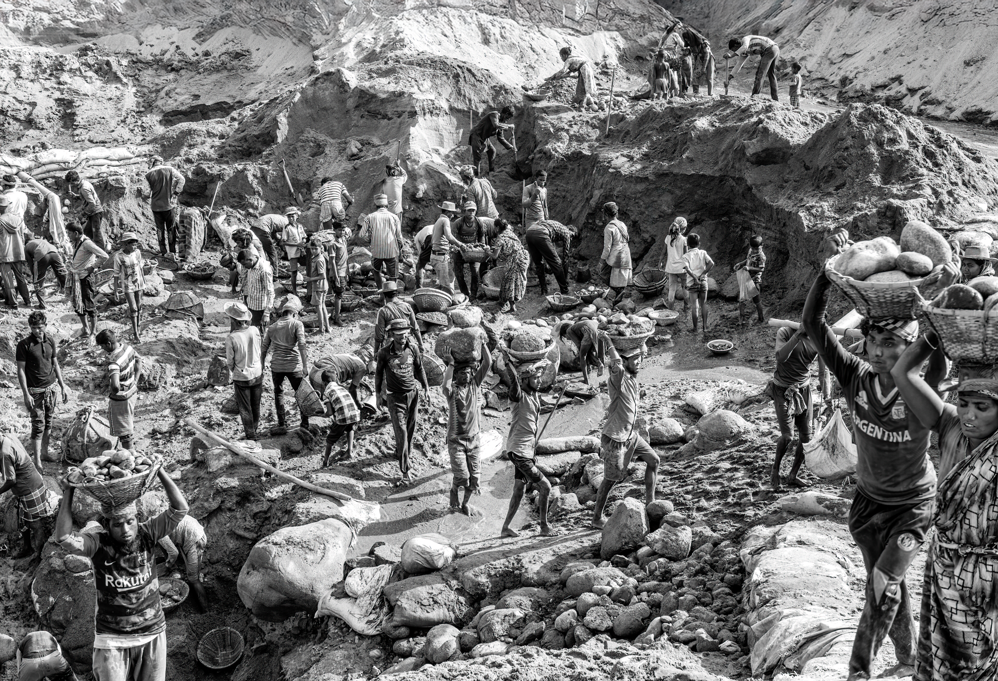
Reportorial Composition.
Think documentary. Context is king. Situating a subject in place and time and in relationship to other objects. Decisive moments or turning points are highly prized. It’s history. These types of images strive for an informed, objective, or balanced viewpoint often attempt to be without style.

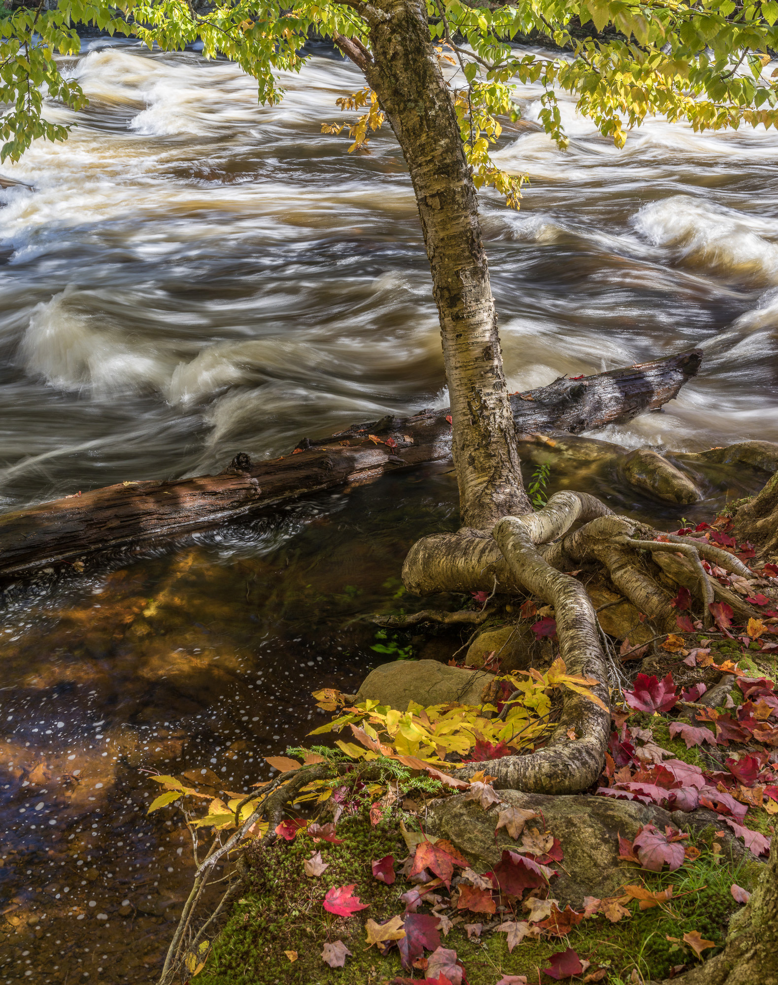
Graphic Composition
Think art. The elements of the image itself are emphasized in an expressive way. Personal interpretation is encouraged. Stylistic enhancement is often favored.
Exercise – Frame Scientifically, Reportorially, and Graphically
Frame a same subject three ways; once to clearly render significant structure or detail; once more to prioritize the story of the subject; and once again to emphasize graphic structure. Compare them.
Audio
I was working with a workshop student, Randy, on the Skeleton Coast of Namibia discussing the importance of alignment and the frame in composition when I made these images. Together, we tested a lot of possibilities, so consequently I have many images to choose from. This is a practice I recommend to everyone. Test many different compositions. Work it.
Of these three pictures of African dunes in Namibia, I prefer the third image. It can stand on its own as a compelling picture. The first image would need text to explain why it’s important. The second picture would need more images to tell us why this place is significant.
I wish I had a second shot to include the base of the dune in this image. There are two critical lines in any landscape that help make place felt more strongly – the horizon line and the baseline. Without one or the other, images become more flat and abstract.
A baseline and a stronger sky might make this image stronger. Would the stronger placed quality and added drama distract attention from the graphic structure and light? Would more be less? I don’t know. That’s why I wish I had the second shot, to be able to confirm whether it did or not. After all these years, I still find it challenging to think outside the frame.
As a fine artist, my natural tendency is to create strong graphic compositions. I’m aware that this is my tendency. And it’s encouraged by the market I sell my work to.
I’m also aware that there are other ways of approaching subjects. Looking at the work of, talking with, and working with other types of photographers (with different passions and other markets) has helped me develop a greater appreciation of their concerns and the creative ways they solve challenges. I’ve learned a lot from them.
I often try to find ways to incorporate the types of concerns they deal with into my work. I like my images to be storied. I look for significant detail (science) and clear contextualization for decisive moments (journalism). I don’t emphasize these concerns so much that they overtake my primary objective (fine art) and core strengths (graphics). I look for a balance that enriches my work and personal perspective.
It’s all about the kind of story you’re telling. Depending on the type of story you’re telling, you’ll use the frame differently. You use the frame to focus attention on the most important information. For scientific or forensic work, the most important information is usually significant detail; the context is often deemphasized, it could be cropped, blurred, darkened, lightened but it’s rendered in a way that makes sure it doesn’t distract from the main focus of attention. It’s objective interpretation. For journalistic work decisive moments at peak action and the context they take place in are highly prized. Often, pretty pictures are overlooked in favor of more informative dramatic ones. It’s cultural interpretation. The fine arts favor graphic work, emphasizing aesthetics and emotional expression. It’s personal interpretation. Most images work on all three levels simultaneously. What distinguishes one type of image from another is the balance it strikes between them. They way the story is told tells you what kind of story it is.


Elevate Your Vision


Read this story and all the best stories on The Luminous Landscape
The author has made this story available to Luminous Landscape members only. Upgrade to get instant access to this story and other benefits available only to members.
Why choose us?
Luminous-Landscape is a membership site. Our website contains over 5300 articles on almost every topic, camera, lens and printer you can imagine. Our membership model is simple, just $2 a month ($24.00 USD a year). This $24 gains you access to a wealth of information including all our past and future video tutorials on such topics as Lightroom, Capture One, Printing, file management and dozens of interviews and travel videos.
- New Articles every few days
- All original content found nowhere else on the web
- No Pop Up Google Sense ads – Our advertisers are photo related
- Download/stream video to any device
- NEW videos monthly
- Top well-known photographer contributors
- Posts from industry leaders
- Speciality Photography Workshops
- Mobile device scalable
- Exclusive video interviews
- Special vendor offers for members
- Hands On Product reviews
- FREE – User Forum. One of the most read user forums on the internet
- Access to our community Buy and Sell pages; for members only.
You may also like