


I am a serious amateur. Photography has never been my Day Job, so I’ve always had the luxury of photographing for myself instead of for clients. Yes, I sell some prints and I have exhibits from time to time, but sales never cover my expenses.
My interest in photography started in high school, became serious in college, and was cemented with workshops with Minor White in 1966 and 1967 and with Paul Caponigro in 1969. I meet for discussion about six times a year with two small groups of photographers, one of which has three of us from that 1966 workshop. And I have been active on the Luminous Landscape Forum since 2004.
Why make a book?
Possible goals include
1. To give to family and friends
2. To leave a legacy
3. To sell a few copies
4. To enter a book competition
5. To make the Amazon best-seller list
6. To sell many copies and get rich and famous.
For me, the urge began when a photographer friend from the 1966 workshop gave me a copy of a beautiful, hard-cover, large-format book of the best of his fifty years in photography. It was printed by Blurb and beautifully done, so I knew that Blurb was capable of excellent black and white printing. Like me, this friend photographs just for himself. He is a meticulous craftsman, shooting primarily on film using a 4×5″ view camera. He now scans his negatives and prints digitally. I expect his book-making goals were numbers 1 and 2 in my list.
His book inspired me to begin planning my own book. I decided to go for a somewhat less expensive plan: soft-cover, about 8×10 inches instead of 12×12. I immediately decided to start with a printed book rather than an e-book because I am of that school that believes that a photograph is only “finished” when it appears as a print, and a printed book is the next best thing.
I knew nothing about book design. I learned that the Luminous Endowment for Photographers had a Lenswork Publication Skills Grant that might provide just the help I needed, so I applied. While waiting for the grant decision, I started exploring the web for information on book design, book cover design, and typography. I found a huge amount of free information, much of it quite helpful.
I also started checking on the cost for printing a modest number of copies from several online book printers, and I ordered a swatch kit (sample papers) from Blurb. The two contenders that had the most reasonable prices were Blurb and BookBaby. I must admit I was somewhat prejudiced in favor of Blurb for three reasons.
1. My friend’s beautiful book was done by Blurb.
2. If I built my book in Lightroom, which is my main photo processing software, then I could send the manuscript directly to Blurb from inside LR’s Book Module.
3. Comparing black-and-white photo books from Blurb and Book Baby, I preferred the appearance of Blurb’s top-of-the-line paper.
When I started this project, my goals were numbers 1 and 2 in my list, above. Once I heard that I had the Lenswork grant, I decided to add number 3 as well. When I mentioned to my wife that the Davis Orton Gallery in Hudson NY was holding a competition called “Photobook 2016″ with a submission deadline of October 20, she said “You’ve got to enter!” So goal number 4 was added to my list, and I only had a couple of months to learn book design and get some copies printed. I stepped up my web search for useful information.
The Good, the Bad, and the Ugly
It was clear from the start that I would be publishing my book myself. An excellent source of information on self-publishing is The Fine Print of Self-Publishing by Mark Levine (sixth Edition, ISBN-13: 978-1-63413-881-9) which covers contracts, printing costs, royalties, distribution, ebooks, and marketing. I also recommend highly a second book, Self-Publisher’s Legal Handbook by Helen Sedwick (ISBN-13: 978-0988302150) on “Protecting your copyright, Avoiding scams and lawsuits, and Maximizing tax deductions.”
From the Web I learned that there are not only specialists in book design but also specialists in the design of book covers. If you decide to do it all yourself, as I did, the best advice I found was to examine closely several photo books that appeal to you and see how they use margins, typefaces, etc. My own taste runs to the simplicity and elegance that I found in books by Edward Weston, Ansel Adams, Minor White, and Paul Caponigro.
On the web are simple lists of the standard names for each type of page in a book, including the ones at the beginning and end of a book and section header pages throughout. You need to decide which of these are important for your book. There are tips on how to choose appropriate and contrasting typefaces for each part of your book, and advice not to use too many.
My web researches suggested that Adobe InDesign was the software most often used for designing photo books, so I went looking for the latest version to buy. But apparently InDesign has also been swallowed up in Adobe’s Cloud, so that the only way I could get the current version was by subscribing to the entire Creative Cloud system. I didn’t want to pay for the entire system, so I would either be using Lightroom’s Book module or free BookWright software from Blurb. Since I am already familiar with Lightroom, I decided to start getting familiar with its Book module. I have also played a bit with BookWright, and I may well use that for my next book.
Lightroom’s Book module is pretty easy to explore and use without much experience. But it is also very easy to make mistakes in it, as I soon learned. And since the Book module does not have a history list, as the Develop module does, if you do make a mistake, you can’t simply back up a step or two to correct it.
To get started in Lightroom, it helps to place into a Collection all the photos you intend to include in the book, and sort them in the order in which they will appear. Then for each image, put an appropriate caption in the Title field of the Metadata. This will let you automatically attach titles below any or all images, if you want to. In the Book module you can then easily load the entire collection, in order, into your book template, and you can insert/edit/delete text pages or image pages, move them around, etc., quite easily.
A Lightroom Annoyance: If you place a caption under each photo, it will be left-justified under each photo, regardless of whether the image is on a left- or right-facing page. There is no option for placing them differently. The default should be that captions are left-justified on left-hand pages and right-justified on right-hand pages.
Trial and Error Time
I put together the first version of my book and sent it to Blurb to see what it would look like. I chose 8″x10″ landscape format, using their best interior paper and glossy covers. My first version arrived promptly and looked quite stunning to me. But as my wife and I started looking through it carefully, we found numerous errors that I had not noticed before sending it out. These included:
- Cover photo not positioned where I had intended it
- Inconsistent line spacing on the sectional title pages
- Inconsistent typefaces and font sizes on the sectional title pages
- Misspellings of some photo titles
- Text pages in inappropriate locations relative to the surrounding photos.
- A few lines missing from lists of photos near the back of the book.
- Font size changes in the middle of the photo lists.
- Incorrect page numbers for some items in my Table of Contents and the photo lists, and
- A few more tiny errors.
What all these errors had in common was that they were the result of my errors, and not Blurb’s. Blurb had done exactly what I had told them to. At that point I realized that I needed to create a style sheet for my book, specifying typefaces and sizes for each category of page, and with specs for all margins on each type of page. I also had to correct the misspellings in my titles, and move my cover photo back where it had been before I accidentally moved it.
Fortunately, Blurb has frequent discounts throughout the year, so I was able to get some kind of discount on each sample that I had printed.
In the meantime, I ordered a block of ten ISBN numbers from Bowker, the agency that issues these for United States publications. I registered my book with the Copyright Office and the Library of Congress. Each of them requires a free copy.
After ordering one copy each of five individual printings, I thought that version 6 was just about perfect, and I ordered twenty copies (at a discount). Even that printing turned out to have a couple of minor problems, including a few lines missing from the lists of photos, which turned out to be the result of my attempting to fit too many lines on one page, with no warning from Lightroom. By reducing the font size a little I was able to get the entire list on for version 7, and I ordered another 40 copies.
One nice feature in LR is that when browsing through your intended book, you have three choices for what will show on the main screen: You can display thumbnails for every two-page spread, similar to the “grid” view in Lightroom’s Library module; or you can display a selected two-page spread; or you can display a single page. You do all of your editing in these two latter views. In each view you can specify margins, insert one or more images (via included templates), and insert text, specifying typefaces and font sizes.
The cover is an exception, which can only be viewed or edited as a spread consisting of back cover, spine, and front cover. On the cover, you can also select a background color, and I chose a light-middle gray.
Another Lightroom annoyance is that on the cover spread you cannot insert more than one image on the back cover. I had chosen a photo for the back cover and I wanted to add a small image of a barcode as well. I was not able to find a way to do it. My best workaround was to combine my photo and the barcode in Photoshop and place that composite on the back cover in full size, with a background color from Photoshop that closely matched Lightroom’s. I finally got close enough to be satisfied with the result.
Pricing
If you plan to sell your book, you need to decide what price to charge. A price that covers your expense and provides at least a small profit is normally included in the barcode that appears on the back of most books. Once I had decided on the price (based on a single copy price with no discount from Blurb) and ordered my barcode (from Bowker) I learned that Blurb announces fairly deep discounts, ranging from 25% to 40%, for short periods frequently throughout the year. At all times, they have regular quantity discounts for orders of ten copies or more. Depending on the number of copies you want, you must choose between the “special” discounts and the quantity discounts, which cannot be combined.
Marketing
Part way through the design process I began to realize that I had no idea how many copies I should order. With my wife’s help I came up with a “preorder” offer for anybody who ordered before I was ready to print. I chose a price that was low enough to seem reasonable (to me) and which I could reasonably subsidize if there were few takers, but which would also be manageable with one of Blurb’s periodic discounts. I announced this offer on the Luminous Landscape Forum as well as by an email blast to friends and relatives and photographers that I know and to people who have bought prints or who have provided email addresses at my exhibits.
My book did get accepted at the Photobook2016 competition, and while it didn’t win a prize, it will be shown at the Griffin Museum of Photography in March of this year, and I will have a few copies available for sale then.
Sales have been quite gratifying, and I will have to order some more when Blurb announces another significant discount. The price on the barcode on my book says $75. This is the price that would cover a single purchase from Blurb (the “Print on Demand” price), with no discount, and including shipping. By ordering batches at discount, I have been able to sell the book for $49 plus shipping and cover a bit more than my costs.

Equipment Used
All work was done on my Windows 10 64 PC, using Adobe Lightroom 6 and Photoshop 6 (both stand-alone versions). Near the start of the project my trusty Epson 3800 printer died, and I replaced it with a new Epson SC P800 printer for doing proofs and general photo printing.
My Assessment
I have given a few copies to interested friends and relatives and offered it to a few who might be able to write a review. A link to one review and some appreciative comments can be found on my website. I feel I have accomplished goals 1 through 4 on my list, and I never had any notion of pursuing goals 5 or 6.
I do plan to convert my book to at least one e-book format and make it available that way, probably through the Blurb bookstore.
This first book has been more challenging than I expected, but I learned enough so that I expect the next book will be easier. I am now considering a book which will include some color images. This will probably be shorter than my first, 106-page book, but I’ll have to see a sample to know whether Blurb can handle color adequately for my purposes. Black and white was fairly straight-forward, since I did not use any toning or duotone or quadtone, etc., for this book.
I may try to use Blurb’s free book design software (BookWright) for the next book, or create parallel versions in that and in Lightroom to see which is more flexible.
Here are my strongest recommendations for anyone else planning to produce a book of photos:
1. Choose your goals carefully, and don’t get swept up in unrealistic ones.
2. Study the two books on Self-publishing that I mentioned above.
3. Search the web for tips and “how-tos” on book design and cover design. There is much free information that is valuable. But you will have to be skeptical of promises of wealth and fame.
4. Consider applying for a Luminous Foundation grant. I am very grateful for my grant, without which my book would likely never have been created.
5. Once you have settled on your basic design ideas, prepare a detailed “style sheet” giving all margin, typeface, font-size, positioning, etc., for every type of page in your book, and check this frequently as you assemble it.
6. Proofread carefully several times, and have at least one other conscientious person do the same.
7. Repeat step 6 three more times. Order (and inspect) a sample once you think your manuscript is perfect (it took me seven tries to get it sufficiently right.)
8. Keep meticulous financial records, of expenses and income, for tax purposes.
9. Keep detailed records of recipients of your book, whether free or paid, and note how the book was delivered or shipped.
10. Enjoy the process!
Acknowledgments
1. I, Eric Myrvaagnes, recognize the Luminous Endowment for Photographers for making a significant financial contribution to support this project. Without such support, this project would not have been possible.
2. My wife, Naomi, contributed text, ideas, proofreading, advice, and extraordinary support for this project.ç√ ∫Ω≈
Eric Myrvaagnes
(Originally) February 2017
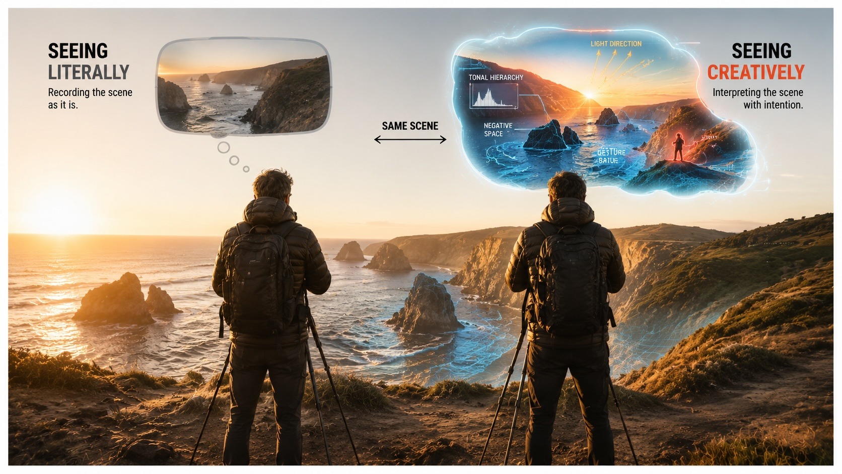
Elevate Your Vision


You may also like