




Growing Up with “Glorious Technicolor”
Jean Curran grew up in the 1980s on a family farm in County Waterford, Ireland. Two television channels. Saturday afternoon matinees. And at the end of those films, rolling past in the credits, a phrase that resonated with her.
“When I was a child,” she says, “I would often see the words ‘In Glorious Technicolor.’ I certainly didn’t know what that meant, but I believed that those words signified quality, like a stamp of approval.”
That idea – that color carried weight and meaning – would take decades to fully understand.
Curran studied photography and printing in Cork, where the darkroom became a second home. She took to the craft side of photography the way some people take to an instrument – learning the mechanics and feeling something deeper in the process.
After school she went into photojournalism, working for national and international outlets, traveling to Ghana, Kenya, and eventually embedding with coalition forces in Afghanistan.
From Conflict Zones to the Darkroom
Afghanistan was where her interest in mediated imagery first took real shape. She found herself drawn to a local tradition of hand-painted portrait photography, where Afghan craftsmen would apply paint directly to photographic prints – a centuries-old technique that transformed a documentary image into something handmade and layered. She began working with these craftsmen, photographing Western soldiers and then having their portraits hand-colored in the local tradition.
It was a strange and beautiful collision – war reportage filtered through artisan craft. And it was the beginning of a long investigation into what happens when photography passes through other hands, other processes, other materials.
“Through these projects,” she explains, “I became increasingly interested in colour itself and in constructing images rather than reproducing them.”
That shift – from capturing to constructing – is the basis that motivates her entire practice.
Why Dye Transfer, Why Now
By the time Curran returned to Ireland and established a studio and darkroom on her family farm, she had already spent years thinking about color as a system, not just an attribute.
The question she kept returning to was this: in a world flooded with images, how do you make work that holds up?
“I began to wonder – if there are that many images uploaded onto the internet every day, how do we know what’s good anymore? Is it the amount of likes something has?”
She decided to return to work she already knew was good. Films that hadn’t just survived but grown richer with time. Images with what she calls “layers that are still relevant today.”
And she wanted to revisit them through a process that matched their visual ambition.
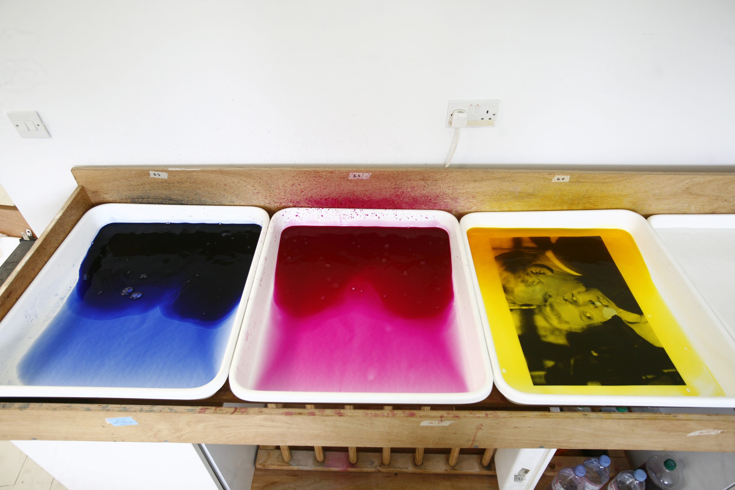
Dye transfer, also called dye imbibition, is one of the oldest and most demanding color photographic printing methods in existence. It works by separating an image into its three color channels – red, green, and blue – and building the final print in sequential layers, each transferring its dye load onto a single receiver sheet.
The results are unlike anything produced digitally: extraordinary color saturation, depth of blacks, tonal separation that is described as the image feels almost three-dimensional.
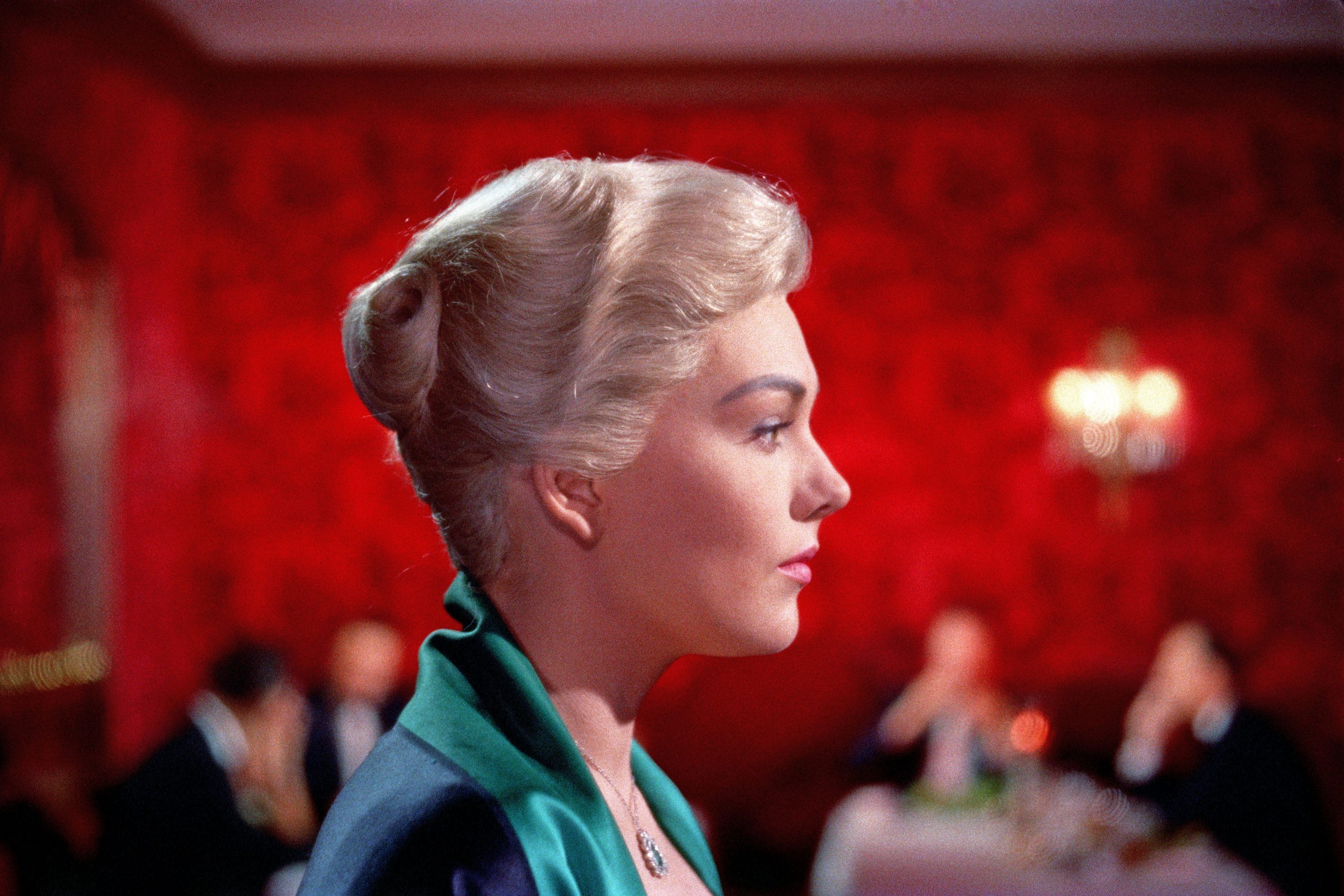
It’s also the exact process Technicolor used to produce motion picture prints through most of the 20th century. The ruby slippers in The Wizard of Oz. The burning of Atlanta in Gone With the Wind. The saturated greens of Vertigo. All dye imbibition. All built the same way Jean Curran builds her prints today.
The Vertigo Project
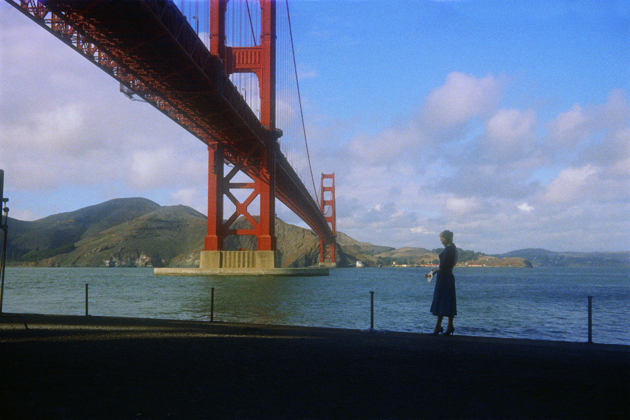
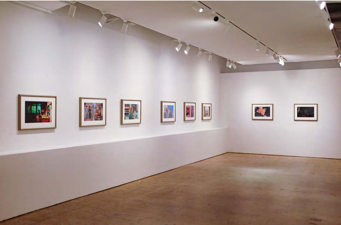
The Vertigo Project came together over years of methodical, patient work. Curran contacted the Hitchcock estate and Universal Studios, secured copyright licenses, and gained access to a rare original Technicolor dye imbibition print of the film from 1958.
Then she sat with hundreds of thousands of frames and chose twenty.
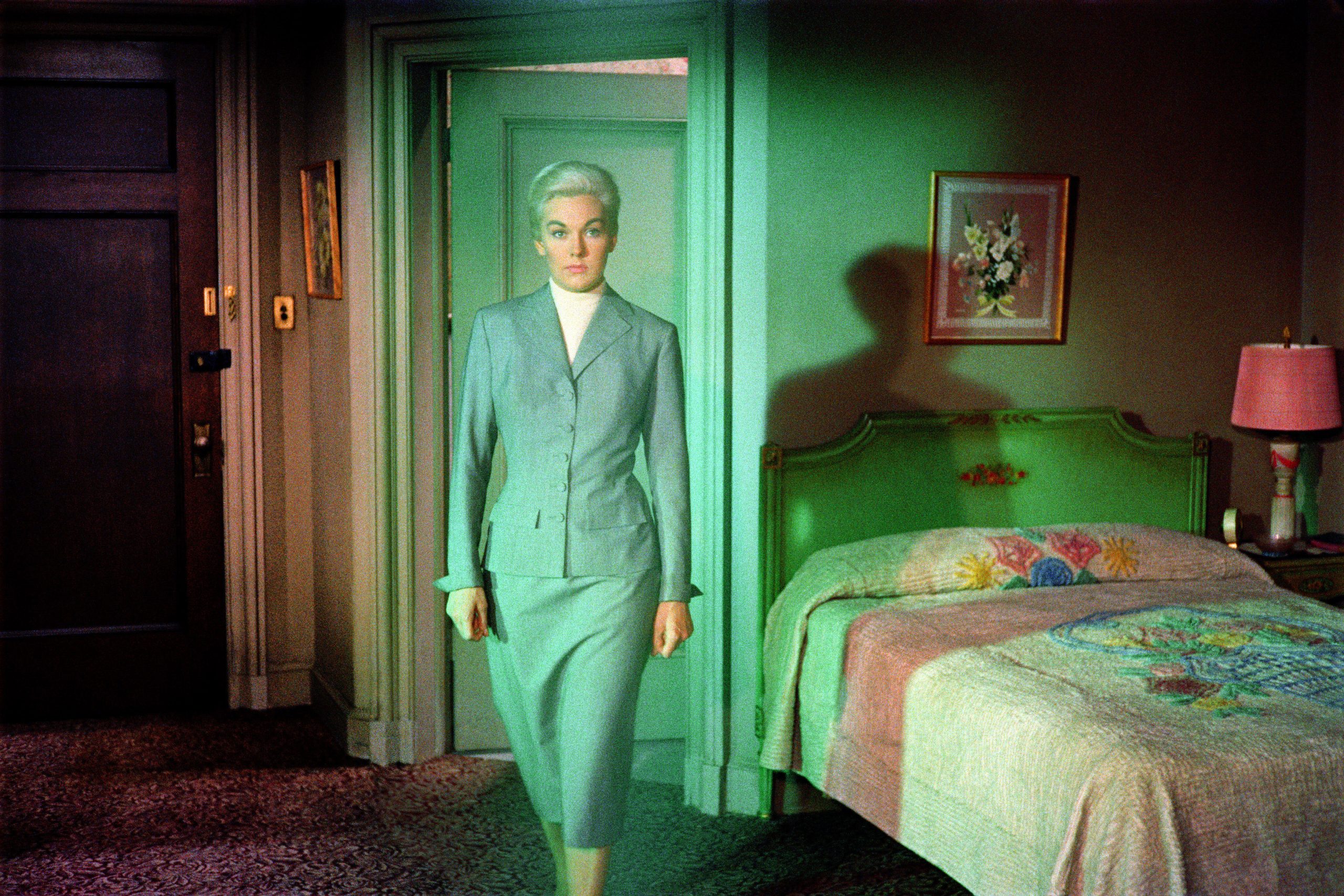
“The frames I selected from each movie really brings home how luminous and opulent the colours in the frames are,” she says. “It gives the audience time with each frame – so you can really see the set, the stage, how it was composed, and what the director is conveying.”
The prints are 20 by 24 inches. Each one was made using the same dye transfer process that produced the original Technicolor release print. By printing frames from a dye imbibition film using the dye imbibition process, Curran created a conceptual loop – the medium and the subject become the same thing.
What she also did was slow the film down. Cinema moves at 24 frames per second. The moments she isolated – a gesture, an architectural detail, a wash of color – those moments quickly pass in projection before the eye can fully register them. As still prints, they open up.
You see what Hitchcock’s cinematographer Robert Burks was doing with light. You see what Edith Head was doing with the costume. You see color being used as narrative, as psychological pressure, as beauty for its own sake.
Godard, Bardot, and the Paradox of Color
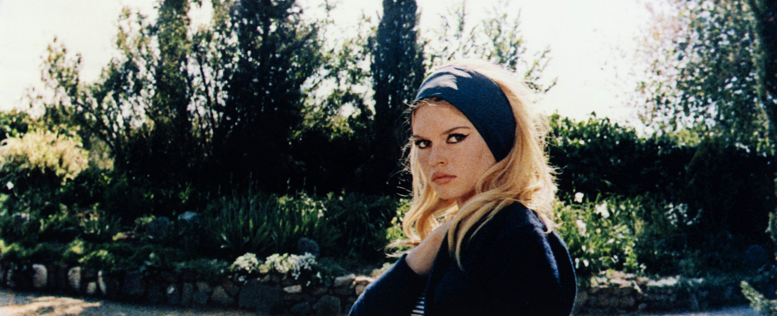
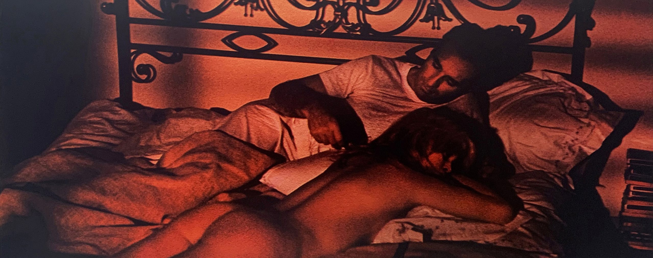
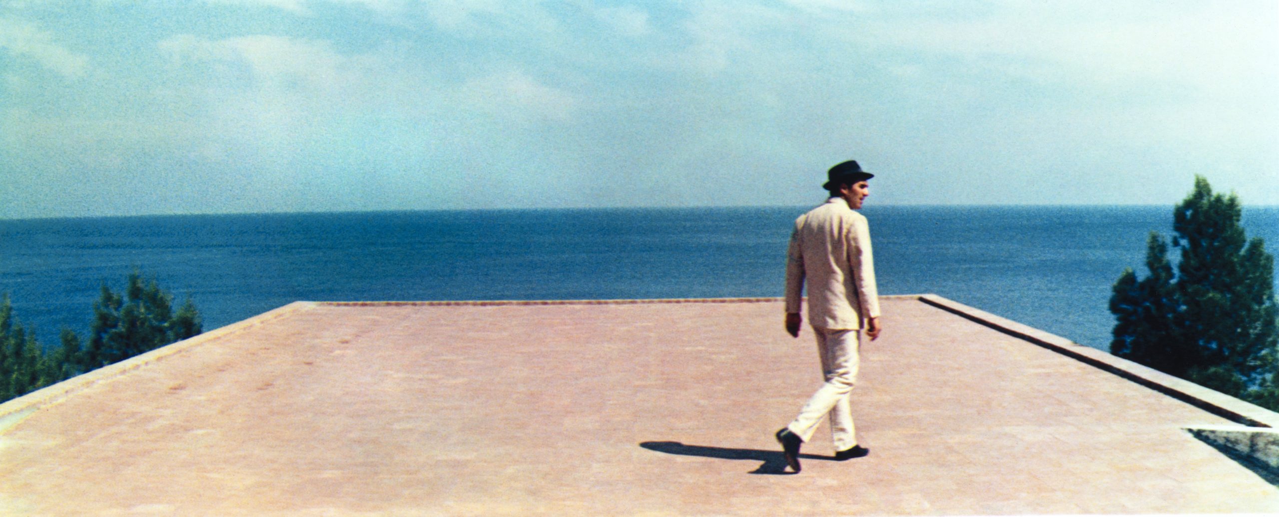
If The Vertigo Project was about luminosity, Godard Bardot – Curran’s series drawn from Jean-Luc Godard’s 1963 film Le Mépris (Contempt) – is about restraint.
Godard’s visual logic runs against expectation. Curran describes it with characteristic precision:
“Think of having your heart broken, but it’s not in a dull space that visually represents the mood you might be feeling – rather it’s in the most beautiful garden. Or your marriage comes apart but it takes place in an iconic property where art, architecture, design and the bourgeois lifestyle all come together.”
That paradox – emotional devastation rendered in gorgeous, modernist color – is exactly what she wanted to bring forward in the prints.
Le Mépris is a film heavily informed by Piet Mondrian and Yves Klein. Its color palette is cool, architectural, almost severe. Curran’s dye transfer process intensifies those blocks of color, making the film’s emotional subtext land physically on the wall.
The series also broke new ground beyond the studio. Brigitte Bardot, who owns her image rights under French law, had never previously allowed any of her nude photographs from Le Mépris to be used. Curran corresponded with her directly.
“Ms. Bardot had not previously allowed any of her nudes from the movie to be used. So to be the first to be granted permission to work with those images was a really great privilege, and I was so honored that she trusted me with them.”
She also reached Jean-Luc Godard before he passed. He reviewed her edit of the film and signed off on it. These prints carry the blessing of the people who made them.
How the Prints Are Actually Made
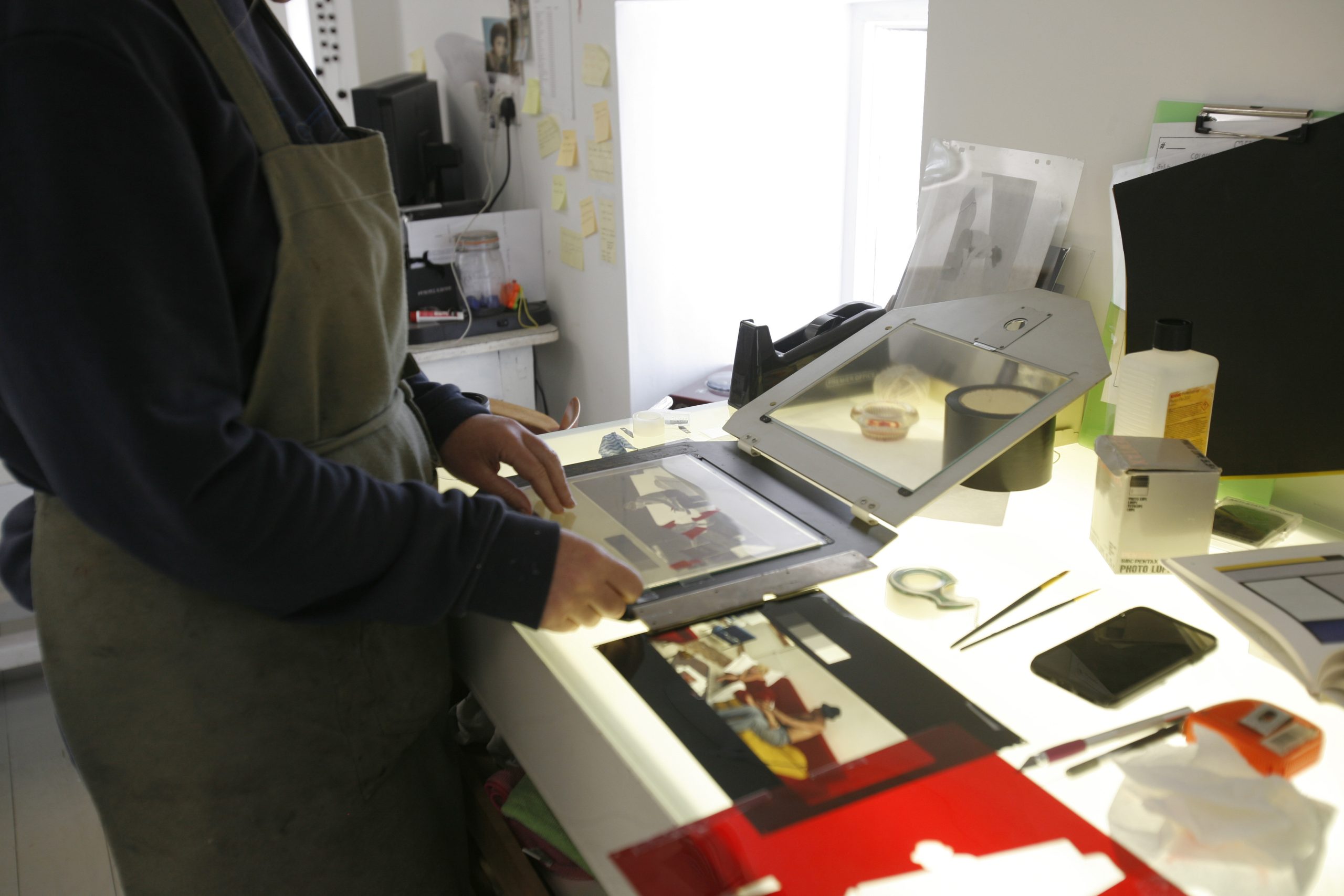
Ask Curran to walk through the process and she does so with the methodical clarity of someone who has lived inside it for years. It starts, she explains, as “essentially a deconstruction and assemblage process.”
Here’s what that looks like in practice:
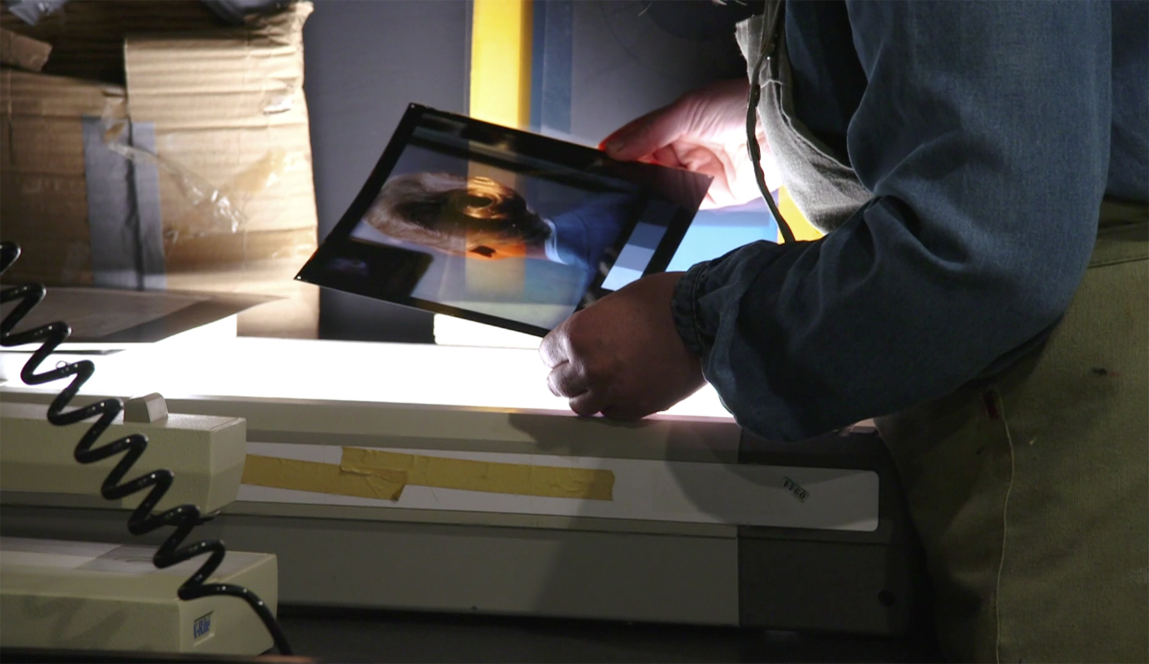
- She begins with a 10×8 color transparency written on an LVT film recorder, which also generates a 21-step grayscale essential for calibration throughout the process
- That transparency gets separated into its three color channels under red, green, and blue filters
- For each channel she reduces contrast by cutting highlights and shadows, makes the negative, creates masks to recover highlights and shadows, and builds any additional color correction masks needed to keep the dyes clean and separate
- All layers for each channel are sandwiched together and exposed onto matrix film – a thin sheet of gelatin-coated plastic that hardens in proportion to the light it receives, creating a physical relief image that carries the tonal information for that color
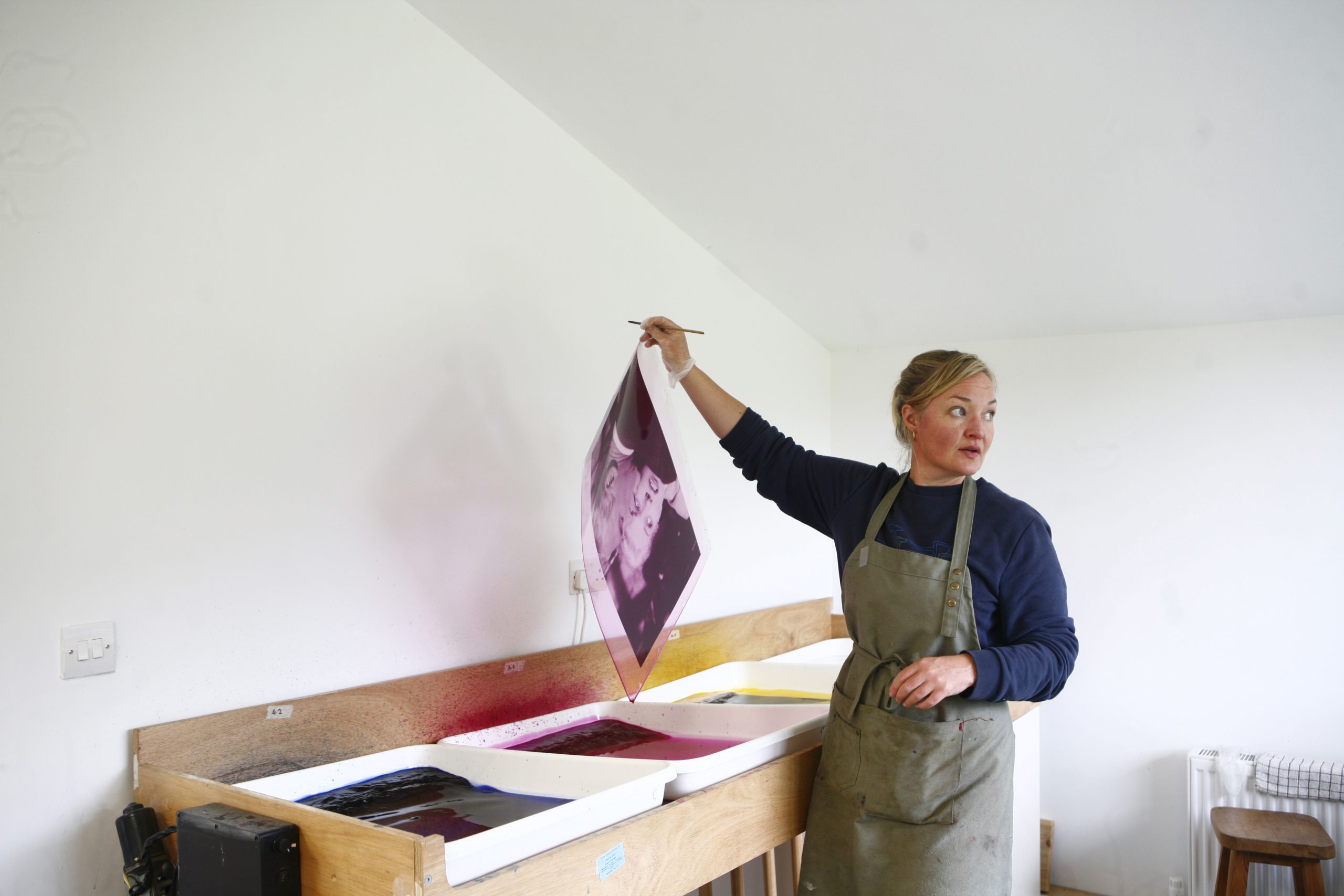
- Each of the three matrices soaks in its corresponding dye bath – cyan, magenta, or yellow
- The matrices are then pulled from the bath, excess dye washed off, and rolled one at a time onto a sheet of primed paper
“Each matrix takes a different amount of time to transfer,” she notes. “Magenta takes the longest, so I often run a warm cloth over the magenta matrix to help aid the transfer while it’s on the rolling table.”
Then she waits. And hopefully, a dye transfer print emerges.
The densitometer is a constant companion throughout. Every layer of film is checked for density before proceeding. If one sheet is off – too dense, not dense enough – it gets re-exposed and processed. With each color channel potentially carrying five separate layers, alignment is relentless work.
“It can be very frustrating,” she says, with the kind of understatement that only comes from someone who has spent a great many frustrating hours in a darkroom.
A single print now takes her a week to ten days. Some have taken considerably longer. She’s been doing this for years.
What the Process Demands
The materials Curran works with are no longer manufactured. Kodak discontinued dye transfer production in the early 1990s, and she spent years tracking down remaining stocks from around the world – acquiring enough to sustain major projects like The Vertigo Project and Godard Bardot.
She is one of only a handful of practicing dye transfer printers left anywhere, and almost certainly the only contemporary artist whose entire practice is built on the process.
Jim Browning in New Hampshire, who made the color separations for Curran’s Vertigo prints, is one of that small circle. Andy Cross in Brisbane is another. It is a community that can hold its meetings in a single room.
That scarcity gives each print a different kind of meaning. These are objects made by hand, from materials that are disappearing, through a process that requires years to learn and a lifetime to master.
“It truly is an art form in itself,” Curran says, “so think about it as you might think about learning an instrument or a language. It takes time to become fluent. Dye transfer is the same.”
Between Photography and Painting
A significant shift happened when Curran spent time studying at the Florence Academy of Art. What she found there wasn’t technique so much as recognition.
“I began to see parallels between what I was doing in the darkroom and what painters do in the studio. A painter builds an image through layers of pigment. In dye transfer I build images through layers of dye.”
Both processes are additive. Both require a trained eye for color interaction, for how one layer changes what’s beneath it. Both reward patience and punish impatience in exactly the same ways.
Today she resists being put in a category.
“For most of my career I’ve identified as a photographer. Photography has been the foundation of my practice for more than twenty years. But the work now moves between photography, printmaking, painting and object making. The dye transfer process has become less a way of reproducing photographs and more a way of creating the raw material from which I construct unique works.”
A Practice Rooted in Place
There’s something fitting about the fact that all of this happens on a farm. The seasons. The cycles. The patience required to work land and the patience required to work dye transfer aren’t entirely different things.
Curran has spoken about how the rural environment in County Waterford informs her practice – the local color in the landscape, the contemplative pace of farm life as a counterweight to the intense, meticulous hours in the darkroom. The studio and the fields exist alongside each other. Both require showing up every day and doing the work.
Her gallery representation – Michael Hoppen in London, Danziger in New York and Los Angeles, Galerie Miranda in Paris – reflects how seriously the international art world has received this work.
Reviews in the Financial Times, The Guardian, and The New York Times have emphasized not just the rarity of her technical skills but the conceptual intelligence behind using them. It’s craft in service of ideas and emotion.
Why It’s Important
When we covered Jim Browning, and again when we heard from Andy Cross in Brisbane, the question underneath every conversation was the same: why preserve something this difficult, this expensive, this time-consuming?
Jean Curran answers it without being asked.
“If you’re drawn to it strongly enough, you’ll accept those challenges because the process gives you something you can’t find elsewhere.”
She’s right. Stand in front of a dye transfer print – the saturated blacks, the color that seems to come from inside the surface rather than sitting on top of it – and you feel the difference. Digital printing is extraordinary.
But dye transfer does something else – something that connects directly to how those classic films looked when they were new, when “In Glorious Technicolor” meant you were about to see color the way almost no one sees it today.
Jean Curran is keeping that alive. As a living practice, on a farm in County Waterford, one glorious careful layer at a time.
Jean Curran’s work is represented by Michael Hoppen Gallery (London), Danziger Gallery (New York/Los Angeles), and Galerie Miranda (Paris). Learn more at jeancurran.com.
Luminous Landscape has covered the dye transfer printing community as part of our ongoing series on photographers and printers keeping analogue craft alive. Read our profiles of Jim Browning and Andy Cross at luminous-landscape.com.
Elevate Your Vision


Read this story and all the best stories on The Luminous Landscape
The author has made this story available to Luminous Landscape members only. Upgrade to get instant access to this story and other benefits available only to members.
Why choose us?
Luminous-Landscape is a membership site. Our website contains over 5300 articles on almost every topic, camera, lens and printer you can imagine. Our membership model is simple, just $2 a month ($24.00 USD a year). This $24 gains you access to a wealth of information including all our past and future video tutorials on such topics as Lightroom, Capture One, Printing, file management and dozens of interviews and travel videos.
- New Articles every few days
- All original content found nowhere else on the web
- No Pop Up Google Sense ads – Our advertisers are photo related
- Download/stream video to any device
- NEW videos monthly
- Top well-known photographer contributors
- Posts from industry leaders
- Speciality Photography Workshops
- Mobile device scalable
- Exclusive video interviews
- Special vendor offers for members
- Hands On Product reviews
- FREE – User Forum. One of the most read user forums on the internet
- Access to our community Buy and Sell pages; for members only.
You may also like