Image Matching
By: Alain Briot
Alain Briot is one of the most successful landscape photographers working in the American Southwest today. His work is widely exhibited and collected. His new monthly column for this web site, of which this is part, is calledBriot’s View. An extensive interview with Alain is included in Issue #1 ofThe Luminous Landscape Video Journal.
Matching a Transparency to its Monitor Version and to a Print
Calibrating your monitoris the first step in insuring that the image on your screen matches your print of this image as well as your original transparency. But how do you achieve this? Here are the three basic steps:
- You calibrate your monitor as described inthis article.
- After scanning your transparency you color-correct the digital file in Photoshop so it matches your transparency or your impression of the original scene.
- You print the digital file and compare this print to your transparencyandto its digital version on your monitor.
This process implies comparing 3 different images: first the original transparency, second the digital version of this transparency on your monitor and third a print of the digital file. To insure that this comparison is reliable it is of utmost importance that the print and the transparency be viewed under the same light source. I recommend a 5000k light source (balanced so as to duplicate sunlight or open shade) since it is the industry standard for viewing photographs and transparencies. If you have a good light table it most likely has a 5000k light source. Remember that all light sources have a specific color temperature and that the color of the light source will affect the color balance of the print.
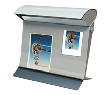
I achieve this three-way comparison by using theColor Master DuofromJust Normlicht
 © 2001 Just Normlicht
TheColor Master Duois a vertical light table designed to simultaneously view a print and a transparency under a 5000k light source.
Prints are attached to the top of the Color Master Duo via a push-in hanger and illuminated from above by a reflected light source. A dimmer allows total control over the intensity of the light shining on the print. Transparencies rests on a support in front of a 5″x7″ light table. A second dimmer allows total control over the intensity of the light behind the transparency. These two dimmers, which operate independently, allow the user to view the print and the transparency under a similar light intensity as well as match this light to the brightness of the monitor.
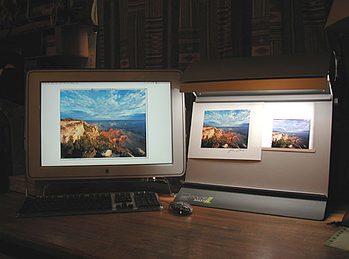 Sunrise from Yaki Point, Grand Canyon National Park
Linhof Master Technica, Schneider Super Angulon 47mm f5/6, Fuji Provia 100F. July 2001.
This unretouched photograph shows my current setup. The monitor image matches the print quite closely while the 4×5 transparency is a little less saturated. I intentionally increased the saturation of the digital file in Photoshop to match my impression of the original scene. Notice that my work room is dimly lit and that the blinds are shut. I actually use light-blocking blinds to insure that no outside light filters through the window. This is done intentionally to insure that the brightest area of the room is the monitor and theColor Master Duo. Overhead or window light are not only distracting they also force my pupils to adjust to a bright light source causing me to make erroneous adjustments in Photoshop.
TheColor Master Duois the ultimate solution for comparing a transparency to a print to an image on the monitor. However at $950 it is expensive for the casual user. An alternate solution is to use a miniature 4×5″ light table and anOtt-Lite.
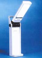
TheOtt-Litecosts $60 while a 4″x5″ light table costs about $45. Together they provide a solution equal to the Color Master Duo for slightly more than a hundred dollars.
I personally used aVisual Plus SV-650 Ultra Thin(1/2″ thick) light table for some time before switching to theColor Master Duo.
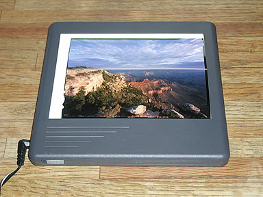
To do color correction I placed the 4×5″ light table in front of me so as to see the transparency and the monitor simultaneously. This way I could compare the image I was working on in Photoshop to the original transparency.
The fact that I work with 4×5 transparencies make things easier. However, when working with medium format or 35mm transparencies I simply keep a loupe next to the original and use it when I need to take a close look at the original.
Once you are satisfied with the appearance of the image on your monitor you are ready to make a print and to look at it under theOtt-Lite. Using this approach you can achieve the same results as with theColor Master Duofor only a fraction of the price.
If you enjoyed this article, as well as the hundreds of other tutorials, features,
reviews and essays on this site, you can support its continued growth
and discover an exciting new photographic resource by …


Elevate Your Vision


Read this story and all the best stories on The Luminous Landscape
The author has made this story available to Luminous Landscape members only. Upgrade to get instant access to this story and other benefits available only to members.
Why choose us?
Luminous-Landscape is a membership site. Our website contains over 5300 articles on almost every topic, camera, lens and printer you can imagine. Our membership model is simple, just $2 a month ($24.00 USD a year). This $24 gains you access to a wealth of information including all our past and future video tutorials on such topics as Lightroom, Capture One, Printing, file management and dozens of interviews and travel videos.
- New Articles every few days
- All original content found nowhere else on the web
- No Pop Up Google Sense ads – Our advertisers are photo related
- Download/stream video to any device
- NEW videos monthly
- Top well-known photographer contributors
- Posts from industry leaders
- Speciality Photography Workshops
- Mobile device scalable
- Exclusive video interviews
- Special vendor offers for members
- Hands On Product reviews
- FREE – User Forum. One of the most read user forums on the internet
- Access to our community Buy and Sell pages; for members only.
You may also like