The End Before the Beginning
Just in case you have no time to read on, the short answer: “There is none – it depends on what you like“. But just in case you’re curious to know why we’re even asking, what led to it and why we knew the answer before we started, please do read on.
Why Ask?
Some time back, Ilford USA invited us to evaluate and review some new photographic papers they were bringing to market. We said OK, and the usual rules of the game apply: we look, we analyze and we call the shots as we see them. Five recent offerings from Ilford are on the table:Gold Mono Silk (GMS),Gold Cotton Smooth (GCS),Gold Cotton Textured (GCT), (now you know what’s all about the “Gold”),Prestige Fine Art Smooth (FAS)andPrestige Fine Art Textured (FAT). Of course, lurking in the background – the one we reviewed quite some time back – GoldFibre Silk (GFS), which to this day remains a benchmark. You may read Ilford’s technical specifications and descriptions for all of these papers by clicking onthis linkand downloading the information. Thumbnail classification: GMS is a gloss type paper, whereas the other four are matte-type. Please memorize these abbreviations, because that’s how the papers are identified from here onward.
Reviewing papers is difficult – as any one who’s been around this subject for a while readily appreciates. Firstly, much is subjective – the relative importance of various evaluation criteria and our visual impressions differ from person to peson; and the results of measurements have some wiggle-room, simply because of variances in the performance of our measuring devices and printers. Fortunately, as we observe below, while these variances exist, when relating them to differences of what we actually see on paper, it turns out that they hardly matter – and we think our visual acuity has pretty well withstood the test of time.
Before proceeding further, a note on the scope of this review. It is limited to Ilford papers. We are not comparing these papers with offerings from other manufacturers. To do so would have vastly expanded the scope of the exercise and raised difficult questions about the comparability of the comparators. By describing the procedures we use here, those interested can test their favourite papers in a similar manner and make their comparative observations.
Procedure
- Download the manufacturer’s profiles, because we want to make prints using them.
- Make our own custom profiles, to compare with the manufacturer’s profiles.
- Observe the profiles.
- Choose printer test targets that will show the capabilities of the papers to the best of our ability.
- Make prints using the various papers, profiles and targets.
- Examine the prints for visual impressions.
- Measure Paper White and DMax for all of them.
- Summary Comment.
1. The manufacturer’s profiles:
Ilford’s profiles for these papers are easily available for download on the Ilford website. Their profile naming is quite intuitive, supported by good documentation explaining how to interpret the profile names, and what OEM paper selection the user should make for each of the Ilford papers; they do not specify whether to use Photo Black or Matte Black ink; however we asked Ilford this question and they recommended using Photo Black ink for all of these papers. All of our test prints were made in Mark’s Epson 4900 using the Epson Ultrachrome HDR inkset and allowed to dry for at lest 24 hours before making any measurements or other observations. For this printer and the corresponding OEM paper types, depending on the kind of paper, it is either necessary or possible to select Photo Black ink. Gold Mono Silk is a gloss paper keyed off of Epson Premium Semi-Gloss Photo Paper (250) – PSPP(250) for which Photo Black is “mandatory”. The other papers are either smooth or textured matte-type papers keyed off of Epson Textured Fine Art Paper (TFAP) for which the Epson driver provides the choice of using either type of black ink. We retained Ilford’s recommendation to use Photo Black ink. According to their spec sheet, Ilford made their profiles using X-Rite Profilemaker. They do not specify which model spectrophotometer or software version they used; however, we are of the view that the Ilford profiles are high quality. More on this below.
2. Make our own custom profiles:
Mark did this largely to have a comparison with Ilford’s profiles and to see which would likely deliver the better results. Mark’s ICC V4 profiles are generated from X-Rite’s 729 patch target using X-Rite’s Pulse Elite (DTP-20) hardware and software (now discontinued but even by comparison with today’s tools, still very respectable at least with the gloss/luster papers); by the way it operates fine in Mac OSX up to version 10.6.8. To print the targets, Mark used the Adobe Color Printing Utility (ACPU), to insure no interference of under-the-hood colour management effects on the prints of the targets. The prints of the targets were dried overnight and measured the next day.
3. Observe the Profiles
Mark then compared the Ilford profiles with his custom profiles for the five papers in ColortThink Pro. Please refer to the table and figures below.
Media Types and Readings
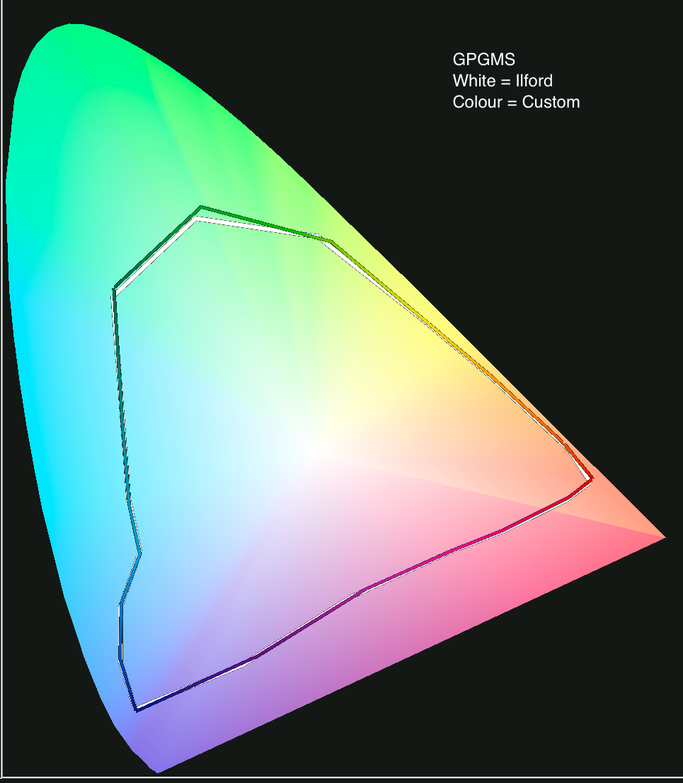
Gamut Volumes: GMS volumes according to profile
For the GMS paper, Mark’s custom profile has ever so slightly more gamut volume (see illustration above) and slightly deeper black than the Ilford profile.
We mentioned above the “benchmark paper” being GFS. For this paper, we used Mark’s custom profile, showing a gamut volume of 966K in ColorThink Pro, the widest he’s seen from amongst a number of Ilford and other custom-made profiles for this paper. We show in the 3-D figure below that the gamut volume of GFS slightly exceeds that of GMS, using the same profiling hardware/software, but the difference is not large in a meaningful sense.
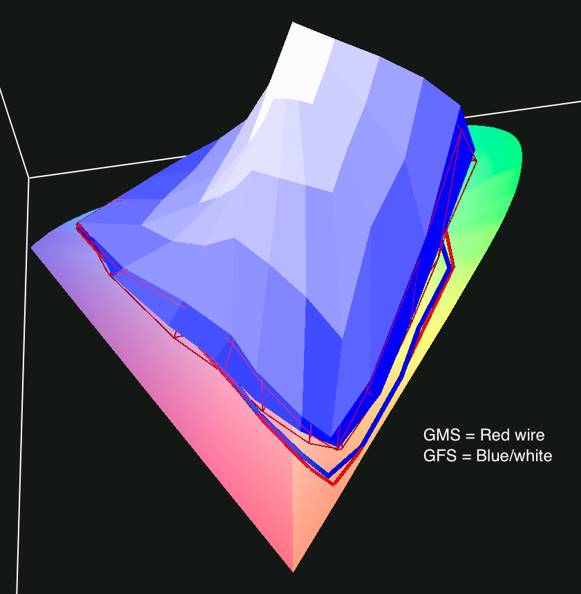
GFS vs GMS gamut volume
Reverting to the table above, three critical data comparisons are:
(i) The noticeably different black value measurement for the four matte papers – the Ilford profiles being in the range of 17 to 20, and the custom profiles 24 to 27. Lower Black numbers for L* should produce better blacks, hence we use the Ilford profiles for all four matte papers and both the custom and Ilford profile for the GMS paper.
(ii) The much higher Black numbers for the matte papers compared with GMS (recall again: lower Black values means blacker black).
(iii) Most remarkable of all – the huge differences of gamut volumes between the GMS paper on the one hand and the matte papers on the other. These differences show markedly as well when viewing prints of the same images side by side. We’ll get to that. Meanwhile, the figures immediately below illustrate the gamut volumes of the matte papers, which you may compare with that for GMS above. We would emphasize here that all the profiles produced smooth grayscale tonal ramps in the Epson 4900, regardless of gamut volume.


Gamut volumes – matte papers
4. Choice of Printer Test Targets
There are quite a number of them out there. Our favorite for all-round evaluation of colour and monochrome is the Bill Atkinson printer test target (left image below).
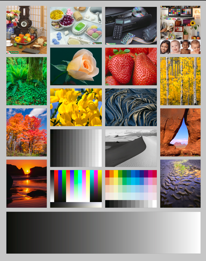
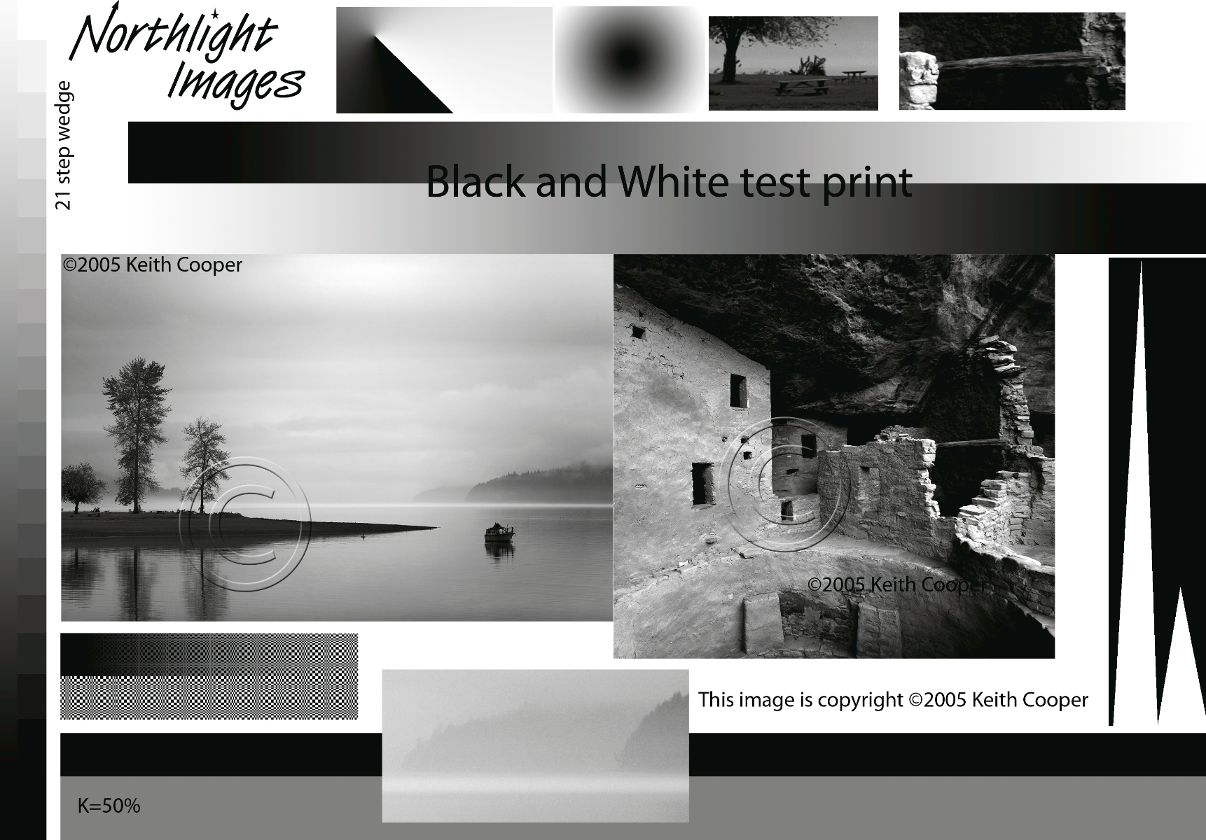
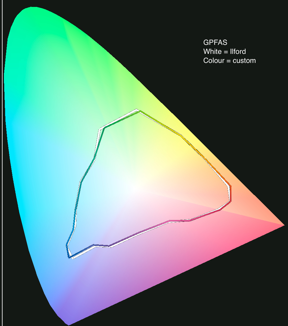
Atkinson (left) and Northlight (right) printer test images
However, because Ilford’s GMS paper is targeted specifically for black and white printing, we thought it appropriate to deploy a bespoke black and white target for examining the characteristics of this one paper, compared with GFS. For this we selected Keith Cooper’s Northlight Images black and white target (right image above), publicly downloadablehere.
5. Make Prints of the Printer Test Targets
Mark made all the prints in his Epson 4900. He printed three samples of the Northlight black and white target: (i) on GFS using his custom profile. (ii) on GMS using his custom profile (virtually indistinguishable from the Ilford profile) and (iii) on GMS using the Epson ABW driver (owners of Epson professional printers know this as the Epson driver configured especially for black and white printing). For further examination of GMS as a general purpose printing paper (i.e. for both colour and B&W), he printed (i) the Atkinson target on GFS using his custom profile, (ii) same on GMS using his custom profile and (iii) same on GMS using the Ilford profile. He printed the Atkinson image on all four of the “matte” papers using their respective Ilford profiles. All the prints were left to “cure” for a couple of days before making any measurements.
6. Examine the Prints for Visual Impressions
This is where the fun begins. For openers, we’ll discuss the Gold Mono Silk (GMS) results, first for the Northlight test page, then for the Atkinson test page.
Comparing the gloss papers – GMS and GFS – the only differences that are visually apparent at first glance are the paper white and the texture. GFS looks a tad warm and by comparison GMS looks a tad cool. GFS has a more luster-like finish, while GMS has a more gloss-like finish. So people who prefer a slightly cooler tone B&W would prefer the GMS and those preferring a slightly warmer tone B&W would prefer the GFS. We use the words “a tad” and “slightly” advisedly, because measuring the actual colour of the paper white in Lab (using the Pulse spectro with the Color Scratchpad in Colorshop-X), both have ever so slightly positive b* values (warm side of neutral; neutral having a b* value of 0), GMS being 0.07 and GFS 0.72. On the a* axis, GFS is just about dead-neutral at -0.01, while GMS is ever so slightly warm at 0.41. So yes, the difference is visible when compared side-by-side, but quite subtle.
Of more interest perhaps are perceptions of gray neutrality and the blackness of black. Apart from the paper white, here one needs to look really hard to see differences, but what we can’t see we can measure for. Unlike measurements of profiles from the profiles as done above, or measurements for DMax and DR as we’ll show further on, the table immediately below shows readings of Lab colour values (amongst others) directly off the prints using the Pulse spectro and ColorShop-X.
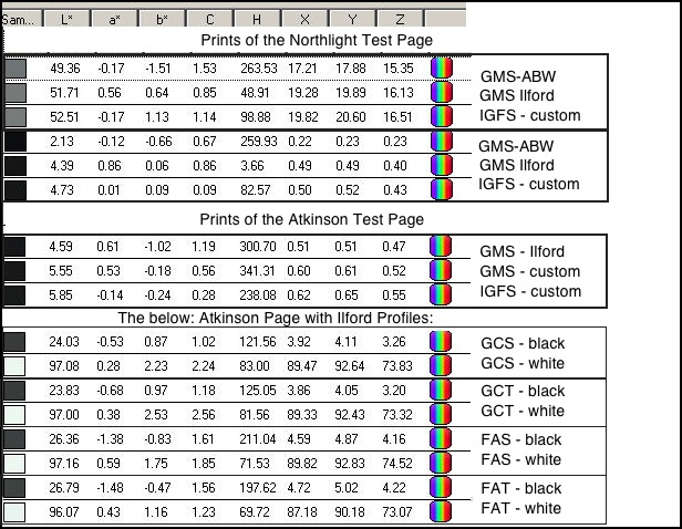
Monochrome read-outs
The first set of six are from the Northlight test page, and the remainder from the Atkinson test page. The top three are measurments of the 50% gray bar (at the bottom of the Northlight image, above). As you can see from the L* readout, they are all close, the GFS with custom profile being a tad brighter. Looking at the a* and b* readings, you will notice that none of them are exactly neutral, but all three are close enough in different ways that for all intents and purposes they should be considered as neutral. What’s interesting, is that on the b* axis, the least neutral of the three is the one printed with the Epson ABW driver. GMS with the Ilford profile shows the best overall neutrality, but we’re talking really small differences here.
Turning to the second group of three, measuring for blackness, the Epson ABW driver on the GMS paper did indeed produce the blackest of the blacks in the whole series. It’s a good two+ L* levels blacker than using the Ilford profile with GMS, or using GFS with the custom profile. But it’s also quite immaterial. When you look at the three blacks on paper side-by-side, they all just look black. What’s more important – to us, at least – is how these different profiling choices affect overall luminosity, particularly in the shadows, where shadow detail can be aesthetically important to the mood of the photograph. On this score we find a slight margin of preference for either of the ICC profiles rather than for the ABW driver. The latter is noticeably a bit heavier enough in the deep shadows to obscure some tonality; put otherwise, the ABW result is a bit more contrasty. We attempt to show this in a scan of the two GMS comparators (ICC Profile, left versus ABW driver, right) – the red-circled areas. The difference is subtle but noticeable. Black neutrality is kind of a non-issue for any of the three tests, but the IGFS with custom ICC is numerically the most neutral.
ICC (left) vs. Epson ABW (right)
The third group, the GMS prints of the Atksinson test page, colour vibrancy and hues are close, the GFS outcome showing ever so slightly more saturated colours than the GMS samples using either the Ilford or the custom profiles. The measured gamuts of these papers are very close as we discussed above.
Part of the reason for this slightly different appearance of colour saturation could be the difference of surface texture between these papers. GMS has a slightly more reflective surface than GFS, which tends to “glaze” the colours a bit, whereas by comparison, GFS seems to “embed” them, imparting a slightly more robust appearance. The black measurements are done at the very left edge of the grayscale ramp at the bottom of the Atkinson image, showing values ever so slightly less black than those from the black wedges of the Northlight test page. But put the these black areas side by side, look long-and-hard as we did under a Solux lamp (even with a magnifying glass) and you will not see a difference – at least we didn’t; the numbers and the ink laydown are just too close to differentiate them visually.
Turning to the matte papers, there are two ways of appreciating them and they each serve a purpose: (i) in isloation, or (ii) compared with the gloss/luster papers. The first is the kinder approach, while the second can be quite revealing and useful for selecting papers.
Looked at in isolation, all four papers reproduce fine image detail very nicely. Between the Fine Art set (FAT, FAS) and the Gold Cotton Set (GCS, GCT), the latter produces more vibrant colour. For those to whom the tactile quality of the paper is important, the Gold Cotton papers have a more rag-like feel compared with the Fine Art set, as they should because they are cotton-rag papers; the Fine Art set are 93% alpha-cellulose according to Ilford. GCS and GCT are also heavier papers, at 330 gsm compared with 220gsm for the Fine Art set. While Ilford specifies that the Gold Cotton papers contain no OBA (optical brightening agents), the same claim is not made for the others. In both sets, comparing the “textured” with the smooth, the texture is quite apparent to both the eye and the hand. This immediately raises a question about the merits of using “textured” versus “smooth”. All we can say is that it depends on the image and your taste. Some images look better printed on a textured paper, others don’t, it’s not possible to make hard and fast rules about which is which and there is no accounting for taste. This is very subjective. We confine ourselves to noting here that for those who like textured papers, these offer it richly. For those who wish double-sided printing, the two Fine Art papers are coated on both sides.
We’ve now reached the moment of truth [well OK, everything we’ve said above is also truthful 🙂 ], so perhaps we should call it the “moment of revelation” – comparing the matte set with the gloss/luster set. The way we did this is to stare for a few moments at the GFS and GMS results, then immediately turn our eyes to the GCS/T and FAS/T results. They do indeed look very different. It’s really hard to convey the impact over a website, but we’ll try to share the different impressions this comparison makes, by providing scans of a part of the Atkinson test page, one for FAS (the one we think is the least vibrant of the lot) one for GFS (to our four eyes, the most vibrant) and another for GCT, each adjusted to resemble as closely as Mark could make it, the relative appearance of the images on these papers when looked at side-by-side, shown below. The matte results don’t compete on blacks and vibrance; however the GCS/GDT result is more vibrant than the FAS outcome, as we attempt to portray in the figure below. The measurements discussed below support these visual observations. The gamut volumes shown below, comparing GMS and GCT (the widest gamut of the four matte papers) also tell the same story.
Visual Impact: Three Papers

Gamut Volumes: GMS vs. GCT
7. Measure Paper White and DMax for all of them
Michael used his i1Profiler and Babelcolor CT&A software for making the measurements shown in the table below.
DMax and Paper White readings
There are essentially two important observations from this data: (i) the DMax of the gloss/luster papers is far superior to that of the matte papers, and (ii) by far the highest DMax of all comes from using the Epson ABW driver with GMS paper. We remind, however, that accompanying this result is the slight loss of shadow detail in parts of the B&W test image. A third point worth retaining is that small differences of DMax or the Relative measure are not visible upon viewing these prints. The bigger differences are visible. To put some numbers on this observation, within the matte papers, there is a difference of about 0.8 DMax between FAT and GCT, and putting these prints side-by-side, we could see it. The difference of 2.00 vs 2.08 between GFS and GMS one does not see. The difference between 1.36 (GMS) and 2.00 (GMS) is hugely visible, and accompanied by the big difference of gamut volume tabulated in the first table of this review, explains the very visible difference of vibrance comparing the gloss/luster vs. the matte prints.
8. Summary Comment
We come back to the beginning – there’s no question that these are all high quality printing papers; but what we choose to print on is, to a large extent, a matter of taste.
Between GFS and GMS, in terms of overall print quality there is little to distinguish them; here the choice largely depends on whether you prefer a slightly warmer or slightly cooler look to your images, and slightly more texture versus slightly less texture. For B&W, while the GMS has better DMax, the advantage is not visible using the ICC profiles we used, and is barely visible with the ABW driver, but at the expense of some shadow detail. For those concerned about the feel of the paper backing, GFS has more of a real paper feel, whereas GMS does feel a bit plasticky; but this would be completely immaterial for prints on display.
Between the matte papers, GCS or GCT come the closest to imparting the kind of vibrancy one expects to see on a luster paper, without quite making it, for expected technical reasons. People preferring these papers do so because they like the look and feel of cotton rag and the comfort of there being no OBAs whatsoever. Between the textured and smooth versions of these papers – what’s preferable depends on the image. For example, where large expanses of blue sky are important to the impact of an image, textured paper may not be the best choice. For gritty images of old walls or ruins, it may be ideal. One needs to match the paper to the image, and this is subjective.
With so many papers on the market to chose from, we commend Ilford’s willingness to develop these new offerings; they are very good products. Expanded choice is the best friend of those in the photographic community who still believe that a photograph remains a form of graphic art that deserves to be seen on paper.
Toronto, May 2013


Elevate Your Vision


Read this story and all the best stories on The Luminous Landscape
The author has made this story available to Luminous Landscape members only. Upgrade to get instant access to this story and other benefits available only to members.
Why choose us?
Luminous-Landscape is a membership site. Our website contains over 5300 articles on almost every topic, camera, lens and printer you can imagine. Our membership model is simple, just $2 a month ($24.00 USD a year). This $24 gains you access to a wealth of information including all our past and future video tutorials on such topics as Lightroom, Capture One, Printing, file management and dozens of interviews and travel videos.
- New Articles every few days
- All original content found nowhere else on the web
- No Pop Up Google Sense ads – Our advertisers are photo related
- Download/stream video to any device
- NEW videos monthly
- Top well-known photographer contributors
- Posts from industry leaders
- Speciality Photography Workshops
- Mobile device scalable
- Exclusive video interviews
- Special vendor offers for members
- Hands On Product reviews
- FREE – User Forum. One of the most read user forums on the internet
- Access to our community Buy and Sell pages; for members only.
You may also like