Ever wonder why some landscape photos stop you in your tracks while others just feel… flat?
The answer often lies in color. Not just any color, but the right colors that speak directly to our emotions. Classical painters mastered this centuries ago, and we photographers can harness that same power.
The Emotional Language of Color
Colors aren’t just pretty—they’re emotional messengers that bypass our logical brain and hit us right in the feelings.
Let’s think about it: why does a golden sunset make you feel peaceful? Why does a stormy blue-gray sky create tension in your chest?
When J.M.W. Turner painted his tempestuous seascapes, he knew warm oranges would make viewers feel the storm’s drama. When Monet captured his haystacks in different light, he showed how cool blues and purples could create a morning’s melancholy.
This is artistic intuition but it’s also science. Colors have wavelengths that literally affect our brain chemistry:
- Warm colors (reds, oranges, yellows) increase heart rate and create energy
- Cool colors (blues, greens, purples) slow breathing and promote calm
- Green actually helps our eye muscles relax—that’s why nature feels restful
The Power of Color: Learning from Branding
Think about how major brands use color psychology to trigger instant emotional associations:
McDonald’s and Burger King both use red in their branding—and it’s no accident. Red stimulates appetite and creates urgency (notice how you suddenly feel hungry when you see those golden arches?). They pair red with yellow to create excitement and draw attention from a distance.
Facebook, Twitter, and PayPal use blue to convey trust, stability, and reliability. Blue feels safe—it’s the color of clear skies and calm waters—exactly what financial and social platforms want you to feel when sharing personal information.
At Luminous Landscape, our signature green is there for good reason. Green represents growth, harmony, and the natural world—perfect for a photography site. Green invites you to explore and connect with nature while feeling balanced and refreshed.
As photographers, we can learn from these branding principles. When you compose a landscape, you’re essentially “branding” that scene with your color choices—setting up specific emotional triggers for your viewer.
Core Color Concepts You Need to Know
Let’s break down some fundamental concepts that will help us control the look and feel of our landscape photos:
Hue, Saturation, and Value
Hue is the “color” itself – red, green, blue, etc. It defines the family of a color. In landscapes, hues come from elements like blue sky, green foliage, red rock. The mix of hues in a scene forms the color palette.
Saturation describes the intensity or purity of a color. High saturation means vivid, rich color; low saturation yields muted or pastel tones. Studies have found that color amplifies the emotional response.
Value (brightness/darkness) affects how we perceive depth. Darker, cooler colors tend to recede; brighter, warmer colors appear closer. Managing contrast is key to guiding the viewer’s attention and balancing an image’s mood.
Color Temperature: The Warm-Cool Dynamic
In photography, color temperature refers to the warmth or coolness of the light, measured in Kelvin, but as a creative concept it’s about the visual “feel” of colors:
- Warm colors (reds, oranges, yellows) are associated with sunlight, fire, and autumn leaves. They tend to feel energetic, exciting or comforting.
- Cool colors (blues, greens, purples) are associated with water, sky, and foliage. They tend to feel calm, soothing or mysterious.
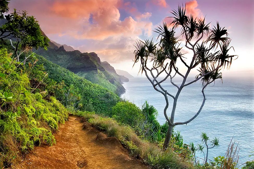
Warm colors generally advance (they grab attention), while cool colors recede into the background. In landscapes, this means a warm-toned subject will stand out against a cool background – for example, golden light on a red rock spire against a blue evening sky.
Psychologically, warm hues often evoke emotions like excitement, passion, or happiness, whereas cool hues evoke tranquility, confidence, or melancholy.
Tints, Tones, and Shades: The Color Variations
These terms refer to variations of a hue by adding white, gray, or black:
- A tint is a hue mixed with white (making a lighter, less intense color)
- A tone is mixed with gray
- A shade is mixed with black (darker)
In landscape photos, tints/tones/shades appear in subtle variations – think of the range of greens in a forest from pale sunlit moss (tint) to mid-tone emerald leaves to deep shadowy pine green (shade). These variations add richness and depth to the scene.
Generally, lighter colors feel airy or cheerful, while darker colors can anchor and add weight and drama.
Field Techniques That Create Emotional Impact
The Magic of Timing
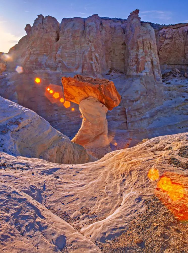
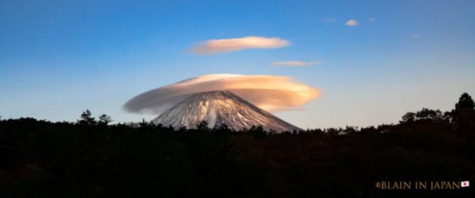
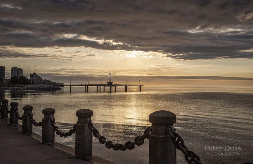
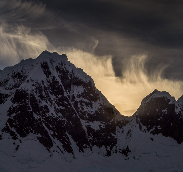
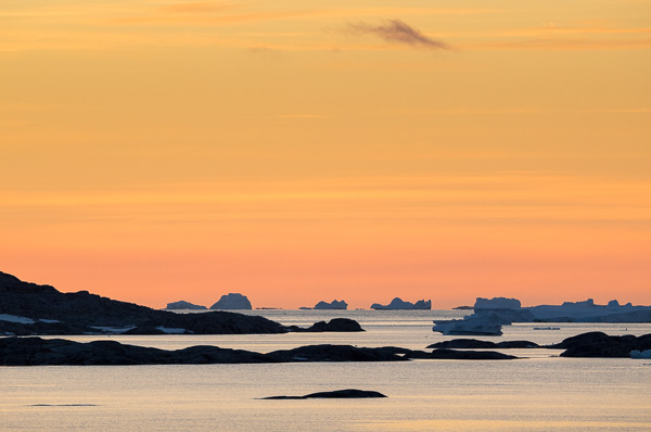
Shoot during the golden hour (around sunrise/sunset) for warm, golden tones that make landscapes glow. Early morning or late afternoon sun will enrich reds, oranges, and yellows – see how the red rocks or autumn trees light up at those times.
Blue hour (dusk/dawn after the sun is below the horizon) bathes the scene in blue-indigo light, perfect for a calm or moody atmosphere. Stay and wait and see immediately after sunset – the sky often erupts in intense colors 15-30 minutes later, and then transitions to blue hour.
Midday sunlight (neutral white) is generally the least flattering for color – it can wash out subtle tones and create harsh contrast. Of course, you can still shoot mid-day if needed by focusing on subjects that work with harsher/harder light.
Overcast light might seem dull, but it actually saturates colors evenly and creates soft shadows (if any) – excellent for forests, waterfalls, and macro details. Cloud cover acts like a giant diffuser, so colors like greens and reds appear richer (no glare).
Seasonal Color Psychology
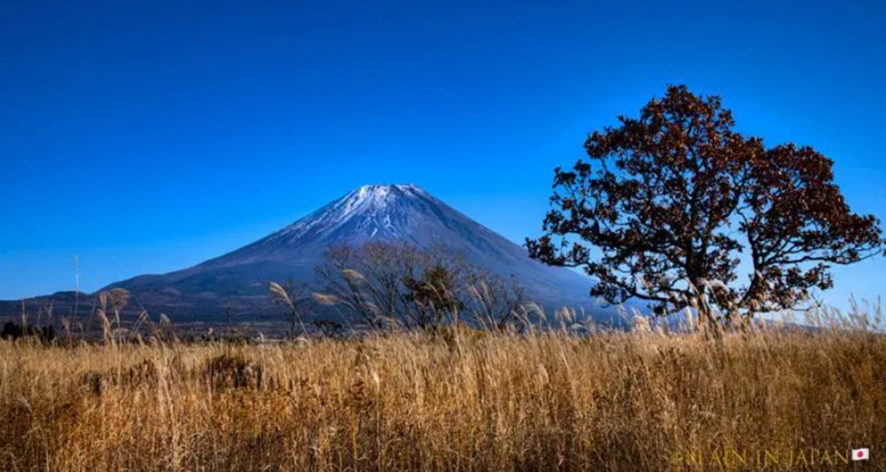
Plan shoots around seasonal color peaks – wildflowers in spring, lush greens in summer, fiery foliage in autumn, snowy blues and whites in winter.
Of course, if you want brilliant warm colors, autumn is unbeatable for oranges and reds. For fresh greens and floral colors, spring is ideal.
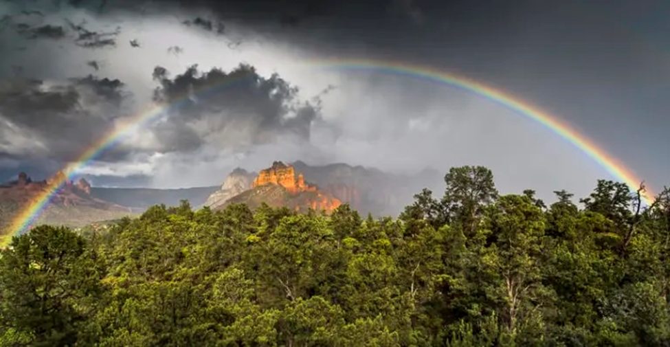
Weather also matters: just after rain, landscapes often have enhanced color saturation (foliage is wet and vibrant, and the sun breaking through clouds can create rainbow colors or dramatic warm/cool contrasts).
Even in winter, look for color: sunrise/sunset can cast pink/purple hues on snow, and evergreen trees give a pop of green in an otherwise monochromatic scene.
Filters That Enhance Emotion
A polarizing filter is one of the few accessories that directly affects color at capture. It reduces reflections from surfaces like water, foliage, and haze in the sky, thereby boosting color saturation and contrast.
For example, leaves often look shiny (reflecting white sunlight) which dulls their green color – a polarizer cuts that glare, revealing a deeper green. It can make a blue sky a richer, darker blue and make clouds stand out more.
Keep in mind: a polarizer has maximum effect at 90° to the sun and minimal effect when looking toward/away from the sun. It also reduces your light by 1-2 stops, so keep that in mind and maybe use a tripod or higher ISO if needed.
If the sky is much brighter than the foreground, you risk overexposing the sky (washing out its color) or underexposing the land. A graduated neutral density filter (half dark, half clear) can balance this by darkening the sky, preserving the rich sunrise/sunset colors and cloud detail.
Pay Attention to Reflected Colors
Landscapes often contain natural reflectors that can cast color onto other objects. For example, near sunset, a red rock cliff can reflect warm light onto nearby clouds or water, tinting them pinkish.
Be conscious of these effects as you compose – they can be used to your advantage. In slot canyons, for instance, the bouncing of light can create beautiful gradients of color on the walls.
Water is a double-edged mirror: it might reflect a blue sky (cool cast) or a bright fall tree (warm cast). Sometimes shifting your position changes what color is being reflected and can dramatically alter the colors in your photo.
Compose for Color
Actively look for color contrasts or harmonies when framing your shot. Instead of just thinking “foreground, middle, background,” think “What colors are present and how do they interact?”
If the scene lacks a focal point, adding a contrasting color element can help – e.g., a single bright subject against a different colored background.
Also, be mindful of color balance: large areas of one strong color might need “weight” from a bit of another color elsewhere in the frame. For instance, a predominantly green scene might be nicely balanced with a corner of blue sky to cool it off and add interest.
Camera Settings for Color
If you shoot JPEG, make use of your camera’s picture styles – for example, a Vivid setting will boost saturation and contrast (useful for punchy landscapes), whereas a Neutral/Flat setting will be more subdued (and safe from clipping colors).
For maximum control, shoot in RAW format; it allows you to adjust white balance and colors extensively in post without quality loss.
In tricky lighting (like mixed shade and sun), consider setting a custom white balance (adjusting the “k”/kelvin value) or using the daylight/shade presets to capture the color cast correctly. Auto white balance sometimes neutralizes the warm glow of sunrise or the cool tint of shade, robbing the scene of mood.
For example, in a sunset, AWB might try to remove the orange cast thinking it’s “wrong,” whereas you want that warmth. It’s often best to set a daylight or cloudy WB to intentionally keep warmth, or play with the kelvin setting, or simply shoot RAW and adjust later.
Understanding Color’s Emotional Impact
Colors affect us psychologically – usually in predictable ways:
Warm Colors (Red, Orange, Yellow)
Warm tones generally energize and excite. Red in a landscape, even in small doses (like a red wildflower or glowing red clouds), demands attention and can evoke passion, drama, or danger. It’s associated with intense emotions – a red sky can feel ominous or awe-inspiring.
Orange carries some of red’s passion but with the optimism of yellow. It often represents change (think of autumn) and can feel enthusiastic or nostalgic.
Yellow, the brightest warm color, is linked to sunlight and happiness – it instantly draws the eye and can convey joy or hope. A field of yellow wildflowers or a burst of golden light can create feelings of cheerfulness and vitality.
Together, warm colors can make an image feel “high energy” or emotionally charged. One study noted that warm hues literally give a sensation of warmth and excitement to viewers.
Cool Colors (Blue, Green, Purple)
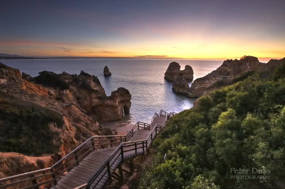
Cool tones are often calming and serene. Blue is ubiquitous in landscapes (skies, water) and usually creates a sense of peace, stability, or even melancholy if it’s a dark blue. A clear blue sky gives a feeling of openness and optimism, while deep blue shadows or twilight can feel quiet or somber.
The Power of Blue: Consider how a blue-hour photograph of a calm lake instantly creates a sense of tranquility and contemplation. The subtle blue tones of early morning mist rising from a mountain valley evoke a peaceful, meditative quality. Blue is the color of distance and space—it makes horizons recede and creates depth. At Luminous Landscape, our most popular blue-dominant images tend to be those that create a sense of expansive wonder or quiet reflection.
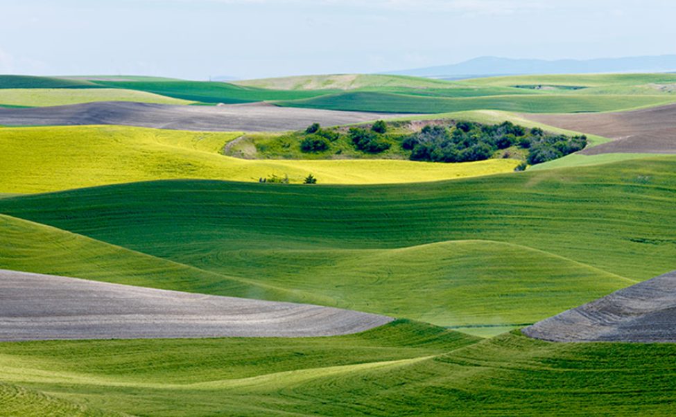
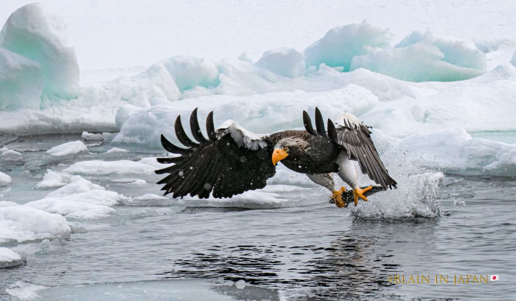
Green is the color of nature, symbolizing life, renewal, and harmony. Lush green landscapes tend to relax viewers and convey growth and freshness. In color psychology, green is restful and healing to the eyes – a photo of a dense green forest can impart calm or an adventurous, earthy mood depending on context.
The Luminous Landscape Green: Our brand green represents the lushness of life and growth. In photography, green-dominant scenes like moss-covered rainforests, spring meadows, or a distant view of rolling emerald hills all convey a sense of vitality. Green is especially powerful when it appears in varying shades and tones—from the yellowish-green of new growth to the deep emerald of old-growth forests. The key to working with green is understanding that it has a natural restorative quality. Studies show that merely looking at green scenes can reduce stress and eye strain—one reason why landscape photography can be so therapeutic.
Purple (and violet) is rarer in nature but very special when it appears (fields of lavender, alpine sunsets, night skies). Purple combines the calm of blue and the energy of red, often evoking mystery, magic, or luxury.
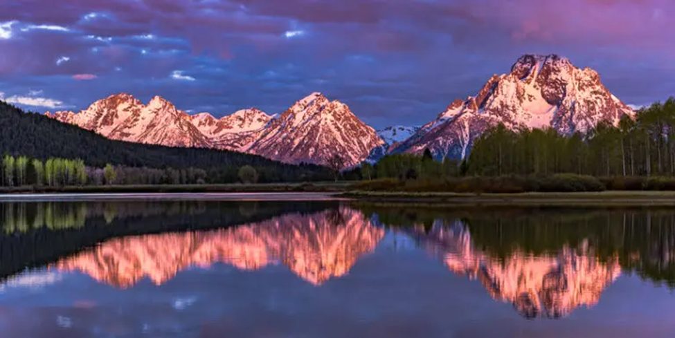
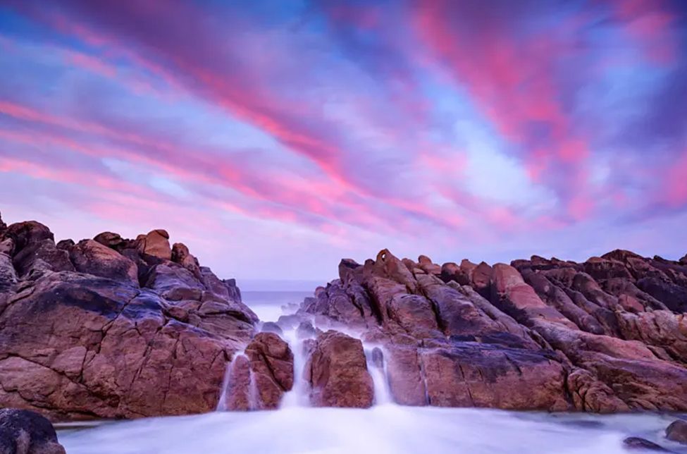
Balanced Palettes (Warm + Cool)
Some of the most emotionally powerful landscapes use a mix of warm and cool in a complementary way. The juxtaposition can create a dramatic tension or a yin-yang balance that viewers find compelling.
For example, a scene with cool blue shadows and warm golden highlights (common at sunrise or sunset) often feels magical because it touches both calming and exciting sensations. The blue tones make the gold seem even warmer and vice versa.
Many landscape photographers intentionally chase these conditions (such as stormy weather at sunset) to get that color contrast that tugs at the emotions.
Post-Processing for Emotional Impact
The digital darkroom is where color theory meets your creative vision and really give an emotional impact:
White Balance and Global Color Cast
Start with correcting or creatively tweaking the white balance. Think about the mood: warming the image (higher Kelvin, towards orange) will enhance sunsets, autumn scenes, and any emotional warmth. Cooling it (lower Kelvin, towards blue) will emphasize dawn, winter, or moody overcast vibes.
For example, a sunset shot might benefit from a slight boost in warmth to really bring out the oranges (many photographers deliberately set their WB “warmer” for sunsets to intensify that glow).
Maintaining a slightly warm or cool global cast that complements the scene can create more emotional resonance than a perfectly neutral white balance.
Contrast and Color Saturation
Adjusting contrast often affects color saturation – increasing contrast can deepen colors (since midtones get richer), while too much contrast might also oversaturate some areas.
Use the “Vibrance” and “Saturation” sliders carefully.
Vibrance is usually preferable for global adjustments because it boosts the less-saturated tones more and protects skin tones (not usually an issue in landscapes, but it also tends to prevent oversaturation of already vivid areas).
A good workflow is to set contrast/levels first for a nice tonal range, then increase vibrance to make the image pop.
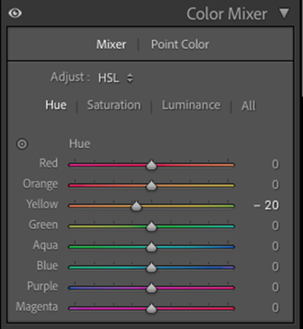
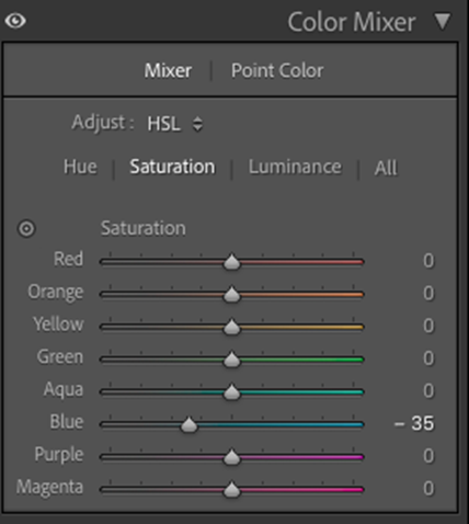
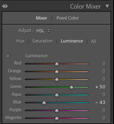
Selective Color Adjustments (HSL)
The HSL panel (Hue, Saturation, Luminance) is your precision toolkit:
Hue shifts: If your sunset came out a bit too yellow and you want it more orange-red, you can nudge the “Yellow” hue slider a bit towards orange. If foliage is too yellowish, shifting the greens slightly towards blue-green can give a lusher look.
Saturation (by color): Maybe the blues in the mountains are too strong – you can lower Blue saturation without affecting the rest of the image. Or boost the Reds and Oranges to enhance fall colors while keeping the sky the same.
Luminance (brightness by color): This is an underrated way to affect color perception. Darkening the blue luminance will deepen the sky color (often more effectively than just increasing saturation). Brightening the greens can make a forest feel sunny and light, whereas darkening them yields a brooding, dense feel.
Color Grading / Split Toning
This technique involves adding a color tint to the shadows, highlights, or midtones. It’s a powerful way to establish an overall mood or color harmony.
For example, split-toning with a cool blue in the shadows and a warm golden in the highlights can enhance an already warm-cool dynamic sunset scene, giving a subtle cinematic quality.
Many landscape photographers use split toning to impart a signature style – like a teal/orange grade (teal in shadows, orange in highlights) which mimics the classic complementary scheme and is emotionally appealing.
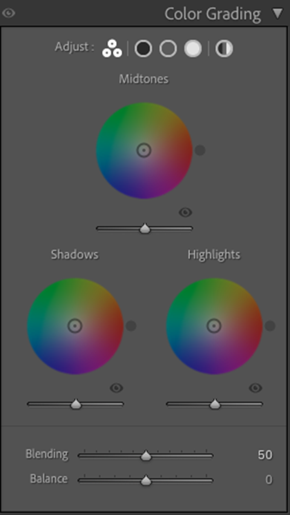
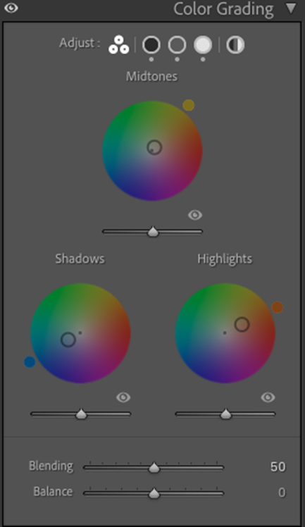
When doing this, start with very low saturation in the color grading – a little hint of tint is usually enough.
Dodging/Burning with Color in Mind
Dodging (brightening) and burning (darkening) selectively can influence color saturation – darkening often intensifies color, brightening can wash it out.
If you burn the corners of a sunset photo (vignette), those corners will also become more saturated in whatever color they are (often cool tones), which might nicely frame the warm center.
You can gently paint warmth into a foreground that was in shadow to simulate reflected sunset glow, for instance. Or paint a hint of blue into the distant hills to enhance aerial perspective (farther objects appear cooler/bluer).
Learning from the Masters
Many renowned landscape photographers have mastered color for emotional impact:
Galen Rowell (1940–2002): A legend of adventure and wilderness photography, Galen Rowell was known for vibrant colors and dramatic lighting in his landscapes. Shooting mostly during golden hours and often in extreme locations, he captured intense sunrise/sunset hues and bold contrasts.
Rowell frequently used graduated neutral density filters and polarizers in the field to control exposure and enhance colors. His book Mountain Light emphasizes how light’s color at different times of day defines a landscape’s emotional character.
David Muench (born 1936): A pioneer of American landscape photography, Muench is revered for his rich, saturated color images of the American West. He often shot with large format film (like Fuji Velvia slide film) known for its vivid color rendition.
Muench’s photos of sandstone canyons, wildflower meadows, and desert vistas are bursting with intense hues – yet always tastefully balanced. He leverages complementary contrasts frequently: blue skies versus red rocks, purple lupine against green grass, etc., to give depth and pop to his compositions.
Art Wolfe (born 1951): A contemporary master known for wildlife and landscapes, Art Wolfe’s style often incorporates striking color contrasts and patterns. He has a painterly approach to composition, using color to create balance and focal points.
Wolfe’s landscapes often juxtapose bold colors – for example, a line of flaming orange trees against dark evergreen forest, or turquoise glacial ice under a pink sunset. His compositions make creative use of color theory; he’s written about color relationships in photography and frequently teaches color as a key element of design.
Art Wolfe articles on LuLa:
- Night Fisherman
- Seeing Like a Painter
- Abstract Vacation
- Constructing the Composition: Angkor Wat
- Beyond the Obvious – Discovering Unintended Art
The Color Journey
Understanding color in landscape photography isn’t just about making prettier pictures—it’s about creating emotional connections. When you think about how color affects feelings, every photograph can become a conversation with the viewer’s heart.
So, next time you’re in the field or sitting at your screen, ask “What do I see?” AND “What do I want people to feel?” The classical painters showed us the way.
Now let’s go paint with light and stir some souls!
Further books to explore:
Galen Rowell – “Mountain Light: In Search of the Dynamic Landscape”
Art Wolfe – “Edge of the Earth, Corner of the Sky”

Elevate Your Vision


Read this story and all the best stories on The Luminous Landscape
The author has made this story available to Luminous Landscape members only. Upgrade to get instant access to this story and other benefits available only to members.
Why choose us?
Luminous-Landscape is a membership site. Our website contains over 5300 articles on almost every topic, camera, lens and printer you can imagine. Our membership model is simple, just $2 a month ($24.00 USD a year). This $24 gains you access to a wealth of information including all our past and future video tutorials on such topics as Lightroom, Capture One, Printing, file management and dozens of interviews and travel videos.
- New Articles every few days
- All original content found nowhere else on the web
- No Pop Up Google Sense ads – Our advertisers are photo related
- Download/stream video to any device
- NEW videos monthly
- Top well-known photographer contributors
- Posts from industry leaders
- Speciality Photography Workshops
- Mobile device scalable
- Exclusive video interviews
- Special vendor offers for members
- Hands On Product reviews
- FREE – User Forum. One of the most read user forums on the internet
- Access to our community Buy and Sell pages; for members only.
You may also like