Background
About twenty years of black and white darkroom work (35mm and large format) ended in the mid-1970s, when matters of time, interest and convenience steered me to working more exclusively with 35mm colour film. I had been shooting chromes as well and continued to do so into the late 1970s. Then I switched to colour negative film and remained with it till October 2004, when I bought a used Canon 1Ds. That ended the film phase of my photography, except for the large legacy of colour negatives meriting more controlled editing and superior printing than available from affordable photo-film labs.
Apart from its fully satisfactory resolution, low speed colour negative film has three advantages over chromes: (i) lower cost and greater ease of making prints, (ii) greater exposure latitude and shadow detail (see Inset 1) and (iii) the more natural quality of the colour, when properly processed. This qualifier got me hooked on digital photography.
It was always a struggle getting the labs to make the prints look right, and they were only 4×6 inches unless I were to spend a lot for each enlargement, over which I had no process control. One day in the late 1990s I discussed my frustration about all this with an experienced imaging specialist at Ritz Photo Corporation’s flagship store in Washington DC, where we were living at the time. He said to me “Mr. Segal, only you know what you saw when you made those photographs and what you expect the prints to look like – when we process them it’s all calibrated in a machine. We have film scanners and inkjet printers good enough that you should consider doing all this yourself.” That advice launched me into digital photography.
________________________________________________________________________
Inset 1. Latitude of Colour Negative Material
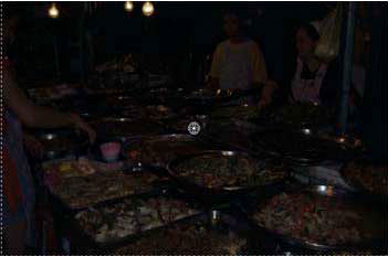
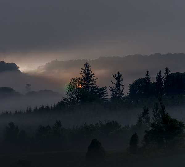
I didn’t notice my Nikon N70 read 1000 ASA instead of 100 ASA from defective bar codes on a batch of film canisters. It looked hopeless at first, but the film was forgiving enough to rescue some of the images in Photoshop:
Sidewalk “café”, evening in Bangkok Thailand, January 2003):
After several years of growth in experience, hardware and software, fast-forward to 2005 when I ‘m now spoiled by the superb, clean, fully digital image quality I get from my Canon 1Ds. So I gave myself a challenge: achieve “Near Digital Quality” (NDQ) from my legacy of worthwhile colour negatives. Yes – film trying to catch-up with digital – some may find this hard to digest, but after considerable experience processing both, I have no doubt this is the technical reality.
The main challenges meeting this objective with colour negatives are threefold: firstly, film grain , and secondly colour balance, the latter due to (a) the orange mask (b) the chemical diversity of colour negative media and (c) because of (a) and (b), the absence of IT8 scanner calibration targets for colour negative materials. Thirdly, most colour negative materials were not designed to be scanned in high resolution scanners. They were intended to be printed on papers generally capable of less output resolution than achievable with today’s film scanners. For this reason, inkjet prints of film scans can show sharper grain and in general look “crunchier” than darkroom prints made from the same negatives. I spent a fair bit of time experimenting with various software and workflow sequences to address these issues and thought it useful to share the experience with others, for feedback and ideas.
________________________________________________________________________Technical Environment
Hardware and Software: I use Photoshop CS2, work in 16 bit image mode and print with an Epson 4800 printer using Epson Ultrachrome inks and Epson Enhanced Matte paper. My scanner is a Minolta Dimage Scan Elite 5400. I use this scanner because it has 16 bit A/D conversion, 16 bit colour depth, a stated dynamic range of 4.8, glassless film carriers, and optical resolution of 5400 pixels per inch. It produces very fine-detailed scans, including film grain, a major topic in this paper. After working with three scanning applications – Minolta’s packaged DiMage Scan, Hamrick’s VueScan and Lasersoft’s Silverfast Ai6 Studio version, I settled on Silverfast.
The main reason for using Silverfast (the costliest of the three) is that it offers the best quality results with the most control when scanning negatives. It is the only scanning application of the three that consistently delivers almost correct colour balance, saturation and luminosity with little effort – after a substantial investment in the Silverfast “learning curve”. Part of the reason it can do this must be its “Negafix” module which contains many custom presets for converting various colour negative films to positive HSB values (8 manufacturers representing 48 film types each customized for the different film speeds in each film type), plus the ability to fine-tune these presets for exposure and “autotolerance” (Silverfast-ese for fine-tuning color cast removal).
Silverfast has a learning curve because the user interface and the documentation leave much to be desired, and the program has some “quirky” features. One wades through these issues because once mastered, it does deliver excellent scan quality and economizes on post-scanning adjustment work in Photoshop. I discuss the operation of Silverfast in some depth in a forthcoming article, because it is the core process for digitizing the image.
Size and Resolution: My prints are sized for either 11 x 8.5 inch paper (including a minimum one inch border around the printed image leaving a maximum image size of 9 x 6.5 inches) or A3 paper, which is a 16.5 x 11.7 inch sheet, ( including a minimum one inch border, leaving a maximum image size of 14.5 x 9.7 inches). It is important to know the approximate output sizes before scanning, in order to set the scanning resolution appropriately. Based on an extensive review of the literature, informed technical discussion forums on the internet and consultation with experienced professionals, there is broad agreement that output PPI should be in the range of 240 to 480 or less, with higher values for smaller prints, because they are viewed from closer-up. (See in particular pages 83 to 85 of “Mastering Digital Printing” Second Edition by Harald Johnson, where the results of our collaboration on scanning resolution tests are reported.) A 35mm film frame is 1.417 x 0.945 inches (aspect ratio of 1.5). I make one scan for both sizes by scanning for the higher PPI requirement (letter-size print) and re-sizing (WITHOUT re-sampling) in Photoshop for the lower PPI requirement (A3 print). The resulting scanner INPUT PPI for both print sizes is about 3070, resulting in about 480 OUTPUT PPI for the letter-size print and 300 OUTPUT PPI for the A3 print. This is derived as follows, focusing on the larger print dimension for each print size:
Magnification factor (MF), letter print: 9 inch print/1.417 inch negative = 6.35; MF, A 3 print: 14.5 inch print/1.417 inch negative = 10.23.
Scanner input PPI for 9 inch print @480 OUTPUT PPI = 480PPI x 6.35MF = 3048 INPUT PPI;
Scanner input PPI for 14.5 inch print @ 300 OUTPUT PPI = 300PPI x 10.23 = 3069 INPUT PPI.
Hence I insure that my scanner software is set to scan at 3070 input PPI in 16-bit mode, producing an initial file size of about 70 MB. The range of 300 to 480 OUTPUT PPI is fine. With 3070 INPUT PPI, there is still room to spare for cropping the image while preserving output dimensions, insofar as 240 OUTPUT PPI or less will yield highly satisfactory A3-size image quality.
There is a considerable amount of discussion about the impact on quality of setting scan resolution at an integer divisor, odd and even resolution settings, scanning exactly to the printer’s native resolution setting, etc. I have tested all of this and the differences in print quality at either A3 or letter-size are not noticeable to (my) naked eye, so I don’t worry about any of it, crop according to artistic requirements and let the eventual output resolution fall wherever it falls, provided it stays within a range of 240 to 480, give or take a little. With an optical INPUT resolution of 5400 PPI, my scanner easily accommodates a higherresolution scan for those images that will be severely cropped and greatly enlarged relative to the usual dimensions discussed above.
________________________________________________________________________
Dusting the Negatives
One may think this doesn’t need to be discussed, but it does, because it is important and there are different approaches for dealing with it – some more effective than others. It is often surprising and disappointing to see how much dust, scratches and other imperfections are in color negatives, notwithstanding that they were processed by a well-known commercial lab, stored in glassine sleeves and virtually untouched by human hands. Effective dusting pays large dividends in saved time after scanning. Dust shows up in the scanned image as white spots. While Photoshop has a dust and scratches filter, and various authors of Photoshop tricks and tips show short-cut methods for eliminating these annoyances, all of them result in some degradation of image detail unless they are implemented on a portion of the image with no needed detail or texture. The only fail-safe way to remove dust from an image file in Photoshop is to apply the Spot Healing Brush (CS2) or the Clone Stamp speck by speck. This is tedious and time consuming, therefore the more of it removed before scanning the better.
The Spot Healing Brush improves on the clone stamp as it is not necessary to select a source of the data replacement. The tool automatically borrows information from neighbouring pixels. There are two problems with this tool: (i) it doesn’t always borrow the right information, and (ii) it gets confused if the information around the spot to be healed lacks uniformity. In these cases it remains necessary to use the clone stamp.
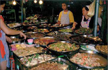
Apart from filtering in Photoshop, the methods for eliminating dust are blowing it or brushing it off the negative before scanning. Blowing it with blower-brush is not very effective because there is insufficient air pressure to assure the dust is completely removed, rather than shifted from one part of the image to another. Much more effective is the American Recorder CO2 Dust Remover gun (see Inset 2). It produces a relatively powerful blast of dry CO2 that has a much higher probability of blowing the dust OFF the negative. Its main downsides are (i) some dust fails to blow off the negative, and (ii) the CO2 cartridges are small and costly. Enter “Visible Dust”. This product is meant for dusting digital camera sensors, but its technical principles apply equally well for dusting negatives. When the Visible Dust brush is blown with air (say using the same American Recorder gun), it is cleaned from previous use and becomes electrostatically charged. When it is passed over the negatives it collects the dust that can be removed by gentle brushing. This combination of the American recorder CO2 gun and the Visible Dust brush is very cost-effective, because it uses a fraction of the CO2 one would use without the brush, and the charged brush is the most effective dust remover.
This solves PART of the problem, but not all of it, because embedded artifacts (sometimes from film development) and scratches (sometimes from poor quality film canisters) still need to be removed in Photoshop. I do this before adding any layers to the image, because the effectiveness of the Clone Stamp or the Spot Healing Brush can be compromised by some layering and blend-mode combinations. In fact, after opening the image in Photoshop, my first two items in the workflow are to make all cropping and Transform adjustments first, because they affect the amount of image material that will remain to be used for everything else (no point wasting time on pixels destined for deletion), and then clean-up the image.
Inset 2. American Recorder and Visible Dust
“De-graining”and Sharpening
I’ve scanned the negative, (in a forthcoming article this is an in-depth description of how I use Silverfast Studio Ai6 for colour negative scanning), opened it in Photoshop, corrected the image for perspective and any required cropping, and I am now ready to clean it up and sharpen it. This is truly the nub of the whole process for achieving NDQ – clean, detailed images. Two plug-ins are at the heart of this process: Neat Image for removing grain, and PK Sharpener Pro for sharpening the “de-grained” image.
After opening the image in Photoshop and dealing with any cropping or transformations I think it needs, I make sure the image is flattened, create a duplicate image layer and open Neat Image. I have the version that works as a Photoshop plug-in. This is preferred for this workflow. Despite the fact that all frames are of the same film batch, I find it is preferable to auto-profile each image. I discovered this when I noticed that saved profiles which were fine for one image either over or under-performed on successive images. I don’t know exactly why, but it is a fact, and only takes a few moments to create a profile. Inset 3 shows the portions of Neat Image I use most often, in the Noise Filter Settings tab.
________________________________________________________________________
Inset 3. Neat Image Interface
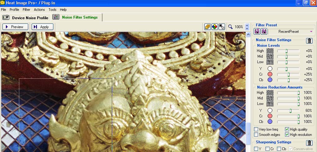
To be sure, Neat Image needs to be configured before use. Based on information in the on-line manual and emails with Neat Image tech support (Vlad – everyone’s fountain of wisdom on the use of Neat Image), I do the following:
In the Device Profile Tab, I have my scanner selected and I select YCrCb for working colour space. I leave everything else untouched, because I can rely on Auto Profile, unless very unusual image conditions arise that make it preferable to manually configure a profile. For grain reduction alone, this seldom happens. In the Noise Filter Settings Tab I select the High Quality and High Resolution check boxes, and leave everything else alone except as discussed below. I do not allow Neat Image to do any smoothing or sharpening. For my workflow, it has one dedicated, specialized function, which it performs very well: grain reduction.
Once I click “Auto Profile”, Neat Image selects what it determines to be the most appropriate area of the image for distinguishing grain/noise from image detail and creates a profile. I then magnify the image to 100% in the Neat Image window, open the Noise Filter Settings tab, and move the image around in the window to a section that contains the finest essential image detail I think it important to preserve. I then click on the Preview button (Inset 3), which opens a Preview box that immediately shows me within the boundaries of that box what the filtered image will look like. This shows in the lower left portion of Inset 3. Clicking inside the Preview box toggles the effect on and off, which is very convenient for rapid “with versus without” the filtering comparison.
I examine this Preview very carefully to see two things: (i) whether it removes the grain to a sufficient extent, and (ii) whether it also removes image detail that I think would otherwise be both visible and interesting to retain in the print. Most of the time, it removes the grain very adequately. When it does not reduce grain sufficiently, either I manually profile by selecting another area of the image and re-profile, as instructed in the very useful on-line manual, or I increase the noise level settings moderately to taste – Inset 3, upper right corner – “Noise Level” sliders. The final choice between these options depends on the impact they have on image detail. If the Auto Profile removes grain too aggressively, it is usually adequate to reduce the Noise Level sliders to taste.
When examining image detail, one needs to do this with a certain mind-set: firstly, not every tiny detail observed at 100% magnification on the monitor will be visible on an A3 print; hence there is a certain amount of “give” on image detail – but I don’t “give” much; secondly, one needs to be aware that some “texture” which may at first have looked like surface detail is actually film grain, not subject matter – one develops a feel for this distinction by knowing that the distinction often needs to be made, and reasoning from the characteristics of the subject matter itself; thirdly, one needs to remember that a minor loss of acutance at the grain reduction stage will be compensated by Capture Sharpening in the next step of the work flow. Yes, it’s true – that is what happens, to be seen below.
However, despite these caveats, if the Preview indicates that too much detail risks being sacrificed to grain reduction, one can reduce the Noise Level sliders to taste. There are other adjustments one can make; however, Neat Image tech support has recommended that this is the place of choice to make such adjustments. These are the primary controls that influence the program’s selection between grain/noise and essential image detail. My experience using this program on many hundreds of images indicates that Auto Profiling, sometimes with minor tweaking of the Noise Levels, provides an appropriate balance between grain reduction and detail retention.
Inset 4. Neat Image – Grain Versus Detail at 100% Magnification 18-03
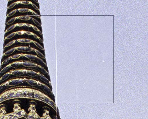
This is roughly 2% of the image area at 100% magnification, where the Neat Image Preview box (black-outlined square) is surrounded by unfiltered material.
Once satisfied with the predicted result in the Preview window, I click “Apply”, the image reverts to the main Photoshop window and the filter is applied to the Background Copy layer (having made sure this layer is active beforehand). I then examine the result in Photoshop to confirm whether it reflects what I considered acceptable in the Neat Image Preview window. Generally it does. If it does not, or I see things I didn’t see before and don’t like, I can start over, using either of two non-destructive options: delete the Neat Image history state from the History list, or delete the Background Copy layer.
That raises a question about the purpose of the Background Copy layer. Why bother having it? Well, there is a good reason. There are certain images that have rather starkly contrasting needs for grain removal and one would like to have two or more “treatments” in the same image. An example is an image that has both large areas of blue sky where one would prefer not to see any evidence of film grain at all, along with other areas of the image containing fine details that despite any settings, the program cannot discern from grain, and can only be preserved by not reducing grain to the extent desired for the sky. When situations like this arise, I let Neat Image reduce grain to the extent required for the sky, add a Hide All Layer Mask to the Background Copy, then use a white brush at maximum opacity to paint in maximum grain reduction for the sky, and at a lower opacity to gently reduce grain in the remainder of the image. This works very well.
After completing grain reduction, I then open PK Sharpener Pro and implement Capture Sharpen. Here, the big questions are which sharpener to use and what “tweaking” to apply. There are many, most clearly not relevant. As well, one’s taste about sharpening affects the choice. My taste is that unless one is aiming for a soft image, the photographic detail should be crisp, but not crinkly or crunchy (a fine, but readily noticeable distinction when you see an over-sharpened image). One’s first temptation is to select “35 mm Slow Negative Film” because that is the medium being used here. I found that regardless of whether I selected Wide, Medium, Narrow or Superfine Edge sharpening, this sharpener produced results bordering on the crinkly, with some evidence of little white speckles. (My testing of this phenomenon, not seen in my digital captures, indicated that these speckles showed on the monitor, but seldom in the print; however for images with deep red and blue surface areas, there was an occasional slight lightening as a result of sharpening.) I raised the problem with Bruce Fraser (a Principal in the PixelGenius Group who developed the tool). Bruce recommended that because I was using an “industrial-strength” grain reduction tool before sharpening, the kind of image I am sharpening more likely resembles a 6*6 Positive rather than a 35mm Negative. So he suggested that I try that sharpener. I did (here with Narrow Edge sharpen), and the results are satisfactory.
Inset 5 Capture Sharpening
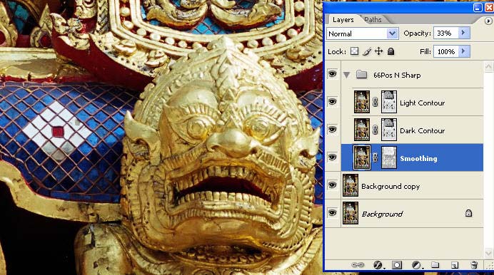
This is roughly 5% of the image area at 50% magnification after grain reduction and Capture Sharpening, but no treatment of highlights and contrast. An A3 print of this image needs no more sharpening, but PK has further sharpening tools if it did.
________________________________________________________________________
The super-imposition of the Layers Palette in inset 5 shows the layer structure of the image to this point. If needed, one has considerable control over the Sharpening effect after the fact by adjusting the opacity of the three layers – Light Contour, Dark Contour and Smoothing. Sometimes I find it appropriate to do so. The default opacities of these layers are 66%, 66% and 33% respectively, so there is room to increase or decrease them.
Having completed these two steps, it is instructive to step back through History and see the progress the image has made. If the workflow has been successful, the image will now be much cleaner and crisper than it was before the filtering with these two tools. Inset 6 is a sample of such a “trek through History”.
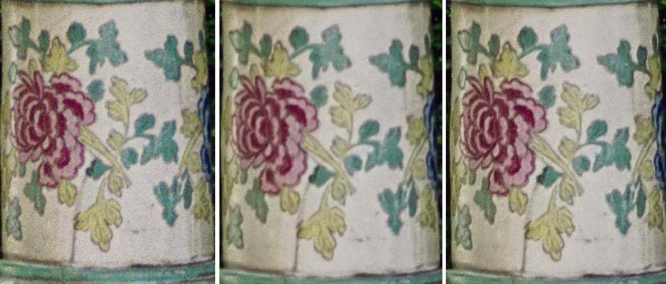
Inset 6.
Progress of the Image from Scan to Capture Sharpen – 100% Magnification
________________________________________________________________________
This snippet of architectural detail from a Thai temple spire is less than 1% of the image area. The detail in the cream-colored leaves is not visible to the naked eye in a 9*6 inch print of the whole photograph. Comparing the image at the far right to that at the far left, the detail is slightly sharper and the whole image is cleaner. Hence we are ahead of the game, and achieved “NDQ”. The key was to insure the correct balance between grain reduction and sharpening, using these two custom tools for each job.
At this point, I flatten the image and proceed with any of the usual further touch-ups in Photoshop before printing.
Mark D. Segal Toronto, February, 2006
Elevate Your Vision


Read this story and all the best stories on The Luminous Landscape
The author has made this story available to Luminous Landscape members only. Upgrade to get instant access to this story and other benefits available only to members.
Why choose us?
Luminous-Landscape is a membership site. Our website contains over 5300 articles on almost every topic, camera, lens and printer you can imagine. Our membership model is simple, just $2 a month ($24.00 USD a year). This $24 gains you access to a wealth of information including all our past and future video tutorials on such topics as Lightroom, Capture One, Printing, file management and dozens of interviews and travel videos.
- New Articles every few days
- All original content found nowhere else on the web
- No Pop Up Google Sense ads – Our advertisers are photo related
- Download/stream video to any device
- NEW videos monthly
- Top well-known photographer contributors
- Posts from industry leaders
- Speciality Photography Workshops
- Mobile device scalable
- Exclusive video interviews
- Special vendor offers for members
- Hands On Product reviews
- FREE – User Forum. One of the most read user forums on the internet
- Access to our community Buy and Sell pages; for members only.
You may also like