Lost in the Gutter
Good Morning. Well, I guess it is, anyway. As I write this it’s "the Monday after," and I’m feeling dejected about the Green Bay Packers’ loss to Philadelphia in overtime yesterday. I don’t think I’ve felt this bad after a loss since my ‘Skins (I lived in D.C. for many years) got whacked by the Raiders in the Super Bowl after the ’83 season. Being a visual person, I remember images, and I’m going to have a couple of images burned into my brain this whole off season — Ahman Green running right into Wahle (our own guy) and failing to score from the 2; Brett diving and reaching for what would have essentially been a game-ending first down and not quite getting it.
On the other hand, Philly was facing fourth and 26, and they got it done. Hats off to them for that. Now let’s talk about photography — that ought to make me feel better.
Photographing to Fit
There are some things that simply tempt us. I won’t mention the most obvious Biblical sins and weaknesses of the flesh, as we all know what those are. One interesting little phenomenon I’ve been learning about recently is that many Americans have become overeaters of sugar — ever since we stopped eating fat and started becoming that way. If you’re one of those who crave sugar every day, just think of a chocolate-covered Dunkin’ Donut. Temptation. You know what I mean.
Or take color film. You give a man color film, and sooner or later you will catch him out in the garden taking pictures of flowers. This seems inevitable. He just can’t resist. He’s got this colorful film, y’see, and he spies this colorful flower, and…well, not being a chimp, he does realize that there are enough flower pictures in the world already, and that the one he’s about to take isn’t going to be of any use to anybody. But he can’t help himself. It’s too great a temptation to resist. He succumbs to the weakness. (I’m partially kidding here. Flower photographers, forgive me.)
Graphic designers must face a similar temptation. Now, I don’t know if you’ve ever seen graphic designers work. They’re fun to watch. They’re typically Quark or Pagemaker or Illustrator ninjas, and at the keyboard and the computer screen they make like a Benihana chef with a pair of ginsu knives. Zip, zam, return — things morph and shift and come together like magic. Then, just like a Renaissance painter, they pause to contemplate what they’ve just wrought and to plan their next move. Artists have been doing that since we drew on cave walls with charred sticks.
But what they’re looking at if they’re designing, say, a magazine spread or a book, is typically a large computer screen divided into two page-sized rectangles placed right next to each other. Enter temptation.
On the computer screen, you see, this expanse of visual real estate is to a designer like a new [insert name of your favorite flower] bloom is to a guy with a macro lens and a fresh roll of Velvia. It’s a siren song. Not being chimps either, designers all know, in the rational part of their brains, that the line in the middle of the screen is actually the gutter — the spine where the book is bound, where one page crosses over into another. It’s where the plane of the pages gets broken and visual information can be obscured or distorted. They know that the gutter is often a larger visual impairment than it looks like on the computer.
Doesn’t matter. That innocent little line on the computer screen just looks so inconsequential. Much as they might try, they can’t resist. They think of the whole spread as their kingdom — all of a piece, theirs to conquer, and they just ache to spread pictures out over the whole thing, spilling them over and across the gutter, building the whole magnificent two-page spread into a cohesive visual whole. Gutter be damned!
Often, this is not good for photographs. I’m still surprised, after all these years, how often otherwise expert and experienced designers fail to account for the gutter. Even the big guns, designers at pricey ad agencies and big-budget magazines, fall prey to this insistent temptation from time to time. Take this ad, for instance, from a recent issue of a prestigious U.S. magazine:
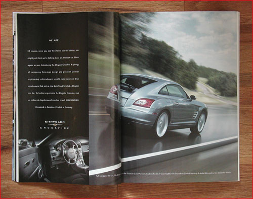
You probably can’t read the text, but the very first line reads, "Once you see the classic boat-tail design…." Now, it looks like a nice car. And it looks like a nice photograph. I’m sure Chrysler paid quite a lot for it. Trouble is, the gutter falls in such a way that it destroys the form and proportion of exactly what the text is calling attention to. Oops!
A few pages further on, we come across this:
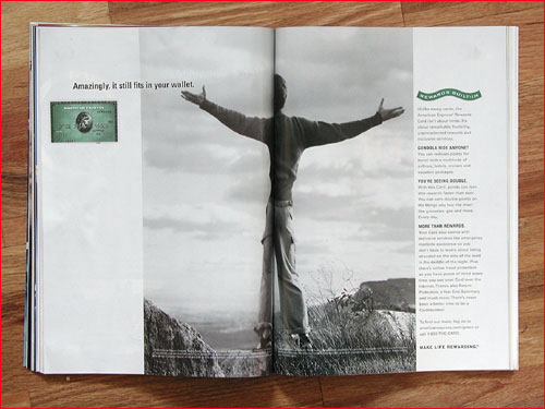
Oh dear. See what I mean? That dratted gutter again. I’m sure this spread looked magnificent in the layout program. I’m sure the designer meant well. But the best laid schemes o’ mice an’ men… (you know why you always see a "dot-dot-dot" after that phrase? It’s because the next line is "Gang aft a-gley." Seriously. It’s from Robert Burns. At least we all know what the first part means).
Logos and crops
One of the things that pro photographers have to deal with all the time, and that amateurs almost never do, is that pros have to accommodate page layouts. That may mean accommodating a fixed element like a logo, or including some dead space so type can be inserted, or simply leaving ample space around the main subject (called "air") so that a picture can be cropped in a variety of ways to accommodate a designer’s needs. The designer is trying to make the photograph (and hence the photographer) look good, but they’re also trying to make the whole page layout look good, and sometimes individual elements may have to suffer a little. Just as words sometimes have to be cut to fit a layout, so sometimes do photographs have to be cropped in ways that might not, in a perfect world, be just what the photographer would have liked.
It seems many hobbyists don’t even think about things like this. When I was atPhoto Techniques, Tinsley Preston got the idea to have a cover contest. It was a good idea — it was popular with readers, and there were lots of entries. We got some good ones. But in looking over all the pictures with Tinsley, I was struck by how many of the entrants didn’t make the slightest allowance for the fact that our cover had a large, blocky logo on the upper left-hand corner. Only one entrant out of many hundreds bothered with an overlay showing the position of the logo, standard practice among many pros. A few people even sent pictures in which the center of interest was in the upper-left-hand corner! Now, obviously, that wouldn’t do. Or you’d think it would have been obvious.
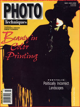
Notice how this considerate model jived to her left a little bit to make room for the logo looming next to her head?
Well, okay, actually that’s something the photographer has to envison. When we published his cover in May of 1996,
Douglas Dubler had more than 750 magazine covers and 1,500 cosmetics ads to his credit. He knew to leave some air for the logo.
The gutter’s fatal attraction
The other aspect of graphic designers succumbing to temptation that’s frustrating to us photographers is how often they think that the reallygoodpictures have to bebig. So — you guessed it — they splay it over the gutter.
Where does this impulse come from? Do they think people won’t see it if it’s small? Do they think people won’t know which picture is a really good one unless they call attention to it by making it big? Do they think readers ache so keenly for visual variety that some pictures simplymustbreak the fetters of one page and flex freely into the next one? In virtually any book that uses bleeds (a "bleed" is anywhere on a page that a picture abuts an edge), at least a few of the photographs are ruined by the gutter.
Sometimes, of course, running pictures across the gutters works. Or at least doesn’t hurt. But the gutter has many perils. Important details can get lost down there, like early ocean explorers falling off the edge of the Earth. Another pitfall, especially in color, is that different sides of the bleed might be printed in different parts of the run, so the color might not match. Try making half of a picture five points more magenta than the other half, and watch the nice photographer hop up and down and make his neck veins stand out — it’s very entertaining. Then too, the gutter itself can become a graphic elementin the photograph— an arbitrary vertical line or division. In the worst of these cases, the gutter breaks the photograph in a totally unfortunate way, making it seem like two separate pictures and ruining the relationships between one side of the frame and the other — relationships that the photographer, you can bet, was careful to get just right. So sorry.
Avoiding the gutter
Good designers have ways of dealing with the gutter, of course. AtPhoto Techniques, for instance, the production manager, Roberta Knight, sometimes built an entire issue around a center spread (which is folded, but is the same piece of paper) just so that a critical gutter bleed would work. If you happen to have, or have access to, the Thames and Hudson bookSo Many Worldspublished in the U.S. by Bulfinch, look through it with an eye towards the bleeds. It’s a model of good, intelligent page design.
The book’s designer, Adam Hay, uses bleeds sparingly. When he does cross the gutter, he follows one of three good strategies. He might do a "mild bleed" where only a relatively small and insignificant part of the picture crosses the gutter; he occasionally bleeds monumental subjects, such as a mountain range, to help with a sense of scale; or he might bleed pictures which are essentially uniform fields of similar details, such as an unbroken sea of children’s faces turned towards the camera. Wherever he risks the gutter, however, he makes it work.
Of course, we photographers can’t help it if we end up in the gutter. The picture is out of our hands by then. About the best we can hope is that the graphic designer to whose hands we entrust our work are feeling resolute that day, and able to withstand temptation.
— Mike Johnston
BOOK UPDATE:I’ve got really good news aboutThe Empirical Photographer. Well, good news and bad news. First of all, it seems that production delays are the rule with book publishing, so I perhaps owe everyone an apology for giving out a date certain way before I had a date certain. I’ve been punished for that indiscretion by now with heartburn, believe me. Anyway, I now have a date certain. I just heard last Monday that the book is a "go": the files are 100% vetted and prepared for printing, and it’s in the queue for the press. That means that everything from here on in proceeds in lockstep. That’s the theory, anyway. Thelatestthat I will get the proof is six weeks from now. If, and only if, I need to make changes in the proof, it could take another two or three weeks to make those. At that point I will get the review copies. Shortly after that, I can begin filling the pre-orders. So it looks right now like the magic date is around mid-to late March. Even at that point, it may take me a while to get all the orders filled. I’ve got quite a handsome backlog. However, I’ve kept all the orders in, well, order, so they’ll be filled as they were received. I’m elated and relieved at this news, and I hope that the next update will show a photo of my hand with a copy of the book in it!
Check out the new LINKS PAGE athttp://www.37thframe.com!
See Mike Johnston’s website atwww.37thframe.com. Also, check out his monthly column in the BritishBlack & White Photographymagazine! (Usually available at Barnes & Noble bookstores.)
Want to read more? Go to the SMP Archives
Please support this column by subscribing toThe 37th Frame,Mike Johnston’s print newsletter for photographers.
Mike Johnstonwrites and publishes an independent quarterly ink-on-paper magazine calledThe 37th Framefor people who are really "into" photography. His book,The Empirical Photographer, has just been published.
You can read more about Mike and findadditional articlesthat he has written for this site, as well as aSunday Morning Index.
Elevate Your Vision


Read this story and all the best stories on The Luminous Landscape
The author has made this story available to Luminous Landscape members only. Upgrade to get instant access to this story and other benefits available only to members.
Why choose us?
Luminous-Landscape is a membership site. Our website contains over 5300 articles on almost every topic, camera, lens and printer you can imagine. Our membership model is simple, just $2 a month ($24.00 USD a year). This $24 gains you access to a wealth of information including all our past and future video tutorials on such topics as Lightroom, Capture One, Printing, file management and dozens of interviews and travel videos.
- New Articles every few days
- All original content found nowhere else on the web
- No Pop Up Google Sense ads – Our advertisers are photo related
- Download/stream video to any device
- NEW videos monthly
- Top well-known photographer contributors
- Posts from industry leaders
- Speciality Photography Workshops
- Mobile device scalable
- Exclusive video interviews
- Special vendor offers for members
- Hands On Product reviews
- FREE – User Forum. One of the most read user forums on the internet
- Access to our community Buy and Sell pages; for members only.
You may also like