Figure #1
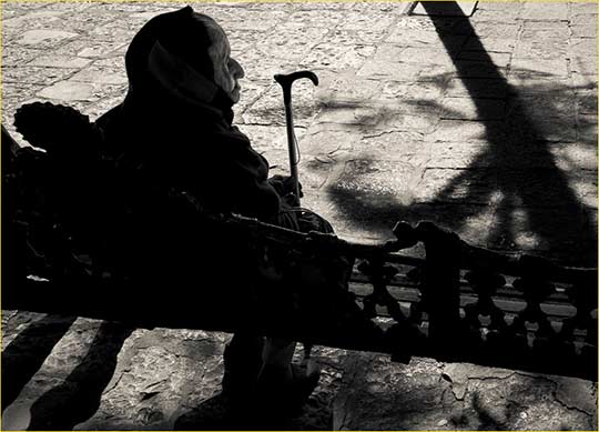
From The Bench. San Miguel de Allende, Mexico. December, 2012
Sony RX1 @ ISO 100
Why do some photographs succeeded and some not? Indeed, what makes a good photograph? Why are some worth looking at, thinking about, admiring or even hating? Why do some (most?) not even merit a second glance?
Are there rules, and who makes the rules? Then, if there are rules – who even cares? Isn’t it enough to just do one’s thing?
Heady questions aren’t they? But these are the ones that must be asked by any photographer who wants to grow an understanding of their art and craft, and even of themselves. These are the questions that students and workshop attendees ask the most often, once they get beyond a fixation with the latest gear.

Figure #2
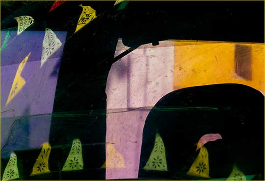
Shadow Play. San Miguel de Allende, Mexico. December, 2012
Canon SX50 @ ISO 80
Contrast / Gesture / Implication
In trying to codify some rules (or at least precepts) I’ve reduced them to three –Contrast, Gesture and Implication. Each of these sound like familiar words, but there is a wide range of meaning and implication within each one. Parenthetically, I would like to pay homage to Jay Maisel’s three touchstones; Light, Color, and Gesture. Jay has taught these for years, and while for my purposes they are a bit limiting, I freely admit to stealing his concept of Gesture, as will be seen soon.
Contrast
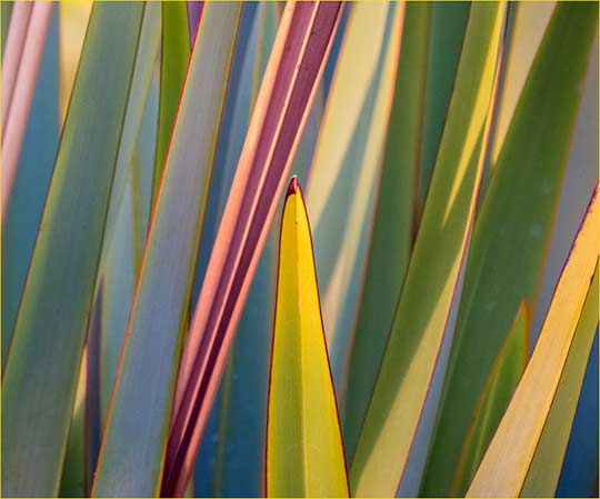
Figure #3
Blades at Sunset. San Miguel de Allende, Mexico. December, 2012
Canon SX50 @ ISO 800
Luminance
When we use the word “contrast” we usually are referring to luminance ; light and dark if you will. Without a contrast of brightness levels there can’t even be an image. A white line on a piece of white paper is invisible. A black line on the same white paper presents an image, though a simple one. It is the multitude of luminance contrasts in a photograph, whether B&W or colour, that create an image. No luminance contrast – no image.
It is the photographer’s responsibility to look for luminance contrasts in the physical world and then record and translate them. But it isn’t necessary to accept what the world serves up. High contrast situations can be made low key, and low contrast situations can be enhanced to provide additional luminance contrast.
Let’s look at the three images above. Figure #1 was converted to B&W and then the contrast was enhanced. The reason I did this is because I wanted to stress the graphic element of the image; the old lady’s silhouette and cane head, as well as the strong tree and bench shadows. In this particular shot colour had no real role to play, and neither did textural detail, except in the woman’s face. So, contrast was increased, shadows closed up, highlights tamed but left strong. This put the woman’s face down in about Zone 3, but alighteningbrush brought back the detail that was needed for visibility.
We’ll return to discuss Figure #1 later when we look at the concept of “gesture“.
Figure #2 illustrates an image with deliberate soft contrast. The shot started that way because I was shooting through a translucent plastic sheet, with the subject woman several feet in front of it. I then decreased the luminance contrast further so that tonalities are restricted to the mid-range. No blacks or whites at all. In other words – contrasts don’t necessarily need to be contrasty.
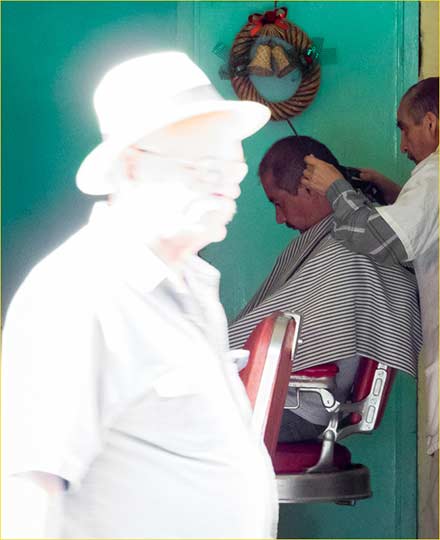
Figure #4
Ghost and Haircut. San Miguel de Allende, Mexico. December, 2012
Canon SX50 @ ISO 800
Figure #4 immediately above was a happy accident. I was shooting the inside of a dimly lit barber-shop from across the street, with exposure set appropriately for the low interior light. In one of the frames a man directly illuminated by the strong Mexican sun walked through the shot. It took a bit of work with theHighlightstool in Lightroom 4 to recover some textural detail, but there’s enough.
In this example the subject matter isn’t terribly exciting, but the juxtaposition of luminances is eye catching. Usually we use large areas of solid black for strong luminance contrast, but this is a rare example of the other extreme.
Colour
Of course we live in a world where 95% of all photography is likely both shot and shown in colour. Colour images have the characteristics of monochrome ones when it comes to luminance, but they also have saturation and, of course, the actual values of the colours being represented. In Figure #3 above we see a frame full of colour tonalities as well as colours with strong saturation due to the blades being illuminated by the setting sun.
There are also colour contrasts, where the different parts of the spectrum either compliment or contrast with each other. My essay onUnderstanding Colour Theoryfrom 2001 has an in-depth look at this subject, and if you are unfamiliar with it I urge you to have a look. It has been one of the widest read essays that I’ve ever written.
Figure #2 presents an example not just of reduced luminance range but also muted (unsaturated) colours. In the days of film we would choose a particular type of transparency film for its colour characteristics and also for the way it handled tonalities as well as colour saturation. Today this is the venue of our image processing software and post-processing preferences.
Size and Shape
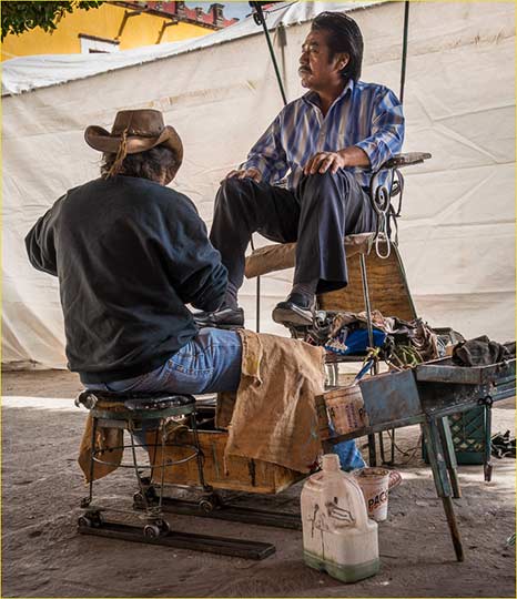
Figure #5
Shoe Shine. San Miguel de Allende, Mexico. December, 2012
Sony RX1 @ ISO 100
If everything was the same size and shape the world would be a pretty boring place. But they aren’t, and it isn’t – at least not for me. Perspective is one way of handling the need to make images interesting and can be considered another form of “contrast”. Here, in Figure #5 immediately above, the use of a low angle and a 35mm medium wide-angle lens gives the image depth, as does the inclusion of a bit of the building behind the white plastic sheeting.
Incidentally, this sheeting created a wonderful fill-light, as evidenced by the modeled light on the seated man’s face. Figure #2 above, was taken at around the same time and location, but from the other direction, creating a completely different mode under the same lighting conditions.
I’ll point out that the scene in Figure #4 above illustrates the inverse; a flattening of perspective due to the use of a long focal length (250mm equivalent). The contrasts in that shot, as discussed, are of a different nature, but obviously more than one sort can be found in any given successful image. Figure #5 immediately below is an abstraction where there are contrasts of tonality, shape, size and colour all contributing to a striking and enigmatic photograph.
Figure #5
Car Window #3. San Miguel de Allende, Mexico. December, 2012
Canon SX50 @ ISO 80. 160mm Equivalent
Gesture
Gestureis a word and a concept that which I have “borrowed” from the Master – Jay Maisel. It is hard to describe, but once one understands what it’s intended to describe it becomes clear that almost every successful photograph has gesture in one form or another.
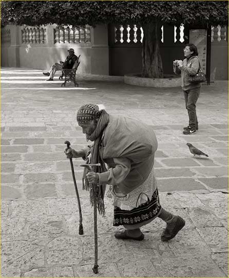
Figure #6
Approaching the Paroquia. San Miguel de Allende, Mexico. December, 2012
Sony RX1 @ ISO 100
Figure #6 above has four elements exhibiting gesture; the old woman, the pigeon, the tourist and the man on the distant bench. But gesture also applies to inanimate subjects. Look at each of the other photographs in this article and see if you can verbalize what elements havegesture. Sometimes it isn’t so obvious, or maybe there really isn’t any – after all, this isn’t a mandate. But, I believe that more often than not successful photographs exhibit this characteristic. Think of it as a “flow” or “energy” that objects in the scene possess. When people are the subject,gesturecan mean what it means – literally, as in Figure #1 above.
Look at Figure #3 again. The central fern blade exhibits gesture not just from its angle, but also via its contrasts of luminance and colour. A feeling of action, energy or motion is conveyed, even though everything in the image is stationary and inanimate.
Implication
Figure #7
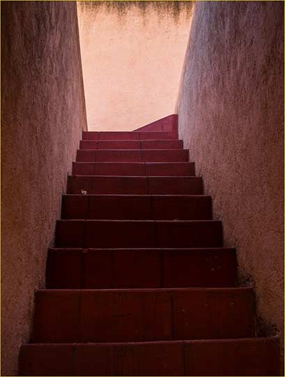
Staircase and Leaf. San Miguel de Allende, Mexico. December, 2012
Sony RX1 @ ISO 100
When I teach classes on “seeing photographically”, and I review student’s portfolios, I almost always ask the question – “What’s this image about?” More often than not this question catches people short. “What do you mean?” they ask.
That’s exactly the answer that I’m looking for, because I don’t really care what a particular image is “about“, but rather I’m trying to discover if the photographer has given thought to what it is they have photographed.
Let’s start with Figure #7 immediately above, because it’s a hard one. If asked the question I could say that it’s about the intensity of the monochromatic red palette, or the dimensionality of the receding staircase, or the somewhat mysterious blank but contrasting wall at the top of the stairs. Or, I could say it’s “about” the lone leaf on the stair bisecting the center of the image.
Each is a plausible answer. There’s no right or wrong, because in fact the photograph can be said to be “about” any or all of the above. The point is though that I, the photographer, have thought about the content and meaning of the image. Maybe it was subconsciously at the time of shooting it, or more deliberately as I reviewed my files on the computer before deciding that this was one to be worked on. But it isn’t simply a “record” of a scene. It’s that process of conscious involvement that I believe is what creates a compelling image, one that commands our attention if only for a moment or two.
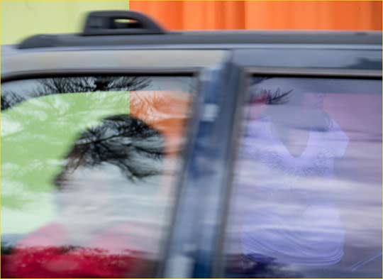
I’ll leave Figure #8 below for your own analysis.
Figure #8
Passing Taxi and Girl
San Miguel de Allende, Mexico. January, 2013
Canon SX50 @ ISO 80
© 2013 Michael Reichmann
January, 2013
Read this story and all the best stories on The Luminous Landscape
The author has made this story available to Luminous Landscape members only. Upgrade to get instant access to this story and other benefits available only to members.
Why choose us?
Luminous-Landscape is a membership site. Our website contains over 5300 articles on almost every topic, camera, lens and printer you can imagine. Our membership model is simple, just $2 a month ($24.00 USD a year). This $24 gains you access to a wealth of information including all our past and future video tutorials on such topics as Lightroom, Capture One, Printing, file management and dozens of interviews and travel videos.
- New Articles every few days
- All original content found nowhere else on the web
- No Pop Up Google Sense ads – Our advertisers are photo related
- Download/stream video to any device
- NEW videos monthly
- Top well-known photographer contributors
- Posts from industry leaders
- Speciality Photography Workshops
- Mobile device scalable
- Exclusive video interviews
- Special vendor offers for members
- Hands On Product reviews
- FREE – User Forum. One of the most read user forums on the internet
- Access to our community Buy and Sell pages; for members only.


