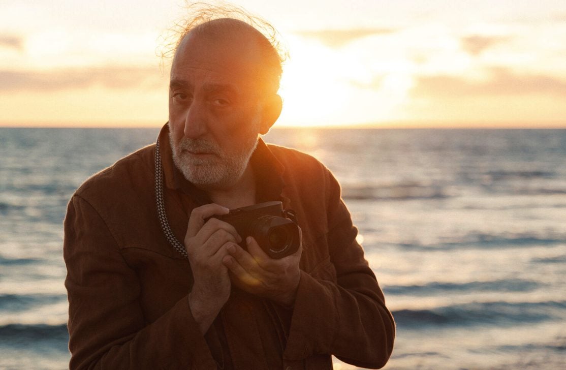
Aftershoot's Justin Benson on AI, photography, and where the line actually is.


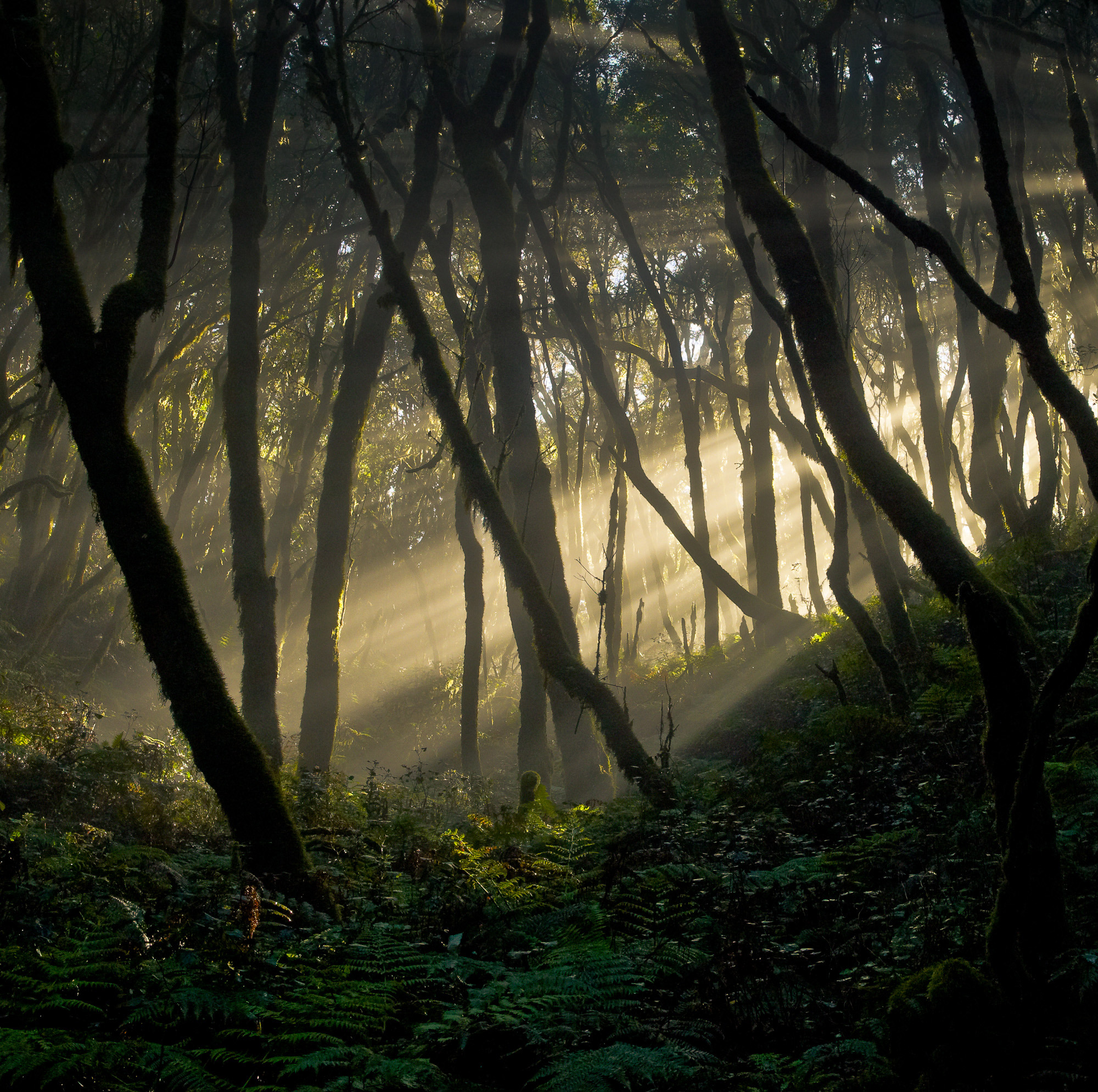
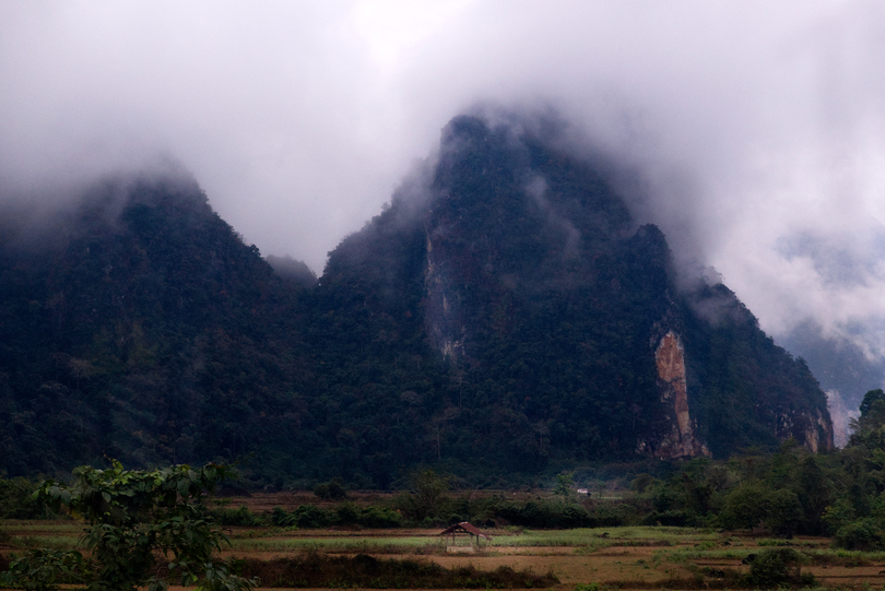
Chasing light, weather, and the quiet shifts of the seasons—this month’s Show & Tell is a beautiful reminder of why we keep coming back with a camera. Take a look…

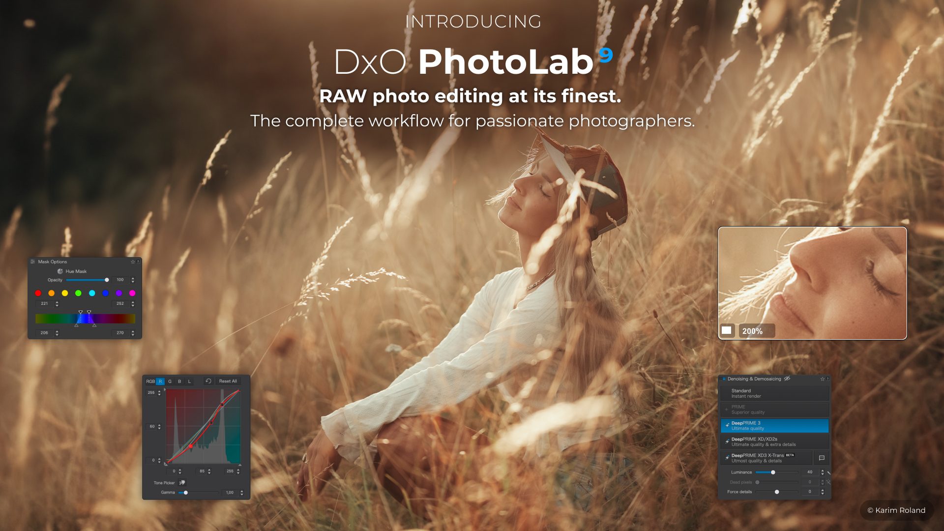
A field journal from the farmlands - and a quick look at where photo editing software stands right now.
Get Our Free Newsletter
Photography craft, printing tips, and honest reviews — delivered to your inbox. No spam, unsubscribe anytime.
Sign Up Free
Our latest articles
All articles
Subscribers Only
Camera & Technology
Photographer Profiles
Techniques
Landscape & Environment
A Book Feature and Interview | Luminous Landscape
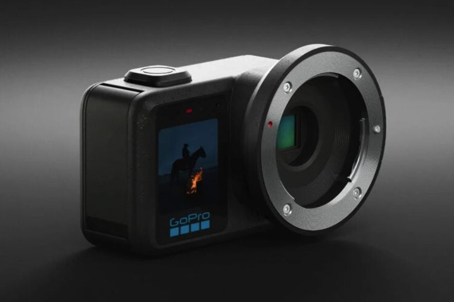
The Mission 1 Pro ILS puts an MFT mount on a 1-inch sensor body - and that's more interesting than it sounds.
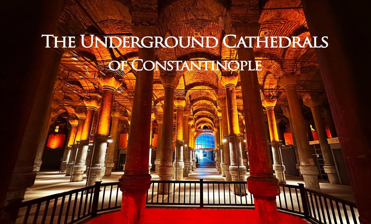
Istanbul’s Basilica Cistern and Byzantine underground reservoirs captured through striking architectural photography.
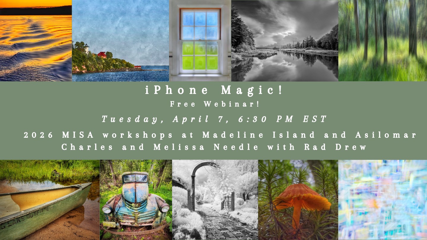
A Free Webinar Worth Your Tuesday Night
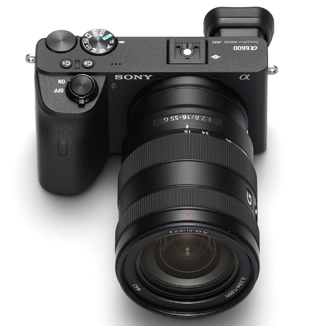
A 15x zoom, 1-inch sensor, and pocketability make this compact a compelling option for photographers who want to travel light and have variable lens lengths.
Aftershoot's Justin Benson on AI, photography, and where the line actually is.
Chasing light, weather, and the quiet shifts of the seasons—this month’s Show & Tell is a beautiful reminder of why we keep coming back with a camera. Take a look…
A field journal from the farmlands - and a quick look at where photo editing software stands right now.
Istanbul’s Basilica Cistern and Byzantine underground reservoirs captured through striking architectural photography.
A Free Webinar Worth Your Tuesday Night
The Mission 1 Pro ILS puts an MFT mount on a 1-inch sensor body - and that's more interesting than it sounds.
A Free Webinar Worth Your Tuesday Night
A 15x zoom, 1-inch sensor, and pocketability make this compact a compelling option for photographers who want to travel light and have variable lens lengths.
A conversation about portable travel cameras - and the six contenders worth considering in 2026
Is the best noise reduction engine in photography available to everyone now?
Aftershoot's Justin Benson on AI, photography, and where the line actually is.
A Book Feature and Interview | Luminous Landscape
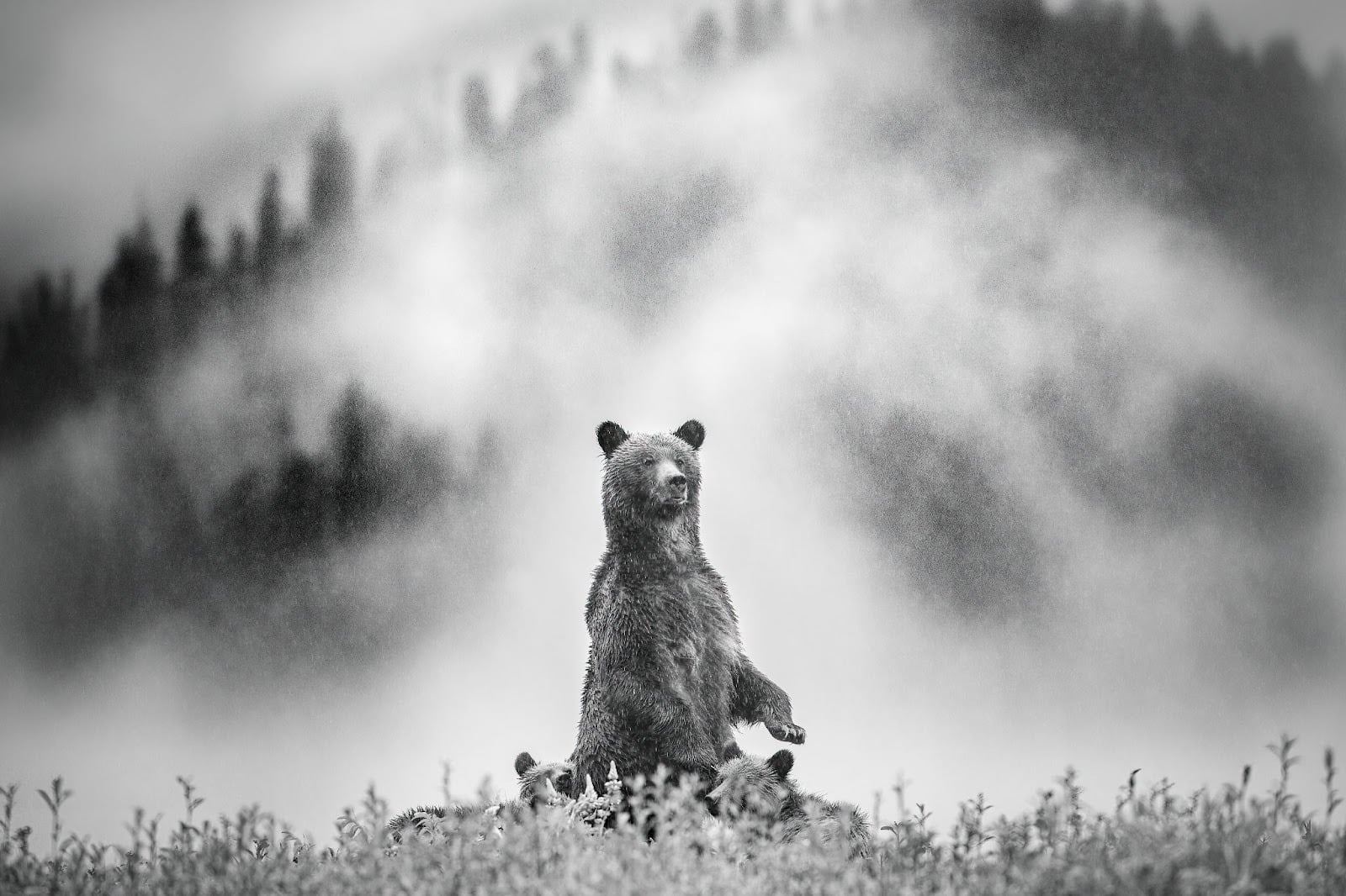
He'd never touched a camera. His first subject was a black bear. Naturally.
This presentation is not about discovering hidden images but an invitation to see differently
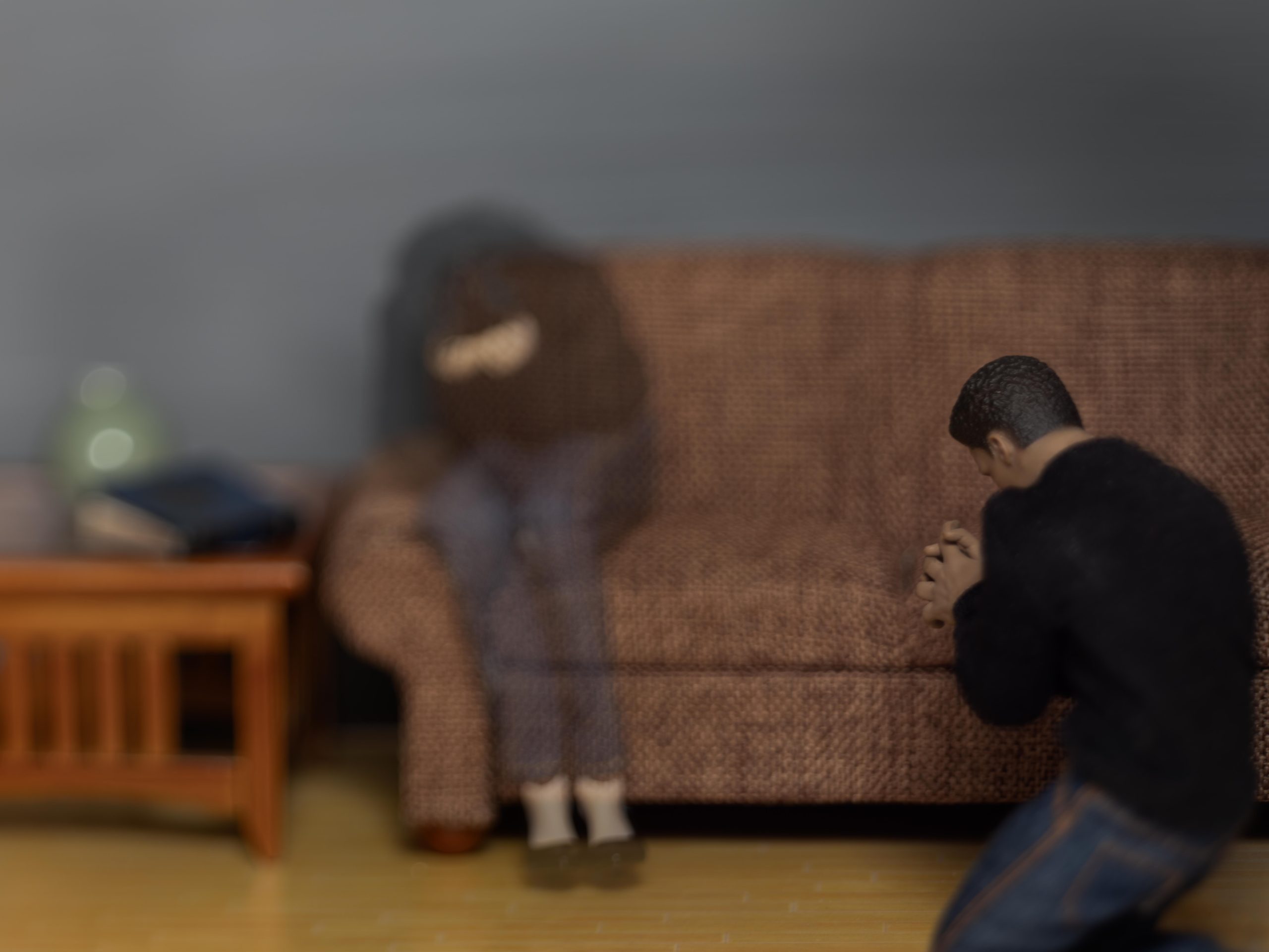
Richard Owens’s years-long project uses miniature scenes and large format photography to explore the unconscious.
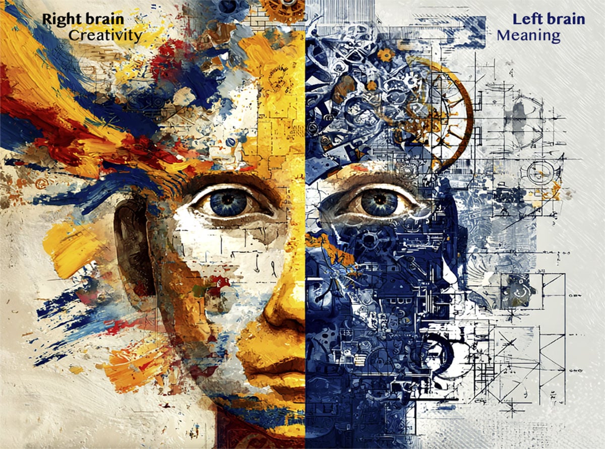
Your most powerful photography tool is the 200 million nerve fibers connecting both halves of your brain.
Hoping someone discovers your work isn't a plan - here's how to actually find the audience your photography deserves.
Master photographic style to create cohesive, professional bodies of work.
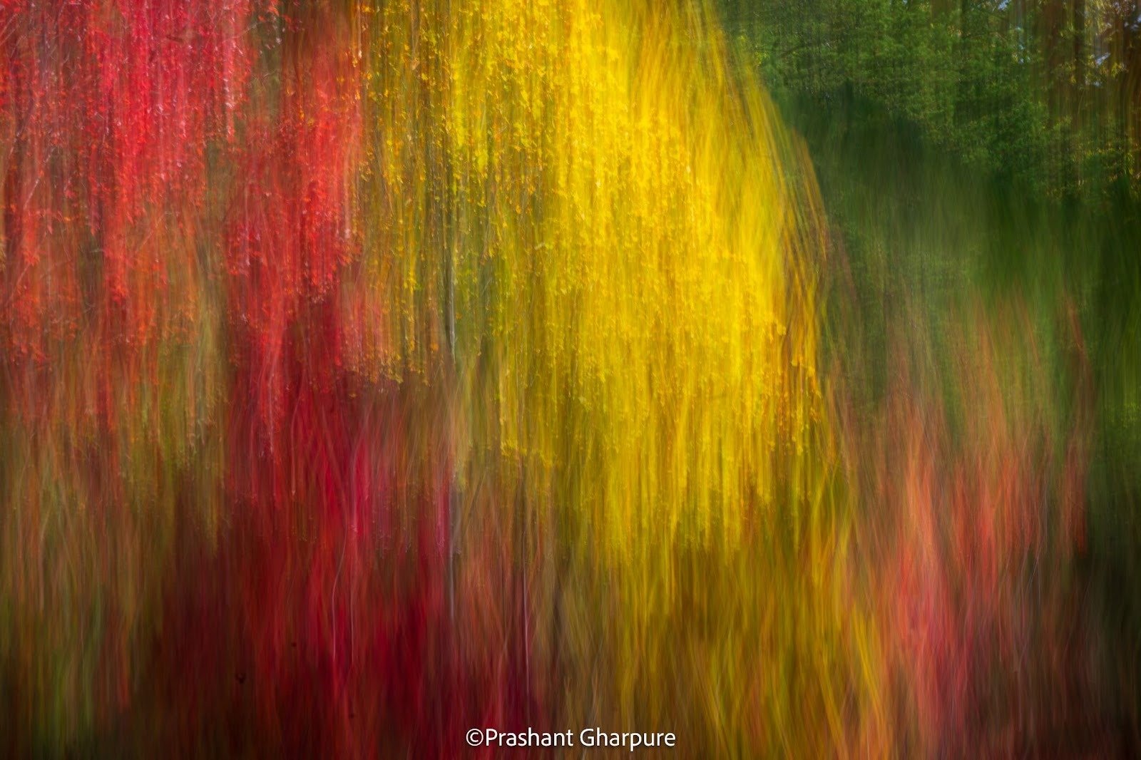
A Conversation with Prashant Gharpure on Intentional Camera Movement in the Smoky Mountains
There are no mistakes in art, only attempts - and why that changes everything about how you create.
Istanbul’s Basilica Cistern and Byzantine underground reservoirs captured through striking architectural photography.
He'd never touched a camera. His first subject was a black bear. Naturally.
Your most powerful photography tool is the 200 million nerve fibers connecting both halves of your brain.
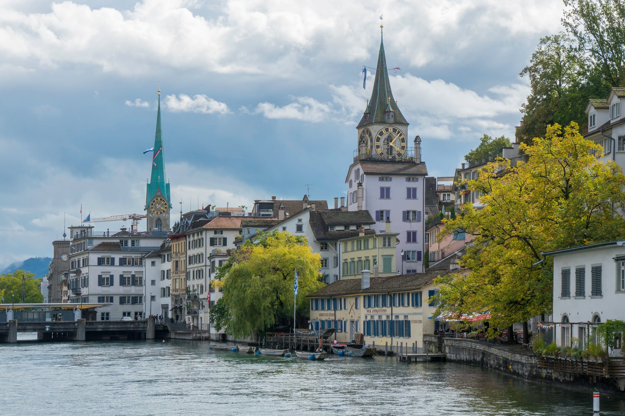
Next month, 25,000 photography enthusiasts will descend on Zurich for PhotoSCHWEIZ 2026 - here's why this prestigious Swiss exhibition deserves a spot on your calendar.
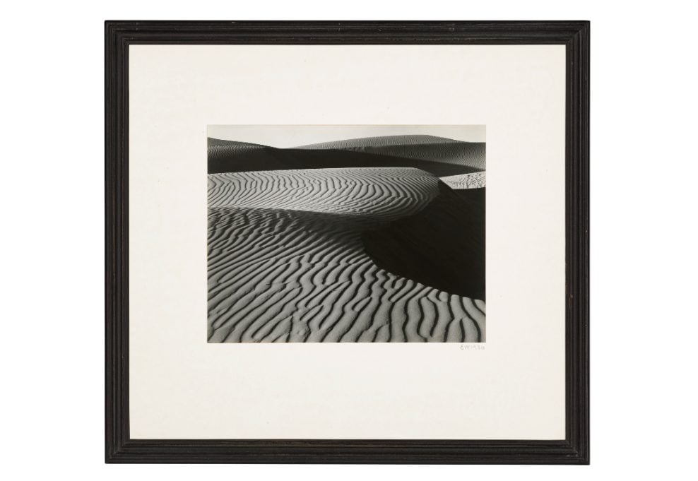
This Christie's sale brings together the titans who invented modern landscape photography, from Adams' technical precision to Sugimoto's philosophical vision.
The most viewed articles


Join for just $2 per month
Join for access to over 5000 in depth articles, hundreds of hours of video tutorials and access to the largest Photography forum.
Be in the Know: Get the Exclusive LuLa Newsletter Sent to Your Inbox!
Get access to exclusive articles, behind-the-scenes content, and become a valued member of our photography team! Subscribe now to elevate your photography experience.
Subscribe Now to Join Us!
Only $2 per month
